Section 2 Data Integration with MINT
This vignette explains the functionalities of MINT (Multivarite INTegrative method) (Rohart et al. 2017) toolkit in combining datasets from multiple single cell transcriptomic studies on the same cell types. The integration is across the common P features. Hence, we call this framework P-Integration. We will also illustrate why Prinicipal Component Analysis might not be as powerful in such setting. It is worth mentioning that MINT can be used to combine datasets from any types of similar ’omics studies (transcriptomics, proteomics, metabolomics, etc) on the samples which share common features. For integration across different omics you can use DIABLO.
2.1 Prerequisites
Also, mixOmics (Le Cao et al. 2018) and the following Bioconductor packages must be installed for this vignette:
## installing libraries
## calling the source R code that installs Bioconductor packages
source('https://bioconductor.org/biocLite.R')
## Try http:// if https:// URLs are not supported

## package installations (might take a bit of time)
biocLite('mixOmics')
biocLite('SingleCellExperiment') ## single-cell experiment data analysis
biocLite('scran') ## sc-RNAseq data analysis
biocLite('scater') ## sc gene expression analysis
biocLite('vennDiagram') ## Venn diagrams
install.packages('tibble') ## for data tables
If any issues arise during package installations, you can check out the Troubleshoots section.
2.2 Why MINT?
Different datasets often contain different levels of unwanted variation that come from factors other than biology of study (e.g. differences in the technology, protocol, etc.) known as batch effects. The MINT framework presented in this vignette is an integrative method that helps to find the common structures in the combined dataset which best explain their biological class membership (cell type), and thus can potentially lead us to insightful signatures. For further examples on bulk data, you can also check out a case study on mixOmics’ website.
2.3 When Not to Use MINT?
Current version of MINT performs supervised data integration. Therefore, the phenotypes/cell types must be known prior to data integration using this method.
2.4 R scripts
The R scripts are available at this link.
2.5 Libraries
Here we load the libraries installed in Prerequisites:
## load the required libraries
library(SingleCellExperiment)
library(mixOmics)
library(scran)
library(scater)
library(knitr)
library(VennDiagram)
library(tibble)
2.6 Data
The benchmark data - available on github - were obtained from our collaborators Luyi Tian and Dr Matt Ritchie at WEHI. Briefly, cells from three human cell lines H2228, H1975, HCC827 collected on lung tissue (Adenocarcinoma; Non-Small Cell Lung Cancer) were barcoded and pooled in equal amounts. The samples were then processed through three different types of 3’ end sequencing protocols that span the range of isolation strategies available:
- Droplet-based capture with:
- Chromium 10X (10X Genomics)
- Drop-seq (Dolomite).
- Plate based isolation of cells in microwells with CEL-seq2.
Therefore, in addition to the biological variability coming from three distinct and separately cultured cell lines, the datasets are likely to also contain different layers of technical variability coming from three sequencing protocols and technologies.
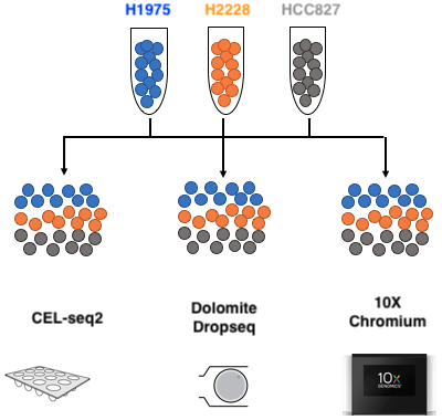
Figure 2.1: Benchmark experiment design: mixture of the three pure cells in equal proportion, processed through 3 different sequencing technologies. Adopted from Luyi Tian slides.
Throughout this vignette, the terms batch, protocol, and study are used interchangeably.
2.7 Loading the Data
We load the data directly from the github repository into R environment:
## load from github
DataURL='https://tinyurl.com/sincell-with-class-RData-LuyiT'
load(url(DataURL))
But you can download and load them from your working directory as well (you must download the sincell_with_class.RData file from the repository):
## load from local directory, change to your own
load('data/sincell_with_class.RData')Tip: For convenience, throughout the runs you may also want to save the finalised RData file from each section using the save function for easy loading using load function in the downstream analyses (refer to R documentation for more details).
The loaded datasets consist of:
- sce10x_qc: From the Chromium 10X technology;
- sce4_qc: From the CEL-seq2 technology; and
- scedrop_qc_qc: From the Drop-seq technology (quality controlled twice due to abundant outliers).
Each dataset is of SingleCellExperiment (SCE) class, which is an extension of the RangedSummarizedExperiment class. For more details see the package’s vignette or refer to the R Documentation.
2.7.1 Quality Control
The data have been quality controlled using scPipe package. It is a Bioconductor package that can handle data generated from all 64 popular 3’ end scRNA-seq protocols and their variants (Tian and Su 2018).
2.7.2 Overview
we now stratify the cell and gene data by cell line in each protocol.
## make a summary of QC'ed cell line data processed by each protocol
sce10xqc_smr =  summary(as.factor(sce10x_qc$cell_line))
sce4qc_smr =    summary(as.factor(sce4_qc$cell_line))
scedropqc_smr = summary(as.factor(scedrop_qc_qc$cell_line))
## combine the summaries
celline_smr = rbind(sce10xqc_smr,sce4qc_smr,scedropqc_smr)
## produce a 'total' row as well
celline_smr = cbind(celline_smr, apply(celline_smr,1,sum))
## add the genes as well
celline_smr = cbind(celline_smr,
                    c(dim(counts(sce10x_qc))[1],
                      dim(counts(sce4_qc))[1],
                      dim(counts(scedrop_qc_qc))[1]))
## label the rows
row.names(celline_smr) = c('10X', 'CEL-seq2', 'Drop-seq')
colnames(celline_smr) = c('H1975', 'H2228', 'HCC827',
                          'Total Cells','Total Genes')
## tabulate the summaries
kable(celline_smr,
caption = 'Summary of cell and gene data
per cell line for each protocol')| H1975 | H2228 | HCC827 | Total Cells | Total Genes | |
|---|---|---|---|---|---|
| 10X | 313 | 315 | 274 | 902 | 16468 |
| CEL-seq2 | 114 | 81 | 79 | 274 | 28204 |
| Drop-seq | 92 | 65 | 68 | 225 | 15127 |
The assignment to each cell line was performed computationally based on the correlation of the gene expression data with a bulk assay of a mixture of cells by DE analysis using edgeR.
The 10X protocol yielded the highest number of cellls (~900). We can visualise the the total amount of genes in each protocol and the amount of overlapping genes among the protocols using a venn diagram:
## create venn diagram of genes in each protocol:
venn.plot = venn.diagram(
  x = list(Chrom.10X = rownames(sce10x_qc),
           CEL.seq2 = rownames(sce4_qc),
           Drop.seq = rownames(scedrop_qc_qc)),
  filename = NULL, label=TRUE, margin=0.05,
  height = 1400, width = 2200,
  col = 'transparent', fill = c('cornflowerblue','green', 'red'),
  alpha = 0.60, cex = 2, fontfamily = 'serif', fontface = 'bold',
  cat.col = c('darkblue', 'darkgreen', 'black'), cat.cex = 2.2)

## save the plot, change to your own directory
png(filename = 'figures/GeneVenn.png')
grid.draw(venn.plot)
dev.off()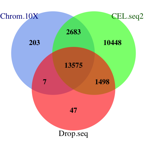
Figure 2.2: The venn diagram of common genes among datasets. MINT uses the common features of all datasets for discriminant analysis.
A total of 13757 genes are shared across three datasets.
2.7.3 Normalisation
Normalisation is typically required in RNA-seq data analysis prior to downstream analysis to reduce heterogeneity among samples due to technical artefact as well as to help to impute the missing values using known data.
We use the scran package’s “Normalisation by deconvolution of size factors from cell pools” method (Lun, Bach, and Marionib 2016). It is a two-step process, in which the size factors are adjusted, and then the expression values are normalised:
## normalise the QC'ed count matrices
sc10x.norm =  computeSumFactors(sce10x_qc) ## deconvolute using size factors
sc10x.norm =  normalize(sc10x.norm) ## normalise expression values
## DROP-seq
scdrop.norm = computeSumFactors(scedrop_qc_qc)
scdrop.norm = normalize(scdrop.norm)
## CEL-seq2
sccel.norm =  computeSumFactors(sce4_qc)
sccel.norm =  normalize(sccel.norm)
Depending on the data structure and/or the question in hand the following analyses can have one of the following two forms:
Unsupervised Analysis: Where we want to explore the patterns among the data and find the main directions that drive the variations in the dataset. It is often beneficial to perform unsupervised analysis prior to supervised analysis to assess the presence of outliers and/or batch effects.
Supervised Analysis: In which each sample consists of a pair of feature measurements (e.g. gene counts) and class membership (e.g. cell type). The aim is to build a model that maps the measurements to their classes using a training set which can adequately predict classes in a test set as well.
We will start with Unsupervised Analysis and then proceed to Supervised Analysis.
2.8 PCA: Unsupervised Analysis
We start by Principal Component Analysis (PCA) (Jolliffe 1986). It is a dimension reduction method which seeks for components that maximise the variance within the datasets. PCA is primarily used to explore one single type of ‘omics data (e.g. transcriptomics, proteomics, metabolomics data, etc). It is an unsupervised learning method and thus there is no assumption of data corresponding to any class (batch, study etc).
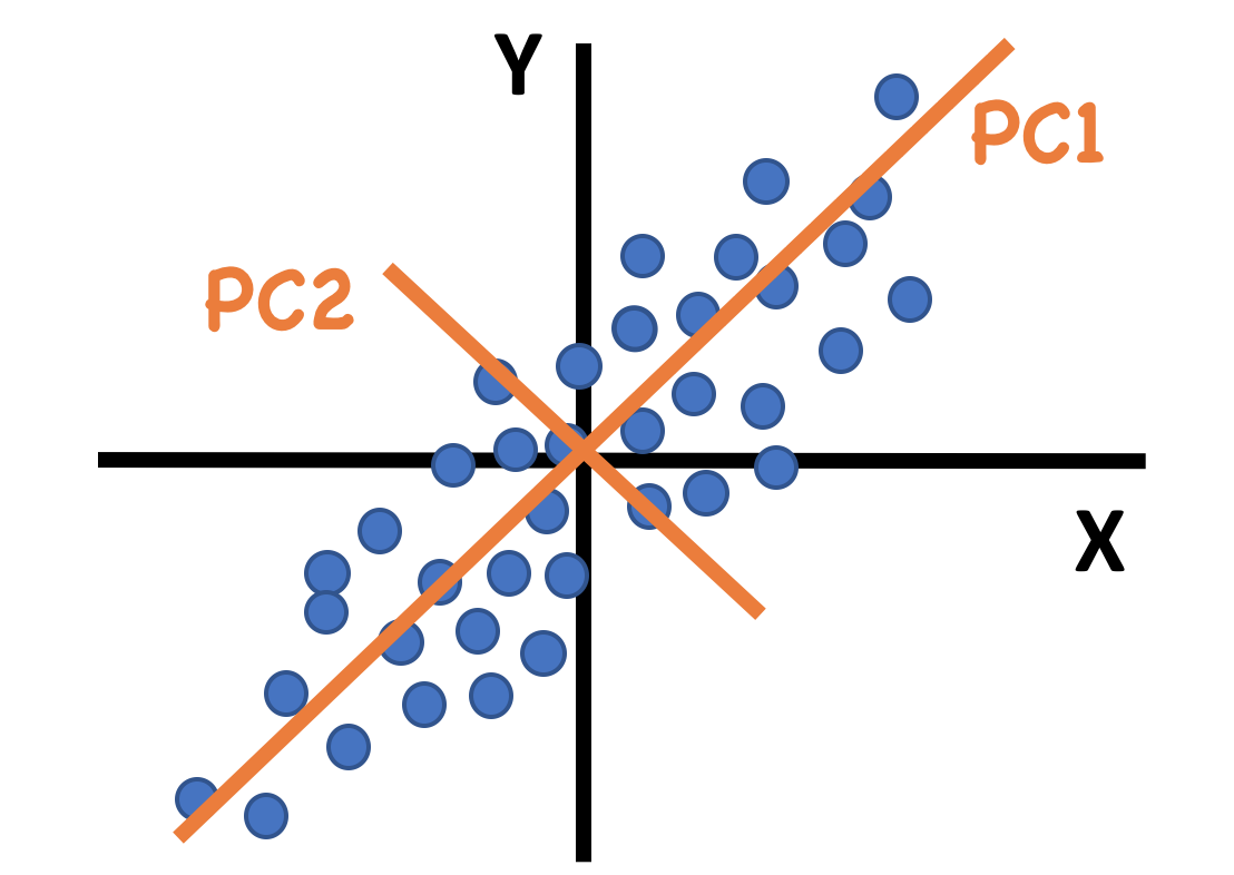
Figure 2.3: An example of principal components for data with only 2 dimensions. The first PC is along the direction of maximum variance.
The first Principal Component (PC) explains as much variance in the data as possible, and each following PC explains as much of the remaining variance as possible, in a direction orthogonal to all previous PCs. Thus, the first few components often capture the main variance in a dataset.
We will perform PCA on the datasets from each protocol separately and then conduct a PCA on the concatenated dataset.
2.8.1 PCA on Each Protocol Individually
We will use mixOmics‘s pca function in this section. The method is implemented numerically and it is capable of dealing with datasets with or without missing values (see documentation for details). The pca function takes the data as a matrix of count data. Contrary to conventional biological data formation, pca takes each row to be the gene expression profile of a molecule/cell. Therefore, we will have to transpose the normalised matrix (using the t() function) to perform PCA. Additionally, we use the log transformed counts (logcounts()) to confine the counts’ span for numerical reasons.
By default, mixOmics centres the normalised matrix to have zero mean. The scale argument can also be set to ‘TRUE’ if there are diverse units in raw data.
The ncomp argument denotes the number of desired PCs to find1. We will retrieve 10 PCs for each protocol at this stage:
## pca on the normlaised count matrices and find 10 PCs
pca.res.10x =     pca(t(logcounts(sc10x.norm)),  ncomp = 10,
                      center=TRUE, scale=FALSE)
pca.res.celseq =  pca(t(logcounts(sccel.norm)),  ncomp = 10,
                      center=TRUE, scale=FALSE)
pca.res.dropseq = pca(t(logcounts(scdrop.norm)), ncomp = 10,
                      center=TRUE, scale=FALSE)
Each output is a pca object that includes the centred count matrix for that protocol, the mean normalised counts for each gene, the PCA loadings, and score values.
It is possible to use the plot function on pca object to visualise the proportion of the total variance of the data explained by each of the 10 PCs for each protocol using a barplot:
## arrange the plots in 1 row and 3 columns
par(mfrow=c(1,3))
## find the maximum explained variance in all PCs:
ymax = max (pca.res.10x$explained_variance[1],
             pca.res.celseq$explained_variance[1],
             pca.res.dropseq$explained_variance[1])

## plot the pca objects and limit the Y axes to ymax for all
plot(pca.res.10x, main= '(A) 10X', ylim=c(0,ymax))
plot(pca.res.celseq,  main= '(B) CEL-seq2', ylim=c(0,ymax))
plot(pca.res.dropseq,  main= '(C) Drop-seq', ylim=c(0,ymax))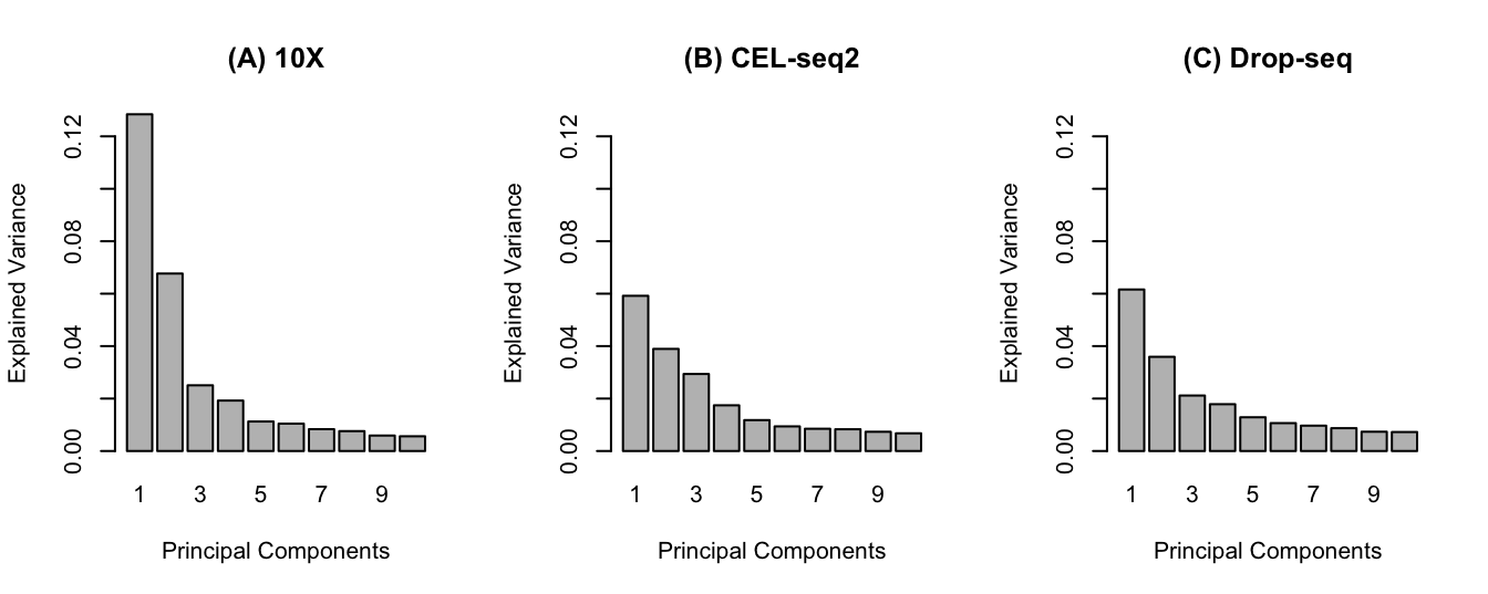
Figure 2.4: The pca barplot for each protocol. (A) The first 2 PCs explain 20% of total variability of the data and there is a drop (elbow) in the explained variability afterwards. (B) The first 2 PCs explain 10% of variability and an elbow is not apparent. (C) similar cumulative explained variance to CEL-seq2 for first 2 PCs.
It will usually be desirable if the first few PCs capture sufficient variation in the data, as this will help with visualisation.
In order to have a simple 2D scatter plot, the first 2 PCs are usually the ones of interest in PCA plots2. Such a plot can be created using the plotIndiv function. For a complete list of the argument options refer to the documentation.
We will colour the data points of each cell line using group argument to see whether there is a differentiation between different cell types:
## define custom colours/shapes
## colour by cell line
col.cell = c('H1975'='#0000ff', 'HCC827'='grey30', 'H2228' ='#ff8000')
## shape by batch
shape.batch = c('10X' = 1, 'CEL-seq2'=2, 'Drop-seq'=3 )
## pca plots for protocols
## 10x
plotIndiv(pca.res.10x, legend = TRUE, title = 'PCA 10X', pch = shape.batch['10X'], col = col.cell,
group = sce10x_qc$cell_line, legend.title = 'Cell Line')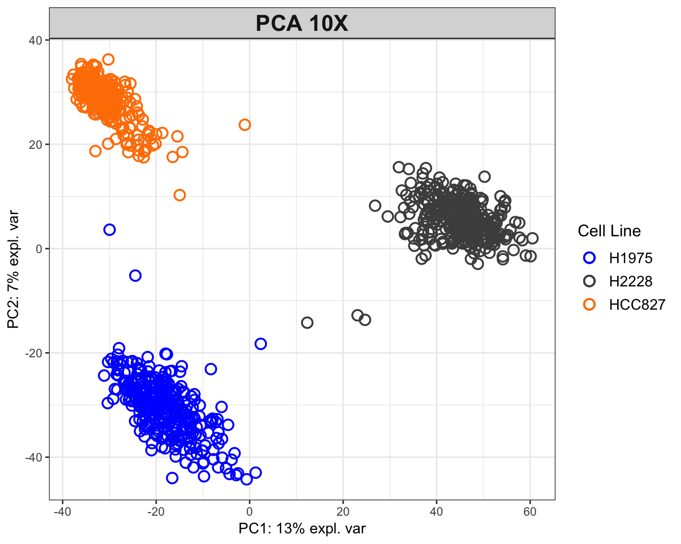
Figure 2.5: PCA plot for the 10X dataset. The data tend to group together by cell lines.
PCA plot for 10X data shows that the H2228 cells are most differentiated from others along the first PC, while the other two are located similarly along this PC. The 3 clusters are separated along the second PC. The Drop-seq data have been quality controlled twice and still exhibit two clusters. One possible explanation is the existence of doublets (droplets with 2 cells). This highlights the importance of carefully tuning the experiment parameters.
## CEL-seq2
plotIndiv(pca.res.celseq, legend = TRUE, title = 'PCA CEL-seq2', pch = shape.batch['CEL-seq2'],
          col = col.cell, group = sce4_qc$cell_line, legend.title = 'Cell Line')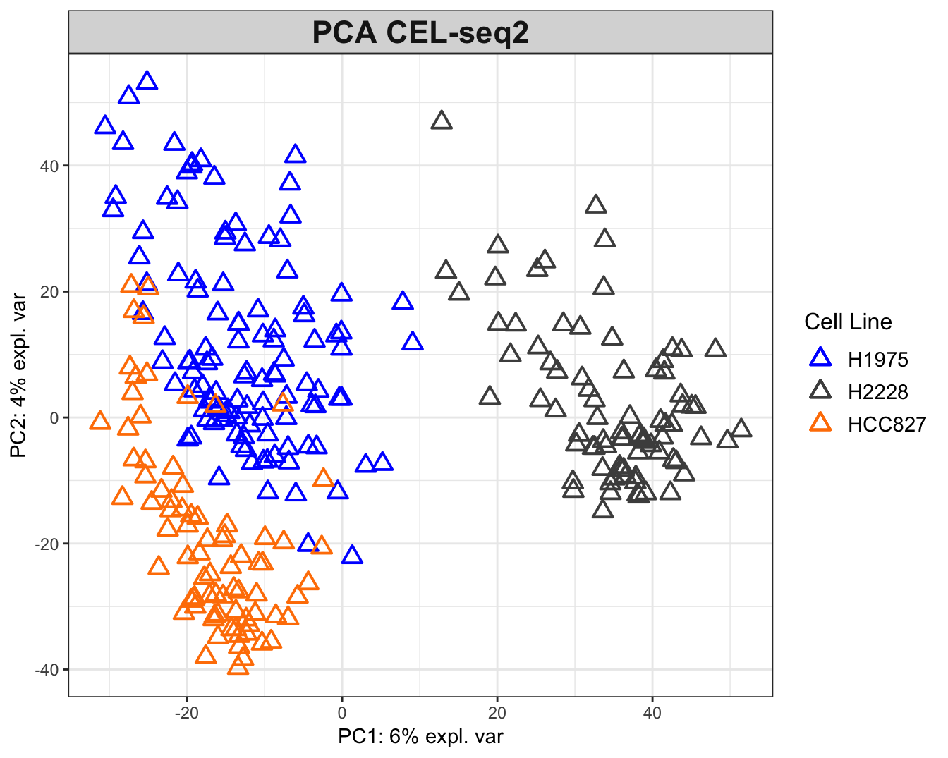
Figure 2.6: The PCA plots for the CEL-seq2 data. The data are widely scattered in the 2D plane while H2228 cells are relatively distant from the other two.
## Drop-seq
plotIndiv(pca.res.dropseq, legend = TRUE, title = 'PCA Drop-seq', pch = shape.batch['Drop-seq'],
          col = col.cell, group = scedrop_qc_qc$cell_line, legend.title = 'Cell Line')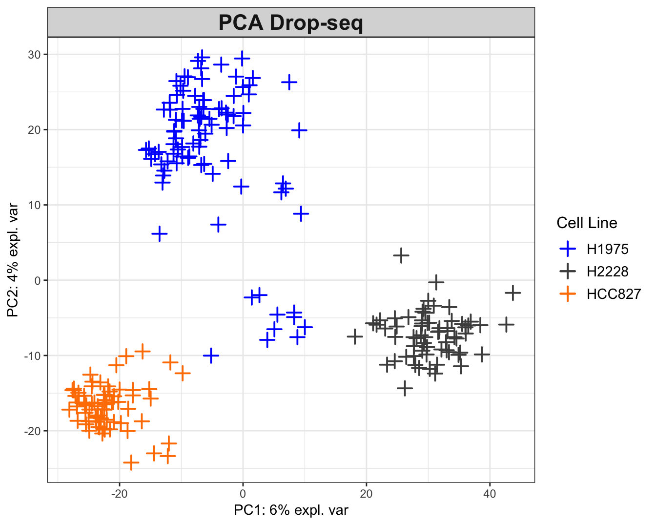
Figure 2.7: The PCA plots for the Drop-seq data. While H2228 and HCC827 cell data tend to cluster by cell line, the H1975 data exhibit two clusters with negative correlation (on opposite sides of origin). The within-data variation is not consistent between datasets. For instance, the 10X data show a clear grouping structure by cell lines, while this observation is not as strongly supported in other datasets.
2.9 PCA on the Combined Dataset
We now pool/concatenate the datasets for unsupervised analysis. First we should find out the common genes across the three datasets, as a requirement for P-Integration:
## find the intersect of the genes for integration
list.intersect = Reduce(intersect, list(
## the rownames of the original (un-transposed) count matrix will -
## output the genes
  rownames(logcounts(sc10x.norm)),
  rownames(logcounts(sccel.norm)),
  rownames(logcounts(scdrop.norm))
))
Now we can merge the 3 datasets:
## combine the data at their intersection
data.combined = t( ## transpose of all 3 datasets combined
  data.frame(
    ## the genes from each protocol that match list.intersect
    logcounts(sc10x.norm)[list.intersect,],
    logcounts(sccel.norm)[list.intersect,],
    logcounts(scdrop.norm)[list.intersect,] ))
## the number of cells and genes in the intersect dataset
dim(data.combined)
## [1] 1401 13575This matrix includes the count data for the combined dataset. We will also create 2 vectors of the cell lines and batches for visualisation of the PCA plots, and also later for the PLS-DA analysis:
# create a factor variable of cell lines
# must be in the same order as the data combination
cell.line = as.factor(c(sce10x_qc$cell_line,
                         sce4_qc$cell_line,
                         scedrop_qc_qc$cell_line))
# name the factor variable with the cell ID
names(cell.line) = rownames(data.combined)

# produce a character vector of batch names
# must be in the same order as the data combination
batch = as.factor(
  c(rep('10X',      ncol(logcounts(sc10x.norm))),
    rep('CEL-seq2',  ncol(logcounts(sccel.norm))),
    rep('Drop-seq', ncol(logcounts(scdrop.norm))) ))
# name it with corresponding cell IDs
names(batch) = rownames(data.combined)
We can now perform PCA and visualise the results:
## perform PCA on concatenated data and retrieve 2 PCs
pca.combined = pca(data.combined, ncomp = 2)
# plot the combined pca coloured by batches
plotIndiv(pca.combined, title = 'PCA Combined',
pch = batch, # shape by cell line
group = cell.line, # colour by batch
legend = TRUE, legend.title = 'Study',
legend.title.pch = 'Cell Line')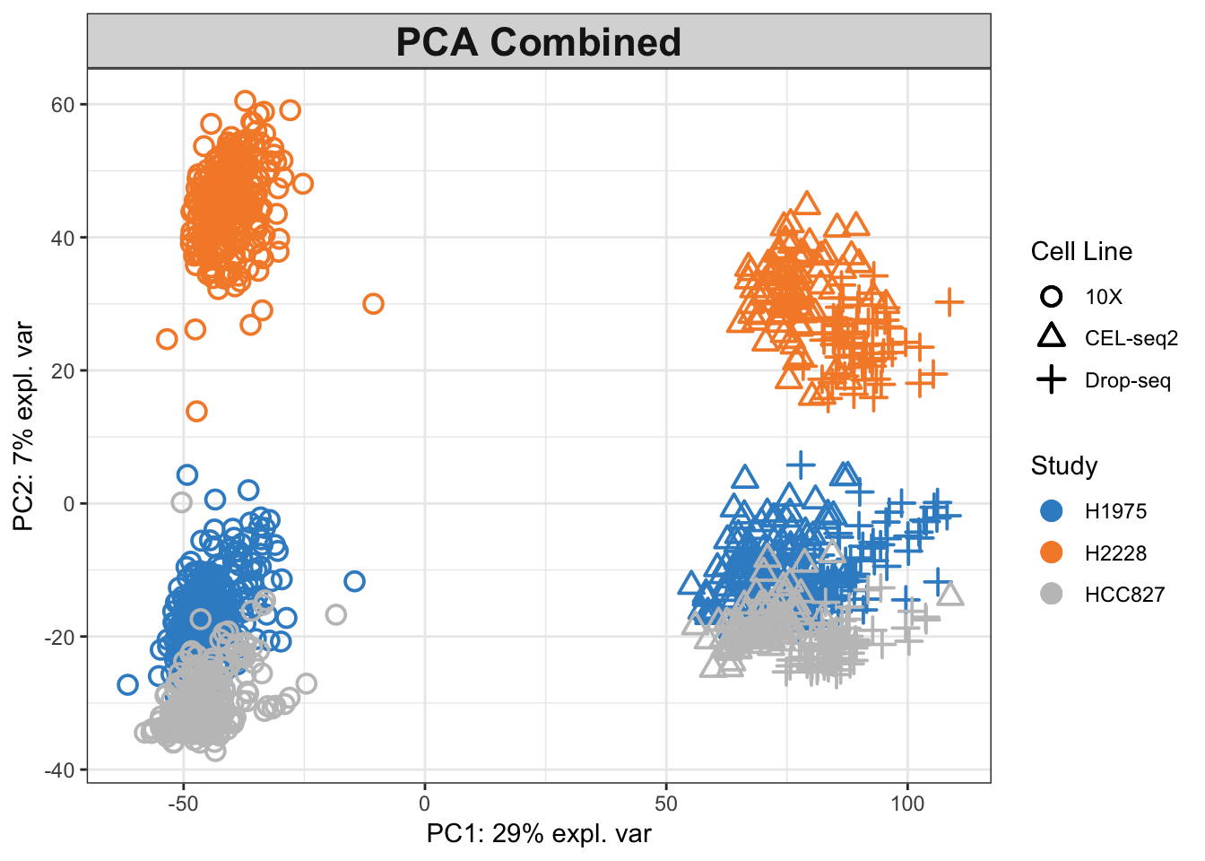
Figure 2.8: The PCA plot for the combined data, coloured by cell lines.
## plot the combined pca coloured by protocols
plotIndiv(pca.combined, title = 'PCA Combined',
          pch = cell.line, ## shape by cell line
          group = batch, ## colour by protocol
          col.per.group = c('red', 'purple', 'green'),
          legend = TRUE, legend.title = 'Study',
          legend.title.pch = 'Cell Line')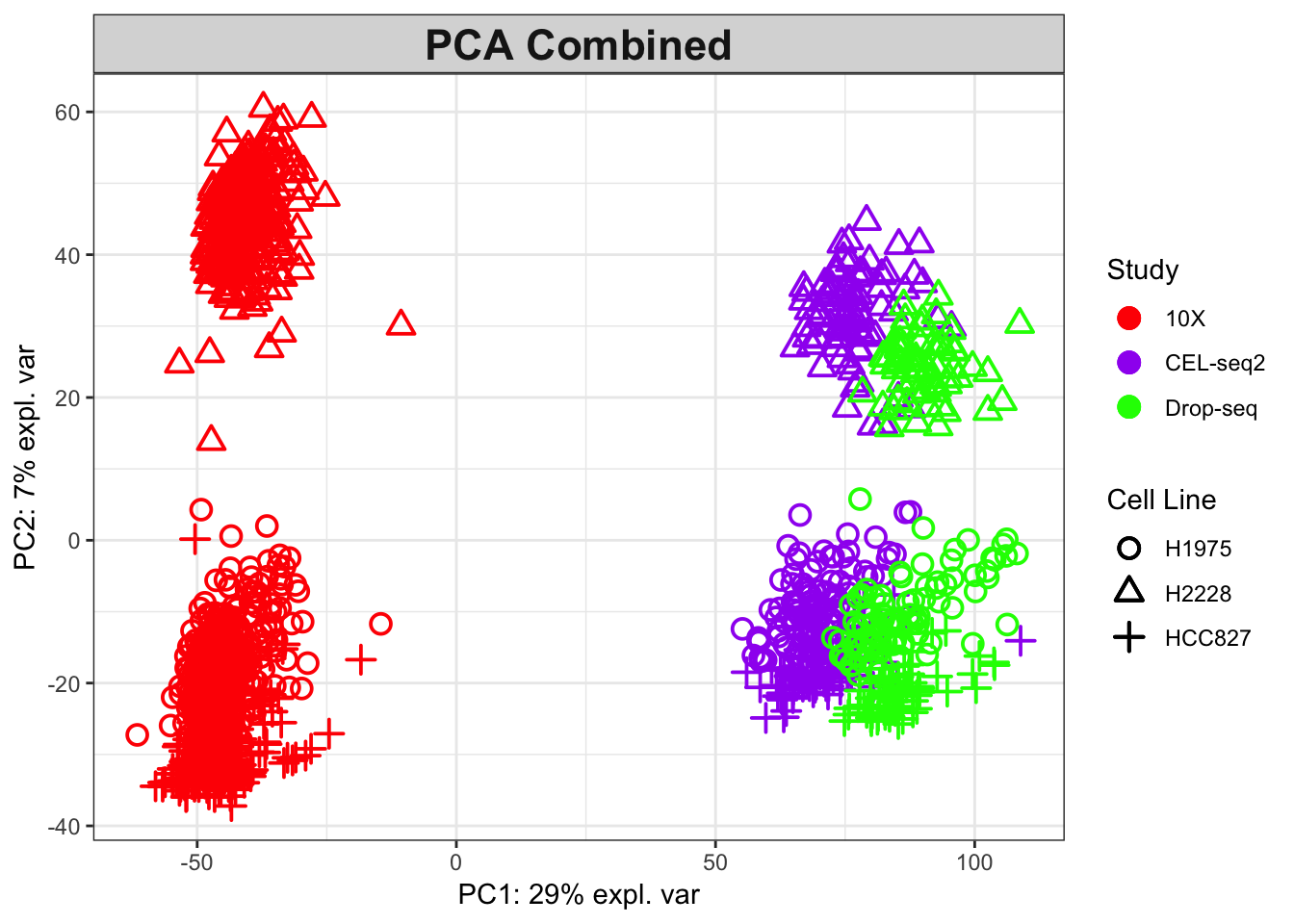
Figure 2.9: The PCA plot for the combined data, coloured by protocols.
As shown in combined PCA plots above, the protocols are driving the variation along PC1 (batch effects), while wanted biological variation is separating the data along PC2. We will next implement the MINT PLS-DA method on the combined dataset with an aim to account for the batch effects in discriminating the different cell types.
2.10 MINT to Combine the Datasets
MINT uses Projection to Latent Structures - Discriminant Analysis to build a learning model on the basis of a training dataset. Such a predictive model is expected to accurately classify the samples with unknown cell types in an external learning dataset.
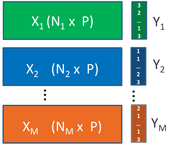
Figure 2.10: P-integration framework using MINT for M independent studies (X) on the same P features. In this setting Y is a vector indicating the class of each cell.
2.10.1 Method
MINT finds a set of discriminative latent variables (in this context, linear combinations of gene expression values) simultaneously in all the datasets, thus leading to PLS-DA Components (as opposed to PCs in PCA) most influenced by consistent biological heterogeneity across the studies. Therefore, these components do not necessarily maximise the variance among the pooled data like what PCs do, but maximise covariance between the combined data and their classes (cell lines).
The mint.plsda function in mixOmics has a set of inputs to perform the analysis, including:
- X: Which is the original predictor matrix.
- Y: Factor of classes (here, cell lines).
- study: Factor indicating the membership of each sample to each of the studies/batches being combined. For a detailed list of functions available with MINT refer to the documentation.
Since PLS-DA is a supervised method, we initially create a vector to assign each sample to its class/cell.line (Y) and then perform MINT, keeping 2 PLS-DA components:
# create variables needed for MINT
# factor variable of cell lines
Y = as.factor(cell.line[rownames(data.combined)])
# factor variable of studies
study = batch # defined in the combined PCA section
# MINT on the combined dataset
mint.plsda.res = mint.plsda(X = data.combined, Y = Y,
                             study = study, ncomp = 2)
The outcome is a mint.plsda object which can be plotted using plotIndiv function:
# plot the mint.plsda plots for the combined dataset
plotIndiv(mint.plsda.res, group = cell.line,
          legend  = TRUE, subtitle     = 'MINT - Coloured by Cell Line',
          ellipse = FALSE, legend.title = 'Cell Line',
          legend.title.pch = 'protocol',
          X.label = 'PLS-DA component 1',
          Y.label = 'PLS-DA component 2')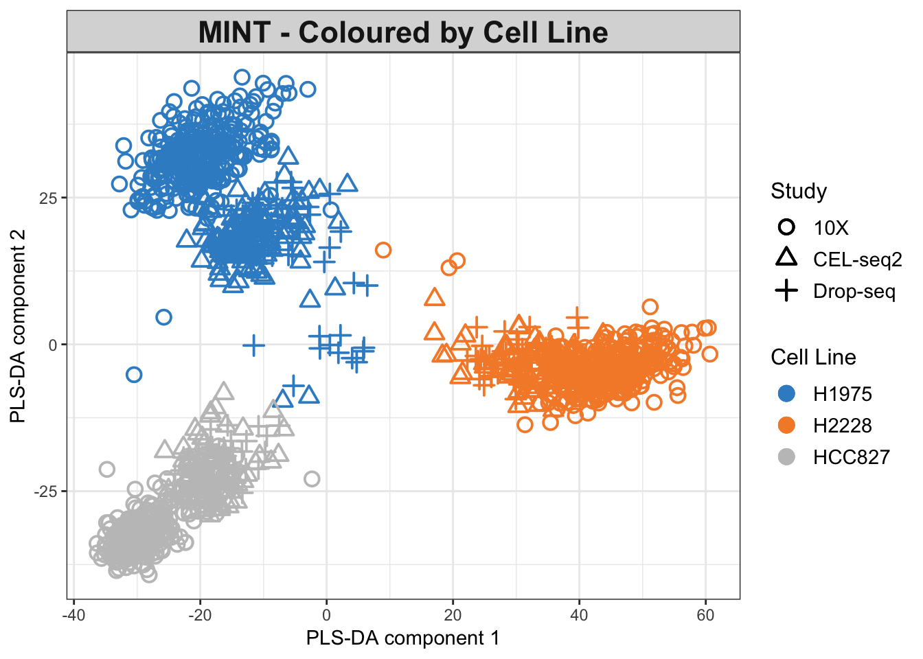
Figure 2.11: The MINT PLS-DA plot for the combined dataset. Data points are coloured by cell lines.
As seen in the PLS-DA plots, the data are differentiated mainly by their cell lines. The effects of batches are not fully eliminated yet.
2.10.2 Optimum Number of Components
So far, we presented a MINT PLS-DA with only 2 components. We can look at the calassification error rates over different choices of number of components using perf function in mixOmics, which evaluates the performance of the fitted PLS models internally using Leave-One-Group-Out Cross Validation (LOGOCV) in MINT (M-Fold Cross-Validation is also available). Refer to the documentation for more details about perf arguments.
## retrieve 5 PLS-DA components using MINT
mint.plsda.res = mint.plsda(X = data.combined, Y = Y,
                                 study = study, ncomp = 5)
## perform cross validation and calculate classification error rates
perf.mint.plsda.res = perf(mint.plsda.res,
          progressBar = FALSE)
We now plot the output:
## plot the classification error rate vs number of components
plot(perf.mint.plsda.res, col = color.mixo(5:7))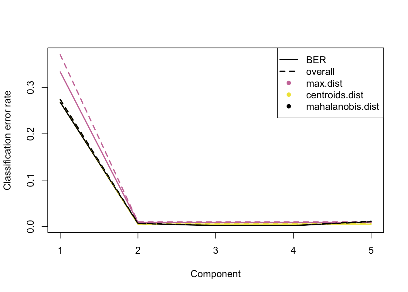
Figure 2.12: The classification error rate for different number of PLS-DA components showing Balanced and Overall Error Rates, each comprising three distance measures. The distances measure how far any given data point is from the mean of its class.
As seen in the plot above, at ncomp = 2 the model has the optimum performance for all distances in terms of Balanced and Overall Error Rate, as there is not a considerable drop in error rates for further components (see supplemental information from (Le Cao et al. 2018) for more details about the prediction distances). Additional numerical outputs are available to stratify the error rates per cell line/protocol/distance measure:
perf.mint.plsda.res$global.error$BER ## further error diagnostics ## max.dist centroids.dist mahalanobis.dist
## comp 1 0.333333333 0.268088134 0.268088134
## comp 2 0.009072456 0.005218891 0.006503413
## comp 3 0.009072456 0.005218891 0.002088392
## comp 4 0.009072456 0.005218891 0.002007587
## comp 5 0.009072456 0.005218891 0.010356977Also, the function outputs the optimal number of components via the choice.ncomp attribute.
## number of variables to select in each component
perf.mint.plsda.res$choice.ncomp
## max.dist centroids.dist mahalanobis.dist
## overall 2 2 2
## BER 2 2 22.10.3 Sparse MINT PLS-DA
At this section, we investigate the performance of MINT with variable selection (we call it sparse MINT PLSDA or MINT sPLS-DA). This helps by eliminating the noisy variables (here genes) from the model to better interpret the signal coming from the primary variables. At this stage, we will ask the model to keep 50 variables with highest loadings on each component. The number of variables to keep should be set as a vector into keepX argument in mint.splsda (refer to the documentation for more details):
## number of variables to keep in each component
list.keepX = c(50,50)
## perform sparse PLS-DA using MINT with 2 components
mint.splsda.res = mint.splsda(X = data.combined, Y = Y,
                              study = study, ncomp = 2, keepX = list.keepX)
Plot the sparse MINT object:
plotIndiv(mint.splsda.res,
          legend  = TRUE, subtitle = 'Sparse MINT', ellipse = TRUE,
          X.label = 'sPLS-DA component 1',
          Y.label = 'sPLS-DA component 2',
          group = Y, ## colour by cell line
          legend.title = 'Cell Line',
          legend.title.pch = 'Protocol')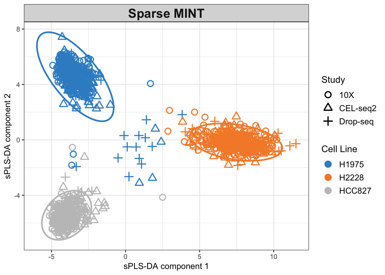
Figure 2.13: The Sparse MINT PLS-DA plot for the combined dataset. Data points are coloured by cell lines.
The clusters are now more refined compared to the non-sparse method. The effects of batches are now almost removed, and the samples from the 10X dataset seem equally differentiated as the others.
2.10.4 Choice of Parameters
Previously, we chose 50 variables for a sparse analysis. The optimal number of the variables can be determined for each component using the tune function. The test.keepX argument specifies a vector of the candidate numbers of variables in each PLS-DA component to be evaluated. We will try 5,10,…,35,40,…,70 and 100 variables, and also record the runtime. We will separately tune each component for better visualisation but tuning can be done in one step for all components.
## tune MINT for component 1 and then 2 and record the run time
## we tune individual components for visualisation purposes
## one can run only the tune.mint.c2 without already.tested.X
start.time = Sys.time()
## tune using a test set of variable numbers
## component 1
tune.mint.c1 = tune(
  X = data.combined, Y = Y, study = study, ncomp = 1,
  ## assess numbers 5,10,15...50,60,70,...100:
  test.keepX = c(seq(5,35,5),seq(40,70,10), 100), method = 'mint.splsda',
  ## use all distances to estimate the classification error rate
  dist = c('max.dist',  'centroids.dist', 'mahalanobis.dist'),
  progressBar = FALSE
)
## component 1 to 2
tune.mint.c2 = tune(
  X = data.combined, Y = Y, study = study, ncomp = 2,
  ## already tuned component 1
  already.tested.X = tune.mint.c1$choice.keepX,
  test.keepX = c(seq(5,35,5),seq(40,70,10), 100), method = 'mint.splsda',
  dist = c('max.dist',  'centroids.dist', 'mahalanobis.dist'),
  progressBar = FALSE
)
end.time = Sys.time()
## see how long it takes to find the optimum number of variables:
run.time =  end.time - start.time
It took less than 5 minutes to evaluate the chosen test set of variables using a 2.6 GHz Dual-core Intel Core i5 processor (8GB RAM). It is always more practical to look into a coarse grid at first and then refine it when the right neighbourhood is found. We now look at the optimum number of components chosen and their corresponding Balanced Error Rate:
## look at the optimal selected variables for each PC
tune.mint.c2$choice.keepX
## comp 1 comp 2
## 35 10## plot the error rates for all test variable numbers
par(mfrow=c(1,3))
plot(tune.mint.c1, col = 'darkred')
plot(tune.mint.c2, col = 'darkblue')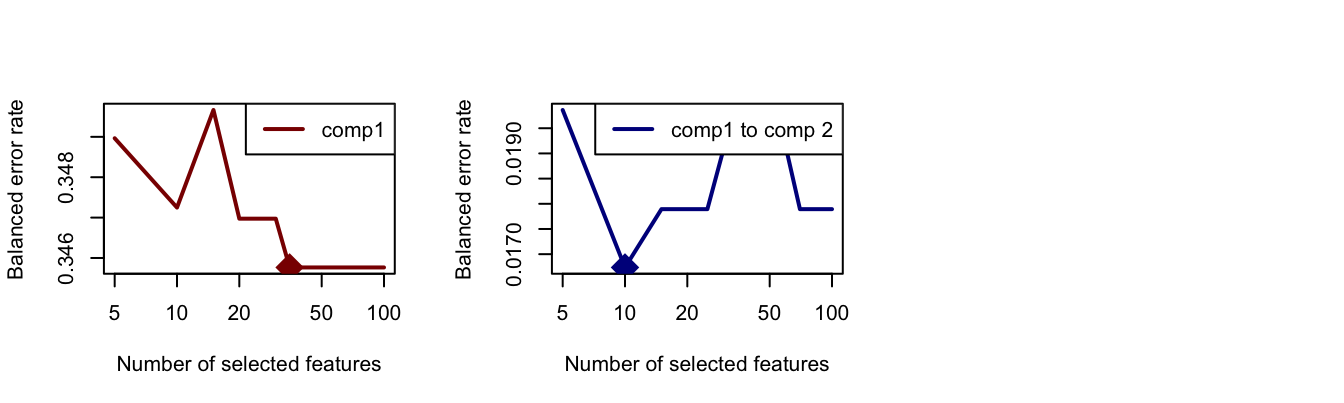
Figure 2.14: The Balanced Error Rate as a function of number of variables in PLS-DA components 1 (left) and 2 (right).
The optimum numbers of variables for each component are shown using a diamond mark in plots above, which are 35 for the first and 10 for the second one.
We now re-run the sparse MINT using optimum parameters:
## run sparse mint using optimum parameters:
mint.splsda.tuned.res = mint.splsda( X =data.combined, Y = Y,
                              study = study, ncomp = 2,
                              keepX = tune.mint.c2$choice.keepX)
Next, we plot the mint.splsda object with global variables (for the combined dataset):
## plot the tuned mint.splsda plot for the combined dataset
plotIndiv(mint.splsda.tuned.res, study = 'global', legend = TRUE,
          title = 'MINT sPLS-DA',  subtitle = 'Global', ellipse=TRUE)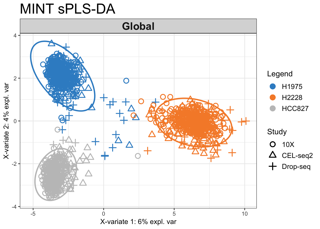
Figure 2.15: The tuned MINT sPLS-DA plot for the combined data. While there are still a number of samples that are not well classified, the clusters are more refined when we perform variable selection.
We can also look at the dataset per protocol using all.partial as the input for the study argument:
## tuned mint.splsda plot for each protocol
plotIndiv(mint.splsda.tuned.res, study = 'all.partial',  title = 'MINT sPLS-DA',
          subtitle = c('10X', 'CEL-seq2', 'Drop-seq'))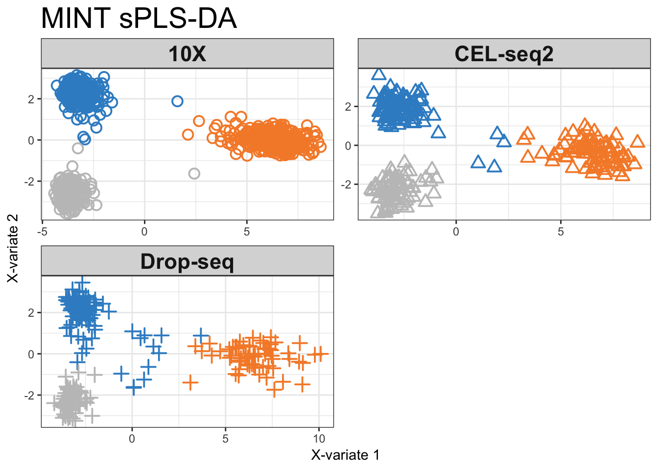
Figure 2.16: MINT sPLS-DA components for each individual protocol coloured by cell line.
The majority of samples from the 10X data are well classified, while the method struggles to classify some samples from H1975 samples in the Drop-seq and CEL-seq2 datasets.
2.10.5 ROC Curves
Another available visualisation tool is the ROC (Receiver Operating Characteristic) curves for each study (or all) to evaluate the prediction accuracy of a classification mode. In a ROC curve the true positive rate (Sensitivity) is plotted against the false positive rate (100-Specificity) for different classification thresholds. This method should be interpreted carefully in such multivariate analysis where no clear cut-off threshold can be considered.
## ROC curves for both components
auc.mint.splsda1 = auroc(mint.splsda.tuned.res, roc.comp = 1, roc.study='CEL-seq2')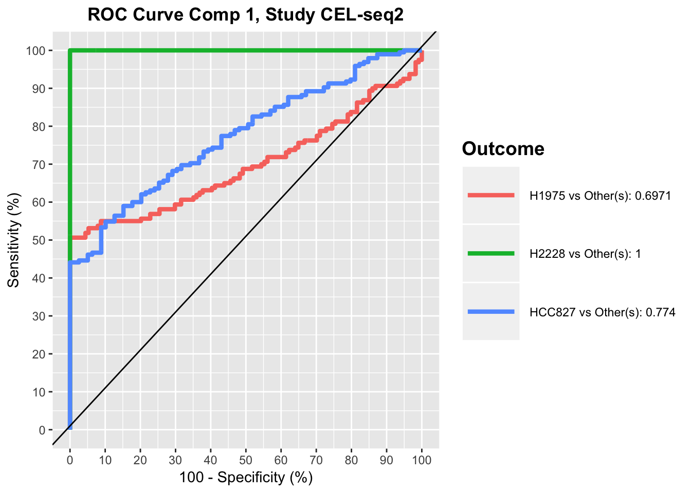
auc.mint.splsda2 = auroc(mint.splsda.tuned.res, roc.comp = 2, roc.study='CEL-seq2')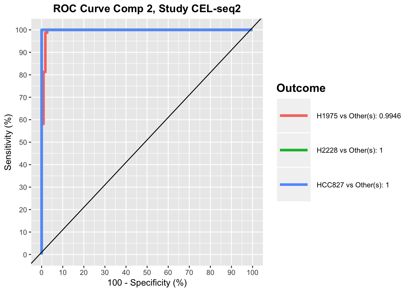
For a perfect model the curve would go through the upper left corner, while the black line represents a perfectly random classification model.
ROC plots show that for CEL-seq data, the model has relatively low prediction accuracy for HCC827 and H1975 samples in the first component, while it has high prediction accuracy for all samples in the second component. This was also apparent in sPLS-DA plot, as HCC827 and H1975 samples were not separated along the first PLSDA component for CEL-seq data, while most of samples were differentiated along the second component by their cell lines.
2.11 Troubleshoots
2.11.1 Bioconductor
You can check out Bioconductor’s troubleshoot page
2.11.2 mixOmics
In case you are having issues with mixOmics, please look it up at the mixOmics issues page and if you did not find your solution, create a new issue. You can also check out or submit your questions on stackoverflow forums.
2.11.3 mac OS
Compilation error while installing libraries from binconductor This could be due to the fortran compiler not being updated for newer R versions. You can go to this website and get the instructions on how to install the latest gfortran for your R and mac OS version.
Unable to import rgl library Ensure you have the latest version of XQuartz installed.
References
Rohart, Florian, Aida Eslami, Nicholas Matigian, Stéphanie Bougeard, and Kim-Anh Lê Cao. 2017. MINT: A Multivariate Integrative Method to Identify Reproducible Molecular Signatures Across Independent Experiments and Platforms. https://doi.org/10.1186/s12859-017-1553-8.
Le Cao, Kim-Anh, Florian Rohart, Ignacio Gonzalez, Sebastien Dejean with key contributors Benoit Gautier, Francois Bartolo, contributions from Pierre Monget, Jeff Coquery, FangZou Yao, and Benoit Liquet. 2018. MixOmics: Omics Data Integration Project. https://CRAN.R-project.org/package=mixOmics.
Tian, Luyi, and Shian Su. 2018. ScPipe: Pipeline for Single Cell Rna-Seq Data Analysis. https://github.com/LuyiTian/scPipe.
Lun, Aaron T. L., Karsten Bach, and John C. Marionib. 2016. Pooling Across Cells to Normalize Single-Cell Rna Sequencing Data with Many Zero Counts. Genome Biology 17.1. https://doi.org/10.1186/s13059-016-0947-7.
Jolliffe, I. T. 1986. Principal Component Analysis and Factor Analysis. https://doi.org/10.1007/978-1-4757-1904-8_7.