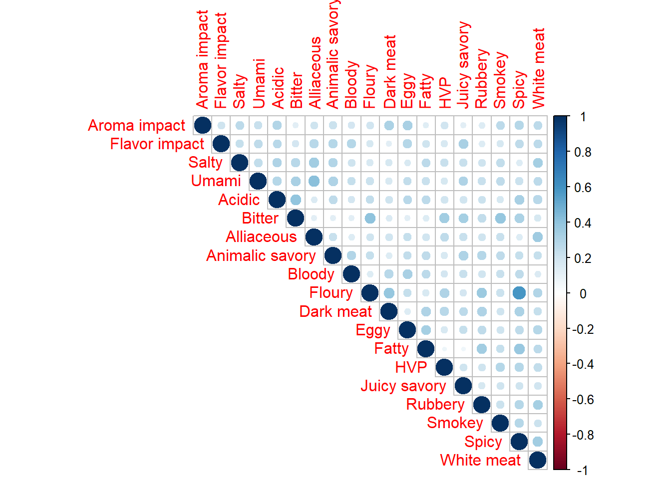
Heat Map
Comparing to the Correlation plot from MCA, we noticed that our Heat Map this time is similar to the Burt Table.
corrMatBurt.list <- phi2Mat4BurtTable(bin_data)
corr4MCA.r <- corrplot(
                 as.matrix(sqrt(corrMatBurt.list$phi2.mat),
                 title = "Phi: Correlation Map for MCA"),
                 type = "upper")
Burt_heatmap1 <- recordPlot()