Chapter 6 Exploratory Data Analysis
6.1 Objectives
At the end of the chapter, readers will be able to
- perform exploratory data analysis (EDA) using graphical methods
- perform EDA using descriptive statistics
- acquire basic skills to use ggplot2 and gtsummary packages
6.2 Introduction
Exploratory Data Analysis or EDA is the critical process of performing initial investigations on data to discover patterns, spot anomalies, test hypotheses and check assumptions with the help of summary statistics and graphical representations.
In statistics, exploratory data analysis (EDA) is an approach to data analysis to summarize their main characteristics, often with visual methods. A statistical model can be used or not, but primarily EDA is for seeing what the data can tell us beyond the formal modelling or hypothesis testing task.
Exploratory data analysis was promoted by John Tukey to encourage statisticians to explore the data and possibly formulate hypotheses that could lead to new data collection (Source)
6.3 EDA using ggplot2 package
6.3.1 Usage of ggplot2
We always start with ggplot() function, the state the specific dataset. Next, we choose the aesthetic mapping (with aes()) represent the variable or variables to plot) and then we add on layers. These can be converted to R codes as below:
- geom_X :
geom_point(),geom_histogram() - scales (like
scale_colour_brewer()) - faceting specifications (like
facet_wrap()) - coordinate systems (like
coord_flip()).
6.4 Preparation
6.4.1 Load the libraries
We will use these packages for data exploration:
- tidyverse package for plotting and data wrangling
- gtsummary package for summary statistics
- patchwork to combine plots
- here to point to the correct working directory
- readxl to read a MS Excel file
The tidyverse is an opinionated collection of R packages designed for data science. All packages share an underlying design philosophy, grammar, and data structures. We may find more information about the package here
## ── Attaching core tidyverse packages ──────────────────────── tidyverse 2.0.0 ──
## ✔ dplyr     1.1.4     ✔ readr     2.1.5
## ✔ forcats   1.0.0     ✔ stringr   1.5.1
## ✔ ggplot2   3.5.1     ✔ tibble    3.2.1
## ✔ lubridate 1.9.3     ✔ tidyr     1.3.1
## ✔ purrr     1.0.2
## ── Conflicts ────────────────────────────────────────── tidyverse_conflicts() ──
## ✖ dplyr::filter() masks stats::filter()
## ✖ dplyr::lag()    masks stats::lag()
## ℹ Use the conflicted package (<http://conflicted.r-lib.org/>) to force all conflicts to become errors## here() starts at D:/Data_Analysis_CRC_multivar_data_analysis_codes6.4.2 Read the dataset into R
Let us read the peptic ulcer data in MS Excel format. To do this, we will
- load the readxl package
- use the function
read_xlsx()to read data into R
Examine the data by looking a the number of observations, type of variables and name of variables.
## Rows: 121
## Columns: 34
## $ age                 <dbl> 42, 66, 67, 19, 77, 39, 62, 71, 69, 97, 52, 21, 57…
## $ gender              <chr> "male", "female", "male", "male", "male", "male", …
## $ epigastric_pain     <chr> "yes", "yes", "yes", "yes", "yes", "yes", "yes", "…
## $ vomiting            <chr> "no", "no", "no", "no", "yes", "no", "no", "yes", …
## $ nausea              <chr> "no", "no", "no", "no", "yes", "no", "no", "no", "…
## $ fever               <chr> "no", "no", "no", "no", "no", "yes", "no", "yes", …
## $ diarrhea            <chr> "no", "no", "yes", "no", "no", "no", "no", "yes", …
## $ malena              <chr> "no", "no", "no", "no", "no", "no", "no", "no", "n…
## $ onset_more_24_hrs   <chr> "no", "no", "no", "yes", "yes", "yes", "yes", "no"…
## $ NSAIDS              <chr> "no", "no", "yes", "no", "no", "no", "no", "no", "…
## $ septic_shock        <chr> "no", "no", "no", "no", "no", "no", "no", "no", "n…
## $ previous_OGDS       <chr> "no", "no", "no", "yes", "no", "no", "no", "no", "…
## $ ASA                 <dbl> 1, 1, 1, 1, 2, 1, 2, 2, 1, 1, 2, 1, 2, 1, 1, 2, 2,…
## $ systolic            <dbl> 141, 197, 126, 90, 147, 115, 103, 159, 145, 105, 1…
## $ diastolic           <dbl> 98, 88, 73, 40, 82, 86, 55, 68, 75, 65, 74, 50, 86…
## $ inotropes           <chr> "no", "no", "no", "no", "no", "no", "no", "no", "n…
## $ pulse               <dbl> 109, 126, 64, 112, 89, 96, 100, 57, 86, 100, 109, …
## $ tenderness          <chr> "generalized", "generalized", "generalized", "loca…
## $ guarding            <chr> "yes", "yes", "yes", "yes", "no", "yes", "yes", "n…
## $ hemoglobin          <dbl> 18.0, 12.0, 12.0, 12.0, 11.0, 18.0, 8.1, 13.3, 11.…
## $ twc                 <dbl> 6.0, 6.0, 13.0, 20.0, 21.0, 4.0, 5.0, 12.0, 6.0, 2…
## $ platelet            <dbl> 415, 292, 201, 432, 324, 260, 461, 210, 293, 592, …
## $ creatinine          <dbl> 135, 66, 80, 64, 137, 102, 69, 92, 94, 104, 58, 24…
## $ albumin             <chr> "27", "28", "32", "42", "38", "38", "30", "41", "N…
## $ PULP                <dbl> 2, 3, 3, 2, 7, 1, 2, 5, 3, 4, 2, 3, 4, 3, 5, 5, 1,…
## $ admission_to_op_hrs <dbl> 2, 2, 3, 3, 3, 3, 4, 4, 4, 4, 4, 5, 5, 6, 6, 6, 6,…
## $ perforation         <dbl> 0.5, 1.0, 0.5, 0.5, 1.0, 1.0, 3.0, 1.5, 0.5, 1.5, …
## $ degree_perforation  <chr> "small", "small", "small", "small", "small", "smal…
## $ side_perforation    <chr> "distal stomach", "distal stomach", "distal stomac…
## $ ICU                 <chr> "no", "no", "no", "no", "yes", "no", "yes", "no", …
## $ SSSI                <chr> "no", "no", "no", "no", "no", "no", "no", "no", "n…
## $ anast_leak          <chr> "no", "no", "no", "no", "no", "no", "no", "no", "n…
## $ sepsis              <chr> "no", "no", "no", "no", "no", "no", "yes", "no", "…
## $ outcome             <chr> "alive", "alive", "alive", "alive", "alive", "aliv…
The are quite several variables. For the sake of simplicity, we will select variables which we think might be important for simple data exploration using the select() function.
6.5 EDA in tables
We can get the overall descriptive statistics for the peptic ulcer data by using the tbl_summary function.
pep %>%
  tbl_summary(
    statistic = list(all_continuous() ~ "{mean} ({sd})",
                     all_categorical() ~ "{n} / {N} ({p}%)"),
    digits = all_continuous() ~ 2) %>%
  modify_caption("Patient Characteristics (N = {N})") %>%
as_gt()| Characteristic | N = 1211 |
|---|---|
| age | 60.43 (18.05) |
| systolic | 128.56 (24.51) |
| diastolic | 72.07 (13.99) |
| hemoglobin | 12.32 (3.33) |
| twc | 13.03 (6.66) |
| ASA | |
| 1 | 63 / 121 (52%) |
| 2 | 50 / 121 (41%) |
| 3 | 8 / 121 (6.6%) |
| PULP | 3.53 (2.28) |
| perforation | 1.22 (0.91) |
| gender | |
| female | 25 / 121 (21%) |
| male | 96 / 121 (79%) |
| epigastric_pain | 116 / 121 (96%) |
| malena | 4 / 121 (3.3%) |
| tenderness | |
| generalized | 84 / 121 (69%) |
| localized | 37 / 121 (31%) |
| degree_perforation | |
| large | 26 / 121 (21%) |
| moderate | 20 / 121 (17%) |
| small | 75 / 121 (62%) |
| outcome | |
| alive | 83 / 121 (69%) |
| dead | 38 / 121 (31%) |
| 1 Mean (SD); n / N (%) | |
To stratify the descriptive statistics based on variable outcome, we use the argument by =.
tab_outcome <- pep %>%
  tbl_summary(
    by = outcome,
    statistic = list(all_continuous() ~ "{mean} ({sd})",
                     all_categorical() ~ "{n} / {N} ({p}%)"),
    digits = all_continuous() ~ 2) %>%
  modify_caption("Patient Characteristics and Fatality (N = {N})")

tab_outcome %>%
as_gt()| Characteristic | alive N = 831 |
dead N = 381 |
|---|---|---|
| age | 58.20 (18.53) | 65.29 (16.14) |
| systolic | 130.95 (25.06) | 123.34 (22.71) |
| diastolic | 73.25 (14.02) | 69.50 (13.75) |
| hemoglobin | 12.74 (3.14) | 11.41 (3.57) |
| twc | 12.75 (6.00) | 13.64 (7.96) |
| ASA | ||
| 1 | 49 / 83 (59%) | 14 / 38 (37%) |
| 2 | 28 / 83 (34%) | 22 / 38 (58%) |
| 3 | 6 / 83 (7.2%) | 2 / 38 (5.3%) |
| PULP | 3.16 (2.35) | 4.34 (1.89) |
| perforation | 0.95 (0.60) | 1.82 (1.16) |
| gender | ||
| female | 13 / 83 (16%) | 12 / 38 (32%) |
| male | 70 / 83 (84%) | 26 / 38 (68%) |
| epigastric_pain | 79 / 83 (95%) | 37 / 38 (97%) |
| malena | 2 / 83 (2.4%) | 2 / 38 (5.3%) |
| tenderness | ||
| generalized | 60 / 83 (72%) | 24 / 38 (63%) |
| localized | 23 / 83 (28%) | 14 / 38 (37%) |
| degree_perforation | ||
| large | 9 / 83 (11%) | 17 / 38 (45%) |
| moderate | 13 / 83 (16%) | 7 / 38 (18%) |
| small | 61 / 83 (73%) | 14 / 38 (37%) |
| 1 Mean (SD); n / N (%) | ||
Next, we stratify the descriptive statistics based on gender also using the by = argument.
tab_gender <- pep %>%
  tbl_summary(
    by = gender,
    statistic = list(all_continuous() ~ "{mean} ({sd})",
                     all_categorical() ~ "{n} / {N} ({p}%)"),
    digits = all_continuous() ~ 2) %>%
  modify_caption("**Patient Characteristics and Gender** (N = {N})")

tab_gender %>%
as_gt()| Characteristic | female N = 251 |
male N = 961 |
|---|---|---|
| age | 70.12 (11.07) | 57.91 (18.70) |
| systolic | 125.84 (26.17) | 129.27 (24.16) |
| diastolic | 66.68 (13.57) | 73.48 (13.82) |
| hemoglobin | 10.43 (3.09) | 12.81 (3.22) |
| twc | 11.06 (7.44) | 13.54 (6.38) |
| ASA | ||
| 1 | 13 / 25 (52%) | 50 / 96 (52%) |
| 2 | 11 / 25 (44%) | 39 / 96 (41%) |
| 3 | 1 / 25 (4.0%) | 7 / 96 (7.3%) |
| PULP | 4.32 (1.86) | 3.32 (2.34) |
| perforation | 1.49 (1.14) | 1.16 (0.83) |
| epigastric_pain | 24 / 25 (96%) | 92 / 96 (96%) |
| malena | 1 / 25 (4.0%) | 3 / 96 (3.1%) |
| tenderness | ||
| generalized | 17 / 25 (68%) | 67 / 96 (70%) |
| localized | 8 / 25 (32%) | 29 / 96 (30%) |
| degree_perforation | ||
| large | 7 / 25 (28%) | 19 / 96 (20%) |
| moderate | 4 / 25 (16%) | 16 / 96 (17%) |
| small | 14 / 25 (56%) | 61 / 96 (64%) |
| outcome | ||
| alive | 13 / 25 (52%) | 70 / 96 (73%) |
| dead | 12 / 25 (48%) | 26 / 96 (27%) |
| 1 Mean (SD); n / N (%) | ||
We can combine the two tables using tbl_merge().
tbl_merge(
  tbls = list(tab_gender, tab_outcome),
  tab_spanner = c("**Gender**", "**Outcome**")) %>%
as_gt()| Characteristic | Gender | Outcome | ||
|---|---|---|---|---|
| female N = 251 |
male N = 961 |
alive N = 831 |
dead N = 381 |
|
| age | 70.12 (11.07) | 57.91 (18.70) | 58.20 (18.53) | 65.29 (16.14) |
| systolic | 125.84 (26.17) | 129.27 (24.16) | 130.95 (25.06) | 123.34 (22.71) |
| diastolic | 66.68 (13.57) | 73.48 (13.82) | 73.25 (14.02) | 69.50 (13.75) |
| hemoglobin | 10.43 (3.09) | 12.81 (3.22) | 12.74 (3.14) | 11.41 (3.57) |
| twc | 11.06 (7.44) | 13.54 (6.38) | 12.75 (6.00) | 13.64 (7.96) |
| ASA | ||||
| 1 | 13 / 25 (52%) | 50 / 96 (52%) | 49 / 83 (59%) | 14 / 38 (37%) |
| 2 | 11 / 25 (44%) | 39 / 96 (41%) | 28 / 83 (34%) | 22 / 38 (58%) |
| 3 | 1 / 25 (4.0%) | 7 / 96 (7.3%) | 6 / 83 (7.2%) | 2 / 38 (5.3%) |
| PULP | 4.32 (1.86) | 3.32 (2.34) | 3.16 (2.35) | 4.34 (1.89) |
| perforation | 1.49 (1.14) | 1.16 (0.83) | 0.95 (0.60) | 1.82 (1.16) |
| epigastric_pain | 24 / 25 (96%) | 92 / 96 (96%) | 79 / 83 (95%) | 37 / 38 (97%) |
| malena | 1 / 25 (4.0%) | 3 / 96 (3.1%) | 2 / 83 (2.4%) | 2 / 38 (5.3%) |
| tenderness | ||||
| generalized | 17 / 25 (68%) | 67 / 96 (70%) | 60 / 83 (72%) | 24 / 38 (63%) |
| localized | 8 / 25 (32%) | 29 / 96 (30%) | 23 / 83 (28%) | 14 / 38 (37%) |
| degree_perforation | ||||
| large | 7 / 25 (28%) | 19 / 96 (20%) | 9 / 83 (11%) | 17 / 38 (45%) |
| moderate | 4 / 25 (16%) | 16 / 96 (17%) | 13 / 83 (16%) | 7 / 38 (18%) |
| small | 14 / 25 (56%) | 61 / 96 (64%) | 61 / 83 (73%) | 14 / 38 (37%) |
| outcome | ||||
| alive | 13 / 25 (52%) | 70 / 96 (73%) | ||
| dead | 12 / 25 (48%) | 26 / 96 (27%) | ||
| gender | ||||
| female | 13 / 83 (16%) | 12 / 38 (32%) | ||
| male | 70 / 83 (84%) | 26 / 38 (68%) | ||
| 1 Mean (SD); n / N (%) | ||||
6.6 EDA with plots
6.6.1 One variable: Distribution of a categorical variable
6.6.1.1 Bar chart
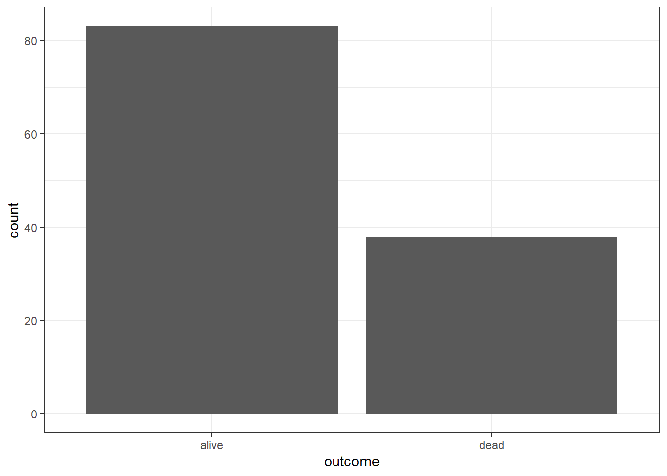
The frequency of the outcome
## # A tibble: 2 × 2
##   outcome  freq
##   <chr>   <int>
## 1 alive      83
## 2 dead       38
To plot the distribution of a categorical variable, we can use a Bar chart.
But we can also pass the aes() to ggplot

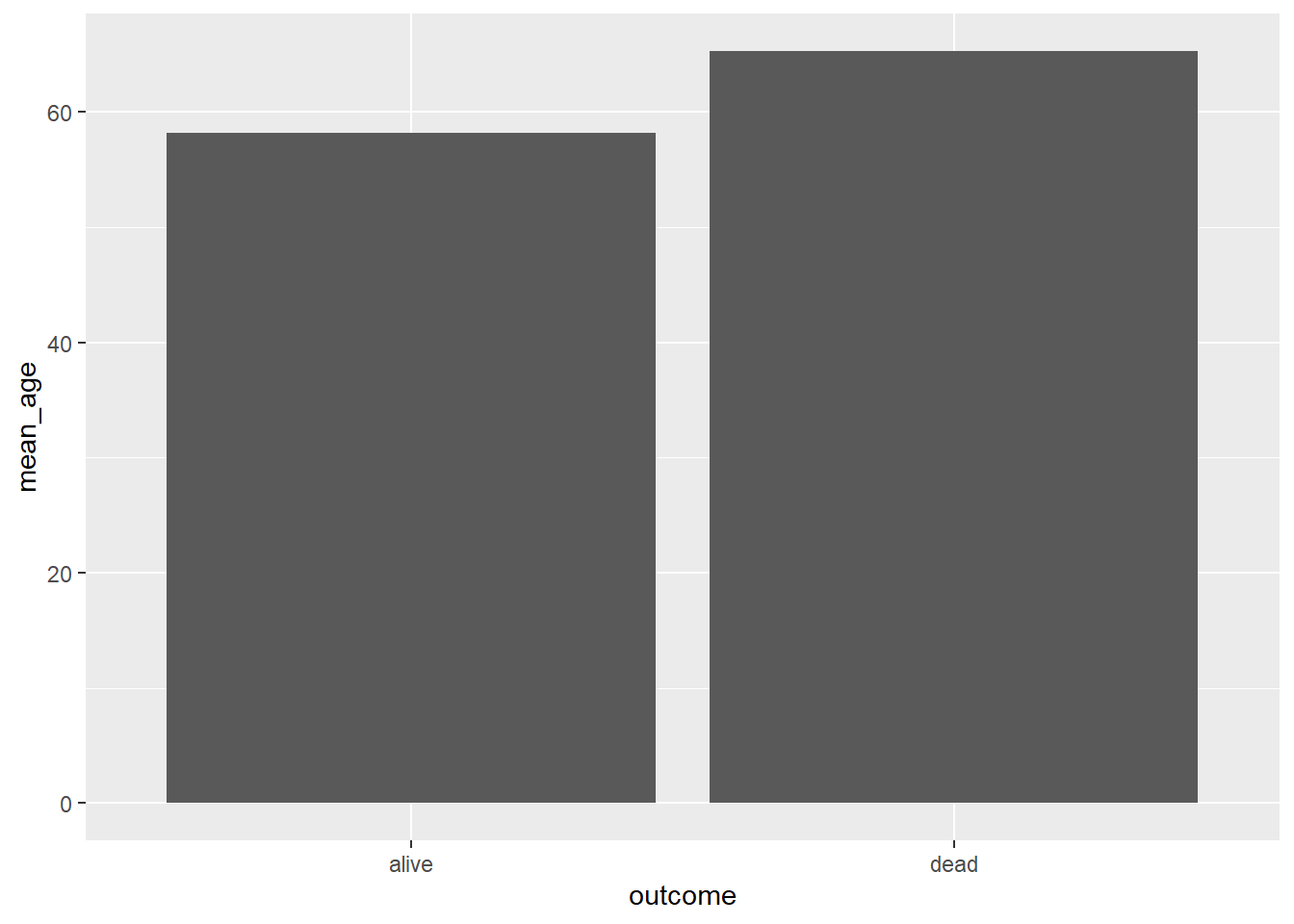
Readers can combine dplyr for data wrangling and then ggplot2 (both are packages inside the tidyverse metapackage) to plot the data. For example, dplyr part for data wrangling:
## # A tibble: 2 × 2
##   outcome mean_age
##   <chr>      <dbl>
## 1 alive       58.2
## 2 dead        65.3
And the ggplot2 part to make the plot:
We can combine both tasks dplyr and ggplot together that will save time:
pep %>%
  group_by(outcome) %>%
  summarize(mean_age = mean(age)) %>%
  ggplot(mapping = aes(x = outcome, y = mean_age, fill = outcome)) +
  geom_col() +
  ylab("Mean age (Years)") +
  xlab("Outcome of ulcer") +
  scale_fill_grey() +
  theme_bw()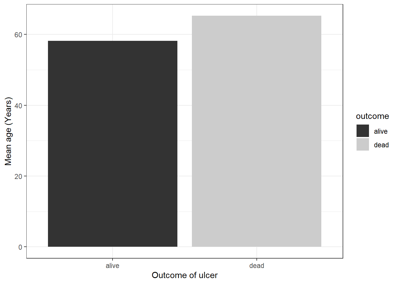
As we mentioned before, an excellent resource for graphics using ggplot2 is availble on this website. It is a must-go-to website. Of if you prefer the read the physical version, purchase the R Graphics Cookbook (Chang 2013).
6.6.2 One variable: Distribution of a numerical variable
6.6.2.1 Histogram
To plot the distribution of a numerical variable, we can plot a histogram. To specify the number of bin, we can use binwidth and add some customization.
ggplot(data = pep, mapping = aes(x = systolic)) +
  geom_histogram(binwidth = 10) +
  ylab("Frequency") +
  xlab("Systolic Blood Pressure") +
  ggtitle("Systolic BP distribution") +
  theme_bw()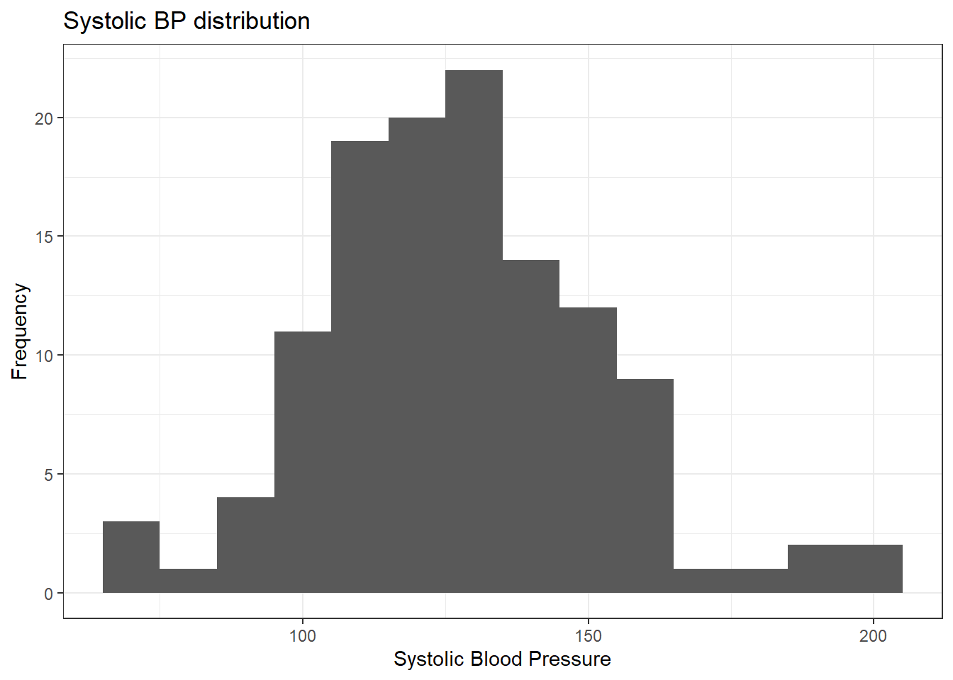
6.6.2.2 Density curve
Let us create a density curve. A density curve also helps us examine the distribution of observations.
ggplot(data = pep, mapping = aes(x = diastolic)) +
  geom_density() +
  xlab("Diastolic BP (mmHg)") +
  ylab("Density") +
  labs(title = "Density distribution for diastolic BP",
       caption = "Source : Peptic ulcer disease data") +
  theme_bw()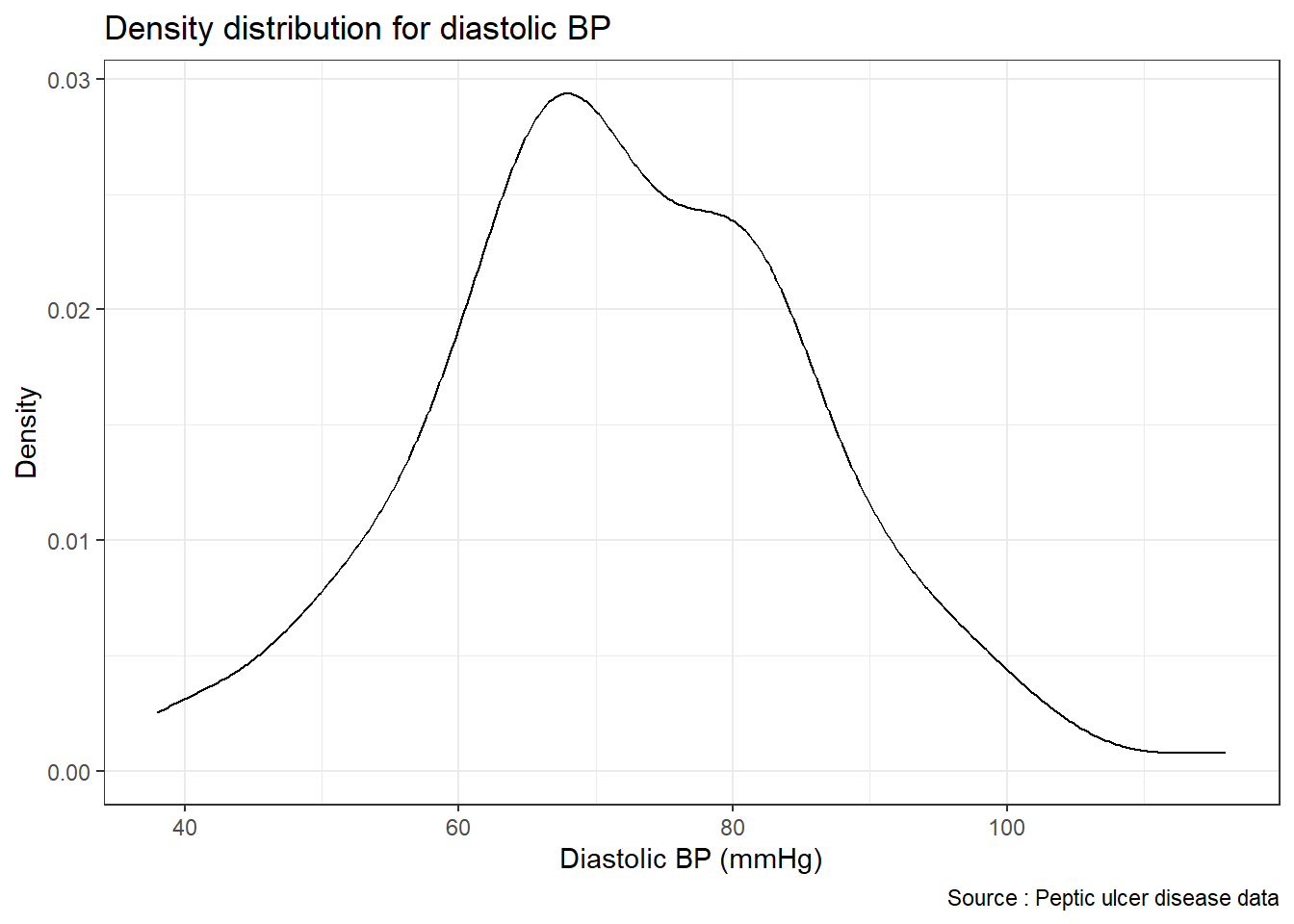
6.6.2.3 Histogram and density curve together
If we want to plot both the histogram and the density curve, we can use geom_histogram() and geom_density() in the single line of codes, we can combine two geoms.
ggplot(pep, mapping = aes(x = diastolic)) +
  geom_histogram(mapping = aes(y = ..density..), binwidth = 10) +
  geom_density() +
  xlab("Diastolic BP (mmHg)") +
  ylab("Density") +
  labs(title = "Density distribution for diastolic BP",
       caption = "Source : Peptic ulcer disease data") +
  theme_bw()
## Warning: The dot-dot notation (`..density..`) was deprecated in ggplot2 3.4.0.
## ℹ Please use `after_stat(density)` instead.
## This warning is displayed once every 8 hours.
## Call `lifecycle::last_lifecycle_warnings()` to see where this warning was
## generated.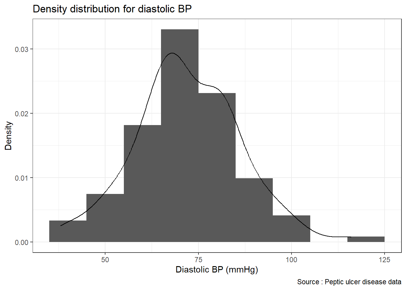
6.6.3 Two variables: Plotting a numerical and a categorical variable
6.6.3.1 Overlaying histograms and boxplot
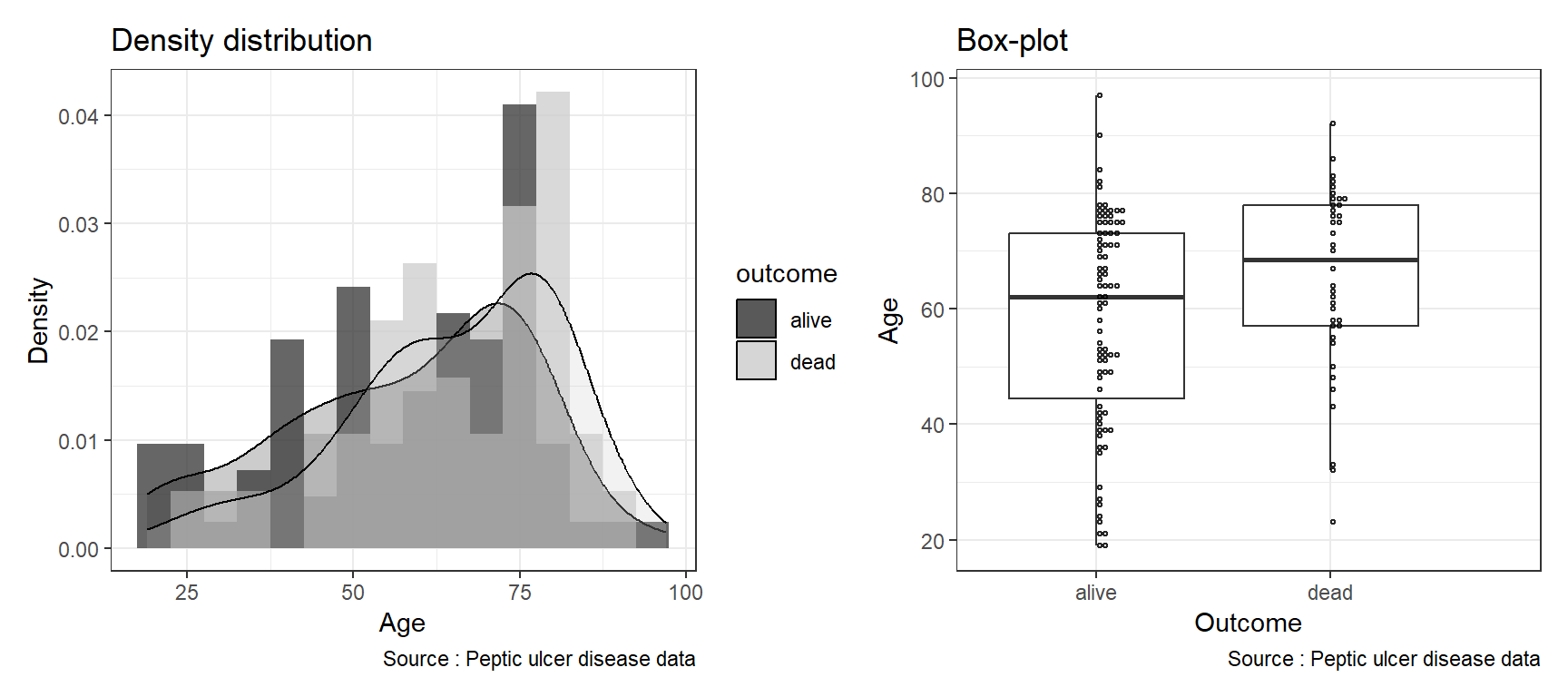
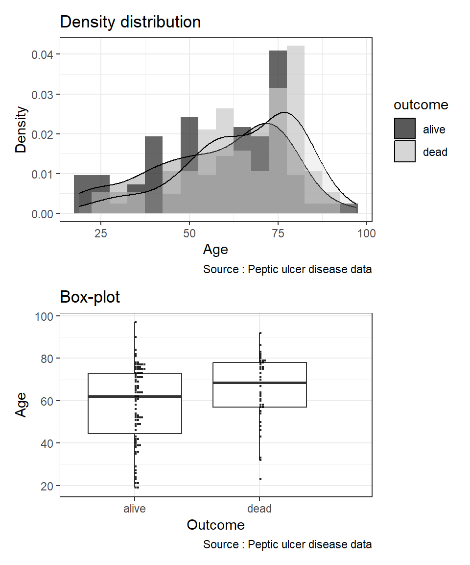
By overlaying histograms, examine the distribution of a numerical variable (var age) based on variable outcome. First, we create an object called hist_age. Next, we create a boxplot object and name it as box-age. After that, we combine the two objects side-by-side using a vertical bar.
hist_age <- ggplot(data = pep, aes(x = age, fill = outcome)) +
  geom_histogram(binwidth = 5, aes(y = ..density..),
                   position = "identity", alpha = 0.75) +
  geom_density(alpha = 0.25) +
  xlab("Age") +
  ylab("Density") +
  labs(title = "Density distribution",
       caption = "Source : Peptic ulcer disease data") +
   scale_fill_grey() +
  theme_bw()
box_age <- ggplot(data = pep, aes(x = outcome, y = age)) +
geom_boxplot(outlier.shape = NA) +
geom_dotplot(binaxis = "y", binwidth = 1, fill = NA,
alpha = 0.85) +
xlab('Outcome') + ylab('Age') +
labs(title = "Box-plot",
caption = "Source : Peptic ulcer disease data") +
theme_bw()When we plot using Rmarkdown, we set the width of the figure as 9 and height as 4 r ,fig.width=9, fig.height=4 in the R code chunk to better show the plots side by side. And then set the width of the figure as 9 and height as 4 r ,fig.width=9, fig.height=4 for the plots in vertical arrangement.You can read more placement of multiple plots from the patchwork package to learn about arranging multiple plots in a single figure.
6.6.4 Three variables: Plotting a numerical and two categorical variables
It is hard to visualize three variables in a single histogram plot. But we can use facet_.() function to further split the plots.
6.6.5 Faceting the plots
We can see better plots if we split the histogram based on particular grouping. In this example, we stratify the distribution of variable age (a numerical variable) based on outcome and gender (both are categorical variables)
ggplot(data = pep, aes(x = age, fill = gender)) +
    geom_histogram(binwidth = 5, aes(y = ..density..),
                   position = "identity", alpha = 0.45) +
  geom_density(aes(linetype = gender), alpha = 0.65) +
  scale_fill_grey() +
  xlab("Age") +
  ylab("Density") +
  labs(title = "Density distribution of age for outcome and gender",
       caption = "Source : Peptic ulcer disease data") +
  theme_bw() +
  facet_wrap( ~ outcome)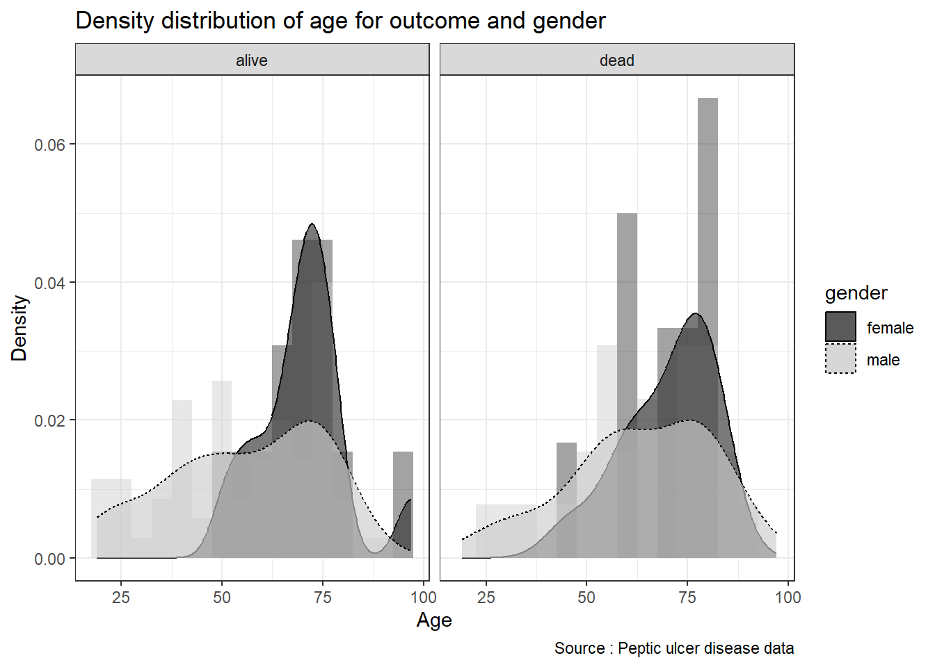
We can provide the summary statistics to complement the plots or vice versa.
pep %>%
  group_by(outcome, gender) %>%
  summarize(mean_age = mean(age, na.rm = TRUE),
            sd_age = sd(age, na.rm = TRUE))
## `summarise()` has grouped output by 'outcome'. You can override using the
## `.groups` argument.## # A tibble: 4 × 4
## # Groups: outcome [2]
## outcome gender mean_age sd_age
## <chr> <chr> <dbl> <dbl>
## 1 alive female 70.2 11.4
## 2 alive male 56.0 18.8
## 3 dead female 70.1 11.2
## 4 dead male 63.1 17.76.6.6 Line plot
Line graphs are typically used for visualizing how one continuous variable on the y-axis changes concerning another continuous variable on the x-axis. This is very useful for longitudinal data. Line graphs can also be used with a discrete variable on the x-axis. This is appropriate when the variable is ordered (e.g., “small,” “medium,” “large”).
Let us Load gapminder package and view the variables and the observations of the gapminder dataset.
## Rows: 1,704
## Columns: 6
## $ country   <fct> "Afghanistan", "Afghanistan", "Afghanistan", "Afghanistan", …
## $ continent <fct> Asia, Asia, Asia, Asia, Asia, Asia, Asia, Asia, Asia, Asia, …
## $ year      <int> 1952, 1957, 1962, 1967, 1972, 1977, 1982, 1987, 1992, 1997, …
## $ lifeExp   <dbl> 28.801, 30.332, 31.997, 34.020, 36.088, 38.438, 39.854, 40.8…
## $ pop       <int> 8425333, 9240934, 10267083, 11537966, 13079460, 14880372, 12…
## $ gdpPercap <dbl> 779.4453, 820.8530, 853.1007, 836.1971, 739.9811, 786.1134, …
We can plot the relationship between variable life expectancy lifeExp only for countried in the Asia continent. To do so, we
- specify the data. In this case the gapminder dataset
- choose only Asia continent using the
filter() - choose variable life expectancy for the y axis and year for the x axis. Then we will give different lines to represent different countries.
- will use
geom_line()to generate the line plot
gapminder %>%
  filter(continent == "Asia") %>%
  ggplot(mapping = aes(x = year, y = lifeExp, linetype = country)) +
  geom_line(show.legend = FALSE) +
  xlab("Year") + ylab("Life Expectancy") +
  theme_bw()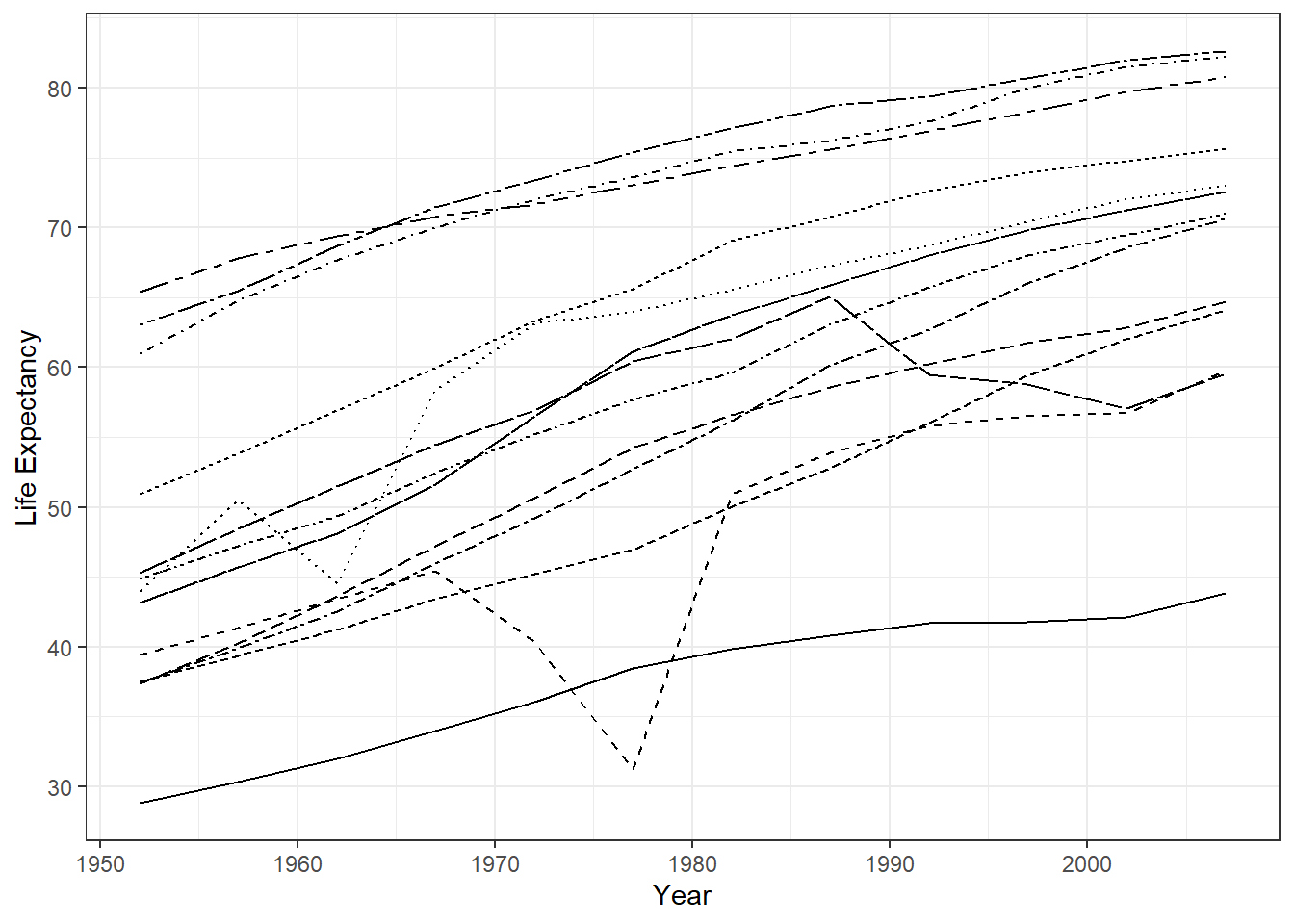
And the summary statistics for the plot.
gapminder %>%
  filter(continent == 'Asia') %>%
  filter(year == 1962 | year == 1982 | year == 2002) %>%
  group_by(year) %>%
  summarise(mean_life = mean(lifeExp, na.rm = TRUE),
            sd_life = sd(lifeExp, na.rm = TRUE))
## # A tibble: 3 × 3
## year mean_life sd_life
## <int> <dbl> <dbl>
## 1 1962 51.6 9.82
## 2 1982 62.6 8.54
## 3 2002 69.2 8.37We may use gtsummary package to generate publication ready table. We need to filter for Asia continent only to represent the line plot we generated before.
gapminder %>%
  select(continent, year, lifeExp, pop, gdpPercap) %>%
  filter(continent == "Asia") %>%
  filter(year == 1962 | year == 1982 | year == 2002) %>%
  mutate(pop = pop/1000000, gdpPercap = gdpPercap/1000) %>%
  tbl_strata(
    strata = continent,
    .tbl_fun =
      ~.x %>%
      tbl_summary(
        by = year,
        label = list(lifeExp ~ "Life Exp", pop ~ "Pop size", gdpPercap ~ "Percap GDP"),
        statistic = list(all_continuous() ~ "{mean} ({sd})",
                         all_categorical() ~ "{n} / {N} ({p}%)"),
        missing = "no",
        digits = all_continuous() ~ 1
        )) %>%
   modify_footnote(all_stat_cols() ~ "Mean(SD), Pop size in million and GDP in thousand") %>%
as_gt()| Characteristic | Asia | ||
|---|---|---|---|
| 1962 N = 331 |
1982 N = 331 |
2002 N = 331 |
|
| Life Exp | 51.6 (9.8) | 62.6 (8.5) | 69.2 (8.4) |
| Pop size | 51.4 (136.1) | 79.1 (206.5) | 109.1 (276.7) |
| Percap GDP | 5.7 (16.4) | 7.4 (8.7) | 10.2 (11.2) |
| 1 Mean(SD), Pop size in million and GDP in thousand | |||
6.6.7 Plotting means and error bars
We want to error bar for life expectancy for Asia continent only. Error bar that contains mean and standard deviation
Our approach is use filter to choose Asia continent only filter(). Then generate the mean and SD for life expectancy using mutate(). Next is to plot the scatterplot (country vs mean life expectancy) geom_point() and then plot errorbar geom_errorbar()
gap_continent <- gapminder %>%
  filter(continent == "Asia") %>%
  group_by(country) %>%
  mutate(mean = mean(lifeExp), sd = sd(lifeExp)) %>%
  arrange(desc(mean))
Plot them with coord_flip() and use the black and white theme. We also set fig.width=5, fig.height=8 in the R code chuck.
gap_continent %>%
  ggplot(mapping = aes(x = country, y = mean)) +
  geom_point(mapping = aes(x = country, y = mean)) +
  geom_errorbar(mapping = aes(ymin = mean - sd, ymax = mean + sd),
                position = position_dodge()) +
  coord_flip() +
  theme_bw()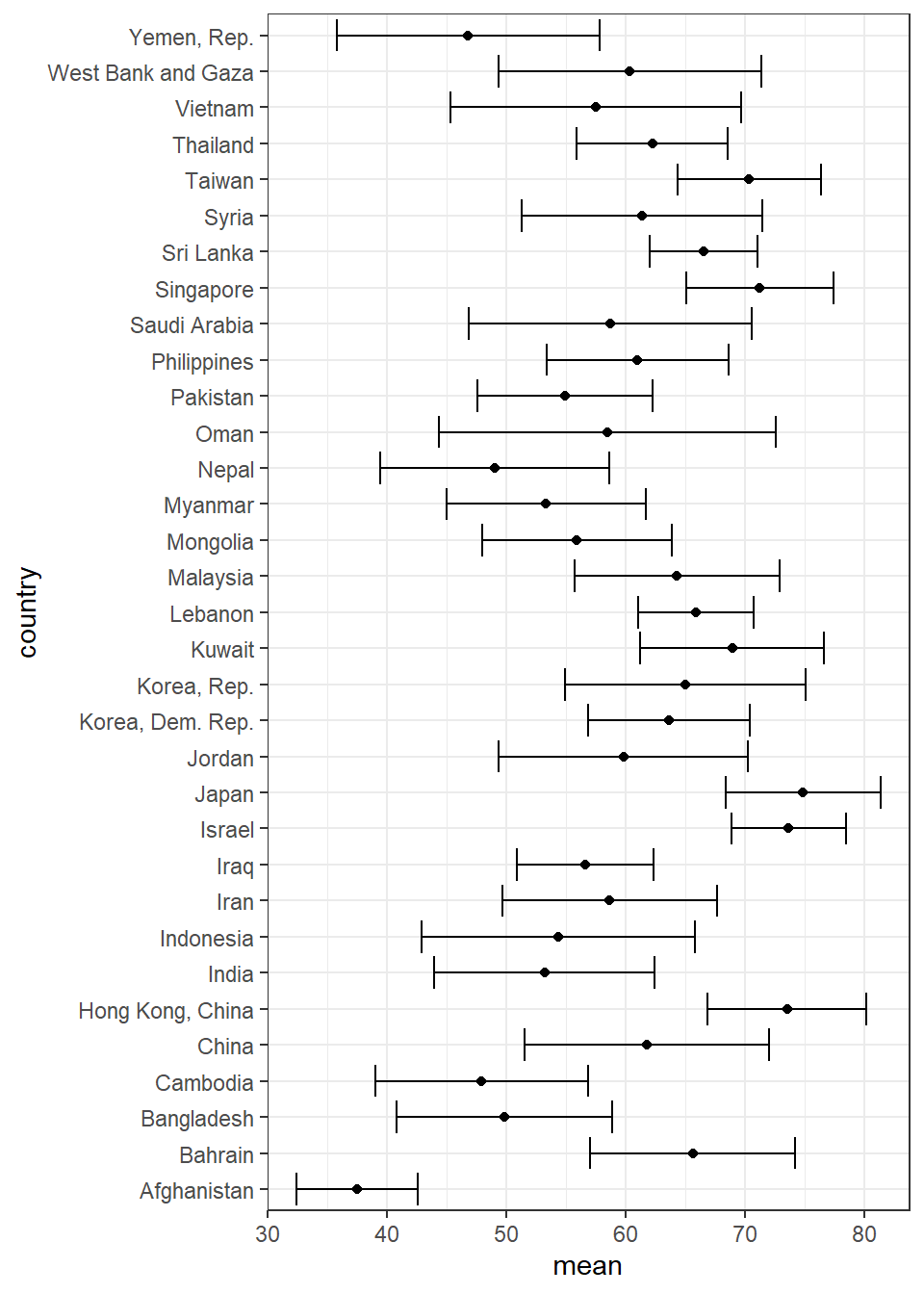
6.6.8 Scatterplot with fit line
We are using the the peptic ulcer data pep where we will create a fit line between age and size of perforation. We then plot the scatterplot and and a fit line on it. We name the plot object generated as pep_fit.
pep_fit <- pep %>%
  ggplot(aes(x = age, y = perforation, shape = outcome)) +
  geom_point(show.legend = TRUE) +
  geom_smooth(aes(x = age, y = perforation, linetype = outcome),
                  method = lm, se = FALSE) +
  ylab('Size of perforation') +
  xlab('Age of patient') +
  labs(title = 'Distribution and fit line',
       caption = 'Source: Peptic ulcer data') +
  theme_bw()
pep_fit
## `geom_smooth()` using formula = 'y ~ x'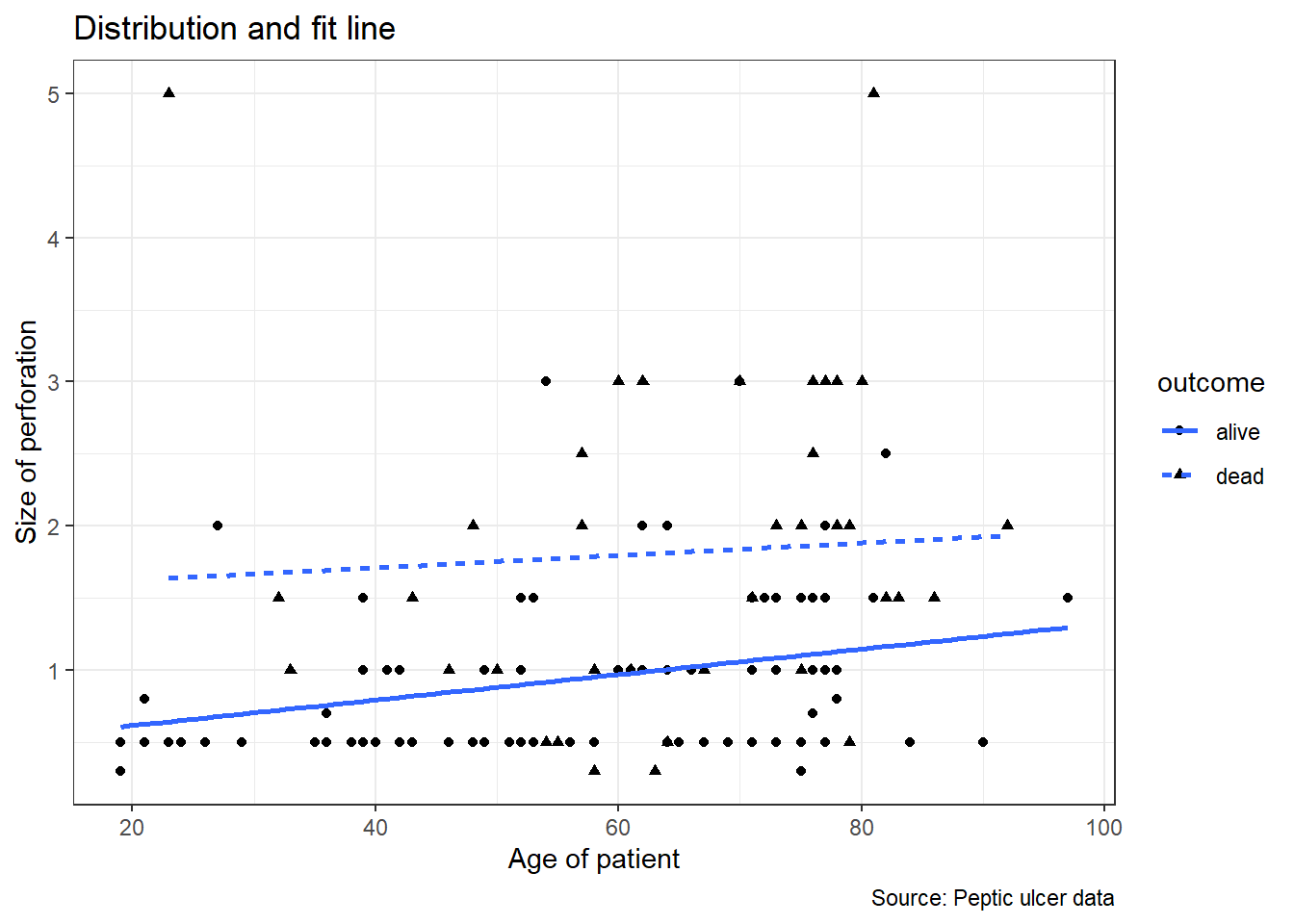
Let us see if the patterns are similar for men and women. We will use facet_wrap() to split the plots based on variable gender.
## `geom_smooth()` using formula = 'y ~ x'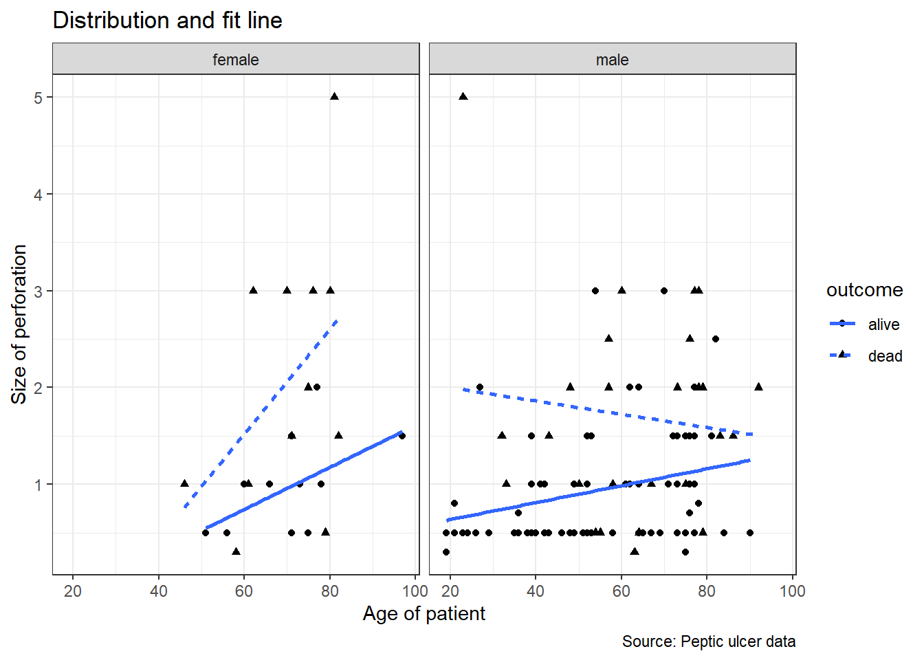
pep %>%
  select(gender, perforation, age) %>%
  tbl_summary(
    by = gender,
    statistic = list(all_continuous() ~ "{mean} ({sd})",
                     all_categorical() ~ "{n} / {N} ({p}%)"),
    missing = "no",
    digits = all_continuous() ~ 2 ) %>%
  modify_caption("**Patient Characteristics and Gender** (N = {N})") %>%
as_gt()| Characteristic | female N = 251 |
male N = 961 |
|---|---|---|
| perforation | 1.49 (1.14) | 1.16 (0.83) |
| age | 70.12 (11.07) | 57.91 (18.70) |
| 1 Mean (SD) | ||
6.7 Summary
This chapters provides understanding to readers about exploratory data analysis (EDA) and skills to perform EDA and descriptive statistics. We learned about graphical methods in R and how to report descriptive statistics in tables. We show readers how to read a MS Excel data and then use three important packages to perform EDA (dplyr, ggplot2 and gtsummary packages) on the data. The excellent resources available to help readers perform more complicated exploratory data analysis include ggplot2: Elegant Graphics for Data Analysis webpage or its physical book (Chang 2013), ggplot2 package, gtsummary webpage (Sjoberg et al. 2021) and R for Data Science website or its physical book (Wickham and Grolemund 2017).