Methods
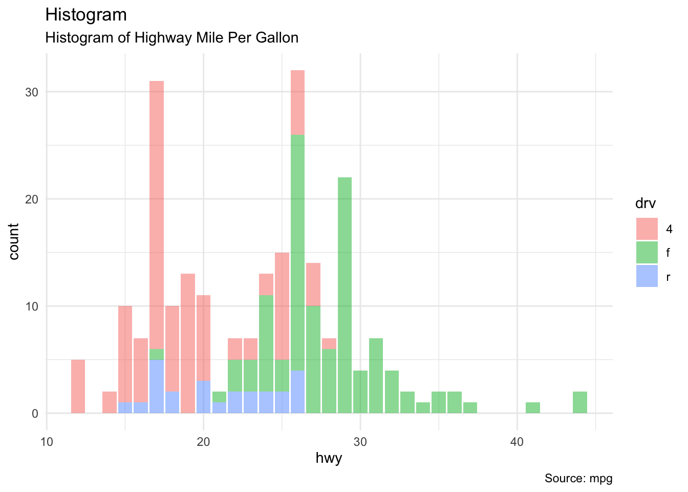
ggplot(data = mpg, aes(x = hwy, fill = drv)) + geom_bar(alpha = 0.5) + theme_minimal() +
  labs(subtitle = "Histogram of Highway Mile Per Gallon",
     y = "count",
     x = "hwy",
     title = "Histogram",
     caption = "Source: mpg")
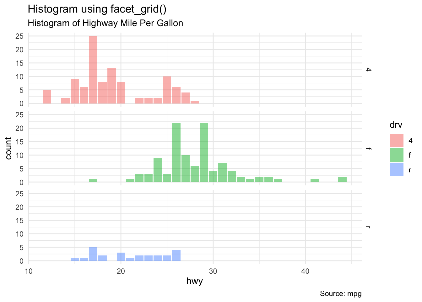
ggplot(data = mpg, mapping = aes(x = hwy, fill = drv)) +
  geom_bar(alpha = 0.5) +
  facet_grid(drv ~ .) +
  theme_minimal() +
   labs(subtitle = "Histogram of Highway Mile Per Gallon",
     y = "count",
     x = "hwy",
     title = "Histogram using facet_grid()",
     caption = "Source: mpg")
ggplot(data = midwest, mapping = aes(x = area, y = poptotal)) +
  geom_point(alpha = 0.4, mapping = aes(color = state, size = popdensity)) + coord_cartesian(xlim = c(0, 0.1), ylim = c(0, 500000)) +
  geom_smooth(method = "loess", formula = 'y ~ x', se = FALSE) + xlim(c(0, 0.1)) + ylim(c(0, 500000)) +
  theme_classic() +
  labs(subtitle = "Area vs. Population",
     y = "Population", options(scipen=999),
     x = "Area",
     title = "Scatterplot",
     caption = "Source: midwest")
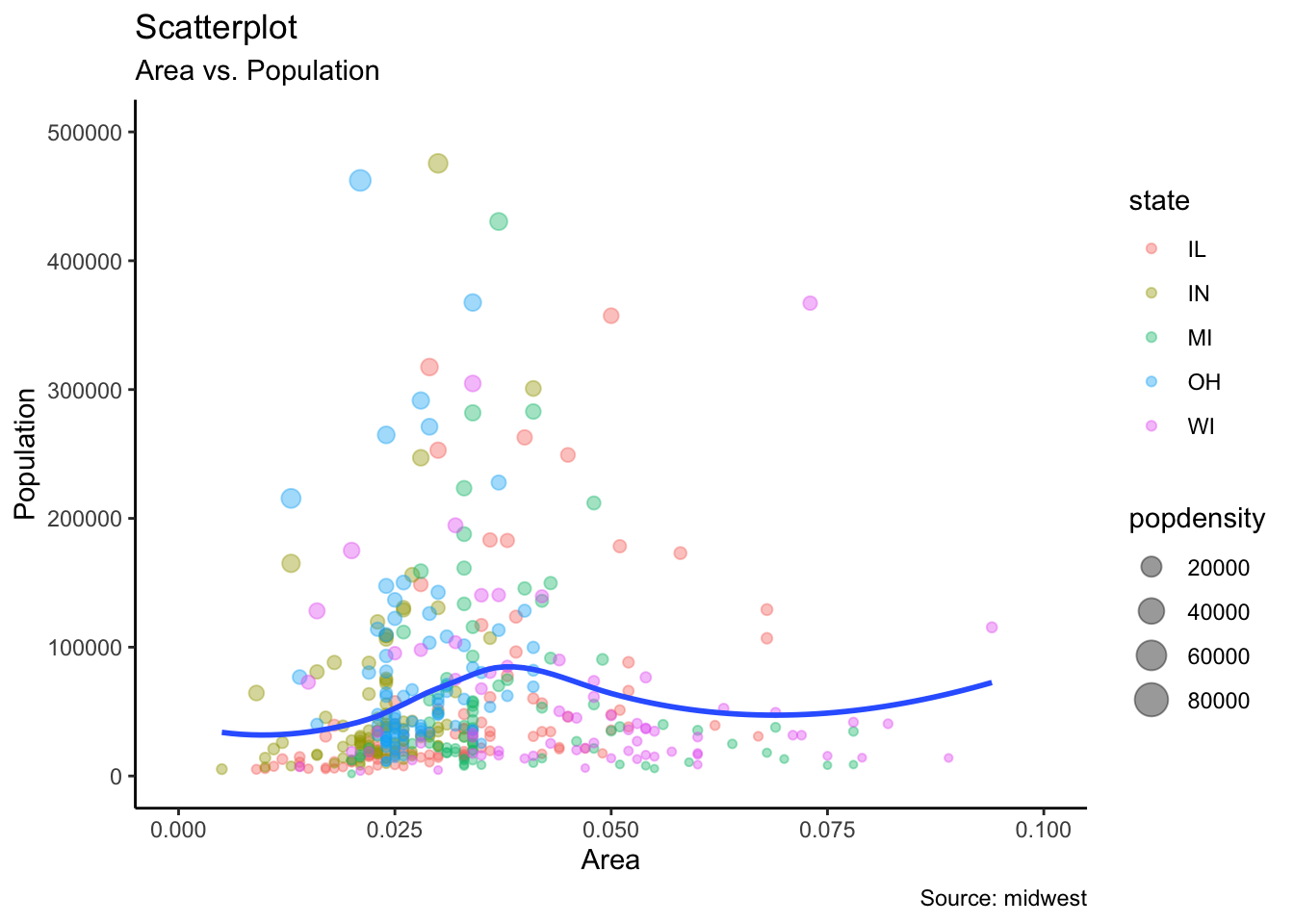
# turn-off scientific notation like 1e+48
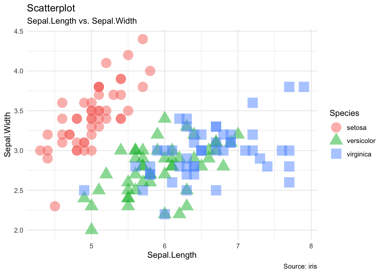
ggplot(data = iris, aes(x = Sepal.Length, y = Sepal.Width, color = Species, shape = Species)) + geom_point(size = 6, alpha = 0.5) + theme_minimal() +
  labs(subtitle = "Sepal.Length vs. Sepal.Width",
     y = "Sepal.Width",
     x = "Sepal.Length",
     title = "Scatterplot",
     caption = "Source: iris")
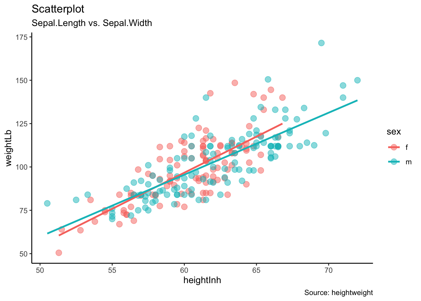
ggplot(data = heightweight, aes(x = heightIn, y = weightLb, color = sex)) + geom_point(size = 3, alpha = 0.5) + geom_smooth(method = "lm", se = FALSE) +
theme_classic() +
  labs(subtitle = "Sepal.Length vs. Sepal.Width",
     y = "weightLb",
     x = "heightInh",
     title = "Scatterplot",
     caption = "Source: heightweight")
## `geom_smooth()` using formula 'y ~ x'
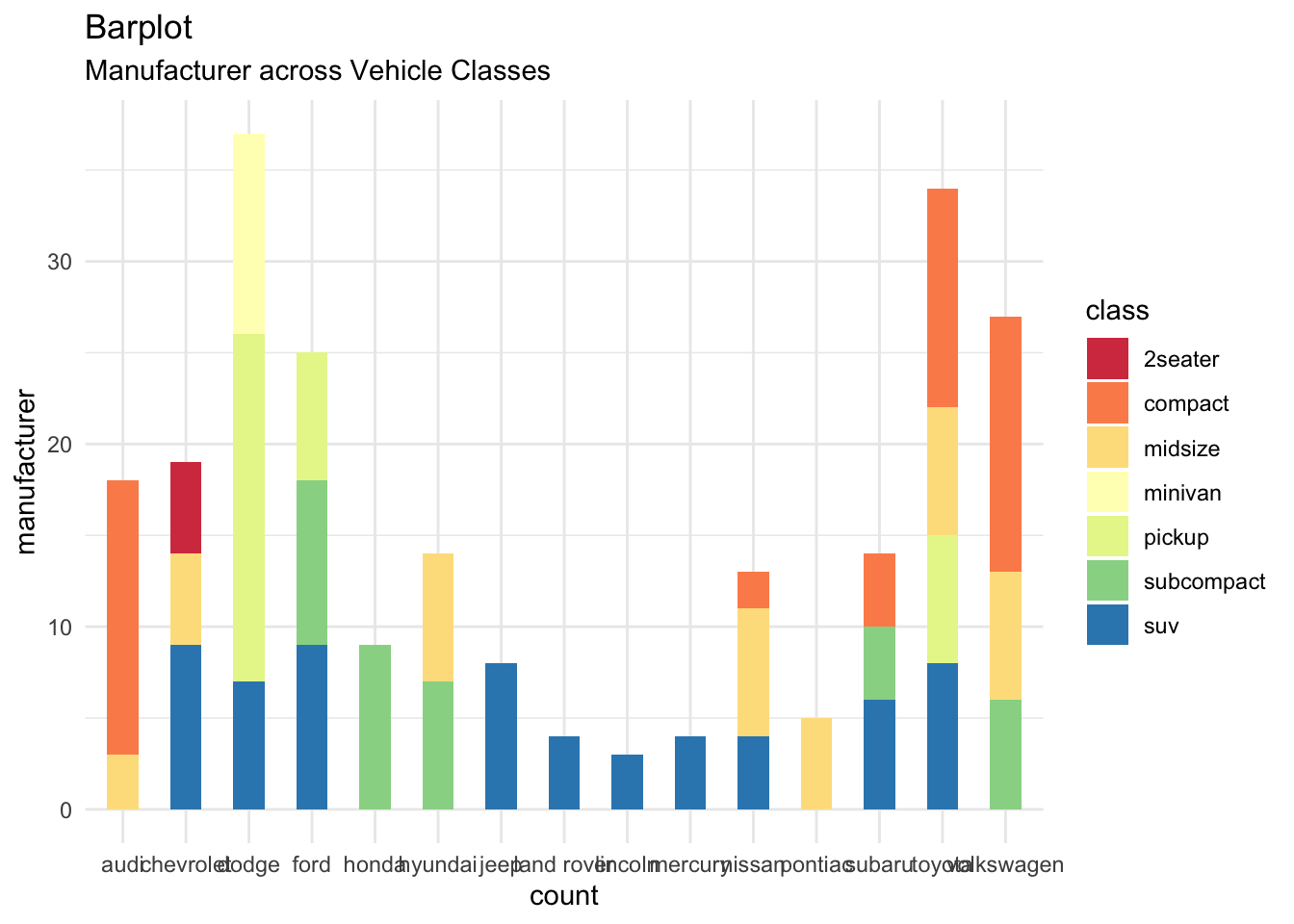
ggplot(data = mpg, aes(x = manufacturer, fill = class)) + geom_bar(width = 0.5) + theme(axis.text.x = element_text(angle=65, hjust = 1)) + theme_minimal() +
  scale_fill_brewer(palette = "Spectral") +
  labs(subtitle = "Manufacturer across Vehicle Classes",
     y = "manufacturer",
     x = "count",
     title = "Barplot")