6.2 Continuous: Histogram
A histogram is a great choice for visualizing the distribution of a continuous variable.
6.2.1 Base R
In base R, use hist() to plot a histogram. The following code produces a frequency histogram (y-axis shows the number in each bin) and a probability histogram (y-axis shows the proportion in each bin). This will also demonstrate the use of par(mfrow) to plot multiple figures at once and main which sets the plot title.
# 1 row, 2 columns
par(mfrow = c(1,2))

hist(mydat$stweight,
     xlab = "Weight",
     main = "Frequency histogram")

hist(mydat$stweight,
     xlab = "Weight",
     main = "Probability histogram",
     probability = T)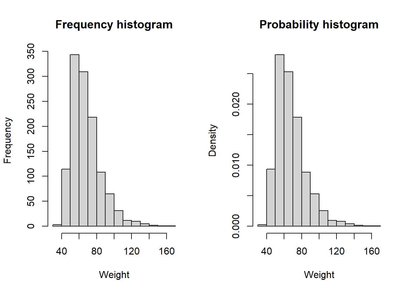
6.2.2 ggplot
In ggplot(), use geom_histogram() to create a histogram. The following code produces a frequency histogram (y-axis shows the number in each bin) and a probability histogram (y-axis shows the proportion in each bin) (using the ..density.. internal variable). This also demonstrates the use of Rmisc::multiplot() (Hope 2022) to plot multiple figures at once. This involves assigning each plot to an object and then using Rmisc::multiplot() to plot all of the objects at once. You will not see anything in the plot window until you run the Rmisc::multiplot() command. Install the Rmisc package if you have not already but do NOT load it with library() since it masks some functions from the tidyverse. In general, you can use individual functions from a package without loading the package by using the :: syntax.
# Frequency histogram
p1 <- mydat %>%
  ggplot(aes(x = stweight)) +
  geom_histogram() +
  labs(y = "Frequency", x = "Weight (kg)")

# Probability histogram
p2 <- mydat %>%
  ggplot(aes(x = stweight)) +
  geom_histogram(aes(y = ..density..)) +
  labs(y = "Density", x = "Weight (kg)")

Rmisc::multiplot(p1, p2, cols = 2)
## `stat_bin()` using `bins = 30`. Pick better value with `binwidth`.## Warning: Removed 556 rows containing non-finite values (`stat_bin()`).## `stat_bin()` using `bins = 30`. Pick better value with `binwidth`.## Warning: Removed 556 rows containing non-finite values (`stat_bin()`).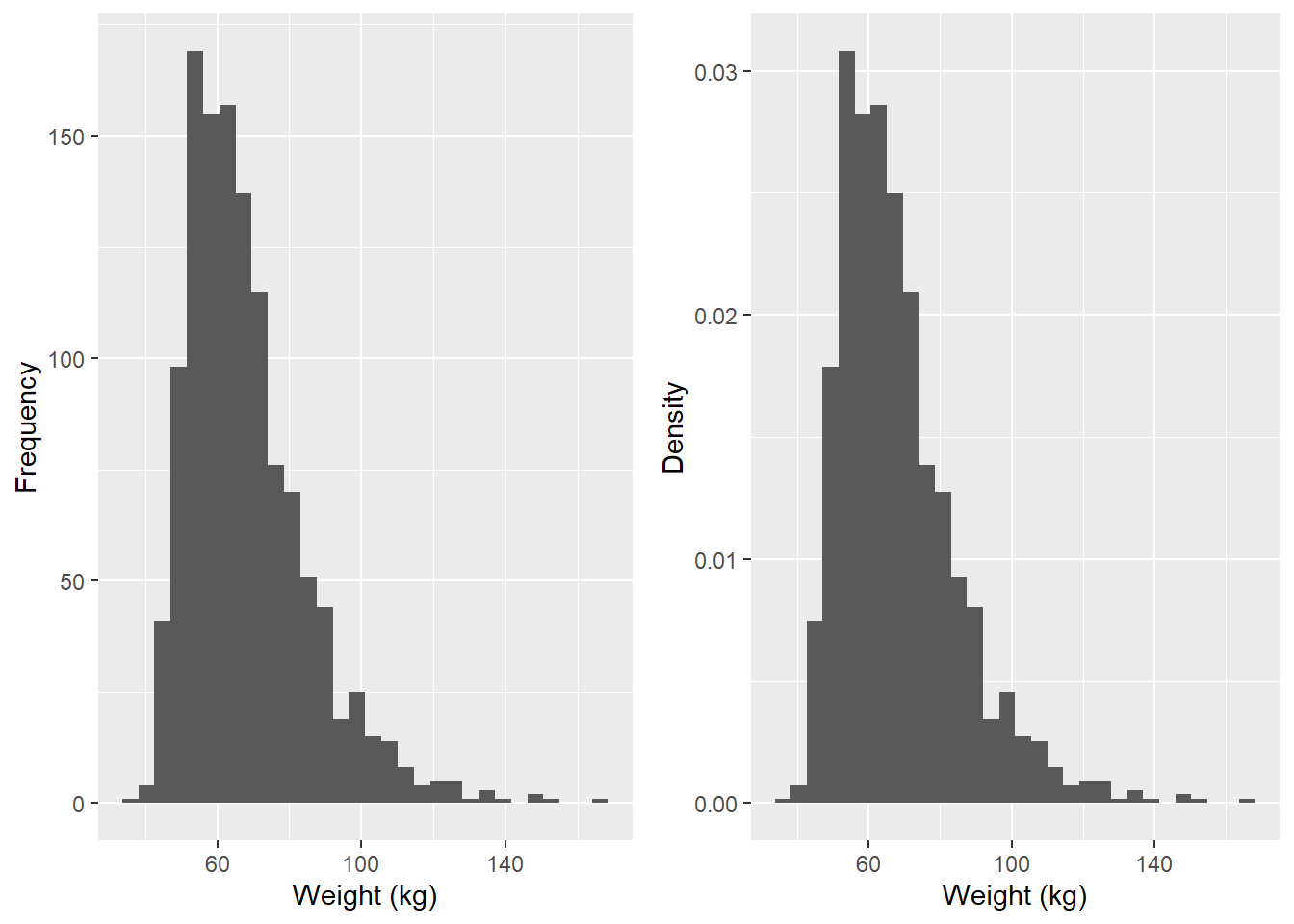
You may notice one or more warnings after using geom_histogram().
- A note instructing you to “Pick better value with binwidth” has to do with how wide the bins are for the histogram. Wider bins result in a smoother histogram. You can ignore this note, or change the value as shown below.
- If you see a warning about “non-finite values”, then R is notifying you that some values were not plotted because they were infinite or missing.
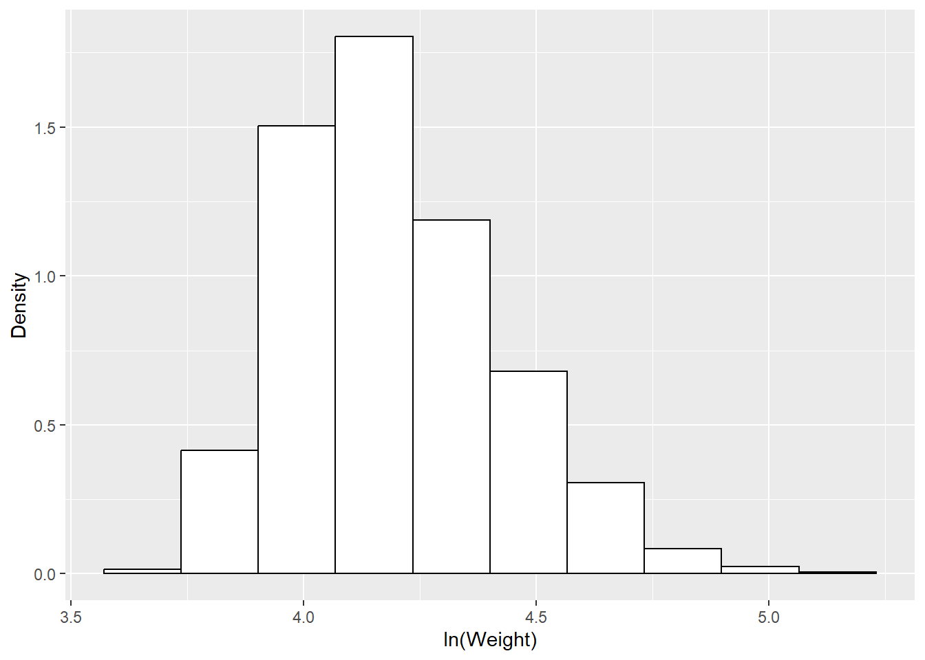
Let’s redo the probability histogram with a smaller number of bins (although the prompt said to change binwidth, you can also change the number of bins, and since I do not know what the previous value of binwidth was but it told me the previous value of bins was 30, its easier to change bins). I will also change the appearance of the histogram just to illustrate a few other options, and use log-transformed weight.
# Different number of bins
mydat %>%
  ggplot(aes(x = ln_weight)) +
  geom_histogram(aes(y = ..density..),
                 bins = 10,
                 color="black",
                 fill="white") +
  labs(y = "Density",
       x = "ln(Weight)")