第 6 章 Guide, Facet and Theme
6.1 Guides (axes+legend)
reference: https://ggplot2.tidyverse.org/reference/guides.html
Guides: 圖形aes mapping說明。主要由座標軸(axes)及圖例(legend)使讀者易於理解aes mapping關係,其設計更動主要透過下面兩個layers:
x/y的說明透過:
- axes:
+scale_<x or y>_...()
其他aes mapping說明透過:
- legend:
+guide(<aes name>=...)
6.1.1 Guides: axes
+scale_<x or y>_...()
6.1.1.1 second axis: sec_axis()
兩個「不同範圍」的y值,有「相同的x」,其中:
(yL,x) 要使用左邊內訂y座標軸;(yR,x)要使用右邊第二座標軸(second axis).步驟1:定義函數轉換(\(f\)及\(f^{-1}\))
先將\(yR\)經過一個函數f轉換成在Y-left axis limits範圍的\(yL^*\),即: \[yL^*=f(yR)\] 形成新的\((yL^*,x)\)資料。 \[ yR\stackrel{f}{\rightarrow}yL^{*}\\ yR\stackrel{f^{-1}}{\leftarrow}yL^{*} \]步驟2:yR資料轉換
將\((yL,x)\)與轉換後的\((yL^*,x)\)畫在一起。步驟3:設定右Y軸
加上右Y軸並告訴ggplot,「左Y」如何對應到「右Y」——使用scale_y_...()layer, 更改設定sec.axis=sec_axis(...), 其中:
sec_axis(trans = f_inverse, name = waiver(), breaks = waiver(),
labels = waiver())- f_inverse: \(f^{-1}\) 函數名稱
範例
billionaire <-
  read_csv("https://www.dropbox.com/s/cpu4f09x3j78wqi/billionaire.csv?dl=1") %>%
  rename(
    "Year"="X1"
  )
billionaire %>%
ggplot()+geom_line(
aes(x=Year,y=Russia)
) +
scale_y_continuous(
breaks=seq(0,200,by=50)
) +
theme_linedraw()-> plot_russia
billionaire %>%
ggplot()+geom_line(
aes(x=Year,y=World)
)+
scale_y_continuous(
breaks=seq(0,2000,by=500)
) +
theme_linedraw()-> plot_world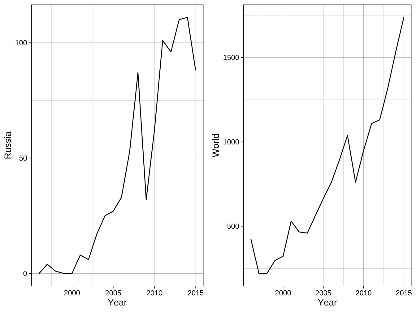
步驟一:定義\(f\)及\(f^{-1}\)
步驟二:轉換\(yR\)成\(yL^*\)
步驟三:設定右Y軸
billionaire %>%
  ggplot()+
  geom_line(
    aes(x=Year,y=Russia), color="blue", size=2
  ) +
  geom_line(
    aes(x=Year,y=World2), color="brown", size=2
  ) +
  scale_y_continuous(
    limits=c(-1,230),
    breaks=seq(0,200,by=50),
    expand=expand_scale(mult=c(0,0)),
    sec.axis = sec_axis(  # 設定右Y軸
      trans=f_inverse,
      name="Rest of the World"
    )
  ) +
  theme_bw() -> plot_sec_axis

plot_sec_axis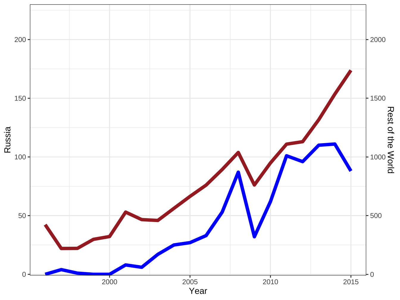
# 引入theme_dual_axis()
source("https://www.dropbox.com/s/8sdedu4wnq8wsns/guides.R?dl=1")

plot_sec_axis +
  scale_x_continuous(
    limits=c(1995,2015),
    breaks=c(1996,seq(2000,2015,by=5)),
    labels=function(x) ifelse(x<=2000,x,str_sub(as.character(x),3,4))
  )+
  labs(x="",y="Russia")+
  theme_dual_axis()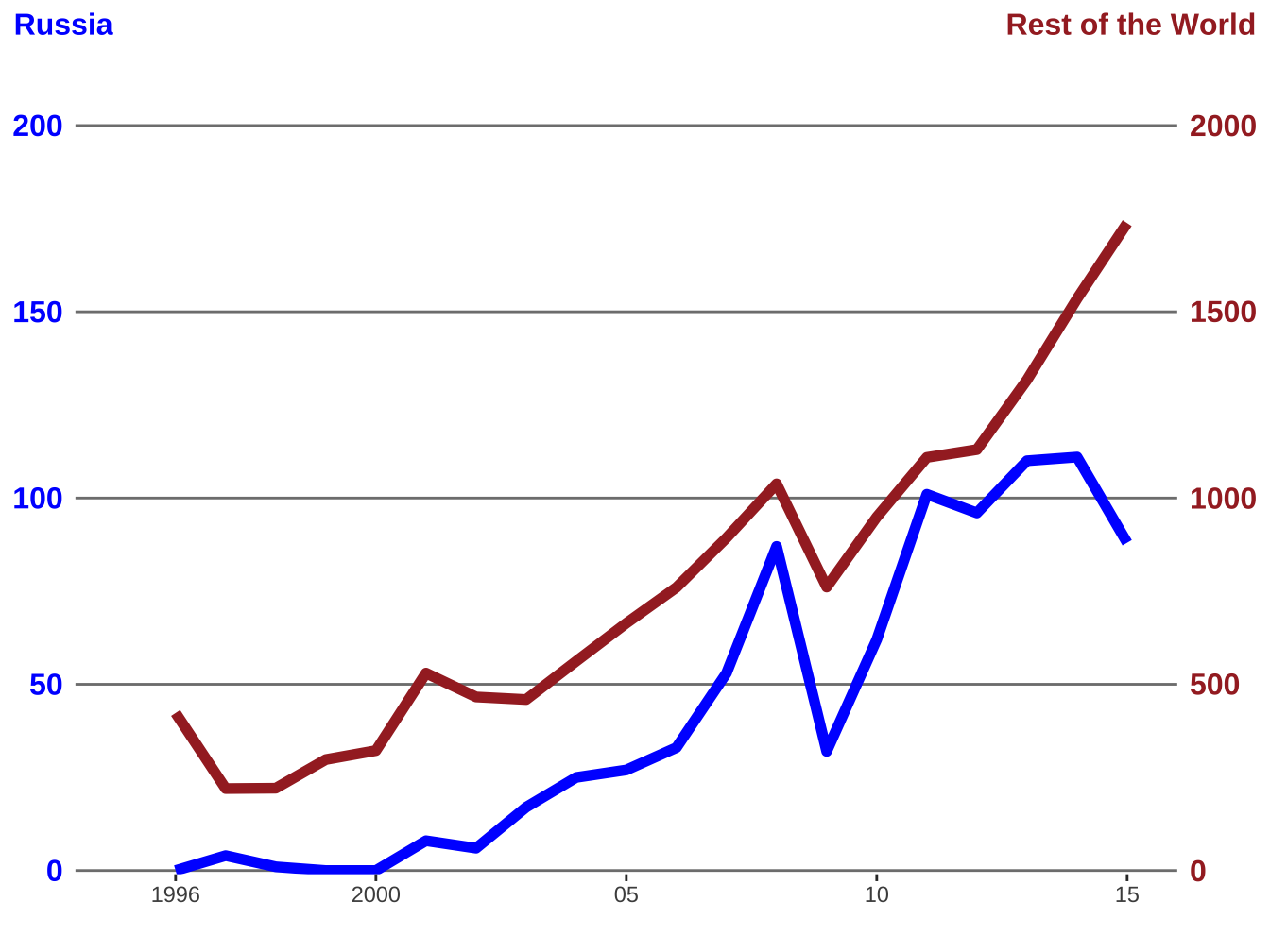
6.1.1.2 duplicated axis: dup_axis()

6.1.2 Guides: legend
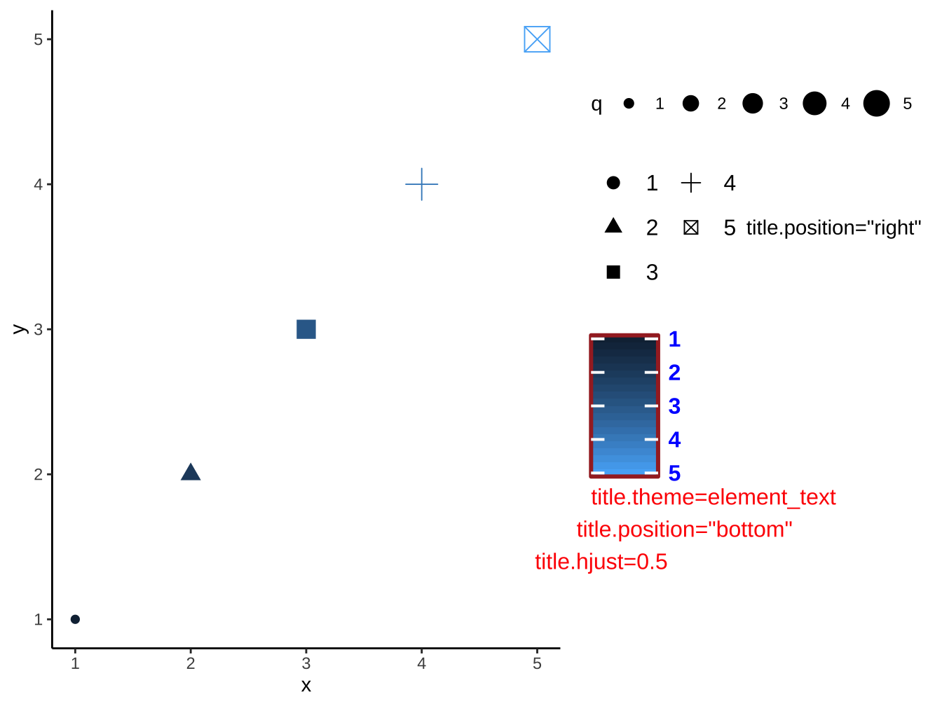
調整x/y以外aes mapping圖例:
+guides(<aes name>=<適當的guide function>)有color bar的使用
guid_colorbar()去調整。其他使用
guide_legend()去調整。
p +
  guides(
  color=guide_colorbar(
      title.position = "bottom",
      title.theme=
        element_text(
          color="red"
        ),
      title.hjust=-0.5,
      label.theme=element_text(
        color="blue",
        face="bold",
        size=unit(12,"pt")
      ),
      barheight = unit(0.2,"npc"),
      barwidth = unit(36,"pt"),
      raster=F,
      frame.colour = "brown",
      frame.linewidth = unit(3,"pt"),
      ticks.linewidth = unit(2,"pt"),
      reverse = T,
      direction="vertical"
    ),
  # size="none",
  shape=guide_legend(
    ncol=2,
    title.position = "right",
    reverse = F,
    keywidth = unit(24,"pt"),
    keyheight = unit(24,"pt"),
    label.theme = element_text(
      size=unit(12,"pt")
    ),
    override.aes=list(size=3)
  ),
  size=guide_legend(
    direction = "horizontal"
  )
)+
  labs(
    color='title.theme=element_text\ntitle.position="bottom"\ntitle.hjust=0.5',
    shape="title.position=\"right\""
  )
6.2 Facet
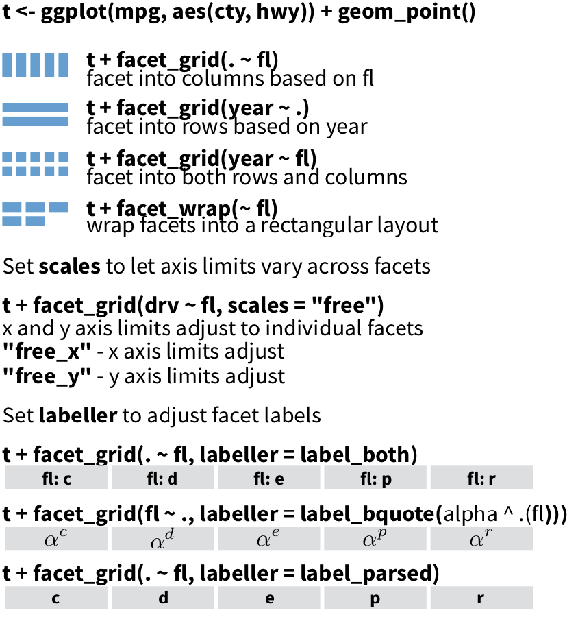
6.2.1 範例
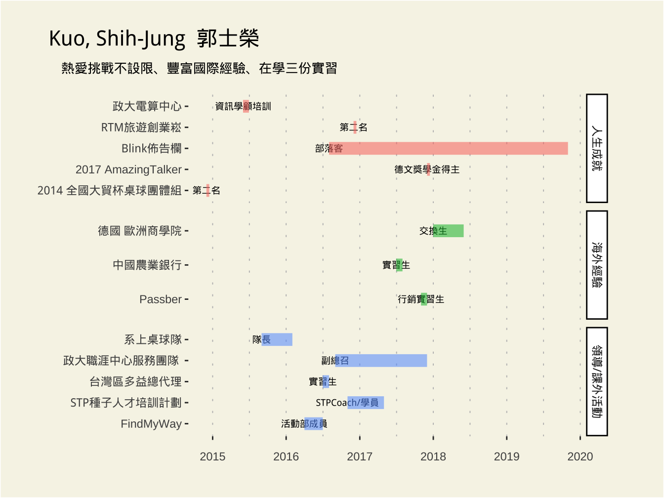
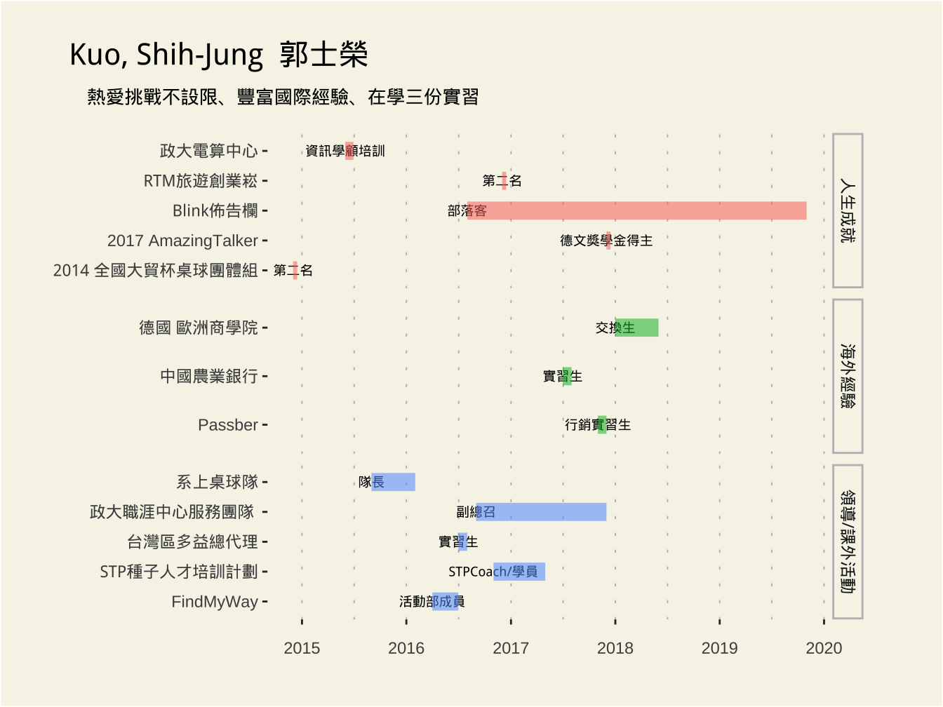
- 取自:作業展示6,作品21 by 林奕齊
load(url("https://github.com/tpemartin/course-108-1-inclass-datavisualization/blob/master/%E4%BD%9C%E5%93%81%E5%B1%95%E7%A4%BA/homework6/graphData_homework6_021.Rda?raw=true"))
source("https://www.dropbox.com/s/0ydtqtxu5guy6i1/theme_lin.R?dl=1")

resume_df %>%
  mutate(開始 = ymd(開始), 結束 = ymd(結束))  -> resume_df
resume_df %>%
ggplot(
aes(x = 開始, y = 項目)) +
geom_text(
aes(label = 名稱), size = 2.5) +
geom_segment(
aes(
xend = 結束, yend = 項目, color = 分類, size = 2, alpha = 1
)
) +
scale_x_date(
breaks = seq(as.Date("2015-01-01"), as.Date("2020-01-01"), by="1 year"),
labels = scales::date_format("%Y")
)+
labs(title = "Kuo, Shih-Jung 郭士榮", subtitle = "熱愛挑戰不設限、豐富國際經驗、在學三份實習") +
theme_lin() -> gg_basic
gg_basic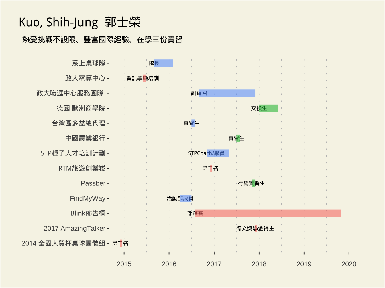

~的表示形式處於soft deprecated,未來要改成:
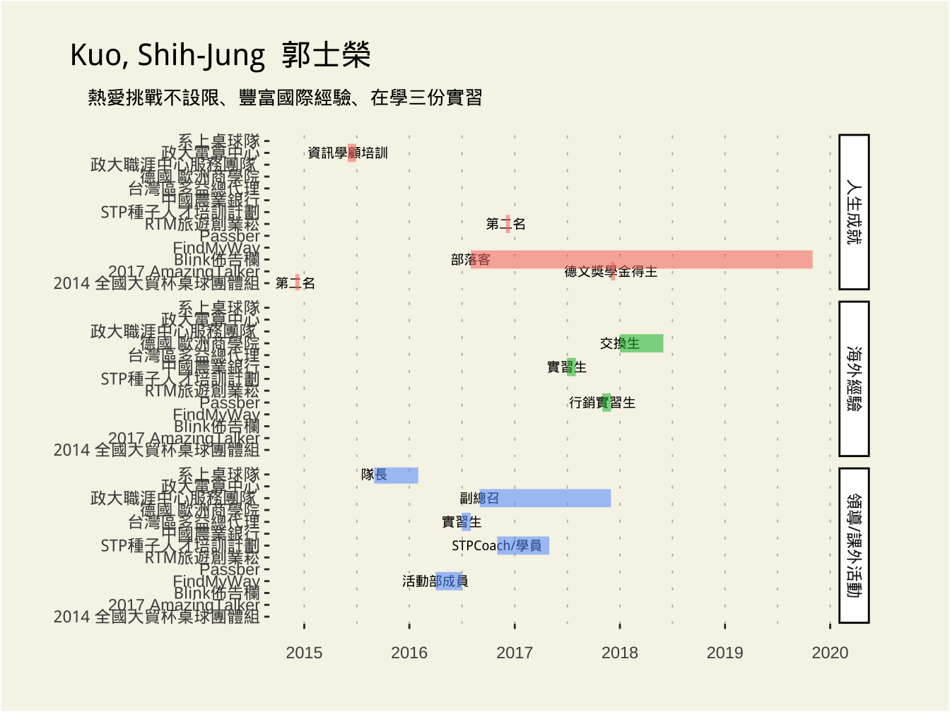
vars(): takes inputs to be evaluated.
要求所有y軸均有相同scale會讓圖面很擠,有些類並不會有某些項目;透過scales修改
6.2.2 Option: scales
- scales: Are scales shared across all facets (the default, “fixed”), or do they vary across rows (“free_x”), columns (“free_y”), or both rows and columns (“free”)?
6.2.3 範例
load(url("https://github.com/tpemartin/course-108-1-inclass-datavisualization/blob/master/%E4%BD%9C%E5%93%81%E5%B1%95%E7%A4%BA/homework3/graphData_homework3_002.Rda?raw=true"))

graphData$sub_2015_city%>%
  arrange(desc(area), avg_nh)%>%
  mutate(city = forcats::fct_inorder(city)) -> df_eldercare
df_eldercare %>%
ggplot(
aes(y = avg_nh, x = city, fill = area)
)+
geom_col(
width=0.7
)+
coord_flip()+
labs(x = "長照機構數(每10,000位老人)", y="")+
theme_lin() -> gg_original
gg_original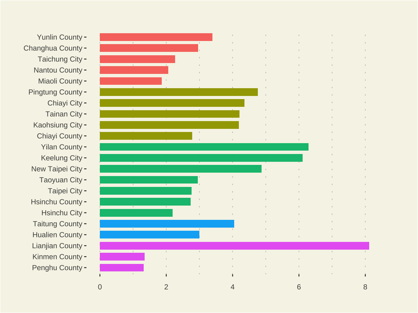
6.2.4 Option: space
- If “free_y” their height will be proportional to the length of the y scale; if “free_x” their width will be proportional to the length of the x scale; or if “free” both height and width will vary.
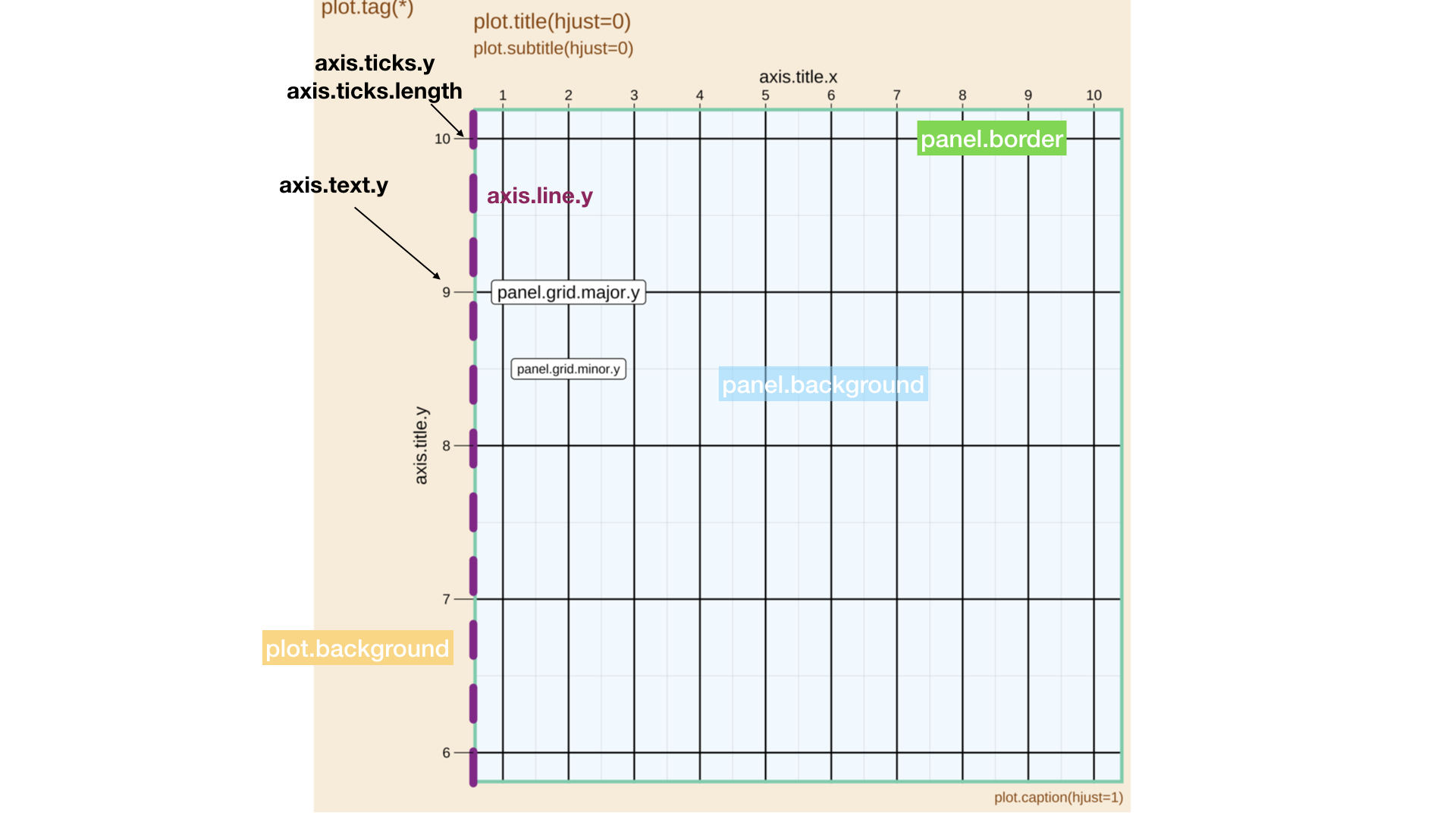
6.3 Theme
任何ggplot都會有一個預設的theme(全部ggplot2 themes), 內定為theme_grey(),接著可以透過theme()去改設定:
which component?
how to set its value?
atomic vector.
list: involved with a lot of settings. usually via some other functions, such as:
element_text/line/rect()orelement_blank()unit()margin()
6.3.1 Component: plot
- (*)會造成plot.margin 之margin(t,l)的增加,因文字的hjust=1,vjust=0(即文字塊的右下角為座標點)。若再配會
plot.tag.position=c(0,1),則tag文字會消失。
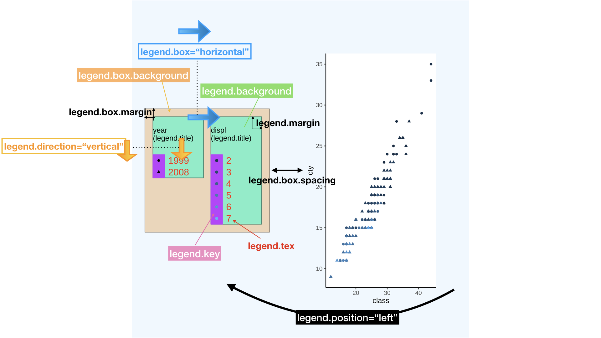
6.3.2 Component: legend
6.4 Size
6.4.1 grid::unit()
透過此函數計算較容易:
unit(<數字>,<單位>)單位:
6.4.2 npc / snpc
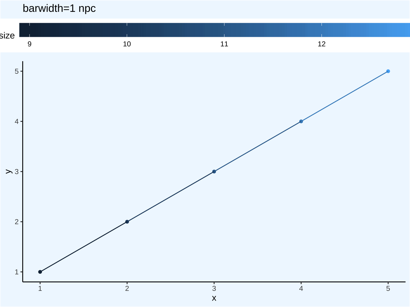
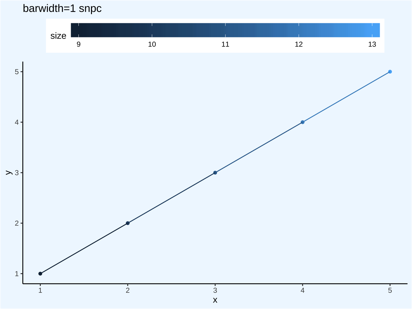
以整個圖面width/height為衡量長度,1為全圖面width/height。
npc: 以尺度所用之處為width或height, 相對於圖面full width或full height。
snpc: 相對於相對於圖面的min{full width, full height},即Viewport的短邊。
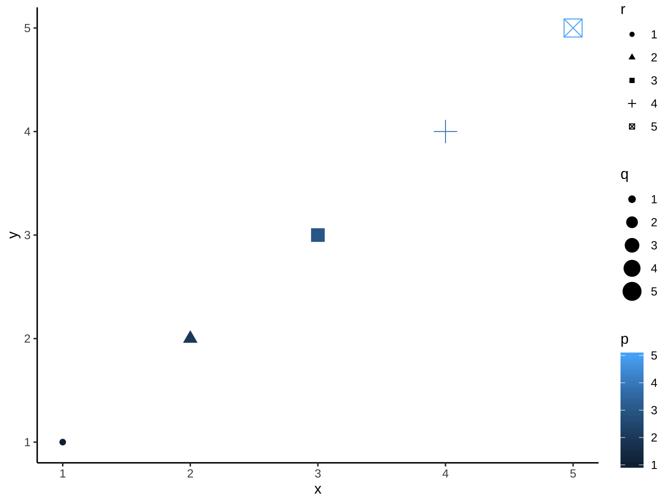
dat <- data.frame(
  x = 1:5,
  y = 1:5,
  size = 8+1:5,
  q = factor(1:5),
  r = factor(1:5),
  lineheight=seq(0.5,1.5,length.out = 5))

p <- ggplot(
  dat,
  aes(x, y,
      colour = size)) +
  geom_point()+
  geom_line()

p+
  theme(
    plot.background = element_rect(
      fill="aliceblue"),
    panel.background = element_rect(
      fill="transparent"
    )
  ) -> p_npc0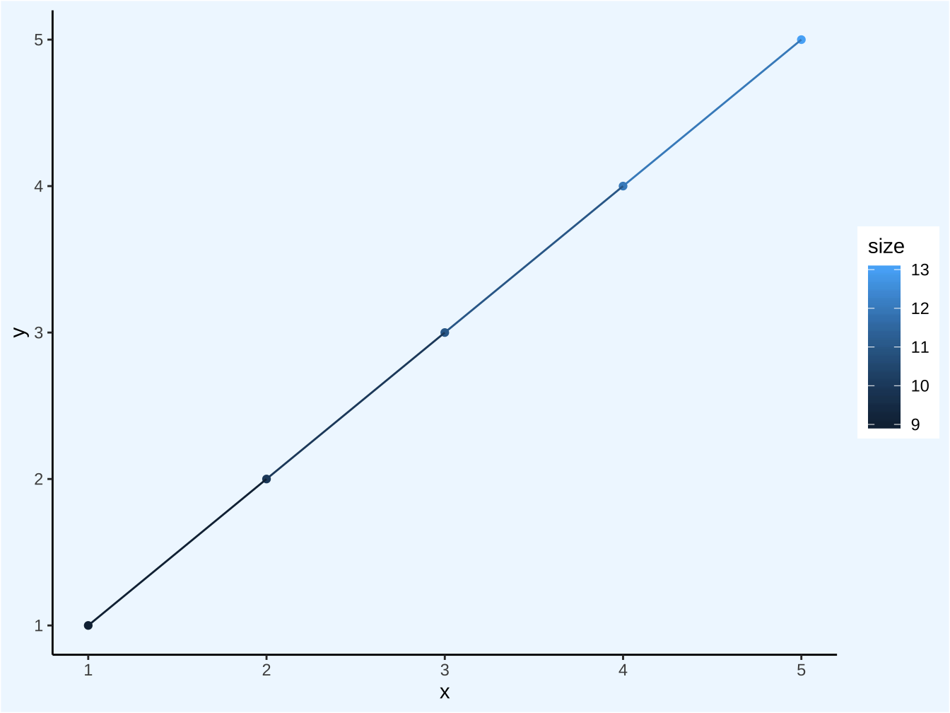

p_npc0 +
  theme(
    legend.position = "top"
  ) -> p_npc0_top

p_npc0_top +
  guides(
    color=guide_colorbar(
      barwidth = unit(1,"npc") # Viewport width的100%
    )
  ) -> p_unit_npc

p_unit_npc+
  labs(
    title="barwidth=1 npc"
  )
p_npc0_top +
  guides(
    color=guide_colorbar(
      barwidth = unit(1,"snpc") # Viewport 短邊(即height)的100%
    )
  ) -> p_unit_snpc
p_unit_snpc+
  labs(
    title="barwidth=1 snpc"
  )
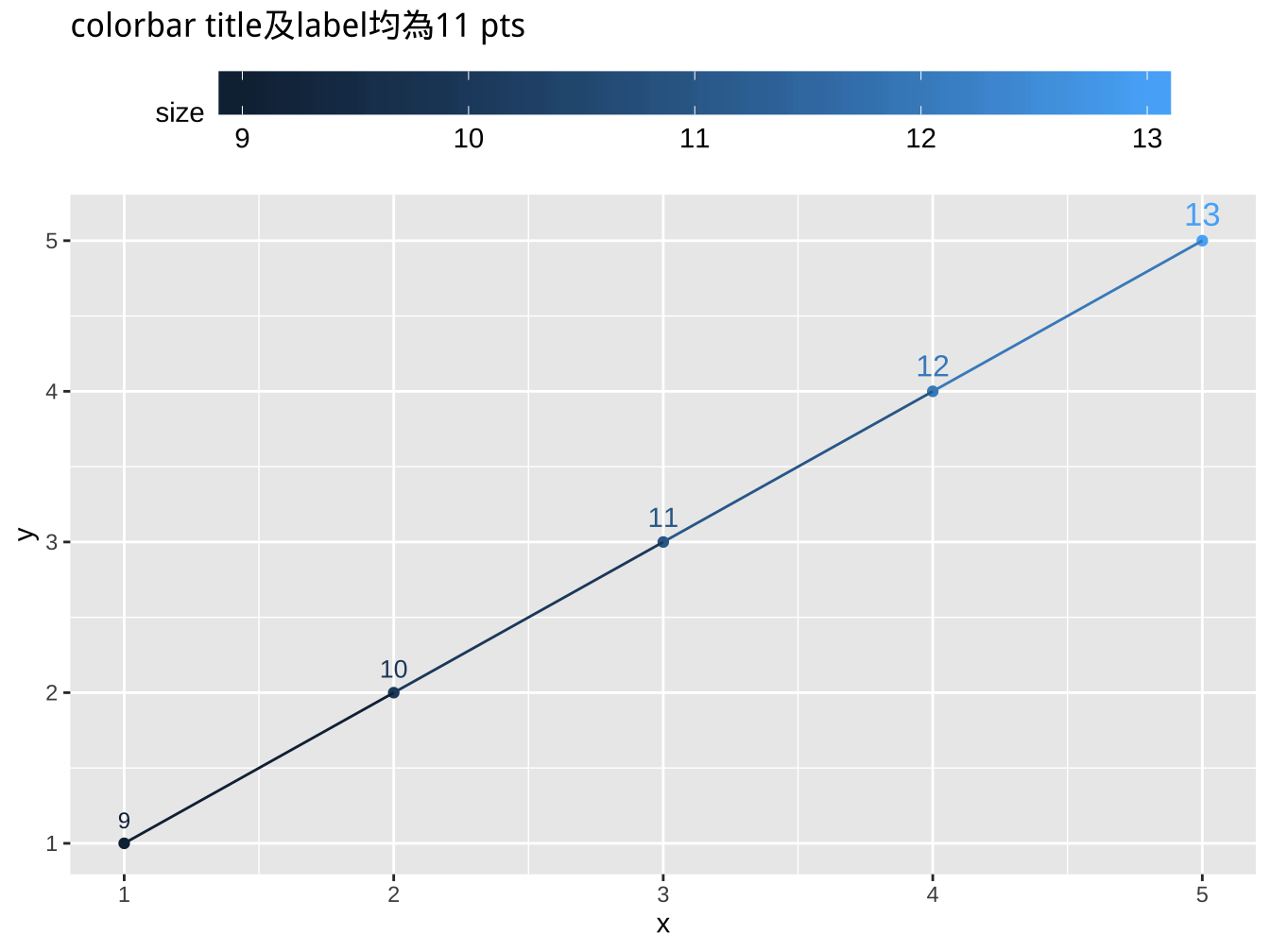
6.4.3 pt
字體多以此為單位。
圖面的基本font size即base_size=11(見https://ggplot2.tidyverse.org/reference/ggtheme.html)
不同地方的size單位不同,要細讀說明:
geom_text: size 1 = 1 mm
element_text: size 1 = 1 pt
1 mm / .pt = 1 pt
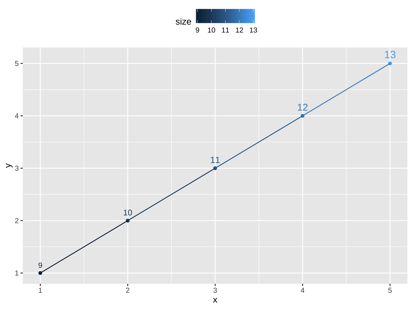
p_npc0+
  geom_text(
    aes(label=size,size=I(size/.pt)), # /.pt讓值為pt值
    vjust=0, nudge_y=0.1
  )+
  theme_grey(
    base_size=11,
  )+
  theme(
    legend.position = "top",
  ) -> p_base11

p_base11 +
  guides(
    color=guide_colorbar(
      label.theme = element_text(
        size=11
      ),
      title.theme = element_text(
        size=11
      ),
      barwidth = unit(1,"snpc")
    ),
    size="none"
  )+
  labs(
    title="colorbar title及label均為11 pts"
  )
6.4.4 lines
- 字體行高。以base_size為1。
p_npc0+
  geom_text(
    aes(label=size,size=I(size/.pt)), # /.pt讓值為pt值
    vjust=0, nudge_y=0.1
  )+
  theme_grey(
    base_size=11,
  )+
  theme(
    legend.position = "top",
  ) -> p_base11

p_base11+
  guides(
    color=guide_colorbar(
      title.theme = element_text(size=11),
      barwidth = unit(5,"lines")
    )
  )
6.4.5 Guidelines
字體以pt為主,並相對於base_size。
非文字配置,視所要感受:
相對於所要對應之字體
相對於viewport
6.5 Customize your graph
4.5 The grid package, from Mastering Software Development in R:
- Especially, 4.5.5 The gridExtra package