12.16 岭线图
ggridges 包,于淼 对此图形的来龙去脉做了比较系统的阐述,详见统计之都主站文章叠嶂图的前世今生
library(ggridges)
ggplot(lincoln_weather, aes(x = `Mean Temperature [F]`, y = Month, fill = stat(x))) +
  geom_density_ridges_gradient(scale = 3, rel_min_height = 0.01, gradient_lwd = 1.) +
  scale_x_continuous(expand = c(0, 0)) +
  scale_y_discrete(expand = expansion(mult = c(0.01, 0.25))) +
  scale_fill_viridis_c(name = "Temp. [F]", option = "C") +
  labs(
    title = 'Temperatures in Lincoln NE',
    subtitle = 'Mean temperatures (Fahrenheit) by month for 2016'
  ) +
  theme_ridges(font_size = 13, grid = TRUE) +
  theme(axis.title.y = element_blank())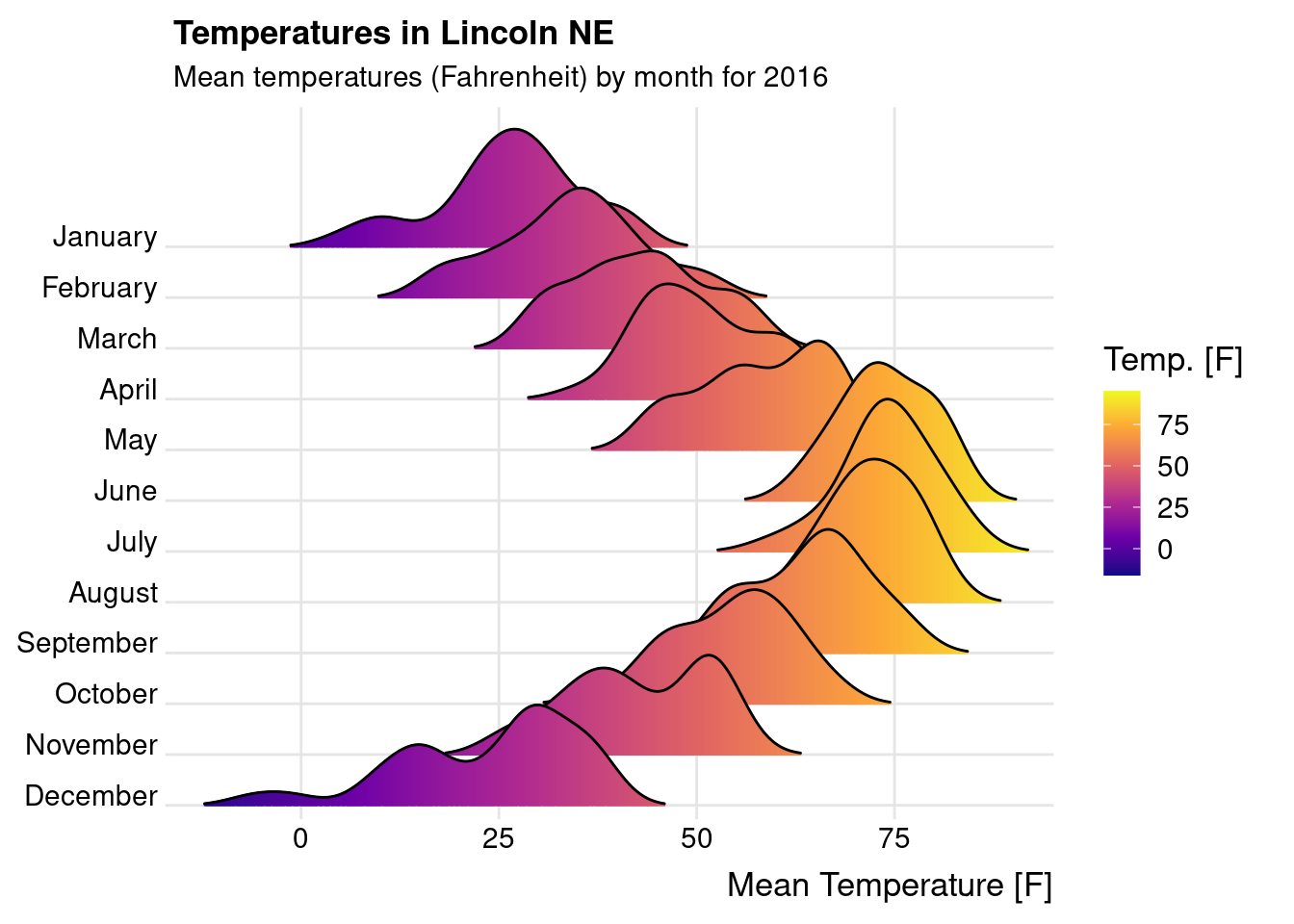
图 12.55: 2016年在内布拉斯加州林肯市的天气变化
通过数据可视化的手段帮助肉眼检查两组数据的分布
p1 <- ggplot(sleep, aes(x = extra, y = group, fill = group)) +
  geom_density_ridges() +
  theme_ridges()

p2 <- ggplot(diamonds, aes(x = price, y = color, fill = color)) +
  geom_density_ridges() +
  theme_ridges()

p1 / p2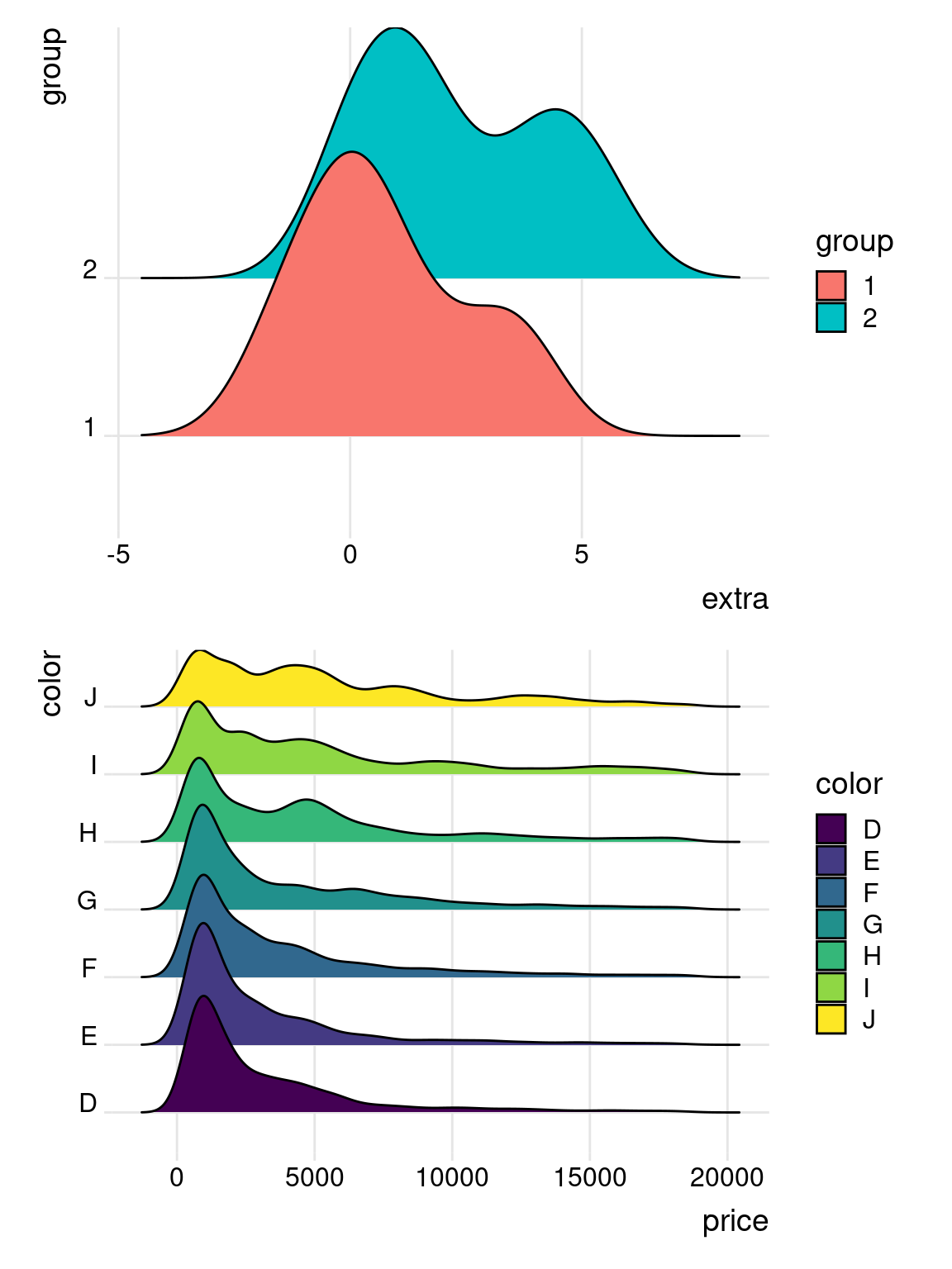
图 12.56: 比较数据的分布
ridgeline 提供 Base R 绘图方案
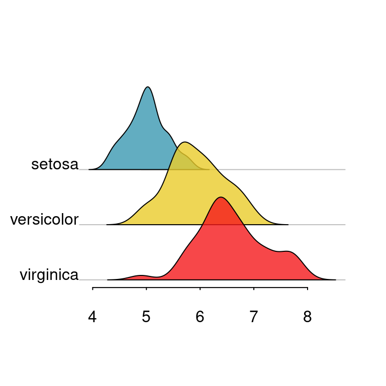
图 12.57: 岭线图