Chapter 3 Reactivity
Until now, we’ve only created static shiny apps, this was a necessary step to apprehend the fundamental shiny process. Throughout this chapter, we’ll focus on what makes Shiny really shine, in one word : Reactivity. Reactivty in Shiny can be defined as a flow between two or more R objects in which the state of one element trigger in a specified direction the behavior of one or several other elements. Generally, in Shiny, R objects react to inputs. There are many type of them, we’ll cover the most frequent.
3.1 Numeric Input
Suppose that we want to create a Shiny app that displays the distribution of the hwy variable from the mpg data frame (recall that the mpg object is attached to the ggplot2 package), and give the user the ability to choose the number of bins used to group the values in a histogram. We need an input from the user right ? as such we’ll use the shiny *Input() family functions. But wait a second, in order to get this input, we have to provide some space on our application allowing the user to introduce the value representing the number of bins. Therefore, it’s obvious that the *Input() functions will be coded inside the ui (user interface) object of our shiny app.
Too much talking, let’s dive into an example. Which *Input() function would be appropriate ? let us think loudly. The user will provide a numeric input, therefore we have to use the numericInput() function !
Similarly to the __*Output()__ functions, numericInput() must contain a unique identifier. The function has also two other mandatory arguments. A label which allows us to frame some description above the input and a value argument used to specify a default value, here the default number of bins.
library(shiny)

ui <- fluidPage(

  numericInput(inputId = "number_of_bins",
            label = "Choose wisely the number of bins",
            value = 10),

  plotOutput(outputId = "our_first_reactive_plot")

)

server <- function(input, output) {}


shinyApp(ui = ui, server = server)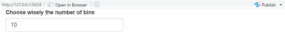
Now, let’s implement the histogram. In order to create a reactive flow between the chosen number of bins and the histogram, we must follow these two steps:
- Collecting the input: this is done using the following coding:
input$<id of the input>, - Incorporating the collected input within the relevant argument within the relevant function.
library(shiny)
library(ggplot2)

ui <- fluidPage(

  numericInput(inputId = "number_of_bins",
            label = "Choose wisely the number of bins",
            value = 10, min = 0, max = 100, step = 10),

  plotOutput(outputId = "our_first_reactive_plot")

)

server <- function(input, output) {


output$our_first_reactive_plot <- renderPlot({

  ggplot(mpg, aes(x = hwy)) +
    geom_histogram(bins = input$number_of_bins) # collecting and incorporating

})

}

shinyApp(ui = ui, server = server)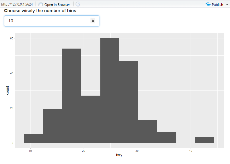
3.1.1 Exercices
Add the width argument inside
numericInput()the and set it equal to “500px” (px stands for pixels), what happens when you run the app ?Now add the min, max and step arguments and introduce respectively these values: 0, 100, 10. Run the app and try to change the number of bins, what do you observe ? with min equal to 0, is it possible to specify a negative value ?
3.2 Slider Input
Another way to get a numeric value from the user is the use of sliders. In shiny it’s extremely simple to create well designed slider widgets, further they take closely the same mandatory arguments as numericInput():
library(shiny)
library(ggplot2)

ui <- fluidPage(

  sliderInput(inputId = "number_of_bins",
            label = "Choose wisely the number of bins",
            value = 10, min = 0, max = 100, step = 10),

  plotOutput(outputId = "our_first_reactive_plot")

)

server <- function(input, output) {


output$our_first_reactive_plot <- renderPlot({

  ggplot(mpg, aes(x = hwy)) +
    geom_histogram(bins = input$number_of_bins) # collecting and incorporating

})

}

shinyApp(ui = ui, server = server)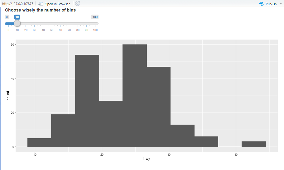
sliderInput() and numericInput() work similarly the same way but sliderInput() has one advantage. Indeed the slider widget offers you the possibility to collect two numeric values. This simply done by specifying a length-2 vector inside the value argument. Let’s create a simple app that print the two selected values from the slider.
library(shiny)
library(ggplot2)

ui <- fluidPage(

  sliderInput(inputId = "slider_two",
            label = "The slider widget takes an interval of values",
            value = c(10, 20), min = 0, max = 100, step = 10, animate = T),

  verbatimTextOutput(outputId = "slider_values")

)

server <- function(input, output) {


output$slider_values <- renderPrint({

  paste("The first value is ", input$slider_two[1], " and the second value is ", input$slider_two[2])


})


}

shinyApp(ui = ui, server = server)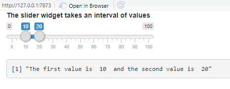
3.2.1 Exercice
- Add animate = T inside
sliderInput(), run the app then click on the triangle button next to the slider. You will see something cool happening. - How can one remove the ticks from the slider ?
3.3 Text Input
The next step in the elaboration of our plotting application would be to allow the user to provide a title to the plot. The title is a text, as such we use the textInput()function. Then we proceed exactly the same way as we did previously. We collect the input within the server and we incorporate it inside the relevant function.
library(shiny)
library(ggplot2)

ui <- fluidPage(

  numericInput(inputId = "number_of_bins",
            label = "Choose wisely the number of bins",
            value = 10),
  textInput(inputId = "plot_title",
            label = "Write your title here please"),

  plotOutput(outputId = "our_first_reactive_plot")

)

server <- function(input, output) {


output$our_first_reactive_plot <- renderPlot({

  ggplot(mpg, aes(x = hwy)) +
    geom_histogram(bins = input$number_of_bins) +
    ggtitle(input$plot_title) # collecting, incorporating

})

}

shinyApp(ui = ui, server = server)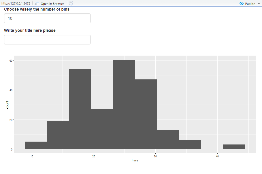
Now the user has just to write the title and it will be automatically displayed on the plot. What’s really interesting here is that if we leave the input title blank, Shiny will consider it as an empty string and won’t display anything. Unlike the numericInput() function, textInput() doesn’t require a mandatory default value.
3.3.1 Exercice
- Inside
textInput()provide any character value to the placeholder argument, run the app and see what happens. - Is it possible to include a default title to our plot ?
In the same way, we can collect the x-axis and the y-axis titles from the user and display them. Before taking at look at the code below, try to do it yourself.
library(shiny)
library(ggplot2)

ui <- fluidPage(

  numericInput(inputId = "number_of_bins",
            label = "Choose wisely the number of bins",
            value = 10),
  textInput(inputId = "plot_title",
            label = "Write your title here please"),

  textInput(inputId = "x_axis_title",
            label = "Your x-axis title"),

  textInput(inputId = "y_axis_title",
            label = "Your y-axis title"),

  plotOutput(outputId = "our_first_reactive_plot")

)

server <- function(input, output) {


output$our_first_reactive_plot <- renderPlot({

  ggplot(mpg, aes(x = hwy)) +
    geom_histogram(bins = input$number_of_bins) +
    ggtitle(input$plot_title) +
    xlab(input$x_axis_title) +
    ylab(input$y_axis_title)
})

}

shinyApp(ui = ui, server = server)
3.4 Select Input
The above application is cool but it’s limited to plotting only one variable which is hwy. What if we could choose the variable to plot ? that would greatly improve the value added of the app. In order to achieve that the Shiny package has the selectInput() function. You provide a unique id, a label and a set of choices, in our cases the names of the quantitative (it’s a histogram) variables to plot. The mpg data frame is quite simple, we can provide the variables’ list manually.
The conception phase is straightforward however if we want to reproduce the previous ggplot2 plot, we’ll get an error. Why ? simply because ggplot2 (and broadly the tidyverse packages) use a special type of coding that relies on non-standard evaluation. I’ll not dig into details but I’ll provide two explicit examples:
- Case 1. This works:
ggplot(mpg, aes(x = hwy)) +
geom_histogram()- Case 2. This doesn’t work:
ggplot(mpg, aes(x = "hwy")) +
  geom_histogram()
Remember that the choices argument would contain a character vector (the names of the variables). As such, we’ll be stuck in the above Case 2. Hopefully, ggplot2 provides a function that does the trick. Instead of using aes(), we use aes_string(). Now, the user can choose which variable to plot:
library(shiny)
library(ggplot2)


ui <- fluidPage(


  selectInput(inputId = "the_variable_to_plot",
              label = "choose wisely your variable",
              choices = c("displ", "cty", "hwy")),

  plotOutput(outputId = "our_first_reactive_plot")

)

server <- function(input, output) {

output$our_first_reactive_plot <- renderPlot({


  ggplot(mpg, aes_string(x = input$the_variable_to_plot)) +
    geom_histogram()

})

}


shinyApp(ui = ui, server = server)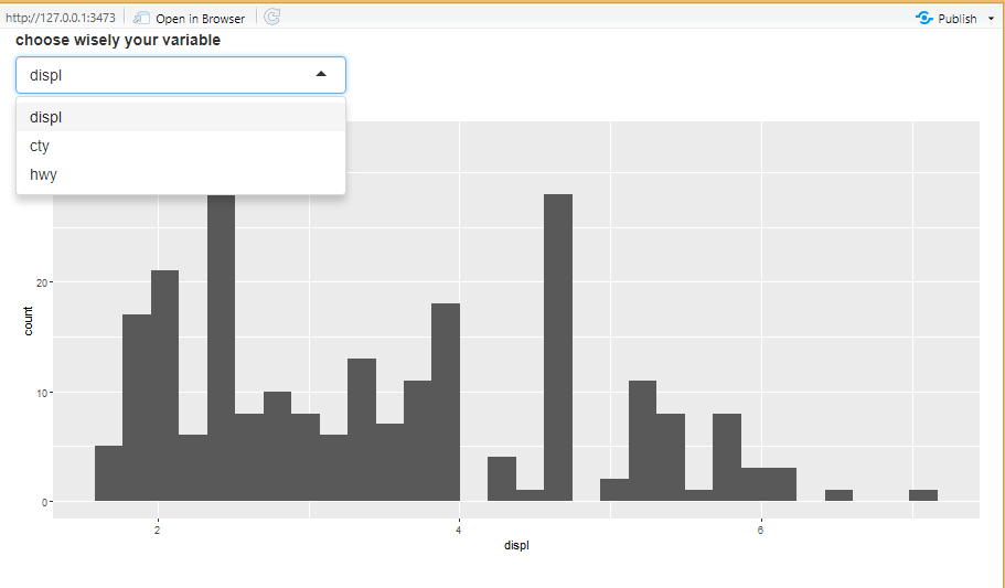
3.4.1 Exercice
Add
selectize = Fandsize = 3toselectInput(), run the app and see what happens.Recreate the same plot, this time using the mtcars R built-in data frame. Is to possible to display the names of the quantitative variables in a functional manner (not manually) ?
3.5 Color Input
In the following section, we’re going to see how to create a Shiny app in which the user can choose the color of the plot. We can do that using the TextInput() function in which the user can type the desired color.
library(shiny)
library(ggplot2)


ui <- fluidPage(

  textInput(inputId = "the_color",
            label = "Choose a nice color please",
            value = "red"), # The default color

  plotOutput(outputId = "the_plot")

)

server <- function(input, output) {

output$the_plot <- renderPlot({


  ggplot(mpg, aes(x = hwy)) +
    geom_histogram(fill = input$the_color)

})

}


shinyApp(ui = ui, server = server)
Now, if we change the color name, the histogram’s color gets updated accordingly but what if the user has an exotic color in mind with a weird name that he doesn’t remember, for example the indianred or the moccasin colors (nice but difficult to remember). In this case, there is cool package developed by [Dean Attali] (https://deanattali.com/), called colourpicker. The package allows the user to choose interactively the color of his choice.
library(shiny)
library(ggplot2)
library(colourpicker) # do not forget to install it.


ui <- fluidPage(

  colourInput(inputId = "interactive_color",
              label = "Choose the color in a cool way ! ",
              value = "red"), # The default color

  plotOutput(outputId = "the_plot")

)

server <- function(input, output) {

output$the_plot <- renderPlot({


  ggplot(mpg, aes(x = hwy)) +
    geom_histogram(fill = input$interactive_color)

})

}


shinyApp(ui = ui, server = server)
3.5.1 Exercice
Try to remove the value argument for the default color and run the app, what do you observe ?
Add the following argument
palette = "limited"to thecolourInput()function and run the app. What is the purpose of this argument ?
3.6 File Input
We’ve seen how implement functions that allow the user to choose the number of bins in a histogram, introduce titles, choose the variables to plot, let’s dive into a more sophisticated app that allows the user to upload a csv data frame and print its first 10 rows.
To do so, we first create a button that will give the user the ability to upload a file. In our case a csv file. This is done in the ui using the fileInput() function.
library(shiny)

ui <- fluidPage(


fileInput(inputId = "the_file",
          label = "Upload your file here please",
          accept = c("csv/text", ".csv", "text/comma-separated-values"))

)

server <- function(input, output) {}

shinyApp(ui = ui, server = server)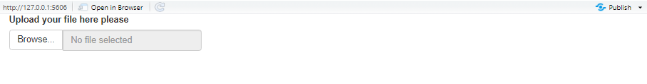
Now, we need to read the csv file in order to exploit it. We can use read.csv() base R or read_csv() from the readr package or fread() from the data.table package (you have many choices). Let’s keep it simple and use base R read.csv(). Inside the function, we must collect the input (the file) not only from the ui but also from the operating system because the file is external to the app. Therefore, we’ll add the datapath extension as follows: read.csv(input$the_file$datapath):
library(shiny)

ui <- fluidPage(


fileInput(inputId = "the_file",
          label = "Upload your file here please",
          accept = c("csv/text", ".csv", "text/comma-separated-values")),

tableOutput(outputId = "table1")

)

server <- function(input, output) {

output$table1 <- renderTable({


df <- read.csv(input$the_file$datapath)

head(df, n = 10)

})


}

shinyApp(ui = ui, server = server)
When you run the above application, it works however it throw an error at the beginning, simply because when Shiny is launched it will immediately look for the csv file before the user has uploaded it. We deal with this issue using the Shiny req() function. This function kindly asks the server to wait until the user has provided the input.
library(shiny)

ui <- fluidPage(


fileInput(inputId = "the_file",
          label = "Upload your file here please",
          accept = c("csv/text", ".csv", "text/comma-separated-values")),

tableOutput(outputId = "table1")

)

server <- function(input, output) {

output$table1 <- renderTable({

req(input$the_file) # Do not read the file until it is provided.

df <- read.csv(input$the_file$datapath)

head(df, n = 10)

})


}

shinyApp(ui = ui, server = server)
3.6.1 Exercices
- Create a Shiny application that reads an Excel (.xls or .xlsx) file and print its first 20 rows.
3.7 Date Input
Using the dateInput() from the Shiny package, the user can choose from a range of dates. This is particularly useful when working with time series data. To give a practical example, let’s create a data frame with a date and a value column.
library(tibble)## Warning: package 'tibble' was built under R version 4.0.3date <- seq(as.Date('2020-01-01'), as.Date('2020-12-31'), by = "1 day")
value <- rnorm(366)
df <- tibble(date = date, value = value )
head(df)## # A tibble: 6 x 2
## date value
## <date> <dbl>
## 1 2020-01-01 -0.937
## 2 2020-01-02 0.608
## 3 2020-01-03 -0.384
## 4 2020-01-04 1.11
## 5 2020-01-05 0.773
## 6 2020-01-06 -1.28Imagine that we want to create a Shiny app that displays a line plot of our data in which the user can specify a range of dates to visualize. This is possible thanks to the dateInput() function. In our case, we want to choose a range of dates, therefore we’ll implement the dateInput() function twice.
library(shiny)
library(dplyr)
library(ggplot2)

ui <- fluidPage(

# First date ------------------------------------------
dateInput(inputId = "date1",
          label = "Choose the first date",
          format = "yyyy-mm-dd",
          value = min(df$date),
          startview = "month"),

# Second date -----------------------------------------

dateInput(inputId = "date2",
          label = "Choose the last date",
          format = "yyyy-mm-dd",
          value = max(df$date),
          startview = "month"),

# The plot -------------------------------------------

plotOutput(outputId = "ts_plot")

)

server <- function(input, output) {


output$ts_plot <- renderPlot(

df %>% filter(between(date, input$date1, input$date2)) %>%
 ggplot(aes(x = date, y = value)) +
  geom_line()

)


}

shinyApp(ui = ui, server = server)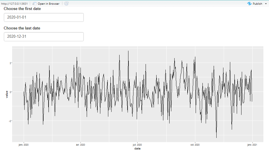
But wait, the above code is quite cumbersome and allowing the user to select a range of time is a feature that is so frequent that the Shiny team has incorporated the dateRangeInput() function. No need to create two dateInput widgets.
library(shiny)
library(dplyr)
library(ggplot2)

ui <- fluidPage(

dateRangeInput(inputId = "daterange",
               label = "Choose a date range",
               start = "2020-01-01",
               end = "2020-12-31",
               startview = "month"),

# The plot -------------------------------------------

plotOutput(outputId = "ts_plot")

)

server <- function(input, output) {

output$ts_plot <- renderPlot(

df %>% filter(between(date, input$daterange[1],input$daterange[2])) %>%
 ggplot(aes(x = date, y = value)) +
  geom_line()

)

}

shinyApp(ui = ui, server = server)
Run the above application and play a little bit with the dates.
3.7.1 Exercices
You’re wondering what the startview does, replace
"month"with"year"and observe the difference.Create an application in which the user can visualize the observations after a specific date.