The Uniform Crime Reporting (UCR) Program generates reliable statistics for use in law enforcement. It also provides information for students of criminal justice, researchers, the media, and the public. The program has been providing crime statistics since 1930.
The UCR Program includes data from more than 18,000 city, university and college, county, state, tribal, and federal law enforcement agencies. Agencies participate voluntarily and submit their crime data either through a state UCR program or directly to the FBI’s UCR Program.
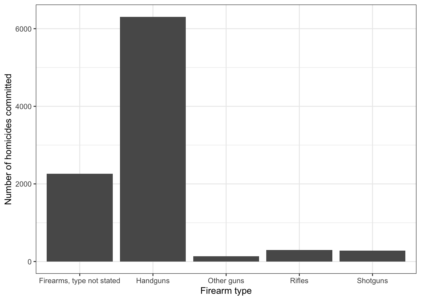
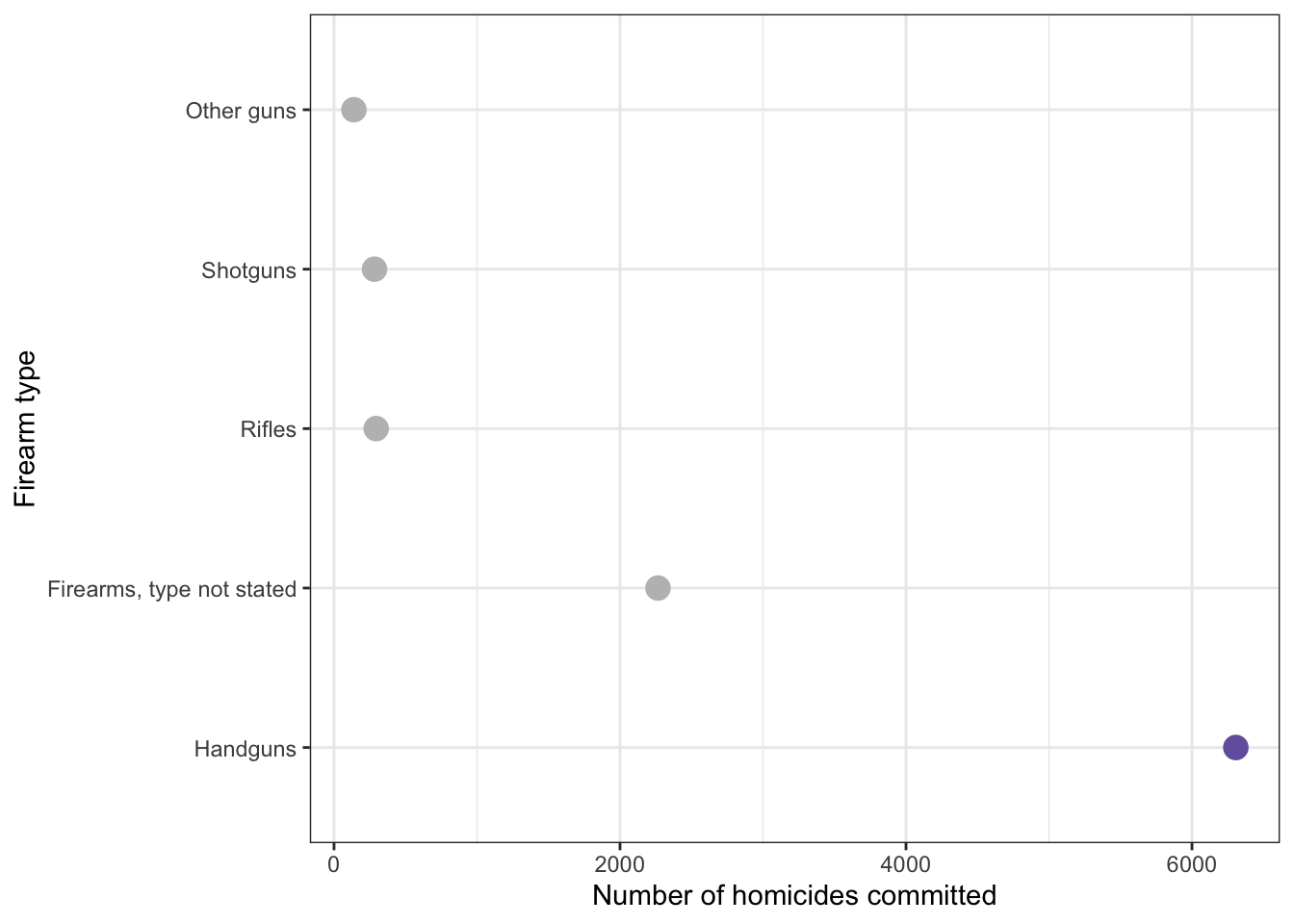
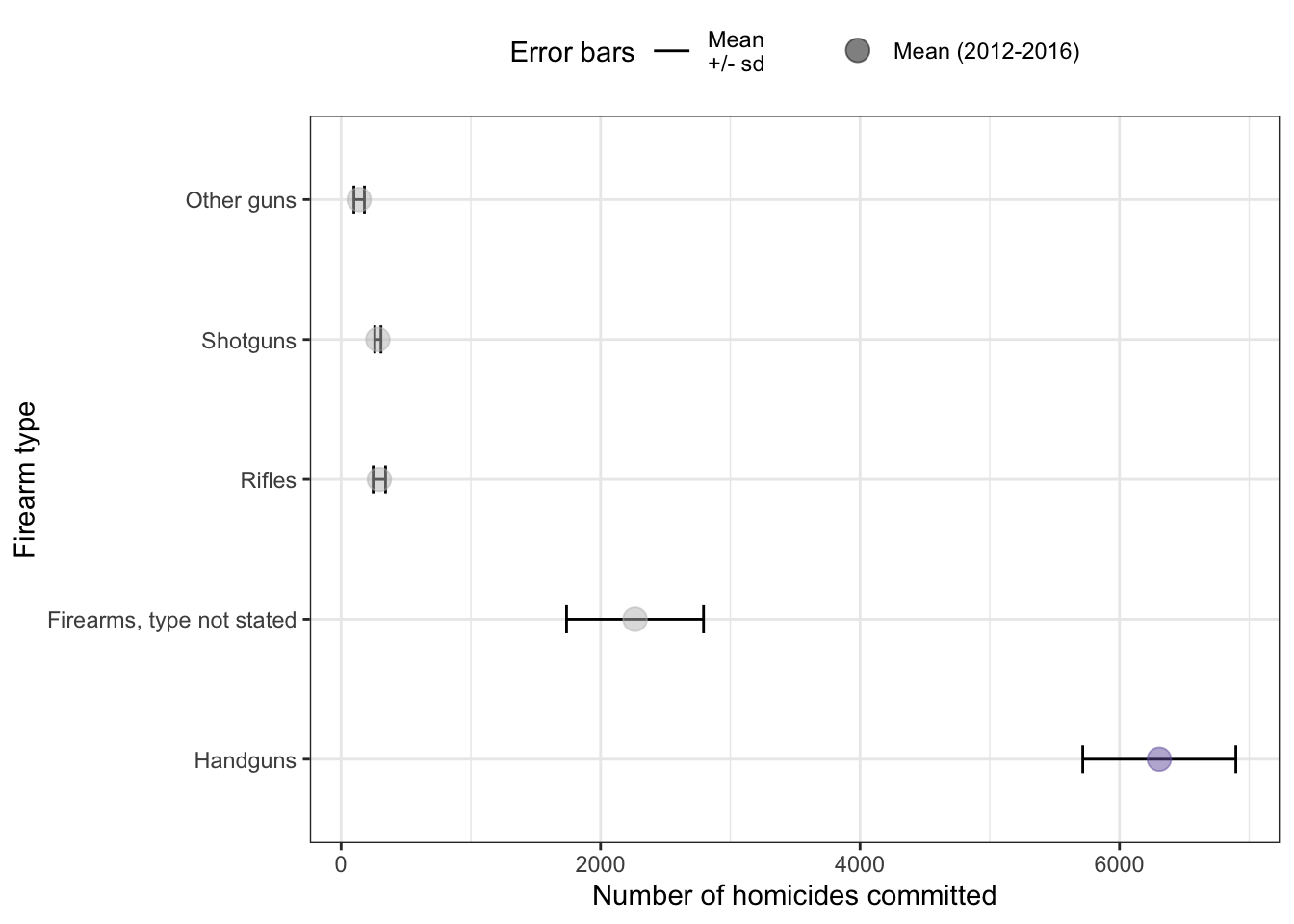
Figure 4: Handguns were the most widely used type of gun for homicide in 2016.
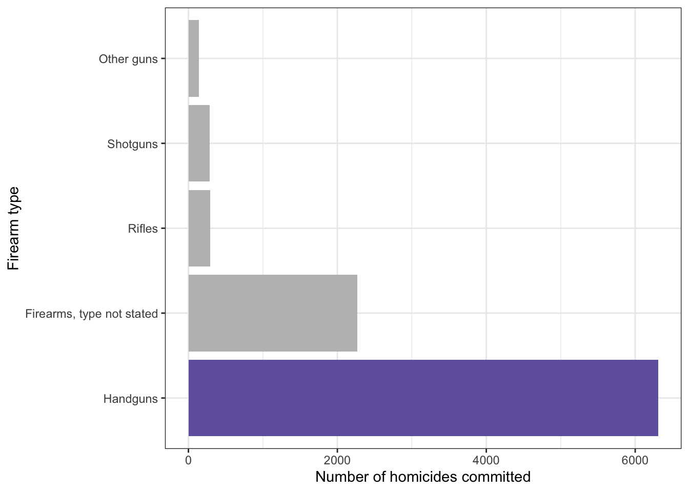
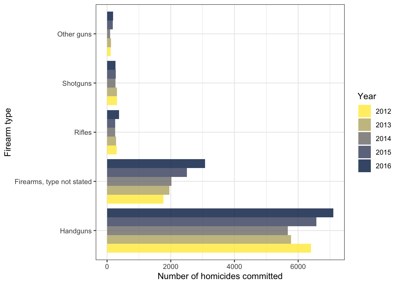
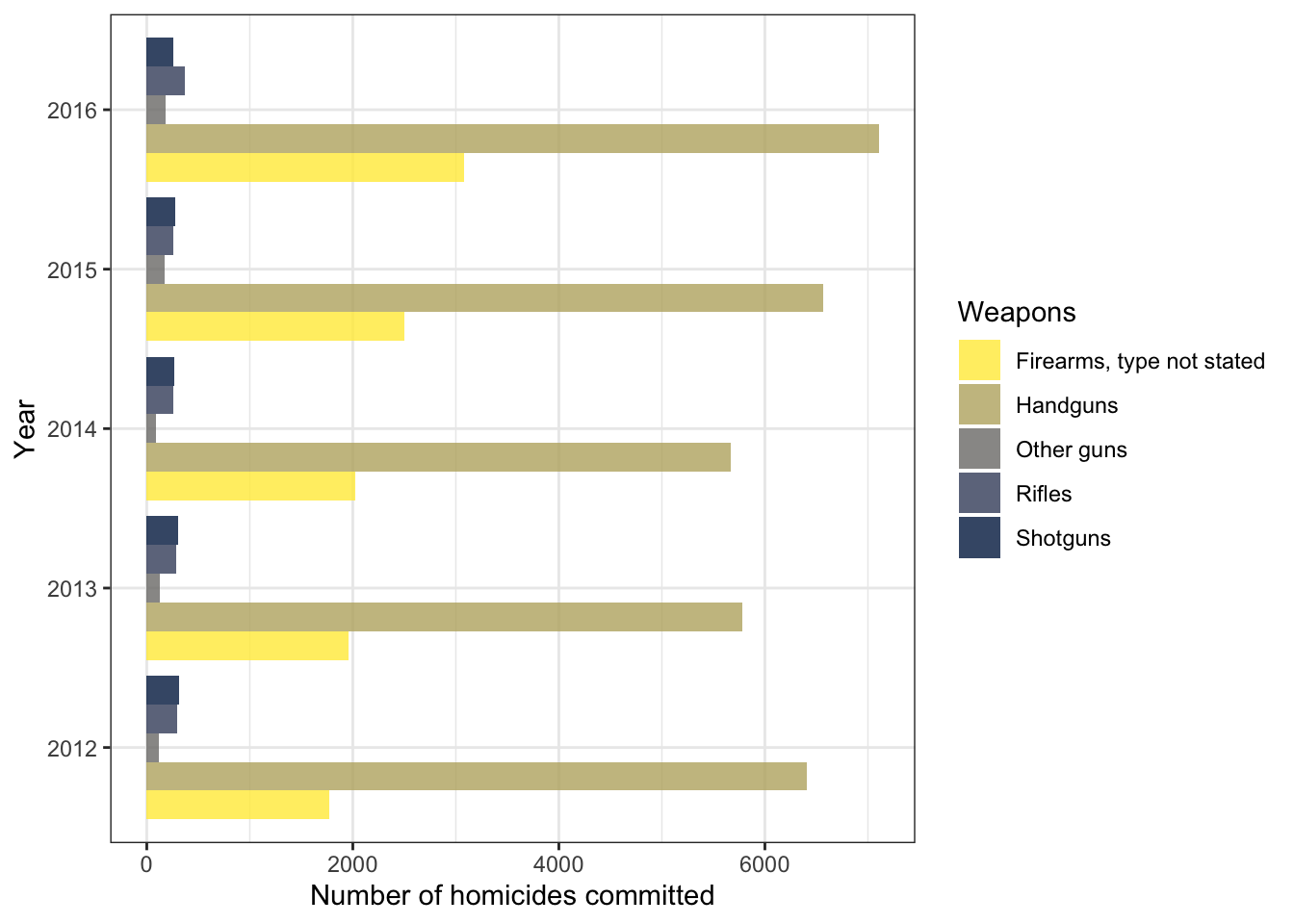
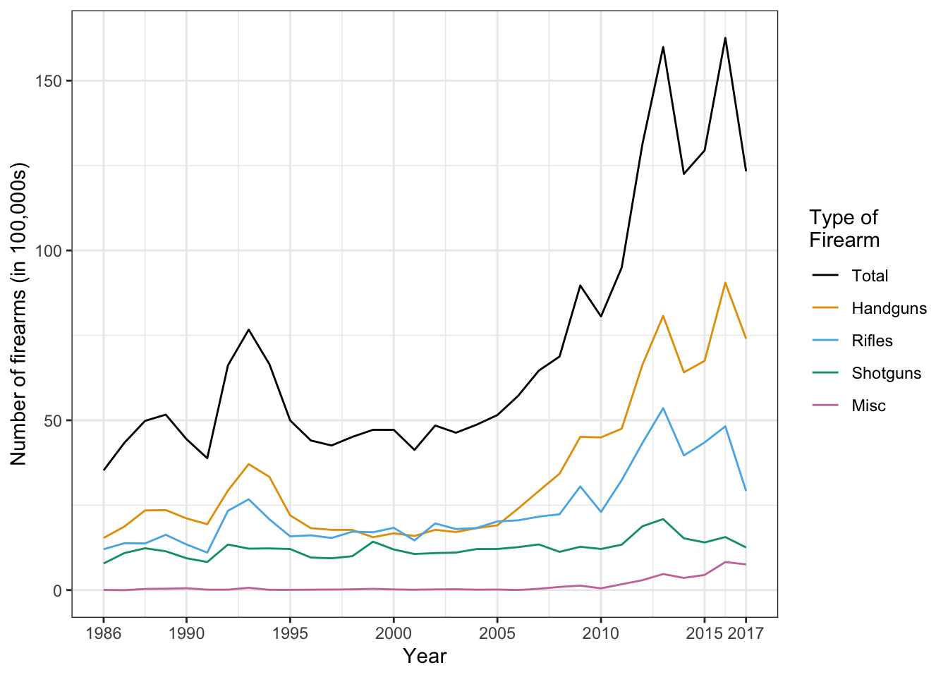
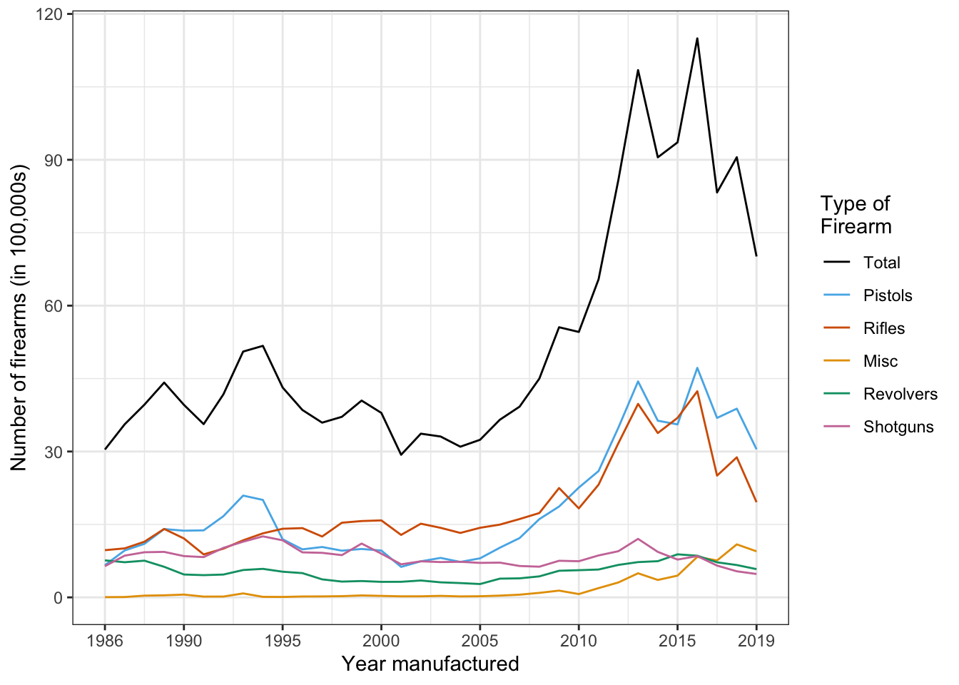
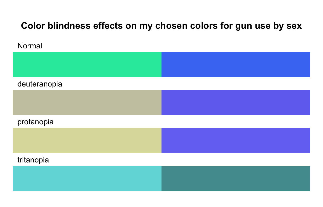
Gun manufacturers play an essential role: Figure 5 and 6.
3.3 Resources & Chapter Outline
3.3.1 Data, codebook, and R packages
Resource 3.1 : Data, codebook, and R packages for data visualization
Harris provides the “total_firearms_manufactured_US_1990to2015.csv” file with firearm production in the US from 1990-2015 but did not mention the source. I have looked around on the web and reported the results of my research in Section 3.3.2.1.
Harris lists the older {httr} package, but now there is {httr2}, “a modern re-imagining of {httr} that uses a pipe-based interface and solves more of the problems that API wrapping packages face.” (See Section A.40)
The {httr} package is in the book just used for downloading the excel file from the FBI website. For this specific task there is no need to download, to install and to learn a new package. You can use utils::download.file(), a function as I have it already applied successfully in Listing / Output 2.1.
There are different sources of data for this chapter. A special case are the data provided by Harris about guns manufactured in the US between 1990 and 2015. There is no source available because this dataset was not mentioned in the section about “Data, codebook, and R packages” (see: Section 3.3.1). But a Google searched revealed several interesting possible sources:
ATF: The original data are generated and published by the Bureau of Alcohol, Tobacco, Firearms and Explosives (ATF). Scrolling down you will find the header “Annual Firearms Manufacturers And Export Report” (AFMER). But the data are separated by year and only available as a summarized PDF fact sheet. But finally I found in a downloaded .csv file from USAFacts a reference to a PDF file where all the data I am interesting in are listed. To the best of my knowledge there are no better accessible data on the ATF website.
Statista: With a free account of statista it is possible to download Number of firearms manufactured in the United States from 1986 to 2021. But here we are missing the detailed breakdown by type of firearms. Another restriction is that the publication of the data are only allowed if you have a professional or enterprise account, starting with € 199,- per month.
The Trace: Another option is to download the collected data by The Trace, an American non-profit journalism outlet devoted to gun-related news in the United States (Wikipeda). The quoted article is referring to a google spreadsheet where you can access the collected data for the US gun production from 1899 (!) until today.
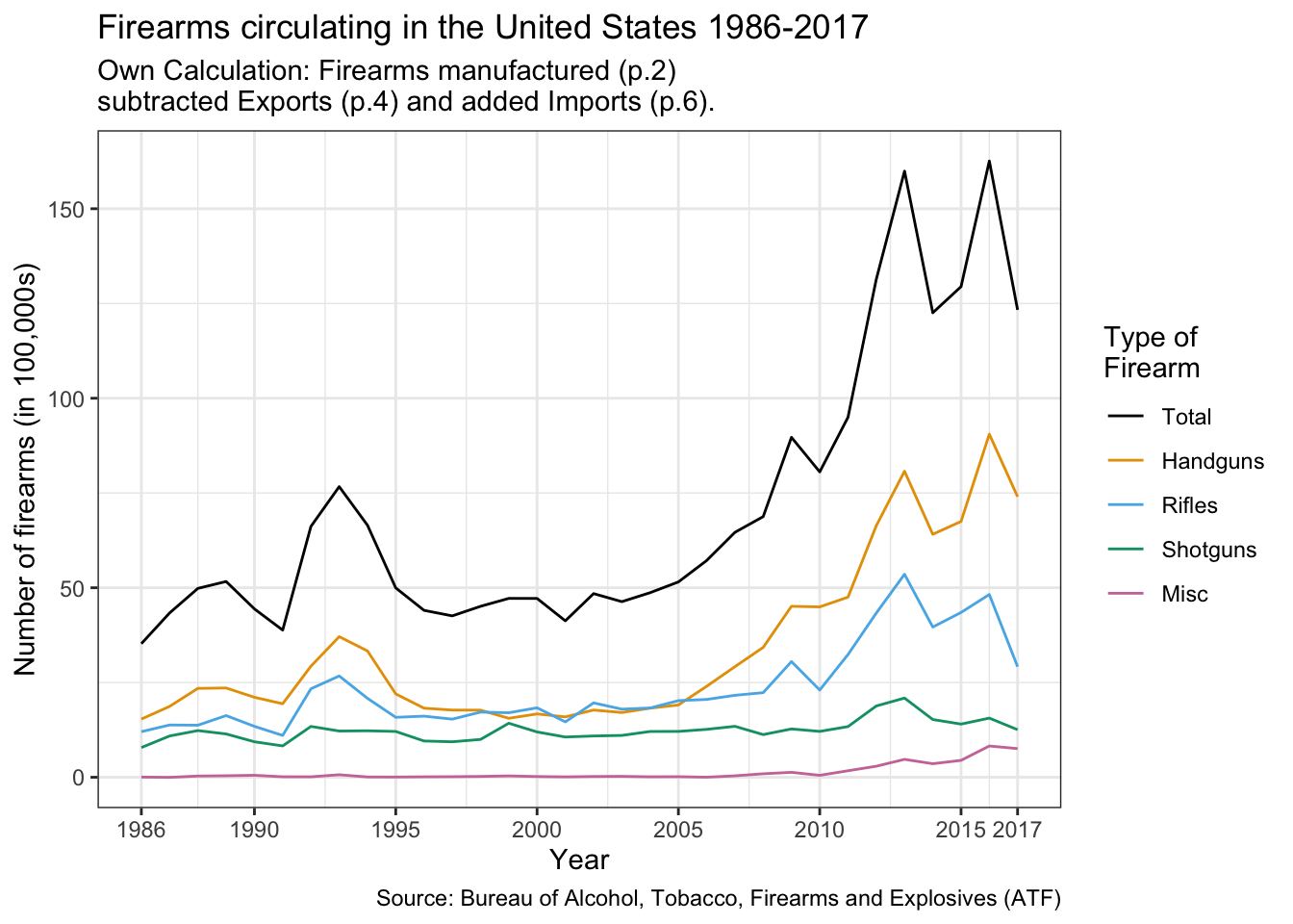
USAFacts: Finally I found the data I was looking for in a easy accessible format to download on the website of USAFacts.org, a not-for-profit organization and website that provides data and reports on the United States population, its government’s finances, and government’s impact on society.(Wikipedia). The data range from 1986 to 2019 and they are based on the original ATF data from the PDF report. They are higher than the data provided by Harris because the include exports. The AFMER report excludes production for the U.S. military but includes also firearms purchased by domestic law enforcement agencies.
But even if you have data of manufactured, exported and imported guns, this does not provide the exact numbers of guns circulating in the US:
Although a few data points are consistently collected, there is a clear lack of data on firearms in the US. It is impossible, for instance, to know the total number of firearms owned in the United States, or how many guns were bought in the past year, or what the most commonly owned firearms are. Instead, Americans are left to draw limited conclusions from available data, such as the number of firearms processed by the National Firearm Administration (NFA), the number of background checks conducted for firearm purchase, and the number of firearms manufactured. However, none of these metrics provide a complete picture because state laws about background checks and gun registration differ widely. (USAFact.org)
Remark 3.1. How to calculate the numbers of circulated guns in the US
If you are interested to research the relationship between gun ownership in the USA and homicides then you would need to reflect how to get a better approximation as the yearly manufactured guns. Besides that not all gun manufacturer have reported their production numbers to the ATF, there is a big difference between gun production and gun sales. Additionally there are some other issues that influence the number of circulated guns in the US. So you have to take into account for instance
the export and import of guns,
that guns fall out of circulation because of broken part, attrition, or illegal exports
As an exercise I have subtracted from the manufactured gun the exported guns and have added the imported firearms. You will find the result in Listing / Output 3.14.
3.3.2.2 Three steps procedure
To get the data for this chapter is a three step procedure:
Procedure 3.1 : How to get data from the internet
My first step is always to go to the website and download the file manually. Some people may believe that this is superfluous, but I think there are three advantages for this preparatory task:
Inspecting the website and checking if the URL is valid and points to the correct dataset.
Checking the file extension
Inspecting the file after downloaded to see if there is something to care about (e.g., the file starts with several lines, that are not data, or other issues).
Download the file using utils::donwload.file().
Read the imported file into R with the appropriate program function, in the first case readxl::read_excel()
R Code 3.1 : Get data from the FBI’s Uniform Crime Reporting database
Code
## run only once (manually)# create a variable that contains the web# URL for the data seturl1<-base::paste0("https://ucr.fbi.gov/crime-in-the-u.s","/2016/crime-in-the-u.s.-2016/tables/","expanded-homicide-data-table-4.xls/output.xls")## code worked in the console## but did not work when rendered in quarto# utils::download.file(url = url1,# destfile = paste0(here::here(),# "/data/chap03/fbi_deaths.xls"),# method = "libcurl",# mode = "wb"# )## the following code line worked but I used {**curl**}# httr::GET(url = url1, # httr::write_disk(# path = base::paste0(here::here(),# "/data/chap03/fbi_deaths.xls",# overwrite = TRUE)# )# )curl::curl_download(url =url1, destfile =paste0(here::here(),"/data/chap03/fbi_deaths.xls"), quiet =TRUE, mode ="wb")fbi_deaths<-tibble::tibble(readxl::read_excel(path =paste0(here::here(), "/data/chap03/fbi_deaths.xls"), sheet =1, skip =3, n_max =18))save_data_file("chap03", fbi_deaths, "fbi_deaths.rds")
Listing / Output 3.1: Get data from the FBI’s Uniform Crime Reporting database
(For this R code chunk is no output available, but you can inspect the data at Listing / Output 3.4.)
In changed the recommended R code by Harris for downloading the FBI Excel Data I in several ways:
Instead of of using {httr}, I tried first with utils::download.file(). This worked in the console (compiling the R code chunk), but did not work when rendered with Quarto. I changed to {curl} and used the curl_download() function which worked in both situations (see: Section A.11).
Instead creating a data frame with base::data.frame() I used a tibble::tibble(). This has the advantage that the column names were not changed. In the original files the column names are years, but in base R is not allowed that column names start with a number. In tidyverse this is possible but you must refer to this column names with enclosed accents like 2016.
Instead of saving the data as an Excel file I think that it is more convenient to store it as an R object with the extension “.rds”. (I believe that Harris saved it in the book only to get the same starting condition with the already downloaded file in the books companion web site.)
R Code 3.2 : Get NHANES data 2011-2012 from the CDC website with {RNHANES}
Code
## run only once (manually)# download audiology data (AUQ_G)# with demographicsnhanes_2012<-RNHANES::nhanes_load_data( file_name ="AUQ_G", year ="2011-2012", demographics =TRUE)save_data_file("chap03", nhanes_2012, "nhanes_2012.rds")
Listing / Output 3.2: Get NHANES data (2011-2012) from the CDC website with {RNHANES}
(For this R code chunk is no output available, but you can inspect the data at Listing / Output 3.5)
{RNHANES} combines as a package specialized to download data from the National Health and Nutrition Examination Survey (NHANES) step 2 and 3 of Procedure 3.1. But as it turned out it only doesn’t work with newer audiology data than 2012. I tried to use the package with data from 2016 and 2018 (For 2014 there are no audiology data available), but I got an error message.
Error in validate_year(year) : Invalid year: 2017-2018
The problem lies in the function RNHANES:::validate_year(). It qualifies in version 1.1.0 only downloads until ‘2013-2014’ as valid:
Conclusion: Special data packages can facilitate your work, but to know how to download data programmatically on your own is an indispensable data science skill.
See tab “NHANES 2018” how this is done.
R Code 3.3 : Get NHANES data 2017-2018 from the CDC website with {haven}
Code
## run only once (manually)# download audiology data (AUQ_J)nhanes_2018<-haven::read_xpt( file ="https://wwwn.cdc.gov/Nchs/Nhanes/2017-2018/AUQ_J.XPT")save_data_file("chap03", nhanes_2018, "nhanes_2018.rds")
Listing / Output 3.3: Get NHANES data 2017-2018 from the CDC website with {haven}
(For this R code chunk is no output available, but you can inspect the data at Listing / Output 3.6.)
The download with {haven} has the additional advantage that the variables are labelled as already explained in Section 1.8.
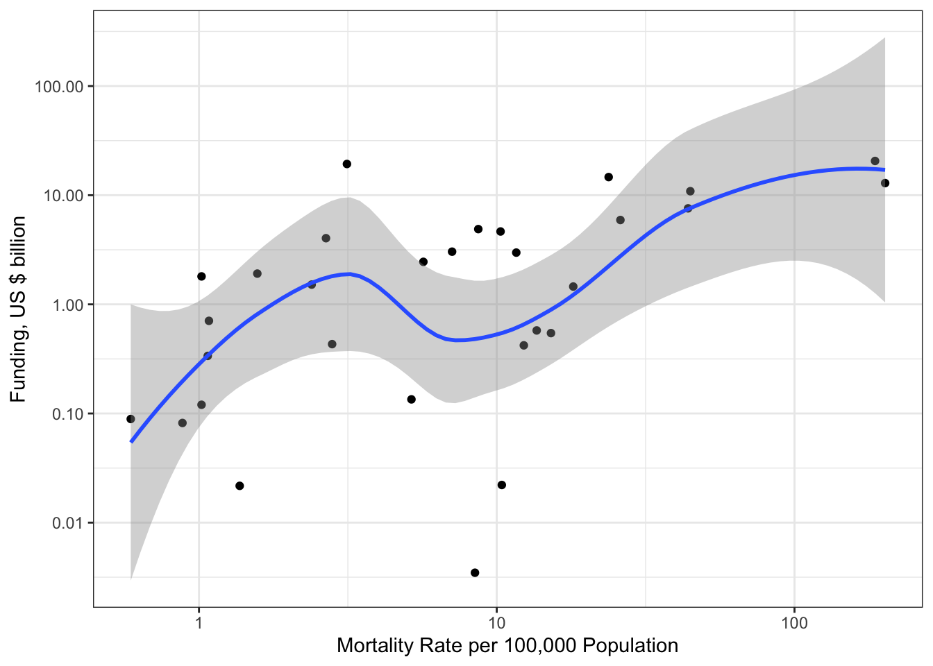
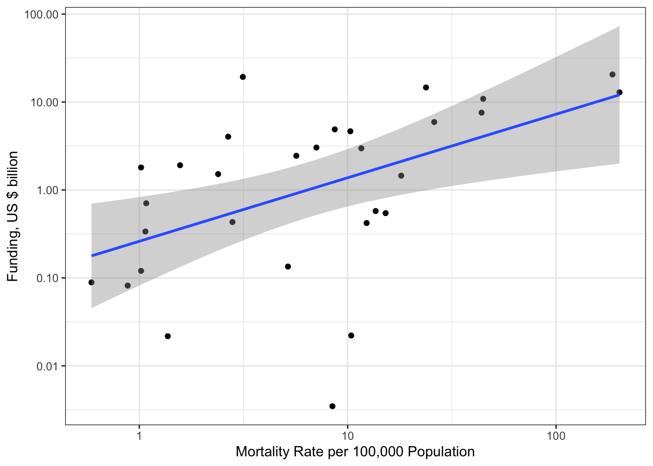
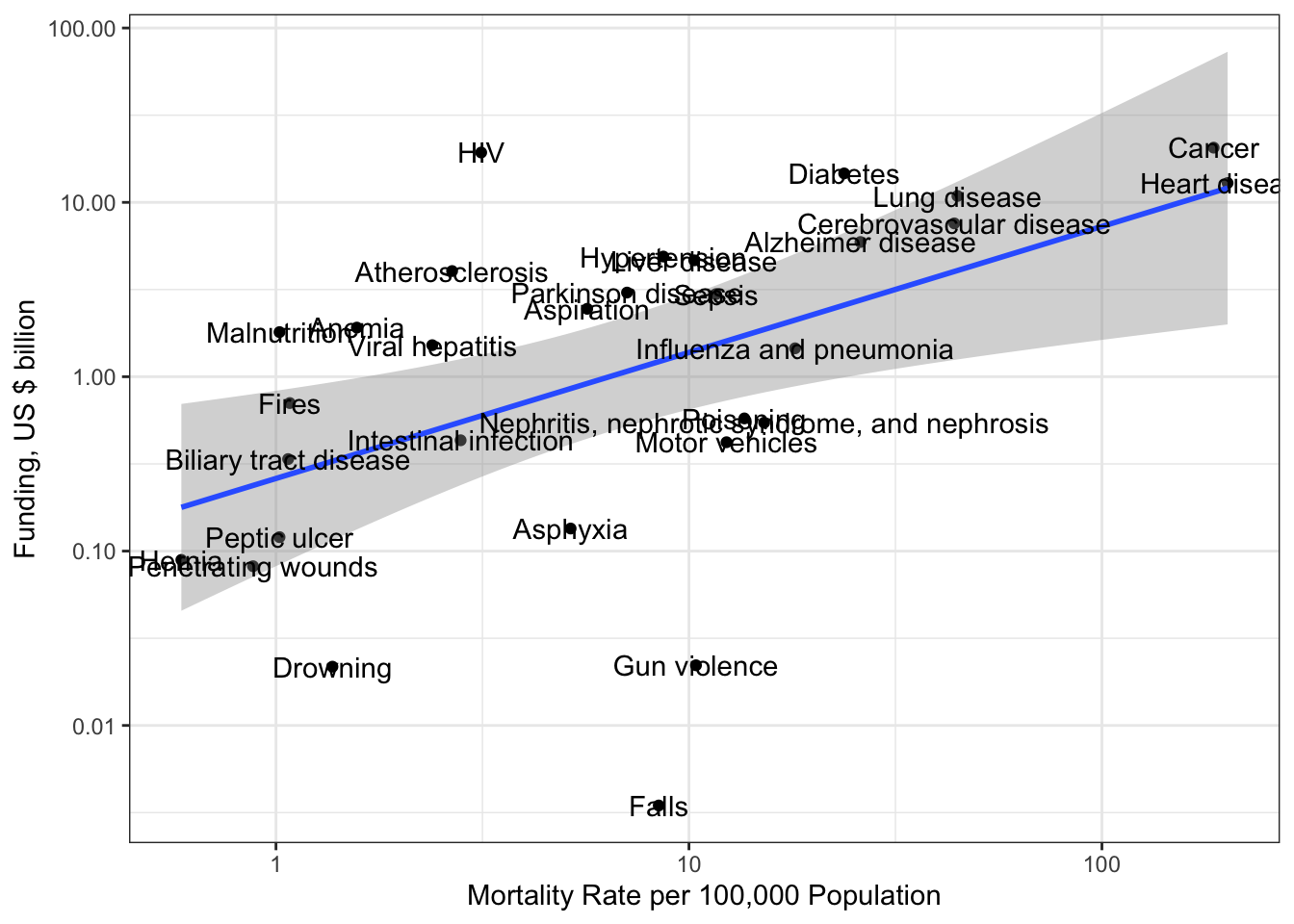
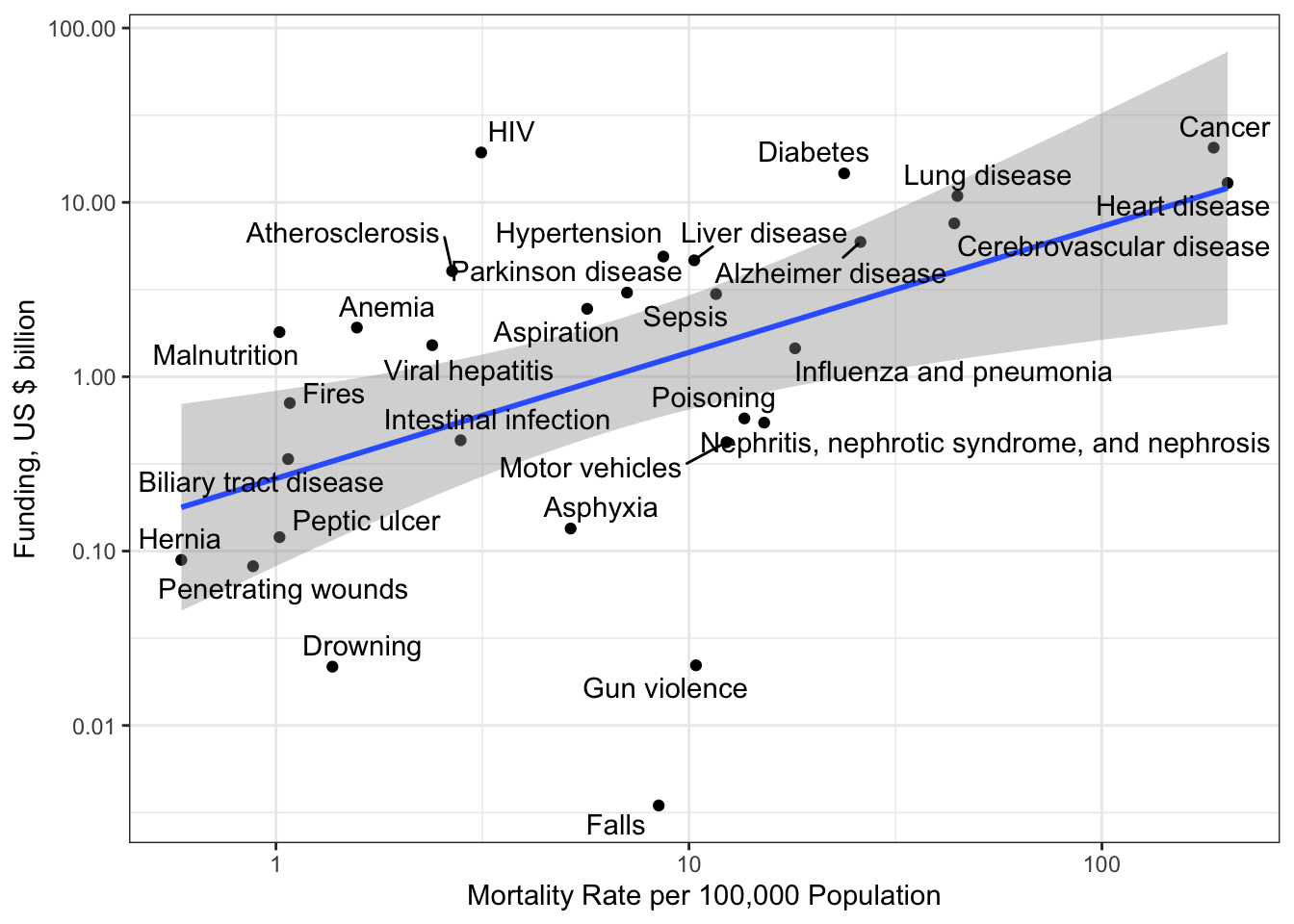
R Code 3.4 : Research funding for different kind of research topics (2004-2015)
(For this R code chunk is no output available, but you can inspect the data at Listing / Output 3.9.)
There are several innovation applied in this R code chunk:
1. First of all I have used the {**tabulizer**} package to scrap the export and import data tables from the original <a class='glossary' title='Bureau of Alcohol, Tobacco, Firearms and Explosives (ATF): ATF’s responsibilities include the investigation and prevention of federal offenses involving the unlawful use, manufacture, and possession of firearms and explosives; acts of arson and bombings; and illegal trafficking of alcohol and tobacco products. The ATF also regulates, via licensing, the sale, possession, and transportation of firearms, ammunition, and explosives in interstate commerce. (ATF)'>ATF</a>-PDF. To make this procedure reproducible I have downloaded the [PDF from the ATF website](https://www.atf.gov/firearms/docs/report/2019-firearms-commerce-report/download) as I assume that this PDF will updated regularily.
WATCH OUT! Read carefully the installation instructions
I have recoded the data in several ways: - I turned the resulted matrices from the {tabulizer} package into tibbles. - Now I could rename all the columns with one name vector. - As the export data end with the year 2017 I had to reduce the import data ans also my original gun manufactured file to this shorter period.
R Code 3.7 : Get and recode guns imported from a PDF by the ATF
#> 'data.frame':    9364 obs. of  81 variables:
#>  $ SEQN      : num  62161 62162 62163 62164 62165 ...
#>  $ cycle     : chr  "2011-2012" "2011-2012" "2011-2012" "2011-2012" ...
#>  $ SDDSRVYR  : num  7 7 7 7 7 7 7 7 7 7 ...
#>  $ RIDSTATR  : num  2 2 2 2 2 2 2 2 2 2 ...
#>  $ RIAGENDR  : num  1 2 1 2 2 1 1 1 1 1 ...
#>  $ RIDAGEYR  : num  22 3 14 44 14 9 6 21 15 14 ...
#>  $ RIDAGEMN  : num  NA NA NA NA NA NA NA NA NA NA ...
#>  $ RIDRETH1  : num  3 1 5 3 4 3 5 5 5 1 ...
#>  $ RIDRETH3  : num  3 1 6 3 4 3 7 6 7 1 ...
#>  $ RIDEXMON  : num  2 1 2 1 2 2 1 1 1 1 ...
#>  $ RIDEXAGY  : num  NA 3 14 NA 14 10 6 NA 15 14 ...
#>  $ RIDEXAGM  : num  NA 41 177 NA 179 120 81 NA 181 175 ...
#>  $ DMQMILIZ  : num  2 NA NA 1 NA NA NA 2 NA NA ...
#>  $ DMQADFC   : num  NA NA NA 2 NA NA NA NA NA NA ...
#>  $ DMDBORN4  : num  1 1 1 1 1 1 1 1 1 1 ...
#>  $ DMDCITZN  : num  1 1 1 1 1 1 1 1 1 1 ...
#>  $ DMDYRSUS  : num  NA NA NA NA NA NA NA NA NA NA ...
#>  $ DMDEDUC3  : num  NA NA 8 NA 7 3 0 NA 9 7 ...
#>  $ DMDEDUC2  : num  3 NA NA 4 NA NA NA 3 NA NA ...
#>  $ DMDMARTL  : num  5 NA NA 1 NA NA NA 5 NA NA ...
#>  $ RIDEXPRG  : num  NA NA NA 2 NA NA NA NA NA NA ...
#>  $ SIALANG   : num  1 1 1 1 1 1 1 1 1 1 ...
#>  $ SIAPROXY  : num  1 1 1 2 1 1 1 2 1 1 ...
#>  $ SIAINTRP  : num  2 2 2 2 2 2 2 1 2 2 ...
#>  $ FIALANG   : num  1 1 1 1 1 1 1 NA 1 2 ...
#>  $ FIAPROXY  : num  2 2 2 2 2 2 2 NA 2 2 ...
#>  $ FIAINTRP  : num  2 2 2 2 2 2 2 NA 2 2 ...
#>  $ MIALANG   : num  1 NA 1 NA 1 1 NA 1 1 1 ...
#>  $ MIAPROXY  : num  2 NA 2 NA 2 2 NA 2 2 2 ...
#>  $ MIAINTRP  : num  2 NA 2 NA 2 2 NA 2 2 2 ...
#>  $ AIALANGA  : num  1 NA 1 NA 1 NA NA 1 1 1 ...
#>  $ WTINT2YR  : num  102641 15458 7398 127351 12210 ...
#>  $ WTMEC2YR  : num  104237 16116 7869 127965 13384 ...
#>  $ SDMVPSU   : num  1 3 3 1 2 1 2 1 3 3 ...
#>  $ SDMVSTRA  : num  91 92 90 94 90 91 103 92 91 92 ...
#>  $ INDHHIN2  : num  14 4 15 8 4 77 14 2 15 9 ...
#>  $ INDFMIN2  : num  14 4 15 8 4 77 14 2 15 9 ...
#>  $ INDFMPIR  : num  3.15 0.6 4.07 1.67 0.57 NA 3.48 0.33 5 2.46 ...
#>  $ DMDHHSIZ  : num  5 6 5 5 5 6 5 5 4 4 ...
#>  $ DMDFMSIZ  : num  5 6 5 5 5 6 5 5 4 4 ...
#>  $ DMDHHSZA  : num  0 2 0 1 1 0 0 0 0 0 ...
#>  $ DMDHHSZB  : num  1 2 2 2 2 4 2 1 2 2 ...
#>  $ DMDHHSZE  : num  0 0 1 0 0 0 1 0 0 0 ...
#>  $ DMDHRGND  : num  2 2 1 1 2 1 1 1 1 1 ...
#>  $ DMDHRAGE  : num  50 24 42 52 33 44 43 51 38 43 ...
#>  $ DMDHRBR4  : num  1 1 1 1 2 1 1 2 2 2 ...
#>  $ DMDHREDU  : num  5 3 5 4 2 5 4 1 5 3 ...
#>  $ DMDHRMAR  : num  1 6 1 1 77 1 1 4 1 1 ...
#>  $ DMDHSEDU  : num  5 NA 4 4 NA 5 5 NA 5 4 ...
#>  $ AUQ054    : num  2 1 2 1 2 1 1 2 2 2 ...
#>  $ AUQ060    : num  1 NA NA NA NA NA NA 2 NA NA ...
#>  $ AUQ070    : num  NA NA NA NA NA NA NA 1 NA NA ...
#>  $ AUQ080    : num  NA NA NA NA NA NA NA NA NA NA ...
#>  $ AUQ090    : num  NA NA NA NA NA NA NA NA NA NA ...
#>  $ AUQ100    : num  5 NA NA 4 NA NA NA 4 NA NA ...
#>  $ AUQ110    : num  5 NA NA 5 NA NA NA 4 NA NA ...
#>  $ AUQ136    : num  1 NA NA 2 NA NA NA 2 NA NA ...
#>  $ AUQ138    : num  1 NA NA 2 NA NA NA 2 NA NA ...
#>  $ AUQ144    : num  4 NA NA 4 NA NA NA 2 NA NA ...
#>  $ AUQ146    : num  2 NA NA 2 NA NA NA 2 NA NA ...
#>  $ AUD148    : num  NA NA NA NA NA NA NA NA NA NA ...
#>  $ AUQ152    : num  NA NA NA NA NA NA NA NA NA NA ...
#>  $ AUQ154    : num  2 NA NA 2 NA NA NA 2 NA NA ...
#>  $ AUQ191    : num  2 NA NA 1 NA NA NA 2 NA NA ...
#>  $ AUQ250    : num  NA NA NA 5 NA NA NA NA NA NA ...
#>  $ AUQ255    : num  NA NA NA 1 NA NA NA NA NA NA ...
#>  $ AUQ260    : num  NA NA NA 2 NA NA NA NA NA NA ...
#>  $ AUQ270    : num  NA NA NA 1 NA NA NA NA NA NA ...
#>  $ AUQ280    : num  NA NA NA 1 NA NA NA NA NA NA ...
#>  $ AUQ300    : num  2 NA NA 1 NA NA NA 2 NA NA ...
#>  $ AUQ310    : num  NA NA NA 2 NA NA NA NA NA NA ...
#>  $ AUQ320    : num  NA NA NA 1 NA NA NA NA NA NA ...
#>  $ AUQ330    : num  2 NA NA 2 NA NA NA 2 NA NA ...
#>  $ AUQ340    : num  NA NA NA NA NA NA NA NA NA NA ...
#>  $ AUQ350    : num  NA NA NA NA NA NA NA NA NA NA ...
#>  $ AUQ360    : num  NA NA NA NA NA NA NA NA NA NA ...
#>  $ AUQ370    : num  2 NA NA 2 NA NA NA 2 NA NA ...
#>  $ AUQ380    : num  1 NA NA 6 NA NA NA 5 NA NA ...
#>  $ file_name : chr  "AUQ_G" "AUQ_G" "AUQ_G" "AUQ_G" ...
#>  $ begin_year: num  2011 2011 2011 2011 2011 ...
#>  $ end_year  : num  2012 2012 2012 2012 2012 ...
Data summary
Name
nhanes_2012
Number of rows
9364
Number of columns
81
_______________________
Column type frequency:
character
2
numeric
79
________________________
Group variables
None
Variable type: character
skim_variable
n_missing
complete_rate
min
max
empty
n_unique
whitespace
cycle
0
1
9
9
0
1
0
file_name
0
1
5
5
0
1
0
Variable type: numeric
skim_variable
n_missing
complete_rate
mean
sd
p0
p25
p50
p75
p100
hist
SEQN
0
1.00
67029.29
2811.36
62161.00
64598.75
67024.50
69457.25
71916.0
▇▇▇▇▇
SDDSRVYR
0
1.00
7.00
0.00
7.00
7.00
7.00
7.00
7.0
▁▁▇▁▁
RIDSTATR
0
1.00
1.96
0.20
1.00
2.00
2.00
2.00
2.0
▁▁▁▁▇
RIAGENDR
0
1.00
1.50
0.50
1.00
1.00
2.00
2.00
2.0
▇▁▁▁▇
RIDAGEYR
0
1.00
32.72
24.22
1.00
11.00
28.00
53.00
80.0
▇▅▃▃▃
RIDAGEMN
9130
0.02
17.94
3.41
12.00
15.00
18.00
21.00
24.0
▇▆▇▆▆
RIDRETH1
0
1.00
3.24
1.25
1.00
3.00
3.00
4.00
5.0
▃▃▇▇▅
RIDRETH3
0
1.00
3.45
1.60
1.00
3.00
3.00
4.00
7.0
▆▇▇▁▅
RIDEXMON
408
0.96
1.52
0.50
1.00
1.00
2.00
2.00
2.0
▇▁▁▁▇
RIDEXAGY
5946
0.37
9.64
5.18
2.00
5.00
9.00
14.00
20.0
▇▇▅▆▃
RIDEXAGM
5737
0.39
114.53
64.66
12.00
57.00
109.00
167.00
239.0
▇▇▇▅▅
DMQMILIZ
3357
0.64
1.91
0.29
1.00
2.00
2.00
2.00
2.0
▁▁▁▁▇
DMQADFC
8813
0.06
1.50
0.59
1.00
1.00
1.00
2.00
9.0
▇▁▁▁▁
DMDBORN4
0
1.00
1.27
2.11
1.00
1.00
1.00
1.00
99.0
▇▁▁▁▁
DMDCITZN
5
1.00
1.13
0.44
1.00
1.00
1.00
1.00
7.0
▇▁▁▁▁
DMDYRSUS
7292
0.22
7.44
14.71
1.00
3.00
5.00
6.00
99.0
▇▁▁▁▁
DMDEDUC3
6765
0.28
6.04
6.13
0.00
2.00
5.00
9.00
66.0
▇▁▁▁▁
DMDEDUC2
3804
0.59
3.47
1.28
1.00
3.00
4.00
5.00
9.0
▃▇▃▁▁
DMDMARTL
3804
0.59
2.75
3.34
1.00
1.00
2.00
5.00
99.0
▇▁▁▁▁
RIDEXPRG
8156
0.13
2.02
0.34
1.00
2.00
2.00
2.00
3.0
▁▁▇▁▁
SIALANG
0
1.00
1.12
0.33
1.00
1.00
1.00
1.00
2.0
▇▁▁▁▁
SIAPROXY
4
1.00
1.65
0.48
1.00
1.00
2.00
2.00
2.0
▅▁▁▁▇
SIAINTRP
0
1.00
1.96
0.18
1.00
2.00
2.00
2.00
2.0
▁▁▁▁▇
FIALANG
99
0.99
1.08
0.27
1.00
1.00
1.00
1.00
2.0
▇▁▁▁▁
FIAPROXY
99
0.99
2.00
0.04
1.00
2.00
2.00
2.00
2.0
▁▁▁▁▇
FIAINTRP
99
0.99
1.97
0.17
1.00
2.00
2.00
2.00
2.0
▁▁▁▁▇
MIALANG
2651
0.72
1.05
0.22
1.00
1.00
1.00
1.00
2.0
▇▁▁▁▁
MIAPROXY
2651
0.72
1.99
0.08
1.00
2.00
2.00
2.00
2.0
▁▁▁▁▇
MIAINTRP
2651
0.72
1.97
0.17
1.00
2.00
2.00
2.00
2.0
▁▁▁▁▇
AIALANGA
3610
0.61
1.11
0.37
1.00
1.00
1.00
1.00
3.0
▇▁▁▁▁
WTINT2YR
0
1.00
32347.76
34440.37
3600.63
11761.87
18490.48
35509.75
220233.3
▇▁▁▁▁
WTMEC2YR
0
1.00
32347.76
35612.05
0.00
11582.07
18605.93
36132.36
222579.8
▇▁▁▁▁
SDMVPSU
0
1.00
1.64
0.64
1.00
1.00
2.00
2.00
3.0
▇▁▇▁▂
SDMVSTRA
0
1.00
95.88
3.98
90.00
92.00
96.00
99.00
103.0
▇▆▃▆▅
INDHHIN2
78
0.99
11.53
16.49
1.00
5.00
7.00
14.00
99.0
▇▁▁▁▁
INDFMIN2
49
0.99
11.10
16.20
1.00
4.00
7.00
14.00
99.0
▇▁▁▁▁
INDFMPIR
805
0.91
2.22
1.64
0.00
0.87
1.64
3.62
5.0
▇▇▃▂▆
DMDHHSIZ
0
1.00
3.73
1.70
1.00
2.00
4.00
5.00
7.0
▇▅▆▅▅
DMDFMSIZ
0
1.00
3.56
1.78
1.00
2.00
4.00
5.00
7.0
▇▅▅▃▃
DMDHHSZA
0
1.00
0.49
0.77
0.00
0.00
0.00
1.00
3.0
▇▂▁▁▁
DMDHHSZB
0
1.00
0.95
1.13
0.00
0.00
1.00
2.00
4.0
▇▃▃▁▁
DMDHHSZE
0
1.00
0.41
0.71
0.00
0.00
0.00
1.00
3.0
▇▂▁▁▁
DMDHRGND
0
1.00
1.49
0.50
1.00
1.00
1.00
2.00
2.0
▇▁▁▁▇
DMDHRAGE
0
1.00
45.85
15.88
18.00
34.00
43.00
57.00
80.0
▅▇▆▃▃
DMDHRBR4
361
0.96
1.44
3.12
1.00
1.00
1.00
2.00
99.0
▇▁▁▁▁
DMDHREDU
358
0.96
3.43
1.33
1.00
2.00
4.00
4.00
9.0
▅▇▃▁▁
DMDHRMAR
128
0.99
3.17
7.49
1.00
1.00
1.00
5.00
99.0
▇▁▁▁▁
DMDHSEDU
4716
0.50
3.59
1.36
1.00
3.00
4.00
5.00
9.0
▃▇▆▁▁
AUQ054
1
1.00
1.93
4.07
1.00
1.00
2.00
2.00
99.0
▇▁▁▁▁
AUQ060
6459
0.31
1.34
0.92
1.00
1.00
1.00
2.00
9.0
▇▁▁▁▁
AUQ070
8587
0.08
1.30
0.65
1.00
1.00
1.00
2.00
9.0
▇▁▁▁▁
AUQ080
9151
0.02
1.29
0.69
1.00
1.00
1.00
2.00
9.0
▇▁▁▁▁
AUQ090
9310
0.01
1.46
0.50
1.00
1.00
1.00
2.00
2.0
▇▁▁▁▇
AUQ100
4689
0.50
4.14
1.13
1.00
4.00
5.00
5.00
9.0
▂▆▇▁▁
AUQ110
4689
0.50
4.59
0.85
1.00
4.00
5.00
5.00
9.0
▁▂▇▁▁
AUQ136
3805
0.59
2.02
1.32
1.00
2.00
2.00
2.00
9.0
▇▁▁▁▁
AUQ138
3805
0.59
2.00
0.62
1.00
2.00
2.00
2.00
9.0
▇▁▁▁▁
AUQ144
4689
0.50
3.84
1.53
1.00
3.00
4.00
5.00
9.0
▅▇▇▁▁
AUQ146
4689
0.50
1.99
0.12
1.00
2.00
2.00
2.00
2.0
▁▁▁▁▇
AUD148
9301
0.01
1.03
0.18
1.00
1.00
1.00
1.00
2.0
▇▁▁▁▁
AUQ152
9303
0.01
3.15
1.63
1.00
1.00
3.00
5.00
5.0
▇▂▃▅▇
AUQ154
4689
0.50
1.98
0.12
1.00
2.00
2.00
2.00
2.0
▁▁▁▁▇
AUQ191
4689
0.50
1.86
0.38
1.00
2.00
2.00
2.00
9.0
▇▁▁▁▁
AUQ250
8680
0.07
3.22
1.50
1.00
2.00
3.00
5.00
9.0
▆▇▆▁▁
AUQ255
8680
0.07
3.02
1.57
1.00
1.00
3.00
5.00
9.0
▇▇▅▁▁
AUQ260
8680
0.07
1.88
0.72
1.00
2.00
2.00
2.00
9.0
▇▁▁▁▁
AUQ270
8680
0.07
1.62
0.56
1.00
1.00
2.00
2.00
9.0
▇▁▁▁▁
AUQ280
8680
0.07
2.15
1.00
1.00
1.00
2.00
3.00
5.0
▅▇▅▁▁
AUQ300
4689
0.50
1.66
0.48
1.00
1.00
2.00
2.00
7.0
▇▁▁▁▁
AUQ310
7751
0.17
2.11
1.42
1.00
1.00
2.00
3.00
9.0
▇▃▁▁▁
AUQ320
7751
0.17
3.06
1.81
1.00
1.00
3.00
5.00
9.0
▇▂▇▁▁
AUQ330
4689
0.50
1.69
0.50
1.00
1.00
2.00
2.00
3.0
▅▁▇▁▁
AUQ340
7828
0.16
4.77
4.59
1.00
3.00
5.00
7.00
99.0
▇▁▁▁▁
AUQ350
7828
0.16
1.37
0.52
1.00
1.00
1.00
2.00
9.0
▇▁▁▁▁
AUQ360
8383
0.10
4.65
3.59
1.00
3.00
5.00
7.00
99.0
▇▁▁▁▁
AUQ370
4689
0.50
1.88
0.32
1.00
2.00
2.00
2.00
2.0
▁▁▁▁▇
AUQ380
4689
0.50
4.68
2.11
1.00
5.00
5.00
6.00
77.0
▇▁▁▁▁
begin_year
0
1.00
2011.00
0.00
2011.00
2011.00
2011.00
2011.00
2011.0
▁▁▇▁▁
end_year
0
1.00
2012.00
0.00
2012.00
2012.00
2012.00
2012.00
2012.0
▁▁▇▁▁
Listing / Output 3.5: Show raw NHANES data (2011-2012) from the CDC website with {RNHANES}
R Code 3.10 : Show raw NHANES data 2017-2018 from the CDC website with {haven}
#> tibble [8,897 × 58] (S3: tbl_df/tbl/data.frame)
#>  $ SEQN   : num [1:8897] 93703 93704 93705 93706 93707 ...
#>   ..- attr(*, "label")= chr "Respondent sequence number"
#>  $ AUQ054 : num [1:8897] 1 1 2 1 1 1 1 1 1 1 ...
#>   ..- attr(*, "label")= chr "General condition of hearing"
#>  $ AUQ060 : num [1:8897] NA NA NA NA NA NA NA NA NA NA ...
#>   ..- attr(*, "label")= chr "Hear a whisper from across a quiet room?"
#>  $ AUQ070 : num [1:8897] NA NA NA NA NA NA NA NA NA NA ...
#>   ..- attr(*, "label")= chr "Hear normal voice across a quiet room?"
#>  $ AUQ080 : num [1:8897] NA NA NA NA NA NA NA NA NA NA ...
#>   ..- attr(*, "label")= chr "Hear a shout from across a quiet room?"
#>  $ AUQ090 : num [1:8897] NA NA NA NA NA NA NA NA NA NA ...
#>   ..- attr(*, "label")= chr "Hear if spoken loudly to in better ear?"
#>  $ AUQ400 : num [1:8897] NA NA NA NA NA NA NA NA NA NA ...
#>   ..- attr(*, "label")= chr "When began to have hearing loss?"
#>  $ AUQ410A: num [1:8897] NA NA NA NA NA NA NA NA NA NA ...
#>   ..- attr(*, "label")= chr "Cause of hearing loss-Genetic/Hereditary"
#>  $ AUQ410B: num [1:8897] NA NA NA NA NA NA NA NA NA NA ...
#>   ..- attr(*, "label")= chr "Cause of hearing loss-Ear infections"
#>  $ AUQ410C: num [1:8897] NA NA NA NA NA NA NA NA NA NA ...
#>   ..- attr(*, "label")= chr "Cause of hearing loss-Ear diseases"
#>  $ AUQ410D: num [1:8897] NA NA NA NA NA NA NA NA NA NA ...
#>   ..- attr(*, "label")= chr "Cause of hearing loss-Illness/Infections"
#>  $ AUQ410E: num [1:8897] NA NA NA NA NA NA NA NA NA NA ...
#>   ..- attr(*, "label")= chr "Cause of hearing loss-Drugs/Medications"
#>  $ AUQ410F: num [1:8897] NA NA NA NA NA NA NA NA NA NA ...
#>   ..- attr(*, "label")= chr "Cause of hearing loss-Head/Neck injury"
#>  $ AUQ410G: num [1:8897] NA NA NA NA NA NA NA NA NA NA ...
#>   ..- attr(*, "label")= chr "Cause of hearing loss-Loud brief noise"
#>  $ AUQ410H: num [1:8897] NA NA NA NA NA NA NA NA NA NA ...
#>   ..- attr(*, "label")= chr "Cause of hearing loss-Long-term noise"
#>  $ AUQ410I: num [1:8897] NA NA NA NA NA NA NA NA NA NA ...
#>   ..- attr(*, "label")= chr "Cause of hearing loss-Aging"
#>  $ AUQ410J: num [1:8897] NA NA NA NA NA NA NA NA NA NA ...
#>   ..- attr(*, "label")= chr "Cause of hearing loss-Others"
#>  $ AUQ156 : num [1:8897] NA NA NA NA NA NA NA NA NA NA ...
#>   ..- attr(*, "label")= chr "Ever used assistive listening devices?"
#>  $ AUQ420 : num [1:8897] NA NA NA 2 1 NA 2 NA 2 NA ...
#>   ..- attr(*, "label")= chr "Ever had ear infections or earaches?"
#>  $ AUQ430 : num [1:8897] NA NA NA NA 1 NA NA NA NA NA ...
#>   ..- attr(*, "label")= chr "Ever had 3 or more ear infections?"
#>  $ AUQ139 : num [1:8897] NA NA NA NA 2 NA NA NA NA NA ...
#>   ..- attr(*, "label")= chr "Ever had tube placed in ear?"
#>  $ AUQ144 : num [1:8897] NA NA NA 1 3 NA 4 NA 2 NA ...
#>   ..- attr(*, "label")= chr "Last time hearing tested by specialist?"
#>  $ AUQ147 : num [1:8897] NA NA NA 2 2 NA 2 NA 2 NA ...
#>   ..- attr(*, "label")= chr "Now use hearing aid/ amplifier/ implant"
#>  $ AUQ149A: num [1:8897] NA NA NA NA NA NA NA NA NA NA ...
#>   ..- attr(*, "label")= chr "Now use a hearing aid"
#>  $ AUQ149B: num [1:8897] NA NA NA NA NA NA NA NA NA NA ...
#>   ..- attr(*, "label")= chr "Now use a personal sound amplifier"
#>  $ AUQ149C: num [1:8897] NA NA NA NA NA NA NA NA NA NA ...
#>   ..- attr(*, "label")= chr "Now have a cochlear implant"
#>  $ AUQ153 : num [1:8897] NA NA NA NA NA NA NA NA NA NA ...
#>   ..- attr(*, "label")= chr "Past 2 weeks how often worn hearing aid"
#>  $ AUQ630 : num [1:8897] NA NA NA 2 2 NA 2 NA 2 NA ...
#>   ..- attr(*, "label")= chr "Ever worn hearing aid/amplifier/implant"
#>  $ AUQ440 : num [1:8897] NA NA NA NA 1 NA NA NA NA NA ...
#>   ..- attr(*, "label")= chr "Ever had Special Ed/Early Intervention"
#>  $ AUQ450A: num [1:8897] NA NA NA NA 1 NA NA NA NA NA ...
#>   ..- attr(*, "label")= chr "Had service for speech-language"
#>  $ AUQ450B: num [1:8897] NA NA NA NA NA NA NA NA NA NA ...
#>   ..- attr(*, "label")= chr "Had service for reading"
#>  $ AUQ450C: num [1:8897] NA NA NA NA NA NA NA NA NA NA ...
#>   ..- attr(*, "label")= chr "Had service for hearing/listening skills"
#>  $ AUQ450D: num [1:8897] NA NA NA NA NA NA NA NA NA NA ...
#>   ..- attr(*, "label")= chr "Had service for intellectual disability"
#>  $ AUQ450E: num [1:8897] NA NA NA NA NA NA NA NA NA NA ...
#>   ..- attr(*, "label")= chr "Had service for movement/mobility issues"
#>  $ AUQ450F: num [1:8897] NA NA NA NA 6 NA NA NA NA NA ...
#>   ..- attr(*, "label")= chr "Had service for other disabilities"
#>  $ AUQ460 : num [1:8897] NA NA NA NA 2 NA NA NA NA NA ...
#>   ..- attr(*, "label")= chr "Exposed to very loud noise 10+ hrs/wk"
#>  $ AUQ470 : num [1:8897] NA NA NA NA NA NA NA NA NA NA ...
#>   ..- attr(*, "label")= chr "How long exposed to loud noise 10+hrs/wk"
#>  $ AUQ101 : num [1:8897] NA NA NA 5 NA NA 5 NA 5 NA ...
#>   ..- attr(*, "label")= chr "Difficult to follow conversation w/noise"
#>  $ AUQ110 : num [1:8897] NA NA NA 5 NA NA 5 NA 5 NA ...
#>   ..- attr(*, "label")= chr "Hearing causes frustration when talking?"
#>  $ AUQ480 : num [1:8897] NA NA NA 5 NA NA 5 NA 4 NA ...
#>   ..- attr(*, "label")= chr "Avoid groups, limit social life?"
#>  $ AUQ490 : num [1:8897] NA NA NA 2 NA NA 1 NA 2 NA ...
#>   ..- attr(*, "label")= chr "Problem with dizziness, lightheadedness?"
#>  $ AUQ191 : num [1:8897] NA NA NA 2 NA NA 2 NA 1 NA ...
#>   ..- attr(*, "label")= chr "Ears ringing, buzzing past year?"
#>  $ AUQ250 : num [1:8897] NA NA NA NA NA NA NA NA 1 NA ...
#>   ..- attr(*, "label")= chr "How long bothered by ringing, buzzing?"
#>  $ AUQ255 : num [1:8897] NA NA NA NA NA NA NA NA 5 NA ...
#>   ..- attr(*, "label")= chr "In past yr how often had ringing/roaring"
#>  $ AUQ260 : num [1:8897] NA NA NA NA NA NA NA NA 2 NA ...
#>   ..- attr(*, "label")= chr "Bothered by ringing after loud sounds?"
#>  $ AUQ270 : num [1:8897] NA NA NA NA NA NA NA NA 2 NA ...
#>   ..- attr(*, "label")= chr "Bothered by ringing when going to sleep?"
#>  $ AUQ280 : num [1:8897] NA NA NA NA NA NA NA NA 2 NA ...
#>   ..- attr(*, "label")= chr "How much of a problem is ringing?"
#>  $ AUQ500 : num [1:8897] NA NA NA NA NA NA NA NA 2 NA ...
#>   ..- attr(*, "label")= chr "Discussed ringing with doctor?"
#>  $ AUQ300 : num [1:8897] NA NA NA 2 NA NA 2 NA 2 NA ...
#>   ..- attr(*, "label")= chr "Ever used firearms for any reason?"
#>  $ AUQ310 : num [1:8897] NA NA NA NA NA NA NA NA NA NA ...
#>   ..- attr(*, "label")= chr "How many total rounds ever fired?"
#>  $ AUQ320 : num [1:8897] NA NA NA NA NA NA NA NA NA NA ...
#>   ..- attr(*, "label")= chr "Wear hearing protection when shooting?"
#>  $ AUQ330 : num [1:8897] NA NA NA 2 NA NA 2 NA 1 NA ...
#>   ..- attr(*, "label")= chr "Ever had job exposure to loud noise?"
#>  $ AUQ340 : num [1:8897] NA NA NA NA NA NA NA NA 2 NA ...
#>   ..- attr(*, "label")= chr "How long exposed to loud noise at work"
#>  $ AUQ350 : num [1:8897] NA NA NA NA NA NA NA NA 2 NA ...
#>   ..- attr(*, "label")= chr "Ever exposed to very loud noise at work"
#>  $ AUQ360 : num [1:8897] NA NA NA NA NA NA NA NA NA NA ...
#>   ..- attr(*, "label")= chr "How long exposed to very loud noise?"
#>  $ AUQ370 : num [1:8897] NA NA NA 2 NA NA 2 NA 1 NA ...
#>   ..- attr(*, "label")= chr "Had off-work exposure to loud noise?"
#>  $ AUQ510 : num [1:8897] NA NA NA NA NA NA NA NA 1 NA ...
#>   ..- attr(*, "label")= chr "How long exposed to loud noise 10+hrs/wk"
#>  $ AUQ380 : num [1:8897] NA NA NA 6 NA NA 5 NA 3 NA ...
#>   ..- attr(*, "label")= chr "Past year: worn hearing protection?"
#>  - attr(*, "label")= chr "Audiometry"
Data summary
Name
nhanes_2018
Number of rows
8897
Number of columns
58
_______________________
Column type frequency:
numeric
58
________________________
Group variables
None
Variable type: numeric
skim_variable
n_missing
complete_rate
mean
sd
p0
p25
p50
p75
p100
hist
SEQN
0
1.00
98333.86
2671.90
93703
96017
98348
100645
102956
▇▇▇▇▇
AUQ054
0
1.00
1.79
2.02
1
1
2
2
99
▇▁▁▁▁
AUQ060
7234
0.19
1.49
1.13
1
1
1
2
9
▇▁▁▁▁
AUQ070
8293
0.07
1.46
1.02
1
1
1
2
9
▇▁▁▁▁
AUQ080
8683
0.02
1.36
1.01
1
1
1
2
9
▇▁▁▁▁
AUQ090
8842
0.01
1.62
1.52
1
1
1
2
9
▇▁▁▁▁
AUQ400
8291
0.07
7.12
12.62
1
4
6
7
99
▇▁▁▁▁
AUQ410A
8813
0.01
34.83
46.87
1
1
1
99
99
▇▁▁▁▅
AUQ410B
8816
0.01
2.00
0.00
2
2
2
2
2
▁▁▇▁▁
AUQ410C
8879
0.00
3.00
0.00
3
3
3
3
3
▁▁▇▁▁
AUQ410D
8871
0.00
4.00
0.00
4
4
4
4
4
▁▁▇▁▁
AUQ410E
8889
0.00
5.00
0.00
5
5
5
5
5
▁▁▇▁▁
AUQ410F
8879
0.00
6.00
0.00
6
6
6
6
6
▁▁▇▁▁
AUQ410G
8807
0.01
7.00
0.00
7
7
7
7
7
▁▁▇▁▁
AUQ410H
8709
0.02
8.00
0.00
8
8
8
8
8
▁▁▇▁▁
AUQ410I
8585
0.04
9.00
0.00
9
9
9
9
9
▁▁▇▁▁
AUQ410J
8871
0.00
10.00
0.00
10
10
10
10
10
▁▁▇▁▁
AUQ156
8291
0.07
1.80
0.40
1
2
2
2
2
▂▁▁▁▇
AUQ420
5544
0.38
1.55
0.71
1
1
2
2
9
▇▁▁▁▁
AUQ430
7276
0.18
1.62
0.96
1
1
2
2
9
▇▁▁▁▁
AUQ139
7276
0.18
1.95
0.79
1
2
2
2
9
▇▁▁▁▁
AUQ144
5544
0.38
3.00
1.88
1
2
2
5
9
▇▃▃▁▁
AUQ147
5544
0.38
1.94
0.25
1
2
2
2
2
▁▁▁▁▇
AUQ149A
8690
0.02
1.00
0.00
1
1
1
1
1
▁▁▇▁▁
AUQ149B
8889
0.00
2.00
0.00
2
2
2
2
2
▁▁▇▁▁
AUQ149C
8893
0.00
3.00
0.00
3
3
3
3
3
▁▁▇▁▁
AUQ153
8682
0.02
3.65
0.91
1
3
4
4
5
▁▁▂▇▁
AUQ630
5759
0.35
1.99
0.12
1
2
2
2
2
▁▁▁▁▇
AUQ440
7181
0.19
1.79
0.44
1
2
2
2
9
▇▁▁▁▁
AUQ450A
8658
0.03
1.00
0.00
1
1
1
1
1
▁▁▇▁▁
AUQ450B
8742
0.02
2.00
0.00
2
2
2
2
2
▁▁▇▁▁
AUQ450C
8859
0.00
3.00
0.00
3
3
3
3
3
▁▁▇▁▁
AUQ450D
8849
0.01
4.00
0.00
4
4
4
4
4
▁▁▇▁▁
AUQ450E
8855
0.00
5.00
0.00
5
5
5
5
5
▁▁▇▁▁
AUQ450F
8819
0.01
6.00
0.00
6
6
6
6
6
▁▁▇▁▁
AUQ460
7181
0.19
1.99
0.27
1
2
2
2
9
▇▁▁▁▁
AUQ470
8866
0.00
2.55
1.75
1
1
2
4
9
▇▆▁▁▁
AUQ101
7261
0.18
3.64
1.25
1
3
4
5
9
▃▇▅▁▁
AUQ110
7261
0.18
4.24
1.11
1
4
5
5
9
▂▅▇▁▁
AUQ480
7261
0.18
4.59
0.90
1
5
5
5
9
▁▂▇▁▁
AUQ490
7261
0.18
1.65
0.58
1
1
2
2
9
▇▁▁▁▁
AUQ191
7261
0.18
1.84
0.45
1
2
2
2
9
▇▁▁▁▁
AUQ250
8615
0.03
3.58
1.61
1
2
4
5
9
▆▆▇▁▁
AUQ255
8615
0.03
2.62
1.67
1
1
2
4
9
▇▃▃▁▁
AUQ260
8615
0.03
1.96
1.02
1
2
2
2
9
▇▁▁▁▁
AUQ270
8615
0.03
1.70
0.64
1
1
2
2
9
▇▁▁▁▁
AUQ280
8615
0.03
2.18
0.96
1
1
2
3
5
▆▇▆▁▁
AUQ500
8615
0.03
1.53
0.81
1
1
1
2
9
▇▁▁▁▁
AUQ300
7261
0.18
1.61
0.51
1
1
2
2
7
▇▁▁▁▁
AUQ310
8251
0.07
2.09
1.40
1
1
2
3
9
▇▃▁▁▁
AUQ320
8251
0.07
3.52
1.71
1
2
4
5
9
▆▃▇▁▁
AUQ330
7261
0.18
1.77
0.60
1
1
2
2
9
▇▁▁▁▁
AUQ340
8412
0.05
4.99
2.14
1
3
6
7
7
▃▂▂▂▇
AUQ350
8412
0.05
1.42
0.69
1
1
1
2
9
▇▁▁▁▁
AUQ360
8600
0.03
5.82
7.94
1
4
6
7
99
▇▁▁▁▁
AUQ370
7261
0.18
1.89
0.36
1
2
2
2
9
▇▁▁▁▁
AUQ510
8712
0.02
2.75
1.40
1
1
3
4
9
▆▇▁▁▁
AUQ380
7261
0.18
4.83
1.18
1
5
5
5
6
▁▁▁▇▃
Listing / Output 3.6: Show raw NHANES data 2017-2018 from the CDC website with {haven}
R Code 3.11 : Show raw research funding data for different kinds of research topics (2004-2015)
R Code 3.16 : Recode gun use variable AUQ300 from NHANES data 2011-2012
Code
## load datanhanes_2012<-base::readRDS("data/chap03/nhanes_2012.rds")## recode datanhanes_2012_clean1<-nhanes_2012|>dplyr::mutate(AUQ300 =dplyr::na_if(x =AUQ300, y =7))|>dplyr::mutate(AUQ300 =dplyr::na_if(x =AUQ300, y =9))|>## see my note in the text under the code# tidyr::drop_na() |> dplyr::mutate(AUQ300 =forcats::as_factor(AUQ300))|>dplyr::mutate(AUQ300 =forcats::fct_recode(AUQ300, "Yes"="1", "No"="2"))|>dplyr::rename(gun_use =AUQ300)|>dplyr::relocate(gun_use)gun_use_2012<-nhanes_2012_clean1|>dplyr::count(gun_use)|>dplyr::mutate(percent =round(n/sum(n), 2)*100)glue::glue("Result calculated manually with `dplyr::count()` and `dplyr::mutate()`")
#> Result calculated manually with `dplyr::count()` and `dplyr::mutate()`
Code
gun_use_2012
#>   gun_use    n percent
#> 1     Yes 1613      17
#> 2      No 3061      33
#> 3    <NA> 4690      50
#>  gun_use    n percent valid_percent
#>      Yes 1613   17.2%         34.5%
#>       No 3061   32.7%         65.5%
#>     <NA> 4690   50.1%             -
For recoding the levels of the categorical variable I have looked up the appropriate passage in the codebook (see: Graph 3.1).
With the last line dplyr::relocate(gun_use) I put the column gun_use to the front of the data frame. If neither the .before nor the .after argument of the function are supplied the column will move columns to the left-hand side of the data frame. So it is easy to find for visual inspections via the RStudio data frame viewer.
When to remove the NA’s?
It would be not correct to remove the NA’s here in the recoding code chunk, because this would remove the rows with missing values from the gun_use variable across the whole data frame! This implies that values of other variable that are not missing would be removed too. It is correct to remove the NA’s when the output for the analysis (graph or table) is prepared via the pipe operator without changing the stored data.
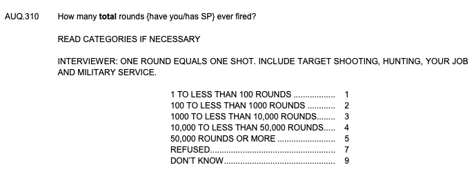
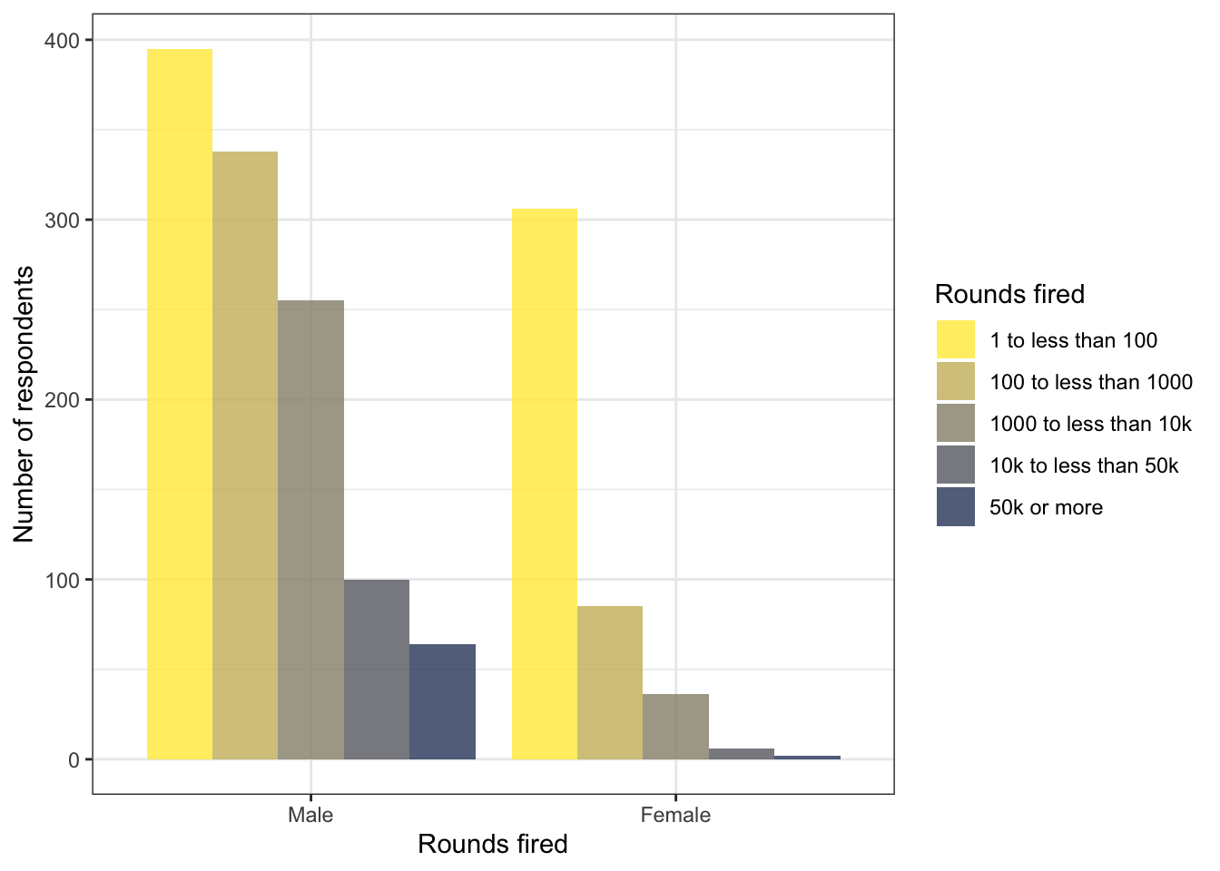
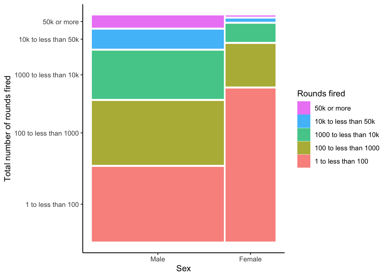
R Code 3.17 : Recode rounds fired variable AUQ310 from NHANES data 2011-2012
Code
nhanes_2012_clean2<-nhanes_2012_clean1|>dplyr::mutate(AUQ310 =forcats::as_factor(AUQ310))|>dplyr::mutate(AUQ310 =forcats::fct_recode(AUQ310,"1 to less than 100"="1","100 to less than 1000"="2","1000 to less than 10k"="3","10k to less than 50k"="4","50k or more"="5","Refused to answer"="7","Don't know"="9"))|>dplyr::rename(rounds_fired =AUQ310)|>dplyr::relocate(rounds_fired, .after =gun_use)
#> Warning: There was 1 warning in `dplyr::mutate()`.
#> ℹ In argument: `AUQ310 = forcats::fct_recode(...)`.
#> Caused by warning:
#> ! Unknown levels in `f`: 7
#>            rounds_fired prop   n
#> 1    1 to less than 100   43 701
#> 2 100 to less than 1000   26 423
#> 3 1000 to less than 10k   18 291
#> 4  10k to less than 50k    7 106
#> 5           50k or more    4  66
#> 6            Don't know    2  26
I got a warning about a unknown level 7 because no respondent refused an answer. But this is not important. I could either choose to not recode level 7 or turn warning off in the chunk option — or simply to ignore the warning.
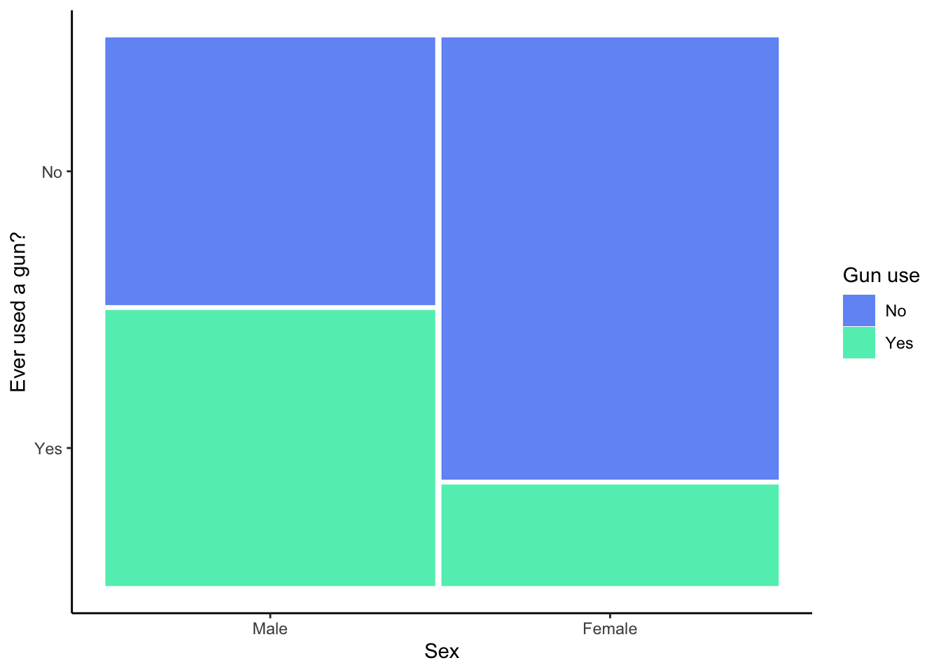
R Code 3.18 : Recode sex variable RIAGENDR from NHANES data 2011-2012
#> sex n percent
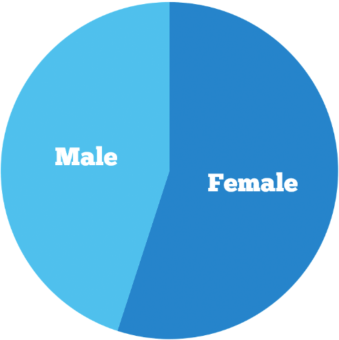
#> Male 4663 49.8%
#> Female 4701 50.2%
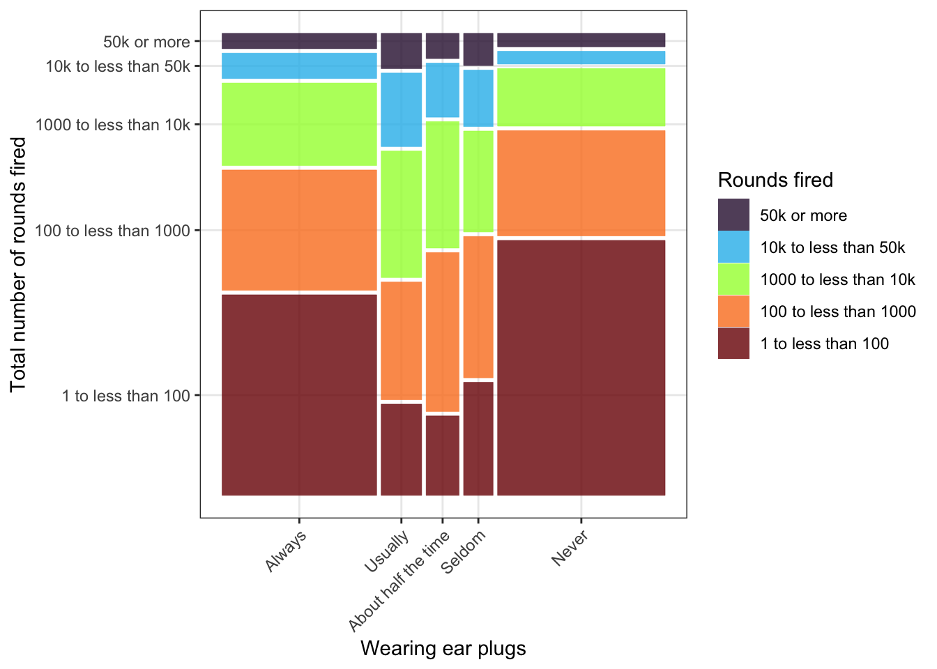
R Code 3.19 : Recode ear plugs variable AUQ320 from NHANES data 2011-2012
Code
nhanes_2012_clean4<-nhanes_2012_clean3|>dplyr::mutate(AUQ320 =forcats::as_factor(AUQ320))|>dplyr::mutate(AUQ320 =forcats::fct_recode(AUQ320,"Always"="1","Usually"="2","About half the time"="3","Seldom"="4","Never"="5",# "Refused to answer" = "7", # nobody refused"Don't know"="9"))|>dplyr::rename(ear_plugs =AUQ320)|>dplyr::relocate(ear_plugs, .after =gun_use)base::saveRDS(nhanes_2012_clean4, "data/chap03/nhanes_2012_clean.rds")nhanes_2012_clean4|>janitor::tabyl(ear_plugs)|>janitor::adorn_pct_formatting()
#>            ear_plugs    n percent valid_percent
#>               Always  583    6.2%         36.1%
#>              Usually  152    1.6%          9.4%
#>  About half the time  123    1.3%          7.6%
#>               Seldom  110    1.2%          6.8%
#>                Never  642    6.9%         39.8%
#>           Don't know    3    0.0%          0.2%
#>                 <NA> 7751   82.8%             -
R Code 3.20 : Recode guns exported from a PDF report by the ATF
Code
guns_exported_2017<-base::readRDS("data/chap03/guns_exported_2017.rds")lookup_export<-c(Year ="V1", Pistols ="V2", Revolvers ="V3", Rifles ="V4", Shotguns ="V5", Misc ="V6", Total ="V7")guns_exported_clean<-dplyr::rename(tibble::as_tibble(guns_exported_2017), dplyr::all_of(lookup_export))|>## comma separated character columns to numericdplyr::mutate(dplyr::across(2:7, function(x){base::as.numeric(as.character(base::gsub(",", "", x)))}))|>## add Pistols and Revolvers to Handgunsdplyr::mutate(Handguns =Pistols+Revolvers)|>## specify the same order for all three data framesdplyr::select(-c(Pistols, Revolvers))|>dplyr::relocate(c(Year, Handguns, Rifles, Shotguns, Misc, Total))
#> Warning: The `x` argument of `as_tibble.matrix()` must have unique column names if
#> `.name_repair` is omitted as of tibble 2.0.0.
#> ℹ Using compatibility `.name_repair`.
Listing / Output 3.11: Recoded: Guns exported from a PDF report by the ATF
I have recoded the data in several ways:
- I turned the resulted matrices from the {**tabulizer**} package into tibbles.
- Now I could rename all the columns with one named vector `lookup_export`.
- All the columns are of character type. Before I could change the appropriate column to numeric I had to remove the comma for big numbers, otherwise the base::as-numeric() function would not have worked.
- I added `Pistols` and `Revolvers` to `Handguns`, because the dataset about imported guns have only this category.
- Finnaly I relocated the columns to get the same structure in all data frames.
R Code 3.21 : Recode guns imported from a PDF by the ATF
Code
guns_imported_2018<-base::readRDS("data/chap03/guns_imported_2018.rds")lookup_import<-c(Year ="V1", Shotguns ="V2", Rifles ="V3", Handguns ="V4", Total ="V5")## reduce the reported period for all file from 1980 to 2017guns_imported_clean<-dplyr::rename(tibble::as_tibble(guns_imported_2018), dplyr::all_of(lookup_import))|>## comma separated character columns to numericdplyr::mutate(dplyr::across(2:5, function(x){base::as.numeric(as.character(base::gsub(",", "", x)))}))|>dplyr::slice(1:dplyr::n()-1)|>dplyr::mutate(Misc =0)|>dplyr::relocate(c(Year, Handguns, Rifles, Shotguns, Misc, Total))save_data_file("chap03", guns_imported_clean, "guns_imported_clean.rds")utils::str(guns_imported_clean)skimr::skim(guns_imported_clean)
Listing / Output 3.12: Recoded: Guns imported from a PDF by the ATF
Here applies similar note as in the previous tab:
- I turned the resulted matrices from the {**tabulizer**} package into tibbles.
- Now I could rename all the columns with one named vector `lookup_import`.
- All the columns are of character type. Before I could change the appropriate column to numeric I had to remove the comma for big numbers, otherwise the base::as-numeric() function would not have worked.
- I relocated the columns to get the same structure in all data frames.
R Code 3.22 : Recode firearms production dataset 1986-2019 from USAFact.org
Code
guns_manufactured_2019<-base::readRDS("data/chap03/guns_manufactured_2019.rds")guns_manufactured_2019_clean<-guns_manufactured_2019|>dplyr::select(-c(2:7))|>dplyr::slice(c(1,3:7))|>## strange: `1986` is a character variabledplyr::mutate(`1986` =as.numeric(`1986`))base::saveRDS(guns_manufactured_2019_clean, "data/chap03/guns_manufactured_2019_clean.rds")utils::str(guns_manufactured_2019_clean)skimr::skim(guns_manufactured_2019_clean)
As a first approximation to get guns data circulated in the US I have taken the manufactured numbers, subtracted the exported guns and added the imported guns.
I have already listed some reasons why the above result is still not the real amount of circulated guns per year in the US (see: Remark 3.1)
3.3.5 Classification of Graphs
3.3.5.1 Introduction
There are different possible classification of graph types. In the book Harris uses as major criteria the types and numbers of variables. This is very sensitive subject orientated arrangement addressed at the statistics novice with the main question: What type of graph should I use for my data?
The disadvantage of the subject oriented selection criteria is that there some graph types (e.g. the bar chart) that appear several times under different headings. Explaining the graph types is therefore somewhat redundant on the one hand and piecemeal on the other hand.
Another classification criteria would be the type of the graph itself. Under this pattern one could concentrate of the special features for each graph type. One of these features would be their applicability referring the variable types.
3.3.5.2 Lists of different categorization approaches
Example 3.4 : Five different categorization approaches
Bullet List 3.1: Book variable types and their corresponding graph types
You can see the redundancy when you categorize the graph types by variable types. But the advantage is, that your choice of graph is driven by essential statistical aspects.
This chapter will follow the book and therefore it will present the same order in the explication of the graphs as in the book outlined.
Bullet List
Bar chart
Box plot
Density plot
Histogram
Line plot
Mosaic plot
Pie chart
Point chart
Scatterplot
Violin plot
Waffle chart
Bullet List 3.2: Book graph types sorted alphabetically
This is a very abridged list of graphs used for presentation of statistical results. Although it is just a tiny selection of possible graphs it contains those graphs that are most important, most used and most well know types.
Bullet List
Correlations
Bubble
Contour plot
Correlogram
Heat map
Scatterplot
Distributions
Beeswarm
Box plot
Density plot
Dot plot
Dumbbell
Histogram
Ridgeline
Violin plot
Evolution
Area chart
Calendar
Candle stick
Line chart
Slope
Flow
Alluvial
Chord
Sankey
Waterfall
Miscellaneous
Art
Biology
Calendar
Computer & Games
Fun
Image Processing
Sports
Part of whole
Bar chart
Dendogram
Donut chart
Mosaic chart
Parliament
Pie chart
Tree map
Venn diagram
Voronoi
Waffle chart
Ranking
Bar chart
Bump chart
Lollipop
Parallel Coordinates
Radar chart
Word cloud
Spatial
Base map
Cartogram
Choropleth
Interactive
Proportion symbol
Bullet List 3.3: Categorization of graph types used by R Chart
Although this list has only 8 categories it is in contrast to Bullet List 3.2 a more complete list of different graphs. It features also not so well known graph types. Besides a miscellaneous category where the members of this group do not share a common feature the graph are sorted in categorization schema that has — with the exception of bar charts — no redundancy, e.g. is almost a taxonomy of graph types.
Bullet List
NUMERIC
One numeric variable
Histogram
Density plot
Two numeric variables
Not ordered
Few points
Box plot
Histogram
Scatter plot
Many points
Violin plot
Density plot
Scatter with marginal point
2D density plot
Ordered
Connected scatter plot
Area plot
Line plot
Three numeric variables
Not ordered
Box plot
Violin plot
Bubble plot
3D scatter or surface
Ordered
Stacked area plot
Stream graph
Line plot
Area (SM)
Several numeric variables
Not ordered
Box plot
Violin plot
Ridge line
PCA
Correlogram
Heatmap
Dendogram
Ordered
Stacked area plot
Stream graph
Line plot
Area (SM)
CATEGORICAL
One categorical variable
Bar plot
Lollipop
Waffle chart
Word cloud
Doughnut
Pie chart
Tree map
Circular packing
Two or more categorical variables
Two independent lists
Venn diagram
Nested or hierarchical data set
Tree map
Circular packing
Sunburst
Bar plot
Dendogram
Subgroups
Grouped scatter
Heat map
Lollipop
Grouped bar plot
Stacked bar plot
Parallel plot
Spider plot
Sankey diagram
Adjacency
Network
Chord
Arc
Sankey diagram
Heat map
NUMERIC & CATEGORICAL
One numeric & one categorical
One observation per group
Box plot
Lollipop
Doughnut
Pie chart
Word cloud
Tree map
Circular packing
Waffle chart
Several observations per group
Box plot
Violin plot
Ridge line
Density plot
Histogram
One categorical & several numeric
No order
Group scatter
2D density
Box plot
Violin plot
PCA
Correlogram
One numeric is ordered
Stacked area
Area
Stream graph
Line plot
Connected scatter
One value per group
Grouped scatter
Heat map
Lollipop
Grouped bar plot
Stacked bar plot
Parallel plot
Spider plot
Sankey diagram
Several categorical & one numeric
Subgroup
One observation per group
One value per group
Grouped scatter
Heat map
Lollipop
Grouped bar plot
Stacked bar plot
Parallel plot
Spider plot
Sankey diagram
Several observations per group
Box plot
Violin plot
Nested / Hierarchical ordered
One observation per group
Bar plot
Dendogram
Sun burst
Tree map
Circular packing
Several observations per group
Box plot
Violin plot
Adjacency
Network diagram
Chord diagram
Arc diagram
Sankey diagram
Heat map
MAPS
Map
Connection map
Choropleth
Map hexabin
Bubble map
NETWORK
Simple network
Network
Chord diagram
Arc diagram
Sankey diagram
Heat map
Hive
Nested or hierarchical network
No value
Dendogram
Tree map
Circular packing
Sunburst
Sankey diagram
Value for leaf
Dendogram
Tree map
Circular packing
Sunburst
Sankey diagram
Value for edges
Dendogram
Sankey diagram
Chord diagram
Value for connection Hierarchical edge bundling
TIME SERIES
One series
Box plot
Violin plot
Ridge line
Area
Line plot
Bar plot
Lollipop
Several series
Box plot
Violin plot
Ridge line
Heat map
Line plot
Stacked area
Stream graph
Bullet List 3.4: Categorization of graph types used by From Data to Viz
This is the same variable oriented approach as in the book but with much more details and differentiation. It is cluttered with redundancies but should be helpful for selecting an appropriate graph type for your data analysis. And the interactive style on the web allows for a much better orientation as implemented in the above list.
R Code 3.25 : Bar charts for gun use (NHANES 2011-2012) with different width of bars
Code
## bar chart: bars with wide widthp_normal<-nhanes_2012_clean1|>dplyr::select(gun_use)|>tidyr::drop_na()|>ggplot2::ggplot(ggplot2::aes(x =gun_use))+ggplot2::geom_bar()+ggplot2::labs(x ="Gun use", y ="Number of participants")+ggplot2::theme_minimal()## bar chart: bars with small widthp_small<-nhanes_2012_clean1|>dplyr::select(gun_use)|>tidyr::drop_na()|>ggplot2::ggplot(ggplot2::aes(x =gun_use))+ggplot2::geom_bar(width =0.4)+ggplot2::theme_minimal()+ggplot2::theme(aspect.ratio =4/1)+ggplot2::labs(x ="Gun use", y ="Number of participants")## display both charts side by sidegridExtra::grid.arrange(p_normal, p_small, ncol =2)
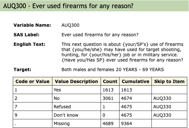
Graph 3.2: Ever used firearms for any reason? (NHANES survey 2011-2012)
Left: Only two bars look horrifying. In this example they are even a lot smaller as normal, because of the second graph to the right.
Right: It is not enough to create smaller bars with the width argument inside the ggplot2::geom_bar() function because that would create unproportional wide space between the two bars. One need to apply the aspect ratio for the used theme as well. In this case all commands to the theme (e.g. my ggplot2::the_bw()) has to come before the aspect.ratio argument. One has to try out which aspect ratio works best.
I used here — as recommended in the book — the {gridExtra} package to display the figures side by side (see Section A.31). But there are other options as well. In the next tab I will use the {patchwork} package, that is especially for {ggplot2} developed (see Section A.62). A third option would be to use one of Quarto formatting commands: See
R Code 3.26 : Bar charts for gun use (NHANES 2011-2012) with different colorizing methods
Code
## bar chart: filled colors within aes() (data controlled)p_fill_in<-nhanes_2012_clean1|>dplyr::select(gun_use)|>tidyr::drop_na()|>ggplot2::ggplot(ggplot2::aes(x =gun_use))+ggplot2::geom_bar(ggplot2::aes(fill =gun_use), width =0.4)+ggplot2::theme_bw()+ggplot2::theme(legend.position ="none")+ggplot2::theme(aspect.ratio =3/1)+ggplot2::labs(x ="Gun use", y ="Number of participants", subtitle ="Filled inside \naes()")## bar chart: filled colors outside aes() (manually controlled)p_fill_out<-nhanes_2012_clean1|>dplyr::select(gun_use)|>tidyr::drop_na()|>ggplot2::ggplot(ggplot2::aes(x =gun_use))+# ggplot2::theme(legend.position = "none") +ggplot2::geom_bar(width =0.4, fill =c("darkred", "steelblue"))+ggplot2::theme_bw()+ggplot2::theme(aspect.ratio =3/1)+ggplot2::labs(x ="Gun use", y ="Number of participants", subtitle ="Filled outside \naes() my colors")## ## bar chart: fill = data controlled by my own colorsp_fill_in_my_colors<-nhanes_2012_clean1|>dplyr::select(gun_use)|>tidyr::drop_na()|>ggplot2::ggplot(ggplot2::aes(x =gun_use))+ggplot2::geom_bar(ggplot2::aes(fill =gun_use), width =0.4)+ggplot2::theme_bw()+ggplot2::scale_fill_manual(values =c("darkred", "steelblue"), guide ="none")+ggplot2::theme(aspect.ratio =3/1)+ggplot2::labs(x ="Gun use", y ="Number of participants", subtitle ="Filled inside \nwith my colors")## bar chart: manually controlled colors with my own colorp_fill_out_my_colors<-nhanes_2012_clean1|>dplyr::select(gun_use)|>tidyr::drop_na()|>ggplot2::ggplot(ggplot2::aes(x =gun_use))+ggplot2::geom_bar(width =0.4, fill =c("darkred", "steelblue"))+ggplot2::theme_bw()+ggplot2::theme(aspect.ratio =3/1)+ggplot2::labs(x ="Gun use", y ="Number of participants", subtitle ="Filled outside \nwith my colors")## patchwork with :: syntax ############################## display all 4 charts side by side## using the trick from ## https://github.com/thomasp85/patchwork/issues/351#issuecomment-1931140157patchwork:::"|.ggplot"(p_fill_in,p_fill_out)patchwork:::"|.ggplot"(p_fill_in_my_colors,p_fill_out_my_colors)# library(patchwork)# p_fill_in | p_fill_out |# p_fill_in_my_colors | p_fill_out_my_colors
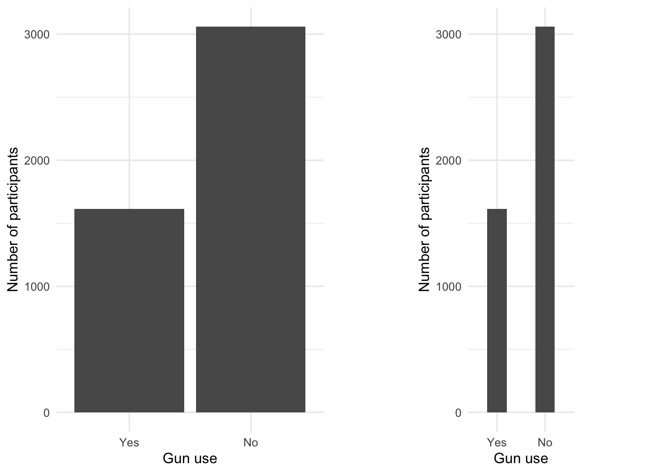
Graph 3.3: Ever used firearms for any reason? (NHANES survey 2011-2012)
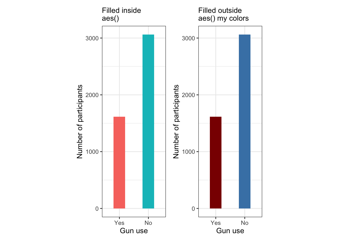
Graph 3.4: Ever used firearms for any reason? (NHANES survey 2011-2012)
Left Top: This graph has the color fill argument within aes() and is therefore data controlled. This means that the colors will be settled automatically by factor level.
Right Top: This graph has the color fill argument outside aes() and is therefore manually controlled. One needs to supply colors otherwise one gets a graph without any colors at all.
Left bottom: Even if the graph has the color fill argument within aes() and is therefore data controlled, you can change the color composition. But you has also the responsibility to provide a correct legend — or as I have done in this example — to remove the legend from the display. (The argument guide = FALSE as used in the book is superseded with guide = "none")
Right bottom: The graph is manually controlled because it has the color fill argument outside aes() with specified colors.
I used {patchwork} here to show all four example graphs (see Section A.62). As always I didn’t want to use the base::library() function to load and attach the package. But I didn’t know how to do this with the {patchwork} operators. Finally I asked my question on StackOverflow and received as answer the solution.
At first I tried it with the + operator. But that produced two very small graphs in the first row of the middle of the display area, and other two small graphs in the second row of the middle of the display area. Beside this ugly display the text of the subtitle was also truncated. After some experimentation I learned that I had to use the | operator.
3.4.3 Pie Chart
3.4.3.1 Introduction
Pie charts show parts of a whole. The pie, or circle, represents the whole. The slices of pie shown in different colors represent the parts. A similar graph type is the but they are not recommended” for several reasons
Humans aren’t particularly good at estimating quantity from angles: Once we have more than two categories, pie charts can easily misrepresent percentages and become hard to read.
Pie charts do badly when there are lots of categories: Matching the labels and the slices can be hard work and small percentages (which might be important) are tricky to show.
But there are some cases, where pie chart (or donut charts sometimes also called ring chart) are appropriate:
3.4.3.2 Visualize an important number
Visualize an important number by highlighting just one junk of the circle
(a) Pie chart demo
(b) Donut chart demo
Graph 3.5: Highlight just one junk to support only one number (Evergreen 2019, 33–35)
BTW: Donut charts are even worse than pie charts:
The middle of the pie is gone. The middle of the pie … where the angle is established, which is what humans would look at to try to determine wedge size, proportion, and data. Even though we aren’t accurate at interpreting angles, the situation is made worse when we remove the middle of the pie. Now we are left to judge curvature and … compare wedges by both curvature and angle (Evergreen 2019, 32).
3.4.3.3 Making a clear point
Use a very limited number of wedges (best not more than two) for making a clear point.
Graph 3.6: Pie charts are acceptable with very few categories (Evergreen 2019, 176)
Example 3.6 : Creating Pie & Donut Charts for Firearm Usage
R Code 3.27 : Visualize percentage of gun user from NHANES survey 2011-2012
Code
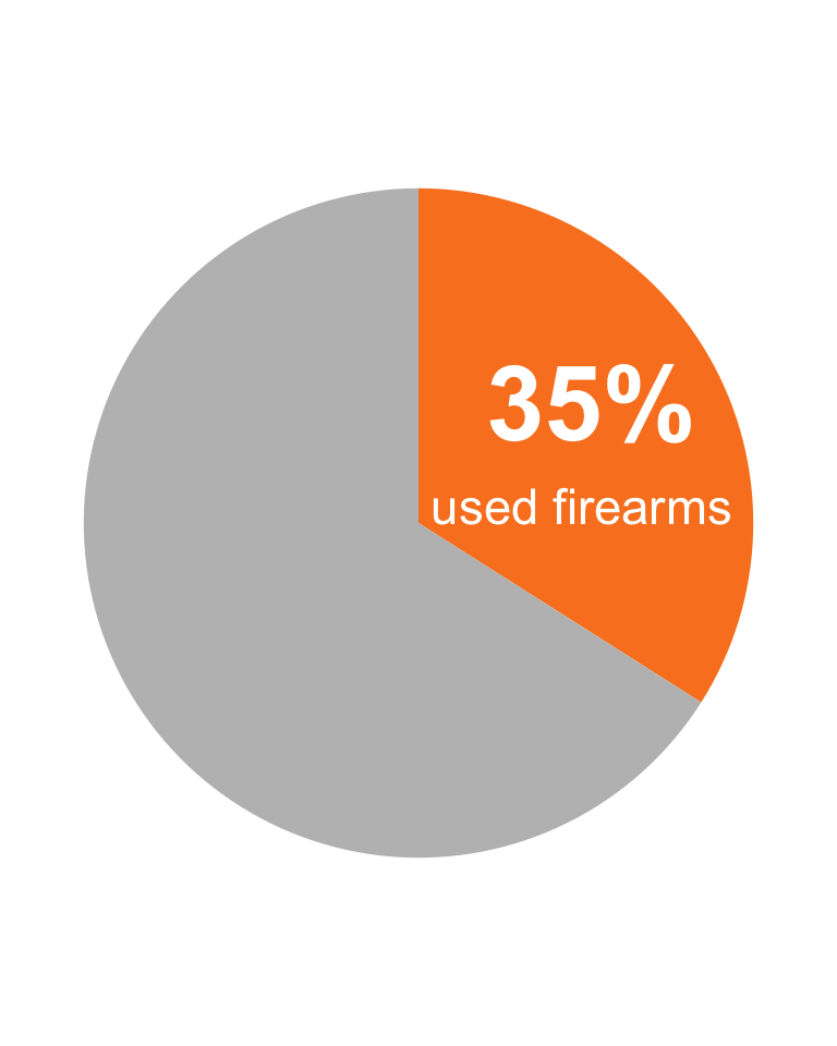
lab<-"<span style='font-size:36pt; color:white'>**35%**</span>"gun_use_2012|>tidyr::drop_na()|>ggplot2::ggplot(ggplot2::aes(x ='', y =percent))+ggplot2::geom_col(fill =c("#fa8324", "grey"))+ggplot2::coord_polar(theta ='y')+ggtext::geom_richtext(ggplot2::aes( x =1.1, y =8, label =lab), fill ="#fa8324", label.colour ="#fa8324")+ggplot2::annotate("text", x =.7, y =10, label =" used firearms", color ="white", size =6)+ggplot2::theme_void()
#> Warning in ggtext::geom_richtext(ggplot2::aes(x = 1.1, y = 8, label = lab), : All aesthetics have length 1, but the data has 2 rows.
#> ℹ Please consider using `annotate()` or provide this layer with data containing
#>   a single row.
Graph 3.7: Percentage of gun user (NHANES survey 2011-2012)
The most important code line to create a pie graph is ggplot2::coord_polar(theta = 'y'). In the concept of gg (grammar of graphics) a car chart and a pie chart are — with the exception of the above code line — identical (C 2010).
Beside the ggplot2::annotate() function for text comments inside graphics I had for to get the necessary formatting options for the big number also to use {ggtext}, one of 132 registered {ggplot2} extensions. {ggtext} enables the rendering of complex formatted plot labels (see Section A.33).
For training purposes I tried to create exactly the same pattern (color, text size etc.) of a pie chart as in Graph 3.5 (a).
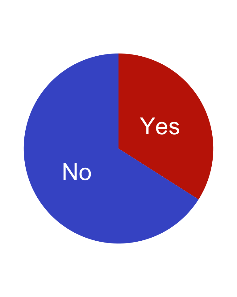
R Code 3.28 : Ever used firearms for any reason? (NHANES survey 2011-2012)
Code
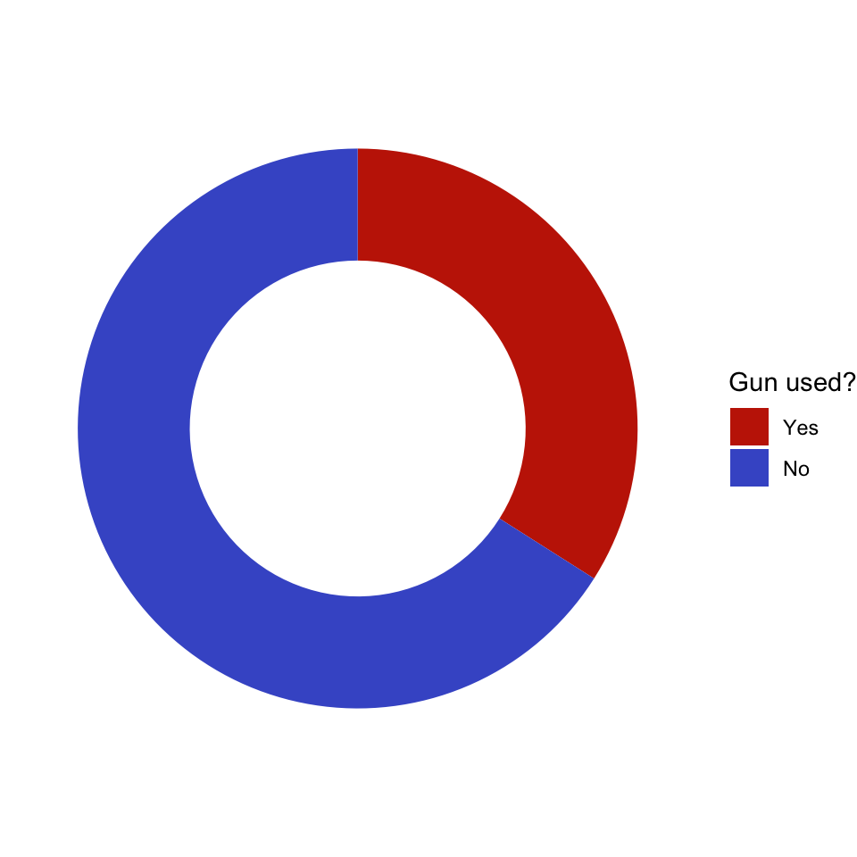
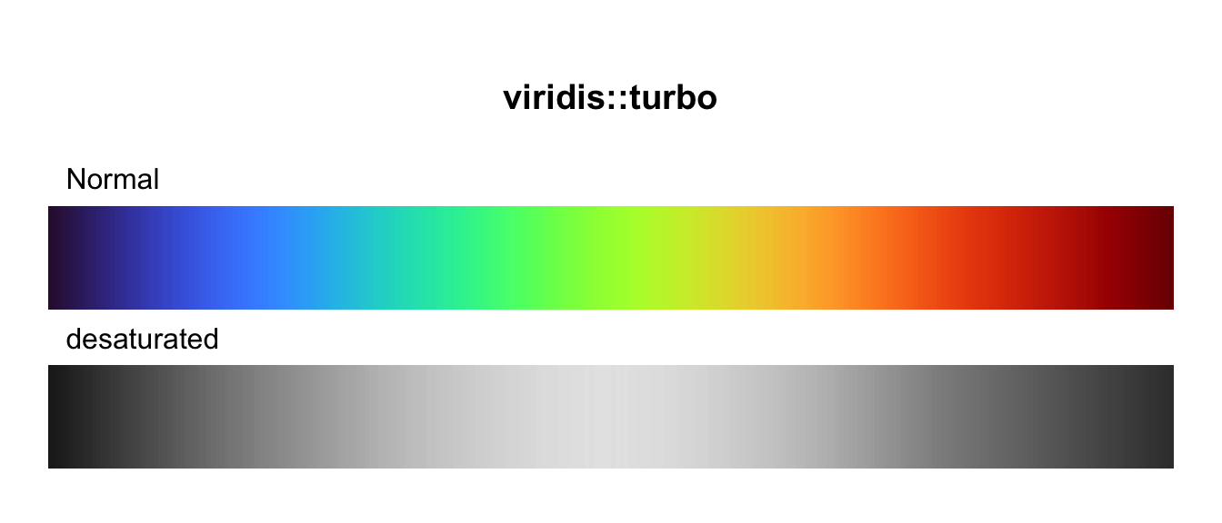
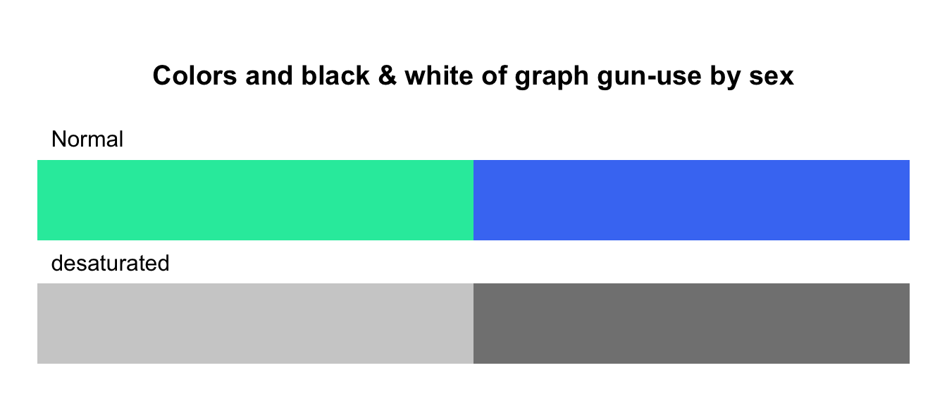
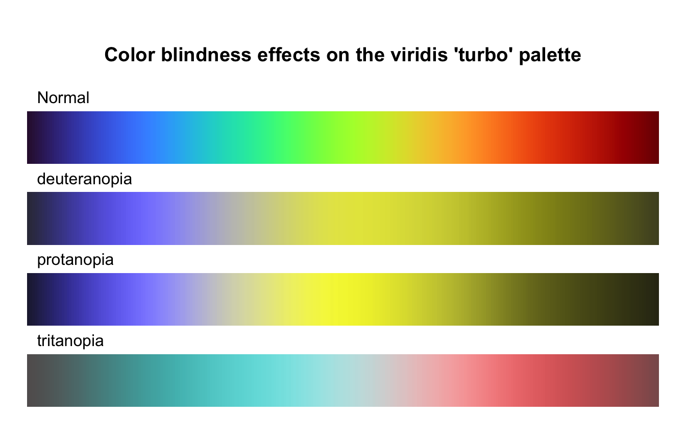
gun_use_2012|>tidyr::drop_na()|>ggplot2::ggplot(ggplot2::aes(x ='', y =percent, fill =forcats::fct_rev(gun_use)))+ggplot2::geom_col()+ggplot2::geom_text(ggplot2::aes( label =gun_use), color ="white", position =ggplot2::position_stack(vjust =0.5), size =10)+ggplot2::coord_polar(theta ='y')+ggplot2::theme_void()+ggplot2::theme(legend.position ="none")+ggplot2::labs(x ='', y ='')+viridis::scale_fill_viridis( discrete =TRUE, option ="turbo", begin =0.1, end =0.9)
Graph 3.8: Ever used firearms for any reason? (NHANES survey 2011-2012)
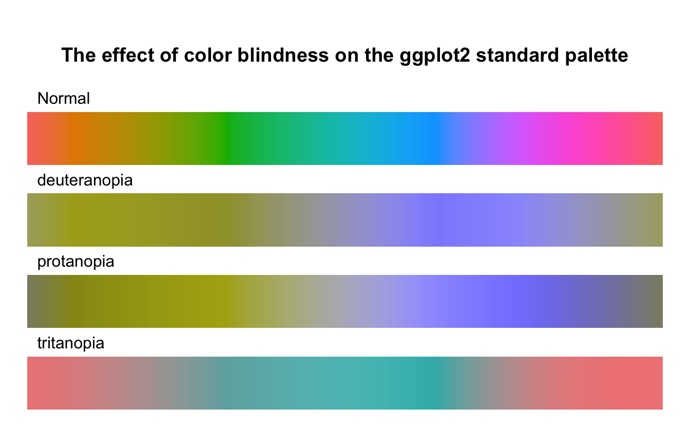
I have used {viridis} to produce colorblind-friendly color maps (see Section A.96). Instead of using as the first default color yellow I have chosen with the color map options and the begin/end argument, what color should appear for this binary variable.
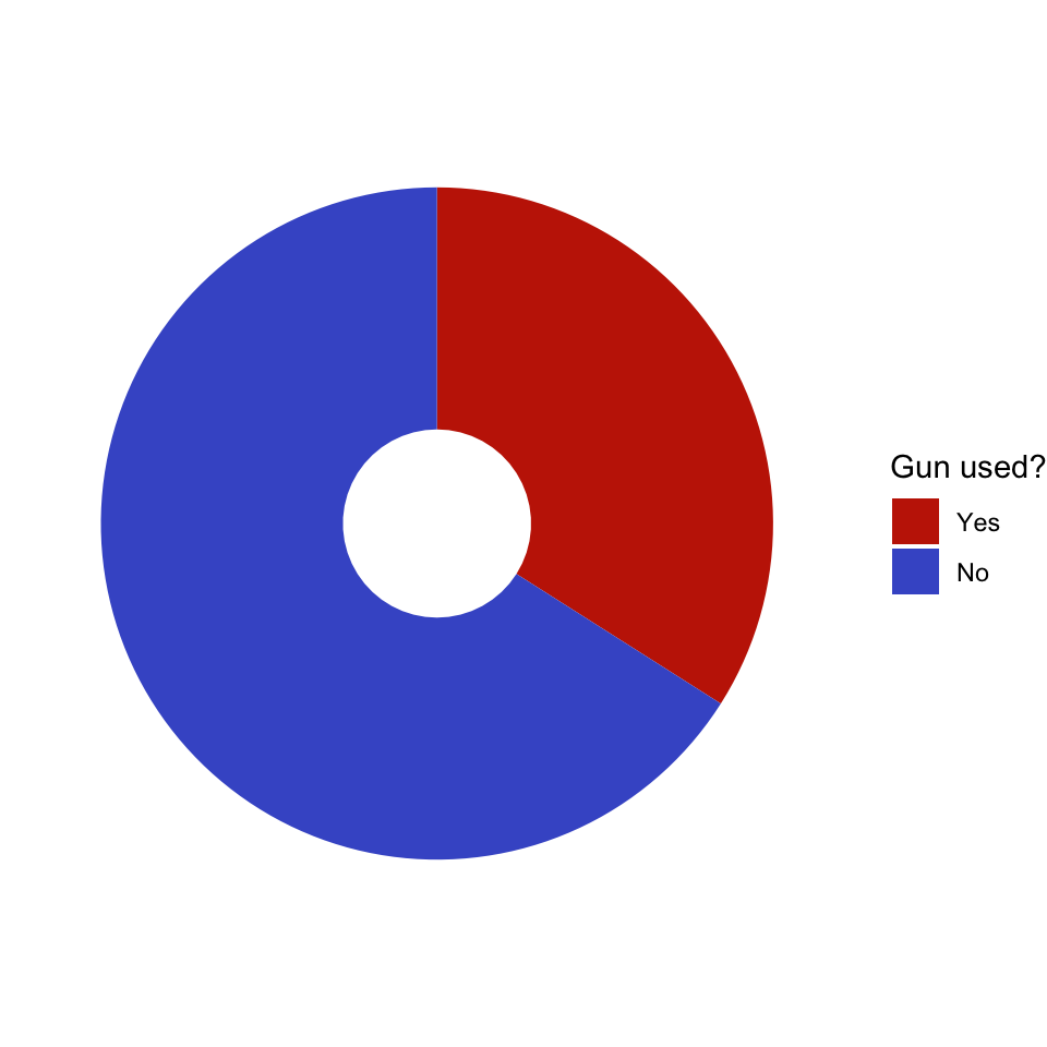
R Code 3.29 : Donut chart with small hole
Code
# Small holehsize<-1gun_use_small_hole<-gun_use_2012|>dplyr::mutate(x =hsize)gun_use_small_hole|>tidyr::drop_na()|>dplyr::mutate(x =hsize)|>ggplot2::ggplot(ggplot2::aes(x =hsize, y =percent, fill =forcats::fct_rev(gun_use)))+ggplot2::geom_col()+ggplot2::coord_polar(theta ='y')+ggplot2::xlim(c(0.2, hsize+0.5))+ggplot2::theme_void()+ggplot2::labs(x ='', y ='', fill ="Gun used?")+viridis::scale_fill_viridis( breaks =c('Yes', 'No'), discrete =TRUE, option ="turbo", begin =0.1, end =0.9)
Graph 3.9: Ever used firearms for any reason? (NHANES survey 2011-2012)
R Code 3.30 : Donut chart with big hole
Code
hsize<-2gun_use_big_hole<-gun_use_2012|>dplyr::mutate(x =hsize)gun_use_big_hole|>tidyr::drop_na()|>dplyr::mutate(x =hsize)|>ggplot2::ggplot(ggplot2::aes(x =hsize, y =percent, fill =forcats::fct_rev(gun_use)))+ggplot2::geom_col()+ggplot2::coord_polar(theta ='y')+ggplot2::xlim(c(0.2, hsize+0.5))+ggplot2::theme_void()+ggplot2::labs(x ='', y ='', fill ="Gun used?")+viridis::scale_fill_viridis( breaks =c('Yes', 'No'), discrete =TRUE, option ="turbo", begin =0.1, end =0.9)
Graph 3.10: Ever used firearms for any reason? (NHANES survey 2011-2012)
3.4.3.4 Case Study
It is a fact that pie chart are still very popular. I recently found for instance a pie chart in one of the most prestigious German weekly newspaper Die Zeit the following pie chart about the financing of the United Nations Relief and Works Agency for Palestine Refugees in the Near East (UNRWA)
Graph 3.11: Who is financing the UNRWA?
The figure is colorful and looks nice. More important is that is has all the important information (Country names and amount of funding) written as labels into the graphic. It seems that this a good example for a pie chart, a kind of an exception to the rule.
But if we get into the details, we see that the graph was a twofold simplification of the complete data set. Twofold because besides the overall ranking of 98 sponsors there is a simplified ranking list of the top 20 donors.The problem with pie charts (and also with waffle charts) is that you can’t use them with many categories.
So it was generally a good choice of “Die Zeit” to contract financiers with less funding and to concentrate to the biggest sponsors. But this has the disadvantage not to get a complete picture that is especially cumbersome for political decisions. As a result we have a huge group of miscellaneous funding sources (2nd in the ranking!) that hides many countries that are important to understand the political commitment im the world for the UNRWA.
But let’s see how this graphic would be appear in alternative charts
R Code 3.32 : Recode and show UNRWA data of top 20 donors 2022
Code
unrwa_donors<-base::readRDS("data/chap03/unrwa_donors.rds")base::options(scipen =999)unrwa_donor_ranking<-unrwa_donors|>dplyr::rename( donor ="V1", total ="V6")|>dplyr::select(donor, total)|>dplyr::mutate(donor =forcats::as_factor(donor))|>dplyr::mutate(donor =forcats::fct_recode(donor, Spain ="Spain (including Regional Governments)*", Belgium ="Belgium (including Government of Flanders)", Kuwait ="Kuwait (including Kuwait Fund for Arab Economic Development)"))|>dplyr::slice(6:25)|>dplyr::mutate(dplyr::across(2, function(x){base::as.numeric(as.character(base::gsub(",", "", x)))}))utils::str(unrwa_donor_ranking)skimr::skim(unrwa_donor_ranking)
#> Warning: There was 1 warning in `dplyr::summarize()`.
#> ℹ In argument: `dplyr::across(tidyselect::any_of(variable_names),
#>   mangled_skimmers$funs)`.
#> ℹ In group 0: .
#> Caused by warning:
#> ! There was 1 warning in `dplyr::summarize()`.
#> ℹ In argument: `dplyr::across(tidyselect::any_of(variable_names),
#>   mangled_skimmers$funs)`.
#> Caused by warning in `sorted_count()`:
#> ! Variable contains value(s) of "" that have been converted to "empty".
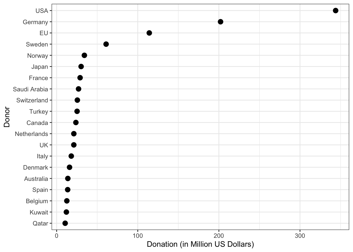
unrwa_donor_ranking|>ggplot2::ggplot(ggplot2::aes( x =stats::reorder(x =donor, X =total), y =total/1e6))+ggplot2::geom_point(size =3)+ggplot2::coord_flip()+ggplot2::theme_bw()+ggplot2::labs( x ="Donor", y ="Donation (in Million US Dollars)")
Graph 3.12: Top 20 UNRWA donors in 2022 (in millions US dollar)
This graph is not as spectacular as “Die Zeit” figure, but carries more information. But what is much more important:
It shows much better the ranking.
It makes it obvious that there are only 4 donors (USA, Germany, EU and Sweden) that stand out from all the other financiers.
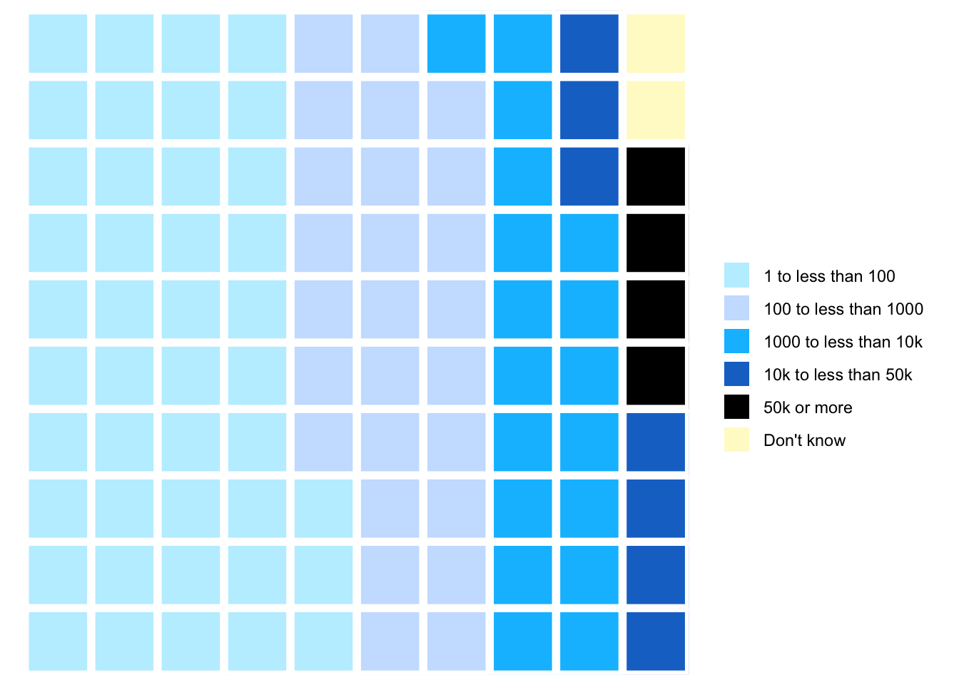
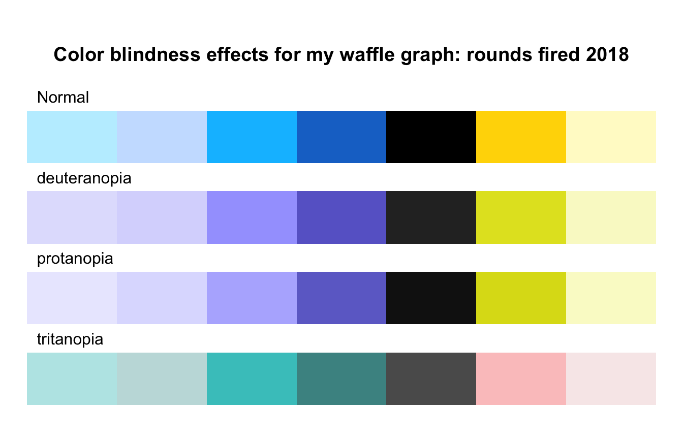
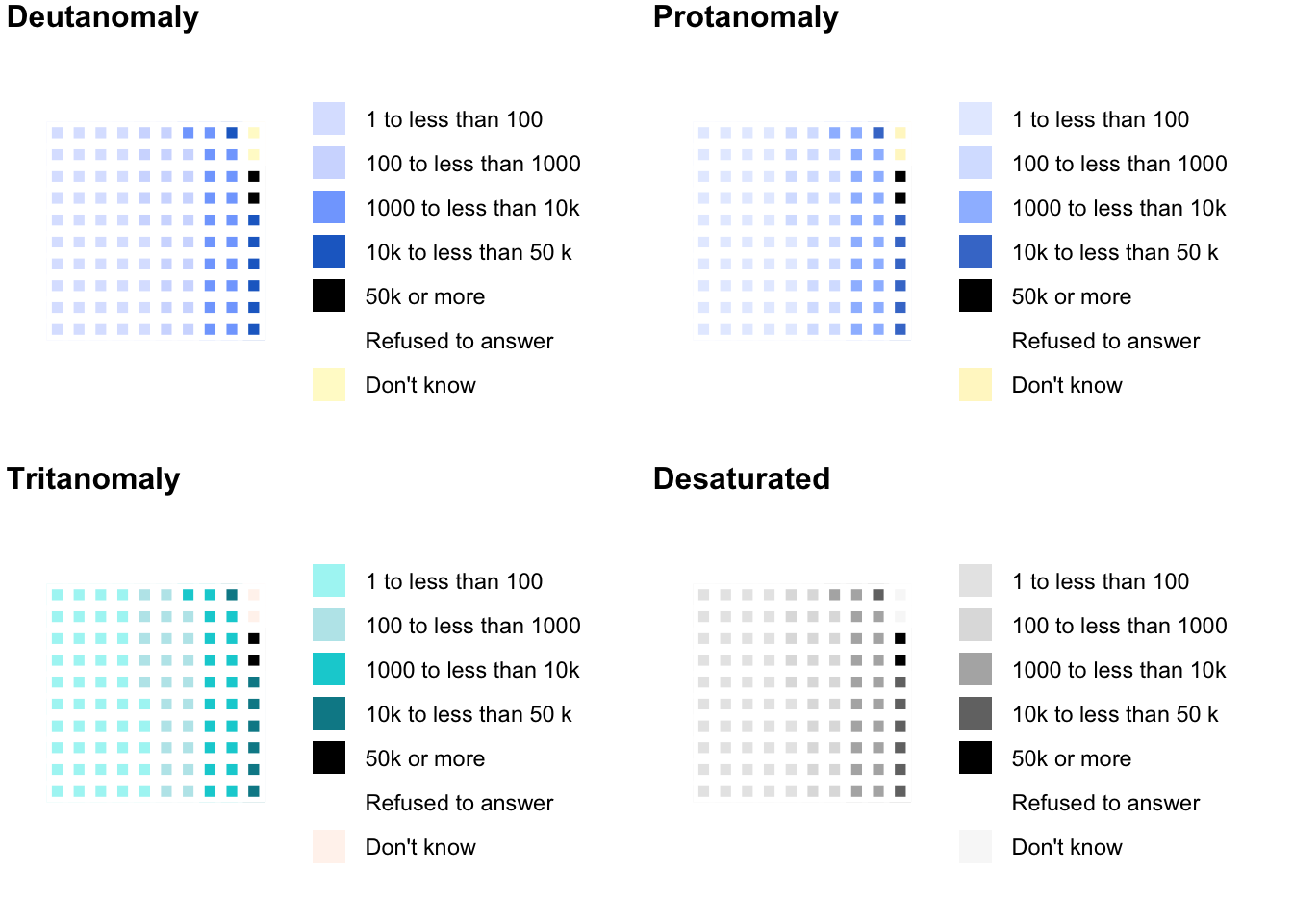
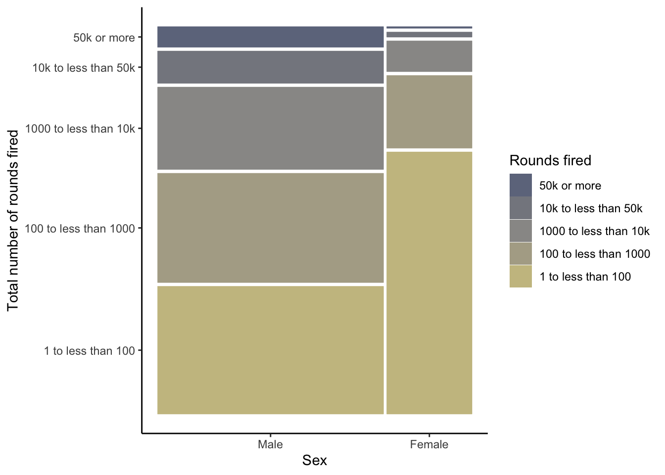
R Code 3.35 : Creating a waffle chart for number of total rounds fired (NHANES survey 2017-2018)
Code
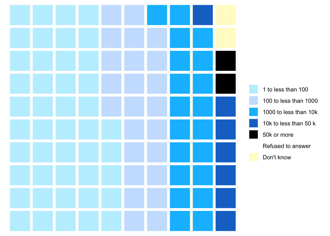
nhanes_2018<-readRDS("data/chap03/nhanes_2018.rds")rounds_fired_2018<-nhanes_2018|>dplyr::select(AUQ310)|>tidyr::drop_na()|>dplyr::mutate(AUQ310 =forcats::as_factor(AUQ310))|>dplyr::mutate(AUQ310 =forcats::fct_recode(AUQ310,"1 to less than 100"="1","100 to less than 1000"="2","1000 to less than 10k"="3","10k to less than 50 k"="4","50k or more"="5","Refused to answer"="7","Don't know"="9"))|>dplyr::rename(rounds_fired =AUQ310)fired_2018<-rounds_fired_2018|>dplyr::count(rounds_fired)|>dplyr::mutate(prop =round(n/sum(n), 2)*100)|>dplyr::relocate(n, .after =dplyr::last_col())(waffle_plot<-waffle::waffle(parts =fired_2018, rows =10, colors =c("lightblue1", "lightsteelblue1", "deepskyblue1", "dodgerblue3", "black","gold1", "lemonchiffon1")))
(a) Proportion of total rounds fired (NHANES survey 2017-2018)
Listing / Output 3.16: Proportion of total rounds fired (NHANES survey 2017-2018)
The number of different levels of the factor variable is almost too high to realize at one glance the differences of the various categories.
Best practices suggest keeping the number of categories small, just as should be done when creating pie charts. (Create Waffle Charts Visualization)
Compare 2011-2012 with 2017-2018 (see Graph 3.15 (a)). You see there is just a small difference: Respondents in the 2017-2018 survey have fired tiny less rounds as the people asked in the 2011-2012 survey. Generally speaking: The fired total of rounds remains more or less constant during the period 2012 - 2018.
R Code 3.36 : Compare the total rounds fired between the NHANES survey participants 2011-2012 and 2017-2018
Code
fired_df<-dplyr::full_join(x =fired_2012, y =fired_2018, by =dplyr::join_by(rounds_fired))fired_df<-fired_df|>dplyr::rename("Rounds fired"=rounds_fired, `2012(%)` =prop.x, `n (2012)` =n.x, `2018(%)` =prop.y, `n (2018)` =n.y,)|>dplyr::mutate(`Diff (%)` =`2012(%)`-`2018(%)`)fired_df
Table 3.1: Total rounds fired of NHANES survey participants 2011-2012 and 2017-2018
#>            Rounds fired 2012(%) n (2012) 2018(%) n (2018) Diff (%)
#> 1    1 to less than 100      43      701      45      289       -2
#> 2 100 to less than 1000      26      423      24      154        2
#> 3 1000 to less than 10k      18      291      20      131       -2
#> 4  10k to less than 50k       7      106      NA       NA       NA
#> 5           50k or more       4       66       2       15        2
#> 6            Don't know       2       26       2       10        0
#> 7 10k to less than 50 k      NA       NA       7       45       NA
#> 8     Refused to answer      NA       NA       0        2       NA
The participants of the NHANES survey 2011-2012 and 2017-2018 fired almost the same numbers of total rounds. The participants in 2017-2018 fired just a tiny amount of bullets less.
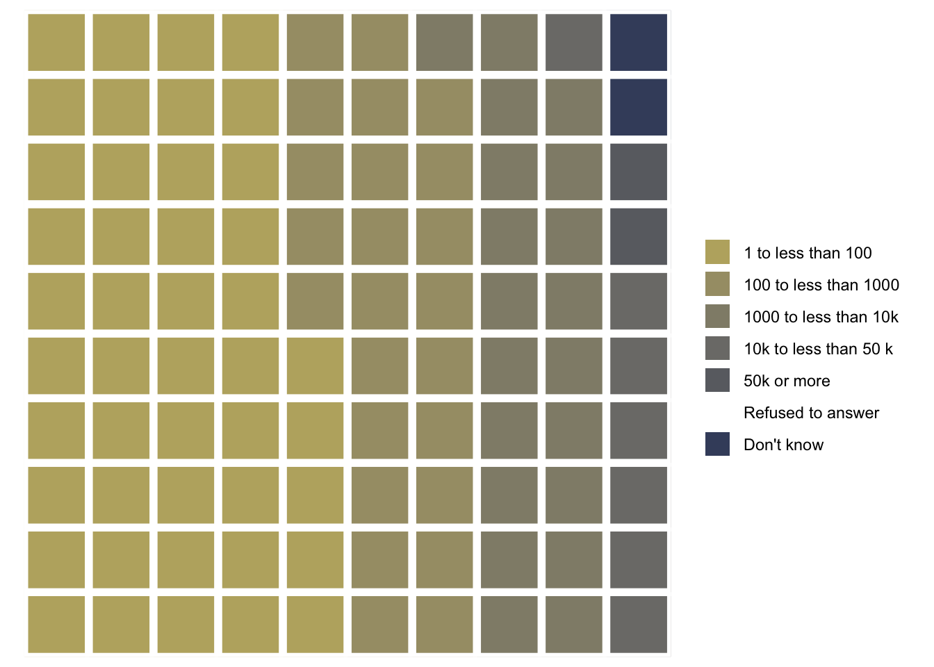
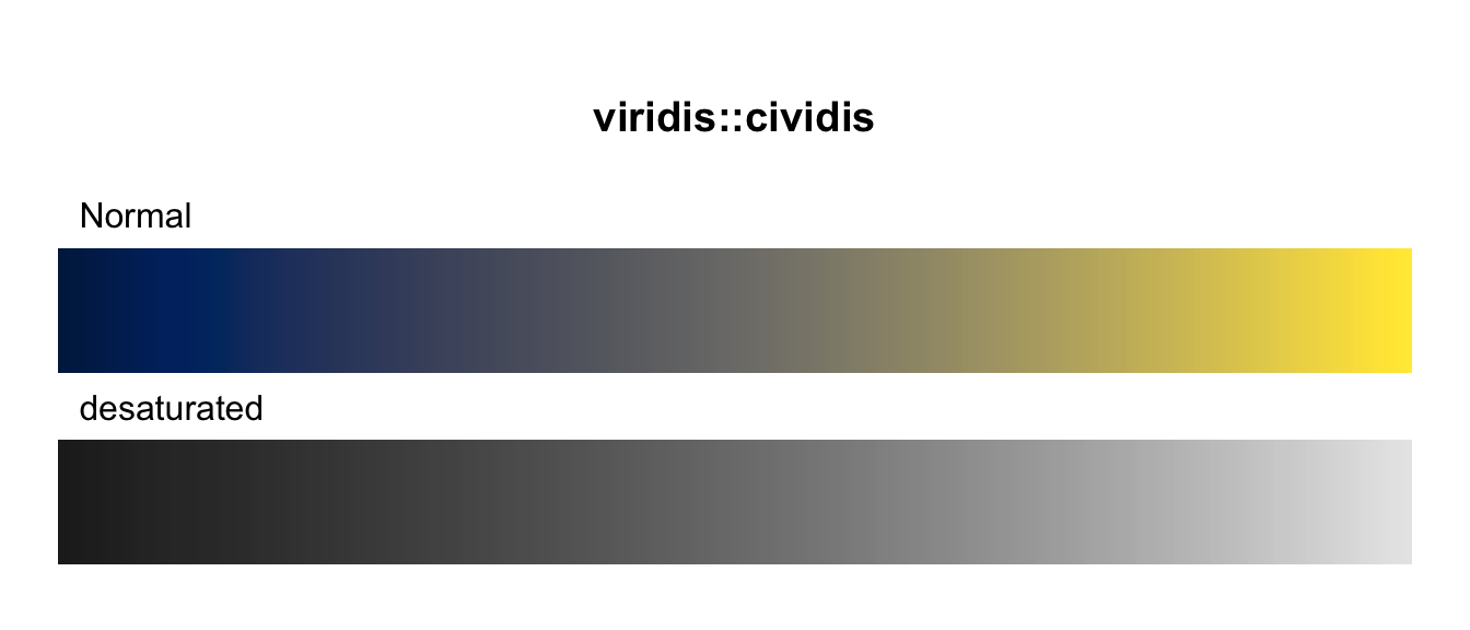
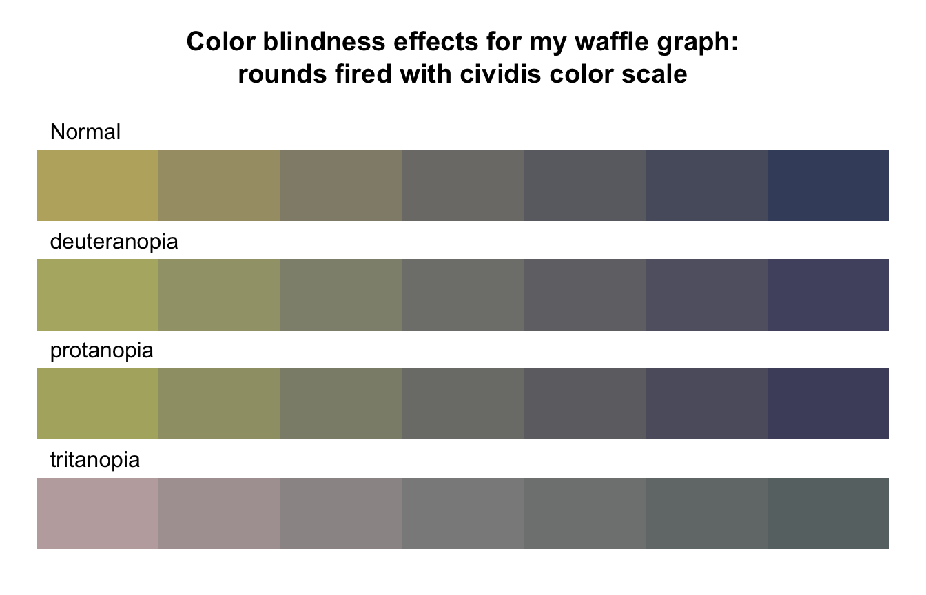
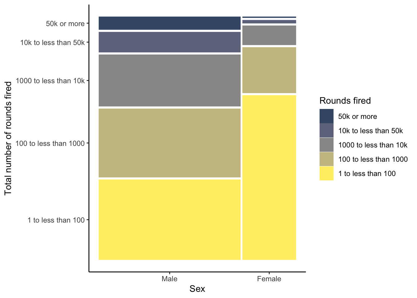
R Code 3.37 : Creating a waffle chart for number of total rounds fired (NHANES survey 2017-2018) with cividis color scale
Code
nhanes_2018<-readRDS("data/chap03/nhanes_2018.rds")rounds_fired_2018<-nhanes_2018|>dplyr::select(AUQ310)|>tidyr::drop_na()|>dplyr::mutate(AUQ310 =forcats::as_factor(AUQ310))|>dplyr::mutate(AUQ310 =forcats::fct_recode(AUQ310,"1 to less than 100"="1","100 to less than 1000"="2","1000 to less than 10k"="3","10k to less than 50 k"="4","50k or more"="5","Refused to answer"="7","Don't know"="9"))|>dplyr::rename(rounds_fired =AUQ310)fired_2018<-rounds_fired_2018|>dplyr::count(rounds_fired)|>dplyr::mutate(prop =round(n/sum(n), 2)*100)|>dplyr::relocate(n, .after =dplyr::last_col())waffle::waffle(parts =fired_2018, rows =10, colors =c("#BCAF6FFF", "#A69D75FF","#918C78FF", "#7C7B78FF","#6A6C71FF", "#575C6DFF", "#414D6BFF"))
(a) Proportion of total rounds fired (NHANES survey 2017-2018) with cividis color scale
Listing / Output 3.17: Proportion of total rounds fired (NHANES survey 2017-2018) with cividis color scale
In contrast to Graph 3.16 (a) — where I have used individual choices of different colors without any awareness of color blindness or black & white printing — here I have used the color blindness friendly cividis palette form the {viridis} package. Read more about my reflections about choosing color palettes in Section 3.9.1.
3.5 Achievement 2: Graphs for a single continuous variable
Bullet List 3.8: Graph options for a single continuous variable
Histograms and density plots are very similar to each other and show the overall shape of the data. These two types of graphs are especially useful in determining whether or not a variable has a normal distribution.
Boxplots show the central tendency and spread of the data, which is another way to determine whether a variable is normally distributed or skewed.
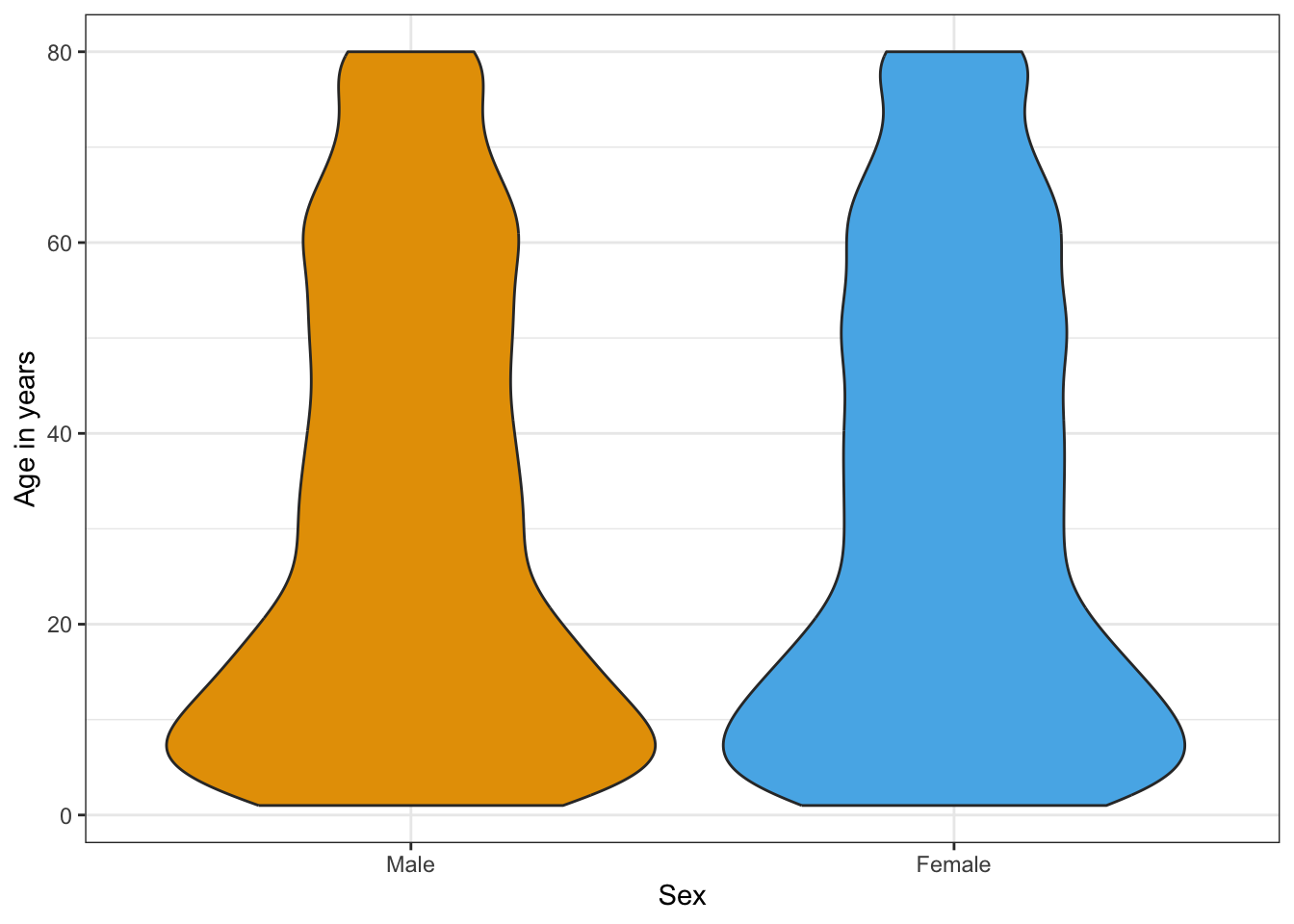
Violin plots are also useful when looking at a continuous variable and are like a combination of boxplots and density plots. Violin plots are commonly used to examine the distribution of a continuous variable for different levels (or groups) of a factor (or categorical) variable.
3.5.2 Histogram
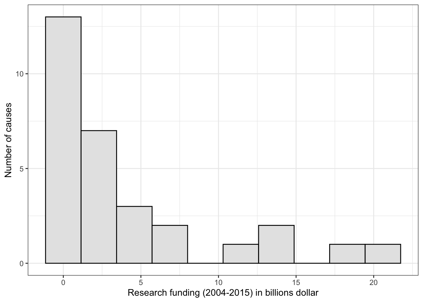
Experiment 3.2 : Histograms of research funding (2004-2015) with 10 and 30 bins
R Code 3.38 : Histogram of research funding (2004-2015) with 10 bins
Code
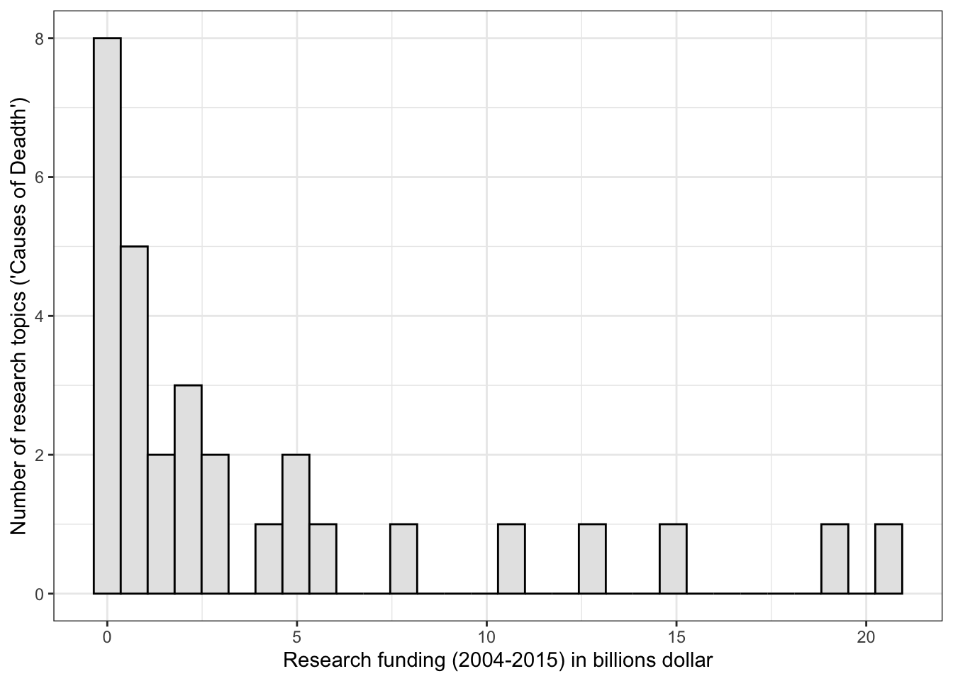
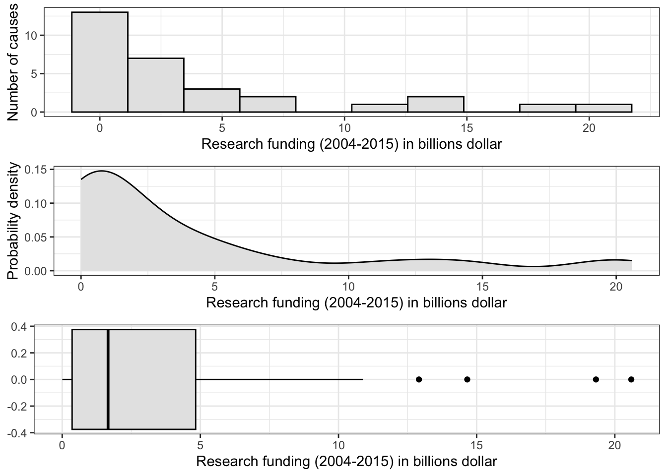
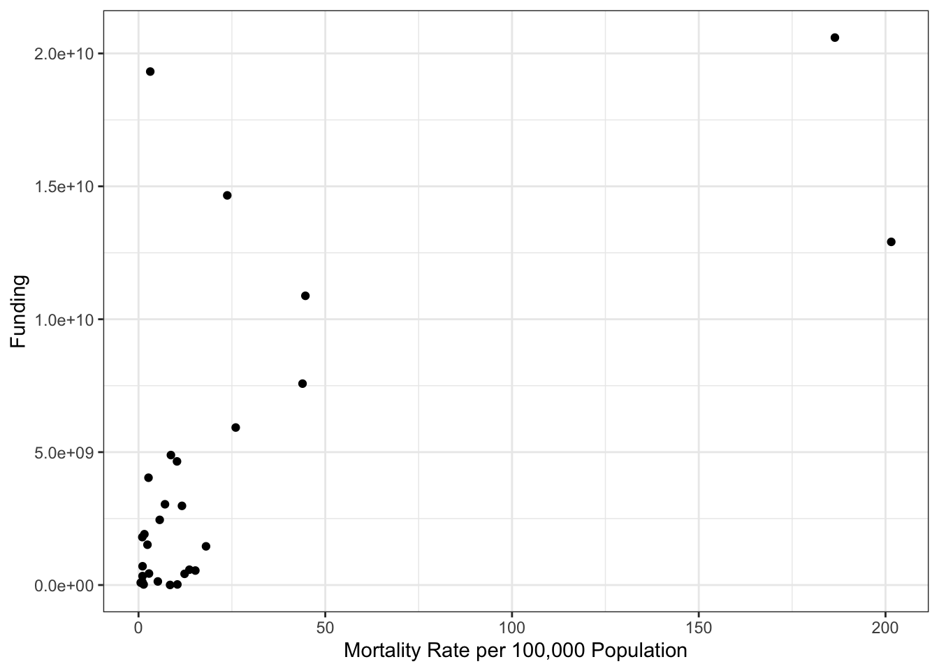
p_histo_funding<-research_funding|>ggplot2::ggplot(ggplot2::aes(x =Funding/1000000000))+ggplot2::geom_histogram(bins =10, fill ="grey90", color ="black")+ggplot2::labs(x ="Research funding (2004-2015) in billions dollar", y ="Number of causes")+ggplot2::theme_bw()p_histo_funding
Graph 3.15: Research funding (2004-2015) for the top 30 mortility casues in the U.S. (in billions dollar)
R Code 3.39 : Histogram of research funding (2004-2015) with 30 bins
Code
research_funding|>ggplot2::ggplot(ggplot2::aes(x =Funding/1000000000))+ggplot2::geom_histogram(bins =30, fill ="grey90", color ="black")+ggplot2::labs(x ="Research funding (2004-2015) in billions dollar", y ="Number of research topics ('Causes of Deadth')")+ggplot2::theme_bw()
Graph 3.16: Research funding (2004-2015) for the top 30 mortility casues in the U.S. (in billions dollar)
With histograms it is important to play around with the number of bins. This changes the appearance of histograms sometimes quite profoundly. The default of 30 bins displays a warning that one should choose a better value with the argument binwidth (another option to control the number of bins.)
It is not quite clear for me what would be the optimal number of bins of a given data set. It was easy for Graph 2.11: There were only 30 different values, each for one. So to provide the same number of bins as number of observed days (= 30) was a sensible choice.
There is not much difference in the case of 10 or 30 bins of Experiment 3.2. A big difference would be for example when the number of modes is changing, or the mode is moving far to another value. It seems to me that with a density plot it is simpler to choose the optimal curve (even if I do not understand the underlying rationale of this kernel density estimation (KDE) procedure).
3.5.3 Density plot
Experiment 3.3 : Density plot of research funding (2004-2015) with different bandwidth
R Code 3.40 : Density plot with standard bandwidth bw = "nrd0"
Code
p_dens_funding<-research_funding|>ggplot2::ggplot(ggplot2::aes(x =Funding/1000000000))+ggplot2::geom_density(fill ="grey90", color ="black")+ggplot2::labs(x ="Research funding (2004-2015) in billions dollar", y ="Probability density")+ggplot2::theme_bw()p_dens_funding
Graph 3.17: Research funding (2004-2015) for the top 30 mortility casues in the U.S. (in billions dollar)
This is the density plot without changing the default bandwidth. It uses nrd0 as bandwidth. One can see that it is somewhat similar to bw = 1.5 (see Graph 3.19).
bw.nrd0 implements a rule-of-thumb for choosing the bandwidth of a Gaussian kernel density estimator. It defaults to 0.9 times the minimum of the standard deviation and the interquartile range divided by 1.34 times the sample size to the negative one-fifth power (= Silverman’s ‘rule of thumb’, Silverman (1986, page 48, eqn (3.31))) unless the quartiles coincide when a positive result will be guaranteed. (Quoted form the help file of stats::bandwidth())
R Code 3.41 : Density plot with bandwidth of 0.5
Code
research_funding|>ggplot2::ggplot(ggplot2::aes(x =Funding/1000000000))+ggplot2::geom_density(fill ="#7d70b6", color ="black", bw =.5)+ggplot2::labs(x ="Research funding (2004-2015) in billions dollar", y ="Probability density")+ggplot2::theme_bw()
Graph 3.18: Research funding (2004-2015) for the top 30 mortility casues in the U.S. (in billions dollar)
I have replicated Figure 3.26 without knowing what bw = 0.5 means and how it is computed.
: Density plot of research funding (2004-2015) with bandwidth of 1.5
Code
research_funding|>ggplot2::ggplot(ggplot2::aes(x =Funding/1000000000))+ggplot2::geom_density(fill ="#7d70b6", color ="black", bw =1.5)+ggplot2::labs(x ="Research funding (2004-2015) in billions dollar", y ="Probability density")+ggplot2::theme_bw()
Graph 3.19: Research funding (2004-2015) for the top 30 mortility casues in the U.S. (in billions dollar)
I have replicated Figure 3.27 without knowing what bw = 1.5 means and how it is computed. This is the figure that was chosen in the book as appropriate to represent the data distribution. It is very similar to the {ggplot2} standard version (Graph 3.17), where neither bw nor kernel was changed.
R Code 3.42 : Density plot with bandwidth selector nrd0
Code
research_funding|>ggplot2::ggplot(ggplot2::aes(x =Funding/1000000000))+ggplot2::geom_density(fill ="grey90", color ="black", bw ="nrd0")+ggplot2::labs(x ="Research funding (2004-2015) in billions dollar", y ="Probability density")+ggplot2::theme_bw()
Graph 3.20: Research funding (2004-2015) for the top 30 mortility casues in the U.S. (in billions dollar)
Here I have stated expressively that bw = "nrd0". This is the default value that implements a rule-of-thumb for choosing the bandwidth of a Gaussian kernel density estimator. It is appropriate for normal-like distributions.
R Code 3.43 : Density plot with bandwidth selector SJ
Code
research_funding|>ggplot2::ggplot(ggplot2::aes(x =Funding/1000000000))+ggplot2::geom_density(fill ="grey90", color ="black", bw ="SJ")+ggplot2::labs(x ="Research funding (2004-2015) in billions dollar", y ="Probability density")+ggplot2::theme_bw()
#> Warning: Computation failed in `stat_density()`.
#> Caused by error in `precompute_bw()`:
#> ! `bw` must be one of "nrd0", "nrd", "ucv", "bcv", "sj", "sj-ste", or
#>   "sj-dpi", not "SJ".
#> ℹ Did you mean "sj"?
Graph 3.21: Research funding (2004-2015) for the top 30 mortility casues in the U.S. (in billions dollar)
bw = "SJ" select the bandwidth using pilot estimation of derivatives and is appropriate for multimodal or general non-normal distribution (od 2018).
R Code 3.44 : Density plot with bandwidth ucv
Code
research_funding|>ggplot2::ggplot(ggplot2::aes(x =Funding/1000000000))+ggplot2::geom_density(fill ="grey90", color ="black", bw ="ucv")+ggplot2::labs(x ="Research funding (2004-2015) in billions dollar", y ="Probability density")+ggplot2::theme_bw()
#> Warning in stats::bw.ucv(x): minimum occurred at one end of the range
Graph 3.22: Research funding (2004-2015) for the top 30 mortility casues in the U.S. (in billions dollar)
ucv is one of the two extremes. It chooses a very small bandwidth. (The other extreme selector is bcv which chooses very a wide bandwidth.)
R Code 3.45 : Density plot with bandwith bcv
Code
research_funding|>ggplot2::ggplot(ggplot2::aes(x =Funding/1000000000))+ggplot2::geom_density(fill ="grey90 ", color ="black", bw ="bcv")+ggplot2::labs(x ="Research funding (2004-2015) in billions dollar", y ="Probability density")+ggplot2::theme_bw()
#> Warning in stats::bw.bcv(x): minimum occurred at one end of the range
Graph 3.23: Research funding (2004-2015) for the top 30 mortility casues in the U.S. (in billions dollar)
bcv is one of the two extremes. It chooses a very wide bandwidth. (The other extreme selector is ucv which chooses a very narrow bandwidth.)
The equivalent of binwidth in histograms is bw (smoothing bandwidth) in density plots. I have to confess that I do not understand all the relevant factors to choose the optimal bandwidth for density plots (or binwidth for histograms).
In density plots there is also the kernel argument for choosing the appropriate smoothing kernel. I learned from the video by od webel (2018) that the chosen kernel (gaussian”, the standard, “rectangular”, “triangular”, “epanechnikov”, “biweight”, “cosine” or “optcosine”) is not so important because the result all in similar distributions. Most important, however, is to choose the appropriate bandwidth.
It is said that one disadvantage of density plots is its feature to smooth out the distribution so that you cannot see anymore — in contrast to histograms — if there are gaps in the data. But if you choose a very small bandwidth like ucv then you get a distribution similar to a histogram.
Resource 3.3 : Information about kernel density estimation and bandwidth
Another article on this complex topic: What is Kernel Density Estimation?. From this article I learned that a kernel is nothing else as a weighting function to estimate the probability density function (PDF). (Until now I had a sketchy impression about this concept derived from another meaning of “kernel”, related with the core part of a computer.)
3.5.4 Box Plot
Histograms and density plots are great for examining the overall shape of the data for a continuous variable. Boxplots in contrasts are useful for identifying the middle value and the boundaries around the middle half of the data.
R Code 3.46 : Box plot of research funding (2004-2015)
Code
p_box_funding<-research_funding|>ggplot2::ggplot(ggplot2::aes(x =Funding/1000000000))+ggplot2::geom_boxplot(fill ="grey90", color ="black")+ggplot2::labs(x ="Research funding (2004-2015) in billions dollar")+ggplot2::theme_bw()p_box_funding
Graph 3.25: Research funding (2004-2015) for the top 30 mortility casues in the U.S. (in billions dollar)
3.5.5 Summary
Each of the three presented plot types (histogram, density plot and box plot) has it strength and disadvantage.
All three graphs show the right skew clearly, while the histogram and boxplot show gaps in the data toward the end of the tail. The boxplot is the only one of the three that clearly identifies the central tendency and spread of the variable.
R Code 3.47 : Comparison of histogram, density plot and box plot
Graph 3.26: Comparison: Histogram, densitiy plot and box plot
3.6 Achievement 3: Graph for two variable at once
3.6.1 Two categorical variables
3.6.1.1 Mosaic Plot
3.6.1.1.1 Properties
Mosaic plots also called Marimekko charts or Mekko charts show the relative size of groups across two or more variables. It gives an overview of the data and makes it possible to recognize relationships between different variables. For example, independence is shown when the boxes across categories all have the same areas.
Mosaic plots are the multidimensional extension of spineplots, which graphically display the same information for only one variable.
Bullet List
The displayed variables are categorical or ordinal scales.
The plot is of at least two variables. There is no upper limit, but too many variables may be confusing in graphic form.
The number of observations is not limited, but not read in the image.
The areas of the rectangular tiles that are available for a combination of features are proportional to the number of observations that have this combination of features.
Unlike as other graphs, it is not possible for the mosaic plot to plot a confidence interval.
Bullet List 3.9: Properties of Mosaic Charts (Wikipedia)
3.6.1.1.2 Mosaic charts with {ggmosaic}
Example 3.8 : Mosaic chart of gun use, rounds fired, ear plugs and by sex (NHANES survey 2011-2012)
R Code 3.48 : Firearm use by sex in the US among 2011–2012 NHANES participants
Code
nhanes_2012_clean<-readRDS("data/chap03/nhanes_2012_clean.rds")library(ggmosaic)library(ggplot2)nhanes_2012_clean|>tidyr::drop_na(c(gun_use, sex))|>ggplot2::ggplot()+ggmosaic::geom_mosaic(ggplot2::aes( x =ggmosaic::product(gun_use, sex), fill =gun_use))+ggplot2::theme_classic()+ggplot2::labs(x ="Sex", y ="Ever used a gun?", fill ="Gun use")+ggplot2::guides(fill =ggplot2::guide_legend(reverse =TRUE))+ggplot2::scale_fill_viridis_d( alpha =1, begin =0.15, end =0.35, direction =-1, option ="turbo", aesthetics ="fill")
Graph 3.27: Firearm use by sex in the US among 2011–2012 NHANES participants
Better use of mosaic charts when variables have different levels with different proportions
Graph 3.27 is a bad example for a mosaic chart: One of its features (that the area of the columns reflect the proportion of the level) does not shine in this example because both levels (men and women) have approximately the same proportion (49.8 vs. 50.2%). Although it is better to have variables with several levels.
WATCH OUT! Loading and attaching {ggmosaic} is mandatory
Just calling the {ggmosaic} functions with the :: syntax results into an error. I have to expressively load and attach the package with library(ggmosiac). But the error only appears when I render the whole document; running just the R code chunk works. I suppose that this results from a misbehavior of the {ggmosaic} code.
There is also another warning with {ggmosaic} version 0.33: One should use tidyr::unite() instead of tidyr::unite_() since {tidyr} version 1.2.0. This is a missing adaption in the {ggmosaic} package as the warning message pointed out. I could get rid of this warning message by installing the GitHub version 0.34 as recommended in this GitHub post.
R Code 3.49 : Rounds fired by sex in the United States among 2011–2012 NHANES participants
Code
nhanes_2012_clean|>dplyr::mutate(rounds_fired =dplyr::na_if(rounds_fired, "Don't know"))|>tidyr::drop_na(c(rounds_fired, sex))|>dplyr::mutate(rounds_fired =forcats::fct_drop(rounds_fired))|>ggplot2::ggplot()+ggmosaic::geom_mosaic(ggplot2::aes( x =ggmosaic::product(rounds_fired, sex), fill =rounds_fired))+ggplot2::theme_classic()+ggplot2::labs(x ="Sex", y ="Total number of rounds fired", fill ="Rounds fired")+ggplot2::guides(fill =ggplot2::guide_legend(reverse =TRUE))+ggplot2::scale_fill_viridis_d( alpha =1, # alpha does not work! begin =.25, end =.75, direction =-1, option ="cividis")
Graph 3.28: Rounds fired by sex in the United States among 2011–2012 NHANES participants
This is already a more informative chart as Graph 3.27. It shows that women are not only less using a gun, those they do, they fire less round than men.
But mosaic charts really shine when both variables have several levels as shown in Graph 3.29.
I have experimented with several approaches to provide a specific scale. In this case the color friendly cividis scale from the {viridis} package. From the 5 different scaling option I have 4 commented out. See the code for the details.
R Code 3.50 : Number of rounds fired by wearing ear plugs among the 2011–2012 NHANES participants
Code
nhanes_2012_clean|>dplyr::mutate(rounds_fired =dplyr::na_if(rounds_fired, "Don't know"))|>dplyr::mutate(ear_plugs =dplyr::na_if(ear_plugs, "Don't know"))|>tidyr::drop_na(c(rounds_fired, ear_plugs))|>dplyr::mutate(rounds_fired =forcats::fct_drop(rounds_fired))|>dplyr::mutate(ear_plugs =forcats::fct_drop(ear_plugs))|>ggplot2::ggplot()+ggmosaic::geom_mosaic(ggplot2::aes( x =ggmosaic::product(rounds_fired, ear_plugs), fill =rounds_fired))+ggplot2::theme_bw()+ggplot2::theme(axis.text.x =ggplot2::element_text(angle =45, vjust =1, hjust =1))+ggplot2::labs(x ="Wearing ear plugs", y ="Total number of rounds fired", fill ="Rounds fired")+ggplot2::guides(fill =ggplot2::guide_legend(reverse =TRUE))+viridis::scale_fill_viridis( discrete =TRUE, option ="turbo", direction =-1)
Graph 3.29: Rounds fired with ear plugs among the 2011–2012 NHANES participants
The chart clearly shows that a part (more than 1/3 of the respondent) never use ear plugs, even if they fire many rounds.
R Code 3.51 : Firearm use by sex in the US among 2011–2012 NHANES participants using {vcd}
Code
nhanes_2012_clean<-base::readRDS("data/chap03/nhanes_2012_clean.rds")test<-nhanes_2012_clean|>dplyr::select(gun_use, sex)|>tidyr::drop_na()vcd::mosaic(~gun_use+sex, data =test, highlighting ="gun_use", highlighting_fill =c("#5fefbd", "#7298f6"), highlighting_direction ="top", direction =c("h", "v"), main ="Firearm use by sex using {vcd}")
Graph 3.30: Firearm use by sex in the US among 2011–2012 NHANES participants
I have tried to replicate Graph 3.27 with the vcd::mosaic() function. But I noticed that there are several facilities of {ggplot2} not available (for instance
to rename x- and y-axis;
to rotate the text for the axis so that I can read longer variable name;
to present a legend with just the variable names,
(For the first issue I would have to rename the column names in the data frame, for the second issue I couldn’t find a solution.)
Because the vcd::mosaic() function is too complex (for my) and requires a new package to learn I will stick with {ggplot2} approaches, even if I have the impression that there are some programming glitches with {ggmosaic}. (See for instance the discussion in the post forum).
Even in all the examples I found on the Internet (see for instance Creating a Mosaic Plot in R Graphics Cookbook (Chang 2024) I could not find a solution for my problems mentioned above.
3.6.1.1.3 Adaptions and other resources
My own adaptions to the mosaic figures
In contrast to the book I have used three additional adaptions for the figures produced with the {ggmosaic} package:
I have used with the {viridis} package color-blind friendly palettes (see: Section A.96). There are several features to comment:
I have the direction of the palettes reversed so that the light color are at the bottom and the dark colors at the top.
In Graph 3.27 I had start and end color of the palette “turbo” manually changed to get a better color separation with lighter colors. Otherwise I would have gotten dark blue and dark red. (Unfortunately the argument alpha for setting the transparency value does not work with {viridis}.)
With {ggplot2} version 3.0.0 the {viridisLite} package was integrated integrated into {ggplot2}. I have used this new possibility in Graph 3.27.
I have removed the small amount of “Don’t know” answers in Graph 3.28 and Graph 3.29 to get a graph that is easier to interpret.
I have reversed the display of the legend so that the colors match the graphic e.g. from bottom to top are colors in the figure and in the legend identical.
For Graph 3.29 I have the angle for the text of the axis set to 45° to prevent overlapping text under small columns.
Concerning color friendly palettes I have added several experiments with different packages in Section 3.9.1.
Resource 3.4 {vcd} / {vcdExtra} are other packages for mosaic graphs (and more)
The packages {vcd} and {vcdExtra} are specialized package for the visualization of categorical data. I have tried it out, but its usage for the mosaic function is more complex and need time to learn.
{vcd} and {vcdExtra} are support packages for the book, “Discrete Data Analysis with R” (Friendly and Meyer 2015) (see Section A.95). There is also a website DDAR (abbreviation of the book title) and a course description with additional material. There are several introductory vignettes to learn different aspects of the two packages.
So if you are interested to learn more about visualization of categorical data besides the mosaic graph then DDAR would be the right place.
ggplot2::geom_bar() if you are providing the records (rows) and geom_bar() has to calculate the number of cases in each group (as we have already done in @#sec-chap03-bar-chart-1) or
ggplot2::geom_col() if you have already counted the number of cases in each groups and provide these summarized numbers to geom_col().
During working on Section 3.6.1 I have added several experiments for color friendly palettes (see Section 3.9.1). Here I will use these lesson learned and changed the default {ggplot2} color palette to the base R Okabe-Ito palette, one of the available safe colorblind palettes. (Another recommended choice are the eight {viridis} palettes, especially the viridis::cividis() palette)
Experiment 3.4 : Working with colorblind friendly color palettes
Table 3.2: Show color distances of the ‘Okabe-Ito’ palette for two colors for normal sighted people and people with CVD
Checking the color distances with {colorblindcheck} we see a very great distance (more than 60) not only in the normal vision palette but also with all CVD palettes. (See for additional details of how to use and interpret results of the {colorblindcheck} in Section 3.9.1.3.3).
There are several options to define a new color palette. I have here chosen three approaches, but used only one (e.g., the other two options I have commented out). I have applied the base R color vision deficiency friendly palette Okabe-Ito.
For the next few graphs I need only two colors. Normally it would not change the appearance if I define a color palette with more color. The first two would always the same. But there is one exception: When I need to reverse the two color used — as I have done in Listing / Output 3.18 — then the reverse function is applied to the complete color palette and results in a different color composition.
This problem could be overcome with the {ggokabeito} package, where you could manually define the order of the colors (see Section A.28). Additionally it provide the Okabe Ito scale for direct use in {ggplot}.
Nevertheless I haven’t use more than two colors. The categorical variable in Graph 3.35 is an ordered variable (0 to 50k rounds fired) but the Okabe Ito palette is with its distinct discrete colors not well suited to display ordered variables.
R Code 3.53 : Change the {ggplot2} default color palette
Code
## change 2 ggplot2 colors #############options( ggplot2.discrete.colour =my_2_colors, ggplot2.discrete.fill =my_2_colors)nhanes_2012_clean<-base::readRDS("data/chap03/nhanes_2012_clean.rds")p1<-nhanes_2012_clean|>dplyr::select(gun_use, sex)|>tidyr::drop_na()|>ggplot2::ggplot(ggplot2::aes(x =sex, fill =gun_use))+ggplot2::geom_bar()+ggplot2::theme_minimal()+ggplot2::theme(legend.position ="none")+ggplot2::theme(aspect.ratio =4/1)+ggplot2::labs(x ="Gun use", y ="Number of respondents")p2<-nhanes_2012_clean|>dplyr::select(gun_use, sex)|>tidyr::drop_na()|>ggplot2::ggplot(ggplot2::aes(x =sex, fill =gun_use))+ggplot2::geom_bar(position ="dodge")+ggplot2::theme_minimal()+ggplot2::theme(legend.position ="none")+ggplot2::theme(aspect.ratio =2/1)+ggplot2::labs(x ="Gun use", y ="Number of respondents")patchwork:::"-.ggplot"(p1, p2)## restore 2 ggplot2 colors ############## options(# ggplot2.discrete.color = NULL,# ggplot2.discrete.fill = NULL# )
Graph 3.31: Change the {ggplot2} default color palette to my two CVD save colors
I have changed the default colors of the {ggplot2} palette with two discrete colors using options(ggplot2.discrete.fill = my_2_colors). To restore the default {ggplot2} color palette use options(ggplot2.discrete.fill = NULL).
3.6.1.2.1 Stacked Bar Chart
Stacked bar charts (like pie & waffle charts) show parts of a whole and have similar problems as pie charts and mosaic plots. If there are many groups or groups of similar size, stacked bar charts are difficult to interpret and not recommended.
Example 3.9 : Stacked bar charts for two categorical variables
R Code 3.54 : Gun use by sex (using raw data = geom_bar())
Code
nhanes_2012_clean<-base::readRDS("data/chap03/nhanes_2012_clean.rds")nhanes_2012_clean|>dplyr::select(gun_use, sex)|>tidyr::drop_na()|>ggplot2::ggplot(ggplot2::aes(x =gun_use, fill =sex))+ggplot2::geom_bar()+ggplot2::theme_bw()+ggplot2::labs( x ="Gun use", y ="Number of respondents")+ggplot2::guides( fill =ggplot2::guide_legend( title ="Gun use"))
Graph 3.32: Stacked bar chart: Gun use by sex (using raw data = geom_bar()
R Code 3.55 : Gun use by sex (using summarized data = geom_col())
Code
nhanes_2012_clean<-base::readRDS("data/chap03/nhanes_2012_clean.rds")nhanes_2012_clean|>dplyr::select(gun_use, sex)|>tidyr::drop_na()|>janitor::tabyl(gun_use, sex)|>tidyr::pivot_longer( cols =!gun_use, names_to ="sex", values_to ="count")|>ggplot2::ggplot(ggplot2::aes(x =gun_use, y =count, fill =sex))+ggplot2::geom_col(position =ggplot2::position_stack(reverse =TRUE))+ggplot2::theme_bw()+ggplot2::labs( x ="Gun use", y ="Number of respondents")+ggplot2::guides( fill =ggplot2::guide_legend( title ="Gun use", reverse =TRUE))+ggplot2::scale_fill_discrete( type =base::rev(getOption("ggplot2.discrete.fill")))
(a) Stacked bar chart: Gun use by sex (using summarized data = geom_col())
Listing / Output 3.18: Stacked bar chart: Gun use by sex (using summarized data = geom_col())
To get exactly the same appearance with geom_col() as with geom_bar() in Graph 3.32 I had to add three important adaptions:
To get the same order of stacked bars (starting with female) I had to add inside ggplot2::geom_col() the argument position = ggplot2::position_stack(reverse = TRUE).
To get the same order of colors I had to reverse the color order in ggplot2::scale_fill_discrete() with type = base::rev(getOption("ggplot2.discrete.fill")).
R Code 3.56 : Stacked bar chart: Gun use by sex in percent of total respondents
Code
nhanes_2012_clean<-base::readRDS("data/chap03/nhanes_2012_clean.rds")nhanes_2012_clean|>dplyr::select(gun_use, sex)|>tidyr::drop_na()|>ggplot2::ggplot(ggplot2::aes(x =gun_use, fill =sex, y =100*ggplot2::after_stat(count)/sum(ggplot2::after_stat(count))))+## adornmentsggplot2::geom_bar()+ggplot2::theme_bw()+ggplot2::labs( x ="Gun use", y ="Number of respondents")+ggplot2::guides( fill =ggplot2::guide_legend( title ="Gun use"))
Graph 3.33: Stacked bar chart: Gun use by sex in percent of total respondents
WATCH OUT! This bar chart is not correct.
Instead of displaying parts of whole (100% in each group) it relates its grouped value to the total amount of observations. This lead to a misleading perception of the relationships if the groups have different sizes. For instance in this graph male using and not using guns have approximately the same percentage (about 25%). But this is not correct: Almost 75% of the men are using fire arms.
R Code 3.57 : Proportional stacked bar chart: Gun use by sex in percent of grouped respondents
Code
nhanes_2012_clean<-base::readRDS("data/chap03/nhanes_2012_clean.rds")nhanes_2012_clean|>dplyr::select(gun_use, sex)|>tidyr::drop_na()|># prepare for proportional stacked bardplyr::group_by(gun_use, sex)|>dplyr::count()|>## pick the variable that will add # to 100%dplyr::group_by(gun_use)|>## compute percents within chosen variabledplyr::mutate(percent =100*(n/sum(n)))|>ggplot2::ggplot(ggplot2::aes(x =gun_use, y =percent, fill =sex))+ggplot2::geom_col()+ggplot2::theme_bw()+ggplot2::labs( x ="Gun use", y ="Number of respondents")+ggplot2::guides( fill =ggplot2::guide_legend( title ="Gun use"))
(a) Proportional stacked bar chart: Gun use by sex in percent of grouped respondents
Listing / Output 3.19: This code snippet from the book is more complex as necessary
This is the same code as in the book. It is more complex as necessary because:
For proportional bars it is sufficient to use position = "fill" in geom_bar() / geom_col(). Then the complex preparation for proportional bars is not necessary anymore.
Instead of multiplying the n / sum(n) with 100 one could use ggplot2::scale_y_continuous(labels = scales::percent). This has the additional advantage that % sign is appended at the y-values.
R Code 3.58 : Proportional stacked bar chart: Gun use by sex
Code
nhanes_2012_clean<-base::readRDS("data/chap03/nhanes_2012_clean.rds")nhanes_2012_clean|>dplyr::select(gun_use, sex)|>tidyr::drop_na()|>ggplot2::ggplot(ggplot2::aes(x =gun_use, fill =sex))+ggplot2::geom_bar(position ="fill")+## adornmentsggplot2::theme_bw()+ggplot2::labs( x ="Gun use", y ="Number of respondents")+ggplot2::guides( fill =ggplot2::guide_legend( title ="Gun use"))+ggplot2::scale_y_continuous(labels =scales::percent)
(a) Proportional stacked bar chart: Gun use by sex
Listing / Output 3.20: More concise code for the proportional stacked bar chart: Gun use by sex
This is the reduced code of the book snippet from Listing / Output 3.19. It does not need a special preparation for proportional bar parts. Instead just add position = "fill" into the ggplot2::geom_bar() or ggplot2::geom_col() function.
3.6.1.2.2 Grouped Bar Chart
Grouped bar charts are the preferred option for bar charts. If there are more than two levels of categorical variables stacked bar charts are difficult to interpret. They lack a common reference point as the different observations or percentage in each levels starts and ends at different absolute position. A comparison of the relative size is for the human eye therefore awkward.
From the conceptual point of view there is no difference in the creation between stacked and grouped bar charts. The only difference is that grouped bar charts have the argument position = "dodge" inside the geom_bar() or geom_col() argument.
Example 3.10 : Grouped bar charts for two categorical variables
R Code 3.59 : Grouped bar chart with two variables with only two levels: Gun use by sex
Code
nhanes_2012_clean<-base::readRDS("data/chap03/nhanes_2012_clean.rds")nhanes_2012_clean|>dplyr::select(gun_use, sex)|>tidyr::drop_na()|>ggplot2::ggplot(ggplot2::aes(x =gun_use, fill =sex))+ggplot2::geom_bar(position ="dodge")+ggplot2::theme_bw()+ggplot2::labs( x ="Gun use", y ="Number of respondents")+ggplot2::guides( fill =ggplot2::guide_legend( title ="Gun use"))
Graph 3.34: Grouped bar chart with two variables with only two levels: Gun use by sex
R Code 3.60 : Choose six colors from a color friendly palette
Table 3.3: Show color distances of the ‘cividis’ palette for six colors for normal sighted people and people with CVD
For the bar charts rounds fired by sex we need a different scale with
more colors (six colors in total) and
a gradual progression to show the order of the categorical variable
Checking the color distances of the cividis palette from the {viridis} packages with {colorblindcheck} we can see that the minimum distance is 10.5. This is relatively low but still acceptable. I have therefore set the default {ggplot2} color palette to these six colors of the cividis palette.
R Code 3.61 : Grouped bar chart of two variables with several levels: Rounds fired by sex
Code
nhanes_2012_clean<-base::readRDS("data/chap03/nhanes_2012_clean.rds")nhanes_2012_clean|>dplyr::select(rounds_fired, sex)|>dplyr::mutate(rounds_fired =dplyr::na_if(rounds_fired, "Don't know"))|>tidyr::drop_na()|>base::droplevels()|>ggplot2::ggplot(ggplot2::aes(x =sex, fill =rounds_fired))+ggplot2::geom_bar(position =ggplot2::position_dodge())+ggplot2::theme_bw()+ggplot2::labs( x ="Rounds fired", y ="Number of respondents")+ggplot2::guides( fill =ggplot2::guide_legend( title ="Rounds fired"))
Graph 3.35: Grouped bar chart of two variables with several levels: Rounds fired by sex
From this graph it is obvious that men fire generally more rounds than women. But the absolute value is not conclusive because we cannot see how many people in each group was excluded because they didn’t even fire one round. It could be that there are much more men than women that did not even fire one round. We already know that this is not the case but from this graph alone you wouldn’t know.
To get a more complete picture:
We add also people without any use of fire arms into the graph.
We calculate the percentage of rounds fired per group (= by sex).
R Code 3.62 : Grouped bar chart of two variables with several levels: Rounds fired by sex of all respondents
Code
nhanes_2012_clean<-base::readRDS("data/chap03/nhanes_2012_clean.rds")nhanes_2012_clean|>dplyr::select(gun_use, rounds_fired, sex)|>dplyr::mutate(rounds_fired =dplyr::if_else(gun_use=="No", "0 rounds fired", rounds_fired))|>dplyr::mutate(rounds_fired =dplyr::na_if(rounds_fired, "Don't know"))|>tidyr::drop_na()|>base::droplevels()|>## prepare for percentage calculationdplyr::group_by(rounds_fired, sex)|>dplyr::count()|>## pick the variable that will add to 100%dplyr::group_by(sex)|>## compute percents within chosen variabledplyr::mutate(percent =n/sum(n))|>ggplot2::ggplot(ggplot2::aes(x =sex, y =percent, fill =rounds_fired))+ggplot2::geom_col(position =ggplot2::position_dodge())+ggplot2::theme_bw()+ggplot2::labs( x ="Rounds fired", y ="Percentage")+ggplot2::guides( fill =ggplot2::guide_legend( title ="Rounds fired"))+ggplot2::scale_y_continuous( labels =scales::label_percent())+ggplot2::scale_fill_brewer(palette ="BuGn")
Graph 3.36: Grouped bar chart of two variables with several levels: Rounds fired by sex of all respondents
Now we can say generally that more man use firearms than women. From those respondents (men and women) that are using guns, men fire generally more rounds than women.
3.6.2 One categorical and one continuous variable
3.6.2.1 Bar Chart
The is just one difference for bar charts with one categorical and one continuous variable in comparison to the bar charts used previously in this chapter: We need a summary statistics for the continuous variable so that we can present accordingly the height of the bar. These summary statistics has to be inserted into the geom_bar() function.
Example 3.11 : Bar charts with one categorical and one continuous variable
R Code 3.63 : The R code from the book does not work
Code
fbi_deaths_clean<-base::readRDS("data/chap03/fbi_deaths_clean.rds")fbi_deaths_clean|>ggplot2::ggplot(ggplot2::aes(x =weapons, y =deaths))+ggplot2::geom_bar(stat ="summary", fun.y =mean)+ggplot2::theme_minimal()+ggplot2::labs(x ="Firearm type", y ="Number of homicides committed")
#> No summary function supplied, defaulting to `mean_se()`
Graph 3.37: Using the R code from the book does not work
Here I was using exactly the same code as in the book for Figure 3.45. Because of changes in {ggplot2) this code does not work anymore. I got two messages:
No summary function supplied, defaulting to mean_se()
fbi_deaths_clean<-base::readRDS("data/chap03/fbi_deaths_clean.rds")fbi_deaths_clean|>ggplot2::ggplot(ggplot2::aes(x =weapons))+ggplot2::geom_bar()+ggplot2::stat_summary(ggplot2::aes(y =deaths), fun ="mean", geom ="bar")+ggplot2::theme_bw()+ggplot2::labs(x ="Firearm type", y ="Number of homicides committed")
Graph 3.38: Bar chart with calculating the mean for the 2012-2016
This code chunk works without any message and warning. There are three differences to the code from the book:
Only the x variable is the aesthetics for the ggplot() call.
geom_bar() is empty in contrast to the book where arguments for summarizing statistics are added inside the geom_bar() parenthesis.
A new function stat_summary() is added with supplies all the necessary arguments to generate the summarizing statistics. It needs an extra aesthetics for the y-axis where the calculation takes place.
R Code 3.65 : Bar chart: Calculating mean values with stat_summary() and flipped coordinates
Code
fbi_deaths_clean<-base::readRDS("data/chap03/fbi_deaths_clean.rds")fbi_deaths_clean|>ggplot2::ggplot(ggplot2::aes( x =stats::reorder(x =weapons, X =-deaths)))+ggplot2::geom_bar()+ggplot2::stat_summary(ggplot2::aes( y =deaths, fill =weapons, group =weapons), fun ="mean", geom ="bar")+ggplot2::coord_flip()+ggplot2::theme_bw()+ggplot2::labs(x ="Firearm type", y ="Number of homicides committed")+ggplot2::scale_fill_manual(values =c("Handguns"="#7463AC","Firearms, type not stated"="gray","Rifles"="gray","Shotguns"="gray","Other guns"="gray"), guide ="none")
Listing / Output 3.21: Calculating mean values using geom_bar() with stat_summary() and flipped coordinates
Here I have used the same code as before but have added several scale improvements like flipped axis, reordered the bars and changed to a sparse theme.
I had considerable problems with the fill color for this chart, because I did not know where and how to add the fill aesthetics. As I added during my experimentation a new ggplot2::eas() layer with the argument fill = weapons, I got the following warning message:
The following aesthetics were dropped during statistical transformation. This can happen when ggplot fails to infer the correct grouping structure in the data. Did you forget to specify a group aesthetic or to convert a numerical variable into a factor?
I didn’t know how to add the group aesthetic and all the examples I found on the web are referring to geom_line(). (See for instance the page of the online manual for ggplot2 Aesthetics: grouping or Mapping variable values to colors in the first edition of R Graphics Cookbook). I finally found the solution. The following text snippet is now more understandable for me:
The group aesthetic is by default set to the interaction of all discrete variables in the plot. This choice often partitions the data correctly, but when it does not, or when no discrete variable is used in the plot, you will need to explicitly define the grouping structure by mapping group to a variable that has a different value for each group. Aesthetics: grouping
An easier solution (for me) is to compute the mean values of the different firearms and then to apply a bar chart using geom_col() as I have done in the next tab with Listing / Output 3.22.
R Code 3.66 : Bar chart: Using mean values with geom_col() and flipped coordinates
Code
fbi_deaths_clean<-base::readRDS("data/chap03/fbi_deaths_clean.rds")fbi_deaths_clean|>dplyr::group_by(weapons)|>dplyr::summarize(mean_deaths_2012_2016 =mean(deaths))|>ggplot2::ggplot(ggplot2::aes(fill =weapons, x =stats::reorder( x =weapons, X =-mean_deaths_2012_2016), y =mean_deaths_2012_2016))+ggplot2::geom_col()+ggplot2::coord_flip()+ggplot2::theme_bw()+ggplot2::labs(x ="Firearm type", y ="Number of homicides committed")+ggplot2::scale_fill_manual(values =c("Handguns"="#7463AC", "Firearms, type not stated"="gray", "Rifles"="gray", "Shotguns"="gray", "Other guns"="gray"), guide ="none")
(a) Bar chart: Using already computed mean values with geom_col() and flipped coordinates
Listing / Output 3.22: Bar chart: Using already computed mean values with geom_col() and flipped coordinates
In this version I have calculated the mean beforehand I have passed the data to {ggplot2}. This was easier for me to understand and I had this solution long before I solved the group problem in Listing / Output 3.21.
R Code 3.67 : Number of Homicides by type of firearms (2012-2016)
Code
p<-fbi_deaths_clean|>ggplot2::ggplot(ggplot2::aes(fill =year, y =deaths, x =stats::reorder( x =weapons, X =-deaths)))+ggplot2::geom_bar(position ='dodge', stat ='identity')+ggplot2::coord_flip()+ggplot2::theme_bw()+ggplot2::labs(x ="Firearm type", y ="Number of homicides committed", fill ="Year")my_5_colors<-viridis::cividis(5, direction =-1, alpha =.8)withr::with_options(list(ggplot2.discrete.fill =my_5_colors),print(p))
Graph 3.39: Number of Homicides by type of firearms (2012-2016)
Here I have the first time used the {withr} package (see: Section A.98) for a just temporary change of the {ggplot2) standard color palette. This has the advantage that one doesn’t restore the original value.
Report
Handguns are in all years constant the type of firearms where the most homicides were committed.
Starting with 2013 the homicides with handguns are rising constantly.
The type of firearms not stated is also rising over the years. What is the reason that this category is on the rise? As the second most cause of homicides it could disturb the previous conclusion. Imagine that most of this category belong to handguns category than we would see a still stepper rise of homicides with handguns. Or the diametrically opposite assumption: If most of the this category belongs to one of the other smaller categories than this would change the ranking of the homicides by firearm types.
R Code 3.68 : Number of homicides in the years 2012-2016 per type of firearms
Code
p<-fbi_deaths_clean|>ggplot2::ggplot(ggplot2::aes(fill =weapons, x =year, y =deaths))+ggplot2::geom_bar(position ='dodge', stat ='identity')+ggplot2::coord_flip()+ggplot2::theme_bw()+ggplot2::labs(x ="Year", y ="Number of homicides committed", fill ="Weapons")my_5_colors<-viridis::cividis(5, direction =-1, alpha =.8)withr::with_options(list(ggplot2.discrete.fill =my_5_colors),print(p))
Graph 3.40: Number of homicides in the years 2012-2016 per type of firearms
Report
This graph is not very informative because it is difficult to compare the type of firearms for different years. To get this information a line chart would be much better (see Section 3.6.3.1).
3.6.2.2 Point Chart
Point charts are an alternative for simple bar graphs. The use less ink and are generated with the same code as bar charts with two exceptions:
R Code 3.69 : Point chart: Mean annual homicides by firearm type in the United States, 2012–2016
Code
fbi_deaths_clean<-base::readRDS("data/chap03/fbi_deaths_clean.rds")fbi_deaths_clean|>dplyr::group_by(weapons)|>dplyr::summarize(mean_deaths_2012_2016 =mean(deaths))|>ggplot2::ggplot(ggplot2::aes(color =weapons, x =stats::reorder( x =weapons, X =-mean_deaths_2012_2016), y =mean_deaths_2012_2016))+ggplot2::geom_point(size =4)+ggplot2::coord_flip()+ggplot2::theme_bw()+ggplot2::labs(x ="Firearm type", y ="Number of homicides committed")+ggplot2::scale_color_manual(values =c("Handguns"="#7463AC", "Firearms, type not stated"="gray", "Rifles"="gray", "Shotguns"="gray", "Other guns"="gray"), guide ="none")
Graph 3.41: Point chart flipped: Mean annual homicides by firearm type in the United States, 2012–2016
R Code 3.70 : Point chart with error bars: Mean annual homicides by firearm type in the United States, 2012–2016
Code
fbi_deaths_clean<-base::readRDS("data/chap03/fbi_deaths_clean.rds")fbi_deaths_clean|>dplyr::group_by(weapons)|>dplyr::summarize( central =mean(x =deaths), spread =sd(x =deaths))|>ggplot2::ggplot(ggplot2::aes(x =stats::reorder( x =weapons, X =-central), y =central))+ggplot2::geom_errorbar(ggplot2::aes(ymin =central-spread, ymax =central+spread, linetype ="Mean\n+/- sd"), width =.2)+ggplot2::geom_point(ggplot2::aes(color =weapons, size ="Mean (2012-2016)"), alpha =0.5)+ggplot2::coord_flip()+ggplot2::theme_bw()+ggplot2::labs(x ="Firearm type", y ="Number of homicides committed")+ggplot2::scale_color_manual(values =c("Handguns"="#7463AC", "Firearms, type not stated"="gray", "Rifles"="gray", "Shotguns"="gray", "Other guns"="gray"), guide ="none")+ggplot2::scale_linetype_manual(values =1, name ="Error bars")+ggplot2::scale_size_manual(values =4, name ="")+ggplot2::theme(legend.position ="top")
Graph 3.42: Point chart with error bars: Mean annual homicides by firearm type in the United States, 2012–2016
I added alpha = 0.5 so that the small error bars are still visible “behind” the big dots.
This is a more complex graph: It has two layers (geom_errorbar() and geom_point()) and three different scales (weapons, line type and size). The difficulty for me is to know where to put the different aesthetics. For instance: I could put size = 4 after the alpha = 0.5 argument, but then the argument scale_size_manual(values = 4) would not work anymore. Otherwise it is not possible to add the alpha argument into the scale_size_manual() function.
Report
Only for “firearms, type not stated” and “Handguns” had a remarkable size of standard deviation from the mean. For the other types (“Riffles”, “shotguns” and “other guns”) the spread is so small that they did not even extend outside of the dots. (To see them, I had to apply an alpha argument.)
In the book Harris supposes that the the small number of years is the reason for this tendency. I do not believe that this may be the main reason. I think it has more to do with the absolute small numbers of observation in these type of firearms.
3.6.2.3 Box Plot
While the bar chart and point chart were great for comparing the means of the groups, the boxplot will provide more information about the distribution in each group.
R Code 3.71 : Boxplot: Annual homicides by firearm type in the United States, 2012–2016
Code
fbi_deaths_clean<-base::readRDS("data/chap03/fbi_deaths_clean.rds")fbi_deaths_clean|>ggplot2::ggplot(ggplot2::aes(x =stats::reorder( x =weapons, X =-deaths), y =deaths))+ggplot2::geom_boxplot()+ggplot2::coord_flip()+ggplot2::theme_bw()+ggplot2::labs(x ="Firearm type", y ="Number of homicides committed")
Graph 3.43: Boxplot: Annual homicides by firearm type in the United States, 2012–2016
In contrast to the book I have not colored / filled the boxes.
In this type of graph we do not only see the bigger spread of handguns and firearms not stated, but we also see the skew of these two distributions.
In the next tab we can see the distribution of the mean values in relation to the boxplots.
Report
The number of homicides by handguns and firearms, where the type is not stated, varies in the years 2012-2016 a lot.
Both distributions are skewed as the median is not in the middle of the box. Firearms, whose types are not stated, has the median on the far left of the box. The distribution is right skewed because is has some large values to the right.
The situation for handguns is reversed: It is a left skewed distribution because there are some small values to the left of the median resulting in a smaller mean.
R Code 3.72 : Boxplot with data points: Annual homicides by firearm type in the United States, 2012–2016
Code
fbi_deaths_clean<-base::readRDS("data/chap03/fbi_deaths_clean.rds")## if jitter should always result ## in the same horizontal position# set.seed(500) fbi_deaths_clean|>ggplot2::ggplot(ggplot2::aes(x =stats::reorder( x =weapons, X =-deaths), y =deaths))+ggplot2::geom_boxplot()+ggplot2::geom_jitter()+ggplot2::coord_flip()+ggplot2::theme_bw()+ggplot2::labs(x ="Firearm type", y ="Number of homicides committed")
Graph 3.44: Boxplot with data points: Annual homicides by firearm type in the United States, 2012–2016
I didn’t need alpha = .8 as in the book, because I didn’t fill the boxes with color.
I noticed that whenever I run the code chunk the horizontal position of the data points changes. This is the effect of the jitter command. I you want to have always exactly the same position than you would have to add a set.seed() in front of the computation.
It is interesting to see that just one data point far from the median cannot change its position. Compare the far right dot of firearms not reported. It has the same relative position to the box as the far right dot of the handguns category. But it didn’t pull the median to its position. In contrast to the handguns where several other points on the right side support the one far right dot and drag the median to the right.
3.6.2.4 Violin Plot
Violin plots can be seen as a graph type between boxplots and density plots. They are typically used to look at the distribution of continuous data within categories.
For the homicide data they do not work because there are not enough data. There were too few cases in some categories. So the book applied the violin plot to the age by sex data from the NHANES survey.
R Code 3.73 : Using a violin plot to compare respondent sex of the NHANES 2012 survey
Code
nhanes_2012_clean<-base::readRDS("data/chap03/nhanes_2012_clean.rds")nhanes_2012_clean|>ggplot2::ggplot(ggplot2::aes(x =sex, y =RIDAGEYR))+ggplot2::geom_violin(ggplot2::aes(fill =sex))+ggplot2::theme_bw()+ggplot2::labs( x ="Sex", y ="Age in years")+ggokabeito::scale_fill_okabe_ito( guide ="none")
3.6.3 Two continuous variables
When to use line graphs and when to use scatterplots
R Code 3.74 : Firearms circulating in the United States 1986-2017
Code
guns_total<-base::readRDS("data/chap03/guns_total.rds")p_guns_total<-guns_total|>tidyr::pivot_longer( cols =2:6, names_to ="gun_type", values_to ="gun_count")|>dplyr::mutate(Year =base::as.numeric(Year), gun_type =forcats::as_factor(gun_type))|>ggplot2::ggplot(ggplot2::aes( x =Year, y =gun_count/1e5))+ggplot2::geom_line(ggplot2::aes(color =gun_type))+ggplot2::theme_bw()+ggplot2::labs( y ="Number of firearms (in 100,000s)",)+ggplot2::scale_x_continuous( limits =c(1986, 2017), breaks =c(1986, 1990, 1995, 2000,2005, 2010, 2015, 2017))+ggokabeito::scale_color_okabe_ito( order =c(1:3, 7, 9), name ="Type ofFirearm", breaks =c('Total', 'Handguns', 'Rifles','Shotguns', 'Misc'))p_guns_total# # # palette_okabe_ito(order = 1:9, alpha = NULL, recycle = FALSE)# "#E69F00" "#56B4E9" "#009E73" "#F0E442" "#0072B2" "#D55E00" "#CC79A7" "#999999" "#000000"
Graph 3.45: Firearms circulating in the United States 1986-2017
There are four remarkable code lines:
To prevent scientific notation on the y-axis I had changed the measure unit to 100000 guns (1e5).
I added several breaks for the x-axis.
I reordered the legend to match the position with the lines of the gun types.
I used with the Okabe Ito color scale a colorblind friendly color palette and chose those colors that can be distinguished best. The function palette_okabe_ito(order = 1:9, alpha = NULL, recycle = FALSE) generates Hex color code for all nine colors of palette. If you copy the (not runable) resulted hex code into the R code chunk, you can examine the appropirate colors visually. — I commented these two code line out.
I took the ATF data form the PDF file and had calculated guns manufactured (from the USAFact.org website) and subtracted exported guns (page 4 of the ATF PDF) and added imported guns (page 6 of the ATF PDF). For details of the sources see Section 3.3.2.1.
R Code 3.75 : Firearms manufactured in the United States 1986-2019
In contrast to other types of graph: Besides the definition of x and y variables, there is a second aes() specification inside the geom_line() necessary where you define linetype or the color of lines. Otherwise the graph would not work as line graph!
3.6.3.2 Scattterplot
Example 3.15 : Scatterplot for Mortality Rate versus Funding
R Code 3.76 : Scatterplot: Mortality Rate versus Funding (with metric x-scale)
Code
research_funding<-base::readRDS("data/chap03/research_funding.rds")research_funding|>ggplot2::ggplot(ggplot2::aes(x =`Mortality Rate per 100,000 Population`, y =Funding))+ggplot2::geom_point()+ggplot2::theme_bw()
Graph 3.47: Scatterplot: Mortality Rate versus Funding (with metric x-scale)
R Code 3.77 : Scatterplot: Mortality Rate versus Funding (with logarithmic x-scale and a ‘loess’ smoother)
Code
## prevent exponential (scientific) notationbase::options(scipen =999)research_funding|>ggplot2::ggplot(ggplot2::aes(x =`Mortality Rate per 100,000 Population`, y =Funding/1e9))+ggplot2::geom_point()+ggplot2::theme_bw()+ggplot2::labs( y ="Funding, US $ billion")+ggplot2::geom_smooth( method ="loess", formula ='y ~ x')+ggplot2::scale_x_log10()+ggplot2::scale_y_log10()
Graph 3.48: Scatterplot: Mortality Rate versus Funding (with logarithmic x-scale and a ‘loess’ smoother)
To produce the trend line I have used ggplot2::geom_smooth() and not ggplot2::stat_smooth() as in the book. Frankly, I do not understand the difference, because the output is the same. As parameters I have added the standard value for less than 1,000 observations method = "loess" and formula = 'y ~x'.
To prevent scientific notation I have added options(scipen = 999).
A penalty to be applied when deciding to print numeric values in fixed or exponential notation. Positive values bias towards fixed and negative towards scientific notation: fixed notation will be preferred unless it is more than scipen digits wider. Help page for Options Settings
R Code 3.78 : Scatterplot: Mortality Rate versus Funding (with logarithmic x-scale and a linear smoother)
Code
research_funding|>ggplot2::ggplot(ggplot2::aes(x =`Mortality Rate per 100,000 Population`, y =Funding/1e9))+ggplot2::geom_point()+ggplot2::theme_bw()+ggplot2::labs( y ="Funding, US $ billion")+ggplot2::geom_smooth( method ="lm", formula ='y ~ x')+ggplot2::scale_x_log10()+ggplot2::scale_y_log10()
Graph 3.49: Scatterplot: Mortality Rate versus Funding (with logarithmic x-scale and a linear model smoother)
In contrast to Graph 3.48 I have here used for the trend line, e.g. the line for the best fit, the smoother for the linear model (‘lm’).
R Code 3.79 : Scatterplot: Mortality Rate versus Funding (with logarithmic x-scale, a linear smoother and points labelled)
Code
research_funding|>ggplot2::ggplot(ggplot2::aes(x =`Mortality Rate per 100,000 Population`, y =Funding/1e9))+ggplot2::geom_point()+ggplot2::theme_bw()+ggplot2::labs( y ="Funding, US $ billion")+ggplot2::geom_smooth( method ="lm", formula ='y ~ x')+ggplot2::scale_x_log10()+ggplot2::scale_y_log10()+ggplot2::geom_text(ggplot2::aes(label =`Cause of Death`))
Graph 3.50: Scatterplot: Mortality Rate versus Funding (with logarithmic x-scale, a linear model smoother and points labelled)
The problem here is that the label are overlapping each other. This can be repaired with the {ggrepel} package (see Section A.32). (See Graph 3.51)
R Code 3.80 : Scatterplot: Mortality Rate versus Funding (with logarithmic x-scale, a linear smoother and points labelled with {ggrepel})
Code
research_funding<-base::readRDS("data/chap03/research_funding.rds")research_funding|>ggplot2::ggplot(ggplot2::aes(x =`Mortality Rate per 100,000 Population`, y =Funding/1e9))+ggplot2::geom_point()+ggplot2::theme_bw()+ggplot2::labs( y ="Funding, US $ billion")+ggplot2::geom_smooth( method ="lm", formula ='y ~ x')+ggplot2::scale_x_log10()+ggplot2::scale_y_log10()+ggrepel::geom_text_repel(ggplot2::aes(label =`Cause of Death`))## return from fixed to standard notationbase::options(scipen =0)
Graph 3.51: Scatterplot: Mortality Rate versus Funding (with logarithmic x-scale, a linear model smoother and points labelled with {ggrepel})
With the {ggrepel} package one prevents overlapping of labels in a scatterplot. Compare to Graph 3.50.
3.7 Ensuring graphs are well formatted
For a graph to stand alone, it should have as many of these features as possible:
Clear labels and titles on both axes
An overall title describing what is in the graph along with
Source of data (added, pb)
Date of data collection
Units of analysis (e.g., people, organizations)
Sample size
In addition, researchers often use the following to improve a graph:
Scale variables with very large or very small values (e.g., using millions or billions).
Color to draw attention to important or relevant features of a graph.
Most of the content in this chapter were tutorial material to choose and produce appropriate graphs for the data at hand. Therefore I didn’t always follow the above rules. Especially the source of the data, and the date of the data collection were most of the time not added.
In the next graph I try to add all the important information to fulfill the above advice.
R Code 3.81 : Firearms circulating in the United States 1986-2017
Code
p_guns_total+ggplot2::labs( title ="Firearms circulating in the United States 1986-2017", subtitle ="Own Calculation: Firearms manufactured (p.2)\nsubtracted Exports (p.4) and added Imports (p.6).", caption ="Source: Bureau of Alcohol, Tobacco, Firearms and Explosives (ATF)")
Graph 3.52: Firearms Commerce in the United States FY 2019 Update (ATF)
Hyperlinks: I could not manage to provide hyperlinks in title, subtitle or caption (= “Source”). Maybe it has to do with the lightbox = true directive in my _quarto.yml file, because the whole picture is an active link for the lightbox. But hyperlinks do work in the figure caption (fig-cap).
New line: Text for title, subtitle and caption can be split into different lines with \n. But this did not work for fig-cap.
3.8 Exercises (empty)
3.9 Additional resources for this chapter
3.9.1 Color Palettes
3.9.1.1 Introduction
At least since creating graphs for two variable at once (Section 3.6) the question arises: What color palette should be chosen?
To dive into the topic of color palettes for R is a very deep water and I can here only scratch the surface. My main purpose in this section is to provide practical orientation on tools to choose appropriate color palettes. I am following here mainly the compiled material by Emil Hvitfeldt(2024), who is also the developer of {paleteer} (see Section A.61) (Hvitfeldt 2021).
It is not enough that the colors do not offend the eye, e.g. that they are aesthetically pleasant. There are two other important consideration as well:
Palettes have to retain its integrity when printed in black and white
Often you have a beauty colorful graphic which looks very nice in RStudio and on your web site. But how does it look when the graphics is printed out or appear in book published only in black and white?
You can check the black/white appearance of the colors your plot is using with the function colorspace::desaturate().
To test if the palette you want to use will be distorted when in black and white, use the colorspace::desaturate() function.
Experiment 3.5 : Using colorspace::desaturate() to test how color palettes perform in black & white
R Code 3.82 : Standard color palette for {ggplot2} in color and desaturated
Code
pal_data<-list( names =c("Normal", "desaturated"), color =list(scales::hue_pal()(256),colorspace::desaturate(scales::hue_pal()(256))))list_plotter(pal_data$color, pal_data$names, "Standard color palette for ggplot2")
Graph 3.53: Standard color palette for ggplot2
The standard color palette of {ggplot2} is completely useless when you print it out in black & white! The problem is that the colors are picked to have constant chroma and luminance thus yielding the same shade of grey when desaturated.
R Code 3.83 : {viridis} color palette “magma” (option ‘A’) in color and desaturated
Code
pal_data<-list(names =c("Normal", "desaturated"), color =list(viridis::magma(256),colorspace::desaturate(viridis::magma(256))))list_plotter(pal_data$color, pal_data$names, "viridis::magma")
Graph 3.54: Viridis palette ‘magma’ (option ‘A’) in color and desaturated
One of the continuous palettes that satisfy the criteria of readable gray shades are the palettes collected in the {viridis} resp. {viridisLite} packages. Here I have used the option “A” (“magma”)
R Code 3.84 : {viridis} color palette “inferno” (option ‘B’) in color and desaturated
Code
pal_data<-list(names =c("Normal", "desaturated"), color =list(viridis::inferno(256),colorspace::desaturate(viridis::inferno(256))))list_plotter(pal_data$color, pal_data$names, "viridis::inferno")
Graph 3.55: Viridis palette ‘inferno’ (option ‘B’) in color and desaturated
One of the continuous palettes that satisfy the criteria of readable gray shades are the palettes collected in the {viridis} resp. {viridisLite} packages. Here I have used the option “B” (“inferno”)
R Code 3.85 : {viridis} color palette “plasma” (option ‘C’) in color and desaturated
Code
pal_data<-list(names =c("Normal", "desaturated"), color =list(viridis::plasma(256),colorspace::desaturate(viridis::plasma(256))))list_plotter(pal_data$color, pal_data$names, "viridis::plasma")
Graph 3.56: Viridis palette ‘plasma’ (option ‘C’) in color and desaturated
One of the continuous palettes that satisfy the criteria of readable gray shades are the palettes collected in the {viridis} resp. {viridisLite} packages. Here I have used the option “C” (“plasma”)
R Code 3.86 : {viridis} color palette “viridis” (option ‘D’) in color and desaturated
Code
pal_data<-list(names =c("Normal", "desaturated"), color =list(viridis::viridis(256),colorspace::desaturate(viridis::viridis(256))))list_plotter(pal_data$color, pal_data$names, "viridis::viridis")
Graph 3.57: Viridis palette ‘viridis’ (option ‘D’) in color and desaturated
One of the continuous palettes that satisfy the criteria of readable gray shades are the palettes collected in the {viridis} resp. {viridisLite} packages. Here I have used the option “D” (“viridis”)
R Code 3.87 : {viridis} color palette “cividis” (option ‘E’) in color and desaturated
Code
pal_data<-list(names =c("Normal", "desaturated"), color =list(viridis::cividis(256),colorspace::desaturate(viridis::cividis(256))))list_plotter(pal_data$color, pal_data$names, "viridis::cividis")
Graph 3.58: Viridis palette ‘cividis’ (option ‘E’) in color and desaturated
One of the continuous palettes that satisfy the criteria of readable gray shades are the palettes collected in the {viridis} resp. {viridisLite} packages. Here I have used the option “D” (“cividis”)
R Code 3.88 : {viridis} color palette “rocket” (option ‘F’) in color and desaturated
Code
pal_data<-list(names =c("Normal", "desaturated"), color =list(viridis::rocket(256),colorspace::desaturate(viridis::rocket(256))))list_plotter(pal_data$color, pal_data$names, "viridis::rocket")
Graph 3.59: Viridis palette ‘rocket’ (option ‘F’) in color and desaturated
One of the continuous palettes that satisfy the criteria of readable gray shades are the palettes collected in the {viridis} resp. {viridisLite} packages. Here I have used the option “F” (“rocket”)
R Code 3.89 : {viridis} color palette “mako” (option ‘G’) in color and desaturated
Code
pal_data<-list(names =c("Normal", "desaturated"), color =list(viridis::mako(256),colorspace::desaturate(viridis::mako(256))))list_plotter(pal_data$color, pal_data$names, "viridis::mako")
Graph 3.60: Viridis palette ‘mako’ (option ‘G’) in color and desaturated
One of the continuous palettes that satisfy the criteria of readable gray shades are the palettes collected in the {viridis} resp. {viridisLite} packages. Here I have used the option “G” (“mako”)
R Code 3.90 : {viridis} color palette “turbo” (option ‘H’) in color and desaturated
Code
pal_data<-list(names =c("Normal", "desaturated"), color =list(viridis::turbo(256),colorspace::desaturate(viridis::turbo(256))))list_plotter(pal_data$color, pal_data$names, "viridis::turbo")
Graph 3.61: Viridis palette ‘turbo’ (option ‘H’) in color and desaturated
One of the continuous palettes that satisfy the criteria of readable gray shades are the palettes collected in the {viridis} resp. {viridisLite} packages. Here I have used the option “H” (“turbo”)
WATCH OUT! Begin and end of the “viridis::turbo” color scale are very similar in black & white
In this chapter I preferred “viridis::turbo” because it is the most colorful palette of {viridis}. But it turned out that the begin and end of the color scale are not distinguishable in black & white. I had therefore to determine a different begin and/or end of the palette to prevent this similarity.
3.9.1.2.0.1 Practice test
R Code 3.91 : Test how my used colors look for printing in black & white
Code
pal_data<-list(names =c("Normal", "desaturated"), color =list(scales::viridis_pal( alpha =1, begin =.15, end =.35, direction =-1, option ="turbo")(2),colorspace::desaturate(scales::viridis_pal( alpha =1, begin =.15, end =.35, direction =-1, option ="turbo")(2))))list_plotter(pal_data$color, pal_data$names, "Colors and black & white of graph gun-use by sex")
(a) Test if used colors of my graph gun-use by sex are also readable in black & white printing
Listing / Output 3.23: Test how the colors you used for your graph look for printing in black & write
Summary and my personal preferences
Read more details about {viridis} scales in the vignette Introduction to the {viridis} color maps. These palettes are not only colorful and pretty but also perceptually uniform and robust to color blindness (CVD).
The default scale is “D” (viridis) which is easier to read for most of the CVDs. cividis is a corrected version providing easiness for all kinds of CVDs.
turbo stands out, because it is a rainbow scale developed to address the shortcomings of the Jet rainbow color map. It is not perceptually uniform.
I do not like yellow (mostly at the end of the color scale and therefore always used, even with binary factors). But one can prevent the appearance with a different choice of the end point of the scale.
If you do not use all colors you can exactly provide all parameters of your scale & color choice to colorspace::desaturate(). For instance: colorspace::desaturate(viridis::turbo(5, 0.5, .25, .75, -1)) See for a practice test Listing / Output 3.23.
Resource 3.5 Other colorblind friendly palettes
{scico} is another package that contains 39 colorblind friendly palettes (see: Section A.79).
scale_color_OkabeIto and scale_fill_OkabeIto from {blindnessr} works also better for people with color-vision deficiency (CVD).
3.9.1.3 Color blindness
350 million people are color blind. Men are affected more than women: 28% (1 out of 12) men and 0.5% (1 out of 200) women. (EnChroma)
Usually when people talk about color blindness, they are referring to the most common forms of red-green color blindness. But there are also other color vision deficiency (CVD):
Deuteranomaly: About 6% of men are red-blind, and so they have trouble distinguishing red from green.
Protanomaly: About 2% of men are green-blind, and they also have trouble distinguishing red from green.
Tritanomaly : Less than 1% of men are blue-blind, and they have trouble distinguishing blue from yellow. (Polychrome: Color deficits)
Bullet List
Deutan = Red-Green Color Blind: Color Cone Sensitivity: Green: Deuteranomaly is the most common type of color blindness, affecting about 6% of men. It is characterized by a reduced sensitivity to green light, making it difficult to differentiate between shades of red and green.
Protan = Red-Green Color Blind: Color Cone Sensitivity: Red: Protan (“pro-tan”) is the second most common and is characterized by a reduced sensitivity to red light. People with protanomaly have difficulty distinguishing between shades of red and green.
Tritan = Blue-Yellow Color Blind: Color Cone Sensitivity: Blue: Tritanomaly is a rare type of color blindness that affects both males and females equally. It is characterized by a reduced sensitivity to blue light, making it difficult to differentiate between shades of blue and green, as well as yellow and red.
Monochromacy and Achromatopsia describes a range of conditions that include rod-Monochromacy, S-cone Monochromacy and Achromatopsia Sometimes these are collectively referred to as types of achromatopsia, as the word “achromat” meaning “no color.” However, not all cases of achromatopsia have “no color” vision.
Bullet List 3.10: Types of color vision deficiency (CVD)
There are different possibilities to determine the effect of color blindness on the used palettes or used graph colors.
3.9.1.3.1 Test with {dichromat}
The {dichromat} package can simulate color blindness on individual colors or entire palettes.
Experiment 3.6 : Effects of color blindness on different palettes using {dichromat}
R Code 3.92 : Standard color palette for {ggplot2} in color and desaturated
Code
pal_data<-list(names =c("Normal", "deuteranopia", "protanopia", "tritanopia"), color =list(scales::hue_pal()(256),dichromat::dichromat(scales::hue_pal()(256), type ="deutan"),dichromat::dichromat(scales::hue_pal()(256), type ="protan"),dichromat::dichromat(scales::hue_pal()(256), type ="tritan")))list_plotter(pal_data$color, pal_data$names, "The effect of color blindness on the ggplot2 standard palette")
Graph 3.62: Effects of color blindness of standard color palette of ggplot2
R Code 3.93 : {viridis} color palette “magma” (option ‘A’) in color and desaturated
Code
pal_data<-list(names =c("Normal", "deuteranopia", "protanopia", "tritanopia"), color =list(viridis::magma(256),dichromat::dichromat(viridis::magma(256), type ="deutan"),dichromat::dichromat(viridis::magma(256), type ="protan"),dichromat::dichromat(viridis::magma(256), type ="tritan")))list_plotter(pal_data$color, pal_data$names, "Color blindness effects on the viridis 'magma' palette")
Graph 3.63: Effects of color blindness of {viridis} palette ‘magma’ (option ‘A’)
R Code 3.94 : {viridis} color palette “inferno” (option ‘B’) in color and desaturated
Code
pal_data<-list(names =c("Normal", "deuteranopia", "protanopia", "tritanopia"), color =list(viridis::inferno(256),dichromat::dichromat(viridis::inferno(256), type ="deutan"),dichromat::dichromat(viridis::inferno(256), type ="protan"),dichromat::dichromat(viridis::inferno(256), type ="tritan")))list_plotter(pal_data$color, pal_data$names, "Color blindness effects on the viridis 'inferno' palette")
Graph 3.64: Effects of color blindness of {viridis} palette ‘inferno’ (option ‘B’)
R Code 3.95 : {viridis} color palette “plasma” (option ‘C’) in color and desaturated
Code
pal_data<-list(names =c("Normal", "deuteranopia", "protanopia", "tritanopia"), color =list(viridis::plasma(256),dichromat::dichromat(viridis::plasma(256), type ="deutan"),dichromat::dichromat(viridis::plasma(256), type ="protan"),dichromat::dichromat(viridis::plasma(256), type ="tritan")))list_plotter(pal_data$color, pal_data$names, "Color blindness effects on the viridis 'plasma' palette")
Graph 3.65: Effects of color blindness of {viridis} palette ‘plasma’ (option ‘C’)
One of the continuous palettes that satisfy the criteria of readable gray shades are the palettes collected in the {viridis} resp. {viridisLite} packages. Here I have used the option “C” (“plasma”)
R Code 3.96 : {viridis} color palette “viridis” (option ‘D’) in color and desaturated
Code
pal_data<-list(names =c("Normal", "deuteranopia", "protanopia", "tritanopia"), color =list(viridis::viridis(256),dichromat::dichromat(viridis::viridis(256), type ="deutan"),dichromat::dichromat(viridis::viridis(256), type ="protan"),dichromat::dichromat(viridis::viridis(256), type ="tritan")))list_plotter(pal_data$color, pal_data$names, "Color blindness effects on the viridis 'viridis' palette")
Graph 3.66: Effects of color blindness of {viridis} palette ‘viridis’ (option ‘D’)
One of the continuous palettes that satisfy the criteria of readable gray shades are the palettes collected in the {viridis} resp. {viridisLite} packages. Here I have used the option “D” (“viridis”)
R Code 3.97 : {viridis} color palette “cividis” (option ‘E’) in color and desaturated
Code
pal_data<-list(names =c("Normal", "deuteranopia", "protanopia", "tritanopia"), color =list(viridis::cividis(256),dichromat::dichromat(viridis::cividis(256), type ="deutan"),dichromat::dichromat(viridis::cividis(256), type ="protan"),dichromat::dichromat(viridis::cividis(256), type ="tritan")))list_plotter(pal_data$color, pal_data$names, "Color blindness effects on the viridis 'cividis' palette")
Graph 3.67: Effects of color blindness of {cividis} palette ‘cividis’ (option ‘E’)
R Code 3.98 : {viridis} color palette “rocket” (option ‘F’) in color and desaturated
Code
pal_data<-list(names =c("Normal", "deuteranopia", "protanopia", "tritanopia"), color =list(viridis::rocket(256),dichromat::dichromat(viridis::rocket(256), type ="deutan"),dichromat::dichromat(viridis::rocket(256), type ="protan"),dichromat::dichromat(viridis::rocket(256), type ="tritan")))list_plotter(pal_data$color, pal_data$names, "Color blindness effects on the viridis 'rocket' palette")
Graph 3.68: Effects of color blindness of {viridis} palette ‘rocket’ (option ‘F’)
R Code 3.99 : {viridis} color palette “mako” (option ‘G’) in color and desaturated
Code
pal_data<-list(names =c("Normal", "deuteranopia", "protanopia", "tritanopia"), color =list(viridis::mako(256),dichromat::dichromat(viridis::mako(256), type ="deutan"),dichromat::dichromat(viridis::mako(256), type ="protan"),dichromat::dichromat(viridis::mako(256), type ="tritan")))list_plotter(pal_data$color, pal_data$names, "Color blindness effects on the viridis 'mako' palette")
Graph 3.69: Effects of color blindness of {viridis} palette ‘mako’ (option ‘G’)
One of the continuous palettes that satisfy the criteria of readable gray shades are the palettes collected in the {viridis} resp. {viridisLite} packages. Here I have used the option “G” (“mako”)
R Code 3.100 : {viridis} color palette “turbo” (option ‘H’) in color and desaturated
Code
pal_data<-list(names =c("Normal", "deuteranopia", "protanopia", "tritanopia"), color =list(viridis::turbo(256),dichromat::dichromat(viridis::turbo(256), type ="deutan"),dichromat::dichromat(viridis::turbo(256), type ="protan"),dichromat::dichromat(viridis::turbo(256), type ="tritan")))list_plotter(pal_data$color, pal_data$names, "Color blindness effects on the viridis 'turbo' palette")
Graph 3.70: Effects of color blindness of {viridis} palette ‘turbo’ (option ‘H’)
R Code 3.101 : Color blindness test of my chosen colors for the graph of gun-use by sex
Code
my_colors=scales::viridis_pal( alpha =1, begin =.15, end =.35, direction =-1, option ="turbo")(2)pal_data<-list(names =c("Normal", "deuteranopia", "protanopia", "tritanopia"), color =list(my_colors,dichromat::dichromat(my_colors, type ="deutan"),dichromat::dichromat(my_colors, type ="protan"),dichromat::dichromat(my_colors, type ="tritan")))list_plotter(pal_data$color, pal_data$names, "Color blindness effects on my chosen colors for gun use by sex")
Graph 3.71: Color blindness (CVD) replication of gun-use by sex
R Code 3.102 : Color blindness test of my chosen colors for the graph rounds fired by sex
Code
my_colors=scales::viridis_pal( alpha =1, begin =.25, end =.75, direction =-1, option ="cividis")(5)pal_data<-list(names =c("Normal", "deuteranopia", "protanopia", "tritanopia"), color =list(my_colors,dichromat::dichromat(my_colors, type ="deutan"),dichromat::dichromat(my_colors, type ="protan"),dichromat::dichromat(my_colors, type ="tritan")))list_plotter(pal_data$color, pal_data$names, "Color blindness effects for my graph: rounds fired by sex")
Graph 3.72: Color blindness (CVD) test of my graph: rounds fired by sex
R Code 3.103 : Color blindness test of my chosen colors for the waffle graph: rounds fired
Code
my_colors<-c("lightblue1", "lightsteelblue1", "deepskyblue1", "dodgerblue3", "black","gold1", "lemonchiffon1")pal_data<-list(names =c("Normal", "deuteranopia", "protanopia", "tritanopia"), color =list(my_colors,dichromat::dichromat(my_colors, type ="deutan"),dichromat::dichromat(my_colors, type ="protan"),dichromat::dichromat(my_colors, type ="tritan")))list_plotter(pal_data$color, pal_data$names, "Color blindness effects for my waffle graph: rounds fired 2018")
Graph 3.73: Color blindness (CVD) test of my waffle graph: rounds fired 2018
R Code 3.104 : Color blindness test of my chosen colors for the waffle graph: rounds fired 2018 with cividis color scale
Code
my_colors<-scales::viridis_pal( alpha =1, begin =.25, end =.75, direction =-1, option ="cividis")(7)pal_data<-list(names =c("Normal", "deuteranopia", "protanopia", "tritanopia"), color =list(my_colors,dichromat::dichromat(my_colors, type ="deutan"),dichromat::dichromat(my_colors, type ="protan"),dichromat::dichromat(my_colors, type ="tritan")))list_plotter(pal_data$color, pal_data$names, "Color blindness effects for my waffle graph:\nrounds fired with cividis color scale")
Graph 3.74: Color blindness (CVD) test of my waffle graph: rounds fired with cividis color scale
With the exception of the turbo palette form the {viridis} package show all palettes a color blindness friendly performance. Again this experiments shows that one should not rely on the standard {ggplot2} palette if one would design for CVD.
But be aware that it worked for my test cases with only 2, 5 and 7 colors. I think one should always test if the used colors are also readable with black and white printing and for people with CVD.
3.9.1.3.2 Test with {colorblindr}
Another helpful package to produce colorblind friendly plots is {colorblindr}. This package is only available at GitHub. It depends on the development versions of {cowplot} and {colorspace}.
It simulates the plot colors for all kinds of CVD with three different methods:
colorblindr::cvd_grid(<gg-object>): Displays the various color-vision-deficiency simulations as a plot in R.
colorblindr::view_cvd(<gg-object>): Inspect the graph in the interactive app. Use this function only interactively (not programmatically!)
I have used the plot for the proportion of total rounds fired (NHANES survey 2017-2018). Compare the simulation with the original in Graph 3.16 (a),
3.9.1.3.3 Test with {colorblindcheck}
Both methods to check for colorblind friendly plots discussed so far (Section A.17 and Section A.6) have the disadvantage that one has to determine the colors by the subjective impression of the personal visual inspection. {colorblindcheck} provides in addition to the visual inspection some objective data: It calculates the distances between the colors in the input palette and between the colors in simulations of the color vision deficiencies.
In the following experiment I am going to investigate my hand-picked colors for the waffle graph in Graph 3.16 (a). I picked these colors because the appeared to me distant enough to make an understandable and pleasant graph.
Experiment 3.7 : Experiments with the {colorblindcheck} package
I had chosen my colors by name. So the first task to apply the function of the {colorblindcheck} package is to translate them into hex code. For this conversion I have used the col2hex() function of the {gplots} package (see Section A.30)
R Code 3.107 : List different parameters for color distance values to check for colorblind friendliness
name: original input color palette (normal), deuteranopia, protanopia, and tritanopia
n: number of colors
tolerance: minimal value of the acceptable difference between the colors to distinguish between them. Here I have used the the default, e.g., the minimal distance between colors in the original input palette. But I think there should be another “normed” values as yard stick to check the color friendliness (maybe about 10-12, depending of the number of colors?)
ncp: number of color pairs
ndcp: number of differentiable color pairs (color pairs with distances above the tolerance value)
min_dist: minimal distance between colors
mean_dist: average distance between colors
max_dist: maximal distance between colors
The table shows in the normal color view that the minimal distance between colors is about 10.5. But in all three CVDs palettes only 20 from the 21 pairs are above this distance. So there is one color pair where people with CVD can’t distinguish.
Let’s go into the details. At first we will inspect the color palettes visually and then we will investigate the distances between all pairs for all palettes of CVDs.
R Code 3.108 : Plot waffle colors palette normal and for different CVDs
Table 3.5: Color pair distances for the normal color palette without CVD
#>      [,1]     [,2]     [,3]     [,4]     [,5]     [,6]     [,7]
#> [1,]   NA 10.54291 18.10731 37.10142 89.17120 41.73917 26.00648
#> [2,]   NA       NA 19.28529 33.38842 84.16342 48.19716 31.10567
#> [3,]   NA       NA       NA 25.22187 64.86977 60.28084 44.44362
#> [4,]   NA       NA       NA       NA 42.63815 67.09988 59.51180
#> [5,]   NA       NA       NA       NA       NA 85.64217 98.42826
#> [6,]   NA       NA       NA       NA       NA       NA 20.57238
#> [7,]   NA       NA       NA       NA       NA       NA       NA
The smallest distance in the normal color palette is about 10.5 between 1 and 2. But this is a very good distance, all the other colors perform even better with higher values of 18.
R Code 3.110 : Color pair distances for the deuteranopia CVD
Table 3.6: Color pair distances for the deuteranopia CVD
#>      [,1]     [,2]     [,3]     [,4]     [,5]     [,6]     [,7]
#> [1,]   NA 2.795989 19.67791 38.31696 87.00229 42.72322 28.91615
#> [2,]   NA       NA 17.19632 36.15745 82.97331 45.39762 31.72386
#> [3,]   NA       NA       NA 21.43223 61.57162 60.53591 47.99180
#> [4,]   NA       NA       NA       NA 41.37258 70.95919 60.97332
#> [5,]   NA       NA       NA       NA       NA 87.88964 98.41086
#> [6,]   NA       NA       NA       NA       NA       NA 19.58039
#> [7,]   NA       NA       NA       NA       NA       NA       NA
Here we can see clearly that the distance between 1 and 2 is only 2.8!. All the other colors perform excellent with higher values of 17.
R Code 3.111 : Color pair distances for the protanopia CVD
Table 3.7: Color pair distances for the protanopia CVD
#>      [,1]     [,2]     [,3]     [,4]     [,5]     [,6]     [,7]
#> [1,]   NA 4.073523 16.80032 35.11481 91.09592 39.70098 26.01640
#> [2,]   NA       NA 12.95911 31.90976 85.83276 43.51167 30.38048
#> [3,]   NA       NA       NA 20.91352 68.81192 54.71840 43.20273
#> [4,]   NA       NA       NA       NA 44.94125 65.17437 54.56921
#> [5,]   NA       NA       NA       NA       NA 82.19301 97.30477
#> [6,]   NA       NA       NA       NA       NA       NA 19.88647
#> [7,]   NA       NA       NA       NA       NA       NA       NA
Again: The problem is the color pair 1 and 2 with a slightly better difference of 4 in comparison with the deuteranopia palette of 2.8.
R Code 3.112 : Color pair distances for the tritanopia CVD
Table 3.8: Color pair distances for the tritanopia CVD
#>      [,1]     [,2]     [,3]     [,4]     [,5]     [,6]     [,7]
#> [1,]   NA 6.730892 13.01156 30.72849 90.39176 38.96913 24.90487
#> [2,]   NA       NA 15.41221 29.64808 84.57220 34.48380 20.06730
#> [3,]   NA       NA       NA 21.02786 69.32457 43.19480 31.56913
#> [4,]   NA       NA       NA       NA 43.74885 46.44875 42.21174
#> [5,]   NA       NA       NA       NA       NA 78.32859 96.26958
#> [6,]   NA       NA       NA       NA       NA       NA 16.50397
#> [7,]   NA       NA       NA       NA       NA       NA       NA
Here again the problem lies smallest distance of the first two color. But 6.7 is not so bad for distinctions. Therefore it is always necessary to see the actual value and not only to stick with the first table in Table 3.4.
It is interesting to notice that my thought from the visual inspection that the pair 1 /3 is also problematic is unsubstantiated.
R Code 3.113 : Color distances with the CVD friendly {cividis} palette
Code
waffle_colors2=scales::viridis_pal(alpha =1, direction =-1, option ="cividis")(7)colorblindcheck::palette_check(waffle_colors2, plot =TRUE)
Color distances with the CVD friendly {cividis} palette
From the table we can see that all three CVDs palette have a smaller tolerance as the normal color palette. But we also see that the differences are minimal. The worst case (tritanopia) is only .05 belwo and has still a distance of almost 9.
Use colorblind friendly palettes
I have tried very hard to choose colorblind friendly manually. But I didn’t succeed.
Lessons learned: Do not rely on your subjective visual impressions but use the professionally designed palettes that improve readability for all kinds of color vision deficiencies.
3.9.2 Adding palettes
I have learned to add palettes with different approaches. The following experiments list all the options I became aware in the last few days.
Experiment 3.8 : How to add palettes to {ggplot2} graphics
Graph 3.82: Viridis Color Palette for ggplot2 using {viridis}
This option uses an abbreviated function of the {paletteer} package. But again it misses the arguments alpha, begin, end and direction. It is possible to use base:rev() to reverse the direction but for the other arguments I have not found an alternative.
There are different option to add a palette. The option 4 and 5 with the {paletteer} lacks some options. I have not much experience with palettes and color scales. There I am not sure if the missing options are a result of my missing knowledge or if it is a design feature or bug.
WATCH OUT! Changing the alpha argument does not work
All the options to add the {viridis} palette does not change the alpha argument. I believe that this is an error on the {ggmosiac} package.
Update: Yes, In the meanwhile I have confirmed my assumption! R Code 5.13 shows an example where the alpha argument is working!
3.9.3 Online resources
Resource 3.6 : Online resources of {ggplot2} code examples
R Graphs Galleries
R Charts: Code examples of R graphs made with base R, {ggplot2} and other packages. Over 1400 graphs with reproducible code divided in 8 big categories and over 50 chart types, in addition of tools to choose and create colors and color palettes (Soage 2024).
The R Graph Gallery: Featuring over 400 examples, our collection is meticulously organized into nearly 50 chart types, following the data-to-viz classification. Each example comes with reproducible code and a detailed explanation of its functionality (Healy and Holtz 2018).
Top 50 ggplot2 Visualizations - The Master List (With Full R Code): Part 3 of a three part tutorial on {ggplot2}. There are 8 types of objectives you may construct plots. So, before you actually make the plot, try and figure what findings and relationships you would like to convey or examine through the visualization (Prabhakaran 2017).
Plotting anything with {ggplot2}: Video 1 & Video 2: Two 2 hour (!) videos: Part I focuses on teaching the underlying theory of {ggplot2} and how it is reflected in the API. Part II focuses on the extended {ggplot2} universe with practical examples from many extension packages. Further, at the end is a short section on how to approach new graphics (Pedersen 2020b, 2020a).
Books online
ggplot2: Elegant Graphics for Data Analysis (3e): This book gives some details on the basics of {ggplot2}, but its primary focus is explaining the Grammar of Graphics that {ggplot2} uses, and describing the full details. It will help you understand the details of the underlying theory, giving you the power to tailor any plot specifically to your needs (Wickham, Navarro, and Pedersen 2024).
R Graphics Cookbook, 2nd edition: a practical guide that provides more than 150 recipes to help you generate high-quality graphs quickly, without having to comb through all the details of R’s graphing systems. Each recipe tackles a specific problem with a solution you can apply to your own project, and includes a discussion of how and why the recipe works (Chang 2024).
3.10 Glossary
term
definition
APIx
An API, or application programming interface, is a set of defined rules that enable different applications to communicate with each other. It acts as an intermediary layer that processes data transfers between systems, letting companies open their application data and functionality to external third-party developers, business partners, and internal departments within their companies. (<a href="https://www.ibm.com/topics/api">IBM</a>)
ATF Agency
Bureau of Alcohol, Tobacco, Firearms and Explosives (ATF): ATF’s responsibilities include the investigation and prevention of federal offenses involving the unlawful use, manufacture, and possession of firearms and explosives; acts of arson and bombings; and illegal trafficking of alcohol and tobacco products. The ATF also regulates, via licensing, the sale, possession, and transportation of firearms, ammunition, and explosives in interstate commerce. (<a href="https://www.atf.gov/about/what-we-do">ATF</a>)
Bar Charts
Bar charts are visual displays of data often used to examine similarities and differences across categories of things; bars can represent frequencies, percentages, means, or other statistics. (SwR, Glossary)
Boxplots
Boxplots are a visual representation of data that shows central tendency (usually the median) and spread (usually the interquartile range) of a numeric variable for one or more groups; boxplots are often used to compare the distribution of a continuous variable across several groups. (SwR, Glossary)
Color blindness
Color blindness (also spelled colour blindness) or color vision deficiency (CVD) or includes a wide range of causes and conditions and is actually quite complex. It's a condition characterized by an inability or difficulty in perceiving and differentiating certain colors due to abnormalities in the three color-sensing pigments of the cones in the retina. (<a href="https://enchroma.com/pages/types-of-color-blindness">EnChroma</a>)
CVD
Color vision deficiency (CVD) or color blindness (also spelled colour blindness) includes a wide range of causes and conditions and is actually quite complex. It's a condition characterized by an inability or difficulty in perceiving and differentiating certain colors due to abnormalities in the three color-sensing pigments of the cones in the retina. (<a href="https://enchroma.com/pages/types-of-color-blindness">EnChroma</a>)
Density Plots
Density plots are used for examining the distribution of a variable measured along a continuum; density plots are similar to histograms but are smoothed and may not show existing gaps in data (SwR, Glossary)
Donut Charts
Donut or doughnut charts (sometimes also called ring charts) are an alternative chart for pie charts, which have a hole in the middle, making them cleaner to read than pie charts. (<a href="https://r-charts.com/part-whole/donut-chart/">R Charts</a>)
Grouped Bar Chart
A grouped bar chart is a data visualization that shows two categorical variables in a bar chart where one group is shown along the x-axis for vertical bars or y-axis for horizontal bars and the other grouping is shown as separate bars within each of the first grouping variable categories; the bars are often different colors to distinguish the groups. (SwR, Glossary)
Histograms
Histograms are visual displays of data used to examine the distribution of a numeric variable. (SwR, Glossary)
Kernel Density Estimation
Kernel density estimation (KDE) extrapolates data to an estimated population probability density function. It’s called kernel density estimation because each data point is replaced with a kernel—a weighting function to estimate the pdf. The function spreads the influence of any point around a narrow region surrounding the point. (<a href="https://www.statisticshowto.com/kernel-density-estimation/">Statistics How To</a>)
Line Graph
A line graph is a visual display of data often used to examine the relationship between two continuous variables or for something measured over time. (SwR, Glossary)
Mosaic Plots
Mosaic plots are visual representations of data to show the relationship between two categorical variables; useful primarily when both variables have few categories. (SwR, Glossary)
NHANES
The National Health and Nutrition Examination Survey (NHANES) is a program of studies designed to assess the health and nutritional status of adults and children in the United States. The survey is unique in that it combines interviews and physical examinations. (<a href="https://www.cdc.gov/nchs/nhanes/about_nhanes.htm">NHANES</a>)
Pie Charts
Pie charts are used to show parts of a whole; pie charts get their name from looking like a pie with pieces representing different groups, and they are not recommended for most situations because they can be difficult to interpret
Point Charts
Point charts are charts that show summary values for a numeric variable, typically across groups; for example, a point chart could be used in place of a bar graph to show mean or median across groups. (SwR, Glossary)
Probability Density Function
A probability density function (PDF) tells us the probability that a random variable takes on a certain value. (<a href="https://www.statology.org/cdf-vs-pdf/">Statology</a>) The probability density function (PDF) for a given value of random variable X represents the density of probability (probability per unit random variable) within a particular range of that random variable X. Probability densities can take values larger than 1. ([StackExchange Mathematics](https://math.stackexchange.com/a/1464837/1215136)) We can use a continuous probability distribution to calculate the probability that a random variable lies within an interval of possible values. To do this, we use the continuous analogue of a sum, an integral. However, we recognise that calculating an integral is equivalent to calculating the area under a probability density curve. We use `p(value)` for probability densities and `P
Scatterplot
A scatterplot is a graph that shows one dot for each observation in the data set (SwR, Glossary)
Stacked Bar Chart
A stacked bar chart is a data visualization that shows parts of a whole in a bar chart format; this type of chart can be used to examine two categorical variables together by showing the categories of one variable as the bars and the categories of the other variable as different colors within each bar. (SwR, Glossary)
Statista
Statista is a global data and business intelligence platform with an extensive collection of statistics, reports, and insights on over 80,000 topics from 22,500 sources in 170 industries. Established in Germany in 2007, Statista operates in 13 locations worldwide and employs around 1,100 professionals. (<a href="https://www.statista.com/aboutus/">statista</a>)
Violin Plots
Violing plots are visual displays of data that combine features of density plots and boxplots to show the distribution of numeric variables, often across groups. (SwR, Glossary)
Waffle Charts
Waffle Charts are visual displays of data that show the parts of a whole similar to a pie chart; waffle charts are generally preferred over pie charts. (SwR, Glossary)
Evergreen, Dr Stephanie. 2019. Effective Data Visualization: The Right Chart for the Right Data. 2nd ed. Los Angeles London New Delhi Singapore Washington DC Melbourne: SAGE Publications, Inc.
Ferreira, João, Maria Pinheiro, Wagner Santos, and Rodrigo Maia. 2016. “Graphical Representation of Chemical Periodicity of Main Elements Through Boxplot.”Educación Química 27 (June). https://doi.org/10.1016/j.eq.2016.04.007.
Friendly, Michael, and David Meyer. 2015. Discrete Data Analysis with R: Visualization and Modeling Techniques for Categorical and Count Data. 1st ed. Chapman; Hall/CRC.
Soage, José, Carlos. 2024. “R CHARTS | a Collection of Charts and Graphs Made with the r Programming Language.”https://r-charts.com/.
Stark, David E., and Nigam H. Shah. 2017. “Funding and Publication of Research on Gun Violence and Other Leading Causes of Death.”JAMA 317 (1): 84–85. https://doi.org/10.1001/jama.2016.16215.
Wickham, Hadley, Danielle Navarro, and Thomas Lin Pedersen. 2024. “Ggplot2: Elegant Graphics for Data Analysis (3e).”https://ggplot2-book.org/.
Source Code
# Data visualization {#sec-chap03}```{r}#| label: setup#| include: falsebase::source(file ="R/helper.R")```## Achievements to unlock:::::: {obj-chap03}::::: my-objectives::: my-objectives-headerObjectives for chapter 03:::::: my-objectives-container**SwR Achievements**- **Achievement 1**: Choosing and creating graphs for a single categorical variable (@sec-chap03-achievement-1)- **Achievement 2**: Choosing and creating graphs for a single continuous variable (@sec-chap03-achievement-2)- **Achievement 3**: Choosing and creating graphs for two variables at once (@sec-chap03-achievement-3)- **Achievement 4**: Ensuring graphs are well-formatted (@sec-chap03-graph-well-formatted)::::::::Achievements for chapter 03::::::## Gun violence in the US1. Research about gun violence in under developed. Harris refers to an article by Stark & Shah [-@stark2017] (Figure 1 and 2).2. Data for figure 3 (Homicides in the US by guns 2012-2016) comes from the [Uniform Crime Reporting (UCR)](fbi.gov/services/cjis/ucr): > The Uniform Crime Reporting (UCR) Program generates reliable statistics for use in law enforcement. It also provides information for students of criminal justice, researchers, the media, and the public. The program has been providing crime statistics since 1930. > The UCR Program includes data from more than 18,000 city, university and college, county, state, tribal, and federal law enforcement agencies. Agencies participate voluntarily and submit their crime data either through a state UCR program or directly to the FBI's UCR Program.3. Figure 4: Handguns were the most widely used type of gun for homicide in 2016.4. Gun manufacturers play an essential role: Figure 5 and 6.## Resources & Chapter Outline### Data, codebook, and R packages {#sec-chap03-data-codebook-packages}:::::::::::: my-resource:::: my-resource-header::: {#lem-chap03-resources}: Data, codebook, and R packages for data visualization:::::::::::::::: my-resource-container**Data**There are two options:1. Download the three data files from <https://edge.sagepub.com/harris1e> - nhanes_2011_2012_ch3.csv - fbi_deaths_2016_ch3.csv - gun_publications_funds_2004_2015_ch3.csv2. Download - the raw data directly from the Internet for the FBI deaths data - the `r glossary("NHANES")` data by following the instructions in Box 3.1 - the gun_publications_funds_2004_2015_ch3.csv from <https://edge.sagepub.com/harris1e>I will only work with the second option.::::: my-remark::: my-remark-headerManufactured firearms data not mentioned:::::: my-remark-containerHarris provides the "total_firearms_manufactured_US_1990to2015.csv" file with firearm production in the US from 1990-2015 but did not mention the source. I have looked around on the web and reported the results of my research in @sec-gun-production.::::::::**Codebook**Again there are two options:1. Download from <https://edge.sagepub.com/harris1e> - nhanes_demographics_2012_codebook.html - nhanes_auditory_2012_codebook.html2. Access the codebooks online on the National Health and Nutrition Examination Survey [(NHANES) website](https://wwwn.cdc.gov/nchs/nhanes/Search/DataPage.aspx?Component=Questionnaire&CycleBeginYear=2011)I will only work with the second option.**Packages**1. Packages used with the book (sorted alphabetically)- {**data.table**}: @sec-data-table (Tyson Barrett)- {**ggmosaic**}: @sec-ggmosaic (Haley Jeppson)- {**ggrepel**}: @sec-ggrepel (Kamil Slowikowski)- {**gridExtra**}: @sec-gridExtra (Baptiste Auguie)- ~~{**httr2**}: @sec-httr2 (Hadley Wickham)~~- {**readxl**}: @sec-readxl (Jennifer Bryan)- {**RNHANES**}: @sec-RNHANES (Herb Susmann)- {**scales**}: @sec-scales (Hadley Wickham)- {**tidyverse**}: @sec-tidyverse (Hadley Wickham)- {**waffle**}: @sec-waffle (Bob Rudis)- {**withr**}: @sec-withr (Lionel Henry)::::: my-remark::: my-remark-headerInstead of downloading the file with {**httr**} I will use `utils::download.file()`:::::: my-remark-containerHarris lists the older {**httr**} package, but now there is {**httr2**}, "a modern re-imagining of {**httr**} that uses a pipe-based interface and solves more of the problems that `r glossary("APIx", "API")` wrapping packages face." (See @sec-httr2)The {**httr**} package is in the book just used for downloading the excel file from the FBI website. For this specific task there is no need to download, to install and to learn a new package. You can use `utils::download.file()`, a function as I have it already applied successfully in @lst-chap02-get-brfss-2014-data.::::::::2. My additional packages (sorted alphabetically)- {**colorblindcheck**}: @sec-colorblindcheck (Jakub Nowosad)- {**colorblindr**}: @sec-colorblindr (Claus O. Wilke)- {**colorspace**}: @sec-colorspace (Achim Zeileis)- {**cowplot**}: @sec-cowplot (Claus O. Wilke)- {**curl**}: @sec-curl (Jeroen Ooms)- {**dichromat**}: @sec-dichromat (Thomas Lumley)- {**ggtext**}: @sec-ggtext (Claus O. Wilke)- {**janitor**}: @sec-janitor (Sam Firke)- {**paletteer**}: @sec-paletteer (Emil Hvitfeldt)- {**patchwork**}: @sec-patchwork (Thomas Lin Pedersen)- {**ggokabeito**}: @sec-ggokabeito (Malcolm Barrett)- {**gplots**}: @sec-gplots (Tal Galili)- {**scico**}: @sec-scico (Thomas Lin Pedersen)- {**vcd**}: @sec-vcd (David Mayer)- {**vcdExtra**}: @sec-vcdExtra (Michael Friendly)- {**viridis**}: @sec-viridis (Simon Garnier):::::::::::::::::::::### Get data#### Gun production {#sec-gun-production}There are different sources of data for this chapter. A special case are the data provided by Harris about guns manufactured in the US between 1990 and 2015. There is no source available because this dataset was not mentioned in the section about "Data, codebook, and R packages" (see: @sec-chap03-data-codebook-packages). But a Google searched revealed several interesting possible sources:- [**ATF**](https://www.atf.gov/): The original data are generated and published by the [Bureau of Alcohol, Tobacco, Firearms and Explosives](https://www.atf.gov/resource-center/data-statistics) (`r glossary("ATF agency", "ATF")`). Scrolling down you will find the header "Annual Firearms Manufacturers And Export Report" (AFMER). But the data are separated by year and only available as a summarized PDF fact sheet. But finally I found in a downloaded `.csv` file from [USAFacts](https://usafacts.org/) a reference to a [PDF file where all the data I am interesting in are listed](https://www.atf.gov/firearms/docs/report/2019-firearms-commerce-report/download). To the best of my knowledge there are no better accessible data on the ATF website.\- [**Statista**](https://www.statista.com/): With a free account of `r glossary("statista")` it is possible to download [Number of firearms manufactured in the United States from 1986 to 2021](https://www.statista.com/statistics/215395/number-of-total-firearms-manufactured-in-the-us/). But here we are missing the detailed breakdown by type of firearms. Another restriction is that the publication of the data are only allowed if you have a professional or enterprise account, starting with € 199,- per month.- [**The Trace**](https://www.thetrace.org/): Another option is to download the collected data by [The Trace](https://www.thetrace.org/2023/03/guns-america-data-atf-total/), an American non-profit journalism outlet devoted to gun-related news in the United States ([Wikipeda](https://en.wikipedia.org/wiki/The_Trace_(website))). The quoted article is referring to a [google spreadsheet](https://docs.google.com/spreadsheets/u/1/d/e/2PACX-1vShiwPP36HrjUyPztuIhoYjR3Xd3uhlQivMC3wPSNq1UCjVbj2wsPZIISqOtFQ0NbVVwwKBzyrDNuCz/pubhtml#) where you can access the collected data for the US gun production from 1899 (!) until today.- [**USAFacts**](https://usafacts.org/): Finally I found the [data I was looking for](https://usafacts.org/data/topics/security-safety/crime-and-justice/firearms/firearms-manufactured/) in a easy accessible format to download on the website of USAFacts.org, a not-for-profit organization and website that provides data and reports on the United States population, its government's finances, and government's impact on society.([Wikipedia](https://en.wikipedia.org/wiki/USAFacts)). The data range from 1986 to 2019 and they are based on the original ATF data from the PDF report. They are higher than the data provided by Harris because the include exports. The AFMER report excludes production for the U.S. military but includes also firearms purchased by domestic law enforcement agencies.But even if you have data of manufactured, exported and imported guns, this does not provide the exact numbers of guns circulating in the US:> Although a few data points are consistently collected, there is a clear lack of data on firearms in the US. It is impossible, for instance, to know the total number of firearms owned in the United States, or how many guns were bought in the past year, or what the most commonly owned firearms are. Instead, Americans are left to draw limited conclusions from available data, such as the number of firearms processed by the National Firearm Administration (NFA), the number of background checks conducted for firearm purchase, and the number of firearms manufactured. However, none of these metrics provide a complete picture because state laws about background checks and gun registration differ widely. ([USAFact.org](https://usafacts.org/articles/2020-has-been-record-setting-year-background-checks-other-firearm-data-incomplete/)):::::: my-remark:::: my-remark-header::: {#rem-chap03-circulated-guns-us}How to calculate the numbers of circulated guns in the US:::::::::: my-remark-containerIf you are interested to research the relationship between gun ownership in the USA and homicides then you would need to reflect how to get a better approximation as the yearly manufactured guns. Besides that not all gun manufacturer have reported their production numbers to the ATF, there is a big difference between gun production and gun sales. Additionally there are some other issues that influence the number of circulated guns in the US. So you have to take into account for instance- the export and import of guns,- that guns fall out of circulation because of broken part, attrition, or illegal exportsAs an exercise I have subtracted from the manufactured gun the exported guns and have added the imported firearms. You will find the result in @lst-chap03-guns-total.:::::::::#### Three steps procedureTo get the data for this chapter is a three step procedure::::::: my-procedure:::: my-procedure-header::: {#prp-chap03-get-internet-data}: How to get data from the internet:::::::::: my-procedure-container1. My first step is always to go to the website and download the file manually. Some people may believe that this is superfluous, but I think there are three advantages for this preparatory task: - Inspecting the website and checking if the URL is valid and points to the correct dataset. - Checking the file extension - Inspecting the file after downloaded to see if there is something to care about (e.g., the file starts with several lines, that are not data, or other issues).2. Download the file using `utils::donwload.file()`.3. Read the imported file into R with the appropriate program function, in the first case `readxl::read_excel()`:::::::::#### Get & save data::::::::::::::::::::::::::::::::::::::::: my-example:::: my-example-header::: {#exm-chap03-get-data}: Get data for chapter 3::::::::::::::::::::::::::::::::::::::::::::: my-example-container::::::::::::::::::::::::::::::::::::: panel-tabset###### FBI::::::: my-r-code:::: my-r-code-header::: {#cnj-chap03-get-fbi-data}: Get data from the FBI’s Uniform Crime Reporting database::::::::::: my-r-code-container::: {#lst-chap03-get-fbi-data}```{r}#| label: get-fbi-data#| cache: true#| results: hold#| eval: false## run only once (manually)# create a variable that contains the web# URL for the data seturl1 <- base::paste0("https://ucr.fbi.gov/crime-in-the-u.s","/2016/crime-in-the-u.s.-2016/tables/","expanded-homicide-data-table-4.xls/output.xls")## code worked in the console## but did not work when rendered in quarto# utils::download.file(url = url1,# destfile = paste0(here::here(),# "/data/chap03/fbi_deaths.xls"),# method = "libcurl",# mode = "wb"# )## the following code line worked but I used {**curl**}# httr::GET(url = url1, # httr::write_disk(# path = base::paste0(here::here(),# "/data/chap03/fbi_deaths.xls",# overwrite = TRUE)# )# )curl::curl_download(url = url1,destfile =paste0(here::here(),"/data/chap03/fbi_deaths.xls"),quiet =TRUE,mode ="wb")fbi_deaths <- tibble::tibble( readxl::read_excel(path =paste0(here::here(), "/data/chap03/fbi_deaths.xls"),sheet =1,skip =3,n_max =18))save_data_file("chap03", fbi_deaths, "fbi_deaths.rds")```Get data from the FBI’s Uniform Crime Reporting database:::------------------------------------------------------------------------(*For this R code chunk is no output available, but you can inspect the data at @lst-chap03-show-fbi-data.*)------------------------------------------------------------------------In changed the recommended R code by Harris for downloading the FBI Excel Data I in several ways:1. Instead of of using {**httr**}, I tried first with `utils::download.file()`. This worked in the console (compiling the R code chunk), but did not work when rendered with Quarto. I changed to {**curl**} and used the `curl_download()` function which worked in both situations (see: @sec-curl).2. Instead creating a data frame with `base::data.frame()` I used a `tibble::tibble()`. This has the advantage that the column names were not changed. In the original files the column names are years, but in base R is not allowed that column names start with a number. In tidyverse this is possible but you must refer to this column names with enclosed accents like `2016`.3. Instead of saving the data as an Excel file I think that it is more convenient to store it as an R object with the extension ".rds". (I believe that Harris saved it in the book only to get the same starting condition with the already downloaded file in the books companion web site.):::::::::::###### NHANES 2012 {#sec-chap03-rnhanes}::::::: my-r-code:::: my-r-code-header::: {#cnj-chap03-get-NHANES-2012-data}: Get NHANES data 2011-2012 from the CDC website with {RNHANES}::::::::::: my-r-code-container::: {#lst-chap03-get-NHANES-2012-data}```{r}#| label: get-NHANES-2012-data#| cache: true#| results: hold#| eval: false## run only once (manually)# download audiology data (AUQ_G)# with demographicsnhanes_2012 <- RNHANES::nhanes_load_data(file_name ="AUQ_G", year ="2011-2012",demographics =TRUE)save_data_file("chap03", nhanes_2012, "nhanes_2012.rds")```Get NHANES data (2011-2012) from the CDC website with {RNHANES}:::------------------------------------------------------------------------(*For this R code chunk is no output available, but you can inspect the data at @lst-chap03-show-NHANES-2012-data*)------------------------------------------------------------------------:::::::::::{RNHANES} combines as a package specialized to download data from the National Health and Nutrition Examination Survey (NHANES) step 2 and 3 of @prp-chap03-get-internet-data. But as it turned out it only doesn't work with newer audiology data than 2012. I tried to use the package with data from 2016 and 2018 (For 2014 there are no audiology data available), but I got an error message.> Error in validate_year(year) : Invalid year: 2017-2018The problem lies in the function `RNHANES:::validate_year()`. It qualifies in version 1.1.0 only downloads until '2013-2014' as valid:------------------------------------------------------------------------``` function (year, throw_error = TRUE) { if (length(year) > 1) { Map(validate_year, year, throw_error = throw_error) %>% unlist() %>% unname() %>% return() } else { valid <- switch(as.character(year), `1999-2000` = TRUE, `2001-2002` = TRUE, `2003-2004` = TRUE, `2005-2006` = TRUE, `2007-2008` = TRUE, `2009-2010` = TRUE, `2011-2012` = TRUE, `2013-2014` = TRUE, FALSE) if (throw_error == TRUE && valid == FALSE) { stop(paste0("Invalid year: ", year)) } return(valid) }}```------------------------------------------------------------------------**Conclusion**: Special data packages can facilitate your work, but to know how to download data programmatically on your own is an indispensable data science skill.See tab "NHANES 2018" how this is done.###### NHANES 2018::::::: my-r-code:::: my-r-code-header::: {#cnj-chap03-get-NHANES-2018-data}: Get NHANES data 2017-2018 from the CDC website with {haven}::::::::::: my-r-code-container::: {#lst-chap03-get-NHANES-2018-data}```{r}#| label: get-NHANES-2018-data#| cache: true#| results: hold#| eval: false## run only once (manually)# download audiology data (AUQ_J)nhanes_2018 <- haven::read_xpt(file ="https://wwwn.cdc.gov/Nchs/Nhanes/2017-2018/AUQ_J.XPT")save_data_file("chap03", nhanes_2018, "nhanes_2018.rds")```Get NHANES data 2017-2018 from the CDC website with {haven}:::------------------------------------------------------------------------(*For this R code chunk is no output available, but you can inspect the data at @lst-chap03-show-NHANES-2018-data.*):::::::::::The download with {**haven**} has the additional advantage that the variables are labelled as already explained in @sec-chap01-labelled-data.###### Research funding:::::: my-r-code:::: my-r-code-header::: {#cnj-chap03-get-research-funding}: Research funding for different kind of research topics (2004-2015):::::::::: my-r-code-container```{r}#| label: get-research-funding#| cache: true#| results: holdresearch_funding <- readr::read_csv("data/chap03/gun_publications_funds_2004_2015_ch3.csv",show_col_types =FALSE)save_data_file("chap03", research_funding, "research_funding.rds")```------------------------------------------------------------------------(*For this R code chunk is no output available, but you can inspect the data at @lst-chap03-show-research-funding.*)------------------------------------------------------------------------:::::::::###### Guns manufactured:::::: my-r-code:::: my-r-code-header::: {#cnj-get-guns-manufactured}: Get guns manufactured 1986-2019 from USAFacts.org:::::::::: my-r-code-container```{r}#| label: get-guns-manufactured-2019#| cache: true#| results: hold#| eval: falseguns_manufactured_2019 <- readr::read_csv("https://a.usafacts.org/api/v4/Metrics/csv/16185?&_ga=2.61283563.611609354.1708598369-436724430.1708598369", show_col_types =FALSE)save_data_file("chap03", guns_manufactured_2019, "guns_manufactured_2019.rds")```------------------------------------------------------------------------(*For this R code chunk is no output available, but you can inspect the data at @lst-chap03-show-guns-manufactured-2019.*)------------------------------------------------------------------------:::::::::###### Guns exported::::::::: my-r-code:::: my-r-code-header::: {#cnj-get-guns-exported}: Get guns exported from a PDF report by the `r glossary("ATF Agency", "ATF")`::::::::::::: my-r-code-container```{r}#| label: get-guns-exported#| results: hold#| cache: true#| eval: falseguns_export <- tabulizer::extract_tables("data/chap03/firearms_commerce_2019.pdf", pages =4 )guns_exported_2017 <- guns_export[[1]]save_data_file("chap03", guns_exported_2017, "guns_exported_2017.rds")```------------------------------------------------------------------------(*For this R code chunk is no output available, but you can inspect the data at @lst-chap03-show-guns-exported-2017.*)------------------------------------------------------------------------There are several innovation applied in this R code chunk:``` 1. First of all I have used the {**tabulizer**} package to scrap the export and import data tables from the original `r glossary("ATF Agency", "ATF")`-PDF. To make this procedure reproducible I have downloaded the [PDF from the ATF website](https://www.atf.gov/firearms/docs/report/2019-firearms-commerce-report/download) as I assume that this PDF will updated regularily. ```::::: my-watch-out::: my-watch-out-headerWATCH OUT! Read carefully the installation instructions:::::: my-watch-out-containerPlease read carefully the [installation advices](https://docs.ropensci.org/tabulizer/) at the start of the page but --- even more important --- [Installing Java on Windows with Chocolatey](https://docs.ropensci.org/tabulizer/#installing-java-on-windows-with-chocolatey) if you working on a windows machine or generally the [Troubleshooting](https://docs.ropensci.org/tabulizer/#troubleshooting) section for macOs, Linux and Windows.::::::::I have recoded the data in several ways: - I turned the resulted matrices from the {**tabulizer**} package into tibbles. - Now I could rename all the columns with one name vector. - As the export data end with the year 2017 I had to reduce the import data ans also my original gun manufactured file to this shorter period.:::::::::::::::###### Guns imported:::::: my-r-code:::: my-r-code-header::: {#cnj-get-guns-imported}: Get and recode guns imported from a PDF by the `r glossary("ATF Agency", "ATF")`:::::::::: my-r-code-container```{r}#| label: get-guns-imported#| results: hold#| cache: true#| eval: falseguns_import <- tabulizer::extract_tables("data/chap03/firearms_commerce_2019.pdf", pages =6 )guns_imported_2018 <- guns_import[[1]]save_data_file("chap03", guns_imported_2018, "guns_imported_2018.rds")```------------------------------------------------------------------------(*For this R code chunk is no output available. But you can inspect the data at @lst-chap03-show-guns-imported-2018.*)------------------------------------------------------------------------:::::::::::::::::::::::::::::::::::::::::::::::::::::::::::::::::::::::::::::::::::::::::::::::::::::::::::::::::::::::::::::### Show raw data {#sec-chap03-rnhanes}:::::::::::::::::::::::::::::::::::::::::: my-example:::: my-example-header::: {#exm-chap03-show-data}: Show raw data for chapter 3:::::::::::::::::::::::::::::::::::::::::::::: my-example-container:::::::::::::::::::::::::::::::::::::: panel-tabset###### FBI::::::: my-r-code:::: my-r-code-header::: {#cnj-chap03-show-fbi-data}: Show raw data from the FBI’s Uniform Crime Reporting database::::::::::: my-r-code-container::: {#lst-chap03-show-fbi-data}```{r}#| label: show-fbi-data#| cache: true#| results: holdfbi_deaths <- base::readRDS("data/chap03/fbi_deaths.rds")utils::str(fbi_deaths)skimr::skim(fbi_deaths)```Show raw data from the FBI’s Uniform Crime Reporting database::::::::::::::###### NHANES 2012::::::: my-r-code:::: my-r-code-header::: {#cnj-chap03-get-NHANES-2012-data}: Show raw NHANES data 2011-2012 from the CDC website with {RNHANES}::::::::::: my-r-code-container::: {#lst-chap03-show-NHANES-2012-data}```{r}#| label: show-NHANES-2012-data#| cache: true#| results: holdnhanes_2012 <- base::readRDS("data/chap03/nhanes_2012.rds")utils::str(nhanes_2012)skimr::skim(nhanes_2012)```Show raw NHANES data (2011-2012) from the CDC website with {RNHANES}::::::::::::::###### NHANES 2018::::::: my-r-code:::: my-r-code-header::: {#cnj-chap03-get-NHANES-2018-data}: Show raw NHANES data 2017-2018 from the CDC website with {haven}::::::::::: my-r-code-container::: {#lst-chap03-show-NHANES-2018-data}```{r}#| label: show-NHANES-2018-data#| cache: true#| results: holdnhanes_2018 <- base::readRDS("data/chap03/nhanes_2018.rds")utils::str(nhanes_2018)skimr::skim(nhanes_2018)```Show raw NHANES data 2017-2018 from the CDC website with {haven}::::::::::::::###### Research funding::::::: my-r-code:::: my-r-code-header::: {#cnj-chap03-show-research-funding}: Show raw research funding data for different kinds of research topics (2004-2015)::::::::::: my-r-code-container::: {#lst-chap03-show-research-funding}```{r}#| label: show-research-funding#| cache: true#| results: holdresearch_funding <- base::readRDS("data/chap03/research_funding.rds")utils::str(research_funding)skimr::skim(research_funding)```Show raw research funding data for different kinds of research topics (2004-2015)::::::::::::::###### Guns manufactured::::::: my-r-code:::: my-r-code-header::: {#cnj-show-guns-manufactured}: Show raw data about guns manufactured in ten US (1986 - 2019) from USAFact.org website::::::::::: my-r-code-container::: {#lst-chap03-show-guns-manufactured-2019}```{r}#| label: show-guns-manufactured-2019#| cache: true#| results: holdguns_manufactured_2019 <- base::readRDS("data/chap03/guns_manufactured_2019.rds")utils::str(guns_manufactured_2019)skimr::skim(guns_manufactured_2019)```Show raw data about guns manufactured in ten US (1986 - 2019) from USAFact.org website::::::::::::::###### Guns exported::::::: my-r-code:::: my-r-code-header::: {#cnj-chap03-show-guns-exported}: Show raw data of exported guns from the ATF PDF report (1998-2019)::::::::::: my-r-code-container::: {#lst-chap03-show-guns-exported-2017}```{r}#| label: show-guns-exported#| results: hold#| cache: trueguns_exported_2017 <- base::readRDS("data/chap03/guns_exported_2017.rds")utils::str(guns_exported_2017)skimr::skim(guns_exported_2017)```Show raw data of exported guns from the ATF PDF report (1986-2017)::::::::::::::###### Guns imported::::::: my-r-code:::: my-r-code-header::: {#cnj-show-guns-imported}: Show raw data of imported guns from the ATF PDF report (1986-2018)::::::::::: my-r-code-container::: {#lst-chap03-show-guns-imported-2018}```{r}#| label: guns-imported#| results: hold#| cache: trueguns_imported_2018 <- base::readRDS("data/chap03/guns_imported_2018.rds")utils::str(guns_imported_2018)skimr::skim(guns_imported_2018)```Show raw data of imported guns from the ATF PDF report (1986-2018):::::::::::::::::::::::::::::::::::::::::::::::::::::::::::::::::::::::::::::::::::::::::::::::::::::::::::::::::::::::::::::::::::::### Recode data:::::::::::::::::::::::::::::::::::::::::::::::::::::: my-example:::: my-example-header::: {#exm-ID-text}: Recode data for chapter 3:::::::::::::::::::::::::::::::::::::::::::::::::::::::::: my-example-container:::::::::::::::::::::::::::::::::::::::::::::::::: panel-tabset###### FBI gun deaths:::::: my-r-code:::: my-r-code-header::: {#cnj-fbi-gun-deaths}: Recode FBI deaths data 2012-2016:::::::::: my-r-code-container```{r}#| label: fbi-gun-deathsfbi_deaths <- base::readRDS("data/chap03/fbi_deaths.rds")fbi_deaths_clean <- fbi_deaths |> dplyr::slice(3:7) |> tidyr::pivot_longer(cols =-Weapons,values_to ="deaths",names_to ="year" ) |> dplyr::rename(weapons = Weapons)base::saveRDS(fbi_deaths_clean,"data/chap03/fbi_deaths_clean.rds")fbi_deaths_clean```:::::::::###### Gun use::::::::: my-r-code:::: my-r-code-header::: {#cnj-chap03-recode-gun-use-2012}: Recode gun use variable `AUQ300` from NHANES data 2011-2012::::::::::::: my-r-code-container```{r}#| label: recode-gun-use#| cache: true## load datanhanes_2012 <- base::readRDS("data/chap03/nhanes_2012.rds")## recode datanhanes_2012_clean1 <- nhanes_2012 |> dplyr::mutate(AUQ300 = dplyr::na_if(x = AUQ300, y =7)) |> dplyr::mutate(AUQ300 = dplyr::na_if(x = AUQ300, y =9)) |>## see my note in the text under the code# tidyr::drop_na() |> dplyr::mutate(AUQ300 = forcats::as_factor(AUQ300)) |> dplyr::mutate(AUQ300 = forcats::fct_recode(AUQ300, "Yes"="1", "No"="2") ) |> dplyr::rename(gun_use = AUQ300) |> dplyr::relocate(gun_use)gun_use_2012 <- nhanes_2012_clean1 |> dplyr::count(gun_use)|> dplyr::mutate(percent =round(n /sum(n), 2) *100) glue::glue("Result calculated manually with `dplyr::count()` and `dplyr::mutate()`")gun_use_2012glue::glue(" ")glue::glue("*******************************************************************")glue::glue("Result calculated with `janitor::tabyl()` and `janitor::adorn_pct_formating()`")nhanes_2012_clean1 |> janitor::tabyl(gun_use) |> janitor::adorn_pct_formatting()```------------------------------------------------------------------------For recoding the levels of the categorical variable I have looked up the appropriate passage in the codebook (see: @fig-firearms-use-codebook-2012).With the last line `dplyr::relocate(gun_use)` I put the column `gun_use` to the front of the data frame. If neither the `.before` nor the `.after` argument of the function are supplied the column will move columns to the left-hand side of the data frame. So it is easy to find for visual inspections via the RStudio data frame viewer.::::: my-note::: my-note-headerWhen to remove the NA's?:::::: my-note-containerIt would be not correct to remove the NA's here in the recoding code chunk, because this would remove the rows with missing values from the `gun_use` variable across the whole data frame! This implies that values of other variable that are not missing would be removed too. It is correct to remove the NA's when the output for the analysis (graph or table) is prepared via the pipe operator without changing the stored data.:::::::::::::::::::::::](img/chap03/NHANES-codebook-firearms-use-2012-min.png){#fig-firearms-use-codebook-2012 fig-alt="'Ever used firearms for any reason?' this question has several options: - 1 = Yes - 2 = No - 7 = Refused - 9 = Don’t know - . = Missing" fig-align="center"}###### Rounds fired:::::: my-r-code:::: my-r-code-header::: {#cnj-chap03-recode-rounds-fired}: Recode rounds fired variable `AUQ310` from NHANES data 2011-2012:::::::::: my-r-code-container```{r}#| label: recode-rounds-fired#| cache: truenhanes_2012_clean2 <- nhanes_2012_clean1 |> dplyr::mutate(AUQ310 = forcats::as_factor(AUQ310)) |> dplyr::mutate(AUQ310 = forcats::fct_recode(AUQ310,"1 to less than 100"="1","100 to less than 1000"="2","1000 to less than 10k"="3","10k to less than 50k"="4","50k or more"="5","Refused to answer"="7","Don't know"="9") ) |> dplyr::rename(rounds_fired = AUQ310) |> dplyr::relocate(rounds_fired, .after = gun_use)fired_2012 <- nhanes_2012_clean2 |> dplyr::select(rounds_fired) |> tidyr::drop_na() |> dplyr::count(rounds_fired) |> dplyr::mutate(prop =round(n /sum(n), 2) *100) |> dplyr::relocate(n, .after = dplyr::last_col())fired_2012```I got a warning about a unknown level `7` because no respondent refused an answer. But this is not important. I could either choose to not recode level `7` or turn warning off in the chunk option --- or simply to ignore the warning.:::::::::###### Sex:::::: my-r-code:::: my-r-code-header::: {#cnj-chap03-recode-sex}: Recode sex variable `RIAGENDR` from NHANES data 2011-2012:::::::::: my-r-code-container```{r}#| label: recode-sex#| cache: truenhanes_2012_clean3 <- nhanes_2012_clean2 |> dplyr::mutate(RIAGENDR = forcats::as_factor(RIAGENDR)) |> dplyr::mutate(RIAGENDR = forcats::fct_recode(RIAGENDR,"Male"='1',"Female"='2') ) |> dplyr::rename(sex = RIAGENDR) |> dplyr::relocate(sex, .after = rounds_fired)nhanes_2012_clean3 |> janitor::tabyl(sex) |> janitor::adorn_pct_formatting()```:::::::::###### Ear plugs:::::: my-r-code:::: my-r-code-header::: {#cnj-chap03-recode-ear-plugs}: Recode ear plugs variable `AUQ320` from NHANES data 2011-2012:::::::::: my-r-code-container```{r}#| label: recode-ear-plugs#| cache: truenhanes_2012_clean4 <- nhanes_2012_clean3 |> dplyr::mutate(AUQ320 = forcats::as_factor(AUQ320)) |> dplyr::mutate(AUQ320 = forcats::fct_recode(AUQ320,"Always"="1","Usually"="2","About half the time"="3","Seldom"="4","Never"="5",# "Refused to answer" = "7", # nobody refused"Don't know"="9") ) |> dplyr::rename(ear_plugs = AUQ320) |> dplyr::relocate(ear_plugs, .after = gun_use)base::saveRDS(nhanes_2012_clean4, "data/chap03/nhanes_2012_clean.rds")nhanes_2012_clean4 |> janitor::tabyl(ear_plugs) |> janitor::adorn_pct_formatting()```:::::::::###### Guns exported::::::: my-r-code:::: my-r-code-header::: {#cnj-chap03-recode-guns-exported}: Recode guns exported from a PDF report by the `r glossary("ATF Agency", "ATF")`::::::::::: my-r-code-container::: {#lst-chap03-recode-guns-exported}```{r}#| label: recode-guns-exported#| results: hold#| cache: falseguns_exported_2017 <- base::readRDS("data/chap03/guns_exported_2017.rds")lookup_export <-c(Year ="V1",Pistols ="V2",Revolvers ="V3",Rifles ="V4",Shotguns ="V5",Misc ="V6",Total ="V7")guns_exported_clean <- dplyr::rename( tibble::as_tibble(guns_exported_2017), dplyr::all_of(lookup_export) ) |>## comma separated character columns to numeric dplyr::mutate(dplyr::across(2:7, function(x) { base::as.numeric(as.character(base::gsub(",", "", x))) }) ) |>## add Pistols and Revolvers to Handguns dplyr::mutate(Handguns = Pistols + Revolvers) |>## specify the same order for all three data frames dplyr::select(-c(Pistols, Revolvers)) |> dplyr::relocate(c(Year, Handguns, Rifles, Shotguns, Misc, Total))save_data_file("chap03", guns_exported_clean, "guns_exported_clean.rds")utils::str(guns_exported_clean)skimr::skim(guns_exported_clean)```Recoded: Guns exported from a PDF report by the `r glossary("ATF Agency", "ATF")`:::------------------------------------------------------------------------I have recoded the data in several ways:``` - I turned the resulted matrices from the {**tabulizer**} package into tibbles.- Now I could rename all the columns with one named vector `lookup_export`.- All the columns are of character type. Before I could change the appropriate column to numeric I had to remove the comma for big numbers, otherwise the base::as-numeric() function would not have worked.- I added `Pistols` and `Revolvers` to `Handguns`, because the dataset about imported guns have only this category.- Finnaly I relocated the columns to get the same structure in all data frames.```:::::::::::###### Guns imported::::::: my-r-code:::: my-r-code-header::: {#cnj-chap03-recode-guns-imported}: Recode guns imported from a PDF by the `r glossary("ATF Agency", "ATF")`::::::::::: my-r-code-container::: {#lst-chap03-recode-guns-imported}```{r}#| label: recode-guns-imported#| results: hold#| cache: falseguns_imported_2018 <- base::readRDS("data/chap03/guns_imported_2018.rds")lookup_import <-c(Year ="V1",Shotguns ="V2",Rifles ="V3",Handguns ="V4",Total ="V5")## reduce the reported period for all file from 1980 to 2017guns_imported_clean <- dplyr::rename( tibble::as_tibble(guns_imported_2018), dplyr::all_of(lookup_import) ) |>## comma separated character columns to numeric dplyr::mutate(dplyr::across(2:5, function(x) { base::as.numeric(as.character(base::gsub(",", "", x))) }) ) |> dplyr::slice(1:dplyr::n() -1) |> dplyr::mutate(Misc =0) |> dplyr::relocate(c(Year, Handguns, Rifles, Shotguns, Misc, Total))save_data_file("chap03", guns_imported_clean, "guns_imported_clean.rds")utils::str(guns_imported_clean)skimr::skim(guns_imported_clean)```Recoded: Guns imported from a PDF by the `r glossary("ATF Agency", "ATF")`:::------------------------------------------------------------------------Here applies similar note as in the previous tab:``` - I turned the resulted matrices from the {**tabulizer**} package into tibbles.- Now I could rename all the columns with one named vector `lookup_import`.- All the columns are of character type. Before I could change the appropriate column to numeric I had to remove the comma for big numbers, otherwise the base::as-numeric() function would not have worked.- I relocated the columns to get the same structure in all data frames.```:::::::::::###### Gun production:::::: my-r-code:::: my-r-code-header::: {#cnj-chap03-recode-gun-production}: Recode firearms production dataset 1986-2019 from USAFact.org:::::::::: my-r-code-container```{r}#| label: recode-gun-production#| cache: true#| results: holdguns_manufactured_2019 <- base::readRDS("data/chap03/guns_manufactured_2019.rds")guns_manufactured_2019_clean <- guns_manufactured_2019 |> dplyr::select(-c(2:7)) |> dplyr::slice(c(1,3:7)) |>## strange: `1986` is a character variable dplyr::mutate(`1986`=as.numeric(`1986`))base::saveRDS(guns_manufactured_2019_clean, "data/chap03/guns_manufactured_2019_clean.rds")utils::str(guns_manufactured_2019_clean)skimr::skim(guns_manufactured_2019_clean)```:::::::::###### Guns manufactured::::::: my-r-code:::: my-r-code-header::: {#cnj-chap03-recode-guns-manufactured}: Recode the guns manufactured data frame to get an appropriate structure to add the imported and subtract the exported data.::::::::::: my-r-code-container::: {#lst-chap03-recode-guns-manufactured}```{r}#| label: recode-guns-manufactured#| results: hold#| cache: trueguns_manufactured_clean <- base::readRDS("data/chap03/guns_manufactured_2019_clean.rds")lookup_manufactured <-c(Total ="Firearms manufactured (Items)",Pistols ="Pistols (Items)",Rifles ="Rifles (Items)",Shotguns ="Shotguns (Items)",Revolvers ="Revolvers (Items)",Misc ="Misc. Firearms (Items)" )guns_manufactured_clean <- guns_manufactured_clean |> dplyr::select(-c(`2018`, `2019`)) |> tidyr::pivot_longer(cols =!Years,names_to ="Year",values_to ="count" ) |> tidyr::pivot_wider(names_from = Years,values_from = count ) |> dplyr::rename( dplyr::all_of(lookup_manufactured) ) |> dplyr::mutate(Handguns = Pistols + Revolvers) |> dplyr::select(-c(Pistols, Revolvers)) |> dplyr::relocate(c(Year, Handguns, Rifles, Shotguns, Misc, Total))save_data_file("chap03", guns_manufactured_clean, "guns_manufactured_clean.rds")utils::str(guns_manufactured_clean)skimr::skim(guns_manufactured_clean)```Recoded: Prepare manufactured data to get an appropriate structure to add the imported and subtract the exported data.::::::::::::::###### Guns total::::::: my-r-code:::: my-r-code-header::: {#cnj-chap03-guns-total}: Manufactured guns - exported guns + imported guns::::::::::: my-r-code-container::: {#lst-chap03-guns-total}```{r}#| label: guns-totalguns_manufactured_clean <- base::readRDS("data/chap03/guns_manufactured_clean.rds")guns_exported_clean <- base::readRDS("data/chap03/guns_exported_clean.rds")guns_imported_clean <- base::readRDS("data/chap03/guns_imported_clean.rds")guns_total_temp_1 <- guns_manufactured_clean[, 2:6] - guns_exported_clean[, 2:6]guns_total_temp_2 <- guns_total_temp_1[, 1:5] + guns_imported_clean[, 2:6]guns_total <- dplyr::bind_cols(guns_manufactured_clean[, 1], guns_total_temp_2)base::saveRDS(guns_total, "data/chap03/guns_total.rds")guns_total```Manufactured guns - exported guns + imported guns:::------------------------------------------------------------------------As a first approximation to get guns data circulated in the US I have taken the manufactured numbers, subtracted the exported guns and added the imported guns.I have already listed some reasons why the above result is still not the real amount of circulated guns per year in the US (see: @rem-chap03-circulated-guns-us)::::::::::::::::::::::::::::::::::::::::::::::::::::::::::::::::::::::::::::::::::::::::::::::::::::::::::::::::::::::::::::::::::::::::::::::::::::::::::::::::::::::### Classification of Graphs#### IntroductionThere are different possible classification of graph types. In the book Harris uses as major criteria the types and numbers of variables. This is very sensitive subject orientated arrangement addressed at the statistics novice with the main question: What type of graph should I use for my data?The disadvantage of the subject oriented selection criteria is that there some graph types (e.g. the bar chart) that appear several times under different headings. Explaining the graph types is therefore somewhat redundant on the one hand and piecemeal on the other hand.Another classification criteria would be the type of the graph itself. Under this pattern one could concentrate of the special features for each graph type. One of these features would be their applicability referring the variable types.#### Lists of different categorization approaches::::::::::::::::::::::::::::::: my-example:::: my-example-header::: {#exm-chap03-categorization-approaches}: Five different categorization approaches::::::::::::::::::::::::::::::::::: my-example-container::::::::::::::::::::::::::: panel-tabset###### Variables:::::: {#bul-chap03-graphs-var-types}::::: my-bullet-list::: my-bullet-list-headerBullet List:::::: my-bullet-list-container1. **One variable** - *Categorical* (achievement 1) - Bar chart (@sec-chap03-bar-chart-1) - Pie chart (@sec-chap03-pie-chart) - Waffle chart (@sec-chap03-waffle-chart) - *Continuous* (achievement 2) - Histogram (@sec-chap03-histogram) - Density plot (@sec-chap03-density-plot) - Box plot (@sec-chap03-box-plot-1) - Violin plot (see under two variables: 1) 2. **Two variables** (achievement 3) - *Both categorical* - Mosaic plot (@sec-chap03-mosaic-plot) - Bar chart (@sec-chap03-bar-chart-2) - stacked - grouped - *Categorical & continuous* - Bar chart (@sec-chap03-bar-chart-3) - Point chart (@sec-chap03-point-chart) - Box plot (@sec-chap03-box-plot-2) - Violin plot (1) - *Both continuous* - Line graph (@sec-chap03-line-graph) - Scatterplot (@sec-chap03-scatterplot)::::::::Book variable types and their corresponding graph types::::::------------------------------------------------------------------------You can see the redundancy when you categorize the graph types by variable types. But the advantage is, that your choice of graph is driven by essential statistical aspects.This chapter will follow the book and therefore it will present the same order in the explication of the graphs as in the book outlined.###### Graphs:::::: {#bul-chap03-graph-types}::::: my-bullet-list::: my-bullet-list-headerBullet List:::::: my-bullet-list-container- Bar chart- Box plot- Density plot- Histogram- Line plot- Mosaic plot- Pie chart- Point chart- Scatterplot- Violin plot- Waffle chart::::::::Book graph types sorted alphabetically::::::------------------------------------------------------------------------This is a very abridged list of graphs used for presentation of statistical results. Although it is just a tiny selection of possible graphs it contains those graphs that are most important, most used and most well know types.###### R Charts:::::: {#bul-chap03-graph-types-r-charts}::::: my-bullet-list::: my-bullet-list-headerBullet List:::::: my-bullet-list-container- **Correlations** - Bubble - Contour plot - Correlogram - Heat map - Scatterplot- **Distributions** - Beeswarm - Box plot - Density plot - Dot plot - Dumbbell - Histogram - Ridgeline - Violin plot- **Evolution** - Area chart - Calendar - Candle stick - Line chart - Slope- **Flow** - Alluvial - Chord - Sankey - Waterfall- **Miscellaneous** - Art - Biology - Calendar - Computer & Games - Fun - Image Processing - Sports- **Part of whole** - Bar chart - Dendogram - Donut chart - Mosaic chart - Parliament - Pie chart - Tree map - Venn diagram - Voronoi - Waffle chart- **Ranking** - Bar chart - Bump chart - Lollipop - Parallel Coordinates - Radar chart - Word cloud- **Spatial** - Base map - Cartogram - Choropleth - Interactive - Proportion symbol::::::::Categorization of graph types used by [R Chart](https://r-charts.com/)::::::------------------------------------------------------------------------Although this list has only 8 categories it is in contrast to @bul-chap03-graph-types a more complete list of different graphs. It features also not so well known graph types. Besides a miscellaneous category where the members of this group do not share a common feature the graph are sorted in categorization schema that has --- with the exception of bar charts --- no redundancy, e.g. is almost a taxonomy of graph types.###### From Data to Viz:::::: {#bul-chap03-graph-types-data-viz}::::: my-bullet-list::: my-bullet-list-headerBullet List:::::: my-bullet-list-container- **NUMERIC** - **One numeric variable** - Histogram - Density plot - **Two numeric variables** - *Not ordered* - Few points - Box plot - Histogram - Scatter plot - Many points - Violin plot - Density plot - Scatter with marginal point - 2D density plot - *Ordered* - Connected scatter plot - Area plot - Line plot - **Three numeric variables** - *Not ordered* - Box plot - Violin plot - Bubble plot - 3D scatter or surface - *Ordered* - Stacked area plot - Stream graph - Line plot - Area (SM) - **Several numeric variables** - *Not ordered* - Box plot - Violin plot - Ridge line - PCA - Correlogram - Heatmap - Dendogram - *Ordered* - Stacked area plot - Stream graph - Line plot - Area (SM)- **CATEGORICAL** - **One categorical variable** - Bar plot - Lollipop - Waffle chart - Word cloud - Doughnut - Pie chart - Tree map - Circular packing - **Two or more categorical variables** - *Two independent lists* - Venn diagram - *Nested or hierarchical data set* - Tree map - Circular packing - Sunburst - Bar plot - Dendogram - *Subgroups* - Grouped scatter - Heat map - Lollipop - Grouped bar plot - Stacked bar plot - Parallel plot - Spider plot - Sankey diagram - *Adjacency* - Network - Chord - Arc - Sankey diagram - Heat map- **NUMERIC & CATEGORICAL** - **One numeric & one categorical** - *One observation per group* - Box plot - Lollipop - Doughnut - Pie chart - Word cloud - Tree map - Circular packing - Waffle chart - *Several observations per group* - Box plot - Violin plot - Ridge line - Density plot - Histogram - **One categorical & several numeric** - *No order* - Group scatter - 2D density - Box plot - Violin plot - PCA - Correlogram - *One numeric is ordered* - Stacked area - Area - Stream graph - Line plot - Connected scatter - *One value per group* - Grouped scatter - Heat map - Lollipop - Grouped bar plot - Stacked bar plot - Parallel plot - Spider plot - Sankey diagram - **Several categorical & one numeric** - *Subgroup* - One observation per group - One value per group - Grouped scatter - Heat map - Lollipop - Grouped bar plot - Stacked bar plot - Parallel plot - Spider plot - Sankey diagram - Several observations per group - Box plot - Violin plot - *Nested / Hierarchical ordered* - One observation per group - Bar plot - Dendogram - Sun burst - Tree map - Circular packing - Several observations per group - Box plot - Violin plot - *Adjacency* - Network diagram - Chord diagram - Arc diagram - Sankey diagram - Heat map- **MAPS** - Map - Connection map - Choropleth - Map hexabin - Bubble map- **NETWORK** - **Simple network** - Network - Chord diagram - Arc diagram - Sankey diagram - Heat map - Hive - **Nested or hierarchical network** - *No value* - Dendogram - Tree map - Circular packing - Sunburst - Sankey diagram - *Value for leaf* - Dendogram - Tree map - Circular packing - Sunburst - Sankey diagram - *Value for edges* - Dendogram - Sankey diagram - Chord diagram - *Value for connection* Hierarchical edge bundling- **TIME SERIES** - **One series** - Box plot - Violin plot - Ridge line - Area - Line plot - Bar plot - Lollipop - **Several series** - Box plot - Violin plot - Ridge line - Heat map - Line plot - Stacked area - Stream graph::::::::Categorization of graph types used by [From Data to Viz](https://www.data-to-viz.com/)::::::------------------------------------------------------------------------This is the same variable oriented approach as in the book but with much more details and differentiation. It is cluttered with redundancies but should be helpful for selecting an appropriate graph type for your data analysis. And the interactive style on the web allows for a much better orientation as implemented in the above list.###### Top 50:::::: {#bul-chap03-graph-types-top-50}::::: my-bullet-list::: my-bullet-list-headerBullet List:::::: my-bullet-list-container- **Correlation** - Scatterplot - Scatterplot With Encircling - Jitter Plot - Counts Chart - Bubble Plot - Animated Bubble Plot - Marginal Histogram / Boxplot - Correlogram- **Deviation** - Diverging Bars - Diverging Lollipop Chart - Diverging Dot Plot - Area Chart- **Ranking** - Ordered Bar Chart - Lollipop Chart - Dot Plot - Slope Chart - Dumbbell Plot- **Distribution** - Histogram - Density Plot - Box Plot - Dot + Box Plot - Tufte Boxplot - Violin Plot - Population Pyramid- **Composition** - Waffle Chart - Pie Chart - Treemap - Bar Chart- **Change** - Time Series Plots - From a Data Frame - Format to Monthly X Axis - Format to Yearly X Axis - From Long Data Format - From Wide Data Format - Stacked Area Chart - Calendar Heat Map - Slope Chart - Seasonal Plot- **Groups** - Dendrogram - Clusters- **Spatial** - Open Street Map - Google Road Map - Google Hybrid Map::::::::Categorization of graph types used by [Top 50 ggplot2 Visualizations](https://r-statistics.co/Top50-Ggplot2-Visualizations-MasterList-R-Code.html)::::::###### ggplot2 gallery:::::: {#bul-chap03-graph-types-ggplot2-gallery}::::: my-bullet-list::: my-bullet-list-headerBullet List:::::: my-bullet-list-container- **Univariate** - Bar graphs - Histograms - Frequency polygons - Dot plots - Density plots - Violin plots - Box plots- **Amounts** - Summary bar graphs - Grouped bar graphs - Overlapping bar graphs - Waffle charts - Heatmaps - Cleveland dot plot- **Proportions** - Pie charts - Diverging bar graphs - Mosaic plots - Treemaps - Stacked densities- **Distributions** - Overlapping histograms - Overlapping frequency polygons - Overlapping dot plots - Beeswarm plots - Overlapping density plot - Ridgeline plots - Grouped box plots - Grouped violin plots - Raincloud plots- **Dates and times** - Line graphs - Grouped line graphs - Bump charts - Slope graphs - Stream plots - Alluvial charts- **Relationships** - Scatter plots - Grouped scatter plots - Bubble charts - Grouped bubble graph - Parallel sets - Density contours - 2D histograms - Hexagon bins- **Lines** - `geom_line()` - `geom_path()` - `geom_step()`- **Complex lines** - `geom_curve()`- **Areas** - `geom_ribbon()`::::::::Categorization of graph types used by [ggplot2 gallery](https://mjfrigaard.github.io/ggp2-gallery/)::::::::::::::::::::::::::::::::::::::::::::::::::::::::::::::::::::::::::::::::::::::::::::------------------------------------------------------------------------## Achievement 1: Graphs for a single categorical variable {#sec-chap03-achievement-1}### IntroductionThere are several options for visualizing a single categorical variable:------------------------------------------------------------------------:::::: {#bul-chap03-single-cat-var}::::: my-bullet-list::: my-bullet-list-headerBullet List:::::: my-bullet-list-container- `r glossary("Bar charts")`- `r glossary("Point charts")`- `r glossary("Waffle charts")`- `r glossary("Pie charts")`::::::::Graph options for a single categorical variable::::::------------------------------------------------------------------------### Bar Chart {#sec-chap03-bar-chart-1}::::::::::::::: my-example:::: my-example-header::: {#exm-chap03-bar-charts}: Creating Bar Charts for Firearm Usage::::::::::::::::::: my-example-container::::::::::: panel-tabset###### Bar width:::::: my-r-code:::: my-r-code-header::: {#cnj-chap03-thick-thin-bar-charts-gun-use}: Bar charts for gun use (NHANES 2011-2012) with different width of bars:::::::::: my-r-code-container```{r}#| label: fig-thick-thin-bar-charts-gun-use#| fig-cap: "Ever used firearms for any reason? (NHANES survey 2011-2012)"#| cache: true## bar chart: bars with wide widthp_normal <- nhanes_2012_clean1 |> dplyr::select(gun_use) |> tidyr::drop_na() |> ggplot2::ggplot( ggplot2::aes(x = gun_use) ) + ggplot2::geom_bar() + ggplot2::labs(x ="Gun use", y ="Number of participants") + ggplot2::theme_minimal()## bar chart: bars with small widthp_small <- nhanes_2012_clean1 |> dplyr::select(gun_use) |> tidyr::drop_na() |> ggplot2::ggplot( ggplot2::aes(x = gun_use) ) + ggplot2::geom_bar(width =0.4) + ggplot2::theme_minimal() + ggplot2::theme(aspect.ratio =4/1) + ggplot2::labs(x ="Gun use", y ="Number of participants")## display both charts side by sidegridExtra::grid.arrange(p_normal, p_small, ncol =2)```------------------------------------------------------------------------1. **Left**: Only two bars look horrifying. In this example they are even a lot smaller as normal, because of the second graph to the right.2. **Right**: It is not enough to create smaller bars with the `width` argument inside the `ggplot2::geom_bar()` function because that would create unproportional wide space between the two bars. One need to apply the aspect ratio for the used theme as well. In this case all commands to the theme (e.g. my `ggplot2::the_bw()`) has to come before the `aspect.ratio` argument. One has to try out which aspect ratio works best.3. I used here --- as recommended in the book --- the {**gridExtra**} package to display the figures side by side (see @sec-gridExtra). But there are other options as well. In the next tab I will use the {**patchwork**} package, that is especially for {**ggplot2**} developed (see @sec-patchwork). A third option would be to use one of Quarto formatting commands: See - [Subfigures](https://quarto.org/docs/authoring/figures.html#subfigures) - [Figure panels](https://quarto.org/docs/authoring/figures.html#figure-panels) - [Multiple Rows](https://quarto.org/docs/authoring/figures.html#multiple-rows) and - [Figure divs](https://quarto.org/docs/authoring/figures.html#figure-divs).:::::::::###### Bar color:::::: my-r-code:::: my-r-code-header::: {#cnj-chap03-colored-bar-charts}: Bar charts for gun use (NHANES 2011-2012) with different colorizing methods:::::::::: my-r-code-container```{r}#| label: fig-colorized-bar-charts-gun-use#| fig-cap: "Ever used firearms for any reason? (NHANES survey 2011-2012)"#| cache: true## bar chart: filled colors within aes() (data controlled)p_fill_in <- nhanes_2012_clean1 |> dplyr::select(gun_use) |> tidyr::drop_na() |> ggplot2::ggplot(ggplot2::aes(x = gun_use)) + ggplot2::geom_bar( ggplot2::aes(fill = gun_use), width =0.4) + ggplot2::theme_bw() + ggplot2::theme(legend.position ="none") + ggplot2::theme(aspect.ratio =3/1) + ggplot2::labs(x ="Gun use", y ="Number of participants",subtitle ="Filled inside \naes()") ## bar chart: filled colors outside aes() (manually controlled)p_fill_out <- nhanes_2012_clean1 |> dplyr::select(gun_use) |> tidyr::drop_na() |> ggplot2::ggplot(ggplot2::aes(x = gun_use)) +# ggplot2::theme(legend.position = "none") + ggplot2::geom_bar(width =0.4, fill =c("darkred", "steelblue")) + ggplot2::theme_bw() + ggplot2::theme(aspect.ratio =3/1) + ggplot2::labs(x ="Gun use", y ="Number of participants",subtitle ="Filled outside \naes() my colors")## ## bar chart: fill = data controlled by my own colorsp_fill_in_my_colors <- nhanes_2012_clean1 |> dplyr::select(gun_use) |> tidyr::drop_na() |> ggplot2::ggplot(ggplot2::aes(x = gun_use)) + ggplot2::geom_bar( ggplot2::aes(fill = gun_use), width =0.4) + ggplot2::theme_bw() + ggplot2::scale_fill_manual(values =c("darkred", "steelblue"), guide ="none") + ggplot2::theme(aspect.ratio =3/1) + ggplot2::labs(x ="Gun use", y ="Number of participants",subtitle ="Filled inside \nwith my colors") ## bar chart: manually controlled colors with my own colorp_fill_out_my_colors <- nhanes_2012_clean1 |> dplyr::select(gun_use) |> tidyr::drop_na() |> ggplot2::ggplot(ggplot2::aes(x = gun_use)) + ggplot2::geom_bar(width =0.4, fill =c("darkred", "steelblue")) + ggplot2::theme_bw() + ggplot2::theme(aspect.ratio =3/1) + ggplot2::labs(x ="Gun use", y ="Number of participants",subtitle ="Filled outside \nwith my colors")## patchwork with :: syntax ############################## display all 4 charts side by side## using the trick from ## https://github.com/thomasp85/patchwork/issues/351#issuecomment-1931140157patchwork:::"|.ggplot"( p_fill_in, p_fill_out)patchwork:::"|.ggplot"( p_fill_in_my_colors, p_fill_out_my_colors)# library(patchwork)# p_fill_in | p_fill_out |# p_fill_in_my_colors | p_fill_out_my_colors ```------------------------------------------------------------------------- **Left Top**: This graph has the color fill argument within `aes()` and is therefore data controlled. This means that the colors will be settled automatically by factor level.- **Right Top**: This graph has the color fill argument outside `aes()` and is therefore manually controlled. One needs to supply colors otherwise one gets a graph without any colors at all.- **Left bottom**: Even if the graph has the color fill argument within `aes()` and is therefore data controlled, you can change the color composition. But you has also the responsibility to provide a correct legend --- or as I have done in this example --- to remove the legend from the display. (The argument `guide = FALSE` as used in the book is superseded with `guide = "none"`)- **Right bottom**: The graph is manually controlled because it has the color fill argument outside `aes()` with specified colors.I used {**patchwork**} here to show all four example graphs (see @sec-patchwork). As always I didn't want to use the `base::library()` function to load and attach the package. But I didn't know how to do this with the {**patchwork**} operators. Finally I asked my question on StackOverflow and received as answer [the solution](https://github.com/thomasp85/patchwork/issues/351#issuecomment-1931140157).At first I tried it with the `+` operator. But that produced two very small graphs in the first row of the middle of the display area, and other two small graphs in the second row of the middle of the display area. Beside this ugly display the text of the subtitle was also truncated. After some experimentation I learned that I had to use the `|` operator.:::::::::::::::::::::::::::::::::::::::::::::::### Pie Chart {#sec-chap03-pie-chart}#### Introduction`r glossary("Pie charts")` show parts of a whole. The pie, or circle, represents the whole. The slices of pie shown in different colors represent the parts. A similar graph type is the but they are **not recommended"** for several reasons- Humans aren’t particularly good at estimating quantity from angles: Once we have more than two categories, pie charts can easily misrepresent percentages and become hard to read.- Pie charts do badly when there are lots of categories: Matching the labels and the slices can be hard work and small percentages (which might be important) are tricky to show.:::::: my-resource:::: my-resource-header::: {#lem-chap03-no-pie-charts}: Why you shouldn’t use pie charts:::::::::: my-resource-container- [Why you shouldn’t use pie charts](https://scc.ms.unimelb.edu.au/resources/data-visualisation-and-exploration/no_pie-charts): Very convincing examples that demonstrate why pie charts provide generally not a good graphical display [@hunt2019].- [Here’s why you should (almost) never use a pie chart for your data](https://theconversation.com/heres-why-you-should-almost-never-use-a-pie-chart-for-your-data-214576)[@barnett2024].- [What is a pie chart?](https://www.storytellingwithdata.com/blog/2020/5/14/what-is-a-pie-chart): A more sympathetic view on pie chart can be found in [@ricks2020].- [The issue with pie charts](https://www.data-to-viz.com/caveat/pie.html): The article shows visually the problems with pie charts and recommend some alternatives. [@holtz2018]:::::::::But there are some cases, where pie chart (or `r glossary("donut charts")` sometimes also called ring chart) are appropriate:#### Visualize an important number**Visualize an important number by highlighting just one junk of the circle**------------------------------------------------------------------------::: {#fig-chap03-pie-donut layout-ncol="2"}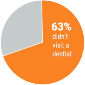{#fig-pie-chart-demo fig-alt="Donut chart: Circle with hole in the middle, colored 63% orange with text '63% didn't visit a dentist'" fig-align="center"}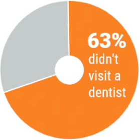{#fig-donut-demo fig-alt="Donut chart: Circle with hole in the middle, colored 63% orange with text '63% didn't visit a dentist'" fig-align="center"}Highlight just one junk to support only one number [@evergreen2019, pp.33-35]:::------------------------------------------------------------------------BTW: Donut charts are even worse than pie charts:> The middle of the pie is gone. The middle of the pie … where the angle is established, which is what humans would look at to try to determine wedge size, proportion, and data. Even though we aren’t accurate at interpreting angles, the situation is made worse when we remove the middle of the pie. Now we are left to judge curvature and … compare wedges by both curvature and angle [@evergreen2019, p.32].#### Making a clear point**Use a very limited number of wedges (best not more than two) for making a clear point.**![Pie charts are acceptable with very few categories [@evergreen2019, p.176]](img/chap03/pie-chart-two-wedges-min.png){#fig-pie-chart-2 fig-alt="circle colored with two different blue, on the left side - about 45% it says 'Male and on the right side 'Female'" fig-align="center" width="40%"}::::::::::::::::::::::: my-example:::: my-example-header::: {#exm-chap03-pie-chart}: Creating Pie & Donut Charts for Firearm Usage::::::::::::::::::::::::::: my-example-container::::::::::::::::::: panel-tabset###### Pie chart (number):::::: my-r-code:::: my-r-code-header::: {#cnj-chap03-pie-chart-number-gun-use}: Visualize percentage of gun user from NHANES survey 2011-2012:::::::::: my-r-code-container```{r}#| label: fig-pie-chart-number-gun-use#| fig-cap: "Percentage of gun user (NHANES survey 2011-2012)"#| fig-width: 4#| cache: truelab <-"<span style='font-size:36pt; color:white'>**35%**</span>"gun_use_2012 |> tidyr::drop_na() |> ggplot2::ggplot(ggplot2::aes(x ='', y = percent)) + ggplot2::geom_col(fill =c("#fa8324", "grey")) + ggplot2::coord_polar(theta ='y') + ggtext::geom_richtext(ggplot2::aes(x =1.1, y =8,label = lab),fill ="#fa8324",label.colour ="#fa8324") + ggplot2::annotate("text", x = .7, y =10,label =" used firearms",color ="white",size =6) + ggplot2::theme_void() ```------------------------------------------------------------------------The most important code line to create a pie graph is `ggplot2::coord_polar(theta = 'y')`. In the concept of `gg` (grammar of graphics) a car chart and a pie chart are --- with the exception of the above code line --- identical [@c2010].Beside the `ggplot2::annotate()` function for text comments inside graphics I had for to get the necessary formatting options for the big number also to use {**ggtext**}, one of [132 registered {**ggplot2**} extensions](https://exts.ggplot2.tidyverse.org/gallery/). {**ggtext**} enables the rendering of complex formatted plot labels (see @sec-ggtext).:::::::::For training purposes I tried to create exactly the same pattern (color, text size etc.) of a pie chart as in @fig-pie-chart-demo.###### Pie chart (yes/no):::::: my-r-code:::: my-r-code-header::: {#cnj-chap03-pie-chart-binary-gun-use}: Ever used firearms for any reason? (NHANES survey 2011-2012):::::::::: my-r-code-container```{r}#| label: fig-pie-chart-binary-gun-use#| fig-cap: "Ever used firearms for any reason? (NHANES survey 2011-2012)"#| fig.width: 4gun_use_2012 |> tidyr::drop_na() |> ggplot2::ggplot( ggplot2::aes(x ='', y = percent, fill = forcats::fct_rev(gun_use)) ) + ggplot2::geom_col() + ggplot2::geom_text(ggplot2::aes(label = gun_use),color ="white",position = ggplot2::position_stack(vjust =0.5),size =10) + ggplot2::coord_polar(theta ='y') + ggplot2::theme_void() + ggplot2::theme(legend.position ="none") + ggplot2::labs(x ='', y ='') + viridis::scale_fill_viridis(discrete =TRUE,option ="turbo",begin =0.1,end =0.9)```I have used {**viridis**} to produce colorblind-friendly color maps (see @sec-viridis). Instead of using as the first default color yellow I have chosen with the color map options and the begin/end argument, what color should appear for this binary variable.:::::::::###### Donut 1:::::: my-r-code:::: my-r-code-header::: {#cnj-chap03-donut-small-hole-gun-use}: Donut chart with small hole:::::::::: my-r-code-container```{r}#| label: fig-donut-small-hole-gun-use#| fig-cap: "Ever used firearms for any reason? (NHANES survey 2011-2012)"#| fig-width: 5# Small holehsize <-1gun_use_small_hole <- gun_use_2012 |> dplyr::mutate(x = hsize)gun_use_small_hole |> tidyr::drop_na() |> dplyr::mutate(x = hsize) |> ggplot2::ggplot( ggplot2::aes(x = hsize, y = percent, fill = forcats::fct_rev(gun_use)) ) + ggplot2::geom_col() + ggplot2::coord_polar(theta ='y') + ggplot2::xlim(c(0.2, hsize +0.5)) + ggplot2::theme_void() + ggplot2::labs(x ='', y ='', fill ="Gun used?") + viridis::scale_fill_viridis(breaks =c('Yes', 'No'),discrete =TRUE,option ="turbo",begin =0.1,end =0.9)```:::::::::###### Donut 2:::::: my-r-code:::: my-r-code-header::: {#cnj-chap03-donut-big-hole-gun-use}: Donut chart with big hole:::::::::: my-r-code-container```{r}#| label: fig-donut-big-hole-gun-use#| fig-cap: "Ever used firearms for any reason? (NHANES survey 2011-2012)"#| fig-width: 5hsize <-2gun_use_big_hole <- gun_use_2012 |> dplyr::mutate(x = hsize)gun_use_big_hole |> tidyr::drop_na() |> dplyr::mutate(x = hsize) |> ggplot2::ggplot( ggplot2::aes(x = hsize, y = percent, fill = forcats::fct_rev(gun_use)) ) + ggplot2::geom_col() + ggplot2::coord_polar(theta ='y') + ggplot2::xlim(c(0.2, hsize +0.5)) + ggplot2::theme_void() + ggplot2::labs(x ='', y ='', fill ="Gun used?") + viridis::scale_fill_viridis(breaks =c('Yes', 'No'),discrete =TRUE,option ="turbo",begin =0.1,end =0.9)```:::::::::::::::::::::::::::::::::::::::::::::::::::::::::::::::::::::::#### Case StudyIt is a fact that pie chart are still very popular. I recently found for instance a pie chart in one of the most prestigious German weekly newspaper [Die Zeit](https://www.zeit.de/index) the following pie chart about the financing of the United Nations Relief and Works Agency for Palestine Refugees in the Near East ([UNRWA](https://www.unrwa.org/))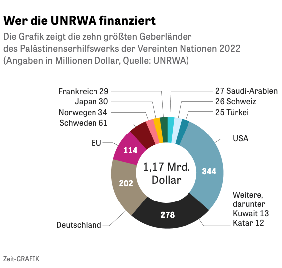{#fig-zeit-pie-graph fig-alt="A German graph that shows as a doughnut the amount and proportion of financing the UNRWA through the ten biggest sponsors in 2022. In the middle (the whole) is written the total sum with 1.17 billion dollar. From right to left: USA 344 Mio, Several countries including Kuwait (13) and Qatar (12) with 278 Mio , Germany (202 Mio ), EU (114 Mio ), Sweden (61), Norway (34), Japan (39), France (29), Saudi Arabia (27), Switzerland (26), and Turkey with 25 Mio. US dollar." fig-align="center"}The figure is colorful and looks nice. More important is that is has all the important information (Country names and amount of funding) written as labels into the graphic. It seems that this a good example for a pie chart, a kind of an exception to the rule.But if we get into the details, we see that the graph was a twofold simplification of the [complete data set](https://www.unrwa.org/sites/default/files/overall_donor_ranking_2022.pdf). Twofold because besides the overall ranking of 98 sponsors there is a simplified [ranking list of the top 20 donors](https://www.unrwa.org/sites/default/files/top_20_donors_2022_overall_ranking.pdf).The problem with `r glossary("pie charts")` (and also with `r glossary("waffle charts")`) is that you can't use them with many categories.So it was generally a good choice of "Die Zeit" to contract financiers with less funding and to concentrate to the biggest sponsors. But this has the disadvantage not to get a complete picture that is especially cumbersome for political decisions. As a result we have a huge group of miscellaneous funding sources (2nd in the ranking!) that hides many countries that are important to understand the political commitment im the world for the UNRWA.But let's see how this graphic would be appear in alternative charts::::::::::::::::::: my-experiment:::: my-experiment-header::: {#def-chap03-top20-donors-2022}: Top 20 UNRWA Donors in 2022::::::::::::::::::::::: my-experiment-container::::::::::::::: panel-tabset###### Get data:::::: my-r-code:::: my-r-code-header::: {#cnj-chap03-get-unrwa-data}: Get UNRWA data of top 20 donors from PDF file with {**tabulizer**}:::::::::: my-r-code-container```{r}#| label: get-unrwa-data#| results: hold#| cache: true#| eval: falseunrwa <- tabulizer::extract_tables("data/chap03/top_20_donors_2022_overall_ranking.pdf")unrwa_donors <- tibble::as_tibble(unrwa[[1]])base::saveRDS(unrwa_donors, "data/chap03/unrwa_donors.rds")```------------------------------------------------------------------------(*For this R code chunk is no output available*):::::::::###### Recode data:::::: my-r-code:::: my-r-code-header::: {#cnj-chap03-recode-unrwa-data}: Recode and show UNRWA data of top 20 donors 2022:::::::::: my-r-code-container```{r}#| label: recode-unrwa-data#| results: hold#| cache: trueunrwa_donors <- base::readRDS("data/chap03/unrwa_donors.rds")base::options(scipen =999)unrwa_donor_ranking <- unrwa_donors |> dplyr::rename(donor ="V1",total ="V6" ) |> dplyr::select(donor, total) |> dplyr::mutate(donor = forcats::as_factor(donor)) |> dplyr::mutate(donor = forcats::fct_recode(donor,Spain ="Spain (including Regional Governments)*",Belgium ="Belgium (including Government of Flanders)",Kuwait ="Kuwait (including Kuwait Fund for Arab Economic Development)" ) ) |> dplyr::slice(6:25) |> dplyr::mutate(dplyr::across(2, function(x) { base::as.numeric(as.character(base::gsub(",", "", x))) }) ) utils::str(unrwa_donor_ranking)skimr::skim(unrwa_donor_ranking)```:::::::::###### Plot data:::::: my-r-code:::: my-r-code-header::: {#cnj-chap03-plot-unrwa-data}: Top 20 UNRWA donors in 2022:::::::::: my-r-code-container```{r}#| label: fig-unrwa-data#| fig-cap: "Top 20 UNRWA donors in 2022 (in millions US dollar)"#| results: hold#| cache: trueunrwa_donor_ranking |> ggplot2::ggplot( ggplot2::aes(x = stats::reorder(x = donor, X = total),y = total /1e6) ) + ggplot2::geom_point(size =3) + ggplot2::coord_flip() + ggplot2::theme_bw() + ggplot2::labs(x ="Donor",y ="Donation (in Million US Dollars)" )```------------------------------------------------------------------------This graph is not as spectacular as "Die Zeit" figure, but carries more information. But what is much more important:1. It shows much better the ranking.2. It makes it obvious that there are only 4 donors (USA, Germany, EU and Sweden) that stand out from all the other financiers.To adapt a quotation from Statistical Consulting Centre in its article [Why you shouldn’t use pie charts](https://scc.ms.unimelb.edu.au/resources/data-visualisation-and-exploration/no_pie-charts):> Some people might say this graph is boring, but as Edward Tufte warns in his book Envisioning information:>> "Cosmetic decoration, which frequently distorts the data, will never salvage an underlying lack of content.">> Why is my point chart so much better?>> - We can estimate the quantities – the gridlines are helpful here.> - We can immediately see the order of the donors.> - We can accurately compare the different donors.:::::::::::::::::::::::::::::::::::::::::::::::::::::::::::------------------------------------------------------------------------------------------------------------------------------------------------### Waffle Chart {#sec-chap03-waffle-chart}:::::::::::::::::::::::::: my-example:::: my-example-header::: {#exm-chap03-waffle-charts}: Creating Waffle Charts:::::::::::::::::::::::::::::: my-example-container:::::::::::::::::::::: panel-tabset###### 2012::::::: my-r-code:::: my-r-code-header::: {#cnj-chap03-waffle-chart-nhanes-2012}: Creating a waffle chart for number of total rounds fired (NHANES survey 2011-2012)::::::::::: my-r-code-container::: {#lst-chap03-waffle-chart-rounds-fired1}```{r}#| label: fig-waffle-chart-nhanes-2012#| fig-cap: "Proportion of total rounds fired (NHANES survey 2011-2012)"#| cache: false#| warning: falsefired_2012 |> waffle::waffle(rows =10,colors =c("lightblue1", "lightsteelblue1", "deepskyblue1", "dodgerblue3", "black","lemonchiffon1"))```Proportion of total rounds fired (NHANES survey 2011-2012):::------------------------------------------------------------------------In contrast to the example in the book I have used percentages and not absolute numbers.> To emulate the percentage view of a pie chart, a 10x10 grid should be used with each square representing 1% of the total. ([waffle homepage](https://cinc.rud.is/web/packages/waffle/index.html))Another advantage: Using percentages I can compare 2011-2012 with 2017-2018 (see @fig-waffle-chart-rounds-fired2):::::::::::](img/chap03/NHANES-codebook-firearms-2012-min.png){#fig-firearms-codebook-2012 fig-alt="'How many rounds in total have you ever fired?' this question has several options: - 1 = 1 to less than 100 rounds - 2 = 100 to less than 1,000 rounds - 3 = 1,000 to less than 10,000 rounds - 4 = 10,000 to less than 50,000 rounds - 5 = 50,000 rounds or more - 7 = Refused - 9 = Don’t know" fig-align="center"}###### 2018::::::: my-r-code:::: my-r-code-header::: {#cnj-chap03-waffle-chart-nhanes-2018}: Creating a waffle chart for number of total rounds fired (NHANES survey 2017-2018)::::::::::: my-r-code-container::: {#lst-chap03-waffle-chart-rounds-fired2}```{r}#| label: fig-waffle-chart-rounds-fired2#| fig-cap: "Proportion of total rounds fired (NHANES survey 2017-2018)"#| results: hold#| cache: false#| warning: falsenhanes_2018 <-readRDS("data/chap03/nhanes_2018.rds")rounds_fired_2018 <- nhanes_2018 |> dplyr::select(AUQ310) |> tidyr::drop_na() |> dplyr::mutate(AUQ310 = forcats::as_factor(AUQ310)) |> dplyr::mutate(AUQ310 = forcats::fct_recode(AUQ310,"1 to less than 100"="1","100 to less than 1000"="2","1000 to less than 10k"="3","10k to less than 50 k"="4","50k or more"="5","Refused to answer"="7","Don't know"="9") ) |> dplyr::rename(rounds_fired = AUQ310) fired_2018 <- rounds_fired_2018 |> dplyr::count(rounds_fired) |> dplyr::mutate(prop =round(n /sum(n), 2) *100) |> dplyr::relocate(n, .after = dplyr::last_col())( waffle_plot <- waffle::waffle(parts = fired_2018,rows =10,colors =c("lightblue1", "lightsteelblue1", "deepskyblue1", "dodgerblue3", "black","gold1", "lemonchiffon1")))```Proportion of total rounds fired (NHANES survey 2017-2018):::------------------------------------------------------------------------The number of different levels of the factor variable is almost too high to realize at one glance the differences of the various categories.> Best practices suggest keeping the number of categories small, just as should be done when creating pie charts. ([Create Waffle Charts Visualization](https://cinc.rud.is/web/packages/waffle/index.html))Compare 2011-2012 with 2017-2018 (see @fig-waffle-chart-nhanes-2012). You see there is just a small difference: Respondents in the 2017-2018 survey have fired tiny less rounds as the people asked in the 2011-2012 survey. Generally speaking: The fired total of rounds remains more or less constant during the period 2012 - 2018.:::::::::::](img/chap03/NHANES-codebook-firearms-2018-min.png){#fig-firearms-codebook-2018 fig-alt="'How many rounds in total have you ever fired?' this question has several options: - 1 = 1 to less than 100 rounds - 2 = 100 to less than 1,000 rounds - 3 = 1,000 to less than 10,000 rounds - 4 = 10,000 to less than 50,000 rounds - 5 = 50,000 rounds or more - 7 = Refused - 9 = Don’t know" fig-align="center"}###### Compare:::::: my-r-code:::: my-r-code-header::: {#cnj-chap03-compare-fired-nhanes-2012-2018}: Compare the total rounds fired between the NHANES survey participants 2011-2012 and 2017-2018:::::::::: my-r-code-container```{r}#| label: tbl-compare-fired-nhanes-2012-2018#| tbl-cap: "Total rounds fired of NHANES survey participants 2011-2012 and 2017-2018"fired_df <- dplyr::full_join(x = fired_2012,y = fired_2018,by = dplyr::join_by(rounds_fired) )fired_df <- fired_df |> dplyr::rename("Rounds fired"= rounds_fired,`2012(%)`= prop.x,`n (2012)`= n.x,`2018(%)`= prop.y,`n (2018)`= n.y, ) |> dplyr::mutate(`Diff (%)`=`2012(%)`-`2018(%)`)fired_df```------------------------------------------------------------------------The participants of the NHANES survey 2011-2012 and 2017-2018 fired almost the same numbers of total rounds. The participants in 2017-2018 fired just a tiny amount of bullets less.:::::::::###### 2018 cividis::::::: my-r-code:::: my-r-code-header::: {#cnj-chap03-waffle-chart-nhanes-2018-cividis}: Creating a waffle chart for number of total rounds fired (NHANES survey 2017-2018) with `cividis` color scale::::::::::: my-r-code-container::: {#lst-chap03-waffle-chart-rounds-fired2-cividis}```{r}#| label: fig-waffle-chart-rounds-fired2-cividis#| fig-cap: "Proportion of total rounds fired (NHANES survey 2017-2018) with cividis color scale"#| results: hold#| cache: false#| warning: falsenhanes_2018 <-readRDS("data/chap03/nhanes_2018.rds")rounds_fired_2018 <- nhanes_2018 |> dplyr::select(AUQ310) |> tidyr::drop_na() |> dplyr::mutate(AUQ310 = forcats::as_factor(AUQ310)) |> dplyr::mutate(AUQ310 = forcats::fct_recode(AUQ310,"1 to less than 100"="1","100 to less than 1000"="2","1000 to less than 10k"="3","10k to less than 50 k"="4","50k or more"="5","Refused to answer"="7","Don't know"="9") ) |> dplyr::rename(rounds_fired = AUQ310) fired_2018 <- rounds_fired_2018 |> dplyr::count(rounds_fired) |> dplyr::mutate(prop =round(n /sum(n), 2) *100) |> dplyr::relocate(n, .after = dplyr::last_col())waffle::waffle(parts = fired_2018,rows =10,colors =c("#BCAF6FFF", "#A69D75FF","#918C78FF", "#7C7B78FF","#6A6C71FF", "#575C6DFF", "#414D6BFF"))```Proportion of total rounds fired (NHANES survey 2017-2018) with `cividis` color scale::::::::::::::In contrast to @fig-waffle-chart-rounds-fired2 --- where I have used individual choices of different colors without any awareness of color blindness or black & white printing --- here I have used the color blindness friendly `cividis` palette form the {**viridis**} package. Read more about my reflections about choosing color palettes in @sec-chap03-color-palettes.:::::::::::::::::::::::::::::::::::::::::::::::::::::::::::::::::::::::## Achievement 2: Graphs for a single continuous variable {#sec-chap03-achievement-2}### IntroductionOptions are:------------------------------------------------------------------------:::::: {#bul-chap03-single-cont-var}::::: my-bullet-list::: my-bullet-list-headerBullet List:::::: my-bullet-list-container- `r glossary("histograms")`,- `r glossary("density plots")`,- `r glossary("boxplots")`,- `r glossary("violin plots")`.::::::::Graph options for a single continuous variable::::::------------------------------------------------------------------------- **Histograms and density plots** are very similar to each other and show the overall shape of the data. These two types of graphs are especially useful in determining whether or not a variable has a normal distribution.- **Boxplots** show the central tendency and spread of the data, which is another way to determine whether a variable is normally distributed or skewed.- **Violin plots** are also useful when looking at a continuous variable and are like a combination of boxplots and density plots. Violin plots are commonly used to examine the distribution of a continuous variable for different levels (or groups) of a factor (or categorical) variable.### Histogram {#sec-chap03-histogram}::::::::::::::: my-experiment:::: my-experiment-header::: {#def-chap03-histogram-research-funding}: Histograms of research funding (2004-2015) with 10 and 30 bins::::::::::::::::::: my-experiment-container::::::::::: panel-tabset###### 10 bins:::::: my-r-code:::: my-r-code-header::: {#cnj-chap03-histogram-research-funding}: Histogram of research funding (2004-2015) with 10 bins:::::::::: my-r-code-container```{r}#| label: fig-histogram-research-funding-10-bins#| fig-cap: "Research funding (2004-2015) for the top 30 mortility casues in the U.S. (in billions dollar)"p_histo_funding <- research_funding |> ggplot2::ggplot(ggplot2::aes(x = Funding /1000000000)) + ggplot2::geom_histogram(bins =10,fill ="grey90",color ="black") + ggplot2::labs(x ="Research funding (2004-2015) in billions dollar",y ="Number of causes") + ggplot2::theme_bw()p_histo_funding```:::::::::###### 30 bins:::::: my-r-code:::: my-r-code-header::: {#cnj-chap03-research-funding-30-bins}: Histogram of research funding (2004-2015) with 30 bins:::::::::: my-r-code-container```{r}#| label: fig-histogram-research-funding-30-bins#| fig-cap: "Research funding (2004-2015) for the top 30 mortility casues in the U.S. (in billions dollar)"research_funding |> ggplot2::ggplot(ggplot2::aes(x = Funding /1000000000)) + ggplot2::geom_histogram(bins =30,fill ="grey90",color ="black") + ggplot2::labs(x ="Research funding (2004-2015) in billions dollar",y ="Number of research topics ('Causes of Deadth')") + ggplot2::theme_bw()```:::::::::::::::::::::::::::::::::::::::::::::::With histograms it is important to play around with the number of `bins`. This changes the appearance of histograms sometimes quite profoundly. The default of 30 bins displays a warning that one should choose a better value with the argument `binwidth` (another option to control the number of bins.)It is not quite clear for me what would be the optimal number of bins of a given data set. It was easy for @fig-histogram-physical-health: There were only 30 different values, each for one. So to provide the same number of bins as number of observed days (= 30) was a sensible choice.There is not much difference in the case of 10 or 30 bins of @def-chap03-histogram-research-funding. A big difference would be for example when the number of modes is changing, or the mode is moving far to another value. It seems to me that with a density plot it is simpler to choose the optimal curve (even if I do not understand the underlying rationale of this `r glossary("kernel density estimation")` (KDE) procedure).### Density plot {#sec-chap03-density-plot}::::::::::::::::::::::::::::::::::: my-experiment:::: my-experiment-header::: {#def-chap03-density-plot-research-funding}: Density plot of research funding (2004-2015) with different bandwidth::::::::::::::::::::::::::::::::::::::: my-experiment-container::::::::::::::::::::::::::::::: panel-tabset###### Default:::::: my-r-code:::: my-r-code-header::: {#cnj-chap03-density-plot-research-funding-2}: Density plot with standard bandwidth `bw = "nrd0"`:::::::::: my-r-code-container```{r}#| label: fig-density-plot-research-funding-0#| fig-cap: "Research funding (2004-2015) for the top 30 mortility casues in the U.S. (in billions dollar)"p_dens_funding <- research_funding |> ggplot2::ggplot(ggplot2::aes(x = Funding /1000000000)) + ggplot2::geom_density(fill ="grey90",color ="black") + ggplot2::labs(x ="Research funding (2004-2015) in billions dollar",y ="Probability density") + ggplot2::theme_bw()p_dens_funding```------------------------------------------------------------------------This is the density plot without changing the default bandwidth. It uses `nrd0` as bandwidth. One can see that it is somewhat similar to `bw = 1.5` (see @fig-density-plot-research-funding-2).- `bw.nrd0` implements a rule-of-thumb for choosing the bandwidth of a Gaussian kernel density estimator. It defaults to 0.9 times the minimum of the standard deviation and the interquartile range divided by 1.34 times the sample size to the negative one-fifth power (= Silverman's ‘rule of thumb’, Silverman (1986, page 48, eqn (3.31))) unless the quartiles coincide when a positive result will be guaranteed. (Quoted form the help file of `stats::bandwidth()`):::::::::###### 0.5:::::: my-r-code:::: my-r-code-header::: {#cnj-chap03-density-plot-research-funding-1}: Density plot with bandwidth of 0.5:::::::::: my-r-code-container```{r}#| label: fig-density-plot-research-funding-1#| fig-cap: "Research funding (2004-2015) for the top 30 mortility casues in the U.S. (in billions dollar)"research_funding |> ggplot2::ggplot(ggplot2::aes(x = Funding /1000000000)) + ggplot2::geom_density(fill ="#7d70b6",color ="black",bw = .5) + ggplot2::labs(x ="Research funding (2004-2015) in billions dollar",y ="Probability density") + ggplot2::theme_bw()```------------------------------------------------------------------------I have replicated Figure 3.26 without knowing what `bw = 0.5` means and how it is computed.:::::::::###### 1.5:::::: my-r-code:::: my-r-code-header<div>: Density plot of research funding (2004-2015) with bandwidth of 1.5</div>::::::: my-r-code-container```{r}#| label: fig-density-plot-research-funding-2#| fig-cap: "Research funding (2004-2015) for the top 30 mortility casues in the U.S. (in billions dollar)"research_funding |> ggplot2::ggplot(ggplot2::aes(x = Funding /1000000000)) + ggplot2::geom_density(fill ="#7d70b6",color ="black",bw =1.5) + ggplot2::labs(x ="Research funding (2004-2015) in billions dollar",y ="Probability density") + ggplot2::theme_bw()```------------------------------------------------------------------------I have replicated Figure 3.27 without knowing what `bw = 1.5` means and how it is computed. This is the figure that was chosen in the book as appropriate to represent the data distribution. It is very similar to the {**ggplot2**} standard version (@fig-density-plot-research-funding-0), where neither `bw` nor `kernel` was changed.:::::::::###### nrd0:::::: my-r-code:::: my-r-code-header::: {#cnj-chap03-density-plot-research-funding-3a}: Density plot with bandwidth selector `nrd0`:::::::::: my-r-code-container```{r}#| label: fig-density-plot-research-funding-3a#| fig-cap: "Research funding (2004-2015) for the top 30 mortility casues in the U.S. (in billions dollar)"research_funding |> ggplot2::ggplot(ggplot2::aes(x = Funding /1000000000)) + ggplot2::geom_density(fill ="grey90",color ="black",bw ="nrd0") + ggplot2::labs(x ="Research funding (2004-2015) in billions dollar",y ="Probability density") + ggplot2::theme_bw()```------------------------------------------------------------------------Here I have stated expressively that `bw = "nrd0"`. This is the default value that implements a rule-of-thumb for choosing the bandwidth of a Gaussian `r glossary("kernel density estimation", "kernel density estimator")`. It is appropriate for normal-like distributions.:::::::::###### SJ:::::: my-r-code:::: my-r-code-header::: {#cnj-chap03-density-plot-research-funding-3b}: Density plot with bandwidth selector `SJ`:::::::::: my-r-code-container```{r}#| label: fig-density-plot-research-funding-3b#| fig-cap: "Research funding (2004-2015) for the top 30 mortility casues in the U.S. (in billions dollar)"research_funding |> ggplot2::ggplot(ggplot2::aes(x = Funding /1000000000)) + ggplot2::geom_density(fill ="grey90",color ="black",bw ="SJ") + ggplot2::labs(x ="Research funding (2004-2015) in billions dollar",y ="Probability density") + ggplot2::theme_bw()```------------------------------------------------------------------------`bw = "SJ"` select the bandwidth using pilot estimation of derivatives and is appropriate for multimodal or general non-normal distribution [@webelod2018].:::::::::###### ucv:::::: my-r-code:::: my-r-code-header::: {#cnj-chap03-density-plot-research-funding-4a}: Density plot with bandwidth `ucv`:::::::::: my-r-code-container```{r}#| label: fig-density-plot-research-funding-4a#| fig-cap: "Research funding (2004-2015) for the top 30 mortility casues in the U.S. (in billions dollar)"research_funding |> ggplot2::ggplot(ggplot2::aes(x = Funding /1000000000)) + ggplot2::geom_density(fill ="grey90",color ="black",bw ="ucv") + ggplot2::labs(x ="Research funding (2004-2015) in billions dollar",y ="Probability density") + ggplot2::theme_bw()```------------------------------------------------------------------------`ucv` is one of the two extremes. It chooses a very small bandwidth. (The other extreme selector is `bcv` which chooses very a wide bandwidth.):::::::::###### bcv:::::: my-r-code:::: my-r-code-header::: {#cnj-chap03-density-plot-research-funding-4b}: Density plot with bandwith `bcv`:::::::::: my-r-code-container```{r}#| label: fig-density-plot-research-funding-4b#| fig-cap: "Research funding (2004-2015) for the top 30 mortility casues in the U.S. (in billions dollar)"research_funding |> ggplot2::ggplot(ggplot2::aes(x = Funding /1000000000)) + ggplot2::geom_density(fill ="grey90 ", color ="black",bw ="bcv") + ggplot2::labs(x ="Research funding (2004-2015) in billions dollar",y ="Probability density") + ggplot2::theme_bw()```------------------------------------------------------------------------`bcv` is one of the two extremes. It chooses a very wide bandwidth. (The other extreme selector is `ucv` which chooses a very narrow bandwidth.):::::::::::::::::::::::::::::::::::::::::::::::::::::::::::::::::::::::::::::::::::::::::::::::::::::::::::The equivalent of `binwidth` in histograms is `bw` (smoothing bandwidth) in density plots. I have to confess that I do not understand all the relevant factors to choose the optimal bandwidth for density plots (or binwidth for histograms).In density plots there is also the `kernel` argument for choosing the appropriate smoothing kernel. I learned from the video by od webel [-@webelod2018] that the chosen kernel (gaussian", the standard, "rectangular", "triangular", "epanechnikov", "biweight", "cosine" or "optcosine") is not so important because the result all in similar distributions. Most important, however, is to choose the appropriate bandwidth.It is said that one disadvantage of density plots is its feature to smooth out the distribution so that you cannot see anymore --- in contrast to histograms --- if there are gaps in the data. But if you choose a very small bandwidth like `ucv` then you get a distribution similar to a histogram.:::::: my-resource:::: my-resource-header::: {#lem-chap03-kernel-density-bandwidth}: Information about kernel density estimation and bandwidth:::::::::: my-resource-containerMuch of my understanding about bandwidth and kernel density estimation comes from the video [Intro to Kernel Density Estimation](https://www.youtube.com/watch?v=x5zLaWT5KPs) by od webel [-@webelod2018].{{< video https://www.youtube.com/watch?v=x5zLaWT5KPs >}}Another article on this complex topic: [What is Kernel Density Estimation?](https://www.statisticshowto.com/kernel-density-estimation/). From this article I learned that a kernel is nothing else as a weighting function to estimate the `r glossary("probability density function")` (PDF). (Until now I had a sketchy impression about this concept derived from another meaning of "kernel", related with the core part of a computer.):::::::::### Box Plot {#sec-chap03-box-plot-1}`r glossary("Histograms")` and `r glossary("density plots")` are great for examining the overall shape of the data for a continuous variable. `r glossary("Boxplots")` in contrasts are useful for identifying the middle value and the boundaries around the middle half of the data.------------------------------------------------------------------------![Parts of a boxplot [@ferreira2016, p.211]](img/chap03/box-plot-parts-min.png){#fig-box-plot-parts fig-alt="Explains the parts of a box plots: The middle 50% are called Interquartile Range (IQR). It is followed by the 'Whiskers'. Whiskers are calculated: Take the first (lower fence) or third (upper fence) 'Quartile' and add 1.5 x IQR. A quartile is 25% of the data. Whiskers are followed by the outliers." fig-align="center" width="100%"}------------------------------------------------------------------------:::::: my-r-code:::: my-r-code-header::: {#cnj-code-name}: Box plot of research funding (2004-2015):::::::::: my-r-code-container```{r}#| label: fig-box-plot-research-funding-1#| fig-cap: "Research funding (2004-2015) for the top 30 mortility casues in the U.S. (in billions dollar)"p_box_funding <- research_funding |> ggplot2::ggplot(ggplot2::aes(x = Funding /1000000000)) + ggplot2::geom_boxplot(fill ="grey90",color ="black") + ggplot2::labs(x ="Research funding (2004-2015) in billions dollar") + ggplot2::theme_bw()p_box_funding```:::::::::### SummaryEach of the three presented plot types (histogram, density plot and box plot) has it strength and disadvantage.> All three graphs show the right skew clearly, while the histogram and boxplot show gaps in the data toward the end of the tail. The boxplot is the only one of the three that clearly identifies the central tendency and spread of the variable.:::::: my-r-code:::: my-r-code-header::: {#cnj-chap03-histogram-density-box-plot}: Comparison of histogram, density plot and box plot:::::::::: my-r-code-container```{r}#| label: fig-histogram-density-box-plot#| fig-cap: "Comparison: Histogram, densitiy plot and box plot"gridExtra::grid.arrange(p_histo_funding, p_dens_funding, p_box_funding, nrow =3)```:::::::::------------------------------------------------------------------------## Achievement 3: Graph for two variable at once {#sec-chap03-achievement-3}### Two categorical variables {#sec-chap03-two-categorical-variables}#### Mosaic Plot {#sec-chap03-mosaic-plot}##### Properties`r glossary("Mosaic plots")` also called [Marimekko](https://en.wikipedia.org/wiki/Marimekko) charts or Mekko charts show the relative size of groups across two or more variables. It gives an overview of the data and makes it possible to recognize relationships between different variables. For example, independence is shown when the boxes across categories all have the same areas.Mosaic plots are the multidimensional extension of [spineplots](https://stat.ethz.ch/R-manual/R-devel/library/graphics/html/spineplot.html), which graphically display the same information for only one variable.------------------------------------------------------------------------:::::: {#bul-chap03-mosaic-charts-properties}::::: my-bullet-list::: my-bullet-list-headerBullet List:::::: my-bullet-list-container- The displayed variables are categorical or ordinal scales.- The plot is of at least two variables. There is no upper limit, but too many variables may be confusing in graphic form.- The number of observations is not limited, but not read in the image.- The areas of the rectangular tiles that are available for a combination of features are proportional to the number of observations that have this combination of features.- Unlike as other graphs, it is not possible for the mosaic plot to plot a confidence interval.::::::::Properties of Mosaic Charts ([Wikipedia](https://en.wikipedia.org/wiki/Mosaic_plot))::::::------------------------------------------------------------------------##### Mosaic charts with {**ggmosaic**}::::::::::::::::::::::::::::: my-example:::: my-example-header::: {#exm-chap03-mosaic-chart-about-gun-usage}: Mosaic chart of gun use, rounds fired, ear plugs and by sex (NHANES survey 2011-2012)::::::::::::::::::::::::::::::::: my-example-container::::::::::::::::::::::::: panel-tabset###### Gun use & sex::::::::: my-r-code:::: my-r-code-header::: {#cnj-chap03-mosaic-gun-use-sex}: Firearm use by sex in the US among 2011–2012 NHANES participants::::::::::::: my-r-code-container```{r}#| label: fig-mosaic-gun-use-sex#| fig-cap: "Firearm use by sex in the US among 2011–2012 NHANES participants"#| warning: false#| results: holdnhanes_2012_clean <-readRDS("data/chap03/nhanes_2012_clean.rds")library(ggmosaic)library(ggplot2)nhanes_2012_clean |> tidyr::drop_na(c(gun_use, sex)) |> ggplot2::ggplot() + ggmosaic::geom_mosaic(ggplot2::aes(x = ggmosaic::product(gun_use, sex), fill = gun_use) ) + ggplot2::theme_classic() + ggplot2::labs(x ="Sex",y ="Ever used a gun?",fill ="Gun use") + ggplot2::guides(fill = ggplot2::guide_legend(reverse =TRUE)) + ggplot2::scale_fill_viridis_d(alpha =1,begin =0.15,end =0.35,direction =-1,option ="turbo",aesthetics ="fill" )```------------------------------------------------------------------------::::: my-remark::: my-remark-headerBetter use of mosaic charts when variables have different levels with different proportions:::::: my-remark-container@fig-mosaic-gun-use-sex is a bad example for a mosaic chart: One of its features (that the area of the columns reflect the proportion of the level) does not shine in this example because both levels (men and women) have approximately the same proportion (49.8 vs. 50.2%). Although it is better to have variables with several levels.:::::::::::::::::::::::::::: my-watch-out::: my-watch-out-headerWATCH OUT! Loading and attaching {**ggmosaic**} is mandatory:::::: my-watch-out-containerJust calling the {**ggmosaic**} functions with the `::` syntax results into an error. I have to expressively load and attach the package with `library(ggmosiac)`. But the error only appears when I render the whole document; running just the R code chunk works. I suppose that this results from a misbehavior of the {**ggmosaic**} code.There is also another warning with {**ggmosaic**} version 0.33: One should use `tidyr::unite(`) instead of `tidyr::unite_()` since {**tidyr**} version 1.2.0. This is a missing adaption in the {**ggmosaic**} package as the warning message pointed out. I could get rid of this warning message by installing the GitHub version 0.34 as recommended in this [GitHub post](https://github.com/haleyjeppson/ggmosaic/issues/68#issuecomment-1812411397).::::::::###### Rounds fired & sex:::::: my-r-code:::: my-r-code-header::: {#cnj-chap03-mosaic-rounds-fired-sex}: Rounds fired by sex in the United States among 2011–2012 NHANES participants:::::::::: my-r-code-container```{r}#| label: fig-mosaic-rounds-fired-sex#| fig-cap: "Rounds fired by sex in the United States among 2011–2012 NHANES participants"#| results: holdnhanes_2012_clean |> dplyr::mutate(rounds_fired = dplyr::na_if(rounds_fired, "Don't know")) |> tidyr::drop_na(c(rounds_fired, sex)) |> dplyr::mutate(rounds_fired = forcats::fct_drop(rounds_fired)) |> ggplot2::ggplot() + ggmosaic::geom_mosaic(ggplot2::aes(x = ggmosaic::product(rounds_fired, sex), fill = rounds_fired) ) + ggplot2::theme_classic() + ggplot2::labs(x ="Sex",y ="Total number of rounds fired",fill ="Rounds fired") + ggplot2::guides(fill = ggplot2::guide_legend(reverse =TRUE)) + ggplot2::scale_fill_viridis_d(alpha =1, # alpha does not work!begin = .25,end = .75,direction =-1,option ="cividis" )```------------------------------------------------------------------------This is already a more informative chart as @fig-mosaic-gun-use-sex. It shows that women are not only less using a gun, those they do, they fire less round than men.But mosaic charts really shine when both variables have several levels as shown in @fig-mosaic-rounds-fired-ear-plugs.:::::::::I have experimented with several approaches to provide a specific scale. In this case the color friendly `cividis` scale from the {**viridis**} package. From the 5 different scaling option I have 4 commented out. See the code for the details.###### Rounds fireds & ear plugs:::::: my-r-code:::: my-r-code-header::: {#cnj-chap03-mosaic-rounds-fired-ear-plugs}: Number of rounds fired by wearing ear plugs among the 2011–2012 NHANES participants:::::::::: my-r-code-container```{r}#| label: fig-mosaic-rounds-fired-ear-plugs#| fig-cap: "Rounds fired with ear plugs among the 2011–2012 NHANES participants"nhanes_2012_clean |> dplyr::mutate(rounds_fired = dplyr::na_if(rounds_fired, "Don't know")) |> dplyr::mutate(ear_plugs = dplyr::na_if(ear_plugs, "Don't know")) |> tidyr::drop_na(c(rounds_fired, ear_plugs)) |> dplyr::mutate(rounds_fired = forcats::fct_drop(rounds_fired)) |> dplyr::mutate(ear_plugs = forcats::fct_drop(ear_plugs)) |> ggplot2::ggplot() + ggmosaic::geom_mosaic(ggplot2::aes(x = ggmosaic::product(rounds_fired, ear_plugs), fill = rounds_fired) ) + ggplot2::theme_bw() + ggplot2::theme(axis.text.x = ggplot2::element_text(angle =45, vjust =1, hjust =1)) + ggplot2::labs(x ="Wearing ear plugs",y ="Total number of rounds fired",fill ="Rounds fired") + ggplot2::guides(fill = ggplot2::guide_legend(reverse =TRUE)) + viridis::scale_fill_viridis(discrete =TRUE,option ="turbo",direction =-1)```------------------------------------------------------------------------The chart clearly shows that a part (more than 1/3 of the respondent) never use ear plugs, even if they fire many rounds.:::::::::###### Gun use & sex {vcd}:::::: my-r-code:::: my-r-code-header::: {#cnj-ID-text}: Firearm use by sex in the US among 2011–2012 NHANES participants using {vcd}:::::::::: my-r-code-container```{r}#| label: fig-mosaic-vcd#| fig-cap: "Firearm use by sex in the US among 2011–2012 NHANES participants"nhanes_2012_clean <- base::readRDS("data/chap03/nhanes_2012_clean.rds")test <- nhanes_2012_clean |> dplyr::select(gun_use, sex) |> tidyr::drop_na()vcd::mosaic(~ gun_use + sex,data = test,highlighting ="gun_use", highlighting_fill =c("#5fefbd", "#7298f6"),highlighting_direction ="top",direction =c("h", "v"),main ="Firearm use by sex using {vcd}")```:::::::::I have tried to replicate @fig-mosaic-gun-use-sex with the `vcd::mosaic()` function. But I noticed that there are several facilities of {**ggplot2**} not available (for instance- to rename x- and y-axis;- to rotate the text for the axis so that I can read longer variable name;- to present a legend with just the variable names,\ (For the first issue I would have to rename the column names in the data frame, for the second issue I couldn't find a solution.)Because the `vcd::mosaic()` function is too complex (for my) and requires a new package to learn I will stick with {**ggplot2**} approaches, even if I have the impression that there are some programming glitches with {**ggmosaic**}. (See for instance the [discussion in the post forum](https://community.rstudio.com/t/visualise-2x2-table-in-ggplot-with-mosaic-plot/55715/10)).Even in all the examples I found on the Internet (see for instance [Creating a Mosaic Plot](https://r-graphics.org/recipe-miscgraph-mosaic) in R Graphics Cookbook [@chang2024] I could not find a solution for my problems mentioned above.::::::::::::::::::::::::::::::::::::::::::::::::::::::::::::::::::::::::::::::::##### Adaptions and other resources::::: my-remark::: my-remark-headerMy own adaptions to the mosaic figures:::::: my-remark-containerIn contrast to the book I have used three additional adaptions for the figures produced with the {**ggmosaic**} package:1. I have used with the {**viridis**} package color-blind friendly palettes (see: @sec-viridis). There are several features to comment: - I have the direction of the palettes reversed so that the light color are at the bottom and the dark colors at the top. - In @fig-mosaic-gun-use-sex I had start and end color of the palette "turbo" manually changed to get a better color separation with lighter colors. Otherwise I would have gotten [dark blue]{style="background-color: #30123BFF; color: white;"} and [dark red]{style="background-color: #7A0403FF; color: white;"}. (Unfortunately the argument `alpha` for setting the transparency value does not work with {**viridis**}.) - With {**ggplot2**} version 3.0.0 the {**viridisLite**} package was integrated integrated into {**ggplot2**}. I have used this new possibility in @fig-mosaic-gun-use-sex.2. I have removed the small amount of "Don't know" answers in @fig-mosaic-rounds-fired-sex and @fig-mosaic-rounds-fired-ear-plugs to get a graph that is easier to interpret.3. I have reversed the display of the legend so that the colors match the graphic e.g. from bottom to top are colors in the figure and in the legend identical.4. For @fig-mosaic-rounds-fired-ear-plugs I have the angle for the text of the axis set to 45° to prevent overlapping text under small columns.Concerning color friendly palettes I have added several experiments with different packages in @sec-chap03-color-palettes.:::::::::::::: my-resource:::: my-resource-header::: {#lem-chap03-vcd}{vcd} / {vcdExtra} are other packages for mosaic graphs (and more):::::::::: my-resource-containerThe packages {**vcd**} and {**vcdExtra**} are specialized package for the **v**isualization of **c**ategorical **d**ata. I have tried it out, but its usage for the mosaic function is more complex and need time to learn.{**vcd**} and {**vcdExtra**} are support packages for the book, "Discrete Data Analysis with R" [@friendly2015] (see @sec-vcdExtra). There is also a website [DDAR](http://ddar.datavis.ca/) (abbreviation of the book title) and a [course description](https://friendly.github.io/psy6136/) with additional material. There are several introductory vignettes to learn different aspects of the two packages.So if you are interested to learn more about visualization of categorical data besides the mosaic graph then DDAR would be the right place.:::::::::#### Bar Chart {#sec-chap03-bar-chart-2}There are two different kinds of bar chars: `r glossary("stacked bar chart", "stacked bar charts")` and `r glossary("grouped bar chart", "grouped bar charts")`:- `ggplot2::geom_bar()` if you are providing the records (rows) and `geom_bar()` has to calculate the number of cases in each group (as we have already done in \@#sec-chap03-bar-chart-1) or- `ggplot2::geom_col()` if you have already counted the number of cases in each groups and provide these summarized numbers to `geom_col()`.During working on @sec-chap03-two-categorical-variables I have added several experiments for color friendly palettes (see @sec-chap03-color-palettes). Here I will use these lesson learned and changed the default {**ggplot2**} color palette to the base R `Okabe-Ito` palette, one of the available safe colorblind palettes. (Another recommended choice are the eight {**viridis**} palettes, especially the `viridis::cividis()` palette)::::::::::::::: my-experiment:::: my-experiment-header::: {#def-chap03-cvd-friendly-palettes}: Working with colorblind friendly color palettes::::::::::::::::::: my-experiment-container::::::::::: panel-tabset###### Choose colors:::::: my-r-code:::: my-r-code-header::: {#cnj-chap03-choose-cvd-friendly-colors}: Choose two colors from a color friendly palette:::::::::: my-r-code-container```{r}#| label: tbl-choose-cvd-friendly-colors#| tbl-cap: "Show color distances of the 'Okabe-Ito' palette for two colors for normal sighted people and people with CVD"my_2_colors <- grDevices::palette.colors(2, palette ="Okabe-Ito", alpha = .8, recycle =FALSE)# my_2_colors <- paletteer::paletteer_c("viridis::cividis", n = 10)# my_2_colors <- viridis::cividis(2, direction = -1, alpha = .8)colorblindcheck::palette_check(my_2_colors, plot =TRUE)```------------------------------------------------------------------------Checking the color distances with {**colorblindcheck**} we see a very great distance (more than 60) not only in the normal vision palette but also with all `r glossary("CVD")` palettes. (See for additional details of how to use and interpret results of the {**colorblindcheck**} in @sec-chap03-test-with-colorblindcheck).There are several options to define a new color palette. I have here chosen three approaches, but used only one (e.g., the other two options I have commented out). I have applied the base R [color vision deficiency friendly palette `Okabe-Ito`](https://stackoverflow.com/a/68492359/7322615).For the next few graphs I need only two colors. Normally it would not change the appearance if I define a color palette with more color. The first two would always the same. But there is one exception: When I need to reverse the two color used --- as I have done in @lst-stacked-bar-geom-col --- then the reverse function is applied to the complete color palette and results in a different color composition.This problem could be overcome with the {**ggokabeito**} package, where you could manually define the order of the colors (see @sec-ggokabeito). Additionally it provide the `Okabe Ito` scale for direct use in {**ggplot**}.Nevertheless I haven't use more than two colors. The categorical variable in @fig-grouped-bar-chart-several-levels is an ordered variable (0 to 50k rounds fired) but the `Okabe Ito` palette is with its distinct discrete colors not well suited to display ordered variables.:::::::::###### ggplot2 default:::::: my-r-code:::: my-r-code-header::: {#cnj-chap03-change-ggplot2-default-palette}: Change the {ggplot2} default color palette:::::::::: my-r-code-container```{r}#| label: fig-change-ggplot2-default-palette#| fig-cap: "Change the {ggplot2} default color palette to my two CVD save colors"#| results: hold## change 2 ggplot2 colors #############options(ggplot2.discrete.colour = my_2_colors,ggplot2.discrete.fill = my_2_colors)nhanes_2012_clean <- base::readRDS("data/chap03/nhanes_2012_clean.rds")p1 <- nhanes_2012_clean |> dplyr::select(gun_use, sex) |> tidyr::drop_na() |> ggplot2::ggplot(ggplot2::aes(x = sex, fill = gun_use)) + ggplot2::geom_bar() + ggplot2::theme_minimal() + ggplot2::theme(legend.position ="none") + ggplot2::theme(aspect.ratio =4/1) + ggplot2::labs(x ="Gun use", y ="Number of respondents")p2 <- nhanes_2012_clean |> dplyr::select(gun_use, sex) |> tidyr::drop_na() |> ggplot2::ggplot(ggplot2::aes(x = sex, fill = gun_use)) + ggplot2::geom_bar(position ="dodge") + ggplot2::theme_minimal() + ggplot2::theme(legend.position ="none") + ggplot2::theme(aspect.ratio =2/1) + ggplot2::labs(x ="Gun use", y ="Number of respondents")patchwork:::"-.ggplot"(p1, p2)## restore 2 ggplot2 colors ############## options(# ggplot2.discrete.color = NULL,# ggplot2.discrete.fill = NULL# )```I have changed the default colors of the {**ggplot2**} palette with two discrete colors using `options(ggplot2.discrete.fill = my_2_colors)`. To restore the default {**ggplot2**} color palette use `options(ggplot2.discrete.fill = NULL)`.:::::::::::::::::::::::::::::::::::::::::::::::##### Stacked Bar ChartStacked bar charts (like pie & waffle charts) show parts of a whole and have similar problems as pie charts and mosaic plots. If there are many groups or groups of similar size, stacked bar charts are difficult to interpret and *not* recommended.::::::::::::::::::::::::::::::::: my-example:::: my-example-header::: {#exm-chap03-bar-charts-2-cat-variables}: Stacked bar charts for two categorical variables::::::::::::::::::::::::::::::::::::: my-example-container::::::::::::::::::::::::::::: panel-tabset###### `geom_bar()`:::::: my-r-code:::: my-r-code-header::: {#cnj-chap03-stacked-bar-geom-bar}: Gun use by sex (using raw data = `geom_bar()`):::::::::: my-r-code-container```{r}#| label: fig-stacked-bar-geom-bar#| fig-cap: "Stacked bar chart: Gun use by sex (using raw data = `geom_bar()`"nhanes_2012_clean <- base::readRDS("data/chap03/nhanes_2012_clean.rds")nhanes_2012_clean |> dplyr::select(gun_use, sex) |> tidyr::drop_na() |> ggplot2::ggplot( ggplot2::aes(x = gun_use, fill = sex) ) + ggplot2::geom_bar() + ggplot2::theme_bw() + ggplot2::labs(x ="Gun use",y ="Number of respondents" ) + ggplot2::guides(fill = ggplot2::guide_legend(title ="Gun use" ))```:::::::::###### `geom_col()`::::::: my-r-code:::: my-r-code-header::: {#cnj-chap03-stacked-bar-geom-col}: Gun use by sex (using summarized data = `geom_col()`)::::::::::: my-r-code-container::: {#lst-stacked-bar-geom-col}```{r}#| label: fig-stacked-bar-geom-col#| fig-cap: "Stacked bar chart: Gun use by sex (using summarized data = `geom_col()`)"nhanes_2012_clean <- base::readRDS("data/chap03/nhanes_2012_clean.rds")nhanes_2012_clean |> dplyr::select(gun_use, sex) |> tidyr::drop_na() |> janitor::tabyl(gun_use, sex) |> tidyr::pivot_longer(cols =!gun_use,names_to ="sex",values_to ="count" ) |> ggplot2::ggplot( ggplot2::aes(x = gun_use,y = count,fill = sex) ) + ggplot2::geom_col(position = ggplot2::position_stack(reverse =TRUE)) + ggplot2::theme_bw() + ggplot2::labs(x ="Gun use",y ="Number of respondents" ) + ggplot2::guides(fill = ggplot2::guide_legend(title ="Gun use",reverse =TRUE )) + ggplot2::scale_fill_discrete(type = base::rev(getOption("ggplot2.discrete.fill")))```Stacked bar chart: Gun use by sex (using summarized data = `geom_col()`):::------------------------------------------------------------------------To get exactly the same appearance with `geom_col()` as with `geom_bar()` in @fig-stacked-bar-geom-bar I had to add three important adaptions:1. To get the correct structure of the data I had --- after the summation with `janitor::tabyl()` --- to apply `tidyr::pivot_longer()`.2. To get the same order of stacked bars (starting with female) I had to add inside `ggplot2::geom_col()` the argument `position = ggplot2::position_stack(reverse = TRUE)`.3. To get the same order of colors I had to reverse the color order in `ggplot2::scale_fill_discrete()` with `type = base::rev(getOption("ggplot2.discrete.fill"))`.:::::::::::###### % of total::::::::: my-r-code:::: my-r-code-header::: {#cnj-chap03-stacked-bar-geom-bar-toatal-percent}: Stacked bar chart: Gun use by sex in percent of total respondents::::::::::::: my-r-code-container```{r}#| label: fig-stacked-bar-geom-bar-total-percent#| fig-cap: "Stacked bar chart: Gun use by sex in percent of total respondents"nhanes_2012_clean <- base::readRDS("data/chap03/nhanes_2012_clean.rds")nhanes_2012_clean |> dplyr::select(gun_use, sex) |> tidyr::drop_na() |> ggplot2::ggplot( ggplot2::aes(x = gun_use, fill = sex,y =100* ggplot2::after_stat(count)/sum(ggplot2::after_stat(count))) ) +## adornments ggplot2::geom_bar() + ggplot2::theme_bw() + ggplot2::labs(x ="Gun use",y ="Number of respondents" ) + ggplot2::guides(fill = ggplot2::guide_legend(title ="Gun use" ))```::::: my-watch-out::: my-watch-out-headerWATCH OUT! This bar chart is not correct.:::::: my-watch-out-containerInstead of displaying parts of whole (100% in each group) it relates its grouped value to the total amount of observations. This lead to a misleading perception of the relationships if the groups have different sizes. For instance in this graph male using and not using guns have approximately the same percentage (about 25%). But this is not correct: Almost 75% of the men are using fire arms.:::::::::::::::::::::::###### % per group::::::: my-r-code:::: my-r-code-header::: {#cnj-chap03-stacked-bar-geom-col-group-percent}: Proportional stacked bar chart: Gun use by sex in percent of grouped respondents::::::::::: my-r-code-container::: {#lst-chap03-stacked-bar-geom-col-group-percent}```{r}#| label: fig-stacked-bar-geom-col-group-percent#| fig-cap: "Proportional stacked bar chart: Gun use by sex in percent of grouped respondents"nhanes_2012_clean <- base::readRDS("data/chap03/nhanes_2012_clean.rds")nhanes_2012_clean |> dplyr::select(gun_use, sex) |> tidyr::drop_na() |># prepare for proportional stacked bar dplyr::group_by(gun_use, sex) |> dplyr::count() |>## pick the variable that will add # to 100% dplyr::group_by(gun_use) |>## compute percents within chosen variable dplyr::mutate(percent =100* (n /sum(n))) |> ggplot2::ggplot( ggplot2::aes(x = gun_use, y = percent,fill = sex)) + ggplot2::geom_col() + ggplot2::theme_bw() + ggplot2::labs(x ="Gun use",y ="Number of respondents" ) + ggplot2::guides(fill = ggplot2::guide_legend(title ="Gun use" )) ```This code snippet from the book is more complex as necessary:::------------------------------------------------------------------------This is the same code as in the book. It is more complex as necessary because:1. For proportional bars it is sufficient to use `position = "fill"` in `geom_bar()` / `geom_col()`. Then the complex preparation for proportional bars is not necessary anymore.2. Instead of multiplying the `n / sum(n)` with 100 one could use `ggplot2::scale_y_continuous(labels = scales::percent)`. This has the additional advantage that `%` sign is appended at the y-values.I will show the more concise code in @lst-chap03-stacked-bar-geom-bar-proportional.:::::::::::###### proportional::::::: my-r-code:::: my-r-code-header::: {#cnj-chap03-stacked-bar-geom-bar-proportional}: Proportional stacked bar chart: Gun use by sex::::::::::: my-r-code-container::: {#lst-chap03-stacked-bar-geom-bar-proportional}```{r}#| label: fig-stacked-bar-geom-bar-proportional#| fig-cap: "Proportional stacked bar chart: Gun use by sex"nhanes_2012_clean <- base::readRDS("data/chap03/nhanes_2012_clean.rds")nhanes_2012_clean |> dplyr::select(gun_use, sex) |> tidyr::drop_na() |> ggplot2::ggplot( ggplot2::aes(x = gun_use, fill = sex)) + ggplot2::geom_bar(position ="fill") +## adornments ggplot2::theme_bw() + ggplot2::labs(x ="Gun use",y ="Number of respondents" ) + ggplot2::guides(fill = ggplot2::guide_legend(title ="Gun use" )) + ggplot2::scale_y_continuous(labels = scales::percent)```More concise code for the proportional stacked bar chart: Gun use by sex:::This is the reduced code of the book snippet from @lst-chap03-stacked-bar-geom-col-group-percent. It does not need a special preparation for proportional bar parts. Instead just add `position = "fill"` into the `ggplot2::geom_bar()` or `ggplot2::geom_col()` function.:::::::::::::::::::::::::::::::::::::::::::::::::::::::::::::::::::::::::::::::::::::::::::::::::::::::------------------------------------------------------------------------##### Grouped Bar Chart`r glossary("grouped bar chart", "Grouped bar charts")` are the preferred option for bar charts. If there are more than two levels of categorical variables `r glossary("stacked bar chart", "stacked bar charts")` are difficult to interpret. They lack a common reference point as the different observations or percentage in each levels starts and ends at different absolute position. A comparison of the relative size is for the human eye therefore awkward.From the conceptual point of view there is no difference in the creation between stacked and grouped bar charts. The only difference is that grouped bar charts have the argument `position = "dodge"` inside the `geom_bar()` or `geom_col()` argument.::::::::::::::::::::::: my-example:::: my-example-header::: {#exm-grouped-bar-charts}: Grouped bar charts for two categorical variables::::::::::::::::::::::::::: my-example-container::::::::::::::::::: panel-tabset###### Guns by sex:::::: my-r-code:::: my-r-code-header::: {#cnj-chap03-grouped-bar-chart-two-levels}: Grouped bar chart with two variables with only two levels: Gun use by sex:::::::::: my-r-code-container```{r}#| label: fig-grouped-bar-chart-two-levels#| fig-cap: "Grouped bar chart with two variables with only two levels: Gun use by sex"nhanes_2012_clean <- base::readRDS("data/chap03/nhanes_2012_clean.rds")nhanes_2012_clean |> dplyr::select(gun_use, sex) |> tidyr::drop_na() |> ggplot2::ggplot( ggplot2::aes(x = gun_use, fill = sex) ) + ggplot2::geom_bar(position ="dodge") + ggplot2::theme_bw() + ggplot2::labs(x ="Gun use",y ="Number of respondents" ) + ggplot2::guides(fill = ggplot2::guide_legend(title ="Gun use" ))```:::::::::###### Set 6 colors:::::: my-r-code:::: my-r-code-header::: {#cnj-chap03-choose-six-cvd-friendly-colors}: Choose six colors from a color friendly palette:::::::::: my-r-code-container```{r}#| label: tbl-choose-six-cvd-friendly-colors#| tbl-cap: "Show color distances of the 'cividis' palette for six colors for normal sighted people and people with CVD"#| results: holdmy_6_colors <- viridis::cividis(6, direction =-1, alpha = .8)colorblindcheck::palette_check(my_6_colors, plot =TRUE)## change 6 ggplot2 colors #############options(ggplot2.discrete.colour = my_6_colors,ggplot2.discrete.fill = my_6_colors)```------------------------------------------------------------------------For the bar charts rounds fired by sex we need a different scale with- more colors (six colors in total) and- a gradual progression to show the order of the categorical variableChecking the color distances of the `cividis` palette from the {**viridis**} packages with {**colorblindcheck**} we can see that the minimum distance is 10.5. This is relatively low but still acceptable. I have therefore set the default {**ggplot2**} color palette to these six colors of the `cividis` palette.:::::::::###### Rounds by sex:::::: my-r-code:::: my-r-code-header::: {#cnj-chap03-bar-chart-several-levels}: Grouped bar chart of two variables with several levels: Rounds fired by sex:::::::::: my-r-code-container```{r}#| label: fig-grouped-bar-chart-several-levels#| fig-cap: "Grouped bar chart of two variables with several levels: Rounds fired by sex"nhanes_2012_clean <- base::readRDS("data/chap03/nhanes_2012_clean.rds")nhanes_2012_clean |> dplyr::select(rounds_fired, sex) |> dplyr::mutate(rounds_fired = dplyr::na_if(rounds_fired, "Don't know")) |> tidyr::drop_na() |> base::droplevels() |> ggplot2::ggplot( ggplot2::aes(x = sex, fill = rounds_fired) ) + ggplot2::geom_bar(position = ggplot2::position_dodge() ) + ggplot2::theme_bw() + ggplot2::labs(x ="Rounds fired",y ="Number of respondents" ) + ggplot2::guides(fill = ggplot2::guide_legend(title ="Rounds fired") ) ```------------------------------------------------------------------------From this graph it is obvious that men fire generally more rounds than women. But the absolute value is not conclusive because we cannot see how many people in each group was excluded because they didn't even fire one round. It could be that there are much more men than women that did not even fire one round. We already know that this is not the case but from this graph alone you wouldn't know.To get a more complete picture:1. We add also people without any use of fire arms into the graph.2. We calculate the percentage of rounds fired per group (= by sex).:::::::::###### Rounds all by sex:::::: my-r-code:::: my-r-code-header::: {#cnj-chap03-bar-chart-several-levels-all}: Grouped bar chart of two variables with several levels: Rounds fired by sex of all respondents:::::::::: my-r-code-container```{r}#| label: fig-grouped-bar-chart-several-levels-all#| fig-cap: "Grouped bar chart of two variables with several levels: Rounds fired by sex of all respondents"nhanes_2012_clean <- base::readRDS("data/chap03/nhanes_2012_clean.rds")nhanes_2012_clean |> dplyr::select(gun_use, rounds_fired, sex) |> dplyr::mutate(rounds_fired = dplyr::if_else(gun_use =="No", "0 rounds fired", rounds_fired) ) |> dplyr::mutate(rounds_fired = dplyr::na_if(rounds_fired, "Don't know")) |> tidyr::drop_na() |> base::droplevels() |>## prepare for percentage calculation dplyr::group_by(rounds_fired, sex) |> dplyr::count() |>## pick the variable that will add to 100% dplyr::group_by(sex) |>## compute percents within chosen variable dplyr::mutate(percent = n /sum(n)) |> ggplot2::ggplot( ggplot2::aes(x = sex, y = percent,fill = rounds_fired) ) + ggplot2::geom_col(position = ggplot2::position_dodge() ) + ggplot2::theme_bw() + ggplot2::labs(x ="Rounds fired",y ="Percentage" ) + ggplot2::guides(fill = ggplot2::guide_legend(title ="Rounds fired") ) + ggplot2::scale_y_continuous(labels = scales::label_percent() ) + ggplot2::scale_fill_brewer(palette ="BuGn")```------------------------------------------------------------------------Now we can say generally that more man use firearms than women. From those respondents (men and women) that are using guns, men fire generally more rounds than women.:::::::::::::::::::::::::::::::::::::::::::::::::::::::::::::::::::::::### One categorical and one continuous variable#### Bar Chart {#sec-chap03-bar-chart-3}The is just one difference for bar charts with one categorical and one continuous variable in comparison to the bar charts used previously in this chapter: We need a summary statistics for the continuous variable so that we can present accordingly the height of the bar. These summary statistics has to be inserted into the `geom_bar()` function.::::::::::::::::::::::::::::::::::: my-example:::: my-example-header::: {#exm-chap03-bar-chart-cat-cont}: Bar charts with one categorical and one continuous variable::::::::::::::::::::::::::::::::::::::: my-example-container::::::::::::::::::::::::::::::: panel-tabset###### book-error:::::: my-r-code:::: my-r-code-header::: {#cnj-chap03-book-error}: The R code from the book does not work:::::::::: my-r-code-container```{r}#| label: fig-book-error#| fig-cap: "Using the R code from the book does not work"fbi_deaths_clean <- base::readRDS("data/chap03/fbi_deaths_clean.rds")fbi_deaths_clean |> ggplot2::ggplot( ggplot2::aes(x = weapons, y = deaths) ) + ggplot2::geom_bar(stat ="summary", fun.y = mean) + ggplot2::theme_minimal() + ggplot2::labs(x ="Firearm type", y ="Number of homicides committed")```------------------------------------------------------------------------Here I was using exactly the same code as in the book for Figure 3.45. Because of changes in {**ggplot2**) this code does not work anymore. I got two messages:> - No summary function supplied, defaulting to `mean_se()`> - Warning: Ignoring unknown parameters: `fun.y`The problem is that the arguments inside `ggplot2::geom_bar()` didn't work.:::::::::###### book revised:::::: my-r-code:::: my-r-code-header::: {#cnj-chap03-book-revised}: Revised book code using `ggplot2::stat_summary()`:::::::::: my-r-code-container```{r}#| label: fig-book-revised#| fig-cap: "Bar chart with calculating the mean for the 2012-2016"fbi_deaths_clean <- base::readRDS("data/chap03/fbi_deaths_clean.rds")fbi_deaths_clean |> ggplot2::ggplot( ggplot2::aes(x = weapons) ) + ggplot2::geom_bar() + ggplot2::stat_summary( ggplot2::aes(y = deaths),fun ="mean",geom ="bar" ) + ggplot2::theme_bw() + ggplot2::labs(x ="Firearm type", y ="Number of homicides committed") ```------------------------------------------------------------------------This code chunk works without any message and warning. There are three differences to the code from the book:1. Only the x variable is the aesthetics for the `ggplot()` call.2. `geom_bar()` is empty in contrast to the book where arguments for summarizing statistics are added inside the `geom_bar()` parenthesis.3. A new function `stat_summary()` is added with supplies all the necessary arguments to generate the summarizing statistics. It needs an extra aesthetics for the y-axis where the calculation takes place.:::::::::###### mean & flipped::::::: my-r-code:::: my-r-code-header::: {#cnj-chap03-bar-chart-mean-and-flipped}: Bar chart: Calculating mean values with `stat_summary()` and flipped coordinates::::::::::: my-r-code-container::: {#lst-chap03-bar-chart-mean}```{r}#| label: fig-bar-chart-mean-and-flipped#| fig-cap: "Calculating mean values using `geom_bar()` with `stat_summary()` and flipped coordinates"fbi_deaths_clean <- base::readRDS("data/chap03/fbi_deaths_clean.rds")fbi_deaths_clean |> ggplot2::ggplot( ggplot2::aes(x = stats::reorder(x = weapons, X =-deaths)) ) + ggplot2::geom_bar() + ggplot2::stat_summary( ggplot2::aes(y = deaths,fill = weapons,group = weapons),fun ="mean",geom ="bar" ) + ggplot2::coord_flip() + ggplot2::theme_bw() + ggplot2::labs(x ="Firearm type", y ="Number of homicides committed") + ggplot2::scale_fill_manual(values =c("Handguns"="#7463AC","Firearms, type not stated"="gray","Rifles"="gray","Shotguns"="gray","Other guns"="gray"), guide ="none")```Calculating mean values using `geom_bar()` with `stat_summary()` and flipped coordinates:::------------------------------------------------------------------------Here I have used the same code as before but have added several scale improvements like flipped axis, reordered the bars and changed to a sparse theme.I had considerable problems with the fill color for this chart, because I did not know where and how to add the `fill` aesthetics. As I added during my experimentation a new `ggplot2::eas()` layer with the argument `fill = weapons`, I got the following warning message:> The following aesthetics were dropped during statistical transformation. This can happen when ggplot fails to infer the correct grouping structure in the data. Did you forget to specify a `group` aesthetic or to convert a numerical variable into a factor?I didn't know how to add the `group` aesthetic and all the examples I found on the web are referring to `geom_line()`. (See for instance the page of the online manual for ggplot2 [Aesthetics: grouping](https://ggplot2.tidyverse.org/reference/aes_group_order.html) or Mapping variable values to colors in the first edition of [R Graphics Cookbook](http://www.cookbook-r.com/Graphs/Colors_(ggplot2)/#mapping-variable-values-to-colors)). I finally found the solution. The following text snippet is now more understandable for me:> The group aesthetic is by default set to the interaction of all discrete variables in the plot. This choice often partitions the data correctly, but when it does not, or when no discrete variable is used in the plot, you will need to explicitly define the grouping structure by mapping group to a variable that has a different value for each group. [Aesthetics: grouping](https://ggplot2.tidyverse.org/reference/aes_group_order.html)An easier solution (for me) is to compute the mean values of the different firearms and then to apply a bar chart using `geom_col()` as I have done in the next tab with @lst-chap03-col-chart-mean.:::::::::::###### `geom_col()`::::::: my-r-code:::: my-r-code-header::: {#cnj-chap03-col-chart-mean-and-flipped}: Bar chart: Using mean values with `geom_col()` and flipped coordinates::::::::::: my-r-code-container::: {#lst-chap03-col-chart-mean}```{r}#| label: fig-col-chart-mean-and-flipped2#| fig-cap: "Bar chart: Using already computed mean values with `geom_col()` and flipped coordinates"fbi_deaths_clean <- base::readRDS("data/chap03/fbi_deaths_clean.rds")fbi_deaths_clean |> dplyr::group_by(weapons) |> dplyr::summarize(mean_deaths_2012_2016 =mean(deaths)) |> ggplot2::ggplot( ggplot2::aes(fill = weapons,x = stats::reorder(x = weapons, X =-mean_deaths_2012_2016),y = mean_deaths_2012_2016) ) + ggplot2::geom_col() + ggplot2::coord_flip() + ggplot2::theme_bw() + ggplot2::labs(x ="Firearm type",y ="Number of homicides committed") + ggplot2::scale_fill_manual(values =c("Handguns"="#7463AC", "Firearms, type not stated"="gray", "Rifles"="gray", "Shotguns"="gray", "Other guns"="gray"), guide ="none")```Bar chart: Using already computed mean values with `geom_col()` and flipped coordinates:::------------------------------------------------------------------------In this version I have calculated the mean beforehand I have passed the data to {**ggplot2**}. This was easier for me to understand and I had this solution long before I solved the `group` problem in @lst-chap03-bar-chart-mean.:::::::::::###### guns/year:::::: my-r-code:::: my-r-code-header::: {#cnj-chap03-homicide-guns-year}: Number of Homicides by type of firearms (2012-2016):::::::::: my-r-code-container```{r}#| label: fig-homicide-guns-year#| fig-cap: "Number of Homicides by type of firearms (2012-2016)"p <- fbi_deaths_clean |> ggplot2::ggplot( ggplot2::aes(fill = year,y = deaths,x = stats::reorder(x = weapons, X =-deaths) ) ) + ggplot2::geom_bar(position ='dodge', stat ='identity') + ggplot2::coord_flip() + ggplot2::theme_bw() + ggplot2::labs(x ="Firearm type",y ="Number of homicides committed",fill ="Year")my_5_colors <- viridis::cividis(5, direction =-1, alpha = .8)withr::with_options(list(ggplot2.discrete.fill = my_5_colors),print(p))```------------------------------------------------------------------------Here I have the first time used the {**withr**} package (see: @sec-withr) for a just temporary change of the {**ggplot2**) standard color palette. This has the advantage that one doesn't restore the original value.:::::::::::: callout-tip1. Handguns are in all years constant the type of firearms where the most homicides were committed.2. Starting with 2013 the homicides with handguns are rising constantly.3. The type of firearms not stated is also rising over the years. What is the reason that this category is on the rise? As the second most cause of homicides it could disturb the previous conclusion. Imagine that most of this category belong to handguns category than we would see a still stepper rise of homicides with handguns. Or the diametrically opposite assumption: If most of the this category belongs to one of the other smaller categories than this would change the ranking of the homicides by firearm types.\:::###### year/gun:::::: my-r-code:::: my-r-code-header::: {#cnj-chap03-homicide-year-gun}: Number of homicides in the years 2012-2016 per type of firearms:::::::::: my-r-code-container```{r}#| label: fig-homicide-year-gun#| fig-cap: "Number of homicides in the years 2012-2016 per type of firearms"p <- fbi_deaths_clean |> ggplot2::ggplot( ggplot2::aes(fill = weapons,x = year,y = deaths) ) + ggplot2::geom_bar(position ='dodge', stat ='identity') + ggplot2::coord_flip() + ggplot2::theme_bw() + ggplot2::labs(x ="Year",y ="Number of homicides committed",fill ="Weapons") my_5_colors <- viridis::cividis(5, direction =-1, alpha = .8)withr::with_options(list(ggplot2.discrete.fill = my_5_colors),print(p))```:::::::::::: callout-tipThis graph is not very informative because it is difficult to compare the type of firearms for different years. To get this information a line chart would be much better (see @sec-chap03-line-graph).:::::::::::::::::::::::::::::::::::::::::::::::::::::::::::::::::::::::::::::::::::::::::::::::::::::------------------------------------------------------------------------#### Point Chart {#sec-chap03-point-chart}Point charts are an alternative for simple bar graphs. The use less ink and are generated with the same code as bar charts with two exceptions:- Instead of the `geom_bar()` / `geom_col()` this type of graph uses `geom_point()`.- To colorize the graph one need the `color` scale instead of the `fill` scale..:::::::::::::::: my-example:::: my-example-header::: {#exm-chap03-point-charts}: Point charts:::::::::::::::::::: my-example-container:::::::::::: panel-tabset###### Point charts:::::: my-r-code:::: my-r-code-header::: {#cnj-code-name-a}: Point chart: Mean annual homicides by firearm type in the United States, 2012–2016:::::::::: my-r-code-container```{r}#| label: fig-point-chart-mean-and-flipped#| fig-cap: "Point chart flipped: Mean annual homicides by firearm type in the United States, 2012–2016"fbi_deaths_clean <- base::readRDS("data/chap03/fbi_deaths_clean.rds")fbi_deaths_clean |> dplyr::group_by(weapons) |> dplyr::summarize(mean_deaths_2012_2016 =mean(deaths)) |> ggplot2::ggplot( ggplot2::aes(color = weapons,x = stats::reorder(x = weapons, X =-mean_deaths_2012_2016),y = mean_deaths_2012_2016) ) + ggplot2::geom_point(size =4) + ggplot2::coord_flip() + ggplot2::theme_bw() + ggplot2::labs(x ="Firearm type",y ="Number of homicides committed") + ggplot2::scale_color_manual(values =c("Handguns"="#7463AC", "Firearms, type not stated"="gray", "Rifles"="gray", "Shotguns"="gray", "Other guns"="gray"), guide ="none") ```:::::::::###### Point chart with error bars:::::: my-r-code:::: my-r-code-header::: {#cnj-chap03-point-chart-mean-error-bars}: Point chart with error bars: Mean annual homicides by firearm type in the United States, 2012–2016:::::::::: my-r-code-container```{r}#| label: fig-point-chart-mean-error-bars#| fig-cap: "Point chart with error bars: Mean annual homicides by firearm type in the United States, 2012–2016"fbi_deaths_clean <- base::readRDS("data/chap03/fbi_deaths_clean.rds")fbi_deaths_clean |> dplyr::group_by(weapons) |> dplyr::summarize(central =mean(x = deaths), spread =sd(x = deaths) ) |> ggplot2::ggplot( ggplot2::aes(x = stats::reorder(x = weapons, X =-central),y = central) ) + ggplot2::geom_errorbar( ggplot2::aes(ymin = central - spread, ymax = central + spread, linetype ="Mean\n+/- sd"), width = .2) + ggplot2::geom_point( ggplot2::aes(color = weapons,size ="Mean (2012-2016)"),alpha =0.5 ) + ggplot2::coord_flip() + ggplot2::theme_bw() + ggplot2::labs(x ="Firearm type",y ="Number of homicides committed") + ggplot2::scale_color_manual(values =c("Handguns"="#7463AC", "Firearms, type not stated"="gray", "Rifles"="gray", "Shotguns"="gray", "Other guns"="gray"), guide ="none" ) + ggplot2::scale_linetype_manual(values =1, name ="Error bars") + ggplot2::scale_size_manual(values =4, name ="") + ggplot2::theme(legend.position ="top")```------------------------------------------------------------------------I added `alpha = 0.5` so that the small error bars are still visible "behind" the big dots.:::::::::This is a more complex graph: It has two layers (`geom_errorbar()` and `geom_point()`) and three different scales (weapons, line type and size). The difficulty for me is to know where to put the different aesthetics. For instance: I could put `size = 4` after the `alpha = 0.5` argument, but then the argument `scale_size_manual(values = 4)` would not work anymore. Otherwise it is not possible to add the alpha argument into the `scale_size_manual()` function.::: callout-tipOnly for "firearms, type not stated" and "Handguns" had a remarkable size of standard deviation from the mean. For the other types ("Riffles", "shotguns" and "other guns") the spread is so small that they did not even extend outside of the dots. (To see them, I had to apply an `alpha` argument.)In the book Harris supposes that the the small number of years is the reason for this tendency. I do not believe that this may be the main reason. I think it has more to do with the absolute small numbers of observation in these type of firearms.::::::::::::::::::::::::::::::::::::::::::::#### Box Plot {#sec-chap03-box-plot-2}While the bar chart and point chart were great for comparing the means of the groups, the boxplot will provide more information about the distribution in each group.:::::::::::::::: my-example:::: my-example-header::: {#exm-chap03-box-plots}: Box Plots:::::::::::::::::::: my-example-container:::::::::::: panel-tabset###### Boxplot:::::: my-r-code:::: my-r-code-header::: {#cnj-chap03-box-plot}: Boxplot: Annual homicides by firearm type in the United States, 2012–2016:::::::::: my-r-code-container```{r}#| label: fig-boxplots-guns#| fig-cap: "Boxplot: Annual homicides by firearm type in the United States, 2012–2016"fbi_deaths_clean <- base::readRDS("data/chap03/fbi_deaths_clean.rds")fbi_deaths_clean |> ggplot2::ggplot( ggplot2::aes(x = stats::reorder(x = weapons, X =-deaths),y = deaths) ) + ggplot2::geom_boxplot() + ggplot2::coord_flip() + ggplot2::theme_bw() + ggplot2::labs(x ="Firearm type",y ="Number of homicides committed") ```In contrast to the book I have not colored / filled the boxes.In this type of graph we do not only see the bigger spread of handguns and firearms not stated, but we also see the skew of these two distributions.In the next tab we can see the distribution of the mean values in relation to the boxplots.:::::::::::: callout-tip1. The number of homicides by handguns and firearms, where the type is not stated, varies in the years 2012-2016 a lot.2. Both distributions are skewed as the median is not in the middle of the box. Firearms, whose types are not stated, has the median on the far left of the box. The distribution is right skewed because is has some large values to the right.3. The situation for handguns is reversed: It is a left skewed distribution because there are some small values to the left of the median resulting in a smaller mean.:::###### Box Plot with Data points:::::: my-r-code:::: my-r-code-header::: {#cnj-chap03-box-plot-with-data-point}: Boxplot with data points: Annual homicides by firearm type in the United States, 2012–2016:::::::::: my-r-code-container```{r}#| label: fig-boxplots-guns-data-points#| fig-cap: "Boxplot with data points: Annual homicides by firearm type in the United States, 2012–2016"fbi_deaths_clean <- base::readRDS("data/chap03/fbi_deaths_clean.rds")## if jitter should always result ## in the same horizontal position# set.seed(500) fbi_deaths_clean |> ggplot2::ggplot( ggplot2::aes(x = stats::reorder(x = weapons, X =-deaths),y = deaths) ) + ggplot2::geom_boxplot() + ggplot2::geom_jitter() + ggplot2::coord_flip() + ggplot2::theme_bw() + ggplot2::labs(x ="Firearm type",y ="Number of homicides committed") ```------------------------------------------------------------------------I didn't need `alpha = .8` as in the book, because I didn't fill the boxes with color.I noticed that whenever I run the code chunk the horizontal position of the data points changes. This is the effect of the `jitter` command. I you want to have always exactly the same position than you would have to add a `set.seed()` in front of the computation.It is interesting to see that just one data point far from the median cannot change its position. Compare the far right dot of firearms not reported. It has the same relative position to the box as the far right dot of the handguns category. But it didn't pull the median to its position. In contrast to the handguns where several other points on the right side support the one far right dot and drag the median to the right.::::::::::::::::::::::::::::::::::::::::::::::::::#### Violin Plot {#sec-chap03-violin-plot}`r glossary("Violin plots")` can be seen as a graph type between `r glossary("boxplots")` and `r glossary("density plots")`. They are typically used to look at the distribution of continuous data within categories.For the homicide data they do not work because there are not enough data. There were too few cases in some categories. So the book applied the violin plot to the age by sex data from the `r glossary("NHANES")` survey.:::::: my-r-code:::: my-r-code-header::: {#cnj-chap03-violin-plot-sex-nhanes-2012}: Using a violin plot to compare respondent sex of the NHANES 2012 survey:::::::::: my-r-code-container```{r}#| label: violin-plot-sex-nhanes-2012nhanes_2012_clean <- base::readRDS("data/chap03/nhanes_2012_clean.rds")nhanes_2012_clean |> ggplot2::ggplot( ggplot2::aes(x = sex, y = RIDAGEYR) ) + ggplot2::geom_violin( ggplot2::aes(fill = sex) ) + ggplot2::theme_bw() + ggplot2::labs(x ="Sex",y ="Age in years" ) + ggokabeito::scale_fill_okabe_ito(guide ="none" )```:::::::::### Two continuous variables::::: my-important::: my-important-headerWhen to use line graphs and when to use scatterplots:::::: my-important-containerSituations where a `r glossary("line graph")` is more useful than a `r glossary("scatterplot")`:- (a) when the graph is showing change over time, and- (b) when there is not a lot of variation in the data.Relationships where there is no measure of time and data that include a lot of variation are better shown with a scatterplot.::::::::#### Line Graph {#sec-chap03-line-graph}::::::::::::::: my-example:::: my-example-header::: {#exm-ID-text}: Firearms per type manufactured in the United States::::::::::::::::::: my-example-container::::::::::: panel-tabset###### Circulating guns:::::: my-r-code:::: my-r-code-header::: {#cnj-chap03-circulated-2017-line-graph}: Firearms circulating in the United States 1986-2017:::::::::: my-r-code-container```{r}#| label: fig-circulated-2017-line-graph#| fig-cap: "Firearms circulating in the United States 1986-2017"#| results: holdguns_total <- base::readRDS("data/chap03/guns_total.rds")p_guns_total <- guns_total |> tidyr::pivot_longer(cols =2:6,names_to ="gun_type",values_to ="gun_count" ) |> dplyr::mutate(Year = base::as.numeric(Year),gun_type = forcats::as_factor(gun_type) ) |> ggplot2::ggplot( ggplot2::aes(x = Year, y = gun_count /1e5) ) + ggplot2::geom_line( ggplot2::aes(color = gun_type) ) + ggplot2::theme_bw() + ggplot2::labs(y ="Number of firearms (in 100,000s)", ) + ggplot2::scale_x_continuous(limits =c(1986, 2017), breaks =c(1986, 1990, 1995, 2000,2005, 2010, 2015, 2017)) + ggokabeito::scale_color_okabe_ito(order =c(1:3, 7, 9),name ="Type ofFirearm",breaks =c('Total', 'Handguns', 'Rifles','Shotguns', 'Misc'))p_guns_total# # # palette_okabe_ito(order = 1:9, alpha = NULL, recycle = FALSE)# "#E69F00" "#56B4E9" "#009E73" "#F0E442" "#0072B2" "#D55E00" "#CC79A7" "#999999" "#000000"```------------------------------------------------------------------------There are four remarkable code lines:1. To prevent scientific notation on the y-axis I had changed the measure unit to 100000 guns (1e5).2. I added several breaks for the x-axis.3. I reordered the legend to match the position with the lines of the gun types.4. I used with the Okabe Ito color scale a colorblind friendly color palette and chose those colors that can be distinguished best. The function `palette_okabe_ito(order = 1:9, alpha = NULL, recycle = FALSE)` generates Hex color code for all nine colors of palette. If you copy the (not runable) resulted hex code into the R code chunk, you can examine the appropirate colors visually. --- I commented these two code line out.:::::::::I took the [ATF data form the PDF file](https://www.atf.gov/firearms/docs/report/2019-firearms-commerce-report/download) and had calculated guns manufactured (from the USAFact.org website) and subtracted exported guns (page 4 of the ATF PDF) and added imported guns (page 6 of the ATF PDF). For details of the sources see @sec-gun-production.###### Guns manufactured:::::: my-r-code:::: my-r-code-header::: {#cnj-chap03-manufactured-2019-line-graph}: Firearms manufactured in the United States 1986-2019:::::::::: my-r-code-container```{r}#| label: fig-manufactured-2019-line-graph#| fig-cap: "Firearms manufactured in the United States 1986-2019"#| results: holdguns_manufactured_2019_clean <- base::readRDS("data/chap03/guns_manufactured_2019_clean.rds")lookup_manufactured <-c(Total ="Firearms manufactured (Items)",Pistols ="Pistols (Items)",Rifles ="Rifles (Items)",Shotguns ="Shotguns (Items)",Revolvers ="Revolvers (Items)",Misc ="Misc. Firearms (Items)" )guns_manufactured_2019_clean |> tidyr::pivot_longer(cols =-Years,names_to ="year",values_to ="gun_count" ) |> dplyr::rename(gun_type ="Years") |> dplyr::mutate(year = base::as.numeric(year),gun_type = forcats::as_factor(gun_type) ) |> tidyr::pivot_wider(names_from = gun_type,values_from = gun_count ) |> dplyr::rename( dplyr::all_of(lookup_manufactured) ) |> tidyr::pivot_longer(cols =-year,names_to ="gun_type",values_to ="gun_count" ) |> ggplot2::ggplot( ggplot2::aes(x = year, y = gun_count /1e5) ) + ggplot2::geom_line( ggplot2::aes(color = gun_type) ) + ggplot2::theme_bw() + ggplot2::labs(y ="Number of firearms (in 100,000s)",x ="Year manufactured" ) + ggplot2::scale_x_continuous(limits =c(1986, 2019),breaks =c(1986, 1990, 1995, 2000,2005, 2010, 2015, 2019)) + ggokabeito::scale_color_okabe_ito(order =c(1:3, 6, 7, 9),name ="Type ofFirearm",breaks =c('Total', 'Pistols', 'Rifles','Misc', 'Revolvers', 'Shotguns'))## palette_okabe_ito(order = 1:9, alpha = NULL, recycle = FALSE)# "#E69F00" "#56B4E9" "#009E73" "#F0E442" "#0072B2" "#D55E00" "#CC79A7" "#999999" "#000000"```------------------------------------------------------------------------Here applies the same comment about the code structure as written for the previous tab "Circulating guns".:::::::::::::::::::::::::::::::::::::::::::::::::::: my-watch-out::: my-watch-out-headerLine graphs need an `ggplot2::aes()` specification inside the `ggplot2::geom_line()`:::::: my-watch-out-containerIn contrast to other types of graph: Besides the definition of x and y variables, there is a second `aes()` specification inside the `geom_line()` necessary where you define `linetype` or the `color` of lines. Otherwise the graph would not work as line graph!::::::::#### Scattterplot {#sec-chap03-scatterplot}::::::::::::::::::::::::::: my-example:::: my-example-header::: {#exm-chap03-scatterplot-mortality-rate-funding}: Scatterplot for Mortality Rate versus Funding::::::::::::::::::::::::::::::: my-example-container::::::::::::::::::::::: panel-tabset###### Metric x-axis:::::: my-r-code:::: my-r-code-header::: {#cnj-chap03-scatterplot-mortality-rate-funding-metric-x-scale}: Scatterplot: Mortality Rate versus Funding (with metric x-scale):::::::::: my-r-code-container```{r}#| label: fig-scatterplot-mortality-rate-funding-metric-x-scale#| fig-cap: "Scatterplot: Mortality Rate versus Funding (with metric x-scale)"research_funding <- base::readRDS("data/chap03/research_funding.rds")research_funding |> ggplot2::ggplot( ggplot2::aes(x =`Mortality Rate per 100,000 Population`,y = Funding) ) + ggplot2::geom_point() + ggplot2::theme_bw()```:::::::::###### Log x-axis (1):::::: my-r-code:::: my-r-code-header::: {#cnj-chap03-scatterplot-mortality-rate-funding-log-x-scale-1}: Scatterplot: Mortality Rate versus Funding (with logarithmic x-scale and a 'loess' smoother):::::::::: my-r-code-container```{r}#| label: fig-scatterplot-mortality-rate-funding-log-x-scale-1#| fig-cap: "Scatterplot: Mortality Rate versus Funding (with logarithmic x-scale and a 'loess' smoother)"## prevent exponential (scientific) notationbase::options(scipen =999) research_funding |> ggplot2::ggplot( ggplot2::aes(x =`Mortality Rate per 100,000 Population`,y = Funding /1e9) ) + ggplot2::geom_point() + ggplot2::theme_bw() + ggplot2::labs(y ="Funding, US $ billion" ) + ggplot2::geom_smooth(method ="loess", formula ='y ~ x' ) + ggplot2::scale_x_log10() + ggplot2::scale_y_log10()```------------------------------------------------------------------------1. To produce the trend line I have used `ggplot2::geom_smooth()` and not `ggplot2::stat_smooth()` as in the book. Frankly, I do not understand the difference, because the output is the same. As parameters I have added the standard value for less than 1,000 observations `method = "loess"` and `formula = 'y ~x'`.2. To prevent scientific notation I have added `options(scipen = 999)`.> A penalty to be applied when deciding to print numeric values in fixed or exponential notation. Positive values bias towards fixed and negative towards scientific notation: fixed notation will be preferred unless it is more than `scipen` digits wider. [Help page for Options Settings](https://web.mit.edu/r/current/lib/R/library/base/html/options.html):::::::::###### Log x-axis (2):::::: my-r-code:::: my-r-code-header::: {#cnj-chap03-scatterplot-mortality-rate-funding-log-x-scale-2}: Scatterplot: Mortality Rate versus Funding (with logarithmic x-scale and a linear smoother):::::::::: my-r-code-container```{r}#| label: fig-scatterplot-mortality-rate-funding-log-x-scale-2#| fig-cap: "Scatterplot: Mortality Rate versus Funding (with logarithmic x-scale and a linear model smoother)"research_funding |> ggplot2::ggplot( ggplot2::aes(x =`Mortality Rate per 100,000 Population`,y = Funding /1e9) ) + ggplot2::geom_point() + ggplot2::theme_bw() + ggplot2::labs(y ="Funding, US $ billion" ) + ggplot2::geom_smooth(method ="lm", formula ='y ~ x' ) + ggplot2::scale_x_log10() + ggplot2::scale_y_log10()```------------------------------------------------------------------------In contrast to @fig-scatterplot-mortality-rate-funding-log-x-scale-1 I have here used for the trend line, e.g. the line for the best fit, the smoother for the linear model ('lm').:::::::::###### Labelled (1):::::: my-r-code:::: my-r-code-header::: {#cnj-chap03-scatterplot-mortality-rate-funding-labelled-1}: Scatterplot: Mortality Rate versus Funding (with logarithmic x-scale, a linear smoother and points labelled):::::::::: my-r-code-container```{r}#| label: fig-scatterplot-mortality-rate-funding-labelled-1#| fig-cap: "Scatterplot: Mortality Rate versus Funding (with logarithmic x-scale, a linear model smoother and points labelled)"research_funding |> ggplot2::ggplot( ggplot2::aes(x =`Mortality Rate per 100,000 Population`,y = Funding /1e9) ) + ggplot2::geom_point() + ggplot2::theme_bw() + ggplot2::labs(y ="Funding, US $ billion" ) + ggplot2::geom_smooth(method ="lm", formula ='y ~ x' ) + ggplot2::scale_x_log10() + ggplot2::scale_y_log10() + ggplot2::geom_text( ggplot2::aes(label =`Cause of Death`) )```------------------------------------------------------------------------The problem here is that the label are overlapping each other. This can be repaired with the {**ggrepel**} package (see @sec-ggrepel). (See @fig-scatterplot-mortality-rate-funding-labelled-2):::::::::###### Labelled (2):::::: my-r-code:::: my-r-code-header::: {#cnj-chap03-scatterplot-mortality-rate-funding-labelled-2}: Scatterplot: Mortality Rate versus Funding (with logarithmic x-scale, a linear smoother and points labelled with {ggrepel}):::::::::: my-r-code-container```{r}#| label: fig-scatterplot-mortality-rate-funding-labelled-2#| fig-cap: "Scatterplot: Mortality Rate versus Funding (with logarithmic x-scale, a linear model smoother and points labelled with {ggrepel})"research_funding <- base::readRDS("data/chap03/research_funding.rds")research_funding |> ggplot2::ggplot( ggplot2::aes(x =`Mortality Rate per 100,000 Population`,y = Funding /1e9) ) + ggplot2::geom_point() + ggplot2::theme_bw() + ggplot2::labs(y ="Funding, US $ billion" ) + ggplot2::geom_smooth(method ="lm", formula ='y ~ x' ) + ggplot2::scale_x_log10() + ggplot2::scale_y_log10() + ggrepel::geom_text_repel( ggplot2::aes(label =`Cause of Death`) )## return from fixed to standard notationbase::options(scipen =0) ```------------------------------------------------------------------------With the {**ggrepel**} package one prevents overlapping of labels in a scatterplot. Compare to @fig-scatterplot-mortality-rate-funding-labelled-1.:::::::::::::::::::::::::::::::::::::::::::::::::::::::::::::::::::::::::::::::::::## Ensuring graphs are well formatted {#sec-chap03-graph-well-formatted}> For a graph to stand alone, it should have as many of these features as possible:> - Clear labels and titles on both axes> - An overall title describing what is in the graph along with> - Source of data (added, pb)> - Date of data collection> - Units of analysis (e.g., people, organizations)> - Sample size> In addition, researchers often use the following to improve a graph:> - Scale variables with very large or very small values (e.g., using millions or billions).> - Color to draw attention to important or relevant features of a graph.Most of the content in this chapter were tutorial material to choose and produce appropriate graphs for the data at hand. Therefore I didn't always follow the above rules. Especially the source of the data, and the date of the data collection were most of the time not added.In the next graph I try to add all the important information to fulfill the above advice.:::::: my-r-code:::: my-r-code-header::: {#cnj-chap03-graph-with-all-meta-information}: Firearms circulating in the United States 1986-2017:::::::::: my-r-code-container```{r}#| label: fig-graph-with-all-meta-information#| fig-cap: "Firearms Commerce in the United States FY 2019 Update (<a href='https://www.atf.gov/firearms/docs/report/2019-firearms-commerce-report/download'>ATF</a>)"p_guns_total + ggplot2::labs(title ="Firearms circulating in the United States 1986-2017",subtitle ="Own Calculation: Firearms manufactured (p.2)\nsubtracted Exports (p.4) and added Imports (p.6).",caption ="Source: Bureau of Alcohol, Tobacco, Firearms and Explosives (ATF)" )```------------------------------------------------------------------------- **Hyperlinks**: I could not manage to provide hyperlinks in title, subtitle or caption (= "Source"). Maybe it has to do with the `lightbox = true` directive in my `_quarto.yml` file, because the whole picture is an active link for the lightbox. But hyperlinks do work in the figure caption (`fig-cap`).- **New line**: Text for title, subtitle and caption can be split into different lines with `\n`. But this did not work for `fig-cap`.:::::::::------------------------------------------------------------------------## Exercises (empty)------------------------------------------------------------------------## Additional resources for this chapter### Color Palettes {#sec-chap03-color-palettes}#### IntroductionAt least since creating graphs for two variable at once (@sec-chap03-achievement-3) the question arises: What color palette should be chosen?To dive into the topic of color palettes for R is a very deep water and I can here only scratch the surface. My main purpose in this section is to provide practical orientation on tools to choose appropriate color palettes. I am following here mainly the [compiled material by Emil Hvitfeldt](https://github.com/EmilHvitfeldt/r-color-palettes)[-@hvitfeldt2024], who is also the developer of {**paleteer**} (see @sec-paletteer) [@paletteer].It is not enough that the colors do not offend the eye, e.g. that they are aesthetically pleasant. There are two other important consideration as well:1. Palettes have to retain its integrity when printed in black and white2. People with colorblindness are able to understand it ([Perception of color palettes](https://github.com/EmilHvitfeldt/r-color-palettes))#### Printing black & whiteOften you have a beauty colorful graphic which looks very nice in RStudio and on your web site. But how does it look when the graphics is printed out or appear in book published only in black and white?You can check the black/white appearance of the colors your plot is using with the function `colorspace::desaturate()`.:::: my-important::: my-important-headerTo test if the palette you want to use will be distorted when in black and white, use the `colorspace::desaturate()` function.::::::::::::::::::::::::::::::::::::::::::::::::::::: my-experiment:::: my-experiment-header::: {#def-colorspace-desaturate}: Using `colorspace::desaturate()` to test how color palettes perform in black & white:::::::::::::::::::::::::::::::::::::::::::::::::: my-experiment-container:::::::::::::::::::::::::::::::::::::::::: panel-tabset###### ggplot2:::::: my-r-code:::: my-r-code-header::: {#cnj-ggplot2-palette-bw}: Standard color palette for {ggplot2} in color and desaturated:::::::::: my-r-code-container```{r}#| label: fig-ggplot2-palette-bw#| fig-cap: "Standard color palette for ggplot2"#| fig-height: 3pal_data <-list(names =c("Normal", "desaturated"),color =list(scales::hue_pal()(256), colorspace::desaturate(scales::hue_pal()(256))))list_plotter(pal_data$color, pal_data$names, "Standard color palette for ggplot2")```------------------------------------------------------------------------The standard color palette of {**ggplot2**} is completely useless when you print it out in black & white! The problem is that the colors are picked to have constant chroma and luminance thus yielding the same shade of grey when desaturated.:::::::::###### A:::::: my-r-code:::: my-r-code-header::: {#cnj-viridis-magma-palette-bw}: {viridis} color palette "magma" (option 'A') in color and desaturated:::::::::: my-r-code-container```{r}#| label: fig-viridis-magma-palette-bw#| fig-cap: "Viridis palette 'magma' (option 'A') in color and desaturated"#| fig-height: 3pal_data <-list(names =c("Normal", "desaturated"),color =list(viridis::magma(256), colorspace::desaturate(viridis::magma(256))))list_plotter(pal_data$color, pal_data$names, "viridis::magma")```------------------------------------------------------------------------One of the continuous palettes that satisfy the criteria of readable gray shades are the palettes collected in the {**viridis**} resp. {**viridisLite**} packages. Here I have used the option "A" ("magma"):::::::::###### B:::::: my-r-code:::: my-r-code-header::: {#cnj-viridis-inferno-palette-bw}: {viridis} color palette "inferno" (option 'B') in color and desaturated:::::::::: my-r-code-container```{r}#| label: fig-viridis-inferno-palette-bw#| fig-cap: "Viridis palette 'inferno' (option 'B') in color and desaturated"#| fig-height: 3pal_data <-list(names =c("Normal", "desaturated"),color =list(viridis::inferno(256), colorspace::desaturate(viridis::inferno(256))))list_plotter(pal_data$color, pal_data$names, "viridis::inferno")```------------------------------------------------------------------------One of the continuous palettes that satisfy the criteria of readable gray shades are the palettes collected in the {**viridis**} resp. {**viridisLite**} packages. Here I have used the option "B" ("inferno"):::::::::###### C:::::: my-r-code:::: my-r-code-header::: {#cnj-viridis-plasma-palette-bw}: {viridis} color palette "plasma" (option 'C') in color and desaturated:::::::::: my-r-code-container```{r}#| label: fig-viridis-plasma-palette-bw#| fig-cap: "Viridis palette 'plasma' (option 'C') in color and desaturated"#| fig-height: 3pal_data <-list(names =c("Normal", "desaturated"),color =list(viridis::plasma(256), colorspace::desaturate(viridis::plasma(256))))list_plotter(pal_data$color, pal_data$names, "viridis::plasma")```------------------------------------------------------------------------One of the continuous palettes that satisfy the criteria of readable gray shades are the palettes collected in the {**viridis**} resp. {**viridisLite**} packages. Here I have used the option "C" ("plasma"):::::::::###### D:::::: my-r-code:::: my-r-code-header::: {#cnj-viridis-viridis-palette-bw}: {viridis} color palette "viridis" (option 'D') in color and desaturated:::::::::: my-r-code-container```{r}#| label: fig-viridis-viridis-palette-bw#| fig-cap: "Viridis palette 'viridis' (option 'D') in color and desaturated"#| fig-height: 3pal_data <-list(names =c("Normal", "desaturated"),color =list(viridis::viridis(256), colorspace::desaturate(viridis::viridis(256))))list_plotter(pal_data$color, pal_data$names, "viridis::viridis")```------------------------------------------------------------------------One of the continuous palettes that satisfy the criteria of readable gray shades are the palettes collected in the {**viridis**} resp. {**viridisLite**} packages. Here I have used the option "D" ("viridis"):::::::::###### E:::::: my-r-code:::: my-r-code-header::: {#cnj-viridis-cividis-palette-bw}: {viridis} color palette "cividis" (option 'E') in color and desaturated:::::::::: my-r-code-container```{r}#| label: fig-viridis-cividis-palette-bw#| fig-cap: "Viridis palette 'cividis' (option 'E') in color and desaturated"#| fig-height: 3pal_data <-list(names =c("Normal", "desaturated"),color =list(viridis::cividis(256), colorspace::desaturate(viridis::cividis(256))))list_plotter(pal_data$color, pal_data$names, "viridis::cividis")```------------------------------------------------------------------------One of the continuous palettes that satisfy the criteria of readable gray shades are the palettes collected in the {**viridis**} resp. {**viridisLite**} packages. Here I have used the option "D" ("cividis"):::::::::###### F:::::: my-r-code:::: my-r-code-header::: {#cnj-viridis-rocket-palette-bw}: {viridis} color palette "rocket" (option 'F') in color and desaturated:::::::::: my-r-code-container```{r}#| label: fig-viridis-rocket-palette-bw#| fig-cap: "Viridis palette 'rocket' (option 'F') in color and desaturated"#| fig-height: 3pal_data <-list(names =c("Normal", "desaturated"),color =list(viridis::rocket(256), colorspace::desaturate(viridis::rocket(256))))list_plotter(pal_data$color, pal_data$names, "viridis::rocket")```------------------------------------------------------------------------One of the continuous palettes that satisfy the criteria of readable gray shades are the palettes collected in the {**viridis**} resp. {**viridisLite**} packages. Here I have used the option "F" ("rocket"):::::::::###### G:::::: my-r-code:::: my-r-code-header::: {#cnj-viridis-mako-palette-bw}: {viridis} color palette "mako" (option 'G') in color and desaturated:::::::::: my-r-code-container```{r}#| label: fig-viridis-mako-palette-bw#| fig-cap: "Viridis palette 'mako' (option 'G') in color and desaturated"#| fig-height: 3pal_data <-list(names =c("Normal", "desaturated"),color =list(viridis::mako(256), colorspace::desaturate(viridis::mako(256))))list_plotter(pal_data$color, pal_data$names, "viridis::mako")```------------------------------------------------------------------------One of the continuous palettes that satisfy the criteria of readable gray shades are the palettes collected in the {**viridis**} resp. {**viridisLite**} packages. Here I have used the option "G" ("mako"):::::::::###### H:::::: my-r-code:::: my-r-code-header::: {#cnj-viridis-turbo-palette-bw}: {viridis} color palette "turbo" (option 'H') in color and desaturated:::::::::: my-r-code-container```{r}#| label: fig-viridis-turbo-palette-bw#| fig-cap: "Viridis palette 'turbo' (option 'H') in color and desaturated"#| fig-height: 3pal_data <-list(names =c("Normal", "desaturated"),color =list(viridis::turbo(256), colorspace::desaturate(viridis::turbo(256))))list_plotter(pal_data$color, pal_data$names, "viridis::turbo")```------------------------------------------------------------------------One of the continuous palettes that satisfy the criteria of readable gray shades are the palettes collected in the {**viridis**} resp. {**viridisLite**} packages. Here I have used the option "H" ("turbo"):::::::::::::: my-watch-out::: my-watch-out-headerWATCH OUT! Begin and end of the "viridis::turbo" color scale are very similar in black & white:::::: my-watch-out-containerIn this chapter I preferred "viridis::turbo" because it is the most colorful palette of {**viridis**}. But it turned out that the begin and end of the color scale are not distinguishable in black & white. I had therefore to determine a different begin and/or end of the palette to prevent this similarity.:::::::::::::::::::::::::::::::::::::::::::::::::::::::::::::::::::::::::::::::::::::::::::::::::::::::::::::::::::::::::::::::::::::::::::###### Practice test {#sec-chap03-practice-test}::::::: my-r-code:::: my-r-code-header::: {#cnj-chap03-color-test-bw}: Test how my used colors look for printing in black & white::::::::::: my-r-code-container::: {#lst-chap03-color-test-bw}```{r}#| label: fig-color-test-bw#| fig-cap: "Test if used colors of my graph gun-use by sex are also readable in black & white printing"#| fig-height: 3#| results: holdpal_data <-list(names =c("Normal", "desaturated"),color =list(scales::viridis_pal(alpha =1, begin = .15, end = .35, direction =-1, option ="turbo")(2), colorspace::desaturate(scales::viridis_pal(alpha =1, begin = .15, end = .35, direction =-1, option ="turbo")(2))) )list_plotter(pal_data$color, pal_data$names, "Colors and black & white of graph gun-use by sex")```Test how the colors you used for your graph look for printing in black & write::::::::::::::**Summary and my personal preferences**Read more details about {**viridis**} scales in the vignette [Introduction to the {**viridis**} color maps](https://cran.r-project.org/web/packages/viridis/vignettes/intro-to-viridis.html). These palettes are not only colorful and pretty but also perceptually uniform and robust to color blindness (`r glossary("CVD")`).- The default scale is "D" (`viridis`) which is easier to read for most of the CVDs. `cividis` is a corrected version providing easiness for all kinds of CVDs.- `turbo` stands out, because it is a rainbow scale developed to address the shortcomings of the Jet rainbow color map. It is not perceptually uniform.- I do not like yellow (mostly at the end of the color scale and therefore always used, even with binary factors). But one can prevent the appearance with a different choice of the end point of the scale.- If you do not use all colors you can exactly provide all parameters of your scale & color choice to `colorspace::desaturate()`. For instance: `colorspace::desaturate(viridis::turbo(5, 0.5, .25, .75, -1))` See for a practice test @lst-chap03-color-test-bw.:::::: my-resource:::: my-resource-header::: {#lem-chap03-colorblind-friendly-palettes}Other colorblind friendly palettes:::::::::: my-resource-container- {**scico**} is another package that contains 39 colorblind friendly palettes (see: @sec-scico).- `scale_color_OkabeIto` and `scale_fill_OkabeIto` from {**blindnessr**} works also better for people with color-vision deficiency (`r glossary("CVD")`).:::::::::------------------------------------------------------------------------#### Color blindness350 million people are color blind. Men are affected more than women: 28% (1 out of 12) men and 0.5% (1 out of 200) women. ([EnChroma](https://enchroma.com/pages/facts-about-color-blindness))Usually when people talk about `r glossary("color blindness")`, they are referring to the most common forms of red-green color blindness. But there are also other color vision deficiency (CVD):- **Deuteranomaly**: About 6% of men are red-blind, and so they have trouble distinguishing red from green.- **Protanomaly**: About 2% of men are green-blind, and they also have trouble distinguishing red from green.- **Tritanomaly** : Less than 1% of men are blue-blind, and they have trouble distinguishing blue from yellow. ([Polychrome: Color deficits](https://cran.r-project.org/web/packages/Polychrome/vignettes/color-deficits.html))------------------------------------------------------------------------:::::: {#bul-types-of-cvd}::::: my-bullet-list::: my-bullet-list-headerBullet List:::::: my-bullet-list-container- **Deutan = Red-Green Color Blind: Color Cone Sensitivity: Green**: Deuteranomaly is the most common type of color blindness, affecting about 6% of men. It is characterized by a reduced sensitivity to green light, making it difficult to differentiate between shades of red and green.- **Protan = Red-Green Color Blind: Color Cone Sensitivity: Red**: Protan (“pro-tan”) is the second most common and is characterized by a reduced sensitivity to red light. People with protanomaly have difficulty distinguishing between shades of red and green.- **Tritan = Blue-Yellow Color Blind: Color Cone Sensitivity: Blue**: Tritanomaly is a rare type of color blindness that affects both males and females equally. It is characterized by a reduced sensitivity to blue light, making it difficult to differentiate between shades of blue and green, as well as yellow and red.- **Monochromacy and Achromatopsia** describes a range of conditions that include rod-Monochromacy, S-cone Monochromacy and Achromatopsia Sometimes these are collectively referred to as types of achromatopsia, as the word “achromat” meaning “no color.” However, not all cases of achromatopsia have “no color” vision.::::::::Types of color vision deficiency (CVD)::::::------------------------------------------------------------------------There are different possibilities to determine the effect of color blindness on the used palettes or used graph colors.##### Test with {**dichromat**}The {**dichromat**} package can simulate color blindness on individual colors or entire palettes.::::::::::::::::::::::::::::::::::::::::::::::::::::::::::: my-experiment:::: my-experiment-header::: {#def-ID-text}: Effects of color blindness on different palettes using {**dichromat**}::::::::::::::::::::::::::::::::::::::::::::::::::::::::::::::: my-experiment-container::::::::::::::::::::::::::::::::::::::::::::::::::::::: panel-tabset###### ggplot2:::::: my-r-code:::: my-r-code-header::: {#cnj-code-name}: Standard color palette for {ggplot2} in color and desaturated:::::::::: my-r-code-container```{r}#| label: fig-ggplot2-palette-cvd#| fig-cap: "Effects of color blindness of standard color palette of ggplot2"#| fig-height: 4.5#| results: holdpal_data <-list(names =c("Normal", "deuteranopia", "protanopia", "tritanopia"),color =list(scales::hue_pal()(256), dichromat::dichromat(scales::hue_pal()(256), type ="deutan"), dichromat::dichromat(scales::hue_pal()(256), type ="protan"), dichromat::dichromat(scales::hue_pal()(256), type ="tritan")))list_plotter(pal_data$color, pal_data$names, "The effect of color blindness on the ggplot2 standard palette")```:::::::::###### A:::::: my-r-code:::: my-r-code-header::: {#cnj-code-name-b}: {viridis} color palette "magma" (option 'A') in color and desaturated:::::::::: my-r-code-container```{r}#| label: fig-magma-palette-cvd#| fig-cap: "Effects of color blindness of {viridis} palette 'magma' (option 'A')"#| fig-height: 4.5#| results: holdpal_data <-list(names =c("Normal", "deuteranopia", "protanopia", "tritanopia"),color =list(viridis::magma(256), dichromat::dichromat(viridis::magma(256), type ="deutan"), dichromat::dichromat(viridis::magma(256), type ="protan"), dichromat::dichromat(viridis::magma(256), type ="tritan")))list_plotter(pal_data$color, pal_data$names, "Color blindness effects on the viridis 'magma' palette")```:::::::::###### B:::::: my-r-code:::: my-r-code-header::: {#cnj-code-name-b}: {viridis} color palette "inferno" (option 'B') in color and desaturated:::::::::: my-r-code-container```{r}#| label: fig-inferno-palette-cvd#| fig-cap: "Effects of color blindness of {viridis} palette 'inferno' (option 'B')"#| fig-height: 4.5#| results: holdpal_data <-list(names =c("Normal", "deuteranopia", "protanopia", "tritanopia"),color =list(viridis::inferno(256), dichromat::dichromat(viridis::inferno(256), type ="deutan"), dichromat::dichromat(viridis::inferno(256), type ="protan"), dichromat::dichromat(viridis::inferno(256), type ="tritan")))list_plotter(pal_data$color, pal_data$names, "Color blindness effects on the viridis 'inferno' palette")```:::::::::###### C:::::: my-r-code:::: my-r-code-header::: {#cnj-code-name-b}: {viridis} color palette "plasma" (option 'C') in color and desaturated:::::::::: my-r-code-container```{r}#| label: fig-plasma-palette-cvd#| fig-cap: "Effects of color blindness of {viridis} palette 'plasma' (option 'C')"#| fig-height: 4.5#| results: holdpal_data <-list(names =c("Normal", "deuteranopia", "protanopia", "tritanopia"),color =list(viridis::plasma(256), dichromat::dichromat(viridis::plasma(256), type ="deutan"), dichromat::dichromat(viridis::plasma(256), type ="protan"), dichromat::dichromat(viridis::plasma(256), type ="tritan")))list_plotter(pal_data$color, pal_data$names, "Color blindness effects on the viridis 'plasma' palette")```------------------------------------------------------------------------One of the continuous palettes that satisfy the criteria of readable gray shades are the palettes collected in the {**viridis**} resp. {**viridisLite**} packages. Here I have used the option "C" ("plasma"):::::::::###### D:::::: my-r-code:::: my-r-code-header::: {#cnj-code-name-b}: {viridis} color palette "viridis" (option 'D') in color and desaturated:::::::::: my-r-code-container```{r}#| label: fig-viridis-palette-cvd#| fig-cap: "Effects of color blindness of {viridis} palette 'viridis' (option 'D')"#| fig-height: 4.5#| results: holdpal_data <-list(names =c("Normal", "deuteranopia", "protanopia", "tritanopia"),color =list(viridis::viridis(256), dichromat::dichromat(viridis::viridis(256), type ="deutan"), dichromat::dichromat(viridis::viridis(256), type ="protan"), dichromat::dichromat(viridis::viridis(256), type ="tritan")))list_plotter(pal_data$color, pal_data$names, "Color blindness effects on the viridis 'viridis' palette")```------------------------------------------------------------------------One of the continuous palettes that satisfy the criteria of readable gray shades are the palettes collected in the {**viridis**} resp. {**viridisLite**} packages. Here I have used the option "D" ("viridis"):::::::::###### E:::::: my-r-code:::: my-r-code-header::: {#cnj-code-name-b}: {viridis} color palette "cividis" (option 'E') in color and desaturated:::::::::: my-r-code-container```{r}#| label: fig-cividis-palette-cvd#| fig-cap: "Effects of color blindness of {cividis} palette 'cividis' (option 'E')"#| fig-height: 4.5#| results: holdpal_data <-list(names =c("Normal", "deuteranopia", "protanopia", "tritanopia"),color =list(viridis::cividis(256), dichromat::dichromat(viridis::cividis(256), type ="deutan"), dichromat::dichromat(viridis::cividis(256), type ="protan"), dichromat::dichromat(viridis::cividis(256), type ="tritan")))list_plotter(pal_data$color, pal_data$names, "Color blindness effects on the viridis 'cividis' palette")```:::::::::###### F:::::: my-r-code:::: my-r-code-header::: {#cnj-code-name-b}: {viridis} color palette "rocket" (option 'F') in color and desaturated:::::::::: my-r-code-container```{r}#| label: fig-rocket-palette-cvd#| fig-cap: "Effects of color blindness of {viridis} palette 'rocket' (option 'F')"#| fig-height: 4.5#| results: holdpal_data <-list(names =c("Normal", "deuteranopia", "protanopia", "tritanopia"),color =list(viridis::rocket(256), dichromat::dichromat(viridis::rocket(256), type ="deutan"), dichromat::dichromat(viridis::rocket(256), type ="protan"), dichromat::dichromat(viridis::rocket(256), type ="tritan")))list_plotter(pal_data$color, pal_data$names, "Color blindness effects on the viridis 'rocket' palette")```:::::::::###### G:::::: my-r-code:::: my-r-code-header::: {#cnj-code-name-b}: {viridis} color palette "mako" (option 'G') in color and desaturated:::::::::: my-r-code-container```{r}#| label: fig-mako-palette-cvd#| fig-cap: "Effects of color blindness of {viridis} palette 'mako' (option 'G')"#| fig-height: 4.5#| results: holdpal_data <-list(names =c("Normal", "deuteranopia", "protanopia", "tritanopia"),color =list(viridis::mako(256), dichromat::dichromat(viridis::mako(256), type ="deutan"), dichromat::dichromat(viridis::mako(256), type ="protan"), dichromat::dichromat(viridis::mako(256), type ="tritan")))list_plotter(pal_data$color, pal_data$names, "Color blindness effects on the viridis 'mako' palette")```------------------------------------------------------------------------One of the continuous palettes that satisfy the criteria of readable gray shades are the palettes collected in the {**viridis**} resp. {**viridisLite**} packages. Here I have used the option "G" ("mako"):::::::::###### H:::::: my-r-code:::: my-r-code-header::: {#cnj-code-name-b}: {viridis} color palette "turbo" (option 'H') in color and desaturated:::::::::: my-r-code-container```{r}#| label: fig-turbo-palette-cvd#| fig-cap: "Effects of color blindness of {viridis} palette 'turbo' (option 'H')"#| fig-height: 4.5#| results: holdpal_data <-list(names =c("Normal", "deuteranopia", "protanopia", "tritanopia"),color =list(viridis::turbo(256), dichromat::dichromat(viridis::turbo(256), type ="deutan"), dichromat::dichromat(viridis::turbo(256), type ="protan"), dichromat::dichromat(viridis::turbo(256), type ="tritan")))list_plotter(pal_data$color, pal_data$names, "Color blindness effects on the viridis 'turbo' palette")```:::::::::###### Test 1:::::: my-r-code:::: my-r-code-header::: {#cnj-chap03-gun-use-test-cvd}: Color blindness test of my chosen colors for the graph of gun-use by sex:::::::::: my-r-code-container```{r}#| label: fig-gun-use-test-cvd#| fig-cap: "Color blindness (CVD) replication of gun-use by sex"#| fig-height: 4.5#| results: holdmy_colors = scales::viridis_pal(alpha =1, begin = .15, end = .35, direction =-1, option ="turbo")(2)pal_data <-list(names =c("Normal", "deuteranopia", "protanopia", "tritanopia"),color =list(my_colors, dichromat::dichromat(my_colors, type ="deutan"), dichromat::dichromat(my_colors, type ="protan"), dichromat::dichromat(my_colors, type ="tritan")))list_plotter(pal_data$color, pal_data$names, "Color blindness effects on my chosen colors for gun use by sex")```:::::::::###### Test 2:::::: my-r-code:::: my-r-code-header::: {#cnj-chap03-rounds-fired-sex-test-cvd}: Color blindness test of my chosen colors for the graph rounds fired by sex:::::::::: my-r-code-container```{r}#| label: fig-rounds-fired-sex-test-cvd#| fig-cap: "Color blindness (CVD) test of my graph: rounds fired by sex"#| fig-height: 4.5#| results: holdmy_colors = scales::viridis_pal(alpha =1, begin = .25, end = .75, direction =-1, option ="cividis")(5)pal_data <-list(names =c("Normal", "deuteranopia", "protanopia", "tritanopia"),color =list(my_colors, dichromat::dichromat(my_colors, type ="deutan"), dichromat::dichromat(my_colors, type ="protan"), dichromat::dichromat(my_colors, type ="tritan")))list_plotter(pal_data$color, pal_data$names, "Color blindness effects for my graph: rounds fired by sex")```:::::::::###### Test 3:::::: my-r-code:::: my-r-code-header::: {#cnj-chap03-rounds-fired-sex-test-cvd}: Color blindness test of my chosen colors for the waffle graph: rounds fired:::::::::: my-r-code-container```{r}#| label: fig-wafffle-rounds-fired-test-cvd#| fig-cap: "Color blindness (CVD) test of my waffle graph: rounds fired 2018"#| fig-height: 4.5#| results: holdmy_colors <-c("lightblue1", "lightsteelblue1", "deepskyblue1", "dodgerblue3", "black","gold1", "lemonchiffon1")pal_data <-list(names =c("Normal", "deuteranopia", "protanopia", "tritanopia"),color =list(my_colors, dichromat::dichromat(my_colors, type ="deutan"), dichromat::dichromat(my_colors, type ="protan"), dichromat::dichromat(my_colors, type ="tritan")))list_plotter(pal_data$color, pal_data$names, "Color blindness effects for my waffle graph: rounds fired 2018")```:::::::::###### Test 4:::::: my-r-code:::: my-r-code-header::: {#cnj-chap03-rounds-fired-sex-test-cvd}: Color blindness test of my chosen colors for the waffle graph: rounds fired 2018 with `cividis` color scale:::::::::: my-r-code-container```{r}#| label: fig-wafffle-rounds-fired-cividis-cvd#| fig-cap: "Color blindness (CVD) test of my waffle graph: rounds fired with cividis color scale"#| fig-height: 4.5#| results: holdmy_colors <- scales::viridis_pal(alpha =1,begin = .25,end = .75,direction =-1,option ="cividis")(7)pal_data <-list(names =c("Normal", "deuteranopia", "protanopia", "tritanopia"),color =list(my_colors, dichromat::dichromat(my_colors, type ="deutan"), dichromat::dichromat(my_colors, type ="protan"), dichromat::dichromat(my_colors, type ="tritan")))list_plotter(pal_data$color, pal_data$names, "Color blindness effects for my waffle graph:\nrounds fired with cividis color scale")```:::::::::::::::::::::::::::::::::::::::::::::::::::::::::::::::::::::::::::::::::::::::::::::::::::::::::::::::::::::::::::::::::::::::::::::::::::::::::::::::::::::::::::::::::::With the exception of the turbo palette form the {**viridis**} package show all palettes a color blindness friendly performance. Again this experiments shows that one should not rely on the standard {**ggplot2**} palette if one would design for `r glossary("CVD")`.But be aware that it worked for my test cases with only 2, 5 and 7 colors. I think one should always test if the used colors are also readable with black and white printing and for people with CVD.##### Test with {**colorblindr**}Another helpful package to produce colorblind friendly plots is {**colorblindr**}. This package is only [available at GitHub](https://github.com/clauswilke/colorblindr). It depends on the development versions of {**cowplot**} and {**colorspace**}.It simulates the plot colors for all kinds of CVD with three different methods:- `colorblindr::cvd_grid(<gg-object>)`: Displays the various color-vision-deficiency simulations as a plot in R.- `colorblindr::view_cvd(<gg-object>)`: Inspect the graph in the interactive app. Use this function only interactively (not programmatically!)- Go to the [interactive simulator](http://hclwizard.org:3000/cvdemulator/) and upload the image you want to test.You get 5 different plots to compare:- Original- Desaturated- Deuteranope- Protanope- Tritanope:::::: my-r-code:::: my-r-code-header::: {#cnj-use-colorblindr}: Demo of the usage of {**colorblindr**}:::::::::: my-r-code-container```{r}#| label: fig-use-colorblindr#| fig-cap: "Demonstration of the `colorblindr::cvd_grid()` function"colorblindr::cvd_grid(waffle_plot)```I have used the plot for the proportion of total rounds fired (NHANES survey 2017-2018). Compare the simulation with the original in @fig-waffle-chart-rounds-fired2,:::::::::##### Test with {**colorblindcheck**} {#sec-chap03-test-with-colorblindcheck}Both methods to check for colorblind friendly plots discussed so far (@sec-dichromat and @sec-colorblindr) have the disadvantage that one has to determine the colors by the subjective impression of the personal visual inspection. {**colorblindcheck**} provides in addition to the visual inspection some objective data: It calculates the distances between the colors in the input palette and between the colors in simulations of the color vision deficiencies.In the following experiment I am going to investigate my hand-picked colors for the waffle graph in @fig-waffle-chart-rounds-fired2. I picked these colors because the appeared to me distant enough to make an understandable and pleasant graph.::::::::::::::::::::::::::::::::::::::: my-experiment:::: my-experiment-header::: {#def-chap03-apply-colorblindcheck}: Experiments with the {colorblindcheck} package::::::::::::::::::::::::::::::::::::::::::: my-experiment-container::::::::::::::::::::::::::::::::::: panel-tabset###### col2hex:::::: my-r-code:::: my-r-code-header::: {#cnj-chap03-colornames-to-hexcode}: Convert colors by name into hexadecimal code:::::::::: my-r-code-container```{r}#| label: colornames-to-hexcodewaffle_colors <- gplots::col2hex(c("lightblue1", "lightsteelblue1", "deepskyblue1", "dodgerblue3", "black", "gold1", "lemonchiffon1"))waffle_colors```I had chosen my colors by name. So the first task to apply the function of the {**colorblindcheck**} package is to translate them into hex code. For this conversion I have used the `col2hex()` function of the {**gplots**} package (see @sec-gplots):::::::::###### df:::::: my-r-code:::: my-r-code-header::: {#cnj-chap03-waffle-color-distance}: List different parameters for color distance values to check for colorblind friendliness:::::::::: my-r-code-container```{r}#| label: tbl-waffle-color-distances#| tbl-cap: "List different parameters for color distince values to check for colorblind friendliness"colorblindcheck::palette_check(waffle_colors)```------------------------------------------------------------------------The `colorblindcheck::palette_check()` function returns a data.frame with 4 observations and 8 variables:- **name**: original input color palette (normal), deuteranopia, protanopia, and tritanopia- **n**: number of colors- **tolerance**: minimal value of the acceptable difference between the colors to distinguish between them. Here I have used the the default, e.g., the minimal distance between colors in the original input palette. But I think there should be another "normed" values as yard stick to check the color friendliness (maybe about 10-12, depending of the number of colors?)- **ncp**: number of color pairs- **ndcp**: number of differentiable color pairs (color pairs with distances above the tolerance value)- **min_dist**: minimal distance between colors- **mean_dist**: average distance between colors- **max_dist**: maximal distance between colorsThe table shows in the normal color view that the minimal distance between colors is about 10.5. But in all three CVDs palettes only 20 from the 21 pairs are above this distance. So there is one color pair where people with `r glossary("CVD")` can't distinguish.Let's go into the details. At first we will inspect the color palettes visually and then we will investigate the distances between all pairs for all palettes of CVDs.:::::::::###### plot:::::: my-r-code:::: my-r-code-header::: {#cnj-chap03-waffle-colors-plot}: Plot waffle colors palette normal and for different CVDs:::::::::: my-r-code-container```{r}#| label: fig-waffle-colors-plot#| fig-cap: "Waffle colors palette normal and for different CVDs with highest severities"colorblindcheck::palette_plot(waffle_colors, severity =1)```------------------------------------------------------------------------From the visual inspections it seems that there is a problem with the color pair 1 / 2.:::::::::###### normal:::::: my-r-code:::: my-r-code-header::: {#cnj-chap03-waffle-colors-normal}: Color pair distances for the normal colors:::::::::: my-r-code-container```{r}#| label: tbl-waffle-colors-normal#| tbl-cap: "Color pair distances for the normal color palette without CVD"colorblindcheck::palette_dist(waffle_colors)```------------------------------------------------------------------------The smallest distance in the normal color palette is about 10.5 between 1 and 2. But this is a very good distance, all the other colors perform even better with higher values of 18.:::::::::###### deu:::::: my-r-code:::: my-r-code-header::: {#cnj-chap03-waffle-colors-deu}: Color pair distances for the deuteranopia CVD:::::::::: my-r-code-container```{r}#| label: tbl-waffle-colors-deu#| tbl-cap: "Color pair distances for the deuteranopia CVD"colorblindcheck::palette_dist(waffle_colors, cvd ="deu")```------------------------------------------------------------------------Here we can see clearly that the distance between 1 and 2 is only 2.8!. All the other colors perform excellent with higher values of 17.:::::::::###### pro:::::: my-r-code:::: my-r-code-header::: {#cnj-chap03-waffle-colors-pro}: Color pair distances for the protanopia CVD:::::::::: my-r-code-container```{r}#| label: tbl-waffle-colors-pro#| tbl-cap: "Color pair distances for the protanopia CVD"colorblindcheck::palette_dist(waffle_colors, cvd ="pro")```------------------------------------------------------------------------Again: The problem is the color pair 1 and 2 with a slightly better difference of 4 in comparison with the deuteranopia palette of 2.8.:::::::::###### tri:::::: my-r-code:::: my-r-code-header::: {#cnj-chap03-waffle-colors-tri}: Color pair distances for the tritanopia CVD:::::::::: my-r-code-container```{r}#| label: tbl-waffle-colors-tri#| tbl-cap: "Color pair distances for the tritanopia CVD"colorblindcheck::palette_dist(waffle_colors, cvd ="tri")```------------------------------------------------------------------------Here again the problem lies smallest distance of the first two color. But 6.7 is not so bad for distinctions. Therefore it is always necessary to see the actual value and not only to stick with the first table in @tbl-waffle-color-distances.It is interesting to notice that my thought from the visual inspection that the pair 1 /3 is also problematic is unsubstantiated.:::::::::###### cividis:::::: my-r-code:::: my-r-code-header::: {#cnj-chap03-waffle-color-distance-cividis}: Color distances with the CVD friendly {**cividis**} palette:::::::::: my-r-code-container```{r}#| label: waffle-color-distance-cividis#| fig-cap: "Color distances with the CVD friendly {**cividis**} palette"waffle_colors2 = scales::viridis_pal(alpha =1,direction =-1,option ="cividis")(7)colorblindcheck::palette_check(waffle_colors2, plot =TRUE)```------------------------------------------------------------------------From the table we can see that all three CVDs palette have a smaller tolerance as the normal color palette. But we also see that the differences are minimal. The worst case (tritanopia) is only .05 belwo and has still a distance of almost 9.:::::::::::::::::::::::::::::::::::::::::::::::::::::::::::::::::::::::::::::::::::::::::::::::::::::::::::::::::::::::::::: my-important::: my-important-headerUse colorblind friendly palettes:::::: my-important-containerI have tried very hard to choose colorblind friendly manually. But I didn't succeed.**Lessons learned**: Do not rely on your subjective visual impressions but use the professionally designed palettes that improve readability for all kinds of color vision deficiencies.::::::::------------------------------------------------------------------------### Adding palettesI have learned to add palettes with different approaches. The following experiments list all the options I became aware in the last few days.::::::::::::::::::::::::::::::: my-experiment:::: my-experiment-header::: {#def-chap03-add-palettes}: How to add palettes to {**ggplot2**} graphics::::::::::::::::::::::::::::::::::: my-experiment-container::::::::::::::::::::::::::: panel-tabset###### Creating the `gg` object:::::: my-r-code:::: my-r-code-header::: {#cnj-chap03-providing-gg-object}: Creating the `gg` object for adding the palette:::::::::: my-r-code-container```{r}#| label: fig-providing-gg-object#| fig-cap: "This is the graph with the default {**ggplot2**} palette."library(ggmosaic)library(ggplot2)## restore ggplot2 colors #############options(ggplot2.discrete.color =NULL,ggplot2.discrete.fill =NULL)nhanes_2012_clean <- base::readRDS("data/chap03/nhanes_2012_clean.rds")( gg <- nhanes_2012_clean |> dplyr::mutate(rounds_fired = dplyr::na_if(rounds_fired, "Don't know")) |> tidyr::drop_na(c(rounds_fired, sex)) |> dplyr::mutate(rounds_fired = forcats::fct_drop(rounds_fired)) |> ggplot2::ggplot() + ggmosaic::geom_mosaic(ggplot2::aes(x = ggmosaic::product(rounds_fired, sex), fill = rounds_fired) ) + ggplot2::theme_classic() + ggplot2::labs(x ="Sex",y ="Total number of rounds fired",fill ="Rounds fired") + ggplot2::guides(fill = ggplot2::guide_legend(reverse =TRUE)))```:::::::::###### 1:::::: my-r-code:::: my-r-code-header::: {#cnj-add-palette-1}: OPTION 1: Viridis color palette from {viridisLite} using {ggplot2}:::::::::: my-r-code-container```{r}#| label: fig-add-palette-1#| fig-cap: "Viridis color palette from {viridisLite} using {ggplot2}"gg + ggplot2::scale_fill_viridis_d(alpha =1, # alpha does not work!begin = .25,end = .75,direction =-1,option ="cividis" )```:::::::::###### 2:::::: my-r-code:::: my-r-code-header::: {#cnj-add-palette-2}: OPTION 2: Create your own discrete scale using {**ggplot2**} and {**scales**}:::::::::: my-r-code-container```{r}#| label: fig-add-palette-2#| fig-cap: Create your own discrete scale using {**ggplot2**} and {**scales**}gg + ggplot2::scale_fill_manual(values = scales::viridis_pal(alpha =1,begin = .25,end = .75,direction =-1,option ="cividis")(5) )```:::::::::###### 3:::::: my-r-code:::: my-r-code-header::: {#cnj-add-palette-3}: OPTION 3: Viridis Color Palette for ggplot2 using {viridis}:::::::::: my-r-code-container```{r}#| label: fig-add-palette-3#| fig-cap: "Viridis Color Palette for ggplot2 using {viridis}"gg + viridis::scale_fill_viridis(begin = .25,end = .75,discrete =TRUE,option ="cividis",direction =-1 )```:::::::::###### 4:::::: my-r-code:::: my-r-code-header::: {#cnj-add-palette-4}: OPTION 4: Viridis manual scale with {paletteer}:::::::::: my-r-code-container```{r}#| label: fig-add-palette-4#| fig-cap: "Viridis manual scale with {paletteer}"library(paletteer)gg + ggplot2::scale_fill_manual(values = paletteer::paletteer_c("viridis::cividis",n =5,direction =-1) )```------------------------------------------------------------------------This option with {**paletteer**} lacks some arguments (`alpha`, `begin` and `end`).:::::::::###### 5:::::: my-r-code:::: my-r-code-header::: {#cnj-add-palette-5}: OPTION 5: Wrapper around continuous function (no direction!):::::::::: my-r-code-container```{r}#| label: fig-add-palette-5#| fig-cap: "Viridis Color Palette for ggplot2 using {viridis}"library(paletteer)gg + ggplot2::scale_fill_manual(values = base::rev(paletteer:::paletteer_c_viridis(name ="cividis",n =5)) )```------------------------------------------------------------------------This option uses an abbreviated function of the {**paletteer**} package. But again it misses the arguments `alpha`, `begin`, `end` and `direction`. It is possible to use `base:rev()` to reverse the direction but for the other arguments I have not found an alternative.:::::::::::::::::::::::::::::::::::::::::::::::::::::::::::::::::::::::::::::::::::::::::::::::There are different option to add a palette. The option 4 and 5 with the {**paletteer**} lacks some options. I have not much experience with palettes and color scales. There I am not sure if the missing options are a result of my missing knowledge or if it is a design feature or bug.::::: my-watch-out::: my-watch-out-headerWATCH OUT! Changing the `alpha` argument does not work:::::: my-watch-out-containerAll the options to add the {**viridis**} palette does not change the `alpha` argument. I believe that this is an error on the {**ggmosiac**} package.**Update**: Yes, In the meanwhile I have confirmed my assumption! @cnj-chap05-pew-voting-geom-col-graph shows an example where the `alpha` argument is working!::::::::------------------------------------------------------------------------### Online resources:::::: my-resource:::: my-resource-header::: {#lem-chap03-ggplot2-code-examples}: Online resources of {**ggplot2**} code examples:::::::::: my-resource-container### R Graphs Galleries {.unnumbered}- [**R Charts**](https://r-charts.com/): Code examples of R graphs made with base R, {**ggplot2**} and other packages. Over 1400 graphs with reproducible code divided in 8 big categories and over 50 chart types, in addition of tools to choose and create colors and color palettes [@soage2024].- [**The R Graph Gallery**](https://r-graph-gallery.com/index.html): Featuring over 400 examples, our collection is meticulously organized into nearly 50 chart types, following the [data-to-viz](https://www.data-to-viz.com/) classification. Each example comes with reproducible code and a detailed explanation of its functionality [@healy2018a].- [**Top 50 ggplot2 Visualizations - The Master List (With Full R Code)**](https://r-statistics.co/Top50-Ggplot2-Visualizations-MasterList-R-Code.html): Part 3 of a three part tutorial on {**ggplot2**}. There are 8 types of objectives you may construct plots. So, before you actually make the plot, try and figure what findings and relationships you would like to convey or examine through the visualization [@prabhakaran2017].- [**ggplot2 gallery**](https://mjfrigaard.github.io/ggp2-gallery/): A collection of graphs created using ggplot2 (and friends!). See also the [ggplot2 field manual](https://mjfrigaard.github.io/fm-ggp2/): What graph should I use? What kind of graph is that? [@frigaard2023; @frigaard2023a]- [**ggplot2 extension gallery**](https://exts.ggplot2.tidyverse.org/gallery/):### Videos {.unnumbered}- **Plotting anything with {**ggplot2**}: [Video 1](https://www.youtube.com/watch?v=h29g21z0a68) & [Video 2](https://www.youtube.com/watch?v=0m4yywqNPVY)**: Two 2 hour (!) videos: Part I focuses on teaching the underlying theory of {**ggplot2**} and how it is reflected in the `r glossary("APIx", "API")`. Part II focuses on the extended {**ggplot2**} universe with practical examples from many extension packages. Further, at the end is a short section on how to approach new graphics [@pedersen2020a; @pedersen2020].### Books online {.unnumbered}- [**ggplot2: Elegant Graphics for Data Analysis (3e)**](https://ggplot2-book.org/): This book gives some details on the basics of {**ggplot2**}, but its primary focus is explaining the Grammar of Graphics that {**ggplot2**} uses, and describing the full details. It will help you understand the details of the underlying theory, giving you the power to tailor any plot specifically to your needs [@wickham2024].- [**R Graphics Cookbook, 2nd edition**](https://r-graphics.org/): a practical guide that provides more than 150 recipes to help you generate high-quality graphs quickly, without having to comb through all the details of R’s graphing systems. Each recipe tackles a specific problem with a solution you can apply to your own project, and includes a discussion of how and why the recipe works [@chang2024].:::::::::## Glossary```{r}#| label: glossary-table#| echo: falseglossary_table()```------------------------------------------------------------------------## Session Info {.unnumbered}::::: my-r-code::: my-r-code-headerSession Info:::::: my-r-code-container```{r}#| label: session-infosessioninfo::session_info()```::::::::