23.4 Mean differences: Graphical summaries
Since the data are the differences (quantitative), the appropriate graph is a histogram (or a dot plot, or a stem-and-leaf plot) of the differences (Fig. 23.1).
Graphing the Before and After data may also be useful too, but a graph of the differences is crucial, as the RQ is about the differences.
A case-profile plot (Sect. 12.8.2) is also useful, but is sometimes harder to produce in software, and difficult to read when the sample size is large (the graph contains a line for each unit of analysis).
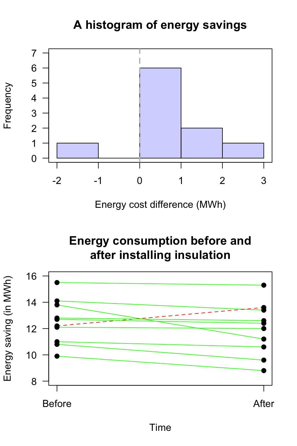
FIGURE 23.1: A plot of the energy savings from the insulation data. Top panel: A histogram (the vertical grey line represents no energy saving). Bottom panel: Case-profile plot (a dashed line represents an energy increase)