Chapter 3 Importing and Cleaning Data
In the previous two chapters, we used mostly built-in data sets to practice visualizing and transforming data. In practice, of course, you’ll have to import a data set into R before starting your analysis. Once a data set is imported, it’s often necessary to spruce it up by fixing broken formatting, changing variable names, deciding what to do with missing values, etc. We address these important steps in this chapter.
We’ll need tidyverse:
library(tidyverse)We’ll also need two new libraries used for importing data sets. They’re installed as part of base R, but you’ll have to load them.
library(readxl) # For importing Excel files
library(readr) # For importing csv (comma separated values) files
3.1 Importing Tabular Data
All of our data sets in this course are tabular, meaning that they consist of several rows of observations and several columns of variables. Tabular data is usually entered into spreadsheet software (such as Excel, Google Sheets, etc), where it can be manipulated using the built-in functionality of the software. Importing the data into R, however, allows for greater flexibility and versatility when performing your analysis.
RStudio makes it very easy to import data sets, although the first step is placing your spreadsheet file in the right directory.
Click here to view a very small sample csv file. Our goal is to import this into R. We can do so as follows:
Download the file by clicking the download button in the upper-right corner of the screen.
The next step is to get this file into R.
- If you’re using the RStudio desktop version, move this downloaded file to your working directory in R. If you’re not sure what your working directory is, you can enter
getwd()to find out. - If you’re using Posit Cloud, click the “Files” tab in the lower-right pane, and then click the “Upload” button. Then click “Choose File” and browse to the location of the downloaded csv file. In either case (desktop or cloud), the file should now appear in your list of files.
Click on the csv file in your files list, and then choose “Import Dataset.” You’ll see a preview of what the data set will look like in R, a window of importing options, and the R code used to do the importing.
In the “Import Options” window, choose the name you want to use for the data set once it’s in R. Enter this in the “Name” field. Also, decide whether you want to use the values in the first row in your csv file as column names. If so, make sure the “First Row as Names” box is checked. There are other options in this window as well that you’ll sometimes need to adjust, but these two will get you started.
Now you’re ready to import. You can do so by either clicking the “Import” button at the bottom right or by cutting and pasting the code into your document. I’d recommend cutting and pasting the code, as it allows you to quickly re-import your csv over your original in case you have to start your analysis over. The code generated by the import feature is:
library(readr)
sample_csv <- read_csv("sample_csv.csv")
View(sample_csv)
readr is the package needed to access the read_csv function. If you’ve already loaded it, it’s unnecessary to do so again. Also, the View(sample_csv) command is, of course, optional. All you really need to import the file is:
sample_csv <- read_csv("sample_csv.csv")Once you import it, you should see sample_csv listed in the Global Environment pane, and you can now start to analyze it like any other data set. It’s always good to at least preview it to make sure it imported correctly:
sample_csv## # A tibble: 3 x 2
## state capital
## <chr> <chr>
## 1 Michigan Lansing
## 2 California Sacramento
## 3 New Jersey TrentonData entry is usually done in Excel (or other spreadsheet software) and then imported into R for analysis. However, you sometimes might want to enter tabular data directly into R, especially when the data set is small. This is often the case when you need a sample data set to test a piece of code.
You can do so in R using the tibble or tribble (= transposed tibble) functions from tidyverse.
small_data_set_tibble <- tibble(
  x = c(3, 4, 2, -5, 7),
  y = c(5, 6, -1, 0, 5),
  z = c(-3, -2, 0, 1, 6)
)

small_data_set_tibble
## # A tibble: 5 x 3
## x y z
## <dbl> <dbl> <dbl>
## 1 3 5 -3
## 2 4 6 -2
## 3 2 -1 0
## 4 -5 0 1
## 5 7 5 6small_data_set_tribble <- tribble(
~name, ~points, ~year,
"Wilt Chamberlain", 100, 1962,
"Kobe Bryant", 81, 2006,
"Wilt Chamberlain", 78, 1961,
"Wilt Chamberlain", 73, 1962,
"Wilt Chamberlain", 73, 1962,
"David Thompson", 73, 1978,
"Luka Doncic", 73, 2024
)
small_data_set_tribble## # A tibble: 7 x 3
## name points year
## <chr> <dbl> <dbl>
## 1 Wilt Chamberlain 100 1962
## 2 Kobe Bryant 81 2006
## 3 Wilt Chamberlain 78 1961
## 4 Wilt Chamberlain 73 1962
## 5 Wilt Chamberlain 73 1962
## 6 David Thompson 73 1978
## 7 Luka Doncic 73 2024Notice that the column names do not require quotation marks, but any non-numeric values in the data set do.
Exercises
Click here to access another sample spreadsheet file. Download it as a .xlsx file and then import it into R. (Copy and paste the code generated for the import into your answer.) Why is the code a little different from that used to import the spreadsheet from above?
Click here for yet another sample spreadsheet. Download it and import it into R, but when you do, give the imported data set a more meaningful name than the default name. What else will you have to do to make the data set import correctly? (Copy and paste the generated import code into your answer.)
When you chose not to use the first row as the column names in the previous exercise, what default names did
read_excelassign to the columns? By either checking theread_exceldocumentation in R (?read_excel) or by searching the internet, find out how to override the default column names. Then re-import the spreadsheet from the previous exercise and assign more meaningful column names.Use both the
tibbleandtribblefunctions to directly enter your current course schedule into R. Include a column for “course” (e.g., MAT 210), “title” (e.g., Data Analysis with R), and “credits” (e.g., 4).The
tibbleandtribblefunctions both result in the same thing, but try to think about why it’s sometimes easier to usetibblethantribbleand vice versa.
3.2 Data Types
You may have noticed that the read_csv, read_excel, tibble, and tribble functions all produce data sets in the structure of a “tibble.” Recall that tibbles are data structures in tidyverse that store tabular data sets in readable, convenient formats.
The built-in iris data set, available in base R, is a data frame, not a tibble. Load iris and note its appearance:
irisTo compare this data frame to a tibble, we can coerce iris into a tibble and then reload it:
iris_tibble <- as_tibble(iris)

iris_tibble
## # A tibble: 150 x 5
## Sepal.Length Sepal.Width Petal.Length Petal.Width Species
## <dbl> <dbl> <dbl> <dbl> <fct>
## 1 5.1 3.5 1.4 0.2 setosa
## 2 4.9 3 1.4 0.2 setosa
## 3 4.7 3.2 1.3 0.2 setosa
## 4 4.6 3.1 1.5 0.2 setosa
## 5 5 3.6 1.4 0.2 setosa
## 6 5.4 3.9 1.7 0.4 setosa
## 7 4.6 3.4 1.4 0.3 setosa
## 8 5 3.4 1.5 0.2 setosa
## 9 4.4 2.9 1.4 0.2 setosa
## 10 4.9 3.1 1.5 0.1 setosa
## # i 140 more rowsWe can’t see the entire data set in the console anymore, just a preview. However, we’re told how many rows and columns the data set has without having to scroll, and, more importantly, we’re told the data type of each variable in the data set.
Knowing the data type of a variable is important, as different data types can behave very differently. The three most commonly occurring data types we’ll encounter are summarized below.
| type | abbreviation in R | objects |
|---|---|---|
| integer | int | whole numbers |
| double-precision floating point number | dbl | real numbers, possibly containing decimal digits |
| character | chr | characters or strings of characters |
You can check the types of the variables in a tibble by displaying it in the console, or you can use the type_sum function. Suppose we want to know the type of the variable hwy in the mpg data set. (Recall that mpg$hwy extracts just the vector of entries in the hwy column from mpg.) If we don’t want to display the entire tibble, we can do this instead:
type_sum(mpg$hwy)## [1] "int"When you import a data set or create one with tibble or tribble, R can usually determine what the variable types are. However, look again at small_data_set_tribble containing basketball data, which we created in the previous section. The data type of the points and year variables is “double.” This is because R converts all imported or input numeric data, whether there are decimal places or not, to the double type since it’s more inclusive and is handled the same way as integers mathematically. If we really want our numeric data to be treated like integers, there are two options:
First, if we’re entering the data directly into R using tibble or tribble, we can specify that the numbers are integers by including the suffix “L.” For example:
small_data_set2 <- tribble(
  ~name, ~points, ~year,
  "Wilt Chamberlain", 100L, 1962L,
  "Kobe Bryant", 81L, 2006L,
  "Wilt Chamberlain", 78L, 1961L,
  "Wilt Chamberlain", 73L, 1962L,
  "Wilt Chamberlain", 73L, 1962L,
  "David Thompson", 73L, 1978L,
  "Luka Doncic", 73L, 2024
)

small_data_set2
## # A tibble: 7 x 3
## name points year
## <chr> <int> <dbl>
## 1 Wilt Chamberlain 100 1962
## 2 Kobe Bryant 81 2006
## 3 Wilt Chamberlain 78 1961
## 4 Wilt Chamberlain 73 1962
## 5 Wilt Chamberlain 73 1962
## 6 David Thompson 73 1978
## 7 Luka Doncic 73 2024Notice that points are year are now integers.
Second, we can coerce a variable of one type into a variable of another type using the as.<TYPE> function within mutate. For example:
small_data_set3 <- small_data_set_tribble %>%
  mutate(points = as.integer(points),
         year = as.integer(year))

small_data_set3
## # A tibble: 7 x 3
## name points year
## <chr> <int> <int>
## 1 Wilt Chamberlain 100 1962
## 2 Kobe Bryant 81 2006
## 3 Wilt Chamberlain 78 1961
## 4 Wilt Chamberlain 73 1962
## 5 Wilt Chamberlain 73 1962
## 6 David Thompson 73 1978
## 7 Luka Doncic 73 2024One other data type worth mentioning here is factor. Notice that when we converted iris to the tibble iris_tibble above, the type of Species was abbreviated fct for “factor.”
type_sum(iris_tibble$Species)## [1] "fct"To begin to see what factors are, let’s create a small data set:
schedule <- tribble(
  ~day, ~task,
  "Tuesday", "wash car",
  "Friday", "doctor's appointment",
  "Monday", "haircut",
  "Saturday", "laundry",
  "Wednesday", "oil change"
)

schedule
## # A tibble: 5 x 2
## day task
## <chr> <chr>
## 1 Tuesday wash car
## 2 Friday doctor's appointment
## 3 Monday haircut
## 4 Saturday laundry
## 5 Wednesday oil changeSuppose we wanted to organize this list of tasks by the day. We could try:
arrange(schedule, day)## # A tibble: 5 x 2
## day task
## <chr> <chr>
## 1 Friday doctor's appointment
## 2 Monday haircut
## 3 Saturday laundry
## 4 Tuesday wash car
## 5 Wednesday oil changeAs you can see, this organizes by day alphabetically, which is certainly not what we want. To organize by day chronologically, we could assign an ordering to each day of the week so that the arrange function would sort it the way we want. We can do this by coercing day into the “factor” type.
We first have to tell R the ordering we want. We do so by entering a vector with the days of the week in chronological order. This ordering establishes the levels of the day variable:
day_levels <- c("Sunday", "Monday", "Tuesday", "Wednesday", "Thursday", "Friday", "Saturday")We can then turn the day column into a factor with the above levels as follows:
schedule2 <- schedule %>%
  mutate(day = factor(day, levels = day_levels))

type_sum(schedule2$day)
## [1] "fct"Now re-run the sort above:
arrange(schedule2, day)## # A tibble: 5 x 2
## day task
## <fct> <chr>
## 1 Monday haircut
## 2 Tuesday wash car
## 3 Wednesday oil change
## 4 Friday doctor's appointment
## 5 Saturday laundryWhen we define the levels of a factor, the values of that variable are replaced internally with integers that are determined by the levels. In the example above, after we turned the day column into factors, the value “Friday” became a 5 since “Friday” was the fifth entry in the level vector. “Monday” became a 2, “Saturday” a 7, etc. The names of the days became aliases for the integers from 1 to 7 that they represent. That’s why the arrange function was able to sort chronologically; it was just sorting a column of numbers from 1 to 7 in ascending order.
Recall from Section 1.1 that there are two varieties of categorical variables: nominal and ordinal. Nominal categorical variables have no inherent order. For example, the drv variable in mpg is nominal. Ordinal categorical variables do have an inherent order. For example, the cut variable in diamonds is ordinal. When it’s necessary to exploit the order of an ordinal categorical variable, it’s best to convert it to a factor, specifying the levels in a way that corresponds to the order.
Exercises
You will need the nycflights13 library for these exercises.
The
flightsdata set has a variable with a type that was not covered in this section. What is the variable, and what is its type?Create a data set called
mpg2which is an exact copy ofmpgexcept that thehwyandctyvariables are doubles rather than integers.Answer the following questions by experimenting. (Try just coercing single values rather than entire columns of data sets. For example, for part (a), try
as.character(7L).)- Can you coerce an integer into a character? What happens when you try?
- Can you coerce a double into a character? What happens when you try?
- Can you coerce a double into an integer? What happens when you try?
- Can you coerce character into either a double or an integer? What happens when you try?
Download and import the data set found here.
- What is the type of the variable
day? Change it to a more appropriate type. - Use
arrangeto sort the data set so that the records are in chronological order. (You’ll have to changemonthto a different type.)
- What is the type of the variable
Download and import the data set found here. It contains observations about 200 college students with two variables:
classis their college class, andpreferenceis their political party preference.- Obtain a bar graph that shows the distribution of the
classvariable. - What is the obvious problem with your bar graph from part (a)?
- Think of a way to fix the problem noticed in part (b), then redo the bar graph.
- Obtain a bar graph that shows the distribution of the
3.3 Renaming Columns
For the next few sections, we’ll be using the data set found here. You should download it and then import it into R using the name high_school_data. It contains high school data for incoming college students as well as data from their first college semester.
high_school_data## # A tibble: 278 x 10
## `High School GPA` `ACT Comp` `SAT Comp` High School Quality Academ~1 `Bridge Program?` FA20 Credit Hours At~2
## <dbl> <dbl> <dbl> <dbl> <chr> <dbl>
## 1 2.72 14 800 0.888 yes 13
## 2 4 NA 1380 0.839 <NA> 15
## 3 3.08 NA 1030 0.894 <NA> 14
## 4 3.69 NA 1240 NA <NA> 17
## 5 NA NA NA NA <NA> 13
## 6 3.47 NA 1030 0.533 <NA> 16
## 7 3.43 27 NA NA <NA> 15
## 8 3.27 NA 1080 NA <NA> 15
## 9 3.76 NA 1120 0.916 <NA> 15
## 10 3.23 33 NA 0.797 <NA> 15
## # i 268 more rows
## # i abbreviated names: 1: `High School Quality Academic`, 2: `FA20 Credit Hours Attempted`
## # i 4 more variables: `FA20 Credit Hours Earned` <dbl>,
## # `Acad Standing After FA20 (Dean's List, Good Standing, Academic Warning, Academic Probation, Academic Dismissal, Readmission on Condition)` <chr>,
## # Race <chr>, Ethnicity <chr>You probably immediately notice that one of the variable names, the one that starts with Acad Standing After FA20... is extremely long. (You can’t see the column’s data in the clipped tibble in the console, but it’s one of the off-screen columns.) A data set should have variable names that are descriptive without being prohibitively long. Column names are easy to change in Excel, Google Sheets, etc, but you can also change them using the tidyverse function rename.
First, a few notes about the way R handles column names. By default, column names are not allowed to contain non-syntactic characters, i.e., any character other than letters, numbers, . (period), and _ (underscore). Also, column names must begin with a letter. In particular, column names cannot have spaces. (It’s best to use an underscore in place of a space in a column name). However, you can override these restrictions by enclosing the character string for a column name in backticks. For example, if we want to rename the long variable name above, then `Acad Standing` is allowed, but Acad Standing is not.
Also, when the data set you’re importing has a column name with a space in it, the space will be retained in R. However, to refer to that column, you’ll have to enclose the column name in backticks. For example, high_school_data$`ACT Comp` will return the ACT Comp column in high_school_data, but high_school_data$ACT Comp will produce an error message.
With the above in mind, renaming variables is actually very easy. The rename function is one of the transformation functions like filter, select, etc, and works the same way. Let’s rename the really long Acad Standing After FA20... column as just Acad_Standing:
high_school_data_clean <- high_school_data %>%
  rename("Acad_Standing" = `Acad Standing After FA20 (Dean's List, Good Standing, Academic Warning, Academic Probation, Academic Dismissal, Readmission on Condition)`)

high_school_data_clean
## # A tibble: 278 x 10
## `High School GPA` `ACT Comp` `SAT Comp` High School Quality Academ~1 `Bridge Program?` FA20 Credit Hours At~2
## <dbl> <dbl> <dbl> <dbl> <chr> <dbl>
## 1 2.72 14 800 0.888 yes 13
## 2 4 NA 1380 0.839 <NA> 15
## 3 3.08 NA 1030 0.894 <NA> 14
## 4 3.69 NA 1240 NA <NA> 17
## 5 NA NA NA NA <NA> 13
## 6 3.47 NA 1030 0.533 <NA> 16
## 7 3.43 27 NA NA <NA> 15
## 8 3.27 NA 1080 NA <NA> 15
## 9 3.76 NA 1120 0.916 <NA> 15
## 10 3.23 33 NA 0.797 <NA> 15
## # i 268 more rows
## # i abbreviated names: 1: `High School Quality Academic`, 2: `FA20 Credit Hours Attempted`
## # i 4 more variables: `FA20 Credit Hours Earned` <dbl>, Acad_Standing <chr>, Race <chr>, Ethnicity <chr>Notice that the syntax for rename is rename(<"NEW NAME"> = <OLD NAME>). Notice also that in the above code chunk, a new data set high_school_data_clean was created to house the renamed column. The original data set, high_school_data, will still have the original long column name. In general, it’s a good practice to not change the original data set. It’s safer to always create a new data set to accept whatever changes you need to make.
3.4 Missing Values
Another thing that stands out right away in high_school_data is the abundance of NAs. This is an issue in most data sets you will analyze. The way you handle the NAs in your analysis will depend on the context, and we’ll see various methods as we proceed in the course. (Recall that we’ve already seen one way to work around NAs, namely the na.rm = TRUE argument we can include when we calculate summary statistics, such as means, sums, and standard deviations.)
Knowing the scope of the missing values in a data set is important when you first start to explore and clean. We can count how many NAs there are in a given column using the is.na function as follows.
Let’s start with a small sample vector, some of whose entries are missing:
v <- c(4, "abc", NA, 16, 3.1, NA, 0, -3, NA)We can apply is.na to the entire vector; it will be applied individually to each entry. (We say that the is.na function is therefore “vectorized.”)
is.na(v)## [1] FALSE FALSE TRUE FALSE FALSE TRUE FALSE FALSE TRUEWe see the value TRUE in the entry spots that had an NA in v. Remember that R treats the logical values TRUE and FALSE arithmetically by giving TRUE the value 1 and FALSE 0. Thus the sum of the entries in is.na(v) would just be the number of TRUE values, and hence the number of NAs in v:
sum(is.na(v))## [1] 3We can apply this process to the columns of high_school_data, replacing the vector v with any of the column vectors. For example, let’s count how many missing values there are in the SAT Comp column. (Notice the backticks around SAT Comp in the code below. Recall that this is necessary since SAT Comp has a space in it.)
sum(is.na(high_school_data$`SAT Comp`))## [1] 40The safest way to handle missing values is to just let them be. However, there are sometimes situations in which missing values will be an obstacle that prevents certain types of analysis. When that’s the case, the NAs have to be either filtered out or imputed.
Filtering out observations with NAs is a good option if you’d be losing only a very small percentage of the data. However, as in the case of SAT Comp, there are often far too many NAs to just get rid of them. In this case, imputing is a better option.
To impute a missing value means to assign an actual value to an NA. This is risky since NA stands for “not available,” and making the decision to change an NA to an actual value runs the risk of compromising the integrity of the data set. An analyst should be wary of “playing God” with the data. However, sometimes we can safely convert NAs to actual values when it’s clear what the NAs really mean or when we need to assign them a certain value in order to make a calculation work.
In high_school_data, the Bridge Program? column indicates whether a student was required to attend the summer Bridge Program as a preparation for taking college classes. The missing values in this column are clearly there because the person who entered the data meant it to be understood that a blank cell means “no.” While this convention is immediately understood by anyone viewing the data set, it sets up potential problems when doing our analysis. It’s always a better practice to reserve NA for values that are truly missing rather than using it as a stand-in for some known value.
We can replace NAs in a column with an actual value using the transformation function mutate together with replace_na. Let’s replace the NAs in the Bridge Program? column with “no.” We’ll display only this cleaned up column so we can check our work.
high_school_data_clean <- high_school_data_clean %>%
  mutate(`Bridge Program?` = replace_na(`Bridge Program?`, "no"))

high_school_data_clean %>%
  select(`Bridge Program?`)
## # A tibble: 278 x 1
## `Bridge Program?`
## <chr>
## 1 yes
## 2 no
## 3 no
## 4 no
## 5 no
## 6 no
## 7 no
## 8 no
## 9 no
## 10 no
## # i 268 more rowsWhen there’s a need to impute missing values of a continuous variable, a common method is to replace them with a plausible or representative value of that variable, usually the mean or median.
Let’s use replace_na to impute the missing values of the brainwt variable in msleep with the mean of the non-missing values. (The na.rm = TRUE argument in the code below is essential, for obvious reasons.) Note that the value of the mean we’re imputing is 0.2815814.
msleep_v2 <- msleep %>%
  mutate(brainwt = replace_na(brainwt, mean(brainwt, na.rm = TRUE))) %>%
  select(name, brainwt)

msleep_v2
## # A tibble: 83 x 2
## name brainwt
## <chr> <dbl>
## 1 Cheetah 0.282
## 2 Owl monkey 0.0155
## 3 Mountain beaver 0.282
## 4 Greater short-tailed shrew 0.00029
## 5 Cow 0.423
## 6 Three-toed sloth 0.282
## 7 Northern fur seal 0.282
## 8 Vesper mouse 0.282
## 9 Dog 0.07
## 10 Roe deer 0.0982
## # i 73 more rowsThe mean of a variable is more sensitive to outliers than the median, so when there are outliers present, it’s often more sensible to impute the median to the missing values.
Exercises
In
high_school_data, do you feel confident replacing theNAs in any of the columns besidesBridge Program?? Why or why not?Run the command
summary(high_school_data). One of the many things you see is the number ofNAs in some of the columns. For what types of columns is thisNAcount missing?For the columns from the previous exercise that did not produce an
NAcount, find the number ofNAs using the method from this section.A rough formula for converting an ACT score to a comparable SAT score is \(\textrm{SAT} = 41.6 \times\textrm{ACT} + 102.4\).
- Use this formula to create a new column in
high_school_data_cleanthat contains the converted ACT scores for each student who took it. - Create another new column in
high_school_data_cleanthat contains the better of each student’s SAT and converted ACT score. (Hint: Look up thepmaxfunction.) You’ll have to think about how to handle the manyNAs in theACT CompandSAT Compcolumns.
- Use this formula to create a new column in
This exercise requires the Lahman library. In baseball, a “plate appearance” is any instance during a game of a batter standing at home plate being pitched to. Only some plate appearances count as “at bats,” namely the ones for which the batter either gets a hit or fails to reach base through some fault of his own. For example, when a player draws a walk (which is the result of four bad pitches) or is hit by a pitch, these plate appearances do not count as at bats. Or if a batter purposely hits the ball in such a way that he gets out so that other base runners can advance, this type of plate appearance is also not counted as an at bat. The idea is that a player’s batting average (hits divided by at bats) should not be affected by walks, being hit by pitches, or sacrifice hits. A player’s plate appearance total is the sum of at bats (
AB), walks (BB), intentional walks (IBB), number of times being hit by a pitch (HBP), sacrifice hits (SH), and sacrifice flies (SF).- Add a column to
Battingthat records each player’s plate appearance totals. - Why are there so many
NAs in the plate appearance column added in part (a)? - For each of the six variables that contribute to the plate appearances total, determine the number of missing values.
- For all of the variables from part (c) that had missing values, replace the missing values with 0.
- Re-do part (a) and verify that there are no missing values in your new plate appearances column.
- Who holds the record for most plate appearances in a single season?
- Who holds the record for most plate appearances throughout his entire career?
- Add a column to
Impute the median to the
brainwtcolumn inmsleep. Do you think this is more appropriate than imputing the mean? Explain your answer.
3.5 Detecting Entry Errors
It’s very common for data entered into a spreadsheet manually to have a few entry errors, and there are standard methods for detecting these errors. One of the first things to look for are numerical data points that seem way too big or way too small. A good place to start is with the summary statistics. (We’ll be using the data set high_school_data_clean throughout this section, which is the partially cleaned version of the original high_school_data with the renamed Acad_Standing column and with the NAs in the Bridge Program? column replaced by "no".)
summary(high_school_data_clean)## High School GPA ACT Comp SAT Comp High School Quality Academic Bridge Program?
## Min. :2.279 Min. : 4.05 Min. : 100 Min. :0.1420 Length:278
## 1st Qu.:3.225 1st Qu.:20.00 1st Qu.:1020 1st Qu.:0.7322 Class :character
## Median :3.625 Median :23.00 Median :1120 Median :0.8470 Mode :character
## Mean :3.534 Mean :22.62 Mean :1116 Mean :0.7982
## 3rd Qu.:3.930 3rd Qu.:26.00 3rd Qu.:1220 3rd Qu.:0.9117
## Max. :4.650 Max. :33.00 Max. :1480 Max. :0.9870
## NA's :2 NA's :205 NA's :40 NA's :76
## FA20 Credit Hours Attempted FA20 Credit Hours Earned Acad_Standing Race Ethnicity
## Min. : 0.00 Min. : 0.00 Length:278 Length:278 Length:278
## 1st Qu.: 14.00 1st Qu.:13.00 Class :character Class :character Class :character
## Median : 15.00 Median :15.00 Mode :character Mode :character Mode :character
## Mean : 15.06 Mean :13.94
## 3rd Qu.: 16.00 3rd Qu.:16.00
## Max. :150.00 Max. :19.00
## This compilation is most helpful for continuous data. We’ll deal with categorical data separately. Notice that the maximum value of FA20 Credit Hours Attempted is quite a bit bigger than the third quartile value (and totally unrealistic anyway). This is certainly an entry error. A visual way to detect this would be to obtain a plot of the distribution of the FA20 Credit Hours Attempted variable. Since this is a continuous variable, we’ll use a histogram. (Recall that categorical distributions are visualized with bar graphs.)
ggplot(data = high_school_data_clean) +
  geom_histogram(mapping = aes(x = `FA20 Credit Hours Attempted`))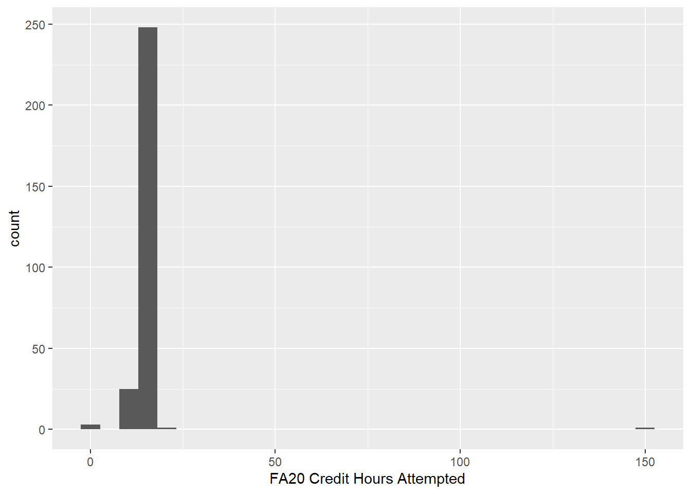
This histogram is skewed very far to the right with a huge gap between the right-most bar and the nearest bar to its left. This is another possible sign of an entry error.
We can drill down and see what’s going on with this point by sorting the FA20 Credit Hours Attempted variable in descending order. In the code below, head is a useful function that can be used to display only the beginning of a data set. (There’s also a tail function that displays the end of the data set.) By default, head displays the first 6 records, but you can override this and specify the number you want to display. Let’s display the records with the top ten highest values of FA20 Credit Hours Attempted. (The reason for the select is to make the FA20 Credit Hours Attempted column visible.)
high_school_data_clean %>%
  arrange(desc(`FA20 Credit Hours Attempted`)) %>%
    select(`FA20 Credit Hours Attempted`,
           `FA20 Credit Hours Earned`,
           Acad_Standing) %>%
  head(10)
## # A tibble: 10 x 3
## `FA20 Credit Hours Attempted` `FA20 Credit Hours Earned` Acad_Standing
## <dbl> <dbl> <chr>
## 1 150 15 Good Standing
## 2 19 19 Dean's List
## 3 18 18 Dean's List
## 4 18 18 Dean's List
## 5 18 17 Good Standing
## 6 18 18 Good Standing
## 7 18 18 Good Standing
## 8 18 18 Dean's List
## 9 18 18 Dean's List
## 10 18 18 Dean's ListSince we can see the entire row with the error, we can also get an insight into what probably happened. The student earned 15 credit hours and finished the semester in good academic standing, which likely means they didn’t fail any classes. Therefore the person doing the data entry probably absent-mindedly entered 150 instead of 15.
It’s a minor judgement call, but it’s probably safe to change the 150 to 15. (The other option would be to ignore this row altogether, which is not ideal.) The easiest way to do this is to make the change in the original spreadsheet and then re-import it. However, we can also make the change directly in R. We just have to see how to access an entry in a specific row and column of our data set.
First, let’s see how to pick out a specific entry from a vector. We’ll use the vector w to illustrate:
w <- c(4, -2, 2.4, 8, 10)To extract the entry in the, let’s say, fourth spot in w, we just enter:
w[4]## [1] 8In a tibble, each column is a vector, so we can access the entry in a given spot the same way. Suppose we want the 27th entry in the FA20 Credit Hours Attempted column of high_school_data_clean:
high_school_data_clean$`FA20 Credit Hours Attempted`[27]## [1] 14If we instead know the actual value in a vector for which we’re searching but not the spot it’s in (which will be the situation as we search for the 150 attempted credit hours value), we can use the which function. Suppose for the vector w above, we know that one of the entries is 2.4, but we don’t know which spot it’s in. We can locate it as follows:
which(w == 2.4)## [1] 3We thus see that 2.4 is the entry in the third spot in w. Notice that we used a double equal sign ==. This is because the argument for which must be a truth condition on the vector. The which function will return the location of every entry that satisfies that truth condition.
We can use this method to find where 150 is in FA20 Credit Hours Attempted. Let’s store the spot number in the variable spot_150 so we can refer to it in the follow-up.
spot_150 <- which(high_school_data_clean$`FA20 Credit Hours Attempted` == 150)

spot_150
## [1] 74So our problematic 150 value is in the 74th row. We can now make the change. We just have to overwrite the 150 in the column FA20 Credit Hours Attempted and row number 74 with 15.
high_school_data_clean$`FA20 Credit Hours Attempted`[spot_150] <- 15Entry errors for categorical variables can be harder to detect than for continuous ones. In this case, entry errors often take the form of inconsistent naming. For example, let’s look at the Race column in high_school_data_clean. One way to check for inconsistencies is to use group_by and summarize to see how many times each value in Race shows up in the data set:
high_school_data_clean %>%
  group_by(Race) %>%
  summarize(count = n())
## # A tibble: 7 x 2
## Race count
## <chr> <int>
## 1 American/Alaska Native 5
## 2 Asian 9
## 3 Black or African American 11
## 4 Black/African American 1
## 5 Hawaiian/Pacific Islander 1
## 6 White 230
## 7 <NA> 21We should especially pay attention to the values with low counts since these might indicate inconsistencies. Notice that “Black or African American” and “Black/African American” are both listed as distinct values, although this is certainly because of an inconsistent naming system. Since “Black/African American” only shows up once, this is probably a mistake and should be changed to “Black or African American.” We can make this change with the str_replace function within mutate. The syntax is str_replace(<VARIABLE>, <VALUE TO REPLACE>, <NEW VALUE>):
high_school_data_clean <- high_school_data_clean %>%
  mutate(Race = str_replace(Race, "Black/African American", "Black or African American"))
Running the grouped summary again on high_school_data_clean shows that the problem has been fixed:
high_school_data_clean %>%
  group_by(Race) %>%
  summarize(count = n())
## # A tibble: 6 x 2
## Race count
## <chr> <int>
## 1 American/Alaska Native 5
## 2 Asian 9
## 3 Black or African American 12
## 4 Hawaiian/Pacific Islander 1
## 5 White 230
## 6 <NA> 21Exercises
Look for possible entry errors for other continuous variables in
high_school_data_clean. Explain why you think there’s an entry error by:- Inspecting the data set summary.
- Referring to a visualization of the variable’s distribution.
- Sorting the data set by the variable and displaying the first or last few entries.
For any of the entry errors you found in the previous exercise, decide whether you think you should fix them. If so, proceed to do so, but if not, explain why.
Suppose the owner of the data set tells you that the 100 in the
SAT Compcolumn was supposed to be 1000. Make this change directly in R.We saw above that
<VECTOR>[<NUMBER>]returns the entry from<VECTOR>in spot<NUMBER>. Suppose we want to return the entries from several of the spots within<VECTOR>. For the vectort <- c("a", "b", "c", "d", "e"), try to come up with a single-line command that will return the entries in spots 1, 4, and 5.For this exercise, you will need the Lahman package.
- Use the
whichfunction to return all of the row numbers fromBattingthat have a home run (HR) value from 50 through 59. - Use part (a) and the idea from Exercise 4 to write a single-line command that will return a list of the players who had a home run total from 50 through 59. (A player could be listed more than once.)
- Use the
3.6 Separating and Uniting Columns
Sometimes the entries in a column of a data set contain more than one piece of data. For example, we might have a column that lists peoples’ full names, and we’d prefer to have separate columns for their first and last names. The function to use is separate. We have to tell it which column to separate as well as names for the two new columns that will house the separated values. By default, separate will split the cell values at the first non-syntactic character, such as a space, a comma, an arithmetic symbol, etc.
Let’s create a small data set to see how this works.
city_data_set <- tibble(
  location = c("Detroit, MI", "Chicago, IL", "Boston, MA")
)

city_data_set
## # A tibble: 3 x 1
## location
## <chr>
## 1 Detroit, MI
## 2 Chicago, IL
## 3 Boston, MANow let’s separate the location column into two columns named city and state:
city_data_set %>%
  separate(location, into = c("city", "state"))
## # A tibble: 3 x 2
## city state
## <chr> <chr>
## 1 Detroit MI
## 2 Chicago IL
## 3 Boston MAWhat if we were to add “Grand Rapids, MI” to the original data set and then redo the separate:
city_data_set_v2 <- tibble(
  location = c("Detroit, MI", "Chicago, IL", "Boston, MA", "Grand Rapids, MI")
)

city_data_set_v2 %>%
  separate(location, into = c("city", "state"))
## # A tibble: 4 x 2
## city state
## <chr> <chr>
## 1 Detroit MI
## 2 Chicago IL
## 3 Boston MA
## 4 Grand RapidsDo you see what happened? The entry “Grand Rapids, MI” was separated in “Grand” and “Rapids” rather than “Grand Rapids” and “MI.” The reason is that separate looks for the first non-syntactic character and separates the data at that point. The space in “Grand Rapids” is non-syntactic and therefore acts as the separation character for that observation.
Luckily, we can specify the separation character using the optional sep argument. We want to separate the location variable at the comma/space sequence:
city_data_set_v2 %>%
  separate(location, into = c("city", "state"), sep = ", ")
## # A tibble: 4 x 2
## city state
## <chr> <chr>
## 1 Detroit MI
## 2 Chicago IL
## 3 Boston MA
## 4 Grand Rapids MIAnother subtlety of separate is revealed in the following example. The following built-in data set contains data about rates of tuberculosis contraction in various countries.
table3## # A tibble: 6 x 3
## country year rate
## <chr> <dbl> <chr>
## 1 Afghanistan 1999 745/19987071
## 2 Afghanistan 2000 2666/20595360
## 3 Brazil 1999 37737/172006362
## 4 Brazil 2000 80488/174504898
## 5 China 1999 212258/1272915272
## 6 China 2000 213766/1280428583The rate column seems to contain the number of tuberculosis cases divided by the population, which would give the rate of the population that contracted tuberculosis. There are a few problems with this. First, it’s not very helpful to report rates this way. Rates are usually more meaningful as decimals or percentages, but even if this is how rate were displayed, remember that when comparing rates, it’s important to also display an overall count. In other words, we should convert the fractions in rate to decimals, but we should also keep the actual case and population numbers, each in its own column. We should therefore separate rate into cases and population columns. The first non-syntactic character in each entry is /, but let’s specify it as a separation character anyway just to be safe. We’ll also go ahead and add a rate column reported as a percentage:
table3_v2 <- table3 %>%
  separate(rate, into = c("cases", "population"), sep = "/") %>%
  mutate(rate = cases / population * 100)
## Error in `mutate()`:
## i In argument: `rate = cases/population * 100`.
## Caused by error in `cases / population`:
## ! non-numeric argument to binary operatorWhat does this error message mean? There’s apparently a problem with rate = cases/population * 100, and it’s that there’s a non-numeric argument to binary operator. A binary operator is an arithmetic operation that takes two numbers as input and produces a single numeric output. The binary operator of concern here is division, so the error message must be saying that one or both of cases or population is non-numeric. Let’s check this out by running the above code again with the offending mutate commented out:
table3_v2 <- table3 %>%
  separate(rate, into = c("cases", "population"), sep = "/") #%>%
  #mutate(rate = cases / population * 100)

table3_v2
## # A tibble: 6 x 4
## country year cases population
## <chr> <dbl> <chr> <chr>
## 1 Afghanistan 1999 745 19987071
## 2 Afghanistan 2000 2666 20595360
## 3 Brazil 1999 37737 172006362
## 4 Brazil 2000 80488 174504898
## 5 China 1999 212258 1272915272
## 6 China 2000 213766 1280428583Notice that, indeed, cases and population are both listed as characters. The reason is that the default procedure for separate is to make the separated variables into characters. We can override this by including the convert = TRUE argument in separate:
table3_v2 <- table3 %>%
  separate(rate, into = c("cases", "population"), sep = "/", convert = TRUE) #%>%
  #mutate(rate = cases / population * 100)

table3_v2
## # A tibble: 6 x 4
## country year cases population
## <chr> <dbl> <int> <int>
## 1 Afghanistan 1999 745 19987071
## 2 Afghanistan 2000 2666 20595360
## 3 Brazil 1999 37737 172006362
## 4 Brazil 2000 80488 174504898
## 5 China 1999 212258 1272915272
## 6 China 2000 213766 1280428583Since we’re now able to compute the rate, let’s remove the # and run the mutate:
table3_v2 <- table3 %>%
  separate(rate, into = c("cases", "population"), sep = "/", convert = TRUE) %>%
  mutate(rate = cases / population * 100)

table3_v2
## # A tibble: 6 x 5
## country year cases population rate
## <chr> <dbl> <int> <int> <dbl>
## 1 Afghanistan 1999 745 19987071 0.00373
## 2 Afghanistan 2000 2666 20595360 0.0129
## 3 Brazil 1999 37737 172006362 0.0219
## 4 Brazil 2000 80488 174504898 0.0461
## 5 China 1999 212258 1272915272 0.0167
## 6 China 2000 213766 1280428583 0.0167We’ve successfully separated the data and added a rate column, but there’s still a problem with rate. The percentages are so small as to be somewhat meaningless. The reason is that a percentage tells you how many cases there are for every hundred people (cent = hundred). When the number is very small (less than 1), it’s better to report the rate as cases per some other power of 10. In this case, if we multiply the rates by 100,000, we get more meaningful numbers, although now we’re calculating cases per 100,000:
table3_v2 <- table3 %>%
  separate(rate, into = c("cases", "population"), sep = "/", convert = TRUE) %>%
  mutate(rate_per_100K = cases / population * 100000)

table3_v2
## # A tibble: 6 x 5
## country year cases population rate_per_100K
## <chr> <dbl> <int> <int> <dbl>
## 1 Afghanistan 1999 745 19987071 3.73
## 2 Afghanistan 2000 2666 20595360 12.9
## 3 Brazil 1999 37737 172006362 21.9
## 4 Brazil 2000 80488 174504898 46.1
## 5 China 1999 212258 1272915272 16.7
## 6 China 2000 213766 1280428583 16.7While the sep = argument allows you to split the cells at any named character, sometimes you’ll want to split the cells into strings of a certain length instead, regardless of the characters involved. Look at this small sample data set, which contains a runner’s split times in a 5K race:
split_times <- tribble(
  ~`distance (km)`, ~`time (min)`,
  1, 430,
  2, 920,
  3, 1424,
  4, 1920,
  5, 2425
)

split_times
## # A tibble: 5 x 2
## `distance (km)` `time (min)`
## <dbl> <dbl>
## 1 1 430
## 2 2 920
## 3 3 1424
## 4 4 1920
## 5 5 2425It obviously didn’t take the runner 430 minutes to finish the first kilometer; the numbers in the time (min) column are clearly meant to be interpreted as “minutes:seconds.” The first 1 or 2 digits are minutes, and the last two are seconds. Let’s fix this.
First, we should separate the last two digits from the first 1 or 2, although there’s no character we can give to sep =. Luckily, sep = also accepts a number that states how many characters into the string we make our separation. If we include the argument sep = <NUMBER>, then the cell will be separated <NUMBER> characters in from the left if <NUMBER> is positive, and from the right otherwise. In our data set above, we want the separation to occur 2 characters in from the right, so we’ll use sep = -2:
split_times_v2 <- split_times %>%
  separate(`time (min)`, into = c("minutes", "seconds"), sep = -2, convert = TRUE)

split_times_v2
## # A tibble: 5 x 3
## `distance (km)` minutes seconds
## <dbl> <int> <int>
## 1 1 4 30
## 2 2 9 20
## 3 3 14 24
## 4 4 19 20
## 5 5 24 25Next, we’ll look at the unite function and see how we can combine the minutes and seconds columns back into a single column with a colon : inserted.
The function used to unite two columns into one is unite. We have to specify a name for the new united column as well as the existing columns we want to unite. Let’s unite the minutes and seconds columns from split_times above.
split_times_v3 <- split_times_v2 %>%
  unite("time (min:sec)", minutes, seconds)

split_times_v3
## # A tibble: 5 x 2
## `distance (km)` `time (min:sec)`
## <dbl> <chr>
## 1 1 4_30
## 2 2 9_20
## 3 3 14_24
## 4 4 19_20
## 5 5 24_25You can see that by default, unite joins combined values with an underscore _. We can override this with the optional sep = <SEPARATION CHARACTER> argument. In this case, we want the separation character to be a colon :.
split_times_v4 <- split_times_v2 %>%
  unite("time (min:sec)", minutes, seconds, sep = ":")

split_times_v4
## # A tibble: 5 x 2
## `distance (km)` `time (min:sec)`
## <dbl> <chr>
## 1 1 4:30
## 2 2 9:20
## 3 3 14:24
## 4 4 19:20
## 5 5 24:25Of course, in practice, we’d combine the separate and unite in the pipe:
split_times_v5 <- split_times %>%
  separate(`time (min)`, into = c("minutes", "seconds"), sep = -2, convert = TRUE) %>%
  unite("time (min:sec)", minutes, seconds, sep = ":")
We saw that by default, separate treats the newly created variables as characters. How does unite handle data types?
Consider the following built-in data set:
table5## # A tibble: 6 x 4
## country century year rate
## <chr> <chr> <chr> <chr>
## 1 Afghanistan 19 99 745/19987071
## 2 Afghanistan 20 00 2666/20595360
## 3 Brazil 19 99 37737/172006362
## 4 Brazil 20 00 80488/174504898
## 5 China 19 99 212258/1272915272
## 6 China 20 00 213766/1280428583Obviously, century and year should be combined into one variable called year. Notice that when we unite these columns, we don’t want the century and year values to be separated by any character, so we should specify the separation character as an empty pair of quotation marks.
table5_v2 <- table5 %>%
  unite("year", century, year, sep = "")

table5_v2
## # A tibble: 6 x 3
## country year rate
## <chr> <chr> <chr>
## 1 Afghanistan 1999 745/19987071
## 2 Afghanistan 2000 2666/20595360
## 3 Brazil 1999 37737/172006362
## 4 Brazil 2000 80488/174504898
## 5 China 1999 212258/1272915272
## 6 China 2000 213766/1280428583Notice that the new year variable is a character. It would be more appropriate to have it be an integer, but unfortunately, unlike separate, unite does not offer a convert = TRUE option. We have to coerce it into an integer like in Section 3.2.
table5_v3 <- table5_v2 %>%
  mutate(year = as.integer(year))

table5_v3
## # A tibble: 6 x 3
## country year rate
## <chr> <int> <chr>
## 1 Afghanistan 1999 745/19987071
## 2 Afghanistan 2000 2666/20595360
## 3 Brazil 1999 37737/172006362
## 4 Brazil 2000 80488/174504898
## 5 China 1999 212258/1272915272
## 6 China 2000 213766/1280428583Exercises
You will need the nycflights13 package for these exercises.
Create a version of the
flightsdata set that has a single column for the date, with dates entered asmm-dd-yyyyrather than three separate columns for the month, day, and year.Click here to go to the Wikipedia page that lists all members of the Baseball Hall of Fame. Then do the following:
- Copy and paste the list, including the column headings, into an Excel document and import it into R.
- Create a data table that lists only the name of each hall of famer in a single column, alphabetized by last name. Be sure there aren’t any
NAentries. Try to execute this using a sequence of commands in the pipe. (Each name should appear in a single cell when you’re done, with the first name listed first. For example, the first entry in your finished list should show up as: Hank Aaron.) - Are there any problematic entries in your list? What’s going on with these? (Hint: Try to interpret the warning message you’ll get.)
3.7 Pivoting
Consider the following built-in data set:
table2## # A tibble: 12 x 4
## country year type count
## <chr> <dbl> <chr> <dbl>
## 1 Afghanistan 1999 cases 745
## 2 Afghanistan 1999 population 19987071
## 3 Afghanistan 2000 cases 2666
## 4 Afghanistan 2000 population 20595360
## 5 Brazil 1999 cases 37737
## 6 Brazil 1999 population 172006362
## 7 Brazil 2000 cases 80488
## 8 Brazil 2000 population 174504898
## 9 China 1999 cases 212258
## 10 China 1999 population 1272915272
## 11 China 2000 cases 213766
## 12 China 2000 population 1280428583It’s clear how to interpret this table; for example, we can see that in Afghanistan in 1999, there were 745 cases of tuberculosis, and the population was 19,987,071. However, this method of recording data doesn’t lend itself well to analysis. For example, we couldn’t readily find the average number of tuberculosis cases or the average population since these values are mixed into the same column. Also, each observation, which consists of a given country in a given year, is spread over two rows. Additionally, the variable type has values (cases and population) which are actually variables themselves, and their values are the corresponding numbers in the count column.
It would be much better to rearrange the data set as shown below:
## # A tibble: 6 x 4
##   country      year  cases population
##   <chr>       <dbl>  <dbl>      <dbl>
## 1 Afghanistan  1999    745   19987071
## 2 Afghanistan  2000   2666   20595360
## 3 Brazil       1999  37737  172006362
## 4 Brazil       2000  80488  174504898
## 5 China        1999 212258 1272915272
## 6 China        2000 213766 1280428583
The way to do this is to perform a pivot on the table that turns the values from the type column into variables and assigns the corresponding values for these new variables from count. Since the values in the type column are being converted to variables, a pivot of this type has the potential to give the data table more columns than it currently has (although not in this case) and thus to make the table wider. The syntax below reflects exactly what we want to do:
table2 %>%
  pivot_wider(names_from = type, values_from = count)
## # A tibble: 6 x 4
## country year cases population
## <chr> <dbl> <dbl> <dbl>
## 1 Afghanistan 1999 745 19987071
## 2 Afghanistan 2000 2666 20595360
## 3 Brazil 1999 37737 172006362
## 4 Brazil 2000 80488 174504898
## 5 China 1999 212258 1272915272
## 6 China 2000 213766 1280428583In general, pivot_wider should be used whenever the values of some column should be pivoted to variable names.
The opposite problem occurs when a data set has column names that are actually values of some variable. For example, consider the following built-in data set:
table4a## # A tibble: 3 x 3
## country `1999` `2000`
## <chr> <dbl> <dbl>
## 1 Afghanistan 745 2666
## 2 Brazil 37737 80488
## 3 China 212258 213766Again, we know what this means. For example, in 1999, there were 745 cases of tuberculosis in Afghanistan, and in 2000, there were 2666. However, 1999 and 2000 are not variable names. It wouldn’t make sense to say that 745 is a value of 1999. Rather, 1999 and 2000 are values of a missing year variable, and the values in the 1999 and 2000 columns are actually values of a missing cases variable. A better way to arrange the data set would be as follows:
## # A tibble: 6 x 3
##   country     year   cases
##   <chr>       <chr>  <dbl>
## 1 Afghanistan 1999     745
## 2 Afghanistan 2000    2666
## 3 Brazil      1999   37737
## 4 Brazil      2000   80488
## 5 China       1999  212258
## 6 China       2000  213766
We can achieve this by performing a pivot that will send the variable names 1999 and 2000 to values of a year variable. We will also have to say what to do with the values in the 1999 and 2000 columns. Since we’re sending variable names to values, a pivot of this type has the potential to add more rows and therefore to make the data table longer. The code below shows how to do this. The first argument is a vector that lists the column names that are being pivoted to values. (Notice the backticks around 1999 and 2000, which are necessary for names that don’t start with a letter.)
table4a_v2 <- table4a %>%
  pivot_longer(cols = c(`1999`, `2000`), names_to = "year", values_to = "cases")

table4a_v2
## # A tibble: 6 x 3
## country year cases
## <chr> <chr> <dbl>
## 1 Afghanistan 1999 745
## 2 Afghanistan 2000 2666
## 3 Brazil 1999 37737
## 4 Brazil 2000 80488
## 5 China 1999 212258
## 6 China 2000 213766Notice that pivoting the years 1999 and 2000 away from variable names and into values converted them to character type. We will have to manually convert them back to integers since pivot_longer does not have a convert = TRUE option.
table4a_v3 <- table4a_v2 %>%
  mutate(year = as.integer(year))

table4a_v3
## # A tibble: 6 x 3
## country year cases
## <chr> <int> <dbl>
## 1 Afghanistan 1999 745
## 2 Afghanistan 2000 2666
## 3 Brazil 1999 37737
## 4 Brazil 2000 80488
## 5 China 1999 212258
## 6 China 2000 213766In general, use pivot_longer whenever a data set has column names that should actually be values of some variable.
Exercises
- Decide whether
pivot_longerorpivot_wideris needed for the data table below, and explain your decision. Then perform the pivot.
patients <- tribble(
  ~name, ~attribute, ~value,
  "Stephen Johnson", "age", 47,
  "Stephen Johnson", "weight", 185,
  "Ann Smith", "age", 39,
  "Ann Smith", "weight", 125,
  "Ann Smith", "height", 64,
  "Mark Davidson", "age", 51,
  "Mark Davidson", "weight", 210,
  "Mark Davidson", "height", 73
)- Repeat the previous exercise for this data table. What problem do you run into? (Use the
Viewcommand to see the pivoted table.) What could be done to avoid this problem?
patients <- tribble(
  ~name, ~attribute, ~value,
  "Stephen Johnson", "age", 47,
  "Stephen Johnson", "weight", 185,
  "Ann Smith", "age", 39,
  "Ann Smith", "weight", 125,
  "Ann Smith", "height", 64,
  "Mark Davidson", "age", 51,
  "Mark Davidson", "weight", 210,
  "Mark Davidson", "height", 73,
  "Ann Smith", "age", 43,
  "Ann Smith", "weight", 140,
  "Ann Smith", "height", 66
)- Perform a pivot (or sequence of pivots) to rearrange the data table below to a more appropriate layout.
preg <- tribble(
  ~pregnant, ~male, ~female,
  "yes",     NA,    10,
  "no",      20,    12
)
3.8 Joining Data Sets
In Exercise 2 from Section 2.5, we noticed that the value of the air_time from the flights data set does not seem to be consistent with the difference between the departure and arrival times, i.e., the “gate-to-gate time.” This difference is partly explained by the fact that air_time does not include time spent taxiing on the runway, but another explanation is the fact that arrival times are recorded relative to the time zone of the destination airport.
In order to compare air_time to the gate-to-gate time, we would need to know the time zone of each destination airport. Download and import the csv file found here. It lists the airport code for every airport in the world along with its time zone.
library(readr)
timezones <- read_csv("timezones.csv")
Between flights and timezones we have enough information to determine the time zone of every destination airport in flights. In fact, we can join these two data sets into one by using timezones to add a column to flights that contains the time zones of each destination airport. The idea is to use the dest variable in flights and the airport code variable in timezones to link the data sets together. A variable used in this way is known as a key variable. When we join two related data sets by a key variable, the key variable must have the same name in both data sets. Let’s rename airport code in timezones as dest so that it matches its partner in flights.
timezones_v2 <- timezones %>%
  rename("dest" = `airport code`)
Now that the key variable has the same name in both data sets, we can join the two data sets by the key variable using the left_join function as follows:
library(nycflights13)

flights_with_timezones <- left_join(flights, timezones_v2, by = "dest")
Let’s select a few columns of our joined data set so that we can see the new time zone column:
flights_with_timezones %>%
  select(dest, `time zone`)
## # A tibble: 336,776 x 2
## dest `time zone`
## <chr> <chr>
## 1 IAH Central Standard Time
## 2 IAH Central Standard Time
## 3 MIA Eastern Standard Time
## 4 BQN SA Western Standard Time
## 5 ATL Eastern Standard Time
## 6 ORD Central Standard Time
## 7 FLL Eastern Standard Time
## 8 IAD Eastern Standard Time
## 9 MCO Eastern Standard Time
## 10 ORD Central Standard Time
## # i 336,766 more rowsYou might be wondering why this is called a left join. The reason is that it uses the data set listed first (i.e., the one on the left), which in this case is flights, as a foundation and then builds onto it using the data set listed second, which in this case is timezones2. We can also construct our join by feeding the first data set into left_join via the pipe as follows:
flights_with_timezones <- flights %>%
  left_join(timezones_v2, by = "dest")
In the exercises, we’ll investigate three other types of joins: right_join, inner_join, and full_join.
Sometimes a single variable is not enough to join two related data sets. Consider the following two data sets, one containing the points scored per game of three NBA players over two years and the other containing those same players’ minutes played per game over those same two years:
points <- tribble(
  ~year, ~player, ~ppg,
  "2022-23", "Lebron James", 28.9,
  "2022-23", "Stephen Curry", 29.4,
  "2022-23", "Nikola Jokic", 24.5,
  "2023-24", "Lebron James", 25.7,
  "2023-24", "Stephen Curry", 26.4,
  "2023-24", "Nikola Jokic", 26.4
)
minutes <- tribble(
~year, ~player, ~mpg,
"2022-23", "Lebron James", 35.5,
"2022-23", "Stephen Curry", 34.7,
"2022-23", "Nikola Jokic", 33.7,
"2023-24", "Lebron James", 35.3,
"2023-24", "Stephen Curry", 32.7,
"2023-24", "Nikola Jokic", 34.6
)Suppose we want to add a column to the points data set containing each player’s mpg value for each year. For example, we would take the mpg value of 35.5 from Lebron James’s 2022-23 row in minutes and add it to his 2022-23 row in points. Notice that this process requires two variables to identify each observation: year and player. Thus, when performing a join, the key will have to be a vector of variables rather than just a single variable:
NBA_data <- left_join(points, minutes, by = c("year", "player"))

NBA_data
## # A tibble: 6 x 4
## year player ppg mpg
## <chr> <chr> <dbl> <dbl>
## 1 2022-23 Lebron James 28.9 35.5
## 2 2022-23 Stephen Curry 29.4 34.7
## 3 2022-23 Nikola Jokic 24.5 33.7
## 4 2023-24 Lebron James 25.7 35.3
## 5 2023-24 Stephen Curry 26.4 32.7
## 6 2023-24 Nikola Jokic 26.4 34.6Exercises
You will need the Lahman package for these exercises.
- Enter the following two small data sets:
sample1 <- tribble(
  ~x, ~y,
  1, "a",
  2, "b",
  3, "c"
)

sample2 <- tribble(
  ~x, ~z,
  1, "p",
  2, "q",
  4, "r"
)
Predict what will happen when you use left_join to join sample2 to sample1 using x as the key variable. In particular, what z value will be assigned to the x value 3 in sample1? Then perform this join.
- Using the data sets
sample1andsample2from the previous exercise, perform each of the following joins, and based on the results, explain what each one does.
right_join(sample1, sample2, by = "x")
inner_join(sample1, sample2, by = "x")
full_join(sample1, sample2, by = "x")
When we created the
NBA_datadata set at the end of this section, we usedleft_join. Explain why usingright_join,inner_join, orfull_joinwould have resulted in the same data set.Another data set included in Lahman is
Salaries, which contains player salaries. Create a data set that contains the salary of each player in theBattingdata set each year. If a player’s salary was not available for a given year, the salary should be displayed asNA.In the previous problem, the joined data set contained the variables
teamID.x,lgID.x,teamID.y, andlgID.y. Try to explain why these variables occurred. Then re-do the join so that this does not happen.Re-do the previous problem, but choose your join so that the only observations that show up in the joined data set are those for which salary data is available.
3.9 Case Study
We’ll close this chapter by cleaning and analyzing data from the World Health Organization’s 2014 Global Tuberculosis Report2. We will be focusing on two data sets (both of which are included with tidyverse): who and population.
who## # A tibble: 7,240 x 60
## country iso2 iso3 year new_sp_m014 new_sp_m1524 new_sp_m2534 new_sp_m3544 new_sp_m4554 new_sp_m5564
## <chr> <chr> <chr> <dbl> <dbl> <dbl> <dbl> <dbl> <dbl> <dbl>
## 1 Afghanistan AF AFG 1980 NA NA NA NA NA NA
## 2 Afghanistan AF AFG 1981 NA NA NA NA NA NA
## 3 Afghanistan AF AFG 1982 NA NA NA NA NA NA
## 4 Afghanistan AF AFG 1983 NA NA NA NA NA NA
## 5 Afghanistan AF AFG 1984 NA NA NA NA NA NA
## 6 Afghanistan AF AFG 1985 NA NA NA NA NA NA
## 7 Afghanistan AF AFG 1986 NA NA NA NA NA NA
## 8 Afghanistan AF AFG 1987 NA NA NA NA NA NA
## 9 Afghanistan AF AFG 1988 NA NA NA NA NA NA
## 10 Afghanistan AF AFG 1989 NA NA NA NA NA NA
## # i 7,230 more rows
## # i 50 more variables: new_sp_m65 <dbl>, new_sp_f014 <dbl>, new_sp_f1524 <dbl>, new_sp_f2534 <dbl>,
## # new_sp_f3544 <dbl>, new_sp_f4554 <dbl>, new_sp_f5564 <dbl>, new_sp_f65 <dbl>, new_sn_m014 <dbl>,
## # new_sn_m1524 <dbl>, new_sn_m2534 <dbl>, new_sn_m3544 <dbl>, new_sn_m4554 <dbl>, new_sn_m5564 <dbl>,
## # new_sn_m65 <dbl>, new_sn_f014 <dbl>, new_sn_f1524 <dbl>, new_sn_f2534 <dbl>, new_sn_f3544 <dbl>,
## # new_sn_f4554 <dbl>, new_sn_f5564 <dbl>, new_sn_f65 <dbl>, new_ep_m014 <dbl>, new_ep_m1524 <dbl>,
## # new_ep_m2534 <dbl>, new_ep_m3544 <dbl>, new_ep_m4554 <dbl>, new_ep_m5564 <dbl>, new_ep_m65 <dbl>, ...population## # A tibble: 4,060 x 3
## country year population
## <chr> <dbl> <dbl>
## 1 Afghanistan 1995 17586073
## 2 Afghanistan 1996 18415307
## 3 Afghanistan 1997 19021226
## 4 Afghanistan 1998 19496836
## 5 Afghanistan 1999 19987071
## 6 Afghanistan 2000 20595360
## 7 Afghanistan 2001 21347782
## 8 Afghanistan 2002 22202806
## 9 Afghanistan 2003 23116142
## 10 Afghanistan 2004 24018682
## # i 4,050 more rowsAs always, you can enter View(who) and View(population) to see the full tables.
The data documentation is often found in the publication or web site from which the data is pulled, but since these are built-in data sets, we’re lucky to have access to their dictionaries right in R. They’re both found in the same place:
?whowho contains data about tuberculosis cases in countries throughout the world during the years 1980-2013, and population contains data about those countries’ populations during those years.
Our analysis will be devoted to answering the following question:
How does the prevalence of tuberculosis vary from region-to-region throughout the world during the years 1980-2013?
We will start by thoroughly cleaning these data sets, and then we will try to answer the question above using visualizations and transformations.
The population data set looks fairly clean already. The data types and names of the columns are appropriate, and a quick look at the summary shows us that there are no missing values and no suspiciously low or high year or population values. One thing to note, though, is that population data only dates back to 1995, whereas tuberculosis data dates back to 1980. We’ll keep this in mind moving forward.
summary(population)## country year population
## Length:4060 Min. :1995 Min. :1.129e+03
## Class :character 1st Qu.:1999 1st Qu.:6.029e+05
## Mode :character Median :2004 Median :5.319e+06
## Mean :2004 Mean :3.003e+07
## 3rd Qu.:2009 3rd Qu.:1.855e+07
## Max. :2013 Max. :1.386e+09We can also check the histogram of population to see whether there are any obvious outliers:
ggplot(data = population) +
  geom_histogram(mapping = aes(x = population))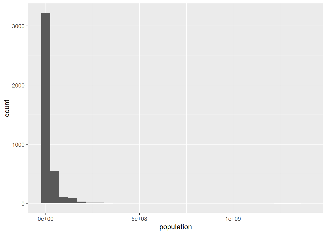
It looks like there is a possible outlier population at the far right. Let’s see why this is:
population %>%
  arrange(desc(population)) %>%
  head()
## # A tibble: 6 x 3
## country year population
## <chr> <dbl> <dbl>
## 1 China 2013 1385566537
## 2 China 2012 1377064907
## 3 China 2011 1368440300
## 4 China 2010 1359821465
## 5 China 2009 1351247555
## 6 China 2008 1342732604We can see that China’s population is creating the big gap in the histogram. We’ll make note of the outlier behavior of China’s population, but as of now, there’s no reason to remove it from the data set. At least we know that the histogram gap is not due to an entry error.
Since population is ready to go, we’ll move on to who.
Let’s start with the data set summary:
summary(who)## country iso2 iso3 year new_sp_m014 new_sp_m1524
## Length:7240 Length:7240 Length:7240 Min. :1980 Min. : 0.00 Min. : 0
## Class :character Class :character Class :character 1st Qu.:1988 1st Qu.: 0.00 1st Qu.: 9
## Mode :character Mode :character Mode :character Median :1997 Median : 5.00 Median : 90
## Mean :1997 Mean : 83.71 Mean : 1016
## 3rd Qu.:2005 3rd Qu.: 37.00 3rd Qu.: 502
## Max. :2013 Max. :5001.00 Max. :78278
## NA's :4067 NA's :4031
## new_sp_m2534 new_sp_m3544 new_sp_m4554 new_sp_m5564 new_sp_m65 new_sp_f014
## Min. : 0.0 Min. : 0.0 Min. : 0 Min. : 0.0 Min. : 0.0 Min. : 0.00
## 1st Qu.: 14.0 1st Qu.: 13.0 1st Qu.: 12 1st Qu.: 8.0 1st Qu.: 8.0 1st Qu.: 1.00
## Median : 150.0 Median : 130.0 Median : 102 Median : 63.0 Median : 53.0 Median : 7.00
## Mean : 1403.8 Mean : 1315.9 Mean : 1104 Mean : 800.7 Mean : 682.8 Mean : 114.33
## 3rd Qu.: 715.5 3rd Qu.: 583.5 3rd Qu.: 440 3rd Qu.: 279.0 3rd Qu.: 232.0 3rd Qu.: 50.75
## Max. :84003.0 Max. :90830.0 Max. :82921 Max. :63814.0 Max. :70376.0 Max. :8576.00
## NA's :4034 NA's :4021 NA's :4017 NA's :4022 NA's :4031 NA's :4066
## new_sp_f1524 new_sp_f2534 new_sp_f3544 new_sp_f4554 new_sp_f5564 new_sp_f65
## Min. : 0.0 Min. : 0.0 Min. : 0.0 Min. : 0.0 Min. : 0.0 Min. : 0.0
## 1st Qu.: 7.0 1st Qu.: 9.0 1st Qu.: 6.0 1st Qu.: 4.0 1st Qu.: 3.0 1st Qu.: 4.0
## Median : 66.0 Median : 84.0 Median : 57.0 Median : 38.0 Median : 25.0 Median : 30.0
## Mean : 826.1 Mean : 917.3 Mean : 640.4 Mean : 445.8 Mean : 313.9 Mean : 283.9
## 3rd Qu.: 421.0 3rd Qu.: 476.2 3rd Qu.: 308.0 3rd Qu.: 211.0 3rd Qu.: 146.5 3rd Qu.: 129.0
## Max. :53975.0 Max. :49887.0 Max. :34698.0 Max. :23977.0 Max. :18203.0 Max. :21339.0
## NA's :4046 NA's :4040 NA's :4041 NA's :4036 NA's :4045 NA's :4043
## new_sn_m014 new_sn_m1524 new_sn_m2534 new_sn_m3544 new_sn_m4554 new_sn_m5564
## Min. : 0.0 Min. : 0.0 Min. : 0.0 Min. : 0.0 Min. : 0.0 Min. : 0.0
## 1st Qu.: 1.0 1st Qu.: 2.0 1st Qu.: 2.0 1st Qu.: 2.0 1st Qu.: 2.0 1st Qu.: 2.0
## Median : 9.0 Median : 15.5 Median : 23.0 Median : 19.0 Median : 19.0 Median : 16.0
## Mean : 308.7 Mean : 513.0 Mean : 653.7 Mean : 837.9 Mean : 520.8 Mean : 448.6
## 3rd Qu.: 61.0 3rd Qu.: 102.0 3rd Qu.: 135.5 3rd Qu.: 132.0 3rd Qu.: 127.5 3rd Qu.: 101.0
## Max. :22355.0 Max. :60246.0 Max. :50282.0 Max. :250051.0 Max. :57181.0 Max. :64972.0
## NA's :6195 NA's :6210 NA's :6218 NA's :6215 NA's :6213 NA's :6219
## new_sn_m65 new_sn_f014 new_sn_f1524 new_sn_f2534 new_sn_f3544 new_sn_f4554
## Min. : 0.0 Min. : 0 Min. : 0.0 Min. : 0.0 Min. : 0.00 Min. : 0.00
## 1st Qu.: 2.0 1st Qu.: 1 1st Qu.: 1.0 1st Qu.: 2.0 1st Qu.: 1.00 1st Qu.: 1.00
## Median : 20.5 Median : 8 Median : 12.0 Median : 18.0 Median : 11.00 Median : 10.00
## Mean : 460.4 Mean : 292 Mean : 407.9 Mean : 466.3 Mean : 506.59 Mean : 271.16
## 3rd Qu.: 111.8 3rd Qu.: 58 3rd Qu.: 89.0 3rd Qu.: 103.2 3rd Qu.: 82.25 3rd Qu.: 76.75
## Max. :74282.0 Max. :21406 Max. :35518.0 Max. :28753.0 Max. :148811.00 Max. :23869.00
## NA's :6220 NA's :6200 NA's :6218 NA's :6224 NA's :6220 NA's :6222
## new_sn_f5564 new_sn_f65 new_ep_m014 new_ep_m1524 new_ep_m2534 new_ep_m3544
## Min. : 0.0 Min. : 0.0 Min. : 0.0 Min. : 0.0 Min. : 0.0 Min. : 0.00
## 1st Qu.: 1.0 1st Qu.: 1.0 1st Qu.: 0.0 1st Qu.: 1.0 1st Qu.: 1.0 1st Qu.: 1.00
## Median : 8.0 Median : 13.0 Median : 6.0 Median : 11.0 Median : 13.0 Median : 10.50
## Mean : 213.4 Mean : 230.8 Mean : 128.6 Mean : 158.3 Mean : 201.2 Mean : 272.72
## 3rd Qu.: 56.0 3rd Qu.: 74.0 3rd Qu.: 55.0 3rd Qu.: 88.0 3rd Qu.: 124.0 3rd Qu.: 91.25
## Max. :26085.0 Max. :29630.0 Max. :7869.0 Max. :8558.0 Max. :11843.0 Max. :105825.00
## NA's :6223 NA's :6221 NA's :6202 NA's :6214 NA's :6220 NA's :6216
## new_ep_m4554 new_ep_m5564 new_ep_m65 new_ep_f014 new_ep_f1524 new_ep_f2534
## Min. : 0.00 Min. : 0.00 Min. : 0.00 Min. : 0.0 Min. : 0.0 Min. : 0.0
## 1st Qu.: 1.00 1st Qu.: 1.00 1st Qu.: 1.00 1st Qu.: 0.0 1st Qu.: 1.0 1st Qu.: 1.0
## Median : 8.50 Median : 7.00 Median : 10.00 Median : 5.0 Median : 9.0 Median : 12.0
## Mean : 108.11 Mean : 72.17 Mean : 78.94 Mean : 112.9 Mean : 149.2 Mean : 189.5
## 3rd Qu.: 63.25 3rd Qu.: 46.00 3rd Qu.: 55.00 3rd Qu.: 50.0 3rd Qu.: 78.0 3rd Qu.: 95.0
## Max. :5875.00 Max. :3957.00 Max. :3061.00 Max. :6960.0 Max. :7866.0 Max. :10759.0
## NA's :6220 NA's :6225 NA's :6222 NA's :6208 NA's :6219 NA's :6219
## new_ep_f3544 new_ep_f4554 new_ep_f5564 new_ep_f65 newrel_m014 newrel_m1524
## Min. : 0.0 Min. : 0.00 Min. : 0.00 Min. : 0.00 Min. : 0.0 Min. : 0.0
## 1st Qu.: 1.0 1st Qu.: 1.00 1st Qu.: 1.00 1st Qu.: 0.00 1st Qu.: 5.0 1st Qu.: 17.5
## Median : 9.0 Median : 8.00 Median : 6.00 Median : 10.00 Median : 32.5 Median : 171.0
## Mean : 241.7 Mean : 93.77 Mean : 63.04 Mean : 72.31 Mean : 538.2 Mean : 1489.5
## 3rd Qu.: 77.0 3rd Qu.: 56.00 3rd Qu.: 42.00 3rd Qu.: 51.00 3rd Qu.: 210.0 3rd Qu.: 684.2
## Max. :101015.0 Max. :6759.00 Max. :4684.00 Max. :2548.00 Max. :18617.0 Max. :84785.0
## NA's :6219 NA's :6223 NA's :6223 NA's :6226 NA's :7050 NA's :7058
## newrel_m2534 newrel_m3544 newrel_m4554 newrel_m5564 newrel_m65 newrel_f014
## Min. : 0 Min. : 0.00 Min. : 0.0 Min. : 0 Min. : 0.0 Min. : 0.0
## 1st Qu.: 25 1st Qu.: 24.75 1st Qu.: 19.0 1st Qu.: 13 1st Qu.: 17.0 1st Qu.: 5.0
## Median : 217 Median : 208.00 Median : 175.0 Median : 136 Median : 117.0 Median : 32.5
## Mean : 2140 Mean : 2036.40 Mean : 1835.1 Mean : 1525 Mean : 1426.0 Mean : 532.8
## 3rd Qu.: 1091 3rd Qu.: 851.25 3rd Qu.: 688.5 3rd Qu.: 536 3rd Qu.: 453.5 3rd Qu.: 226.0
## Max. :76917 Max. :84565.00 Max. :100297.0 Max. :112558 Max. :124476.0 Max. :18054.0
## NA's :7057 NA's :7056 NA's :7056 NA's :7055 NA's :7058 NA's :7050
## newrel_f1524 newrel_f2534 newrel_f3544 newrel_f4554 newrel_f5564 newrel_f65
## Min. : 0.00 Min. : 0.0 Min. : 0.0 Min. : 0.0 Min. : 0.0 Min. : 0.0
## 1st Qu.: 10.75 1st Qu.: 18.0 1st Qu.: 12.5 1st Qu.: 10.0 1st Qu.: 8.0 1st Qu.: 9.0
## Median : 123.00 Median : 161.0 Median : 125.0 Median : 92.0 Median : 69.0 Median : 69.0
## Mean : 1161.85 Mean : 1472.8 Mean : 1125.0 Mean : 877.3 Mean : 686.4 Mean : 683.8
## 3rd Qu.: 587.75 3rd Qu.: 762.5 3rd Qu.: 544.5 3rd Qu.: 400.5 3rd Qu.: 269.0 3rd Qu.: 339.0
## Max. :49491.00 Max. :44985.0 Max. :38804.0 Max. :37138.0 Max. :40892.0 Max. :47438.0
## NA's :7056 NA's :7058 NA's :7057 NA's :7057 NA's :7057 NA's :7055A couple of things might stand out right away, namely the redundant iso2 and iso3 columns, the several NAs, and the strange looking column names.
Let’s address the column names first. The documentation explains that the column names encode several pieces of information. They all begin with new, indicating that these are newly diagnosed cases. After new_, the next string encodes the method of diagnosis. For example, rel means the case was a relapse. The next string is an m (for male) or f (for female), followed by numbers which indicate an age range. Thus each column heading is actually a set of four data values. The numbers in these columns are the numbers of cases. Since we have values being used as column names, we should pivot the column names into values. This will make the data table longer, so we’ll use pivot_longer. We’ll also get rid of the iso2 column while we’re at it. (We’re going to leave iso3 since we’ll need it later. It provides a standardized name for each country.)
who_clean <- who %>%
  select(-iso2) %>%
  pivot_longer(cols = new_sp_m014:newrel_f65, names_to = "case_type", values_to = "cases")

who_clean
## # A tibble: 405,440 x 5
## country iso3 year case_type cases
## <chr> <chr> <dbl> <chr> <dbl>
## 1 Afghanistan AFG 1980 new_sp_m014 NA
## 2 Afghanistan AFG 1980 new_sp_m1524 NA
## 3 Afghanistan AFG 1980 new_sp_m2534 NA
## 4 Afghanistan AFG 1980 new_sp_m3544 NA
## 5 Afghanistan AFG 1980 new_sp_m4554 NA
## 6 Afghanistan AFG 1980 new_sp_m5564 NA
## 7 Afghanistan AFG 1980 new_sp_m65 NA
## 8 Afghanistan AFG 1980 new_sp_f014 NA
## 9 Afghanistan AFG 1980 new_sp_f1524 NA
## 10 Afghanistan AFG 1980 new_sp_f2534 NA
## # i 405,430 more rowsAnother easy cleanup is to remove the rows with missing values for cases, as our question depends on knowing the number of cases.
who_clean <- who_clean %>%
  filter(!is.na(cases))

who_clean
## # A tibble: 76,046 x 5
## country iso3 year case_type cases
## <chr> <chr> <dbl> <chr> <dbl>
## 1 Afghanistan AFG 1997 new_sp_m014 0
## 2 Afghanistan AFG 1997 new_sp_m1524 10
## 3 Afghanistan AFG 1997 new_sp_m2534 6
## 4 Afghanistan AFG 1997 new_sp_m3544 3
## 5 Afghanistan AFG 1997 new_sp_m4554 5
## 6 Afghanistan AFG 1997 new_sp_m5564 2
## 7 Afghanistan AFG 1997 new_sp_m65 0
## 8 Afghanistan AFG 1997 new_sp_f014 5
## 9 Afghanistan AFG 1997 new_sp_f1524 38
## 10 Afghanistan AFG 1997 new_sp_f2534 36
## # i 76,036 more rowsYou may have noticed during the pivot above that there are, annoyingly, some inconsistent naming conventions. For example, in some of the case types, there is an underscore after new and in some there are not. Let’s perform a grouped count on the case_type variable to see the extent of this problem. Notice that we’re not storing this grouped table in who_clean since we’re only using it to detect entry errors.
case_type_count <- who_clean %>%
  group_by(case_type) %>%
  summarize(count = n())
By viewing the full case_type_count table (View(case_type_count)), we see that the last 14 values are entered as newrel rather than new_rel. Here’s what you’d see at the end of the table:
tail(case_type_count, 16)## # A tibble: 16 x 2
## case_type count
## <chr> <int>
## 1 new_sp_m5564 3218
## 2 new_sp_m65 3209
## 3 newrel_f014 190
## 4 newrel_f1524 184
## 5 newrel_f2534 182
## 6 newrel_f3544 183
## 7 newrel_f4554 183
## 8 newrel_f5564 183
## 9 newrel_f65 185
## 10 newrel_m014 190
## 11 newrel_m1524 182
## 12 newrel_m2534 183
## 13 newrel_m3544 184
## 14 newrel_m4554 184
## 15 newrel_m5564 185
## 16 newrel_m65 182We can fix this with str_replace:
who_clean <- who_clean %>%
  mutate(case_type = str_replace(case_type, "newrel", "new_rel"))
Now let’s separate the case_type variable into each of its four parts. We’ll first separate at the underscores, which separate will do by default since they’re non-syntactic characters. (Do you now see why we first had to fix the newrel entry error?)
who_clean <- who_clean %>%
  separate(case_type, into = c("new or old", "diagnosis type", "sex_age"))

who_clean
## # A tibble: 76,046 x 7
## country iso3 year `new or old` `diagnosis type` sex_age cases
## <chr> <chr> <dbl> <chr> <chr> <chr> <dbl>
## 1 Afghanistan AFG 1997 new sp m014 0
## 2 Afghanistan AFG 1997 new sp m1524 10
## 3 Afghanistan AFG 1997 new sp m2534 6
## 4 Afghanistan AFG 1997 new sp m3544 3
## 5 Afghanistan AFG 1997 new sp m4554 5
## 6 Afghanistan AFG 1997 new sp m5564 2
## 7 Afghanistan AFG 1997 new sp m65 0
## 8 Afghanistan AFG 1997 new sp f014 5
## 9 Afghanistan AFG 1997 new sp f1524 38
## 10 Afghanistan AFG 1997 new sp f2534 36
## # i 76,036 more rowsNow let’s separate sex_age, which will mean splitting off the m or f character, hence the sep = 1 argument:
who_clean <- who_clean %>%
  separate(sex_age, into = c("sex", "age"), sep = 1)

who_clean
## # A tibble: 76,046 x 8
## country iso3 year `new or old` `diagnosis type` sex age cases
## <chr> <chr> <dbl> <chr> <chr> <chr> <chr> <dbl>
## 1 Afghanistan AFG 1997 new sp m 014 0
## 2 Afghanistan AFG 1997 new sp m 1524 10
## 3 Afghanistan AFG 1997 new sp m 2534 6
## 4 Afghanistan AFG 1997 new sp m 3544 3
## 5 Afghanistan AFG 1997 new sp m 4554 5
## 6 Afghanistan AFG 1997 new sp m 5564 2
## 7 Afghanistan AFG 1997 new sp m 65 0
## 8 Afghanistan AFG 1997 new sp f 014 5
## 9 Afghanistan AFG 1997 new sp f 1524 38
## 10 Afghanistan AFG 1997 new sp f 2534 36
## # i 76,036 more rowsNow that the columns are separated, notice that it looks like every value in new or old is new. Let’s check:
n_distinct(who_clean$`new or old`)## [1] 1Thus, in this case, the new_or_old column is not helpful, so let’s remove it:
who_clean <- who_clean %>%
  select(-`new or old`)
Now let’s clean up the age column, making it clearer that it represents an age range. Let’s first split off the last two numbers. (Do you see why we wouldn’t want to split off the first two?)
who_clean <- who_clean %>%
  separate(age, into = c("first", "last"), sep = -2)

who_clean
## # A tibble: 76,046 x 8
## country iso3 year `diagnosis type` sex first last cases
## <chr> <chr> <dbl> <chr> <chr> <chr> <chr> <dbl>
## 1 Afghanistan AFG 1997 sp m "0" 14 0
## 2 Afghanistan AFG 1997 sp m "15" 24 10
## 3 Afghanistan AFG 1997 sp m "25" 34 6
## 4 Afghanistan AFG 1997 sp m "35" 44 3
## 5 Afghanistan AFG 1997 sp m "45" 54 5
## 6 Afghanistan AFG 1997 sp m "55" 64 2
## 7 Afghanistan AFG 1997 sp m "" 65 0
## 8 Afghanistan AFG 1997 sp f "0" 14 5
## 9 Afghanistan AFG 1997 sp f "15" 24 38
## 10 Afghanistan AFG 1997 sp f "25" 34 36
## # i 76,036 more rowsNow we could unite these columns back together, separating the values by a dash, so that the age ranges look like 25-34, for example:
who_clean <- who_clean %>%
  unite("age range", first, last, sep = "-")

who_clean
## # A tibble: 76,046 x 7
## country iso3 year `diagnosis type` sex `age range` cases
## <chr> <chr> <dbl> <chr> <chr> <chr> <dbl>
## 1 Afghanistan AFG 1997 sp m 0-14 0
## 2 Afghanistan AFG 1997 sp m 15-24 10
## 3 Afghanistan AFG 1997 sp m 25-34 6
## 4 Afghanistan AFG 1997 sp m 35-44 3
## 5 Afghanistan AFG 1997 sp m 45-54 5
## 6 Afghanistan AFG 1997 sp m 55-64 2
## 7 Afghanistan AFG 1997 sp m -65 0
## 8 Afghanistan AFG 1997 sp f 0-14 5
## 9 Afghanistan AFG 1997 sp f 15-24 38
## 10 Afghanistan AFG 1997 sp f 25-34 36
## # i 76,036 more rowsThis creates a new problem, though, because the “65 and older” values are now expressed as -65. Another str_replace easily fixes this:
who_clean <- who_clean %>%
  mutate(`age range` = str_replace(`age range`, "-65", "65 and older"))

who_clean
## # A tibble: 76,046 x 7
## country iso3 year `diagnosis type` sex `age range` cases
## <chr> <chr> <dbl> <chr> <chr> <chr> <dbl>
## 1 Afghanistan AFG 1997 sp m 0-14 0
## 2 Afghanistan AFG 1997 sp m 15-24 10
## 3 Afghanistan AFG 1997 sp m 25-34 6
## 4 Afghanistan AFG 1997 sp m 35-44 3
## 5 Afghanistan AFG 1997 sp m 45-54 5
## 6 Afghanistan AFG 1997 sp m 55-64 2
## 7 Afghanistan AFG 1997 sp m 65 and older 0
## 8 Afghanistan AFG 1997 sp f 0-14 5
## 9 Afghanistan AFG 1997 sp f 15-24 38
## 10 Afghanistan AFG 1997 sp f 25-34 36
## # i 76,036 more rowsLastly, we should check that the cases column doesn’t have any potential entry errors. We can start with the summary statistics:
summary(who_clean$cases)## Min. 1st Qu. Median Mean 3rd Qu. Max.
## 0.0 3.0 26.0 570.7 184.0 250051.0The maximum value seems very large. Let’s look at the distribution:
ggplot(data = who_clean) +
  geom_histogram(mapping = aes(x = cases))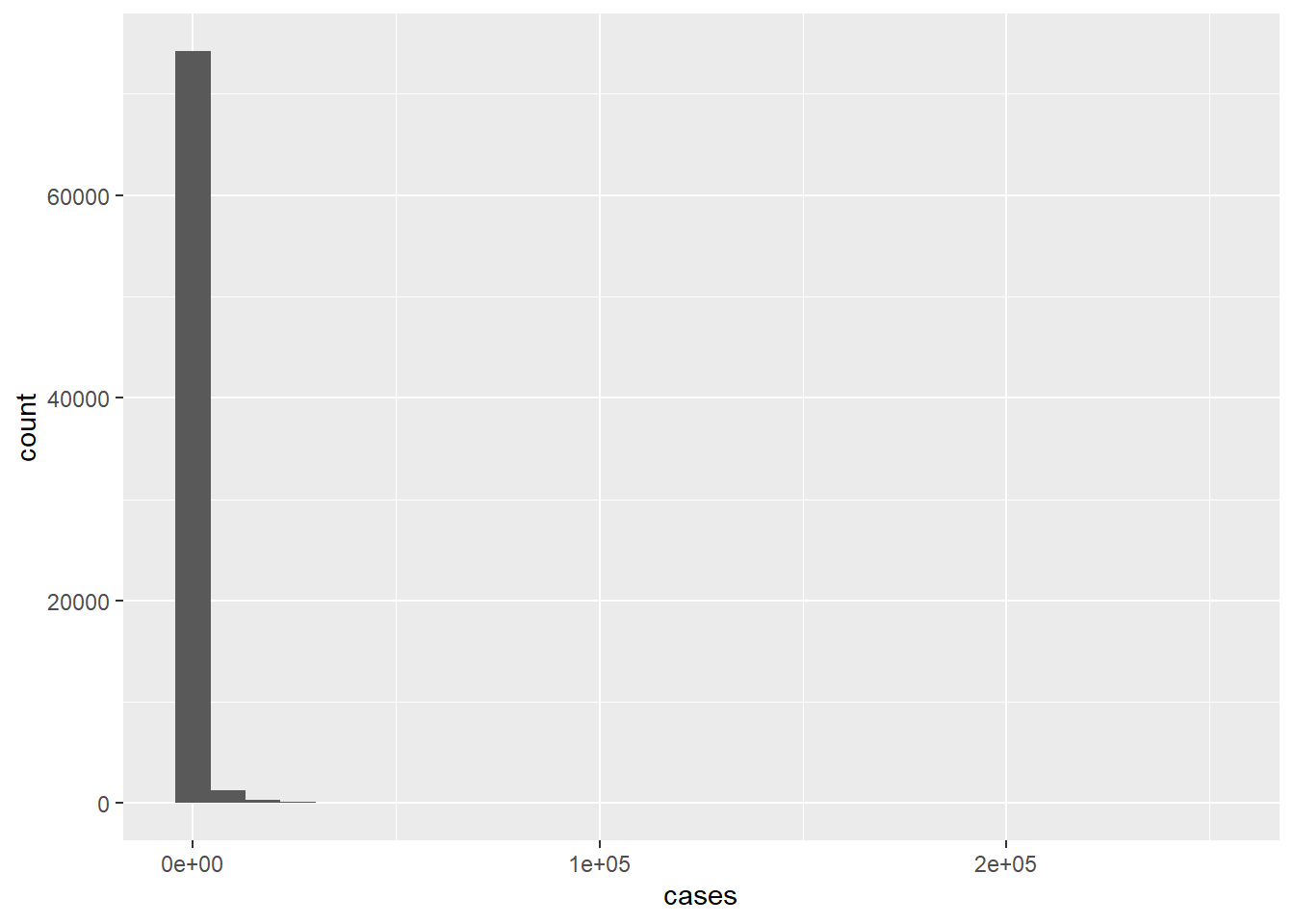
This is skewed way to the right, which might indicate an entry error. Let’s sort by cases and look at the top of the list:
who_clean %>%
  arrange(desc(cases)) %>%
  head()
## # A tibble: 6 x 7
## country iso3 year `diagnosis type` sex `age range` cases
## <chr> <chr> <dbl> <chr> <chr> <chr> <dbl>
## 1 India IND 2007 sn m 35-44 250051
## 2 India IND 2007 sn f 35-44 148811
## 3 China CHN 2013 rel m 65 and older 124476
## 4 China CHN 2013 rel m 55-64 112558
## 5 India IND 2007 ep m 35-44 105825
## 6 India IND 2007 ep f 35-44 101015It looks like there actually are some very high case counts in the table, but they come from India and China, the two most populous countries in the world. While the value 250,051 does seem extremely high (maybe it should be 150,051?), there doesn’t seem to be enough rationale to change it. If there had been any unrealistically high values or negative values or decimal values (and we know there are not because we can see that the variable type is “integer”), then we would probably just filter out those observations.
At this point, who_clean is in good shape. It should be noted that the piecemeal approach above would probably not be done in practice. Using the pipe, we could condense all of the cleaning we just did into the following:
who_clean <- who %>%
  select(-iso2) %>%
  pivot_longer(cols = new_sp_m014:newrel_f65, names_to = "case_type", values_to = "cases") %>%
  filter(!is.na(cases)) %>%
  mutate(case_type = str_replace(case_type, "newrel", "new_rel")) %>%
  separate(case_type, into = c("new or old", "diagnosis type", "sex_age")) %>%
  separate(sex_age, into = c("sex", "age"), sep = 1) %>%
  select(-`new or old`) %>%
  separate(age, into = c("first", "last"), sep = -2) %>%
  unite("age range", first, last, sep = "-") %>%
  mutate(`age range` = str_replace(`age range`, "-65", "65 and older"))
We know that we can import Excel files into R data sets, but we can also export R data sets back into Excel files. This makes it easier to share data sets with others. Since we now have such a nice, clean version of who, let’s do this. It requires the writexl package:
install.packages("writexl")Running the following will create an Excel version of who_clean named “who_clean.xlsx” in your working directory.
library(writexl)
write_xlsx(who_clean, "who_clean.xlsx")
Now that who_clean and population are ready for analysis, we can return to our question:
How does the prevalence of tuberculosis vary from region-to-region throughout the world during the years 1980-2013?
This is a somewhat open-ended question, and it’s the job of the analyst to think of a way to make it more specific. The prevalence of a disease is a measure of how common it is, usually expressed as a rate of cases relative to the population. Thus, a good way to start would be to compute the tuberculosis rate in each country for each year, which would entail dividing the case count for a given country and year by the population for that country and year. To do this, we will have to get the population data from population into who_clean using a join.
First though, notice in who_clean that each country/year observation is split into several observations. Since our question doesn’t involve diagnosis type, sex, or age range, we should group the data by country (and iso3, which will soon be needed) and year and count the total number of cases for each group:
who_grouped <- who_clean %>%
  group_by(country, iso3, year) %>%
  summarize(cases = sum(cases))

who_grouped
## # A tibble: 3,484 x 4
## # Groups: country, iso3 [219]
## country iso3 year cases
## <chr> <chr> <dbl> <dbl>
## 1 Afghanistan AFG 1997 128
## 2 Afghanistan AFG 1998 1778
## 3 Afghanistan AFG 1999 745
## 4 Afghanistan AFG 2000 2666
## 5 Afghanistan AFG 2001 4639
## 6 Afghanistan AFG 2002 6509
## 7 Afghanistan AFG 2003 6528
## 8 Afghanistan AFG 2004 8245
## 9 Afghanistan AFG 2005 9949
## 10 Afghanistan AFG 2006 12469
## # i 3,474 more rowsNow we can join population to who_grouped by the key consisting of country and year. However, the values of country and year for the two tables are not identical; for example, population contains data for Afghanistan in 1995, but who_grouped does not. It’s also possible that who_grouped might contain key values that are missing from population. Since we won’t be able to use data with missing values, we should choose our join so that it only merges the data on key values that are present in both tables. This is what inner_join does:
who_rates <- who_grouped %>%
  inner_join(population, by = c("country", "year"))

who_rates
## # A tibble: 3,432 x 5
## # Groups: country, iso3 [217]
## country iso3 year cases population
## <chr> <chr> <dbl> <dbl> <dbl>
## 1 Afghanistan AFG 1997 128 19021226
## 2 Afghanistan AFG 1998 1778 19496836
## 3 Afghanistan AFG 1999 745 19987071
## 4 Afghanistan AFG 2000 2666 20595360
## 5 Afghanistan AFG 2001 4639 21347782
## 6 Afghanistan AFG 2002 6509 22202806
## 7 Afghanistan AFG 2003 6528 23116142
## 8 Afghanistan AFG 2004 8245 24018682
## 9 Afghanistan AFG 2005 9949 24860855
## 10 Afghanistan AFG 2006 12469 25631282
## # i 3,422 more rowsNow we can calculate rates.
who_rates <- who_rates %>%
  mutate(rate = cases/population)

who_rates
## # A tibble: 3,432 x 6
## # Groups: country, iso3 [217]
## country iso3 year cases population rate
## <chr> <chr> <dbl> <dbl> <dbl> <dbl>
## 1 Afghanistan AFG 1997 128 19021226 0.00000673
## 2 Afghanistan AFG 1998 1778 19496836 0.0000912
## 3 Afghanistan AFG 1999 745 19987071 0.0000373
## 4 Afghanistan AFG 2000 2666 20595360 0.000129
## 5 Afghanistan AFG 2001 4639 21347782 0.000217
## 6 Afghanistan AFG 2002 6509 22202806 0.000293
## 7 Afghanistan AFG 2003 6528 23116142 0.000282
## 8 Afghanistan AFG 2004 8245 24018682 0.000343
## 9 Afghanistan AFG 2005 9949 24860855 0.000400
## 10 Afghanistan AFG 2006 12469 25631282 0.000486
## # i 3,422 more rowsThe rate numbers look pretty small. Let’s see what their range is:
summary(who_rates$rate)## Min. 1st Qu. Median Mean 3rd Qu. Max.
## 0.000e+00 7.535e-05 2.122e-04 4.198e-04 5.262e-04 8.135e-03If we were to move the decimal point five places to the right, these numbers would be easier to digest. Thus, when we calculate the rate, we should multiply the quotient by 100,000 (since 100,000 has five zeros). This means we would be measuring rate in cases per 100,000 people (as in Section 3.6).
who_rates_100K <- who_rates %>%
  mutate(rate_per_100K = cases/population * 100000)

who_rates_100K
## # A tibble: 3,432 x 7
## # Groups: country, iso3 [217]
## country iso3 year cases population rate rate_per_100K
## <chr> <chr> <dbl> <dbl> <dbl> <dbl> <dbl>
## 1 Afghanistan AFG 1997 128 19021226 0.00000673 0.673
## 2 Afghanistan AFG 1998 1778 19496836 0.0000912 9.12
## 3 Afghanistan AFG 1999 745 19987071 0.0000373 3.73
## 4 Afghanistan AFG 2000 2666 20595360 0.000129 12.9
## 5 Afghanistan AFG 2001 4639 21347782 0.000217 21.7
## 6 Afghanistan AFG 2002 6509 22202806 0.000293 29.3
## 7 Afghanistan AFG 2003 6528 23116142 0.000282 28.2
## 8 Afghanistan AFG 2004 8245 24018682 0.000343 34.3
## 9 Afghanistan AFG 2005 9949 24860855 0.000400 40.0
## 10 Afghanistan AFG 2006 12469 25631282 0.000486 48.6
## # i 3,422 more rowsTo compare tuberculosis prevalence in different regions, it would be necessary to assign each country a specific world region. The web page found here has exactly the information we need. We can copy and paste the data into an Excel spreadsheet and then import it into R. The code chunk below assumes that the data has been pasted into an Excel document named “regions.xlsx” which is stored in your working directory:
library(readxl)
regions <- read_excel("regions.xlsx")

regions
## # A tibble: 249 x 10
## Continent Region Country Capital FIPS `ISO (2)` `ISO (3)` `ISO (No)` Internet Note
## <chr> <chr> <chr> <chr> <chr> <chr> <chr> <chr> <chr> <chr>
## 1 Asia South Asia Afghanistan Kabul AF AF AFG 4 AF <NA>
## 2 Europe South East Europe Albania Tirana AL AL ALB 8 AL <NA>
## 3 Africa Northern Africa Algeria Algiers AG DZ DZA 12 DZ <NA>
## 4 Oceania Pacific American Samoa Pago Pago AQ AS ASM 16 AS <NA>
## 5 Europe South West Europe Andorra Andorra ~ AN AD AND 20 AD <NA>
## 6 Africa Southern Africa Angola Luanda AO AO AGO 24 AO <NA>
## 7 Americas West Indies Anguilla The Vall~ AV AI AIA 660 AI <NA>
## 8 Americas West Indies Antigua and Barbuda Saint Jo~ AC AG ATG 28 AG <NA>
## 9 Americas South America Argentina Buenos A~ AR AR ARG 32 AR <NA>
## 10 Asia South West Asia Armenia Yerevan AM AM ARM 51 AM <NA>
## # i 239 more rowsThe key variable that links regions to who_rates_100K is iso3 / ISO (3). (This is why we kept the iso3 column above. Do you see why we could not have used country as the key?) However, the key variable must be identically named in both data sets, so we’ll change ISO (3) in regions to iso3 so that it matches who_rates_100K.
regions <- regions %>%
  rename("iso3" = `ISO (3)`)
We can now add a column called Region to who_rates_100K by joining the regions data set, using iso3 as the key. Since it won’t be helpful to have any missing country or region values, we’ll use inner_join again so that the only rows that are retained in the merged data set are the ones for which the key values are present in both data sets. After merging, we’ll select only the relevant columns.
who_regions <- who_rates_100K %>%
  inner_join(regions, by = "iso3") %>%
  select(country, iso3, year, cases, population, rate_per_100K, Region)

who_regions
## # A tibble: 3,321 x 7
## # Groups: country, iso3 [206]
## country iso3 year cases population rate_per_100K Region
## <chr> <chr> <dbl> <dbl> <dbl> <dbl> <chr>
## 1 Afghanistan AFG 1997 128 19021226 0.673 South Asia
## 2 Afghanistan AFG 1998 1778 19496836 9.12 South Asia
## 3 Afghanistan AFG 1999 745 19987071 3.73 South Asia
## 4 Afghanistan AFG 2000 2666 20595360 12.9 South Asia
## 5 Afghanistan AFG 2001 4639 21347782 21.7 South Asia
## 6 Afghanistan AFG 2002 6509 22202806 29.3 South Asia
## 7 Afghanistan AFG 2003 6528 23116142 28.2 South Asia
## 8 Afghanistan AFG 2004 8245 24018682 34.3 South Asia
## 9 Afghanistan AFG 2005 9949 24860855 40.0 South Asia
## 10 Afghanistan AFG 2006 12469 25631282 48.6 South Asia
## # i 3,311 more rowsCreating a box plot of rate_per_100K vs. Region would be good way to compare tuberculosis rates by region. Notice that we’re reordering the boxes to make the comparison easier to see and that we’re laying out the boxes horizontally since there are too many categories to display them vertically without crowding the x-axis labels.
ggplot(data = who_regions) +
  geom_boxplot(mapping = aes(x = reorder(Region, rate_per_100K), y = rate_per_100K)) +
  coord_flip() +
  labs(title = "Tuberculosis Rates from Around the World (1995-2013)",
       y = "cases per 100,000 people",
       x = "region")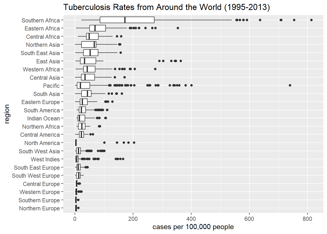
It seems that the highest rates are generally found in African and Asian regions and the lowest in European regions. Factors such as degree of industrialization, poverty levels, climate, etc, might explain some of these trends.
In practice, the process of importing a data set, cleaning it, transforming it, merging it with other data sets, and visualizing it is very long and not at all linear. It’s often the case that we have to back-track and re-clean or re-transform the data set after our analysis reveals something we missed. However, our who project gives a good cross-section of the data analysis techniques we’ve covered in the course so far.
3.10 Dashboards
A dashboard is a compilation of data tables and visualizations that is meant to provide a quick snapshot of certain relevant performance indicators and metrics. They are often interactive and meant to be a purely visual overview of the data describing a process or phenomenon. Click here for an example of a dashboard displaying COVID-related data provided by the Center for Disease Control.
Dashboards usually don’t contain much or any data storytelling like a data analysis report would. Text is kept to a minimum and it’s left to the viewer to extract their own insights. On the other hand, all displayed data tables are absolutely pristine, and all visualizations are aesthetically pleasing and fully labeled.
The COVID dashboard linked to above was created with Microsoft PowerBI, which is very powerful visualization software often used in industry, but we can also create dashboards in R Markdown. In doing so, we can learn a few best practices of dashboard building that would transer to other software platforms. The project for this chapter will require you to create a dashboard, so we’ll use this section to go over the basics in R.
First, in a scratch work .R file, install the flexdashboard package, which provides the functionality to create nice-looking dashboards in R. You will also need the package htmltools.
install.packages("flexdashboard")
install.packages("htmltools")
Let’s create a sample dashboard that displays information about the mpg data set. Click here to access a .Rmd file that you can download and put into your working R directory. When you’ve done so, open it and knit it so you can see the output. We’ll use the rest of this section to walk through it. This file can serve as a template for building your own dashboards.
Lines 1-6:
This is the standard heading setup for any R Markdown file. Notice that the output is flexdashboard::flex_dashboard. flex_dashboard is the output profile we want to use, but it’s part of the flexdashboard library you just installed. Since there’s nowhere to load this library before the heading setup, we have to install the library “on the fly” by including flexdashboard:: before the the output profile we’re accessing.
Lines 8-11
This is a good place to load any libraries you’ll need to display information in your dashboard. You’ll probably at least need tidyverse and DT (for data tables), but you might need others as well. The include=FALSE option ensures that these lines of code don’t show up in your dashboard.
Lines 13-18
On these lines, some data transformation is done to mpg to create the data set mpg_manufacturer that will be analyzed in the dashboard. (Again, notice the include=FALSE.) This is a good spot to do any cleaning and transformation on your data sets to get them ready to display and visualize. Code should never be included in a dashboard, though, so remember include=FALSE.
It’s very important to note that any variables to which you refer in your .Rmd file must be defined within the .Rmd file. If you create a variable in a scratch .R file, for example, but not in your .Rmd file, then you’ll get an error message when you try to knit.
Line 20
Dashboards are separated into several tabbed pages, and each page is given a name that describes what the page contains. To set up and name a page, use a single # followed by a space and the desired page name.
Line 22
Each page is further subdivided into vertical columns. You can set up and name a column with a double ## followed by the column name. The column name is only for your benefit and is not visible in the compiled dashboard.
Line 24
Each column can be even further subdivided into horizontal rows. To set up up a row, use a triple ### followed by the row name. The row name should be a description of the information it contains. Unlike column names, row names do appear in the compiled dashboard.
Lines 26-28
After the page, column, and row are established, you’re ready to enter the code that will produce whatever you want to display there. In this sample dashboard, we’re displaying the mpg_manufacturer data table. Notice that the row name we choose describes what the data table is showing us.
Lines 30-38
Still on page 1, we’re starting a second column (using ##) and within that second column, a new row (using ###) named with a description of what’s to follow. We then enter the code chunk to produce a box plot.
Lines 40-48
We’re now starting a whole new page (which will show up as another tab in the dashboard). We establish a first column and a row within that column. Then we have a code chunk that will display the full mpg data table.
Lines 50-55
Columns can have more than one row, and here we’re setting up a second row within the first column of page 2. The code chunk produces a scatter plot.
Lines 57-81
We establish a second column on page 2, which contains three rows. Each row contains a code chunk that produces the desired outputs. Notice that in lines 69-71, we have code that transforms mpg to create class_mileage. Since this code only establishes the class_mileage data set and produces no actual output, we can include it here and not worry about it showing up in the dashboard.
Line 84
We start a third page, which we could then populate with columns and rows as needed.
We can structure our dashboards with as many pages, rows, and columns as we want, but the guiding principles are that it should contain immediately accessible information, should be uncluttered and not overwhelming, and should be free of R code and blocks of text. The sample dashboard we walked through here actually has some problems that are worth pointing out:
Throughout, the original variable names from
mpgsuch ashwy,cty,displ, etc., and some newly created variables such asavg_hwyshow up in the dashboard. Every instance of these abbreviations should be replaced by more meaningful names.If we’re using row names to describe what the visualizations contain, we don’t have to also label the visualizations with titles, but we should still label the x- and y-axes (and the legend if it exists) using descriptive names.
The box plots should be ordered by mean value. (Recall the
reorderfunction.) All visualizations in a dashboard should be as aesthetically pleasing as you can make them.Most importantly, page 2 is very crowded. The plots are too small, and the tables are too compressed. The information on this page should be spread out over more pages with fewer rows.
3.11 Project
Project Description: The purpose of this project is to import and clean a real-world data set and to display the results in a dashboard.
Instructions:
Open the spreadsheet linked to here. This contains data from the 2019 STAR math placement exams. Import this data into R.
Give the data set a very thorough cleaning, considering all of the techniques discussed in this chapter.
This web site gives ACT/SAT concordance tables, which are used to convert scores of one test to those of the other. Find the conversion from ACT Math scores to SAT Math scores, and copy and paste the information into a spreadsheet. Then import this spreadsheet into R.
Use the imported concordance spreadsheet from the previous problem to add a column to the STAR data table that contains a converted SAT Math score for each student who took the ACT. Then create a new column called
SAT_ACT_Maxthat lists the higher of the SAT Math or converted ACT Math score.The rest of the project will involve analyzing and summarizing your cleaned data in a dashboard. Specifically, your dashboard should contain:
- The cleaned data table.
- A visualization which shows the distribution of the placement exam scores. (Recall the geom which does this for continuous data.)
- A visualization which shows the relationship between GPA and placement exam score.
- A visualization which shows the relationship between
SAT_ACT_Maxand placement exam score. - A visualization which shows the relationship between STAR date and placement exam score. (Think carefully about which geom is most appropriate. What types of variables are
STAR dateandAQ Score?) - A data table that ranks the high schools by average AQ math placement score. (You might want to consider filtering out the high schools that didn’t have many students at STARs.)
- A data table that ranks the career goals by average AQ math placement score. (You might want to consider filtering out the career goals that didn’t have many students at STARs.)
Guidelines:
Since your work in this project will be put into a dashboard rather than a report, the guidelines are a little different from those of the first two projects.
- Make sure that no code or warning/error messages show up in your dashboard.
- Give descriptive names to all of the pages and rows in the dashboard.
- Label all visualizations, although as noted above, you can omit the title of a visualization when the title is instead the row name in the dashboard.
- Use variable names in your displayed data tables and visualizations that are meaningful and self-explanatory.
- Make sure that none of your dashboard pages are too cluttered. Everything should be visually pleasing.
- Use the
datatablefunction from DT to display your tables. - As with the other projects, you should publish your dashboard online using RPubs and then send me the URL to submit your work.
Grading Rubric:
- Cleanness: Did you properly clean the data? Did you pay attention to data types and convert them if necessary? Did you rename unnecessarily long columns? Did you handle missing values appropriately? Did you search for and fix entry errors? Is your data tidy? Did you correctly perform any necessary joins? (30 points)
- Dashboard: Does your dashboard have all of the required components? (30 points)
- Professionalism: Does your dashboard look nice? Is the information neatly laid out in rows and columns? Would a potential viewer be able to make sense of it easily? Did you follow the guidelines listed above? (15 points)
WHO, Global tuberculosis report 2014. World Health Organization, Geneva2014 http://www.who.int/tb/publications/global_report/en/↩︎