Chapter 4 Linear Regression
We’ve been able to extract meaningful insights from data sets using various transformation functions and visualizations, but these insights have been largely qualitative, meaning that we’ve mostly only been able to describe our insights rhetorically by appealing to nicely displayed tables and plots. In this chapter, we’ll use statistical models as ways to extract more quantitative insights. In the process, we’ll have to dive deeper into statistics topics than we have so far.
We’ll need a new package called modelr. You’ll have to install it first:
install.packages("modelr")And remember to load the necessary libraries:
library(tidyverse)
library(modelr)
4.1 Simple Linear Regression
A statistical model is a mathematical relationship among variables in a data set. This relationship often describes how one variable, known as the response (or dependent) variable, is a function of other variables, known as the predictor (or feature or explanatory or independent) variables.
For example, consider the small sample data set sim1:
sim1## # A tibble: 30 x 2
## x y
## <int> <dbl>
## 1 1 4.20
## 2 1 7.51
## 3 1 2.13
## 4 2 8.99
## 5 2 10.2
## 6 2 11.3
## 7 3 7.36
## 8 3 10.5
## 9 3 10.5
## 10 4 12.4
## 11 4 11.9
## 12 4 14.3
## 13 5 19.1
## 14 5 11.7
## 15 5 16.0
## 16 6 13.3
## 17 6 16.0
## 18 6 16.9
## 19 7 20.1
## 20 7 17.2
## 21 7 19.9
## 22 8 21.7
## 23 8 18.4
## 24 8 22.5
## 25 9 26.8
## 26 9 22.8
## 27 9 21.1
## 28 10 25.0
## 29 10 23.3
## 30 10 22.0We’ll take x to be the predictor variable and y to be the response variable. A natural question is, “If we know the value of x, can we predict the value of y?” Technically, the answer is “no.” For example, notice that when x is 3, y could be either 7.36 or 10.5. But the purpose of a statistical model is to provide an approximate prediction rather than an exact one.
A good first step toward making a prediction would be to obtain a scatter plot of the data.
ggplot(data = sim1, mapping = aes(x = x, y = y)) +
  geom_point()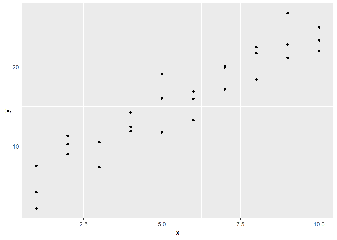
Before proceeding, it’s finally worth pointing out a shortcut in the ggplot syntax. The first argument required by every ggplot call is data =. Thus, it’s actually unnecessary to include data =; you can just type the name of the data set. The same is true for mapping =. This is the second argument by default, so you can just enter your aesthetics with aes. Finally, in geom_point, it’s understood that the first two arguments used within aes are x = and y =, so you can just enter the x and y variables directly. Thus, the above ggplot call can be shortened to:
ggplot(sim1, aes(x, y)) +
  geom_point()
We’ll be using these shortcuts from now on.
Anyway, referring to our scatter plot, it’s clear that, while our points don’t all lie exactly on the same line, they do seem to cluster around some common line. This line of best fit is called the regression line of the data set. Being a line, it can be described algebraically by an equation of the form \(y=mx + b\). If we can find the values of \(m\) (the slope) and \(b\) (the y-intercept), we’ll have a statistical model for our data set. A statistical model of this type is called a simple linear regression model. The word “simple” refers to the fact that we have only one predictor variable. When we have more than one, we call it a multiple linear regression model.
One way to find \(m\) and \(b\) would be to eyeball the scatter plot. This isn’t ideal, but it will get us started. If we were to imagine a line that passes as closely as possible to all of the data points, it looks like it might cross the \(y\)-axis around 4. Also, it looks like as x increases from 1 to 10, y increases from about 5 to 24. This means we have a rise of 19 over a run of 9, for a slope of 19/9, or about 2.1. If we have a slope and intercept, we can plot the corresponding line with geom_abline. Let’s plot our estimated regression line over our scatter plot:
ggplot(sim1) +
  geom_point(aes(x, y)) +
  geom_abline(intercept = 4, slope = 2.1)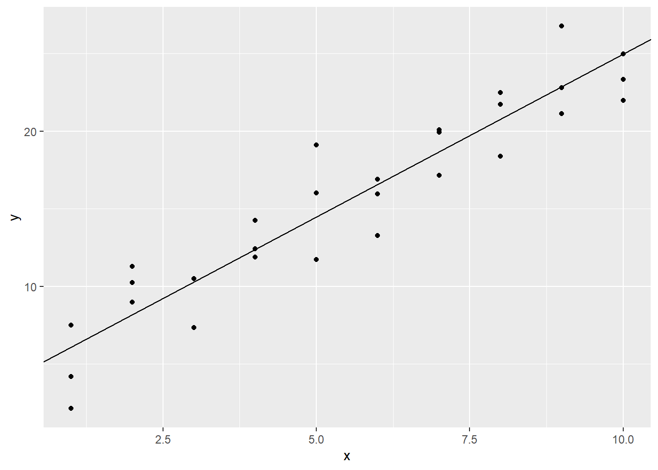
This looks like a pretty good fit, but we’d prefer that R find \(m\) and \(b\) for us. We can achieve this with the lm (which stands for linear model) function from the modelr library. In the code below, sim1_model is the name we’re choosing for our regression model. Also, notice the first argument of lm is y ~ x. The lm function wants us to enter the response variable on the left of ~ and the predictor on the right. (We should think of the syntax y ~ x as shorthand for the sentence, “y will be predicted from x.”)
sim1_model <- lm(y ~ x, data = sim1)Let’s see what we have:
sim1_model##
## Call:
## lm(formula = y ~ x, data = sim1)
##
## Coefficients:
## (Intercept) x
## 4.221 2.052It looks like the actual intercept value is 4.221. The value 2.052 listed under x in the above output is the coefficient of x in our linear model, i.e., the slope. So, we were close. Let’s plot the actual regression line in red over our estimated one from above:
ggplot(sim1) +
  geom_point(aes(x, y)) +
  geom_abline(intercept = 4, slope = 2.1) +
  geom_abline(intercept = 4.221, slope = 2.052, color = "red")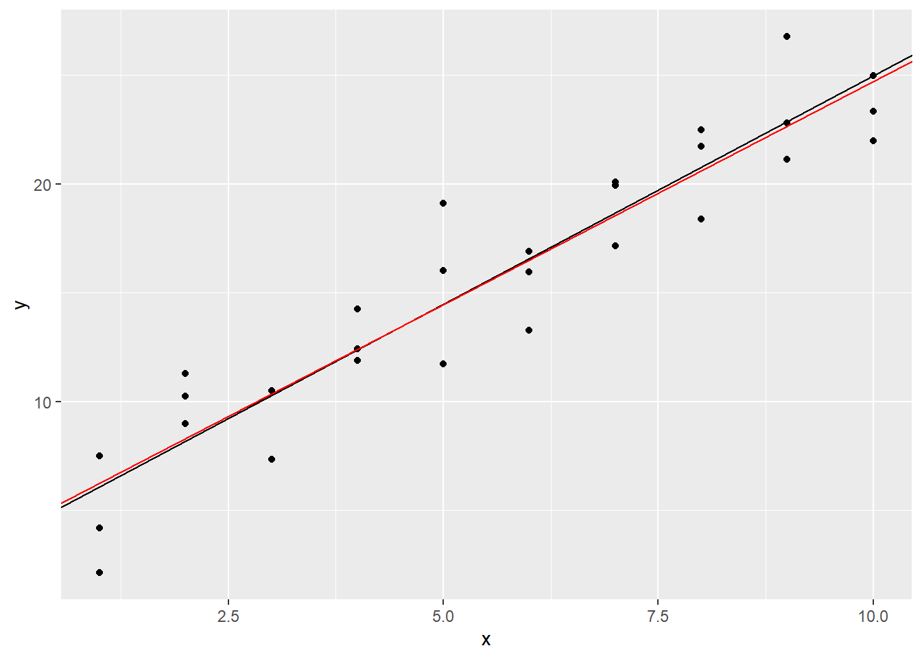
It’s hard to tell the difference, but we’ll trust that the red line fits the data more closely.
Of course, it’s not a good practice to do all of this piecemeal, transcribing the intercept and slope over to geom_abline. An entry error could be made. We can extract these values directly from the model, though, by getting the coefficient vector:
coef(sim1_model)## (Intercept) x
## 4.220822 2.051533If we give this vector a name, we can then access the individual entries when plotting our regression line:
sim1_coefs <- coef(sim1_model)

b <- sim1_coefs[1]
m <- sim1_coefs[2]

ggplot(sim1) +
  geom_point(aes(x, y)) +
  geom_abline(intercept = b, slope = m, color = "red")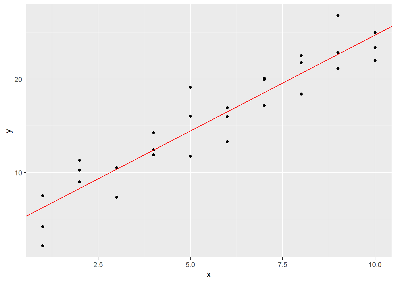
Exercises
To complete the exercises below, download this R Notebook file and open it in RStudio using the Visual Editor. Then enter your answers in the space provided.
Obtain the scatter plot from the
mpgdata set ofhwyvsdispl. (Recall that this means thathwyis the \(y\) variable anddisplis the \(x\).) Guess the values of the slope and intercept of the regression line, and plot the line along with the scatter plot.Referring to the previous exercise, use
lmto find the actual regression line. Then plot it in a different color on top of your scatter plot and estimated regression line from the previous exercise.
4.2 Residuals
Obtaining and graphing a simple linear regression model is easy; the subtler part of regression modeling involves assessing the model. If we’re going to use a regression model to make predictions or measure impacts, it’s very important to know how reliable the model actually is. We’ll return to the question about determining the impact of predictor variables on the response variable in Section 4.7, but in this and the next few sections, we’ll see how to assess the effectiveness of a regression model.
All of our assessment methods are based on a model’s residuals. The residual of a data point relative to a model is the difference between the actual response value of the point and the predicted response value. In other words, \[\textrm{residual} = \textrm{actual response} - \textrm{predicted response}.\] We can think of the residuals of a model as the model’s prediction errors.
Let’s calculate a few of the residuals of points in sim1 relative to sim1_model from Section 4.1. Recall that the formula of our model is \(y=2.052x+4.221\). One of the data points in sim1 is \(x = 2\), \(y = 11.3\). So 11.3 is the actual response value when \(x\) is 2. To get the predicted response value, we have to plug 2 in for \(x\) in our model. The predicted \(y\) value is thus \((2.052\times 2) + 4.221 = 8.325\). The residual is therefore \(11.3 - 8.325 = 2.975\). Our model underestimates the \(y\) value by 2.975.
Another of our data points in sim1 is \(x = 4\), \(y = 12.4\). The predicted \(y\) value is \((2.052\times 4) + 4.221 = 12.429\). The residual, then, is \(12.4 - 12.429 = -0.029\). The model just barely overestimates the \(y\) value by 0.029.
We’d ideally like all of our residuals to be near 0. The modelr library includes two very useful functions that will help us check our residuals: add_residuals and add_predictions. Their names describe exactly what they do:
sim1_w_pred_resids <- sim1 %>%
  add_predictions(sim1_model) %>%
  add_residuals(sim1_model)

sim1_w_pred_resids
## # A tibble: 30 x 4
## x y pred resid
## <int> <dbl> <dbl> <dbl>
## 1 1 4.20 6.27 -2.07
## 2 1 7.51 6.27 1.24
## 3 1 2.13 6.27 -4.15
## 4 2 8.99 8.32 0.665
## 5 2 10.2 8.32 1.92
## 6 2 11.3 8.32 2.97
## 7 3 7.36 10.4 -3.02
## 8 3 10.5 10.4 0.130
## 9 3 10.5 10.4 0.136
## 10 4 12.4 12.4 0.00763
## # i 20 more rowsThe pred column contains the results of plugging the x values into our model. The resid column contains the residuals, the values of which are equal to y - pred. By scrolling through the resid column, we see that a lot of the residuals are in fact close to 0. We can more easily see this by obtaining a residual plot using the resid column:
ggplot(sim1_w_pred_resids) +
  geom_point(aes(x, resid))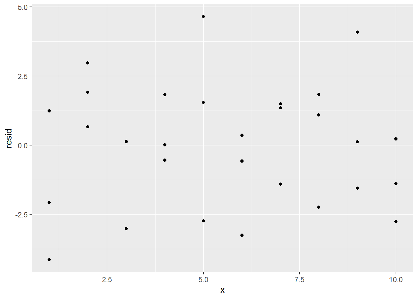
Since we’re interested in the proximity of the residuals to 0, we can also add a horizontal reference line at 0 with geom_hline:
ggplot(sim1_w_pred_resids) +
  geom_point(aes(x, resid)) +
  geom_hline(yintercept = 0)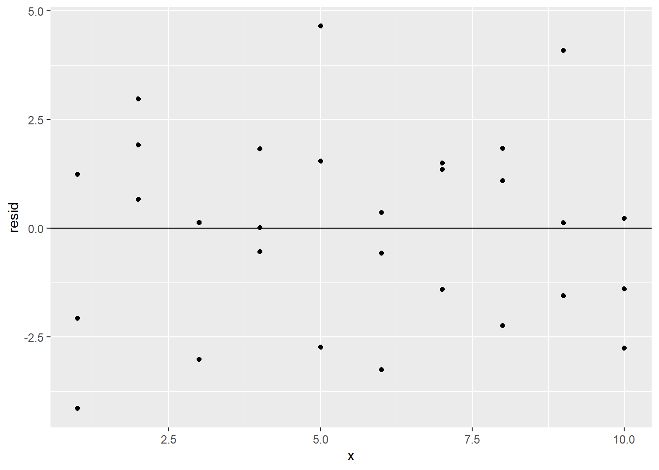
The clustering of the residuals around 0 is a good sign, but the residual plot also reveals another reason to believe that a simple linear regression model is appropriate for this data set: The residual plot has no obvious pattern.
To explain why the lack of a residual pattern is a good thing, consider the fact that in any statistical process, there will be an element of randomness that is completely unpredictable. This is called noise. No model should predict noise. However, if there is any real underlying relationship among the variables at play in the statistical process, a good model would detect that relationship. Thus, we want our models to detect real relationships but not noise.
What does this have to do with our residual plot? Well, if our model can explain all of the behavior of our data except the random noise, then the only reason for a difference between actual and predicted values would be that noise. In other words, the residuals would measure only the noise. Since noise is totally random, this means that a good model would have a residual plot that looks totally random, as the one above does.
To contrast this situation, consider the following data set. (It’s not built in, which is why we’re importing it.)
sim1a <- readr::read_csv("https://raw.githubusercontent.com/jafox11/MS282/main/sim1_a.csv")sim1a## # A tibble: 10 x 2
## x y
## <dbl> <dbl>
## 1 1 8.34
## 2 2 9.91
## 3 3 10.6
## 4 4 11.2
## 5 5 12.5
## 6 6 14.7
## 7 7 17.2
## 8 8 19.0
## 9 9 19.9
## 10 10 20.5Looking at a scatter plot, it seems like a linear model would be appropriate:
ggplot(sim1a) +
  geom_point(aes(x, y))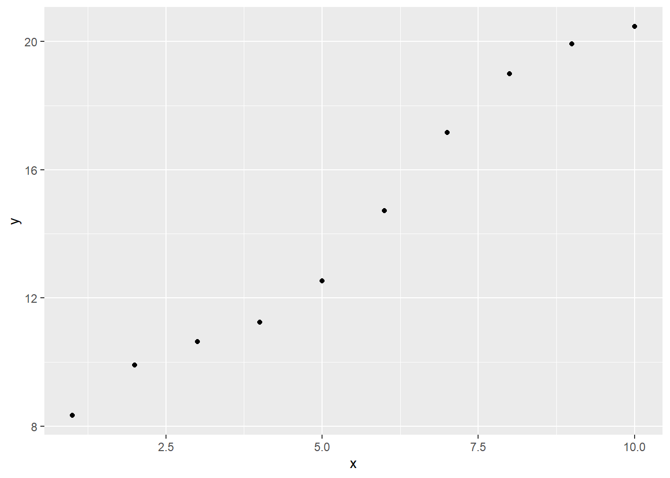
However, we should make sure that the residuals are random. Let’s build a linear model on sim1a, add the resulting residuals column to sim1a, and then get the residual plot:
sim1a_model <- lm(y ~ x, data = sim1a)

sim1a_w_resid <- sim1a %>%
  add_residuals(sim1a_model)

ggplot(sim1a_w_resid) +
  geom_point(aes(x, resid)) +
  geom_hline(yintercept = 0)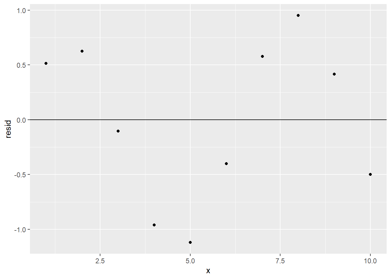
There’s a definite pattern in the residual plot. This means that there’s some relationship between x and y that sim1a_model is not detecting; its predictive power isn’t as good as it could be, and a different type of model might be more appropriate than our linear one. (However, only one residual value is more than 1 unit away from 0, so despite its shortcomings, our model is still pretty good at predicting y from x.)
It’s also worth mentioning that some numerical information about a model’s residuals can be found in the summary provided by modelr:
summary(sim1_model)##
## Call:
## lm(formula = y ~ x, data = sim1)
##
## Residuals:
## Min 1Q Median 3Q Max
## -4.1469 -1.5197 0.1331 1.4670 4.6516
##
## Coefficients:
## Estimate Std. Error t value Pr(>|t|)
## (Intercept) 4.2208 0.8688 4.858 4.09e-05 ***
## x 2.0515 0.1400 14.651 1.17e-14 ***
## ---
## Signif. codes: 0 '***' 0.001 '**' 0.01 '*' 0.05 '.' 0.1 ' ' 1
##
## Residual standard error: 2.203 on 28 degrees of freedom
## Multiple R-squared: 0.8846, Adjusted R-squared: 0.8805
## F-statistic: 214.7 on 1 and 28 DF, p-value: 1.173e-14We will understand what all of this means by the end of the chapter, but note for now that we’re given the five-number summary of the residuals, i.e., the minimum, first quartile, median, third quartile, and maximum. This gives a sense of the range and distribution of the model’s residuals.
Exercises
To complete the exercises below, download this R Notebook file and open it in RStudio using the Visual Editor. Then enter your answers in the space provided.
Exercises 1-4 refer to the model that was built in the exercises from Section 4.1.
Row 36 of the
mpgdata set has adisplvalue of 3.5 and ahwyvalue of 29. Using only the formula for your model (and not theadd_predictionsoradd_residualsfunctions) find thehwyvalue predicted by your model and corresponding residual whendispl = 3.5.Add columns to the
mpgdata set that contain the residuals and predictions relative to your model.Plot the residuals from the previous problem. Include a horizontal reference line through 0.
Based on your residual plot from the previous problem, would you say that a linear model is appropriate for this data set? Explain your answer.
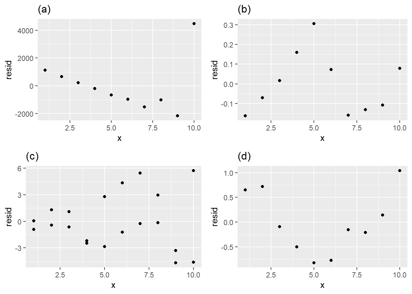
Which of the following residual plots best indicates that a linear model is an appropriate way to model the data? Explain your answer.
Download and import the csv file linked to here.
- Find the linear model that best fits the data.
- Obtain the residual plot.
- Based on the residual plot, would you say that a linear model is appropriate for this data? Explain your answer.
- Find the linear model that best fits the data.
4.3 Residual Standard Error
We know that a good model is one with small residuals. It would make sense, then, to assess a model by computing its mean residual value. However, some residuals are positive and some are negative, so when finding the average, the positives and negatives will partially cancel each other, leading to a deceptively small mean. In fact, it turns out (non-obviously) that the mean of the residuals of a linear regression model is always 0!
A better attempt to summarize the residuals would be to find the mean of the absolute values of the residuals. This would avoid the positive/negative cancellation problem and would give a sense of a model’s average prediction error. In this section, we will define a “goodness-of-fit” statistic for a model called residual standard error (RSE), which is an approximation of the mean of the residuals’ absolute values.
First, we’ll need to discuss the following concepts from statistics:
- standard deviation
- normal distributions
- degrees of freedom
We’ll provide informal, intuitive explanations of these concepts, though it should be noted that we’re skipping a lot of technical details that are beyond our scope.
We’ve used a variable’s standard deviation a few times as a measurement of how spread out the values of the variable are. For example, consider the data set below:
example <- tibble(
  x = c(-50,-27,85,115,165,228),
  y = c(-0.32,0.11,0.18,0.19,0.22,0.24)
)

example
## # A tibble: 6 x 2
## x y
## <dbl> <dbl>
## 1 -50 -0.32
## 2 -27 0.11
## 3 85 0.18
## 4 115 0.19
## 5 165 0.22
## 6 228 0.24It looks like the values of x are much more spread out than those of y, and we should thus expect x to have a bigger standard deviation than y. That is indeed the case:
sd(example$x)## [1] 108.1776sd(example$y)## [1] 0.2121006What do these numbers actually mean, though? One way to measure a variable’s spread would be to see how far its values deviate from the mean. These deviations would be the absolute values of the differences between the value and the mean. (We use absolute value since we only care about the size of the deviations, not whether they’re positive or negative.) We can add mean deviation columns to our data set:
example_v2 <- example %>%
  mutate(x_mean_dev = abs(x - mean(x)),
         y_mean_dev = abs(y - mean(y)))

example_v2
## # A tibble: 6 x 4
## x y x_mean_dev y_mean_dev
## <dbl> <dbl> <dbl> <dbl>
## 1 -50 -0.32 136 0.423
## 2 -27 0.11 113 0.00667
## 3 85 0.18 1 0.0767
## 4 115 0.19 29 0.0867
## 5 165 0.22 79 0.117
## 6 228 0.24 142 0.137We can then find the average of these deviations:
mean(example_v2$x_mean_dev) # <-- average of deviations of x## [1] 83.33333mean(example_v2$y_mean_dev) # <-- average of deviations of y## [1] 0.1411111These averages are called the mean absolute deviations (MAD) of x and y. The MAD of x means that the values of x deviate from the mean of x by about 83.3, on average. The values of y deviate from the mean of y by about 0.14, on average.
Notice that the MADs of x and y are somewhat close to the standard deviations computed above. It turns out that standard deviation is actually an approximation of MAD. In other words, the standard deviation of a variable is roughly equal to the average deviation of the variable’s values from its mean. For technical reasons, standard deviation turns out to be a much more user-friendly measure of spread than MAD, which is why standard deviation is the default statistic to use when dealing with spread.
Recall that a variable’s distribution is a description of how the values of the variable are distributed throughout the variable’s range. As we saw in Chapter 1, distributions of continuous variables are visualized as histograms. We’ll be interested in one special type of distribution: the normal distribution.
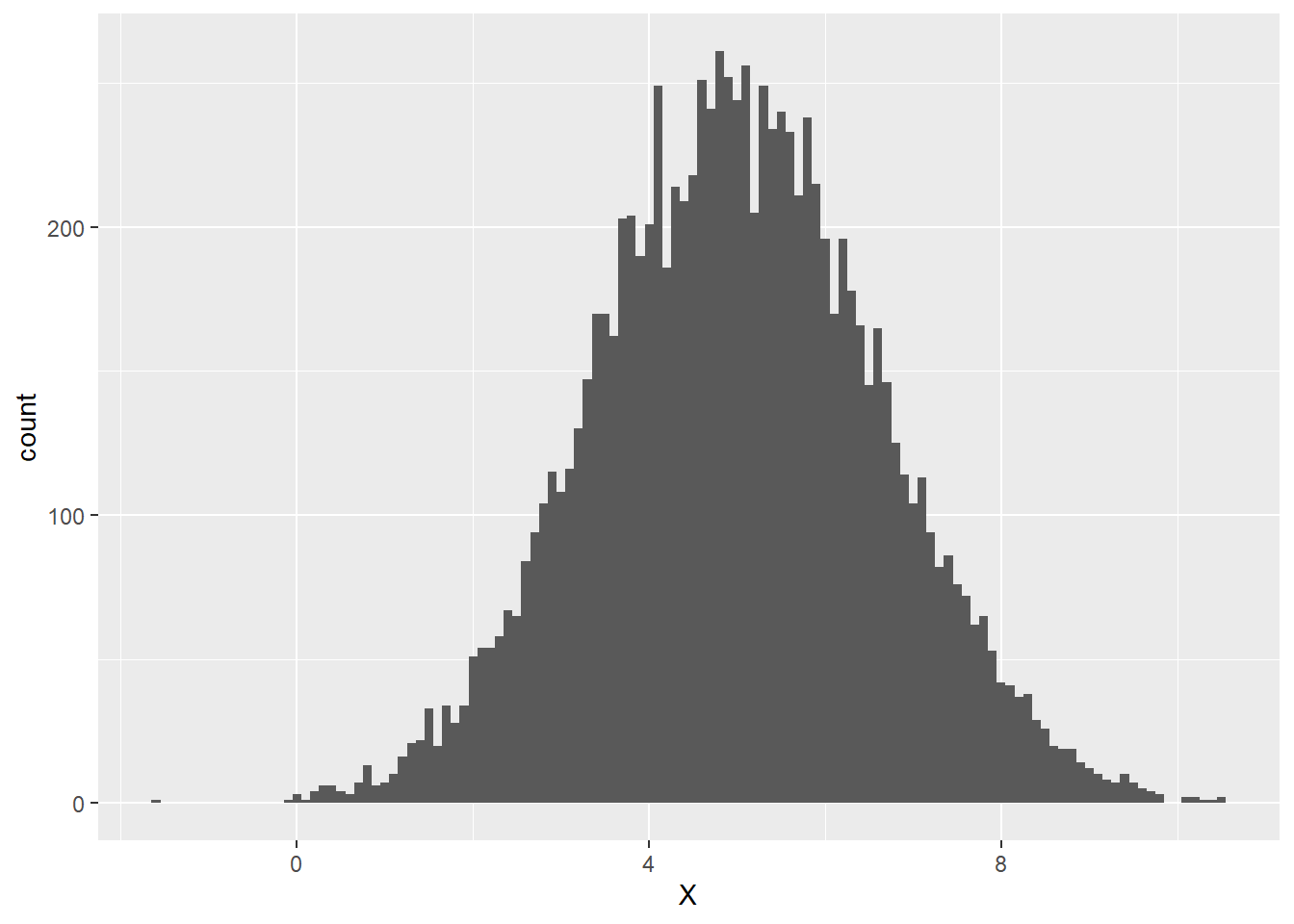
A variable has a normal distribution when the peak of the variable’s histogram is at the variable’s mean and the heights of the bars decrease toward 0 symmetrically to the left and right of the peak. The width of the distribution is determined by the standard deviation of the variable – the larger the variable’s standard deviation, the more spread out its values, the wider the histogram. The histogram below exhibits an approximately normally distributed variable X whose mean value is 5 and whose standard deviation is 1.6:
We can see that the peak of the histogram seems to be close to the mean value of 5, but how does the standard deviation of 1.6 show up in the distribution? Let’s add vertical lines exactly one standard deviation to the left and right of the mean, i.e., at 3.4 and 6.6:
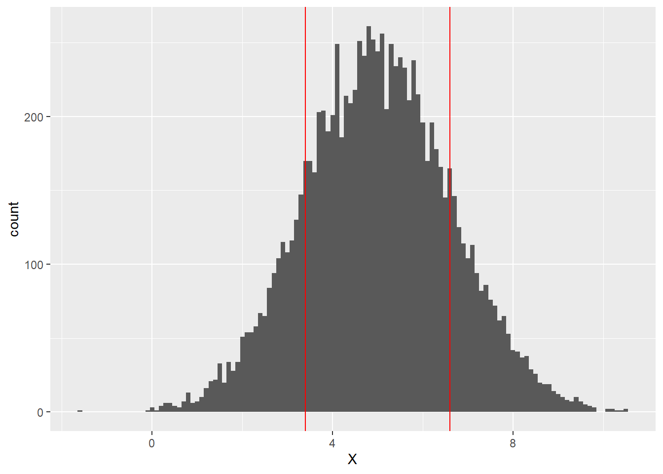
It turns out that about 68% of the values of a normally distributed variable lie within 1 standard deviation of the mean. This means that about 68% of the values of X, lie between 3.4 and 6.6 (the area between the red lines above).
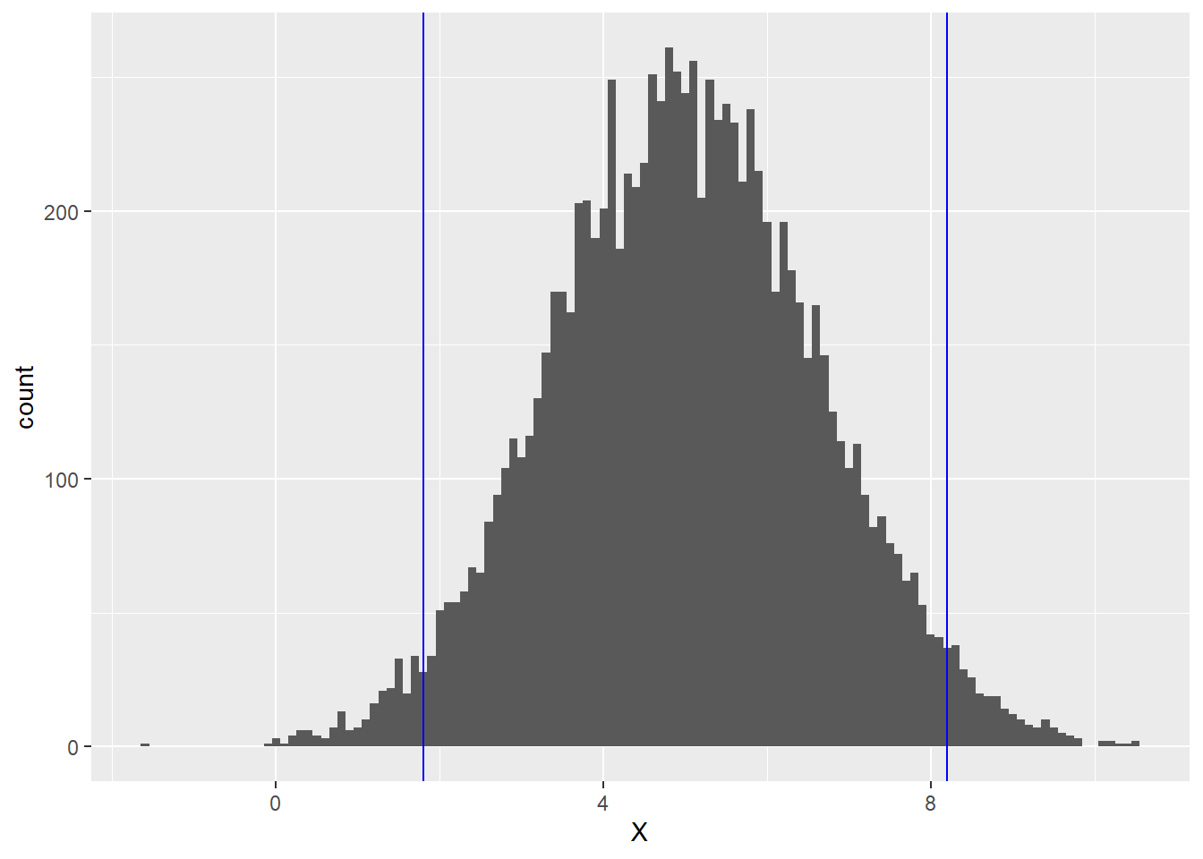
It also turns out that if we stray 2 standard deviations away from the mean in either direction, we pick up the middle 95% (roughly) of the values of X. Thus for the normal distribution above, about 95% of the area lies between 1.8 (which is 5 - 2(1.6)) and 8.2 (which is 5 + 2(1.6)). This middle 95% is the region between the blue lines below:
The final piece of statistics background we need before defining residual standard error is the notion of degrees of freedom.
One of the goals of statistics is to try to describe an entire population by instead studying smaller subsets of that population. For example, suppose a high school math teacher wants to know the percent of sophomores in the school who have memorized the Quadratic Formula. Instead of asking every sophomore, she instead gives her 10th grade Algebra II class a quiz on which they have to write down the Quadratic Formula. She finds that 86% of her students know the formula. She then estimates that about 86% of sophomores in general in the school know the Quadratic Formula. This process of calculating a statistic from a sample and using it as an estimate for a population is known as statistical inference.
Statistical inference is more reliable for large sample sizes than for small ones. Thus, reporting the size of a sample (often called the \(n\)-value) is a standard practice when making an inference. However, the \(n\)-value doesn’t always tell the whole story. In our Quadratic Formula example, what if our sample size is \(n\) = 28. We would hope that the responses of our 28 people are independent of each other, meaning that no one’s answer will be influenced by anyone else’s answer. Suppose, though, that there are 3 people in the class who cheated and just copied their neighbor’s answer. This means there are actually only 25 independent responses. The number of independent observations in a sample used to make an inference is known as the number of degrees of freedom (\(df\)) of the inference. In our example, we have \(df\) = 25. The \(df\)-value, rather than the \(n\)-value, is more meaningful measure of sample size when doing statistical inference.
In general, \(df = n - p\), where \(p\) is the number of observations in a sample that depend on other observations in the sample; these \(p\) observations are determined by the others. In our example above, \(p\) = 3. We will soon see how degrees of freedom is relevant in the context of linear regression.
With this short statistics detour, we’re ready to define residual standard error (RSE), which we already mentioned above will measure (approximately) the mean of the absolute values of the residuals.
We know that the mean of the residuals is 0. Thus, if we take the mean absolute deviation (MAD) of the residuals, we’d be finding the average amount by which the residuals differ (in absolute value) from 0. In other words, the MAD of the residuals gives us the exact mean of the absolute values of the residuals. Knowing that standard deviation is a very well-behaved approximation of MAD, we will define a model’s residual standard error by:
\[\textrm{RSE} = \textrm{standard deviation of the residuals}.\]
The smaller a model’s RSE, the more closely it fits the data points (on average).
RSE is provided in a model’s summary (three lines up from the bottom):
summary(sim1_model)##
## Call:
## lm(formula = y ~ x, data = sim1)
##
## Residuals:
## Min 1Q Median 3Q Max
## -4.1469 -1.5197 0.1331 1.4670 4.6516
##
## Coefficients:
## Estimate Std. Error t value Pr(>|t|)
## (Intercept) 4.2208 0.8688 4.858 4.09e-05 ***
## x 2.0515 0.1400 14.651 1.17e-14 ***
## ---
## Signif. codes: 0 '***' 0.001 '**' 0.01 '*' 0.05 '.' 0.1 ' ' 1
##
## Residual standard error: 2.203 on 28 degrees of freedom
## Multiple R-squared: 0.8846, Adjusted R-squared: 0.8805
## F-statistic: 214.7 on 1 and 28 DF, p-value: 1.173e-14The RSE of sim1_model is 2.203. What does that mean?
One way to contextualize RSE is to recall the fact stated above that when a distribution is normal, 68% of the data lies within 1 standard deviation of the mean, and 95% lies within 2 standard deviations of the mean. Since RSE is the standard deviation of the residuals, and the mean of the residuals is 0, this means that when a model’s residuals are normally distributed, 68% of the residuals are within 1 RSE of 0, and 95% are within 2 RSEs of 0. In other words, assuming the residuals are normally distributed, 68% of the model’s predictions are off by at most 1 RSE, and 95% are off by at most 2 RSEs.
Let’s apply this to sim1_model, first checking that the residuals are normally distributed:
ggplot(sim1_w_pred_resids) +
  geom_histogram(aes(resid))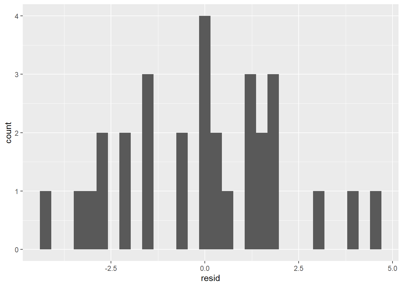
With only 30 data points, it would be hard to get a really convincing normal histogram, but the one above is at least roughly normal; the peak occurs at the mean, and the tails taper down toward 0 symmetrically on both sides. We can thus assume that our residuals are normally distributed and therefore make the following statements:
- The model predicts the
yvalue within 2.203 about 68% of the time. - The model predicts the
yvalue within 4.406 about 95% of the time.
Even with a statement like this, it’s not clear whether our RSE is indicating that our model is reliable. It could be that in this context 2.203 is either considered very small or very large. For this reason, RSE is often more meaningful when comparing two models on the same data set, as we’ll see in the next section.
Lastly, you might have noticed that the summaries for sim1_model and sim1a_model also included the \(df\)-values for the RSE calculations. For sim1_model, \(n\) = 30 and \(df\) = 28. For sim1a_model, \(n\) = 10 and \(df\) = 8. It must be, then, that for each of these data sets, \(p\) = 2. In other words, when calculating RSE, there are two values in each data set that are dependent on the other ones. Why would this be?
First, an unrelated easy example. Suppose we know that the mean of 4 numbers is 8. This means \(n\) is 4, but what would \(df\) be? Well, suppose the first 3 numbers are 2, 10, and 6. Knowing ahead of time that the mean must be 8, we can obtain the fourth number from the other 3 as follows. If the mean is 8, the sum of the 4 numbers must be 32. The sum of the first 3 numbers is 2 + 10 + 6 = 18. This means that the fourth number must be 32 - 18 = 14. Since the fourth number is determined by the other 3, we have \(df\) = 3.
In the previous paragraph, the reason why \(df\) is less than \(n\) is because we were given 1 statistic for the data set (mean) ahead of time, and this made \(df\) 1 less than \(n\). In general, if we’re given \(p\) statistics ahead of time for a data set of size \(n\), then \(df = n - p\).
Returning to RSE, we first have to know the values of all of the residuals. To find a residual, we have to subtract a model’s predicted response value from its actual response value. To get a predicted response value, we have to know the formula for the regression line, which in turn requires that we know the \(m\) and \(b\) values of the line ahead of time. Thus, computing RSE requires that we be given two statistics (\(m\) and \(b\)) about a data set ahead of time, which is why \(p\) = 2 in this case. Therefore, RSE is computed on \(n-2\) degrees of freedom.
Exercises
To complete the exercises below, download this R Notebook file and open it in RStudio using the Visual Editor. Then enter your answers in the space provided.
You can obtain a random sample of values from a population with a normal distribution with a given mean and standard deviation in R by using the function
rnorm(<SAMPLE SIZE>, <MEAN>, <STANDARD DEVIATION>). For example,rnorm(25, 10, 2)will produce 25 points from a normal distribution with mean 10 and standard deviation 2. Obtain a sample of 100 points from a normally distributed population with mean 50 and standard deviation 0.6.- About how many of your 100 points should you expect to be within 0.6 units of the mean? Compare this expected number to the actual number.
- About how many of your 100 points should you expect to be within 1.2 units of the mean? Compare this expected number to the actual number.
When a data set is very large explain why the difference between \(n\) and \(df\) is not as noticeable as it is for a small data set.
Exercises 3-6 refer to the model that was built in the exercises from Section 4.1.
Determine whether the residuals from this model are roughly normally distributed.
Find the RSE of this model. Use it to fill in the blanks in the following sentences:
- There is a 68% chance that for a given value of
displ, the value ofhwypredicted by the model is within _________ of the actual value ofhwy. - There is a 95% chance that for a given value of
displ, the value ofhwypredicted by the model is within _________ of the actual value ofhwy.
- There is a 68% chance that for a given value of
Why was Exercise 4 only possible to do after completing Exercise 3?
- Plot the regression line for this model along with the scatter plot of
hwyvsdispl. - Plot another line on the graph from part (a) that is parallel to the regression line but 2 RSEs above it. Also plot a line parallel to the regression line which is 2 RSEs below it.
- About what percentage of points in the scatter plot should lie between the two lines plotted in part (b)?
- Count the percentage of scatter plot points that actually do lie between the two lines from part (b).
- Plot the regression line for this model along with the scatter plot of
- Obtain a histogram that shows the distribution of residuals of
sim1a_model. - Would you be able to make a statement about
sim1a_modellike the ones in Exercise 4 above? Explain why or why not.
- Obtain a histogram that shows the distribution of residuals of
4.4 F Tests
In the last section, we developed a goodness-of-fit statistic (RSE) that can be used to measure the average prediction error of a linear regression model. However, we mentioned that the RSE by itself is most useful as a way to compare two models on the same data set. In this and the next section, we will see how the RSE can be used to make such a comparison.
When building a statistical model, we should always make sure it performs better than some kind of “baseline” model. For example, suppose we create a model that will predict someone’s gender based on variables such as height, weight, hair color, etc. We find that our model makes the right prediction 51% of the time. Is our model really doing anything? Couldn’t we make an equally good prediction just by flipping a coin? In this case, the baseline coin flip model is just as good as the model we created, which means our model is useless.
The baseline model to which we will compare our linear regression models is the mean model, which always predicts that the response is equal to the mean of the response values. For example, the mean y value in the sim1 data set is:
mean(sim1$y)## [1] 15.50425Thus the mean model on this data set would just predict 15.5 every time, regardless of the value of the predictor. To see whether our linear regression model sim1_model outperforms the mean model, we should compare their RSEs.
We saw in the previous section that the RSE of sim1_model is 2.203. What about the RSE of the mean model? A residual of the mean model would, as always, equal the predicted response value subtracted from the actual response value. However, the mean model’s predicted response is always the mean y value. Thus, the RSE of the mean model is the average amount by which the values of y differ from the mean of y; in other words, the RSE of the mean model is just the standard deviation of y!
sd(sim1$y)## [1] 6.372218So the RSE of the regression model (2.203) is smaller than the RSE of the mean model (6.372). It’s clear, then, that the regression model outperforms the baseline mean model.
In the example above, the RSEs for the regression and mean models are significantly different, but imagine a scenario where the mean model had produced an RSE closer to that of the regression model. Suppose, for example, the mean model’s RSE had been 2.205. The regression model’s RSE is still lower, but not significantly so. In this case, is it really fair to say that the regression model is better? How do we determine whether a difference in RSEs is actually significant?
The way statisticians determine whether a statistic (like the regression RSE) is significantly different from a baseline statistic (like the mean RSE) is to carry out a hypothesis test. We will briefly discuss hypothesis tests before returning to our RSE comparison.
In a hypothesis test, our goal is to answer the question: Is our computed statistic significantly different from our baseline statistic? There are only two answers: (1) No. We call this possibility the null hypothesis and refer to it as \(H_0\). (2) Yes. We call this possibility the alternative hypothesis and refer to it as \(H_a\).
In our sim1 example, we have:
- \(H_0\): The regression RSE essentially equals the mean RSE.
- \(H_a\): The regression RSE is essentially less than the mean RSE.
The null hypothesis is always the hypothesis of the status quo – there’s nothing interesting happening. The alternative hypothesis is the claim for which we’re seeking evidence – we think the alternative hypothesis is true and we want to find evidence in its favor.
The evidence (or lack thereof) for \(H_a\) is provided by our computed statistic (such as the regression RSE). We can ask whether our computed statistic is consistent with \(H_0\). If so, then we’d have no reason to accept \(H_a\). If not, then we would have a reason to accept \(H_a\). We can measure the degree to which our computed statistic is consistent with \(H_0\) as follows.
To find this measure of consistency, we ask, “If the null hypothesis really were true, how likely would it be for us to actually observe a statistic at least as extreme as the one we have?” In our sim1 example, this question becomes, “If the regression RSE really is essentially equal to 6.372, how likely would it be for us to actually observe a regression RSE as low as 2.203?” This likelihood is what we call the p-value. (“p” stands for “probability.”)
Finding the p-value in a hypothesis test involves theory that would take us too far afield, so we won’t go into the details, but suppose for the moment that we find the p-value of a hypothesis test to be 0.03. This would mean that if the null hypothesis were really true, then the probability of getting a statistic at least as extreme as our observed statistic is only 3%. In other words, our actual evidence is not very consistent with the null hypothesis. Such a small p-value means that our observed statistic provides significant evidence that the alternative hypothesis is true.
How small does a p-value have to be in order to be considered significant evidence in favor of \(H_a\)? A standard cutoff is 5%, but other cutoffs are often used instead, such as 1% or 10%.
In summary:
- We start with a statistic \(s\) computed on a data set.
- We make a claim about \(s\) that we would like to affirm. This is the alternative hypothesis \(H_a\).
- We call the opposite claim (which would say that \(H_a\) isn’t true) the null hypothesis \(H_0\).
- We then find the probability that our data set would produce a statistic at least as extreme as \(s\) if \(H_0\) were actually true. This probability is the p-value.
- If the p-value is below the 5% cutoff (or whatever cutoff is chosen), we have significant evidence in favor of \(H_a\). Otherwise, we do not.
When we run a hypothesis test to test whether a regression model is better than a mean model, we call it an F test. Let’s run an F test on our sim1 example. Recall our null and alternative hypotheses:
- \(H_0\): The regression RSE essentially equals the mean RSE.
- \(H_a\): The regression RSE is essentially less than the mean RSE.
We’re hoping to find evidence that our regression RSE of 2.203 is essentially less that the mean RSE of 6.372. In other words, we’re hoping that the F test produces a small p-value. The p-value of an F test is found on the last line of the model’s summary:
summary(sim1_model)##
## Call:
## lm(formula = y ~ x, data = sim1)
##
## Residuals:
## Min 1Q Median 3Q Max
## -4.1469 -1.5197 0.1331 1.4670 4.6516
##
## Coefficients:
## Estimate Std. Error t value Pr(>|t|)
## (Intercept) 4.2208 0.8688 4.858 4.09e-05 ***
## x 2.0515 0.1400 14.651 1.17e-14 ***
## ---
## Signif. codes: 0 '***' 0.001 '**' 0.01 '*' 0.05 '.' 0.1 ' ' 1
##
## Residual standard error: 2.203 on 28 degrees of freedom
## Multiple R-squared: 0.8846, Adjusted R-squared: 0.8805
## F-statistic: 214.7 on 1 and 28 DF, p-value: 1.173e-14We see that the p-value is stated in scientific notation as 1.173e-14. (You might be more familiar with the notation 1.173 x 10⁻¹⁴.) Written out as a decimal, this is 0.00000000000001173 (there are 13 leading zeros to the right of the decimal). This is an extremely small p-value, well below the 0.05 cutoff (or any other reasonable cutoff). We conclude that we have significant evidence in favor of \(H_a\), and we therefore have grounds to claim that our regression model on sim1 is better than the baseline mean model.
The last line of the summary also contains an “F-statistic” and two degrees of freedom values. We won’t need to reference these; we’ll only refer to the p-value.
Let’s do another example. Consider the following data set:
F_example <- tibble(
  x = c(1,2,3,4,5,6,7,8,9,10),
  y = c(-4,1,5,-2,0,9,-7,0, -1, 4)
)

F_example
## # A tibble: 10 x 2
## x y
## <dbl> <dbl>
## 1 1 -4
## 2 2 1
## 3 3 5
## 4 4 -2
## 5 5 0
## 6 6 9
## 7 7 -7
## 8 8 0
## 9 9 -1
## 10 10 4Let’s build a linear regression model with x as the predictor and y as the response:
F_model <- lm(y ~ x, data = F_example)Now let’s run an F test to see whether there’s significant evidence that F_model makes better predictions than the mean model. All we need is the F test’s p-value in the last line of the summary:
summary(F_model)##
## Call:
## lm(formula = y ~ x, data = F_example)
##
## Residuals:
## Min 1Q Median 3Q Max
## -7.7455 -2.2091 -0.6636 2.3409 8.4182
##
## Coefficients:
## Estimate Std. Error t value Pr(>|t|)
## (Intercept) -0.4000 3.3142 -0.121 0.907
## x 0.1636 0.5341 0.306 0.767
##
## Residual standard error: 4.851 on 8 degrees of freedom
## Multiple R-squared: 0.0116, Adjusted R-squared: -0.112
## F-statistic: 0.09386 on 1 and 8 DF, p-value: 0.7671The p-value is 0.7671, which is very large, well above the 0.05 cutoff. We therefore do not have enough evidence to claim that F_model performs better than the mean model. It must therefore be that this model’s RSE is not essentially different from the RSE of the mean model, i.e., the standard deviation of the response variable. The summary shows that the RSE of the regression model is 4.851. The standard deviation of y is:
sd(F_example$y)## [1] 4.600725These RSEs are very close. Our F test says that, in fact, they’re too close to say that one model outperforms the other.
WARNING: It might be tempting at this point to say that the mean model is just as good or better than F_model, i.e., that the null hypothesis is true. However, hypothesis tests can never provide evidence in favor of \(H_0\). Our large p-value only says that the RSE of F_model is consistent with \(H_0\). Being consistent with a hypothesis is not the same as affirming a hypothesis. Hypothesis testing is only able to provide evidence in favor of \(H_a\). If it can’t, as is the case with F_model, then we can’t conclude anything at all.
Exercises
To complete the exercises below, download this R Notebook file and open it in RStudio using the Visual Editor. Then enter your answers in the space provided.
Exercises 1-3 refer to the model you built in the Section 4.1 exercises.
Find the RSE of this model as well as the RSE of the mean model. Does it seem like the regression RSE is significantly less than the mean RSE?
What is the p-value of the F test for this model? Does this p-value confirm your answer to the previous exercise?
What does the p-value from the previous exercise tell you about your regression model?
Exercises 4-7 refer to the data set found here. The birthday variable records the day of the year on which a person is born. (For example, a birthday value of 43 means the person was born on the 43rd day of the year, i.e., February 12.) The age variable is the person’s age at which they died. Download the data set and import it into R.
We’d like to know whether a person’s birthday is a good predictor of their age at death. Build a linear regression model on the data set with
birthdayas the predictor andageas the response.Find the RSE of the model from Exercise 4 as well as the RSE of the mean model. In your opinion, are these RSEs significantly different?
What is the p-value of the F test on this model? Does it confirm your opinion from the previous exercise?
What does the p-value from the previous exercise tell you about your regression model?
4.5 R2 Values
An F test can tell us whether a linear regression model on a data set makes more accurate predictions that the mean model, which just predicts the mean response value every time. However, it would also be valuable to have a statistic that describes the extent to which the regression model outperforms the mean model. We develop such a statistic, called the model’s R2 value, in this section.
The R2 value of a linear regression model is a number that usually falls within the interval from 0 to 1. When the R2 value is near 0, the regression model is only a little better than the mean model; when it’s near 1, the regression model is a lot better than the mean model. We can think of the R2 value as a measure of the overall strength of a regression model.
Like all of our methods of assessing regression models, the R2 value is defined in terms of the model’s residuals, in particular the RSE. As in the last section, we can begin by comparing the regression RSE to the RSE of the mean model (which is just the standard deviation of the response variable). Recall that for our sim1 example, we have:
- regression RSE = 2.203
- mean RSE = 6.372
In the last section, we used an F test to verify that the regression RSE is significantly smaller than the mean RSE. Now let’s quantify how much smaller it is. One way to compare these two quantities is with the following ratio: \[\frac{\textrm{regression RSE}}{\textrm{mean RSE}}\]
If the regression RSE is much smaller than the mean RSE, this ratio will have a value close to 0. If the regression RSE is about the same size as the mean RSE, then this ratio will have a value close to 1. In other words, when the regression model is strong, the ratio is near 0; when it’s weak, it’s near 1.
For technical reasons that are not important to us now, we actually use the squared RSEs instead:
\[\frac{(\textrm{regression RSE})^2}{(\textrm{mean RSE})^2}\]
The result is the same: A strong model produces a ratio near 0, and a weak model produces a ratio near 1.
For our sim1 example, this squared ratio equals (2.203)2/(6.372)2, which is about 0.1195. This is pretty close to 0, indicating that sim1_model is fairly strong.
The R2 value is now defined as follows:
\[\textrm{R}^2 = 1-\frac{(\textrm{regression RSE})^2}{(\textrm{mean RSE})^2}\]
Therefore, since a strong model will result in a squared RSE ratio close to 0, its R2 value will be close to 1. Likewise, since a weak model has a squared RSE ratio close to 1, its R2 value will be close to 0. For sim1_model, the R2 value is 1 - 0.1195 = 0.8805, which is indeed close to 1, indicating that sim1_model is a strong model.
One might wonder why we would define the R2 value by subtracting the squared RSE ratio from 1. Isn’t the squared RSE ratio good enough? After all, if we know the squared RSE ratio, we can get R2 and vice versa.
One reason for defining R2 this way is so that we can interpret it as a percentage. The squared RSE ratio for sim1_model is 0.1195. We can think of this as saying that the amount of variation in y that is not explained by the model (i.e., the average prediction error or RSE) is only 11.95% of the total amount of variation in y (i.e., the standard deviation of y). This then means that sim1_model can explain about 88.05% of the variation in y.
Thus, a helpful interpretation of a regression model’s R2 value is the percentage of variation in the response variable that the model can successfully explain. (Strictly speaking, R2 values are not percentages. We’ll see in the exercises that they can be negative. However, our interpretation as the percentage of variation explained by the model is useful.)
The R2 value is, of course, contained in the summary (in the second to last line):
summary(sim1_model)##
## Call:
## lm(formula = y ~ x, data = sim1)
##
## Residuals:
## Min 1Q Median 3Q Max
## -4.1469 -1.5197 0.1331 1.4670 4.6516
##
## Coefficients:
## Estimate Std. Error t value Pr(>|t|)
## (Intercept) 4.2208 0.8688 4.858 4.09e-05 ***
## x 2.0515 0.1400 14.651 1.17e-14 ***
## ---
## Signif. codes: 0 '***' 0.001 '**' 0.01 '*' 0.05 '.' 0.1 ' ' 1
##
## Residual standard error: 2.203 on 28 degrees of freedom
## Multiple R-squared: 0.8846, Adjusted R-squared: 0.8805
## F-statistic: 214.7 on 1 and 28 DF, p-value: 1.173e-14Notice there are two R2 values listed. The one we’ve just defined in the adjusted R2 value. The other one, the multiple R2 value, is usually very close numerically to the adjusted R2, especially when \(n\) is large. There are sometimes advantages for using one over the other, but we’ll use the adjusted version as our default R2 for now.
In practice, the assessment of the performance of a regression model should never be the responsibility of a single method. A good rule of thumb is to run through the following procedure whenever creating a simple regression model:
- Check the scatterplot of the response variable vs the predictor. Do the data points seem to cluster along a straight line?
- Check the residual plot. Are the points randomly scattered?
- Find the RSE. Is it small?
- If the residuals are normally distributed, use the RSE to state the 68% and 95% prediction intervals. Do these intervals seem reasonably narrow?
- Run an F test. Is the p-value below the 0.05 cutoff?
- Find the R2 value. Is it close to 1?
If your model performs favorably on these assessments, you can consider it to be reliable and use it to say meaningful things about your data set.
Exercises
To complete the exercises below, download this R Notebook file and open it in RStudio using the Visual Editor. Then enter your answers in the space provided.
Referring to the model that was built in the Section 4.1 exercises, what is the adjusted R2 value? Explain precisely what this number tells you about your model. (You can have R compute the R2 value for you.)
For the data set below, build a linear model with
yas the response and state the R2 value. Then look at the residual plot. Explain why this example shows that a nearly perfect R2 value does not automatically mean that a model is nearly perfect.
df <- tibble(
  x = c(1, 2, 3, 4, 5, 6, 7, 8, 100),
  y = c(2, 1, 4, 3, 6, 5, 8, 7, 100)
)
Remember that R2 values are not true percentages. For example, they can be negative. What would it mean for a model to have a negative R2 value? (Hint: Look at the formula for R2, and think about what would have to happen in order to get a negative number.)
This exercise refers to the data set
F_exampleand the modelF_modelfrom the last section:
F_example <- tibble(
  x = c(1,2,3,4,5,6,7,8,9,10),
  y = c(-4,1,5,-2,0,9,-7,0, -1, 4)
)
F_model <- lm(y ~ x, data = F_example)- Find the adjusted R2 value.
- Why should you not be surprised about your R2 value from part (a)? (Hint: Check the p-value for this model’s F test.)
4.6 Multiple Linear Regression
A famous study once reported that increasing the amount of coffee a person drinks tends to lower their life expectancy. The following (made-up) data set mimics this finding:
coffee <- tibble(
  cups_per_day = c(1, 3, 2, 4, 3, 2, 1, 5, 3, 4, 5, 3, 2, 1),
  age_at_death = c(87, 76, 85, 80, 84, 87, 88, 82, 78, 81, 82, 78, 82, 84)
)

coffee
## # A tibble: 14 x 2
## cups_per_day age_at_death
## <dbl> <dbl>
## 1 1 87
## 2 3 76
## 3 2 85
## 4 4 80
## 5 3 84
## 6 2 87
## 7 1 88
## 8 5 82
## 9 3 78
## 10 4 81
## 11 5 82
## 12 3 78
## 13 2 82
## 14 1 84Let’s follow the six steps at the end of the previous section to see if a simple linear regression model (with cups_per_day as the predictor and age_at_death as the response) is appropriate for this data set. First we examine the scatter plot:
ggplot(coffee) +
  geom_point(aes(cups_per_day, age_at_death))
There seems to be a weak linear trend, enough so for us to continue.
Now let’s build a simple regression model and make sure the residual plot looks random:
coffee_model <- lm(age_at_death ~ cups_per_day, data = coffee)

coffee_resids <- coffee %>%
  add_residuals(coffee_model)

ggplot(coffee_resids) +
  geom_point(aes(cups_per_day, resid)) +
  geom_hline(yintercept = 0)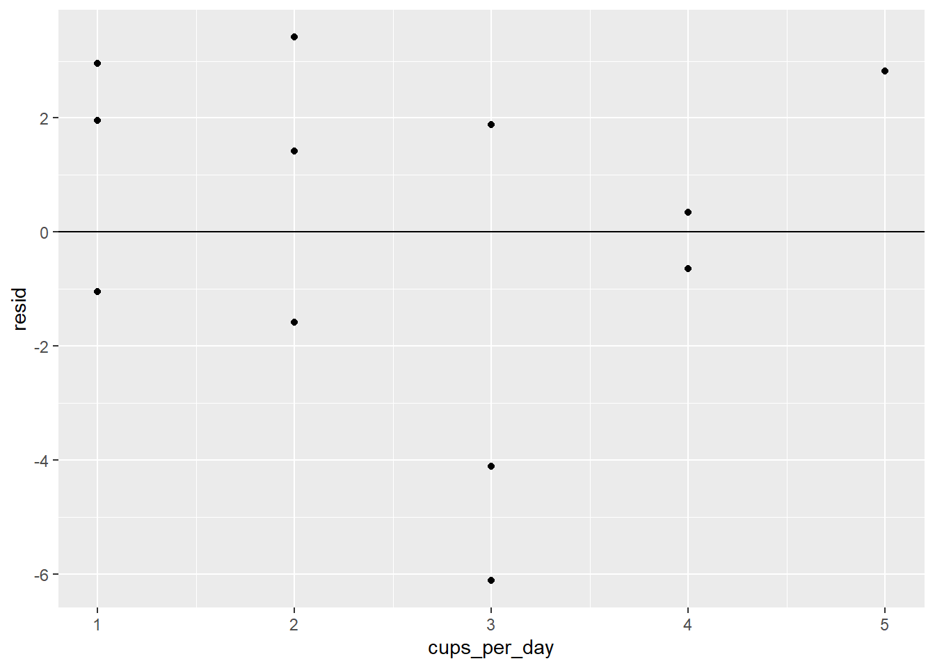
There definitely does not seem to be a pattern.
The rest of our assessment steps rely on the model’s summary:
summary(coffee_model)##
## Call:
## lm(formula = age_at_death ~ cups_per_day, data = coffee)
##
## Residuals:
## Min 1Q Median 3Q Max
## -6.1144 -1.4472 0.8856 2.6019 3.4194
##
## Coefficients:
## Estimate Std. Error t value Pr(>|t|)
## (Intercept) 86.5132 1.9836 43.614 1.37e-14 ***
## cups_per_day -1.4663 0.6436 -2.278 0.0418 *
## ---
## Signif. codes: 0 '***' 0.001 '**' 0.01 '*' 0.05 '.' 0.1 ' ' 1
##
## Residual standard error: 3.176 on 12 degrees of freedom
## Multiple R-squared: 0.302, Adjusted R-squared: 0.2438
## F-statistic: 5.191 on 1 and 12 DF, p-value: 0.0418The RSE is 3.176, which seems small given that it’s the average prediction error for a person’s lifespan. Let’s see if the residuals are normally distributed so we can state 68% and 95% prediction intervals:
ggplot(coffee_resids) +
  geom_histogram(aes(resid))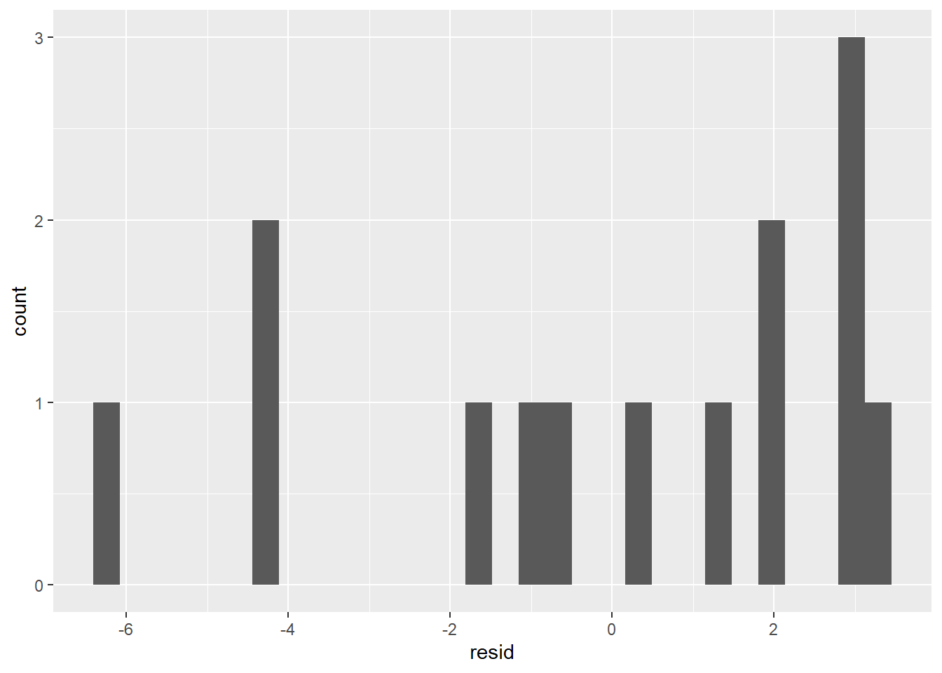
This doesn’t look very normal. We can continue with our model, but we won’t be able to state prediction intervals.
The F test produces a p-value of 0.0418, which is below the 0.05 cutoff. That means we have significant evidence that our regression model outperforms the mean model. However, the R2 value of 0.2438, being somewhat low, indicates that the regression model is still not very strong. However, given the full battery of assessments we just ran, it’s safe to say that coffee_model reliably models the data set.
With that in mind, let’s look at what our model is telling us. Let’s extract the coefficients (\(m\) and \(b\)) so we can see the formula for the regression line:
coef(coffee_model)## (Intercept) cups_per_day
## 86.513196 -1.466276Thus the formula is: age_at_death = -1.47(cups_per_day) + 86.5. This means that for every extra cup of coffee someone drinks, their life expectancy drops by about 1.47 years. That’s troubling news for coffee drinkers, especially since we have good reason to believe what our model tells us.
However, there is a problem with this model. One’s life expectancy depends on much, much more than one’s coffee intake. What if there’s a confounding variable, that is, a variable closely correlated with coffee intake which has a real effect on life expectancy. In fact, there is such a confounding variable: the person’s cigarette usage. Cigarette usage is correlated with coffee intake, and it’s well-known that smoking causes health problems that can shorten one’s life. Maybe coffee is not the culprit after all!
Suppose, in our hypothetical data set, we had also recorded how many cigarettes each individual smoked per day:
coffee_cigs <- tibble(
  cups_per_day = c(1, 3, 2, 4, 3, 2, 1, 5, 3, 4, 5, 3, 2, 1),
  cigs_per_day = c(0, 4, 0, 2, 0, 0, 0, 4, 5, 0, 1, 2, 0, 1),
  age_at_death = c(87, 76, 85, 80, 84, 87, 88, 82, 78, 81, 82, 78, 82, 84)
)

coffee_cigs
## # A tibble: 14 x 3
## cups_per_day cigs_per_day age_at_death
## <dbl> <dbl> <dbl>
## 1 1 0 87
## 2 3 4 76
## 3 2 0 85
## 4 4 2 80
## 5 3 0 84
## 6 2 0 87
## 7 1 0 88
## 8 5 4 82
## 9 3 5 78
## 10 4 0 81
## 11 5 1 82
## 12 3 2 78
## 13 2 0 82
## 14 1 1 84This extra data will allow us to examine how life expectancy is related to both coffee and cigarette usage. The way to do this is to build a multiple linear regression model. A multiple linear regression model is one in which we use a linear equation with more than one predictor variable to model a data set. Let’s build such a model with age_at_death as the response and both cups_per_day and cigs_per_day as the predictors:
coffee_mult_model <- lm(age_at_death ~ cups_per_day + cigs_per_day, data = coffee_cigs)We can check the coefficients:
coef(coffee_mult_model)## (Intercept) cups_per_day cigs_per_day
## 86.1967736 -0.7414466 -1.2546534The formula is thus age_at_death = -0.74(cups_per_day) - 1.25(cigs_per_day) + 86.2.
For example, someone who drinks 3 cups of coffee per day and smokes 2 cigarettes per day will have an expected life expectancy of -0.74(3) - 1.25(2) + 86.2 = 81.48 years. Now, what if we compare this person’s life expectancy to someone with the same cigarette usage but who drinks 1 more cup of coffee each day. In this way, we can see the effect of increased coffee intake for people with the same cigarette usage: -0.74(4) - 1.25(2) + 86.2 = 80.74. The difference in life expectancies due to this extra cup is 81.48 - 80.74 = 0.74. In other words, when the cups_per_day variable increases by 1 while cigs_per_day is held constant, the change in age_at_death is -0.74. Notice that this is exactly the coefficient of cups_per_day. This is not a coincidence:
The value of the coefficient of a predictor variable x in a multiple regression model is the amount by which the response variable changes when x increases by 1 and the other predictors are held constant.
This fact reveals the power of multiple regression: If you want to see how one variable affects another without the effect of confounding variables, just include the confounding variables as predictors!
In our coffee example, by including cigarette usage as a predictor, we see that the effect of coffee intake on life expectancy is about half what we thought it was after examining the simple regression model from earlier in this section. Our multiple regression model allows us to study the effect of coffee drinking on life expectancy while controlling for cigarette usage.
Adding a control variable allows us to make an apples-to-apples comparison of the life expectancies of coffee drinkers. We’re now only comparing coffee drinkers with similar smoking habits, which is more appropriate than comparing the life expectancies of, for example, someone who drinks one cup of coffee per day and does not smoke to someone who drinks four cups per day and also smokes a pack of cigarettes per day. The smoker will probably have a lower life expectancy, but not because he or she drinks more coffee.
Before we get too carried away with interpreting the results of our multiple regression model, we should first assess our model. With more predictor variables, we should expect our multiple model to make better predictions that our simple one. This means we should expect a lower RSE, a lower p-value, and a higher R2 value.
- Check the scatter plot: We have to get a scatter plot for each predictor variable separately.
ggplot(coffee_cigs) +
  geom_point(aes(cups_per_day, age_at_death))
ggplot(coffee_cigs) +
  geom_point(aes(cigs_per_day, age_at_death))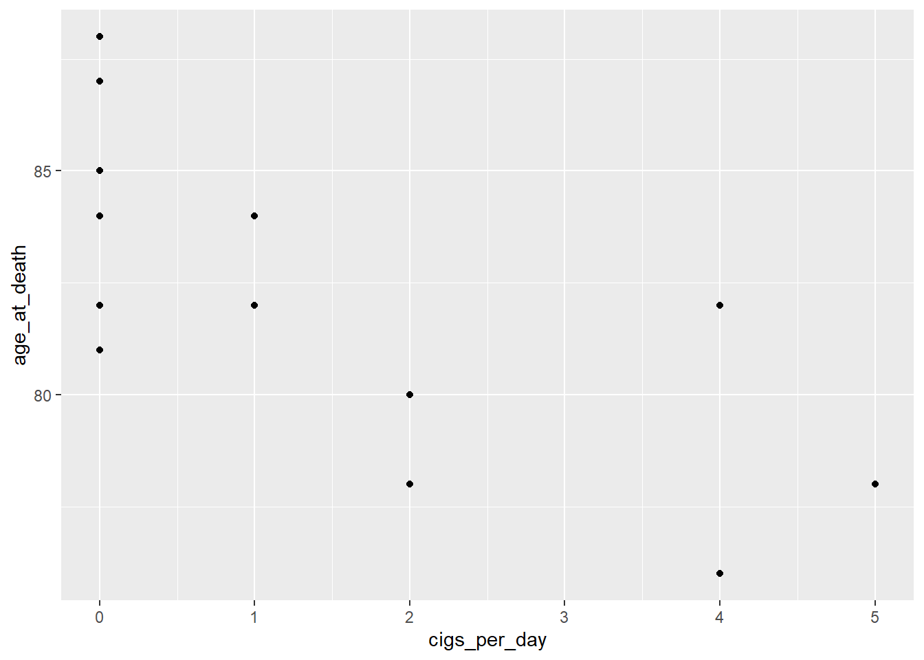
Neither displays a very strong linear relationship, but they’re close enough to continue.
- Check the residual plot: We will also have to produce one of these for each predictor. First, let’s add the residuals to our data set:
coffee_cigs_resid <- coffee_cigs %>%
  add_residuals(coffee_mult_model)
Now we can get our residual plots:
ggplot(coffee_cigs_resid) +
  geom_point(aes(cups_per_day, resid)) +
  geom_hline(yintercept = 0)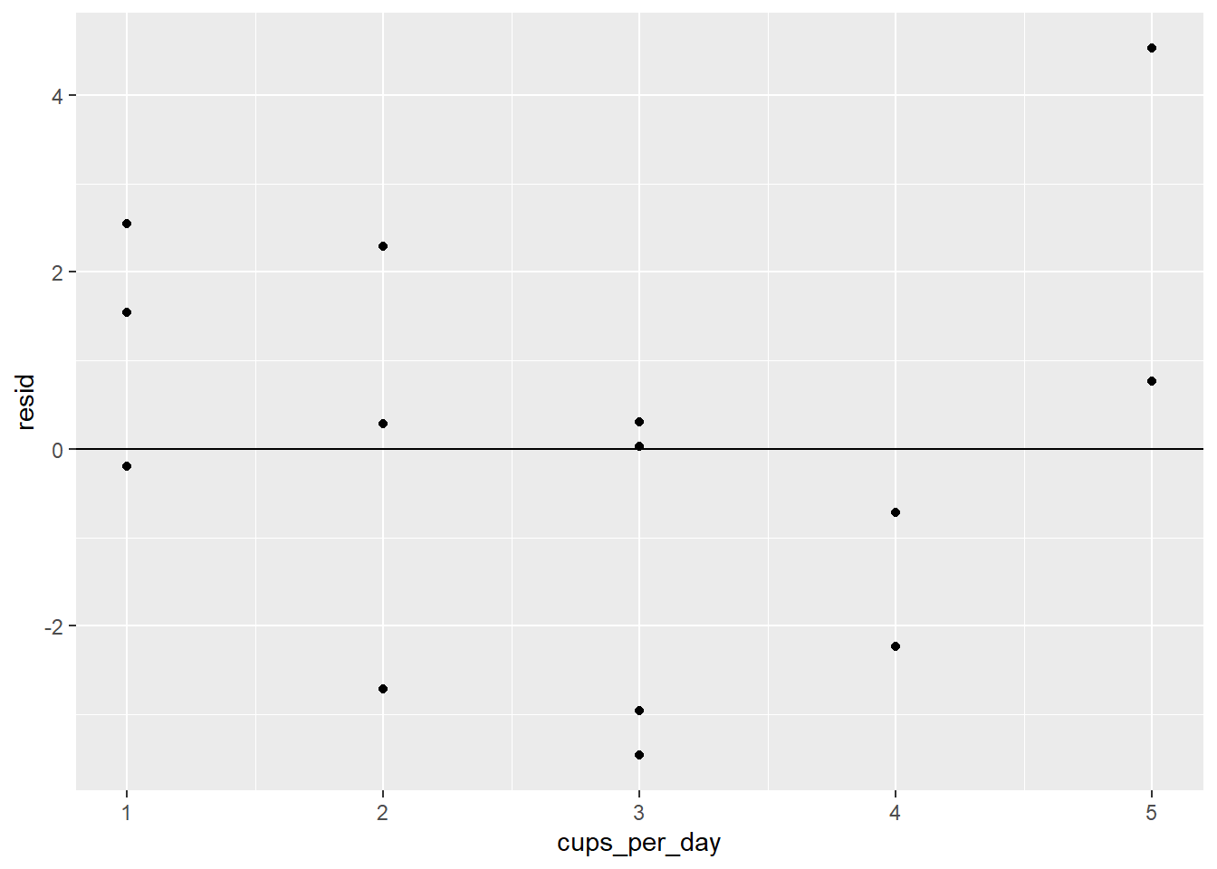
ggplot(coffee_cigs_resid) +
  geom_point(aes(cigs_per_day, resid)) +
  geom_hline(yintercept = 0)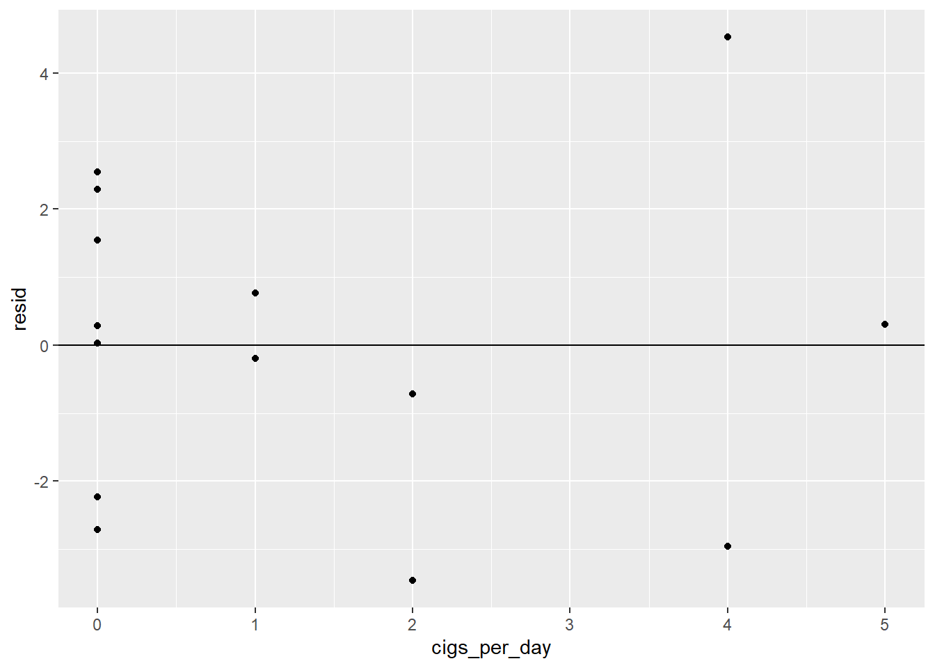
Neither one has an obvious pattern.
- Check the RSE: The RSE has the same interpretation as it did for simple regression models; it’s roughly the average prediction error, so we’d like it to be small. It can be found in the model summary:
summary(coffee_mult_model)##
## Call:
## lm(formula = age_at_death ~ cups_per_day + cigs_per_day, data = coffee_cigs)
##
## Residuals:
## Min 1Q Median 3Q Max
## -3.4631 -1.8537 0.1568 1.3498 4.5291
##
## Coefficients:
## Estimate Std. Error t value Pr(>|t|)
## (Intercept) 86.1968 1.5678 54.980 8.89e-15 ***
## cups_per_day -0.7414 0.5663 -1.309 0.2171
## cigs_per_day -1.2547 0.4354 -2.882 0.0149 *
## ---
## Signif. codes: 0 '***' 0.001 '**' 0.01 '*' 0.05 '.' 0.1 ' ' 1
##
## Residual standard error: 2.504 on 11 degrees of freedom
## Multiple R-squared: 0.6023, Adjusted R-squared: 0.5299
## F-statistic: 8.328 on 2 and 11 DF, p-value: 0.006278The RSE is 2.504, which is smaller than it was for the simple model. Notice that there are 11 degrees of freedom, even though \(n\) = 14. Recall that with simple regression, \(df = n-2\). With multiple regression, there are more than two statistics specified ahead of time (all coefficients and the intercept) rather than the two we had for simple regression. In our example, there are two coefficients and the intercept (3 statistics total), so \(df\) = 14 - 3 = 11.
- If the residuals are normally distributed, we can state prediction intervals. Let’s check:
ggplot(coffee_cigs_resid) +
  geom_histogram(aes(resid))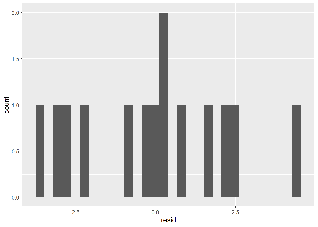
It’s probably not normal enough to use the 68% or 95% rules.
F test: The summary above shows that the p-value of the F test is 0.006278, which is well below the 0.05 cutoff. We can therefore say that our multiple regression model is better than the mean model.
R2 value: The R2 value has the same definition and interpretation as it did in the simple case. The summary above says it’s 0.5299, meaning that our model can explain about 53% of the variation in the
age_at_deathvariable. This is significantly bigger than it was for the simple regression model, meaning that our multiple model is stronger than the simple one (as is almost always the case).
We can see that our multiple model predicts a decrease in life expectancy of 0.74 years for each additional cup of coffee per day (with cigarette usage held constant) and 1.25 years for each additional cigarette per day (with coffee usage held constant) and that these predictions are at least somewhat reliable given our assessment results. Does this mean it’s time to alert the media and tell people to quit drinking coffee? We’ll address the very important issue of interpreting a model’s coefficients in the next section.
Exercises
To complete the exercises below, download this R Notebook file and open it in RStudio using the Visual Editor. Then enter your answers in the space provided.
These exercises refer to the data set found here. It consists of attributes describing the size and performance of several car makes and models from 1985 along with their retail selling price. (Click here for more information about this data set.)
Download the data set above and import it into R.
Create a simple linear regression model with
priceas the response variable andhighway-mpgas the predictor variable.State the RSE, p-value, and R2 value of your simple regression model. Do these three statistics indicate that your model is reliable?
State the coefficient of
highway-mpgand explain what it tells you about the relationship betweenpriceandhighway-mpg.Why might the relationship you described in the previous exercise seem surprising?
Explain why
curb-weightandhorsepowermight be confounding variables in your model.Control for
curb-weightandhorsepowerby building a multiple regression model and adding them as predictors to your model from Exercise 2. (Your multiple regression model will have three predictors:highway-mpg,curb-weight, andhorsepower.)State the RSE, p-value, and R2 value of your multiple regression model. How do they compare with those of the simple regression model from Exercise 3? Is this what you would expect?
State the coefficient of
highway-mpgin your multiple regression model and explain what it tells you about the relationship betweenpriceandhighway-mpg.Explain how these exercises illustrate the danger of omitting important predictors from regression models.
4.7 Regression Coefficients and p-values
In the last section, we built a multiple regression model with a person’s life expectancy as the response and the person’s coffee intake and cigarette usage as predictors. By examining the model’s residuals and goodness-of-fit statistics (RSE, p-value, R2 value), we found this model to be reliable. The formula is:
age_at_death = -0.74(cups_per_day) - 1.25(cigs_per_day) + 86.2
As we stated in the last section, we can interpret the coefficients as follows:
- Increasing one’s coffee intake by 1 cup per day and leaving one’s smoking habits unchanged will lower one’s life expectancy by 0.74 years.
- Increasing one’s smoking habits by 1 cigarette per day and leaving one’s coffee usage unchanged will lower one’s life expectancy by 1.25 years.
The question we’ll address in this section is:
How do we determine whether the value of a regression coefficient is significantly different from 0?
This is an important question because a regression coefficient measures the size of the impact of a predictor on a response. It’s clear that when the coefficient is close to 0, the impact of the predictor is insignificant, but how do we determine what’s considered “close?”
We addressed a question like this in Section 4.4 when we asked how to determine whether a regression model’s RSE is significantly different from a mean model’s RSE. In statistics, the way to determine significance is to run a hypothesis test. That’s how we determined RSE significance in Section 4.4, and that’s how we’ll determine regression coefficient significance now.
Recall that the process for a hypothesis test is to first state the claim for which you’re seeking evidence (the alternative hypothesis, \(H_a\)). In our case, we have
- \(H_a\): The regression coefficient is significantly different from 0.
We then determine whether we have evidence that supports \(H_a\). We do this by finding the probability (called the p-value) of obtaining our observed statistic when \(H_a\) is false. If the p-value is small (less than 0.05), then we have evidence in favor of \(H_a\). Otherwise, we don’t.
The p-value of a regression coefficient is found in the Coefficients section of the model’s summary. It’s the number in the Pr(>|t|) column. Let’s check the p-values of the regression coefficients in our coffee and cigarettes model:
summary(coffee_mult_model)##
## Call:
## lm(formula = age_at_death ~ cups_per_day + cigs_per_day, data = coffee_cigs)
##
## Residuals:
## Min 1Q Median 3Q Max
## -3.4631 -1.8537 0.1568 1.3498 4.5291
##
## Coefficients:
## Estimate Std. Error t value Pr(>|t|)
## (Intercept) 86.1968 1.5678 54.980 8.89e-15 ***
## cups_per_day -0.7414 0.5663 -1.309 0.2171
## cigs_per_day -1.2547 0.4354 -2.882 0.0149 *
## ---
## Signif. codes: 0 '***' 0.001 '**' 0.01 '*' 0.05 '.' 0.1 ' ' 1
##
## Residual standard error: 2.504 on 11 degrees of freedom
## Multiple R-squared: 0.6023, Adjusted R-squared: 0.5299
## F-statistic: 8.328 on 2 and 11 DF, p-value: 0.006278The p-value of the cups_per_day coefficient (-0.74) is 0.2171. Since it’s above the cutoff, we do not have evidence to suggest that -0.74 is significantly different from 0. This means we have no evidence to suggest that coffee intake has a significant impact on life expectancy. (Thank goodness!)
On the other hand, the p-value of cigs_per_day (0.0149) is small enough to claim that -1.25 is significantly different from 0, and that therefore, smoking has a significant negative impact on life expectancy.
Using the msleep data set, let’s analyze the impact of brainwt, bodywt, and sleep_rem on awake. To do so, we’ll build a multiple regression model using the msleep data set with awake as the response and brainwt, bodywt, and sleep_rem as the predictors, and then we’ll check the p-values of each regression coefficient.
sleep_model <- lm(awake ~ brainwt + bodywt + sleep_rem, data = msleep)

summary(sleep_model)
##
## Call:
## lm(formula = awake ~ brainwt + bodywt + sleep_rem, data = msleep)
##
## Residuals:
## Min 1Q Median 3Q Max
## -8.6683 -1.6118 0.2404 2.2189 4.5371
##
## Coefficients:
## Estimate Std. Error t value Pr(>|t|)
## (Intercept) 17.327539 0.881333 19.661 < 2e-16 ***
## brainwt 2.531074 2.122046 1.193 0.2394
## bodywt 0.008231 0.004195 1.962 0.0561 .
## sleep_rem -2.279956 0.364726 -6.251 1.44e-07 ***
## ---
## Signif. codes: 0 '***' 0.001 '**' 0.01 '*' 0.05 '.' 0.1 ' ' 1
##
## Residual standard error: 2.835 on 44 degrees of freedom
## (35 observations deleted due to missingness)
## Multiple R-squared: 0.6002, Adjusted R-squared: 0.5729
## F-statistic: 22.02 on 3 and 44 DF, p-value: 7.368e-09If we use 0.05 as our p-value cutoff, we can conclude that brainwt and bodywt have insignificant impacts on awake, while sleep_rem has a significant negative impact on awake. (If we instead set our cutoff to 0.1, which is common, we’d conclude that bodywt has a significant positive impact on awake.)
On a final note, we might wonder what the relationship is between the p-value for the F test and the p-values of the regression coefficients. Recall that the p-value for the F test determines the significance of the RSE – it’s meant to be an assessment of the model as a whole. The p-values of the regression coefficients, on the other hand, only measure the impact of the individual predictor variables. In a simple regression model (only one predictor), the p-value of the F test is always the same as that of the coefficient.
For example, in the sleep_model example above, the overall p-value is 7.368e-09. This is very small, which means that we have evidence to suggest that the model is good (i.e., better than the mean model). However, the coefficient p-values tell us that only one of the predictors (sleep_rem) has a significant impact on awake. This tells us that the insignificant predictors (bodywt and brainwt) probably don’t contribute much to the model. In fact, let’s build a model using only the significant sleep_rem variable and compare the goodness-of-fit statistics.
sleep_model_v2 <- lm(awake ~ sleep_rem, data = msleep)

summary(sleep_model_v2)
##
## Call:
## lm(formula = awake ~ sleep_rem, data = msleep)
##
## Residuals:
## Min 1Q Median 3Q Max
## -9.1852 -2.5483 0.3293 2.5774 4.6138
##
## Coefficients:
## Estimate Std. Error t value Pr(>|t|)
## (Intercept) 18.5365 0.6821 27.175 < 2e-16 ***
## sleep_rem -2.6257 0.2998 -8.757 2.91e-12 ***
## ---
## Signif. codes: 0 '***' 0.001 '**' 0.01 '*' 0.05 '.' 0.1 ' ' 1
##
## Residual standard error: 3.015 on 59 degrees of freedom
## (22 observations deleted due to missingness)
## Multiple R-squared: 0.5652, Adjusted R-squared: 0.5578
## F-statistic: 76.68 on 1 and 59 DF, p-value: 2.911e-12As expected, removing some of the predictors made the RSE increase (from 2.835 to 3.015) and the R2 decrease (from 0.5729 to 0.5578), but only negligibly so. It’s always best to exclude predictors with insignificant impacts.
Exercises
To complete the exercises below, download this R Notebook file and open it in RStudio using the Visual Editor. Then enter your answers in the space provided.
Exercises 1-3 refer to the model that was built in the exercises from Section 4.1.
- State the coefficient (i.e., the slope) and explain what this number means in the context of the data set.
- State the p-value for this model and explain what it tells you about the impact of
displonhwy. Specifically, is it positive and significant, negative and significant, or insignificant? - What is the intercept of the model? Is it meaningful in the real-life context?
Exercises 4-6 refer to the simple and multiple regression models that were built in the exercises from Section 4.6.
- According to the simple regression model (the one with
priceas the response andhighway-mpgas the predictor), what kind of impact (positive and significant, negative and significant, or insignificant) doeshighway-mpghave onprice? - According to the multiple regression model (the one that also includes
curb-weightandhorsepoweras predictors), what kind of impact dohighway-mpg,curb-weight, andhorsepowerhave onprice? - Suppose you have a hunch that the
peak-rpmvariable will be a helpful addition to your multiple regression model, along withhighway-mpg,curb-weight, andhorsepower. Think of a way to test your hunch, and then state whether your hunch is correct.
4.8 Categorical Predictors
It’s often the case that a response variable we want to model could have categorical predictors. For example, we might want to know whether a person’s gender has an impact on their salary, whether a car’s class has an impact on its fuel efficiency, or whether a diamond’s cut has an impact on its price. How can we build a regression model that accepts non-numerical input?
The idea is to numerically encode categorical data so that it can be fed into a regression formula. Consider the following built-in data set:
sim2## # A tibble: 40 x 2
## x y
## <chr> <dbl>
## 1 a 1.94
## 2 a 1.18
## 3 a 1.24
## 4 a 2.62
## 5 a 1.11
## 6 a 0.866
## 7 a -0.910
## 8 a 0.721
## 9 a 0.687
## 10 a 2.07
## 11 b 8.07
## 12 b 7.36
## 13 b 7.95
## 14 b 7.75
## 15 b 8.44
## 16 b 10.8
## 17 b 8.05
## 18 b 8.58
## 19 b 8.12
## 20 b 6.09
## 21 c 6.86
## 22 c 5.76
## 23 c 5.79
## 24 c 6.02
## 25 c 6.03
## 26 c 6.55
## 27 c 3.73
## 28 c 8.68
## 29 c 5.64
## 30 c 6.21
## 31 d 3.07
## 32 d 1.33
## 33 d 3.11
## 34 d 1.75
## 35 d 0.822
## 36 d 1.02
## 37 d 3.07
## 38 d 2.13
## 39 d 2.49
## 40 d 0.301The variable x has four different values: a, b, c, and d. One might attempt to encode these values by just assigning each one a number: a = 1, b = 2, c = 3, and d = 4. However, assigning numbers in this way imposes a ranking on the categorical values: a is less than b, which is less than c, which is less than d. This is a problem because there is no reason to assume there is any relationship among the values at all. We would also be in the strange situation where the computer would treat c as the average of b and d since 3 is the average of 2 and 4. This type of value encoding could misrepresent the data and lead to poorly performing models.
A better way to encode categorical data would not impose any kind of order or arithmetical significance on the values. The standard way to do this is to split the single categorical variable x into three indicator variables, each of which takes on the value 0 or 1. Let’s call them xb, xc, and xd. The encoding then works as follows:
- When
x=a, letxb,xc, andxdall equal 0. - When
x=b, letxb=1 and letxcandxdequal 0. - When
x=c, letxc=1 and letxbandxdequal 0. - When
x=d, letxd=1 and letxbandxcequal 0.
With this encoding, the data set becomes:
## # A tibble: 40 x 4
##       xb    xc    xd      y
##    <dbl> <dbl> <dbl>  <dbl>
##  1     0     0     0  1.94
##  2     0     0     0  1.18
##  3     0     0     0  1.24
##  4     0     0     0  2.62
##  5     0     0     0  1.11
##  6     0     0     0  0.866
##  7     0     0     0 -0.910
##  8     0     0     0  0.721
##  9     0     0     0  0.687
## 10     0     0     0  2.07
## 11     1     0     0  8.07
## 12     1     0     0  7.36
## 13     1     0     0  7.95
## 14     1     0     0  7.75
## 15     1     0     0  8.44
## 16     1     0     0 10.8
## 17     1     0     0  8.05
## 18     1     0     0  8.58
## 19     1     0     0  8.12
## 20     1     0     0  6.09
## 21     0     1     0  6.86
## 22     0     1     0  5.76
## 23     0     1     0  5.79
## 24     0     1     0  6.02
## 25     0     1     0  6.03
## 26     0     1     0  6.55
## 27     0     1     0  3.73
## 28     0     1     0  8.68
## 29     0     1     0  5.64
## 30     0     1     0  6.21
## 31     0     0     1  3.07
## 32     0     0     1  1.33
## 33     0     0     1  3.11
## 34     0     0     1  1.75
## 35     0     0     1  0.822
## 36     0     0     1  1.02
## 37     0     0     1  3.07
## 38     0     0     1  2.13
## 39     0     0     1  2.49
## 40     0     0     1  0.301
The data set above contains the same information as sim2, except now all of the variables are numerical. This means we can build a multiple regression model with y as the response and xb, xc, and xd as the predictors.
Luckily, modelr can recognize categorical predictors and carry out the numerical encoding for us; all we have to do is supply the response and predictors from the original (i.e., unencoded) data set, and the lm function will perform the encoding and produce a linear model:
sim2_model <- lm(y ~ x, data = sim2)We can now extract the coefficients and obtain the model’s formula:
coef(sim2_model)## (Intercept) xb xc xd
## 1.1521664 6.9638728 4.9750241 0.7588142The formula is therefore: y = 1.15 + 6.96(xb) + 4.98(xc) + 0.76(xd).
Assessing a regression model with categorical predictors is done just like before: We examine the residuals and check the goodness-of-fit statistics (RSE, F test p-value, and R2 value).
However, we should think carefully about the meaning of the intercept and regression coefficients and their p-values.
The first thing to realize is that the y value for each x value is just the average y value associated to that x value. To check this, let’s first revert to the methods of Chapter 2 to find the average y value for each x value:
sim2 %>%
  group_by(x) %>%
  summarize(mean(y))
## # A tibble: 4 x 2
## x `mean(y)`
## <chr> <dbl>
## 1 a 1.15
## 2 b 8.12
## 3 c 6.13
## 4 d 1.91Now let’s use the model’s formula to calculate the predicted y for each x value:
- When
x = a, we letxb = xc = xd = 0in the model. Soy= 1.15. - When
x = b, we letxb = 1andxc = xd = 0in the model. Soy= 1.15 + 6.96 = 8.11. - When
x = c, we letxc = 1andxb = xd = 0in the model. Soy= 1.15 + 4.98 = 6.13. - When
x = d, we letxd = 1andxb = xc = 0in the model. Soy= 1.15 + 0.76 = 1.91.
Comparing these predictions to the average y values for each x confirms our claim. We also see exactly how the intercept and regression coefficients come in to play. The intercept is just the predicted y value when x = a. Recall that x = a is encoded by letting all of the indicator variables have a value of 0. The x = a observations in the data set make up the reference category. By default, modelr takes the reference category to be the one which comes first alphabetically. (This choice of reference category can be overridden, although we won’t worry about that here.) So we have:
- The intercept of a regression model with a categorical predictor is the mean value of the reference category.
As for the regression coefficients, we can see from the above calculations that they turn out to be the differences between the reference category’s mean and the other categories’ means. For example, when x = b, we add the intercept (i.e., the reference category mean) to the coefficient of xb to get the predicted y value when x = b (i.e., the mean y value when x = b). So we also have:
- The regression coefficient of an indicator variable is the difference between the mean value of that indicator’s category and the mean value of the reference category.
If, as usual, we interpret the p-value of a regression coefficient as a number that determines whether the impact of a predictor on the response is significant, then:
- The p-value of an indicator variable’s coefficient determines whether the difference between the mean of the indicator category and the mean of the reference category is significant. If the p-value is below 0.05 (or some other cutoff), the difference is significant. Otherwise, it’s not.
Let’s check the p-values of the indicator variables from sim2_model:
summary(sim2_model)##
## Call:
## lm(formula = y ~ x, data = sim2)
##
## Residuals:
## Min 1Q Median 3Q Max
## -2.40131 -0.43996 -0.05776 0.49066 2.63938
##
## Coefficients:
## Estimate Std. Error t value Pr(>|t|)
## (Intercept) 1.1522 0.3475 3.316 0.00209 **
## xb 6.9639 0.4914 14.171 2.68e-16 ***
## xc 4.9750 0.4914 10.124 4.47e-12 ***
## xd 0.7588 0.4914 1.544 0.13131
## ---
## Signif. codes: 0 '***' 0.001 '**' 0.01 '*' 0.05 '.' 0.1 ' ' 1
##
## Residual standard error: 1.099 on 36 degrees of freedom
## Multiple R-squared: 0.8852, Adjusted R-squared: 0.8756
## F-statistic: 92.52 on 3 and 36 DF, p-value: < 2.2e-16We see that the difference between the reference category mean and those of the b category and c category are significant, but the difference between the reference and d categories is not. A quick check of the box plots confirms this finding:
ggplot(sim2) +
  geom_boxplot(aes(x, y))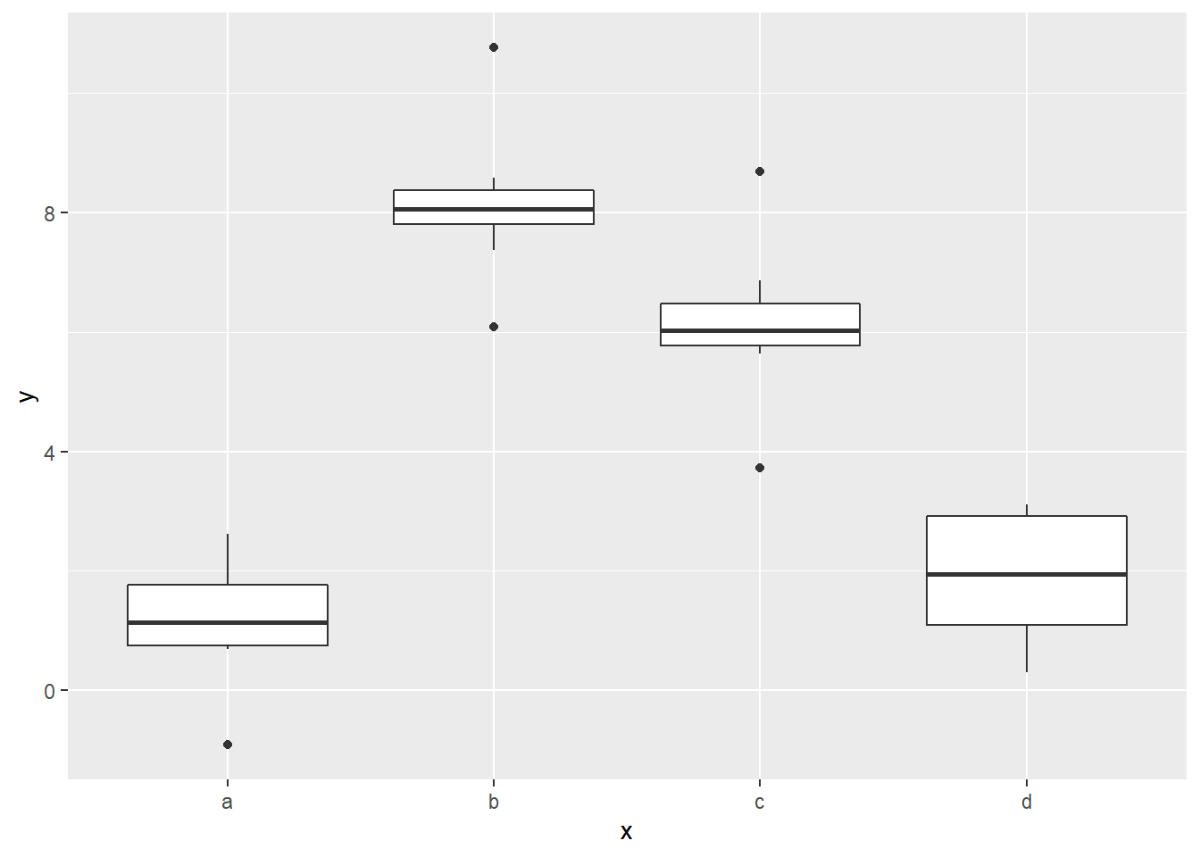
Notice that the boxes for a and d are on about the same level.
The above analysis is especially useful when the categorical predictor is binary, meaning it only has two values. Consider the following data set, which lists the genders (M or F) of 10 adults along with their heights (in inches).
df <- tibble(
  gender = c("M", "F", "M", "M", "F", "F", "M", "M", "F", "F"),
  height = c(70, 64, 73, 67, 62, 67, 75, 68, 65, 63)
)

df
## # A tibble: 10 x 2
## gender height
## <chr> <dbl>
## 1 M 70
## 2 F 64
## 3 M 73
## 4 M 67
## 5 F 62
## 6 F 67
## 7 M 75
## 8 M 68
## 9 F 65
## 10 F 63Based on this sample, can we conclude that there is a significant difference between the average heights of adult males and females? In light of the method of our sim2 example, one way to answer this question would be to build a regression model with gender as the predictor and height as the response. The p-value of the coefficient would then tell us whether the difference in mean heights is significant.
Since gender only has two values (M and F), we’ll only need one indicator variable. Since F comes first alphabetically, the reference category will be the females, and our indicator variable will be genderM.
Let’s build and assess our model:
height_model <- lm(height ~ gender, data = df)

summary(height_model)
##
## Call:
## lm(formula = height ~ gender, data = df)
##
## Residuals:
## Min 1Q Median 3Q Max
## -3.60 -1.95 -0.40 2.00 4.40
##
## Coefficients:
## Estimate Std. Error t value Pr(>|t|)
## (Intercept) 64.200 1.225 52.419 1.94e-11 ***
## genderM 6.400 1.732 3.695 0.00609 **
## ---
## Signif. codes: 0 '***' 0.001 '**' 0.01 '*' 0.05 '.' 0.1 ' ' 1
##
## Residual standard error: 2.739 on 8 degrees of freedom
## Multiple R-squared: 0.6305, Adjusted R-squared: 0.5844
## F-statistic: 13.65 on 1 and 8 DF, p-value: 0.006086It looks like we have a low RSE, and the F test’s p-value is well below 0.05. The R2 value is reasonably high. We have a reliable model.
We also see that the average height of the reference category (gender = F) is 64.2 inches and the difference in mean heights of females and males is 6.4 inches. To see whether this difference is significant, we’ll note that the p-value of genderM is 0.00609 (which is the same as the F test’s p-value since this is a simple regression model), and this is below the 0.05 cutoff. We can conclude that the data set provides evidence that the difference in mean heights of females and males is significant.
Of course, it’s often necessary to use both continuous and categorical predictors in a regression model, as we’ll see in the following example.
In the diamonds data set, a mysterious phenomenon is that diamonds with the best cut (“Ideal”) are on average worth the least. We can see this in the box plot below:
ggplot(diamonds) +
  geom_boxplot(aes(cut, price))
We can also back this claim up with a regression model.
cut_model1 <- lm(price ~ cut, data = diamonds)

summary(cut_model1)
##
## Call:
## lm(formula = price ~ cut, data = diamonds)
##
## Residuals:
## Min 1Q Median 3Q Max
## -4258 -2741 -1494 1360 15348
##
## Coefficients:
## Estimate Std. Error t value Pr(>|t|)
## (Intercept) 4062.24 25.40 159.923 < 2e-16 ***
## cut.L -362.73 68.04 -5.331 9.8e-08 ***
## cut.Q -225.58 60.65 -3.719 2e-04 ***
## cut.C -699.50 52.78 -13.253 < 2e-16 ***
## cut^4 -280.36 42.56 -6.588 4.5e-11 ***
## ---
## Signif. codes: 0 '***' 0.001 '**' 0.01 '*' 0.05 '.' 0.1 ' ' 1
##
## Residual standard error: 3964 on 53935 degrees of freedom
## Multiple R-squared: 0.01286, Adjusted R-squared: 0.01279
## F-statistic: 175.7 on 4 and 53935 DF, p-value: < 2.2e-16Before digging into this summary, let’s clear up the strange names given to the coefficients. In diamonds, cut is actually an ordered factor variable (as discussed in Section 3.2), not a categorical one:
type_sum(diamonds$cut)## [1] "ord"When factors are used as regression predictors, they’re encoded as above by lm. We’re going to coerce cut into a character type and treat it as categorical so that the model output will be easier to interpret:
diamonds_cat_cut <- diamonds %>%
  mutate(cut = as.character(cut))

type_sum(diamonds_cat_cut$cut)
## [1] "chr"Now we’ll rebuild the model.
cut_model2 <- lm(price ~ cut, data = diamonds_cat_cut)

summary(cut_model2)
##
## Call:
## lm(formula = price ~ cut, data = diamonds_cat_cut)
##
## Residuals:
## Min 1Q Median 3Q Max
## -4258 -2741 -1494 1360 15348
##
## Coefficients:
## Estimate Std. Error t value Pr(>|t|)
## (Intercept) 4358.76 98.79 44.122 < 2e-16 ***
## cutGood -429.89 113.85 -3.776 0.000160 ***
## cutIdeal -901.22 102.41 -8.800 < 2e-16 ***
## cutPremium 225.50 104.40 2.160 0.030772 *
## cutVery Good -377.00 105.16 -3.585 0.000338 ***
## ---
## Signif. codes: 0 '***' 0.001 '**' 0.01 '*' 0.05 '.' 0.1 ' ' 1
##
## Residual standard error: 3964 on 53935 degrees of freedom
## Multiple R-squared: 0.01286, Adjusted R-squared: 0.01279
## F-statistic: 175.7 on 4 and 53935 DF, p-value: < 2.2e-16We can use the model to verify our claim that the diamonds with the best cut are worth the least. The intercept 4358.76 is the mean price value of the reference category cut = Fair (since Fair comes first alphabetically among the cut values). The coefficient of cutIdeal is -901.22, which means that on average, the price of a diamond with an ideal cut is $901.22 less than that of a diamond with a fair cut. Since the cutIdeal coefficient has the largest negative value among the coefficients, the model is saying that diamonds with an ideal cut are worth the least. Further, the minuscule p-value for cutIdeal means that this $900 difference in price is statistically significant. So what’s going on?
The first clue that something is wrong should have been the very low R2 value. This model only explains about 1.3% of the variation. That’s a really bad fit, and we shouldn’t even be talking about such a model’s coefficients and p-values. The low R2 value is telling us that we might have omitted some helpful predictors. Let’s use carat as well:
cut_model3 <- lm(price ~ cut + carat, data = diamonds_cat_cut)

summary(cut_model3)
##
## Call:
## lm(formula = price ~ cut + carat, data = diamonds_cat_cut)
##
## Residuals:
## Min 1Q Median 3Q Max
## -17540.7 -791.6 -37.6 522.1 12721.4
##
## Coefficients:
## Estimate Std. Error t value Pr(>|t|)
## (Intercept) -3875.47 40.41 -95.91 <2e-16 ***
## cutGood 1120.33 43.50 25.75 <2e-16 ***
## cutIdeal 1800.92 39.34 45.77 <2e-16 ***
## cutPremium 1439.08 39.87 36.10 <2e-16 ***
## cutVery Good 1510.14 40.24 37.53 <2e-16 ***
## carat 7871.08 13.98 563.04 <2e-16 ***
## ---
## Signif. codes: 0 '***' 0.001 '**' 0.01 '*' 0.05 '.' 0.1 ' ' 1
##
## Residual standard error: 1511 on 53934 degrees of freedom
## Multiple R-squared: 0.8565, Adjusted R-squared: 0.8565
## F-statistic: 6.437e+04 on 5 and 53934 DF, p-value: < 2.2e-16Our R2 value jumped way up to about 0.86, so adding carat gave the model quite a bit of extra explanatory power. The cut coefficients still represent differences between the indicator category means and the reference category mean, but it’s now assumed that these differences are measured for diamonds with the same carat value. The main point is that the cutIdeal coefficient now has the largest positive value, meaning that once we control for the weight of the diamond (carat), the ideal cut diamonds are actually the most valuable. The low p-value tells us that we can be confident in this assertion.
What happened is this: We already know that price is heavily influenced by carat. Big diamonds are generally worth more than small ones. But it must be that the data set doesn’t contain many “unicorn” diamonds, i.e., big diamonds with ideal cuts. Diamonds with an ideal cut are usually small, and this brings their value down. That’s why we see that, on average, ideal diamonds are worth the least. It’s not because being ideal is undesirable; rather it’s because there’s a confounding variable, carat, that needs to be taken into account.
Once we include carat as a predictor, we’re then able to do an apples-to-apples comparison of the prices of the various cuts across diamonds of similar sizes. We’re no longer making unfair comparisons such as a 4.5-carat diamond with a Fair cut to a 0.2-carat diamond with an Ideal cut. This is analogous to the model constructed in Section 4.6 in which we first predicted life expectancy from coffee intake and then immensely improved the model by controlling for smoking behavior.
Exercises
To complete the exercises below, download this R Notebook file and open it in RStudio using the Visual Editor. Then enter your answers in the space provided.
Build a model using
mpgwithhwyas the response andclassas the predictor. Write down the actual algebraic formula for your model.Using the model formula from the previous exercise, predict the highway gas mileages of the following classes (without using the
add_predictionsfunction).suvsubcompact2seater
Use the summary statistics for your model from Exercise 1 to assess how well your model performs.
Click here to access a csv file containing average life expectancies of people from a selection of European countries in 2020, obtained from the World Bank web site.
- Download this file and import it into R.
- Use a linear model to determine whether there is a significant difference in average life expectancies in Northern European versus Western European countries. Explain your answer using your model’s statistics.
We’ve known since Chapter 1 that in the
mpgdata set, cars with larger engines (as measured bydispl) get worse gas mileage (as measured byhwy). However, there are exceptions to this trend, such as cars in the2seaterclass, which get better gas mileage than would be predicted for cars with such big engines.- Build a model that predicts
hwyfromdispl, but this time, control forclass. - When you take a car’s
classinto account, doesdisplhave as big an impact onhwyas it did before? Explain your answer. (Hint: Compare the coefficient ofdisplfrom the model you built in the Section 4.1 exercises to the coefficient ofdisplfrom the model you built in part (a).)
- Build a model that predicts
4.9 Case Study
We’ll need to install and load a new library called wooldridge, which contains various economics data sets.
install.packages("wooldridge")

library(wooldridge)
The specific data set we’ll be using from wooldridge is called wage1. As always, we should read the documentation:
?wage1The data set requires a small amount of cleaning so that it will work better with tidyverse and modelr functions. First, we’ll convert wage1 to a tibble:
wage1 <- as_tibble(wage1)Also, the female and nonwhite variables have integer values, even though they’re both categorical. Let’s coerce these variables into characters.
wage1 <- wage1 %>%
  mutate(female = as.character(female),
         nonwhite = as.character(nonwhite))
Note that a female value of 1 is a female, and 0 is a male. Likewise, a nonwhite value of 1 is nonwhite, and 0 is white.
The questions we’d like to answer are:
- In the population represented by this data set, was there gender-based pay inequity?
- In the population represented by this data set, was there race-based pay inequity?
Let’s start with the gender question. We could, of course, just compare the average values of wage for males and females:
wage1 %>%
  group_by(female) %>%
  summarize(mean(wage))
## # A tibble: 2 x 2
## female `mean(wage)`
## <chr> <dbl>
## 1 0 7.10
## 2 1 4.59The average wage for males is about $2.51 per hour higher. However, before we say that there is definitely gender-based pay inequity, we should dig a little deeper, especially since this is such a sensitive issue. In particular, there are two issues we should address before coming to a conclusion:
- The difference in mean
wagevalues might not be statistically significant. - There might be confounding variables that should be taken into account when making a comparison.
These issues can both be addressed by regression models. Let’s start with a simple regression model with wage as the response and female as the predictor and check its summary.
gender_model <- lm(wage ~ female, data = wage1)

summary(gender_model)
##
## Call:
## lm(formula = wage ~ female, data = wage1)
##
## Residuals:
## Min 1Q Median 3Q Max
## -5.5995 -1.8495 -0.9877 1.4260 17.8805
##
## Coefficients:
## Estimate Std. Error t value Pr(>|t|)
## (Intercept) 7.0995 0.2100 33.806 < 2e-16 ***
## female1 -2.5118 0.3034 -8.279 1.04e-15 ***
## ---
## Signif. codes: 0 '***' 0.001 '**' 0.01 '*' 0.05 '.' 0.1 ' ' 1
##
## Residual standard error: 3.476 on 524 degrees of freedom
## Multiple R-squared: 0.1157, Adjusted R-squared: 0.114
## F-statistic: 68.54 on 1 and 524 DF, p-value: 1.042e-15The slope of our model is telling us that females, on average, make about $2.51 per hour less than males (which, of course, agrees with the difference in means noted above). However, the p-value of this coefficient allows us to say more. Since the p-value is extremely low, we can say that the difference in means is actually significant.
Before we make a conclusion, though, notice that our model has a large RSE (relative to the wage values) and a row R2 value. This tells us that female as the lone predictor doesn’t have much predictive power. There are probably confounding variables that we should consider. In particular, it seems that education level (educ), years of experience (exper), and tenure at a company (tenure) might be confounding variables; each of them has potential correlations with gender, and they also would potentially have an impact on pay rate. Let’s rebuild our model, controlling for these three variables:
gender_mult_model <- lm(wage ~ female + educ + exper + tenure, data = wage1)

summary(gender_mult_model)
##
## Call:
## lm(formula = wage ~ female + educ + exper + tenure, data = wage1)
##
## Residuals:
## Min 1Q Median 3Q Max
## -7.7675 -1.8080 -0.4229 1.0467 14.0075
##
## Coefficients:
## Estimate Std. Error t value Pr(>|t|)
## (Intercept) -1.56794 0.72455 -2.164 0.0309 *
## female1 -1.81085 0.26483 -6.838 2.26e-11 ***
## educ 0.57150 0.04934 11.584 < 2e-16 ***
## exper 0.02540 0.01157 2.195 0.0286 *
## tenure 0.14101 0.02116 6.663 6.83e-11 ***
## ---
## Signif. codes: 0 '***' 0.001 '**' 0.01 '*' 0.05 '.' 0.1 ' ' 1
##
## Residual standard error: 2.958 on 521 degrees of freedom
## Multiple R-squared: 0.3635, Adjusted R-squared: 0.3587
## F-statistic: 74.4 on 4 and 521 DF, p-value: < 2.2e-16The RSE dropped, and the R2 more than tripled. We certainly have a more reliable model now. With that in mind, the coefficient of female1 is more meaningful than it was in the simple model above. In particular, it’s more accurate to say that for males and females with similar education, experience, and tenure levels, females still make about $1.81 per hour less than males. Also, the small p-value of female1 means that this difference in pay rates between men and women is statistically significant. Our data set does indeed provide evidence of gender-based pay inequity in the population.
We can perform the same analysis to investigate race-based pay inequity. First, let’s check the average wage values for the white and non-white categories:
wage1 %>%
  group_by(nonwhite) %>%
  summarize(mean(wage))
## # A tibble: 2 x 2
## nonwhite `mean(wage)`
## <chr> <dbl>
## 1 0 5.94
## 2 1 5.48The wage for whites is about $0.46 per hour higher than non-whites, but again, we’ll need to check whether this difference is significant and whether there are confounding variables. To do so, we’ll build regression models, starting with a simple model with wage as the response and nonwhite as the predictor.
race_model <- lm(wage ~ nonwhite, data = wage1)

summary(race_model)
##
## Call:
## lm(formula = wage ~ nonwhite, data = wage1)
##
## Residuals:
## Min 1Q Median 3Q Max
## -5.414 -2.526 -1.259 1.026 19.036
##
## Coefficients:
## Estimate Std. Error t value Pr(>|t|)
## (Intercept) 5.9442 0.1700 34.961 <2e-16 ***
## nonwhite1 -0.4682 0.5306 -0.882 0.378
## ---
## Signif. codes: 0 '***' 0.001 '**' 0.01 '*' 0.05 '.' 0.1 ' ' 1
##
## Residual standard error: 3.694 on 524 degrees of freedom
## Multiple R-squared: 0.001484, Adjusted R-squared: -0.0004218
## F-statistic: 0.7786 on 1 and 524 DF, p-value: 0.378We see that the p-value of the nonwhite1 coefficient is well above the 0.05 cutoff, so we would conclude from this model that race has an insignificant impact on pay. However, the RSE is high and the R2 value is negative, which means our model is actually worse than the mean model (as confirmed by the p-value of the F test).
Since our simple model is unreliable, we should add more predictors. We’ll use the same ones as above: educ, exper, and tenure.
race_mult_model <- lm(wage ~ nonwhite + educ + exper + tenure, data = wage1)

summary(race_mult_model)
##
## Call:
## lm(formula = wage ~ nonwhite + educ + exper + tenure, data = wage1)
##
## Residuals:
## Min 1Q Median 3Q Max
## -7.6154 -1.7815 -0.6287 1.1882 14.6463
##
## Coefficients:
## Estimate Std. Error t value Pr(>|t|)
## (Intercept) -2.85711 0.73687 -3.877 0.000119 ***
## nonwhite1 -0.06758 0.44520 -0.152 0.879403
## educ 0.59830 0.05152 11.613 < 2e-16 ***
## exper 0.02231 0.01207 1.848 0.065142 .
## tenure 0.16932 0.02167 7.814 3.07e-14 ***
## ---
## Signif. codes: 0 '***' 0.001 '**' 0.01 '*' 0.05 '.' 0.1 ' ' 1
##
## Residual standard error: 3.087 on 521 degrees of freedom
## Multiple R-squared: 0.3065, Adjusted R-squared: 0.3011
## F-statistic: 57.55 on 4 and 521 DF, p-value: < 2.2e-16The RSE and R2 values are much more acceptable now. The coefficient of nonwhite1 changed from -0.4682 in the simple model to only -0.06758 in the multiple model. This means our multiple regression model is telling us that for whites and nonwhites with similar education, experience, and tenure levels, nonwhites make about $0.07 less per hour than whites. However, the p-value for this coefficient (0.879403) is very high, meaning that this 7-cents per hour difference is not significant. We can therefore conclude that our data set does not provide evidence of race-based pay inequity in the population.
There are a few important points to make about our analysis:
- At no point did we base our conclusions on our own personal feelings about workplace inequity, however strong they may be. The power of regression lies in its objectivity.
- This analysis only applies to the population from which the data was collected. The
wage1data set was taken from a Current Population Survey in 1976, which is a monthly survey administered by the U.S. Census Bureau and the Bureau of Labor Statistics. It would be a mistake to extrapolate our conclusions to the present time.
4.10 Project
Project Description:
The purpose of this project is to build a linear regression model on a real-life data set and to interpret the results.
Download and import the data set found here. It contains data pertaining to health insurance charges along with various health and demographic data of the insured. A full description of this data set can be found here.
The question you are to answer is: Does the data set provide evidence that men are charged significantly more for health insurance than women?
Instructions:
Compare the average insurance charges for men and women. Based on this comparison only, would it be fair to conclude that men are charged more than women? Explain your answer.
Determine whether the difference in average charges noted in the previous problem is signficant. Be sure to cite the relevant statistics.
Are there any reasons to distrust your answer to the previous problem? Explain.
Explain why
agemight be a confounding variable and why it might explain why men are charged significantly more than women.Re-do your comparison of insurance charges for males and females, but this time, control for age. Explain what your new comparison is telling you, and determine whether the observed difference in charges is significant.
Are there any reasons to distrust your comparison from the previous problem? Explain.
Which two variables in the data set can be used to describe a person’s health? Re-do your
chargescomparison, controlling for these variables in addition toage. Explain what your new comparison is telling you, and determine whether the observed difference in charges is significant.Should you trust your comparison from the previous problem? Explain.
At this point, there are two variables in the data set that you have not yet included as controls. Determine whether either of these variables has a significant impact on
charges.By now, you should be able to make a reliable comparison. Using your analysis, answer the main question of the project: Does the data set provide evidence that men are charged significantly more for health insurance than women?
Guidelines:
Heading: Include a descriptive title for your report (do not just call it “Project 4”), your name, and the date in the heading.
Introduction:
- Begin with a description of the problem you’re solving or question you’re answering in your report. This should be concise but detailed enough to set the stage for the work you’ll be doing.
- Describe your data set. Say what it contains, how many observations and variables it contains, and where it comes from.
- Create a data dictionary, at least for the variables which will be referenced in your report.
- Use the
datatablefunction to display your data set. (If the data set is too big to display when you try to knit your .Rmd file, you don’t have to display it.) - Include a code chunk in which you load the libraries you’ll need, and briefly say what each one is for.
Body:
- Follow the introduction with the body of your report which will contain your work, broken into relevant section headings.
- The body should include text that provides a running narrative that guides the reader through your work. This should be thorough and complete, but you should avoid large blocks of text.
- Do not use the problem-numbering in the Instructions above in the body. That’s just for your benefit as you prepare your work. Your narrative structure – not an enumerated list – should lead the reader from one question to the next.
- The body of the report should show all of your R code and its output, but it should not show any warning or error messages. (This is for my benefit. A professional report might not include the code, depending on the audience.)
- All graphics should look nice, be easy to read, and be fully labeled.
- You should include insightful statements about the meaning you’re extracting from your graphics rather than just superficial descriptions of your visualizations.
Conclusion:
- End with an overall concluding statement which summarizes your findings.
- Provide a clear answer to the question you set out to answer.
- If you were not able to answer the question fully, possibly because of insufficient data, explain why.
Report Preparation: The problems for the project should be worked out in a scratch work .R file which you will not turn in. Once you’re done, write up your results in an R Notebook report, making sure to follow the guidelines above. Then publish your report online using RPubs and send me the URL to submit your work.
Grading Rubric:
Technical Explanations: Do you explain the technical aspects of your work, such as residuals, R2 values, RSE, regression coefficients, and p-values, correctly? (30 points)
Interpretation: Do you correctly interpret the results of your models? Do your conclusions follow correctly from your models’ statistics? (30 points)
Narrative: Is it clear what you’re trying to do in this project? Do you maintain a readable narrative throughout that guides the reader through your analysis? (20 points)
Professionalism: Does your report look nice? Do you provide insights based on your analysis? Is your code clear and readable? Did you follow the guidelines? (15 points)