Code
world <- rnaturalearth::ne_countries(
        scale = "medium",
        returnclass = "sf"
    ) |>
dplyr::filter(admin != "Antarctica")I am following here the article (FelixAnalytix 2023) and video (Felix Analytix 2023).
Article and video explain how to
As an example Europe will be visualized. But you can reuse the R code shared in this article on any region of your choice.
Packages used in this article
Besides packages from the {tidyverse} the article uses
For doanloading world data for the map, we will call the rnaturalearth::ne_countries() function with scale as “medium” (we don’t need detailed geographic data) and the returnclass will be “sf” (we want an sf object to work with the {sf} package).
We will immediately Antartica remove from the dataset.
R Code B.1 : Download world data and remove Antartica
world <- rnaturalearth::ne_countries(
scale = "medium",
returnclass = "sf"
) |>
dplyr::filter(admin != "Antarctica")Changing the world map projection can easily be done using the sf::st_transform() function. Here we decide to use the mollweide projection.

The Mollweide is a pseudocylindrical projection in which the equator is represented as a straight horizontal line perpendicular to a central meridian that is one-half the equator’s length. The other parallels compress near the poles, while the other meridians are equally spaced at the equator. The meridians at 90 degrees east and west form a perfect circle, and the whole earth is depicted in a proportional 2:1 ellipse. The proportion of the area of the ellipse between any given parallel and the equator is the same as the proportion of the area on the globe between that parallel and the equator, but at the expense of shape distortion, which is significant at the perimeter of the ellipse… (Wikipedia)
There are numerous different projection explained in PROJ (Evenden et al. 2024) a generic coordinate transformation software that transforms geospatial coordinates from one coordinate reference system (CRS) to another. This includes cartographic projections as well as geodetic transformations.
Consulting the PROJ manual (PROJ contributors 2024) is vital to get the code that sf::st_transform() needs as parameter for the transformation. This code for the Mollweide projection is +proj=moll.
R Code B.2 : Change world map projection to Mollweide projection
target_crs = "+proj=moll"
world_moll <- world |>
sf::st_transform(crs = target_crs)How to use the {wbstats} package is explained well in the package vignette. To get data for our map example we will download the indicator “employment (% of the labor force)”. It is an arbitrary indicator chosen from a list of all the indicators available in the World Bank API generated with the wbstats::wb_cachelist() function. We will filter this indicator using again the dplyr::filter() function.
For the most recent information on available data from the World Bank API wbstats::wb_cache() downloads an updated version of the information stored in wb_cachelist. wb_cachelist is simply a saved return of wb_cache(lang = “en”). To use this updated information in wb_search() or wb_data(), set the cache parameter to the saved list returned from wb_cache(). It is always a good idea to use this updated information to insure that you have access to the latest available information, such as newly added indicators or data sources.
Download “Unemployment” indicator
To download data you need to follow several steps:
wbstats::wb_cachelist() update data with wbstats::wb_cache()
wbstats::wb_search() to find the parameter(s) for the indicator(s) your are looking for.wbstats::wb_data().Code Collection B.1 : Download world bank data
R Code B.3 : Update world bank data
pb_create_folder("data/annex-b")

new_cache <- wbstats::wb_cache(lang = "en")
pb_save_data_file("annex-b", new_cache, "new_cache.RDS")The expression in the parentheses lang = "en" wouldn’t be necessary because the default language is English.
R Code B.4 : Compare cachelist and new_cache World Bank datasets
file_to_check <- "data/annex-b/new_cache.RDS"

if (file.exists(file_to_check)) {
    new_cache <- base::readRDS(file_to_check)
    base::cat("********** Updated World Bank Data Set *********\n")
    utils::str(new_cache, max.level = 1)
} else {
    base::cat("********** No new dataset available *********\n")
    base::cat("********** Run the previous 'Update data' tab manually *********\n")
}

base::cat("\n********** World Bank Data Set in wb_cachelist *********\n")
utils::str(wbstats::wb_cachelist, max.level = 1)
#> ********** Updated World Bank Data Set *********
#> List of 8
#> $ countries : tibble [296 × 18] (S3: tbl_df/tbl/data.frame)
#> $ indicators : tibble [23,678 × 8] (S3: tbl_df/tbl/data.frame)
#> $ sources : tibble [69 × 9] (S3: tbl_df/tbl/data.frame)
#> $ topics : tibble [21 × 3] (S3: tbl_df/tbl/data.frame)
#> $ regions : tibble [44 × 4] (S3: tbl_df/tbl/data.frame)
#> $ income_levels: tibble [7 × 3] (S3: tbl_df/tbl/data.frame)
#> $ lending_types: tibble [4 × 3] (S3: tbl_df/tbl/data.frame)
#> $ languages : tibble [23 × 3] (S3: tbl_df/tbl/data.frame)
#>
#> ********** World Bank Data Set in wb_cachelist *********
#> List of 8
#> $ countries : tibble [304 × 18] (S3: tbl_df/tbl/data.frame)
#> $ indicators : tibble [16,649 × 8] (S3: tbl_df/tbl/data.frame)
#> $ sources : tibble [63 × 9] (S3: tbl_df/tbl/data.frame)
#> $ topics : tibble [21 × 3] (S3: tbl_df/tbl/data.frame)
#> $ regions : tibble [48 × 4] (S3: tbl_df/tbl/data.frame)
#> $ income_levels: tibble [7 × 3] (S3: tbl_df/tbl/data.frame)
#> $ lending_types: tibble [4 × 3] (S3: tbl_df/tbl/data.frame)
#> $ languages : tibble [23 × 3] (S3: tbl_df/tbl/data.frame)There are some notable differences in my datasets between the release of the {wbstats} package (2020-12-04) and my update four year later (2024-12-31):
wbstats::wb_cachelist version.The numbers are the result of the differences. For instance the difference of four regions is the result of two more regions in the updates version (“Africa Eastern and Southern” and “Africa Western and Central”) contra six less regions (“Andean Region”, “Latin America and the Caribbean”, “Central America”, “Non-resource rich Sub-Saharan Africa countries, of which landlocked”, “Resource rich Sub-Saharan Africa countries, of which oil exporters”, “Southern Cone”)
The situation is even more complicated in the country case: There are in sum 64 differences in various columns, some of them just different names (Czech Republik versus Czechia). These 64 distinctions consist of more and less countries in the two datasets compared and boil down to the number of eight rows. But behind these eight rows lurk 64 mismatches.
The four data frames with the same number of rows (“topics”, “income_levels”, “lending_types”, “languages) are not the result of different mismachtes. These four tibbles are actually identical.
R Code B.5 : Show World Bank datasets
file_to_check <- "data/annex-b/new_cache.RDS"


if (file.exists(file_to_check)) {
    my_cache <- base::readRDS(file_to_check)
} else {
    my_cache <- wbstats::wb_cachelist
}

base::cat("********** List details of all eight tibbles *********\n")
#> ********** List details of all eight tibbles *********my_cache#> $countries
#> # A tibble: 296 × 18
#> iso3c iso2c country capital_city longitude latitude region_iso3c region_iso2c
#> <chr> <chr> <chr> <chr> <dbl> <dbl> <chr> <chr>
#> 1 ABW AW Aruba Oranjestad -70.0 12.5 LCN ZJ
#> 2 AFE ZH Africa… <NA> NA NA <NA> <NA>
#> 3 AFG AF Afghan… Kabul 69.2 34.5 SAS 8S
#> 4 AFR A9 Africa <NA> NA NA <NA> <NA>
#> 5 AFW ZI Africa… <NA> NA NA <NA> <NA>
#> 6 AGO AO Angola Luanda 13.2 -8.81 SSF ZG
#> 7 ALB AL Albania Tirane 19.8 41.3 ECS Z7
#> 8 AND AD Andorra Andorra la … 1.52 42.5 ECS Z7
#> 9 ARB 1A Arab W… <NA> NA NA <NA> <NA>
#> 10 ARE AE United… Abu Dhabi 54.4 24.5 MEA ZQ
#> # ℹ 286 more rows
#> # ℹ 10 more variables: region <chr>, admin_region_iso3c <chr>,
#> # admin_region_iso2c <chr>, admin_region <chr>, income_level_iso3c <chr>,
#> # income_level_iso2c <chr>, income_level <chr>, lending_type_iso3c <chr>,
#> # lending_type_iso2c <chr>, lending_type <chr>
#>
#> $indicators
#> # A tibble: 23,678 × 8
#> indicator_id indicator unit indicator_desc source_org topics source_id
#> <chr> <chr> <lgl> <chr> <chr> <list> <dbl>
#> 1 1.0.HCount.1.90usd Poverty … NA The poverty h… LAC Equit… <df> 37
#> 2 1.0.HCount.2.5usd Poverty … NA The poverty h… LAC Equit… <df> 37
#> 3 1.0.HCount.Mid10t… Middle C… NA The poverty h… LAC Equit… <df> 37
#> 4 1.0.HCount.Ofcl Official… NA The poverty h… LAC Equit… <df> 37
#> 5 1.0.HCount.Poor4u… Poverty … NA The poverty h… LAC Equit… <df> 37
#> 6 1.0.HCount.Vul4to… Vulnerab… NA The poverty h… LAC Equit… <df> 37
#> 7 1.0.PGap.1.90usd Poverty … NA The poverty g… LAC Equit… <df> 37
#> 8 1.0.PGap.2.5usd Poverty … NA The poverty g… LAC Equit… <df> 37
#> 9 1.0.PGap.Poor4uds Poverty … NA The poverty g… LAC Equit… <df> 37
#> 10 1.0.PSev.1.90usd Poverty … NA The poverty s… LAC Equit… <df> 37
#> # ℹ 23,668 more rows
#> # ℹ 1 more variable: source <chr>
#>
#> $sources
#> # A tibble: 69 × 9
#> source_id last_updated source source_code source_desc source_url
#> <dbl> <date> <chr> <chr> <lgl> <lgl>
#> 1 1 2021-08-18 Doing Business DBS NA NA
#> 2 2 2024-12-16 World Development … WDI NA NA
#> 3 3 2024-11-05 Worldwide Governan… WGI NA NA
#> 4 5 2016-03-21 Subnational Malnut… SNM NA NA
#> 5 6 2024-12-03 International Debt… IDS NA NA
#> 6 11 2013-02-22 Africa Development… ADI NA NA
#> 7 12 2024-06-25 Education Statisti… EDS NA NA
#> 8 13 2022-03-25 Enterprise Surveys ESY NA NA
#> 9 14 2024-12-17 Gender Statistics GDS NA NA
#> 10 15 2024-12-19 Global Economic Mo… GEM NA NA
#> # ℹ 59 more rows
#> # ℹ 3 more variables: data_available <lgl>, metadata_available <lgl>,
#> # concepts <dbl>
#>
#> $topics
#> # A tibble: 21 × 3
#> topic_id topic topic_desc
#> <dbl> <chr> <chr>
#> 1 1 Agriculture & Rural Development "For the 70 percent of the world's …
#> 2 2 Aid Effectiveness "Aid effectiveness is the impact th…
#> 3 3 Economy & Growth "Economic growth is central to econ…
#> 4 4 Education "Education is one of the most power…
#> 5 5 Energy & Mining "The world economy needs ever-incre…
#> 6 6 Environment "Natural and man-made environmental…
#> 7 7 Financial Sector "An economy's financial markets are…
#> 8 8 Health "Improving health is central to the…
#> 9 9 Infrastructure "Infrastructure helps determine the…
#> 10 10 Social Protection & Labor "The supply of labor available in a…
#> # ℹ 11 more rows
#>
#> $regions
#> # A tibble: 44 × 4
#> region_id iso3c iso2c region
#> <dbl> <chr> <chr> <chr>
#> 1 NA AFE ZH Africa Eastern and Southern
#> 2 NA AFR A9 Africa
#> 3 NA AFW ZI Africa Western and Central
#> 4 NA ARB 1A Arab World
#> 5 NA CAA C9 Sub-Saharan Africa (IFC classification)
#> 6 NA CEA C4 East Asia and the Pacific (IFC classification)
#> 7 NA CEB B8 Central Europe and the Baltics
#> 8 NA CEU C5 Europe and Central Asia (IFC classification)
#> 9 NA CLA C6 Latin America and the Caribbean (IFC classification)
#> 10 NA CME C7 Middle East and North Africa (IFC classification)
#> # ℹ 34 more rows
#>
#> $income_levels
#> # A tibble: 7 × 3
#> iso3c iso2c income_level
#> <chr> <chr> <chr>
#> 1 HIC XD High income
#> 2 INX XY Not classified
#> 3 LIC XM Low income
#> 4 LMC XN Lower middle income
#> 5 LMY XO Low & middle income
#> 6 MIC XP Middle income
#> 7 UMC XT Upper middle income
#>
#> $lending_types
#> # A tibble: 4 × 3
#> iso3c iso2c lending_type
#> <chr> <chr> <chr>
#> 1 IBD XF IBRD
#> 2 IDB XH Blend
#> 3 IDX XI IDA
#> 4 LNX XX Not classified
#>
#> $languages
#> # A tibble: 23 × 3
#> iso2 lang lang_native
#> <chr> <chr> <chr>
#> 1 en English English
#> 2 es Spanish Español
#> 3 fr French Français
#> 4 ar Arabic عربي
#> 5 zh Chinese 中文
#> 6 bg Bulgarian Български
#> 7 de German Deutsch
#> 8 hi Hindi हिंदी
#> 9 id Indonesian Bahasa indonesia
#> 10 ja Japanese 日本語
#> # ℹ 13 more rowsR Code B.6 : Search World Bank data
file_to_check <- "data/annex-b/new_cache.RDS"

if (file.exists(file_to_check)) {
    my_cache <- base::readRDS(file_to_check)
} else {
    my_cache <- wbstats::wb_cachelist
}

employment_inds<- wbstats::wb_search(
    pattern = "Unemployment, total",
    extra = TRUE,
    cache = my_cache)

dplyr::glimpse(employment_inds)
#> Rows: 2
#> Columns: 8
#> $ indicator_id <chr> "SL.UEM.TOTL.NE.ZS", "SL.UEM.TOTL.ZS"
#> $ indicator <chr> "Unemployment, total (% of total labor force) (national…
#> $ unit <lgl> NA, NA
#> $ indicator_desc <chr> "Unemployment refers to the share of the labor force th…
#> $ source_org <chr> "International Labour Organization. “Labour Force Stati…
#> $ topics <list> [<data.frame[1 x 2]>], [<data.frame[2 x 2]>]
#> $ source_id <dbl> 2, 2
#> $ source <chr> "World Development Indicators", "World Development Indi…Searching for “Unemployment (% of the labor force)” returned an empty data frame. The new (updated) search string is “Unemployment, total”. This search returns two results. The first row uses for the percentage of unemployment national statistics and can therefore vary between different countries. The second row uses the modeled estimate of the ILO.
I am going to use the ILO unemployment indicator SL.UEM.TOTL.ZS as used in the blog example by Felix Analytix.
To provide the source for creating graphics I need the content of the “source_orgcolumn. By the default the parameterextra = FALSEprovides only indicator ID, the short name and the description of the indicator. To get all columns of the cache parameters's indicator we need to setextra = TRUE`.
The larger string “Unemployment, total (% of total labor force)” did not work for me and returned an empty data frame.
One has to have already specific knowledge to get not too many rows returned. If you are using just “Unemployment” then you have to skim through 93 observations to find your indicator.
R Code B.7 : Filter World Bank data
ind <- "SL.UEM.TOTL.ZS"

indicator_info <- employment_inds |>
    dplyr::filter(indicator_id == ind)

indicator_info$indicator
indicator_info$indicator_desc
indicator_info$source_org
#> [1] "Unemployment, total (% of total labor force) (modeled ILO estimate)"
#> [1] "Unemployment refers to the share of the labor force that is without work but available for and seeking employment."
#> [1] "International Labour Organization. “ILO Modelled Estimates and Projections database (ILOEST)” ILOSTAT. Accessed June 18, 2024. https://ilostat.ilo.org/data/."R Code B.8 : Numbered R Code Title
file_to_check <- "data/annex-b/new_cache.RDS"

if (file.exists(file_to_check)) {
    my_cache <- base::readRDS(file_to_check)
} else {
    my_cache <- wbstats::wb_cachelist
}

df <- wbstats::wb_data(
    indicator = ind,
    start_date = 2023,
    end_date = 2023,
    cache = my_cache
    )

dplyr::glimpse(df)
#> Rows: 217
#> Columns: 9
#> $ iso2c <chr> "AW", "AF", "AO", "AL", "AD", "AE", "AR", "AM", "AS", "…
#> $ iso3c <chr> "ABW", "AFG", "AGO", "ALB", "AND", "ARE", "ARG", "ARM",…
#> $ country <chr> "Aruba", "Afghanistan", "Angola", "Albania", "Andorra",…
#> $ date <dbl> 2023, 2023, 2023, 2023, 2023, 2023, 2023, 2023, 2023, 2…
#> $ SL.UEM.TOTL.ZS <dbl> NA, 14.386, 14.620, 11.584, NA, 2.706, 6.178, 8.586, NA…
#> $ unit <chr> NA, NA, NA, NA, NA, NA, NA, NA, NA, NA, NA, NA, NA, NA,…
#> $ obs_status <chr> NA, NA, NA, NA, NA, NA, NA, NA, NA, NA, NA, NA, NA, NA,…
#> $ footnote <chr> NA, NA, NA, NA, NA, NA, NA, NA, NA, NA, NA, NA, NA, NA,…
#> $ last_updated <date> 2024-12-16, 2024-12-16, 2024-12-16, 2024-12-16, 2024-1…Looking at https://data.worldbank.org/indicator/SL.UEM.TOTL.ZS, I learned the latest data are from 2023.
With a very quick data exploratory analysis we will see the distribution of our indicator.
Code Collection B.2 : Visualize data distribution
R Code B.9 : Show the data distribution without transformation
df |>
    dplyr::filter(!is.na(SL.UEM.TOTL.ZS)) |>
    ggplot2::ggplot(ggplot2::aes(SL.UEM.TOTL.ZS)) +
    ggplot2::geom_histogram(bins = 100)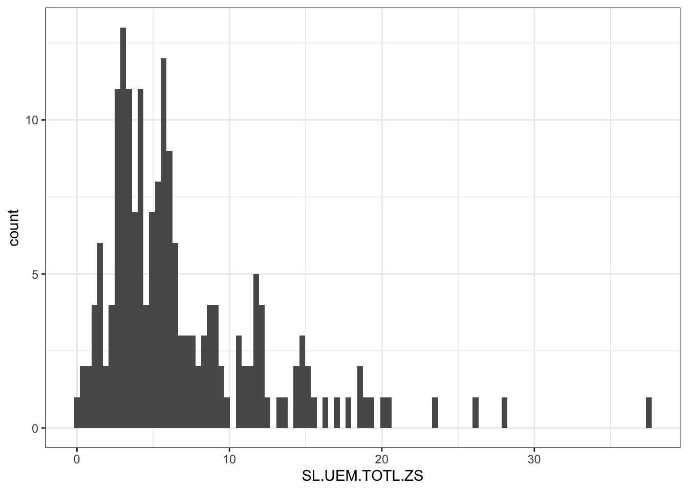
Most of the data show 3-6% unemployment rate. This can be a bit annoying because we will hardly see the difference in the color palette for these specific percentages.
I will therefore use a square root transformation on the percentage values so that the color palette will be better distributed (showed in the next tab).
R Code B.10 : Show the data distribution with a square root transformation
df |>
    dplyr::filter(!is.na(SL.UEM.TOTL.ZS)) |>
    ggplot2::ggplot(ggplot2::aes(SL.UEM.TOTL.ZS)) +
    ggplot2::geom_histogram(bins = 100) +
ggplot2::scale_x_sqrt()With the square root transformation the data are somewhat better distributed.
We are now prepared to join our World Bank data to the previously generated geographic world_moll sf object (see: R Code B.2).
The blog entry recommends to join the World Bank data object df by “iso3c” code which represents the alpha-3 ISO 3166 Country Codes). But it does it with “iso_a3” code from the naturalearthdata object “wordl_moll”. But it turned out that in my case “iso_a3” does not contain correct data for all countries. For instance is has -99 for France and Norway instead of the valide codes of “FRA” and “NOR”. The result is that these tw3o countries are greyed out in the colored map reprsentation of the unemployment rate.
Instead I am going to use “adm0_a3”. I could also use “iso_a3_eh” as a Brave-KI research result says:
The
iso_a3_ehfield in Natural Earth data is used to provide a more flexible interpretation of ISO 3-character country codes. The “eh” suffix stands for “okay, but not great” in American English slang, indicating that while the code is not strictly accurate according to ISO standards, it is close enough for most practical purposes. This field was added to help users who are looking for a simpler, albeit less precise, match for their data visualization or analysis needs. For instance, France’siso_a2field is set to-99to indicate a strict ISO match is not available, whileiso_a2_ehis set toFR. Similarly, Norway’siso_a3might be-99, butiso_a3_ehwould beNOR.
See also the discussion in the GitHub thread especially the following comment/answer of the developer.
Using the {ggplot2} R package, we will create a world map with the function ggplot2::geom_sf(). We will also make the square root transformation to see more clearly the percentage differences.
R Code B.11 : Unemployment rate in 2023
world_moll |>
    dplyr::left_join(df, by = c("adm0_a3" = "iso3c")) |>
    ggplot2::ggplot() +
    ggplot2::geom_sf(ggplot2::aes(fill = SL.UEM.TOTL.ZS)) +
    ggplot2::scale_fill_viridis_c(
        trans = "sqrt",
        labels = scales::percent_format(scale = 1),
        breaks = c(1:5)^2
        ) +

    ## fix labels if needed: https://stackoverflow.com/a/60733863
    ## not necessary, only for Linux/Fedora systems
    # ggplot2::scale_x_continuous(labels = function(x) paste(x, '\udoBo' , "W")) +
    # ggplot2::scale_y_continuous(labels = function(x) paste(x, '\uboBo', "N" )) +

    ggplot2::theme_bw() +
    ggplot2::theme(
        panel.background = ggplot2::element_rect(fill = "aliceblue")
        ) +
    ggplot2::labs (
        title = paste(unique(df$date), indicator_info$indicator),
        fill = NULL,
        caption = paste0("Source: ",
            stringr::str_split_i(indicator_info$source_org, "\\. ", 1),
            ".\n",
            stringr::str_split_i(indicator_info$source_org, "\\. ", 2),
             ".\n",
            stringr::str_split_i(indicator_info$source_org, "\\. ", 3),
            ". ",
             stringr::str_split_i(indicator_info$source_org, "\\. ", -1)
        )
    )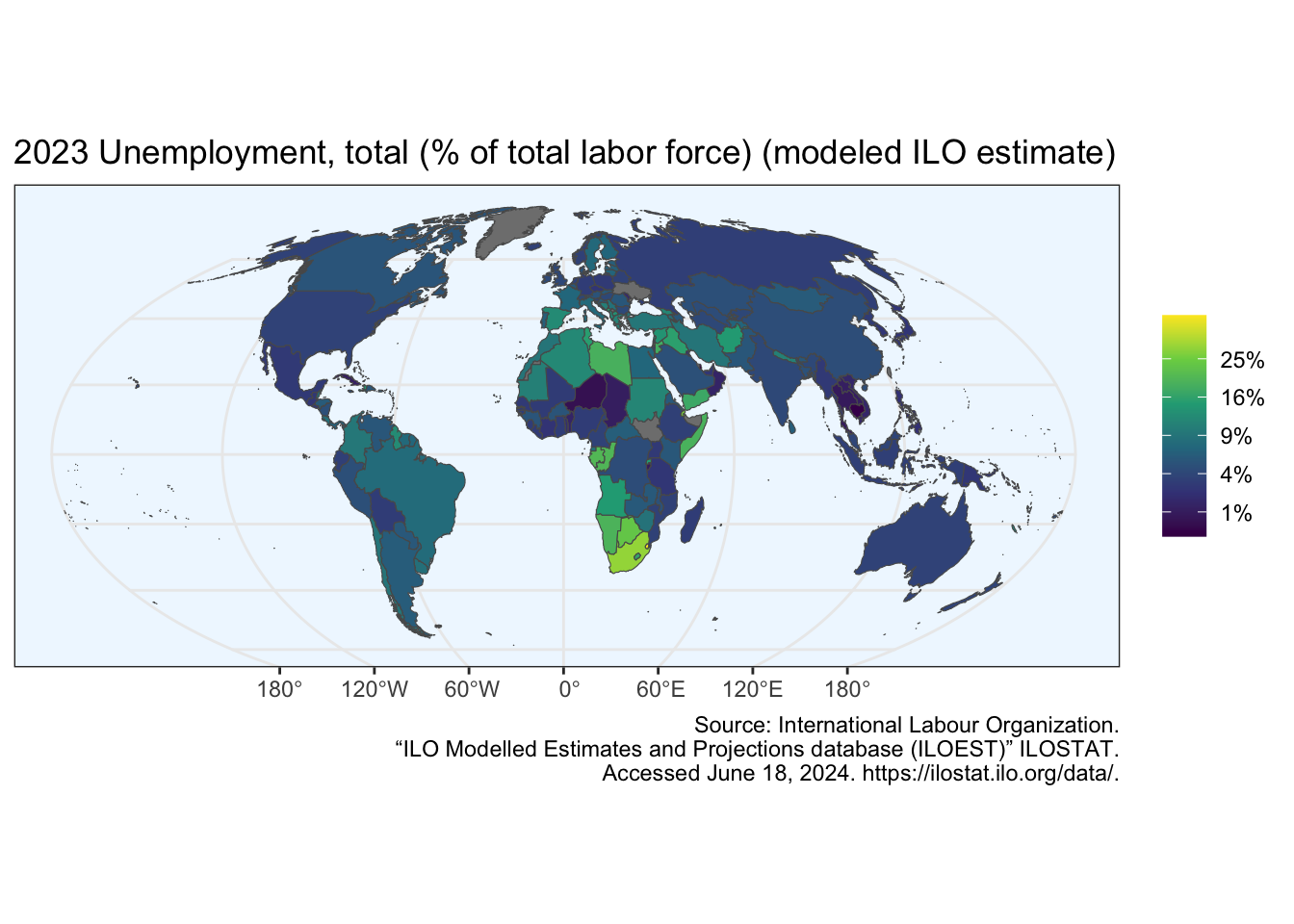
The two data frames are joined by the ISO-alpha3 codes that have different names in the two datasets.
The scale_fill_viridis() function is designed to be perceived by viewers with common forms of colour blindness. We have used the ggplot2::scale_fill_viridis_c() function, and applied the “trans” argument to specify the “sqrt” transformation. We have also adjusted the “breaks” argument accordingly.
Without splitting the caption text it would be too long to fit into one line.
To zoom on a specific area, you need to know its coordinates, i.e., its bounding box. You can’t determine the exact coordinates from the world map because the graph is too coarse. OpenStreetMap has a nice tool to get the coordinates of a specific bounding box.
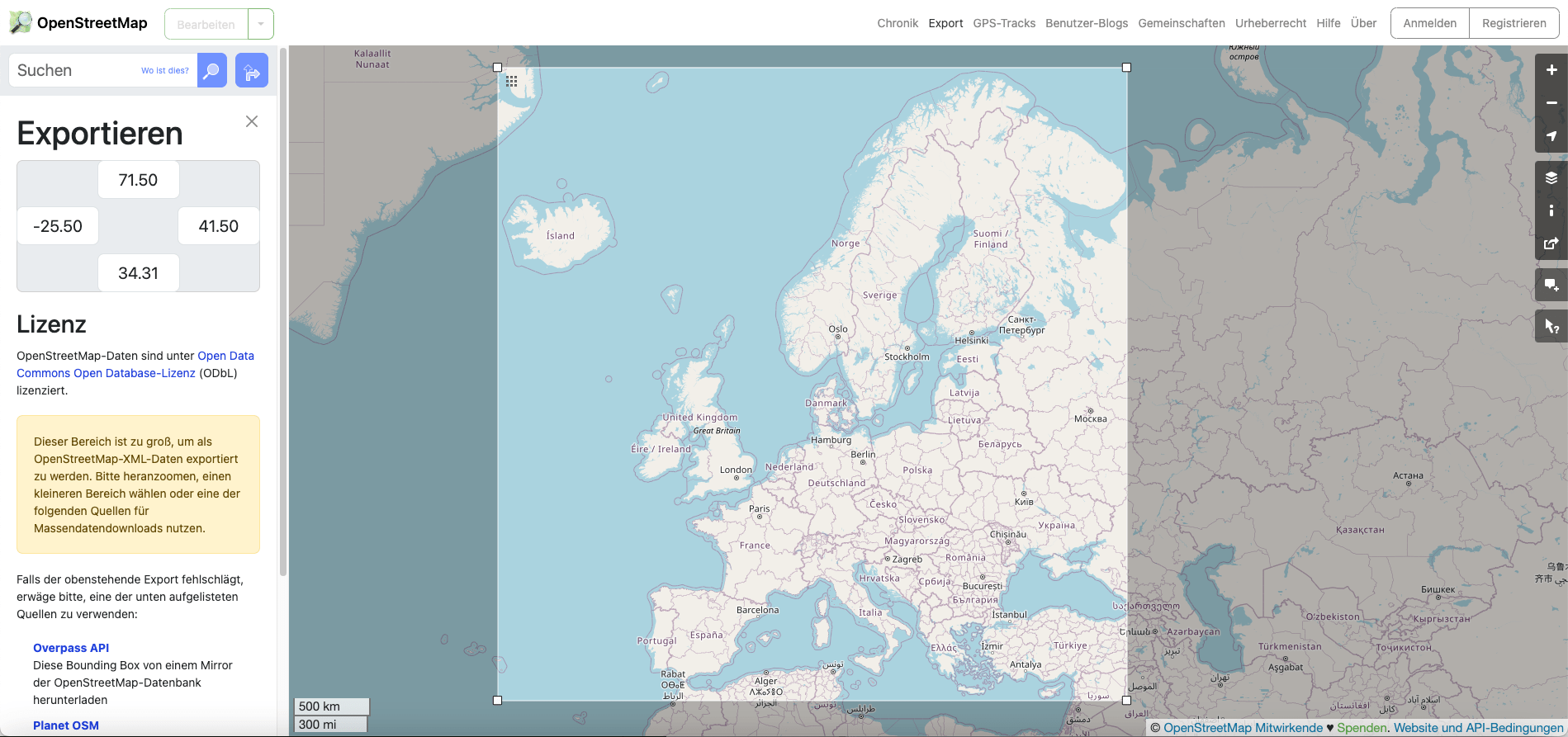
The coordinates for my bounding box which I have drawn manually with the cursor on the world map are written in the gray box on the left pane: Starting from the top clockwise: 71.5, 41.5, 34.31, -25.5 they represent latitude and longitude and can be used in the R code. (Before I could draw the bounding box I had to click the link under the gray bounding box in the left pane saying “Choose another area manually”1.)
I didn’t know how to get maps from continents, such as Europe, for a long time. It was relatively easy for Africa to sort by country names. However, this strategy did not work for Europe, where, for instance, France and Great Britain still have several overseas territories (see: What is a country?).
Now, I have learned that the trick is to zoom in and clip the relevant part of the world map downloaded via Natural Earth (see also Making Maps in R, chapter 23 of the open source book “Working in R” (Soulé, Halbritter, and Telford 2024).
R Code B.12 : Zooming into a area manually specified
window_coord <- sf::st_sfc(
    sf::st_point(c(-24.5, 34.31)),  # left, bottom
    sf::st_point(c(41.5, 71.5)),    # right, top
    crs = 4326 # the EPSG identifier of WGS84 (used in GPS)
    )

window_coord_sf <- window_coord |>
    sf::st_transform(crs = target_crs) |>
    sf::st_coordinates() # retrieve coordinates
R Code B.13 : Show map of Europe (first version)
world_moll |>
    dplyr::left_join(df, by = c("adm0_a3" = "iso3c")) |>
    ggplot2::ggplot() +
    ggplot2::geom_sf(ggplot2::aes(fill = SL.UEM.TOTL.ZS)) +

    ## window of the map
    ggplot2::coord_sf(
        xlim = window_coord_sf[, "X"],
        ylim = window_coord_sf[, "Y"],
        expand = FALSE
        ) +

    ggplot2::scale_fill_viridis_c(
    trans = "sqrt",
    labels = scales::percent_format(scale = 1),
    breaks = c(1:5)^2
    ) +

    ## fix labels not needed: https://stackoverflow.com/a/60733863

    ggplot2::theme_bw() +
    ggplot2::theme(
        panel.background = ggplot2::element_rect(fill = "aliceblue"),
        aspect.ratio = 3/4
        ) +
    ggplot2::labs (
        title = paste(unique(df$date), indicator_info$indicator),
        fill = NULL,
        caption = paste0("Source: ",
            stringr::str_split_i(indicator_info$source_org, "\\. ", 1),
            ".\n",
            stringr::str_split_i(indicator_info$source_org, "\\. ", 2),
             ".\n",
            stringr::str_split_i(indicator_info$source_org, "\\. ", 3),
            ". ",
             stringr::str_split_i(indicator_info$source_org, "\\. ", -1)
        )
    )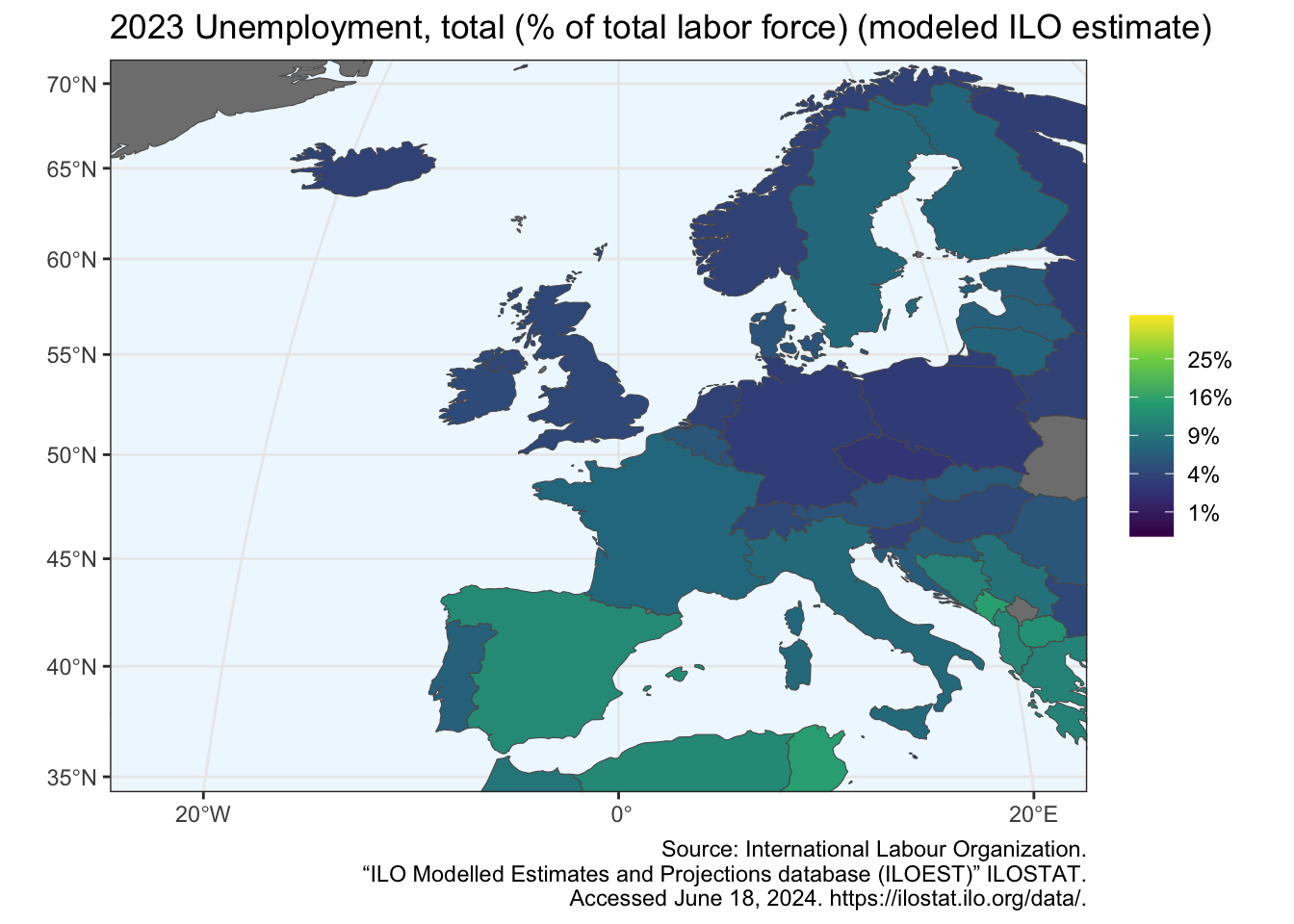
To get a graphic with more width I have changed the aspect ration slightly form 1 to aspect.ratio = 3/4.
There are no data (NA) for the unemployment ratio available for Ukraine and Kosovo. These two countries are therefore colored grey.
In the 2020 dataset used by the blog article I am referring here, there was the unemployment rate quite different. Especially the very low in Greenland and the very high in the African countries distorted the visual outcome. The extreme yellow and dark blue color with the highest and lowest percentage was not within the European countries.
We will therefore remove the African countries and Greenland. We will also reduce our data to European countries only. So now the extreme yellow and dark blue color will be the highest and lowest percentage within the European countries. We will also remove the square root transformation (the square root transformation can be misleading for some audience).
R Code B.14 : Show map of Europe (second version)
world_moll |>
    dplyr::left_join(df, by = c("adm0_a3" = "iso3c")) |>
    dplyr::filter(continent == "Europe") |>
    ggplot2::ggplot() +
    ggplot2::geom_sf(ggplot2::aes(fill = SL.UEM.TOTL.ZS)) +

    ## window of the map
    ggplot2::coord_sf(
        xlim = window_coord_sf[, "X"],
        ylim = window_coord_sf[, "Y"],
        expand = FALSE
        ) +

    ggplot2::scale_fill_viridis_c(
    # trans = "sqrt",
    labels = scales::percent_format(scale = 1) #,
    # breaks = c(1:5)^2
    ) +

    ## fix labels not needed: https://stackoverflow.com/a/60733863

    ggplot2::theme_bw() +
    ggplot2::theme(
        panel.background = ggplot2::element_rect(fill = "aliceblue"),
        aspect.ratio = 3/4
        ) +
    ggplot2::labs (
        title = paste(unique(df$date), indicator_info$indicator),
        fill = NULL,
        caption = paste0("Source: ",
            stringr::str_split_i(indicator_info$source_org, "\\. ", 1),
            ".\n",
            stringr::str_split_i(indicator_info$source_org, "\\. ", 2),
             ".\n",
            stringr::str_split_i(indicator_info$source_org, "\\. ", 3),
            ". ",
             stringr::str_split_i(indicator_info$source_org, "\\. ", -1)
        )
    )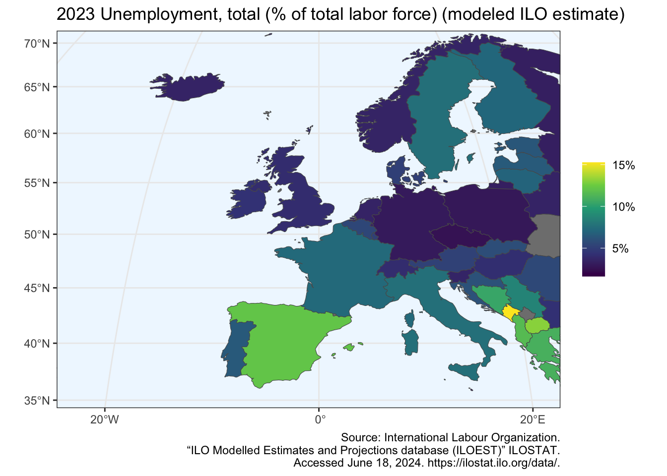
The result surprised me. The graphic of the unemployment rate for Europe is now quite different. As the article by (FelixAnalytix 2023) correctly wrote:
… we see here a comparison of unemployment between European countries only, while in the previous plot (Graph B.6 in my article) we were using global data on unemployment. Spain and Baltic countries are popping up much more, while it was less the case when using a scale based on global world unemployment.
or similar: The text in my page was in German: “Einen anderen Bereich manuell auswählen”.↩︎