4 Lab 1 Introductory Material
4.1 Background
4.1.1 APIs
APIs (Application Programming Interfaces) are powerful tools for data analysis and landscape ecology. Many databases (both in and outside of science) use APIs, both publicly accessible and private, to serve data to end users or for website. You may have heard about the controversy a year or so ago where Reddit changed the rules for third party apps to use its API. In this course, we will use APIs to access public data, including in our first lab.
Many important datasets for landscape ecology are hosted using APIs including:
Remote Sensing Data: APIs from platforms like NASA, ESA, and Google Earth Engine provide access to satellite imagery (e.g., Landsat, MODIS, Sentinel), enabling analyses of land cover, vegetation health, and environmental change.
Biodiversity Databases: APIs like GBIF (Global Biodiversity Information Facility) allow landscape ecologists to access species occurrence data for large-scale biodiversity studies.
Climate and Weather Data: APIs from NOAA, OpenWeatherMap, or Copernicus Climate Data Store provide real-time and historical climate data for analyzing ecological patterns influenced by temperature, precipitation, and extreme events.
Some of these are easier to use than others. Some have R packages or other tools that enable access, or a web interface to access the API.
Benefits of APIs:
Allows for querying and downloading subsets of data instead of downloading entire datasets which can be enormous in landscape ecology, especially satellite data.
Can create reproducible scripts with a workflow that can be scaled up.
Unlike static data releases, many are automatically updated in real time or with a short lag meaning that you can often get very recent data for things like weather data.
Downsides of APIs:
Workflow with API queries can sometimes be a lot slower than just copying a whole database if it is small enough to read into R or Python.
APIs generally have rate limits that can slow your workflow down. They generally will publish these rules, but from experience some APIs will cut off the data flow even if you follow their rules!
If there aren’t already packages and tools for interfacing with the API, you will have to learn how to work in data formats you may be unfamiliar with such as JSON.
APIs get updated or deprecated and your scripts may break in the future.
4.1.2 GBIF
The exercise will first go through the steps of downloading species occurrence data for one species from GBIF, the Global Biodiversity Information Facility, which includes species records from museums, community science platforms, and other datasets. The data will be accessed using an API (Application Programming Interface), allowing for download directly into the R session. The code will then present a few example maps and mapping packages, which you are free to adapt or modify as you see fit. You should also feel free to complete the exercise using different methods that you are more comfortable with, but this will not be treated as a criterion for assessment.
4.2 Coding Walkthrough
4.2.1 Package Installation
Packages in R contain pre-written functions to expand the functionality of base R. Your base R installation will contain a number of common functions, but many advanced data manipulation functions, statistics, and analyses require third-party packages. These must be installed (one time) and then loaded into your R session (each time used).
First, we will bring in any required packages for our first exercise. You can either install packages using the RStudio interface or using the install.packages() function such as install.packages(‘rgbif’) to install the R package used to interface with the GBIF API.
At the beginning of your own .rmd file, you will need to bring these packages in to your R session in order to use functions from these packages.
library(rgbif) #Package for accessing GBIF API
library(ggplot2) #Plotting library
library(maps) #Basemap library
library(hexbin) #Hexbin for plotting
library(ggthemes) #Themes for plotting
library(gganimate) #Animation library for ggplot
library(gifski) #GIF-making library
Another way to do this is to create a list of needed packages that are installed if missing:
### Install all required libraries
req.libraries <- c("rgbif", "ggplot2", "maps", "hexbin", "ggthemes") #List of desired packages
needed.lib <- req.libraries[!(req.libraries %in% installed.packages()[,"Package"])] #Check if they are installed already
if(length(needed.lib)) install.packages(needed.lib, repos="http://cran.rstudio.com/") #Install missing packages

### Load all required libraries at once
lapply(req.libraries, require, character.only = TRUE)
## [[1]]
## [1] TRUE
##
## [[2]]
## [1] TRUE
##
## [[3]]
## [1] TRUE
##
## [[4]]
## [1] TRUE
##
## [[5]]
## [1] TRUE4.2.2 GBIF API Data Pull
We will use the occ_data() function from the package rgbif to access the GBIF API for data. You can see the many toggles available to us for pulling data and that they are unique to this API. For these examples, we will map data for the scientificName of Hyla versicolor, or the gray treefrog. For this example pull, I will also specify stateProvince of Michigan and, importantly, specify hasCoordinate = TRUE since we only want occurrence records that have coordinates that we can map.
Since we get much more information than we need, we also have to do some cleaning of the data pull to get something simpler to work with. First, we want to (1) take the data portion of the pull and turn it into a dataframes, (2) remove occurrence records without year reported, and (3) specify what columns we want to keep out of the 100+.
IMPORTANTLY, we then save the data using write.csv() so that we have a local file for these data. We then don’t have to pull data again from the API which can be time consuming and so that our data do not change. After writing this once, we can # out the API pull code so that it won’t run each time we generate our report.
#hyla_data <- occ_data(scientificName = c("Hyla versicolor"), stateProvince = "Michigan", hasCoordinate = TRUE, limit = 20000)

#hyla_data <- as.data.frame(hyla_data$data)

#hyla_data <- hyla_data[!is.na(hyla_data$year), ]

#columns_to_keep <- c("key", "scientificName", "decimalLatitude", "decimalLongitude", "occurrenceStatus", "basisOfRecord", "gbifRegion", "stateProvince", "year", "datasetName")

#hyla_data <- hyla_data[, columns_to_keep]

#write.csv(hyla_data, file = "hyla_data.csv")
Next we can read back in our saved data to work with:
4.2.3 New R user basic functions
If you have not used R before or have limited experience, you should take the time to learn about the basic syntax and functions used in R. There are a massive number of new user tutorials online, including one by the undergrad stats department at MSU. I am also available for one-on-one teaching during my office hours and computer lab period. If you are already familiar with R, you can skim/skip this section.
4.2.3.1 Reading in data and object assignment
The line above hyla_data <- read.csv(file = “hyla_data.csv”) readings in .csv data file using the function read.csv(). The code assigns (using the syntax <-) to a new object ‘hyla_data’ the contents of the .csv file provided. Functions in R use the syntax () after the function name, which in this case is read.csv(). What goes in the () depends on the function and you can see what is expected by the function by entering ?read.csv into the console.
For example another function is head(), which prints the head (or top few rows) of your data. So, we can put our assigned object hyla_data between the () as code and execute this new function:
##   X        key                scientificName decimalLatitude decimalLongitude
## 1 1 4096485627 Hyla versicolor LeConte, 1825        42.99541        -85.73884
## 2 2 4096873658 Hyla versicolor LeConte, 1825        42.99801        -85.46650
## 3 3 4091702029 Hyla versicolor LeConte, 1825        42.89141        -85.89355
## 4 4 4091660266 Hyla versicolor LeConte, 1825        42.99434        -85.73868
## 5 5 4096561705 Hyla versicolor LeConte, 1825        42.37324        -84.43604
## 6 6 4442630619 Hyla versicolor LeConte, 1825        42.30383        -83.72986
##   occurrenceStatus     basisOfRecord    gbifRegion stateProvince year
## 1          PRESENT HUMAN_OBSERVATION NORTH_AMERICA      Michigan 2023
## 2          PRESENT HUMAN_OBSERVATION NORTH_AMERICA      Michigan 2023
## 3          PRESENT HUMAN_OBSERVATION NORTH_AMERICA      Michigan 2023
## 4          PRESENT HUMAN_OBSERVATION NORTH_AMERICA      Michigan 2023
## 5          PRESENT HUMAN_OBSERVATION NORTH_AMERICA      Michigan 2023
## 6          PRESENT HUMAN_OBSERVATION NORTH_AMERICA      Michigan 2023
##                               datasetName
## 1 iNaturalist research-grade observations
## 2 iNaturalist research-grade observations
## 3 iNaturalist research-grade observations
## 4 iNaturalist research-grade observations
## 5 iNaturalist research-grade observations
## 6 iNaturalist research-grade observations
You will notice here that we have text included in the code chunk that isn’t run. These are called annotations and are specified by the # symbol. Anything after a # on a coding line will be printed as text and not code.
4.2.3.2 Selecting data
If we want to look at or use just a part of our data, we can specify which rows or columns that we want. We can do this in base R or with other packages that have more advanced functions. In base R, we can select a column from a dataframe by either selecting it’s position (i.e., column 5) or by using using $ followed by the name of the column after our named data object like so:
## [1] 2023 2023 2023 2023 2023 2023Alternatively, we can select the column using [] syntax which is used to index data. For a data matrix like our current one, we have two positions that we can index within the ‘[ ]’, the row and then the column. So if we coded ‘hyla_data[1, 5]’ it would give us the first element of the 5th column. We can also specify these rows and columns by the names in our data frame.
## [1] -85.73884## [1] 2023 2023 2023 2023 2023 20234.2.3.3 Removing NAs
In the above processing we ran:
as part of our data pre-processing. This step takes the original data, looks at the year column for missing data, selects the data that are not missing, and then overwrites the initial data object with only the non-missing data. (Phew!) This combines data selection, a logic statement, filtering, and object assignment. Let’s break that down.
First, we are specifying we want to index our data, which has two dimensions rows and columns so we use [,]
Next, we specify that we want to look at the year column for NAs so we use the is.na() function to find which
This will generate a string of TRUE and FALSE for if the year is missing. We then can invert this TRUE/FALSE logic by using !, so we are saying tell us which years a NOT missing:
Next, we want to select the rows from our dataframe without this missing data so we put these TRUE/FALSE values into our row index position within the [,]. So, all rows that have a year (TRUE) will be retained.
Finally, if we don’t assign this data to an object it will only be printed. So, again we use the assignment syntax <- to tell R to save our data to the object ‘hyla_data’. In this case, we are overwriting our original data (which has pros and cons). Alternatively, we could write it to a new object such as ‘hyla_data2’ or ‘hyla_data_noNA’ if we wanted to retain the original data file as well:
4.2.4 Creating basemaps
The packages we brought in above contain basemaps that we can use to plot our species occurrence data on top of. Here, we are saying we want a US county map that I have centered around Michigan with the x limit for our longitude range and y limit for our latitude range around the state. We also specify the colors we want for our map.
michigan <- ggplot() +
  borders("county", colour = "gray85", fill = "gray80", xlim = c(-89, -82), ylim = c(41.5, 48)) +
  theme_map()
michigan
We can also create world and U.S. basemaps in the same way. You can use these basemaps for your portion of the exercise.
4.2.5 Plotting Occurrence Data
We can now plot our point data (a vector type) for the occurrence of Hyla versicolor in GBIF across Michigan. Just as we used ‘+’ to layer maps in the previous exercise, we can layer points using geom_point() on top of our basemap, specifying the data source hyla_data and that our aes() or aesthetic uses the column decimalLongitude for the x data and the column decimalLatitude for the y data. We can also specify the size of our points using size = .
We can layer on still more commands by specifying the title we want and the text size of that title.
michigan +
    geom_point(data = hyla_data, aes(decimalLongitude, decimalLatitude), size = 5) +
    labs(title = 'GBIF Michigan Hyla versicolor') +
  theme(plot.title = element_text(size=28))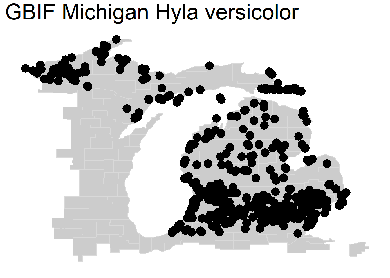
Although our data here are accurate, you can see a common issue with mapping in landscape ecology where you have many overlapping points that make it difficult to see the actual density of the data. We call this overplotting. Next, we will go over four (of many) strategies to better visualize overlapping data.
4.2.5.1 Changing Transparency or Symbology
The most basic change we can make to address overplotted is to alter transparency by specifying the argument ‘alpha =’ within our geom_point() function, where 0 is fully transparent and 1 is fully opaque. Depending on the point density, this can help us visualize areas of greater or lesser species observation density:
michigan +
    geom_point(data = hyla_data, aes(decimalLongitude, decimalLatitude), size = 5,
               alpha = .4, color = "purple"
               ) +
    labs(title = 'GBIF Michigan Hyla versicolor') +
  theme(plot.title = element_text(size=28))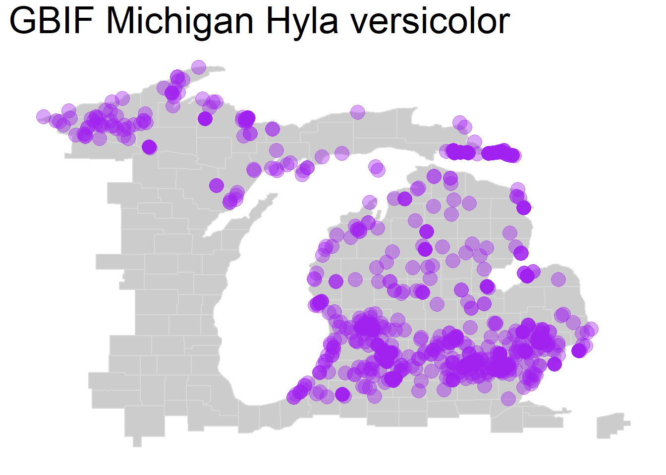
We can also change ‘shape =’ within our geom_point() function for a shape that shows overlap better such as X’s or open circles, either doing this alone or in combination with our alpha change:
michigan +
    geom_point(data = hyla_data, aes(decimalLongitude, decimalLatitude), size = 5,
               alpha = 0.5, color = "purple", shape = 21
               ) +
    labs(title = 'GBIF Michigan Hyla versicolor') +
  theme(plot.title = element_text(size=28))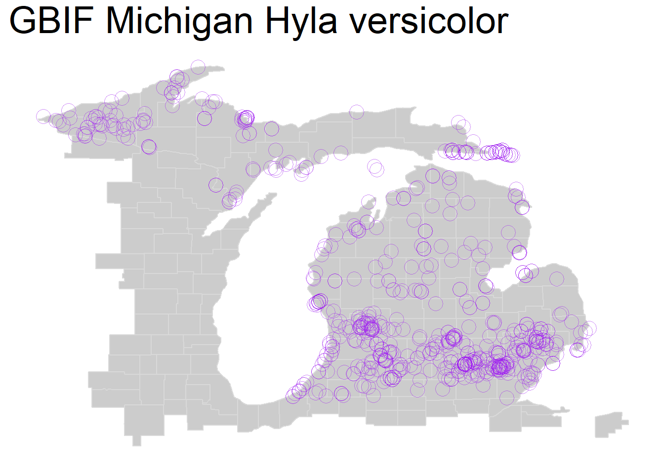
4.2.5.2 2D Density Plot
One is to bin the data and instead plot the density as opposed to each individual point. Here, we do this with geom_bin2d(). Note that here instead of point size we specify the number of bins = . If you increase the number of bins, then you will get smaller bins and vice versa. If you use this method then you can adjust the bin size for one that makes sense for your occurrence data for visualization.
We also specify the color ramp, in this case the commonly used color-blind friendly palette viridis.
michigan +
    geom_bin2d(data = hyla_data, aes(decimalLongitude, decimalLatitude), bins = 50) +
  scale_fill_continuous(type = "viridis") +
    labs(title = 'GBIF Michigan Hyla versicolor') +
  theme(plot.title = element_text(size=28))
4.2.5.3 Hexbin Plot
A nearly identical method that many prefer visually is the hexbin plot, here using geom_hex(). For this, we will set a smaller number of bins to show how decreasing this number leads to larger areas to calculate point density.
michigan +
    geom_hex(data = hyla_data, aes(decimalLongitude, decimalLatitude), bins = 30) +
  scale_fill_continuous(type = "viridis") +
    labs(title = 'GBIF Michigan Hyla versicolor') +
  theme(plot.title = element_text(size=28))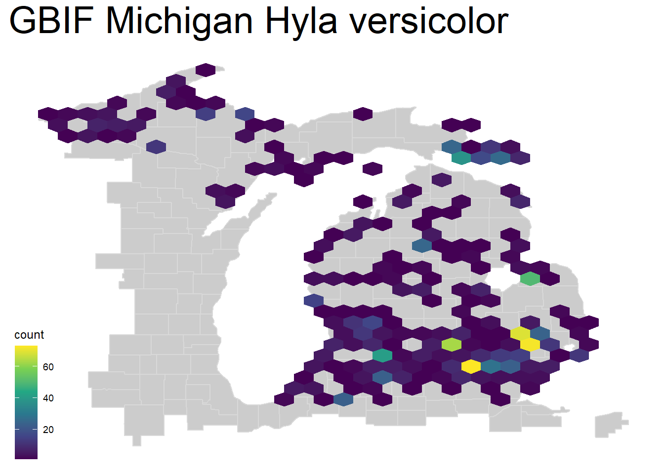
4.2.5.4 Contour Plot
We can also create a density contour map using geom_density_2d_filled(). You can note some immediate issues with this style of map, greatest of all that there are no units to the density:
michigan +
    geom_density_2d_filled(data = hyla_data, aes(decimalLongitude, decimalLatitude), bins = 30, alpha = 0.5) +
    labs(title = 'GBIF Michigan Hyla versicolor') +
  theme(plot.title = element_text(size=28)) + theme(legend.position="none")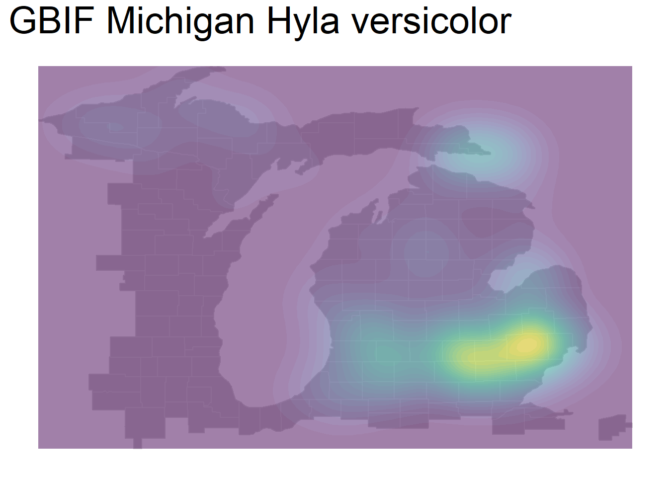
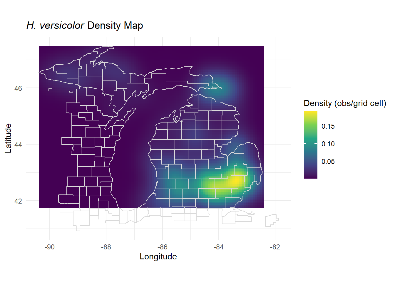
You can explicitly calculate the density per area across an area by estimating the kernel density of your species observations. Kernel density estimation creates a smoothed approximation of distributions, generating a continuous surface. The pre-installed MASS package has the simplest execution of a 2D normal kernel with few parameters to change. There are more advanced packages and techniques for this such as in the spatstat package, and others.
density_est <- MASS::kde2d(hyla_data$decimalLongitude, hyla_data$decimalLatitude,
                          n = 100 # Number of grid points
                          )

density_df <- as.data.frame(as.table(density_est$z))
colnames(density_df) <- c("longitude", "latitude", "density") #Rename columns

# Map density to geographic space
density_df$longitude <- density_est$x[density_df$longitude]
density_df$latitude <- density_est$y[density_df$latitude]

# Plot with density levels in species density units
ggplot(density_df, aes(x = longitude, y = latitude, fill = density)) +
  geom_tile() + # Use tiles for rasterized density display
  scale_fill_viridis_c(name = "Density (obs/grid cell)") +
  coord_fixed() +
  theme_minimal() +
  borders("county", colour = "gray85", fill = NA, xlim = c(-89, -82), ylim = c(41.5, 48)) +
  labs(
    title = expression(paste(italic("H. versicolor"), " Density Map")),
    x = "Longitude",
    y = "Latitude"
  )
4.2.5.5 Animated Occurrence Plot
THIS WILL NOT WORK FOR A PDF AND IS JUST FOR ILLUSTRATION! This will work for HTML publishing, however.
Finally, we can also plot occurrences through times using an animation. NOTE: Making an animation will be optional here but can be a useful skill to learn if you are up for a challenge. You can actually animate nearly any kind of plot, not just maps!
We will again use geom_point() for plotting points, but we will change the alpha = to a value below 1, which decreases point opacity.
We specify that we want transitions between frames, transition_reveal() of our animation to be based on year observed. We also specify that each point is unique by specifying group = the unique identifier named key in our data. Finally, we indicate that we want the title for each frame of our animation to be our year. This whole object called ani_hyla is our set of frames that we want to animate.
Next, we use the animate() function to animate our above plot, specifying the pixel height and pixel width of the animation. You may need to change these proportions depending on what makes sense for your map. Finally, we specify that we want to render it as a gif using the gifski_renderer().
ani_hyla <- michigan +
  geom_point(data = hyla_data,
             aes(decimalLongitude, decimalLatitude, group = key), color = 'dark green', size = 5, alpha = 0.4) +
  transition_reveal(year) +
  labs(title = '{(frame_along)}') +
  theme(plot.title = element_text(size=48))

animate(ani_hyla, height = 800, width = 800, renderer = gifski_renderer())