7 Lab 2 Introductory Material
7.1 Background
7.1.1 1. Overview of Spatial Data
Almost all models and analyses in landscape ecology have a spatial component. While sometimes space may be abstracted and considered implicitly, typically we explicitly represent the arrangement and distribution of landscape features, species observations, and ecological events. To do this, we need to work with spatial data, which comes in two general forms:
- Vector data
- Raster data
Each format has pros and cons, and as with many real-world questions may come down to the format of your data source. For example, you may be working with satellite imagery which will be represented by image pixels, a raster format. There is a saying that “raster is faster but vector is corrector” meaning that the delineations of vector data are more accurate (if defined properly) but that computationally raster data can be a lot faster, which you may find necessary when doing complex spatial modeling.
7.1.2 2. Vector Data
Vector data represents spatial features geometrically in three ways:
7.1.2.1 Types of Vector Data
- Points
- Represent discrete locations in space (e.g., tree locations, weather stations).
- Defined by a single pair of coordinates (e.g., latitude and longitude).
- Lines (or polylines)
- Represent linear features (e.g., roads, rivers, or animal movement paths).
- Composed of connected points (i.e., not just a straight line, it can be a series of line segments of any complexity but are not closed)
- Polygons
- Represent areas with defined boundaries (e.g., lakes, forest patches, or land use zones).
- Formed by a closed sequence of points.
7.1.2.2 Advantages of Vector Data
- High precision and accuracy for representing boundaries.
- Efficient for attribute-based queries.
- Scaleable across multiple resolutions without loss of detail. i.e., you can keep zooming in and a vector will never become “pixelated”.
7.1.2.3 Limitations of Vector Data
- Computationally intensive for complex shapes. E.g., a shape with 1000 vertices will take longer to perform analyses on than a simple square.
- Less suited for continuous surface representation (e.g., temperature or soil moisture gradients). For example, each polygon will have a single value per variable assigned to it.
7.1.3 3. Raster Data
Raster data represents spatial information as a grid of cells, where each cell holds a value corresponding to a specific attribute (e.g., elevation, vegetation index, or satellite band reflectance value).
7.1.3.1 Characteristics of Raster Data
- Grid structure with rows and columns.
- Each cell has a uniform size and shape (typically square).
- Well-suited for continuous data, such as elevation, temperature, or land cover classification.
7.1.4 4. Coordinate Systems and Datums
Spatial data requires accurate positioning within a reference system. This is achieved using:
7.1.4.1 Datums
A datum defines the geometric shape of the Earth and serves as a base for measuring locations. - Most common examples: WGS84 (most global datasets) and NAD83 (many US government datasets).
7.1.4.2 Coordinate Reference Systems (CRS)
CRS describes how coordinates map to locations on the Earth’s surface. It has two components:
A datum, which is the mathematical model used to approximate the Earth’s shape, and which can be an ellipsoid for global use (WGS84) or optimized for local use like the North American Datum 1983 (NAD83).
A projection: Method of representing the 3D surface of the Earth in two dimensions.
7.1.5 EPSG Codes
- EPSG codes uniquely identify a specific CRS. So, one code defines both parts of the CRS.
- E.g., EPSG:4326 refers to WGS84 in geographic coordinates (latitude and longitude).
- Many (all?) R packages will use EPSG codes when you are defining your CRS and transforming between CRS.
7.1.5.1 Common EPSG Codes
Most data you encounter will be in WGS84 and/or NAD83 format in the U.S., but can sometimes be fine tuned to states or regions (e.g., NAD83 / Alaska Albers). If you work in other countries or other regions of the world, you may have to consider their local CRS usage.
| Region | EPSG Code | Name | Description |
|---|---|---|---|
| Global | 4326 | WGS 84 | Geographic coordinates in latitude and longitude. |
| Global | 3857 | Web Mercator | Popular for web mapping applications. |
| USA | 4269 | NAD 83 | Commonly used in the USA for regional mapping. |
| USA | 5070 | NAD 83 / Conus Albers | Equal-area projection for the contiguous United States. |
| Europe | 4258 | ETRS89 | Standard for Europe, based on WGS84 but more region-specific. |
7.1.6 Point Process Models
Point process models are statistical models used to describe random events or points that occur in space or time. Our “default” null model are points generated through a homogenous Poisson process. A homogenous Poisson process allows us to set the intensity (λ), or, the number of points per unit area. When we say that the process is “homogeneous” we just mean that λ is constant. By default, many functions will use the intensity of your data in the homogenous Poisson process but you can also set it yourself.
This is distinct from a uniform random process across the X and Y dimensions since the number of points in the region is treated as a random variable that follows a Poisson distribution. Often in ecology, there is an underlying random process to organism/species presence as well as ecological events. The Poisson point process adds some uncertainty around the point generating process. In other words, natural variation in the real world generally has random variation in both location and numbers of individuals/species/events.
A homogenous Poisson process is the default (but not always best) null model in landscape ecology.
| Model | Definition | Key Characteristics | Typical Usage in spatstat |
|---|---|---|---|
| Homogeneous Poisson Process | A point process with a constant intensity (rate) of events over space (or time). | - Events occur independently of each other. - Constant rate \(\lambda\). - The number of points in any region follows a Poisson distribution with mean \(\lambda \times \text{area}\). |
- Fitted in spatstat using ppm() with no trend and no interaction. Example: ppm(pointpattern ~ 1) |
| Non-Homogeneous Poisson Process | A point process with an intensity (rate) function \(\lambda(x)\) that varies over space (or time). | - Events still occur independently. - Rate \(\lambda(x)\) depends on spatial location \(x\). - Flexible for modeling intensity based on covariates or spatial trends. |
- Fitted in spatstat using ppm() with a trend formula or covariates. Example: ppm(pointpattern ~ covariate1 + ...) |
| Gibbs Point Process | A point process where points interact, allowing for clustering or repulsion. | - Events are not independent. - Interaction can be described by pairwise or higher-order potentials. - Can capture inhibition or aggregation effects. |
- Fitted in spatstat via ppm() using an interaction function (e.g., Strauss(), StraussHard(), Matexpo()). |
| Cox (Doubly Stochastic) Process | A Poisson process with a random (stochastic) intensity function. The intensity itself is drawn from some underlying stochastic process. | - Conditional on the random intensity, the process is Poisson. - Captures extra variability where the rate field is itself random. - Often modeled via Gaussian random fields or other. |
- Fitted in spatstat using kppm() (cluster or Cox models). Example: kppm(pointpattern ~ 1, cluster="Thomas"). |
7.1.7 Introduction to Gibbs Models
A Gibbs point process is a flexible statistical model used to analyze spatial point patterns where interactions between points are of interest. Unlike simpler models like the homogeneous or inhomogeneous Poisson process, Gibbs models account for dependence between points, such as clustering or inhibition.
7.1.7.1 Key Features of Gibbs Models
- Point Interactions:
- Gibbs models incorporate interaction terms that allow points to attract (cluster) or repel (inhibit) each other.
- Configurational Probability:
- The probability of observing a specific point pattern depends on the configuration of points in space.
- Energy Function:
- Gibbs models are defined by an energy function that quantifies the cost or likelihood of a specific point configuration.
7.1.7.2 Common Types of Gibbs Models
- Poisson Process:
- A special case of a Gibbs model where there are no interactions between points (independent).
- Strauss Process:
- Introduces pairwise interactions between points.
- Points within a specified distance \(r\) interact, influencing clustering or inhibition.
- Hardcore Process:
- Imposes a minimum distance between points, resulting in inhibition.
- Softcore Process:
- Models interactions between points that decrease smoothly with distance.
- Unlike the Hardcore process, points can occur close together, but their interaction intensity diminishes as the distance between them increases.
7.1.7.3 Applications of Gibbs Models in Ecology
- Studying species distributions influenced by competition or facilitation.
- Analyzing habitat preferences in relation to environmental covariates.
- Investigating clustering of disease cases.
7.1.7.4 Components of a Gibbs Model
- Interaction Function:
- Describes how points interact within a specified distance.
- Covariates:
- Environmental factors or marks that influence the intensity of the point process.
- Fitted Intensity:
- The predicted density of points based on the model.
7.2 Coding Walkthrough
7.2.1 Point pattern model worked example
The spatstat package in R is a behemoth of 3000+ functions for point pattern modeling. We can only scratch the surface in our tutorial but I will work through one example using data within the package as well as some other environmental data. You may want to start installing this package on your own computer while you read through the rest of the tutorial since it takes a bit of time to install all the dependencies …Zzz.
The lansing dataset in the spatstat package represents the spatial locations of trees of different species in Lansing Woods. It is a classic dataset for exploring point pattern analysis in ecology. This data was collected by Douglas Gerrard of MSU in the 1960s.
## Marked planar point pattern: 2251 points
## Multitype, with levels = blackoak, hickory, maple, misc, redoak, whiteoak
## window: rectangle = [0, 1] x [0, 1] units (one unit = 924 feet)
species_colors <- c("red", "blue", "green", "black", "orange", "purple") # Define colors for the 6 species
plot(lansing, main = "Lansing Woods: Spatial Distribution of Tree Species", cols = species_colors)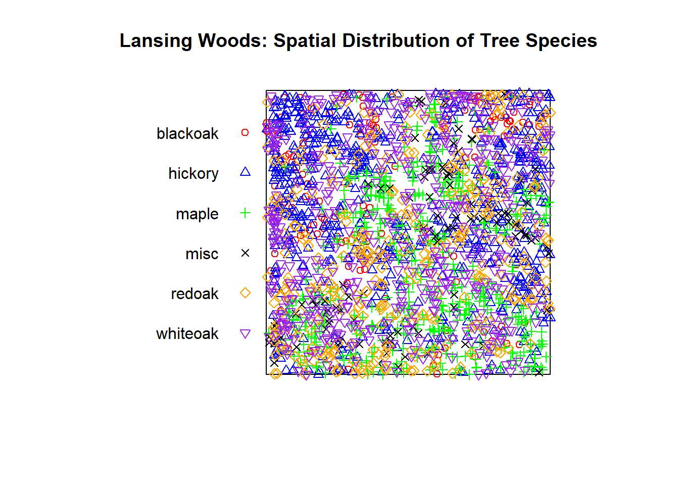 You can see that this is a dataset of the locations of 2,251 trees in Lansing Forest in
 planar point pattern (or ppp) format with 5 species (+ miscellaneous). You can also see the defined window (or spatial area), here abstracted into the bounds of 0 to 1 in both the x and y dimensions.
7.2.1.1 Inspect the Data
We can then look at summary statistics of the data and see the proportion of each species in our spatial extent and the intensity, which is equal to frequency since the bounds of our area are 1 by 1:
## Marked planar point pattern:  2251 points
## Average intensity 2251 points per square unit (one unit = 924 feet)
##
## *Pattern contains duplicated points*
##
## Coordinates are given to 3 decimal places
## i.e. rounded to the nearest multiple of 0.001 units (one unit = 924 feet)
##
## Multitype:
##          frequency proportion intensity
## blackoak       135 0.05997335       135
## hickory        703 0.31230560       703
## maple          514 0.22834300       514
## misc           105 0.04664594       105
## redoak         346 0.15370950       346
## whiteoak       448 0.19902270       448
##
## Window: rectangle = [0, 1] x [0, 1] units
## Window area = 1 square unit
## Unit of length: 924 feet
7.2.1.2 Visualize Patterns for One Species
Let’s pick one species to look at, hickory, to do a single species analysis. I’ve also added some extra options to the top of the coding chunk to specify figure dimension output since I was asked this the previous week. Here, I am manually setting the height and width to be 5 by initiating the chunk with {r, fig.width = 5, fig.height = 5}.
# Extract only the hickory tree points
hick_split <- split(lansing)$hickory
# Create a ggplot of the point pattern
ggplot() +
geom_point(data = as.data.frame(hick_split), aes(x = x, y = y), color = "darkgreen", alpha = 0.7) +
theme_minimal() +
labs(
title = "Lansing Woods Hickory Trees",
x = "X Coordinate",
y = "Y Coordinate"
)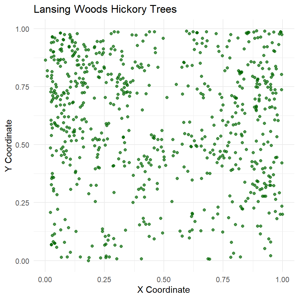 These appear pretty random, but are they actually distributed different from complete spatial randomness (CSR)?
7.2.2 2. Testing for Complete Spatial Randomness (CSR)
7.2.2.1 Quadrat Test
One way to test CSR is with the quadrat.test method in spatstat, which looks to see if quadrats differ from CSR based on chi-square (test statistic based) or Monte Carlo tests (simulation based). We will perform the default chi-square version below:
First, let’s turn Lansing Woods into a grid of tiles that represent quadrats of the total spatial extent. We can set our total quadrats in both the x (nx) and y (ny) dimensions.
# Split Lansing Woods into 4x4 quadrats
hick_quad <- quadratcount(hick_split, nx = 4, ny = 4)
hick_quad
## x
## y [0,0.25) [0.25,0.5) [0.5,0.75) [0.75,1]
## [0.75,1] 101 48 30 67
## [0.5,0.75) 75 35 28 61
## [0.25,0.5) 40 37 30 60
## [0,0.25) 26 23 18 24# Split Lansing Woods into 4x4 quadrats
plot(hick_split, main = "4x4 Quadrats of Hickory Trees") # Plot points of hickory trees
plot(hick_quad, add = TRUE, cex = 2, col = "blue") # Plot counts (observed intensities) in each quadrat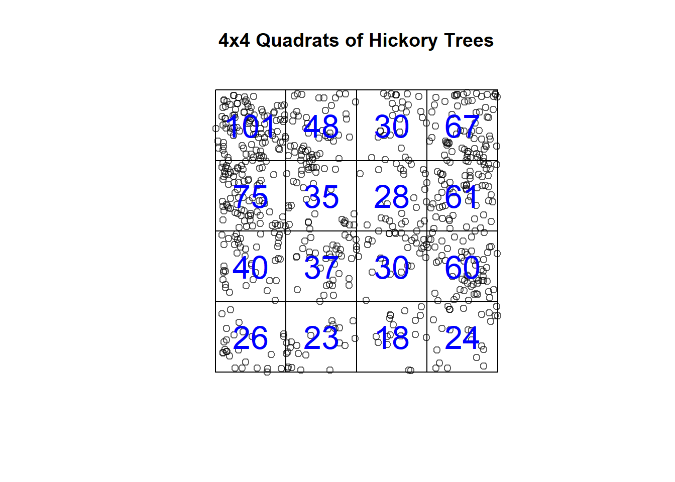
The question is: Are the counts in these quadrats CSR, regularly distributed, or clustered? The default settings are a two-sided test just looking to see if they deviate from CSR, but for your own work you may want to look at only one of the alternative hypotheses.
# Test CSR using quadrat counts
qt <- quadrat.test(hick_quad) # Fit quadrat model with 4x4 quadrats
qt # Print output of quadrat test
##
## Chi-squared test of CSR using quadrat counts
##
## data:
## X2 = 180.6, df = 15, p-value < 2.2e-16
## alternative hypothesis: two.sided
##
## Quadrats: 4 by 4 grid of tilesAs you can see, a Chi-squared test shows that, in fact, our hickory trees deviate from CSR if quadrats are defined this way. **Thought question: Would your results be the same here no matter how large your quadrats are?
That previous test was for any deviation from CSR, but we could also test explicitly for clustering:
# Test CSR using quadrat counts
qt_clust <- quadrat.test(hick_quad, alternative = "clustered") # Fit quadrat model with 4x4 quadrats
qt_clust # Print output of quadrat test
##
## Chi-squared test of CSR using quadrat counts
##
## data:
## X2 = 180.6, df = 15, p-value < 2.2e-16
## alternative hypothesis: clustered
##
## Quadrats: 4 by 4 grid of tilesWe can see that our hickory data are in fact clustered, meaning that if you ran this with “regular” as your alternative hypothesis that you wouldn’t reject the null of CSR. In practice, you would want to decide on which hypothesis test is appropriate prior to running your test.
7.2.2.2 K-Function Test
Complete Spatial Randomness (CSR) assumes that our hickory trees in Lansing Woods would follow a homogeneous Poisson process.
For example, you can create random point patterns yourself using a homogenous Poisson process usine the rpoispp function in spatstat.
In our Lansing Woods data above we had 703 hickory trees in our x 0 to 1 and y 0 to 1 window. We can create random point patterns using the homogenous Poisson as such at the same intensity:
set.seed(34598) # Set seed so that the 'random' result is the same every time
pois_hick <- rpoispp(703, win=owin(c(0,1),c(0,1))) # Set intensity to our previous hickory tree number and our same window
plot(pois_hick, main = "Homogenous Poisson Hickories") # Plot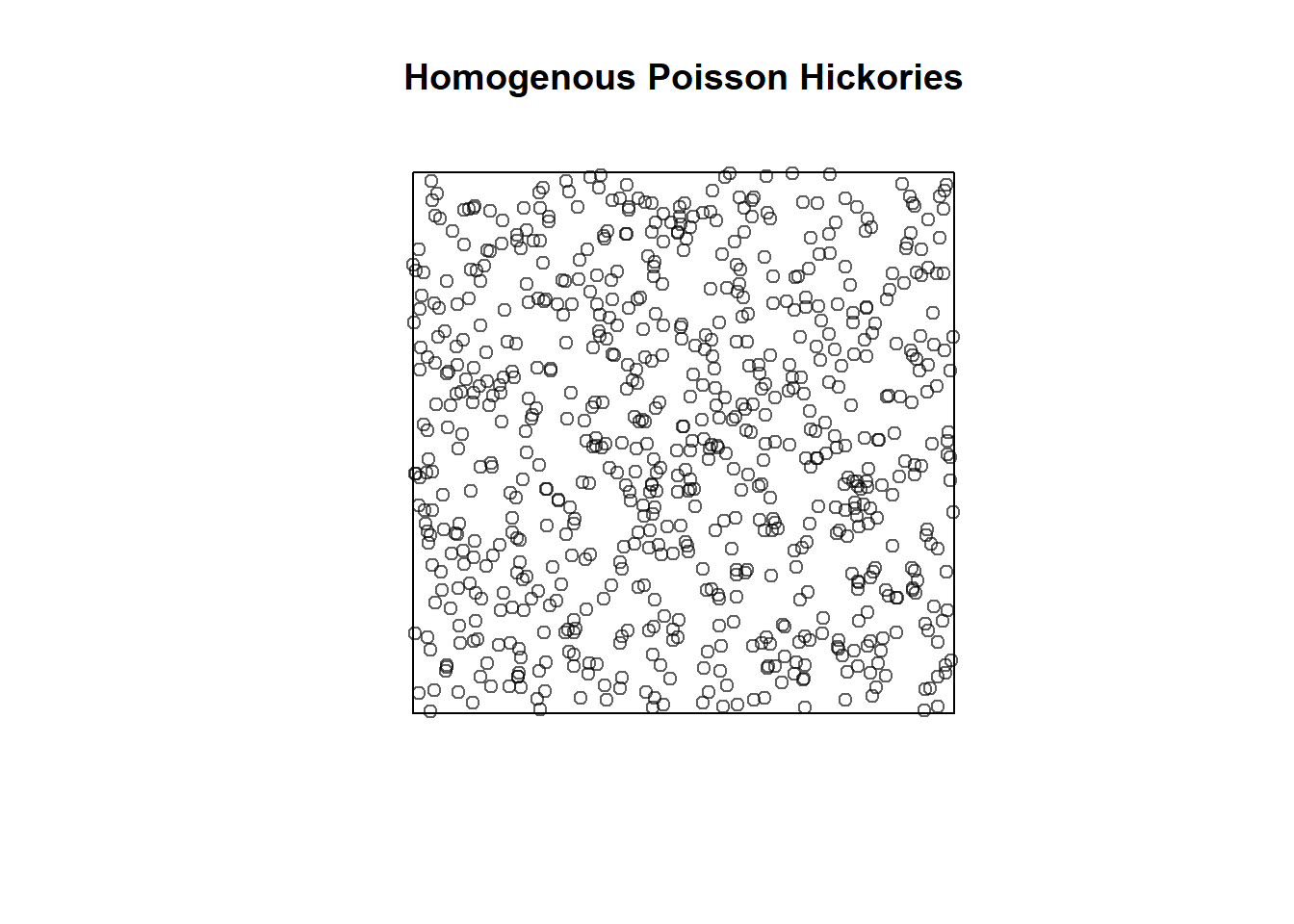
We can then calculate our (Ripley’s) K-function using the Kest() function in R for both this random data and our Lansing Woods hickory trees.
par(mfrow=c(1,2))
plot(Kest(pois_hick), main = "Homogenous Poisson")
plot(Kest(hick_split), main = "Lansing Hickory")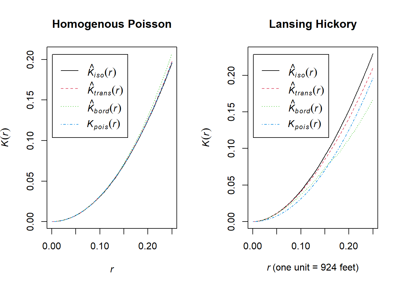 Explanation of Ripley’s K Function:
Ripley’s \(K(r)\) function is a tool for analyzing spatial point patterns over varying distances \(r\). It measures the interaction between points at a given distance, helping to identify clustering or regularity in the data.
Definition of \(K(r)\)
\(K(r)\): Expected number of points within distance \(r\) of a randomly chosen point, normalized by the intensity (average point density).
Under Complete Spatial Randomness (CSR): \[ K(r) = \pi r^2 \]
Interpretation:
\(K(r) > \pi r^2\): Indicates clustering, meaning more points are found within distance \(r\) than expected under CSR.
\(K(r) < \pi r^2\): Indicates regularity, meaning fewer points are found within distance \(r\) than expected under CSR.
For example in the above, at a search radius (r) of 0.1, you would expect a value of pi*0.1^2.
The other values are different empirical \(K(r)\) observed values from the actual data. By default, the K-function estimations generated by Kest() apply various edge corrections (since we miss points in the radius that go outside our spatial extent!).
The above shows us our observed and CSR K-functions, but it doesn’t give us a statistical test to tell us if the deviation for hickory trees is significantly different from CSR.
We can use the envelope() function to:
- Simulate many landscapes generated under CSR with a homogenous Poisson like at the beginning of this section.
- Compute the \(K(r)\)-function for each simulation.
- Produce an envelope that represents the range of \(K(r)\) values under CSR.
- Assess whether the observed \(K(r)\) deviates significantly from CSR.
Note that if you want to specify a specific edge correction you will have to do this within the envelope() function as well.
## Generating 99 simulations of CSR  ...
## 1, 2, 3, 4, 5, 6, 7, 8, 9, 10, 11, 12, 13, 14, 15, 16, 17, 18, 19, 20,
## 21, 22, 23, 24, 25, 26, 27, 28, 29, 30, 31, 32, 33, 34, 35, 36, 37, 38, 39, 40,
## 41, 42, 43, 44, 45, 46, 47, 48, 49, 50, 51, 52, 53, 54, 55, 56, 57, 58, 59, 60,
## 61, 62, 63, 64, 65, 66, 67, 68, 69, 70, 71, 72, 73, 74, 75, 76, 77, 78, 79, 80,
## 81, 82, 83, 84, 85, 86, 87, 88, 89, 90, 91, 92, 93, 94, 95, 96, 97, 98,
## 99.
##
## Done.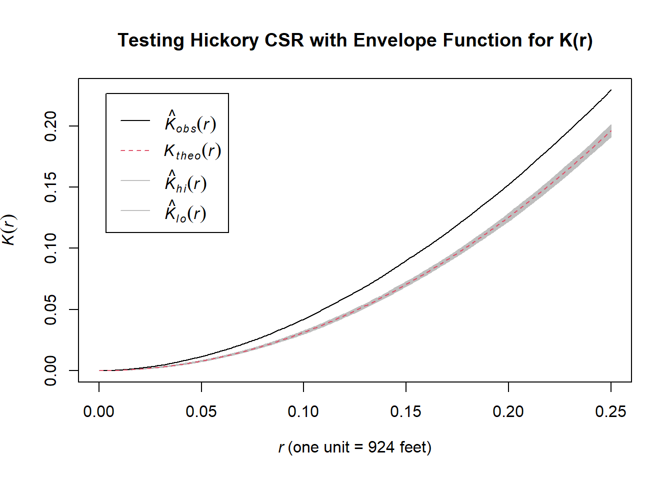
The plot produced above by the envelope() function includes an envelope with:
- Black line: Represents the observed \(K(r)\)-function for the point pattern of the actual hickory trees.
- Shaded Region (Envelope): Displays the range of \(K(r)\) values generated under the assumption of CSR (based on simulations) with the theoretical value under CSR as a red dashed line.
You can interpret the plot as follows: 1. If the observed \(K(r)\) lies outside the envelope, it indicates a significant deviation from CSR: - Above the envelope: Suggests clustering, meaning there are more points within distance \(r\) than expected under CSR. - Below the envelope: Suggests regularity, meaning points are more evenly spaced than expected under CSR. 2. If the observed \(K(r)\) lies within the envelope, it suggests the pattern is consistent with CSR.
So, both our quadrat test method and our (Ripley’s) K-function method agree that hickories are clustered nonrandomly in Lansing Woods!
7.2.3 Point Process Model with Covariates
Next, we will fit a point process model with covariates (i.e., not a homogenous Poisson). In this case, a point process dependent on environment but without interacting points (as in a Gibbs model).
7.2.3.1 Digital Elevation Model (DEM) and NLCD Land Use/Land Cover Data
Like many datasets nowadays, we can bring them directly into our R session. One such package for some federal govt data such as elevation and NLCD LULC is the FedData package. You can check out other datasets in there for your own exercise.
To import the data, we need to set the spatial extent we want the data for. This could be done using a shapefile of a known region of interest or you could create your own bounding box. This could be done either based on the range of locations of your points, or you could find some coordinates to create a bounding box – this could be as simple as finding an area of interest on Google Maps.
# Define the bounding box (xmin, ymin, xmax, ymax in degrees) around Baker Woodlot
bbox <- c(xmin = -84.479, ymin = 42.712, xmax = -84.47, ymax = 42.719)

# Create a SpatExtent object for the bounding box
bounding_extent <- ext(bbox["xmin"], bbox["xmax"], bbox["ymin"], bbox["ymax"])
Many spatial packages have different data structures than your typical R data frames. One common spatial structure are simple features which are a standard to encode spatial vector data (such as a bounding box).
# Convert SpatExtent to sf (simple features)
bounding_polygon <- as.polygons(bounding_extent)
bounding_sf <- st_as_sf(bounding_polygon)
We also need to provide the CRS we are working with. If you got the coordinates from a webmap it is likely in a WGS84 CRS but you can find this in the metadata of your data provider (hopefully!) or if you import a shapefile it will already be defined. You can check the CRS using crs().
## [1] "GEOGCRS[\"WGS 84\",\n ENSEMBLE[\"World Geodetic System 1984 ensemble\",\n MEMBER[\"World Geodetic System 1984 (Transit)\"],\n MEMBER[\"World Geodetic System 1984 (G730)\"],\n MEMBER[\"World Geodetic System 1984 (G873)\"],\n MEMBER[\"World Geodetic System 1984 (G1150)\"],\n MEMBER[\"World Geodetic System 1984 (G1674)\"],\n MEMBER[\"World Geodetic System 1984 (G1762)\"],\n MEMBER[\"World Geodetic System 1984 (G2139)\"],\n ELLIPSOID[\"WGS 84\",6378137,298.257223563,\n LENGTHUNIT[\"metre\",1]],\n ENSEMBLEACCURACY[2.0]],\n PRIMEM[\"Greenwich\",0,\n ANGLEUNIT[\"degree\",0.0174532925199433]],\n CS[ellipsoidal,2],\n AXIS[\"geodetic latitude (Lat)\",north,\n ORDER[1],\n ANGLEUNIT[\"degree\",0.0174532925199433]],\n AXIS[\"geodetic longitude (Lon)\",east,\n ORDER[2],\n ANGLEUNIT[\"degree\",0.0174532925199433]],\n USAGE[\n SCOPE[\"Horizontal component of 3D system.\"],\n AREA[\"World.\"],\n BBOX[-90,-180,90,180]],\n ID[\"EPSG\",4326]]"Next, we can download and plot the elevation data for our bounding box extent.
# Download and load DEM data
dem <- get_ned(template = bounding_sf, label = "bounding_box_dem", res = "1")
## Area of interest includes 1 NED tiles.## (Down)Loading NED tile for 43N and 85W.
We can load the NLCD data for the same extent. Note in the get_nlcd() documentation that not all years are available. Also, I was having some issues with 2021 despite it mentioning as available.
# Specify a custom directory for the downloaded data
nlcd <- get_nlcd(
template = bounding_sf,
label = "baker_woodlot_nlcd",
year = 2019, # Specify NLCD year
dataset = "landcover",
force.redo = FALSE
)
# Plot the NLCD data
plot(nlcd, main = "Baker Woodlot NLCD LULC")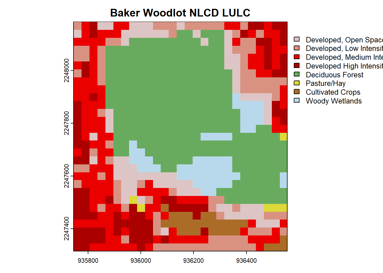 You can pretty clearly see the outline of Baker Woodlot in this NLCD map and all of the developed areas of campus.
Next, let’s bring in some real data from GBIF. If you haven’t been to Baker Woodlot in late April/early May, it is a great place to see spring ephemeral flowers that come out before the canopy fills in. Let’s bring in one species, the large white trillium, Trillium grandiflorum. GBIF also uses the WGS84 EPSG:4326, and we will assume that all constituent data are appropriately harmonized for this exercise.
trill <- occ_data(
  scientificName = "Trillium grandiflorum",  # Specify species
  hasCoordinate = TRUE,          # Ensure records have coordinates
  geometry = paste(
    "POLYGON((",
    bbox["xmin"], bbox["ymin"], ",",
    bbox["xmax"], bbox["ymin"], ",",
    bbox["xmax"], bbox["ymax"], ",",
    bbox["xmin"], bbox["ymax"], ",",
    bbox["xmin"], bbox["ymin"], "))"
  ),                             # Define bounding box. Note the 5 coordinate for closure of a polygon!
)

trill <- as.data.frame(trill$data)
We can plot these on top of our environmental rasters:
# Plot our DEM, NLCD, and Trillium data
par(mfrow=c(1,2))
plot(dem, main = "Digital Elevation Model (DEM)")
points(trill$decimalLongitude, trill$decimalLatitude)
plot(nlcd, main = "Baker Woodlot NLCD LULC")
points(trill$decimalLongitude, trill$decimalLatitude)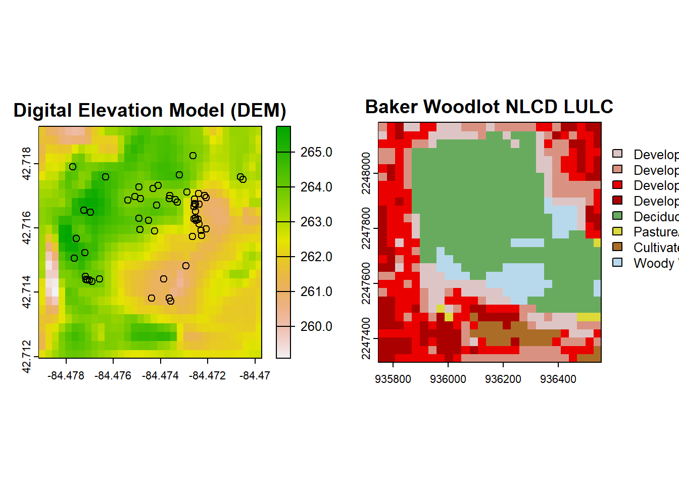
You’ll notice that even though we specified the CRS for import of the DEM and NLCD data, the data we received did not have our desired CRS. This is most obvious in the NLCD plot since it is no longer in a decimal coordinate system. You can check the coordinate system with the crs() function, but the DEM data is NAD83 and not WGS84, so is wrong as well.
# Define the target CRS (EPSG:4326)
target_crs <- "EPSG:4326"
# Reproject DEM to EPSG:4326
dem_reprojected <- project(dem, target_crs)
# Reproject NLCD to EPSG:4326
nlcd_reprojected <- project(nlcd, target_crs)
# Plot our DEM, NLCD, and Trillium data reprojected!
par(mfrow=c(1,2))
plot(dem_reprojected, main = "Digital Elevation Model (DEM)")
points(trill$decimalLongitude, trill$decimalLatitude)
plot(nlcd_reprojected, main = "Baker Woodlot NLCD LULC")
points(trill$decimalLongitude, trill$decimalLatitude)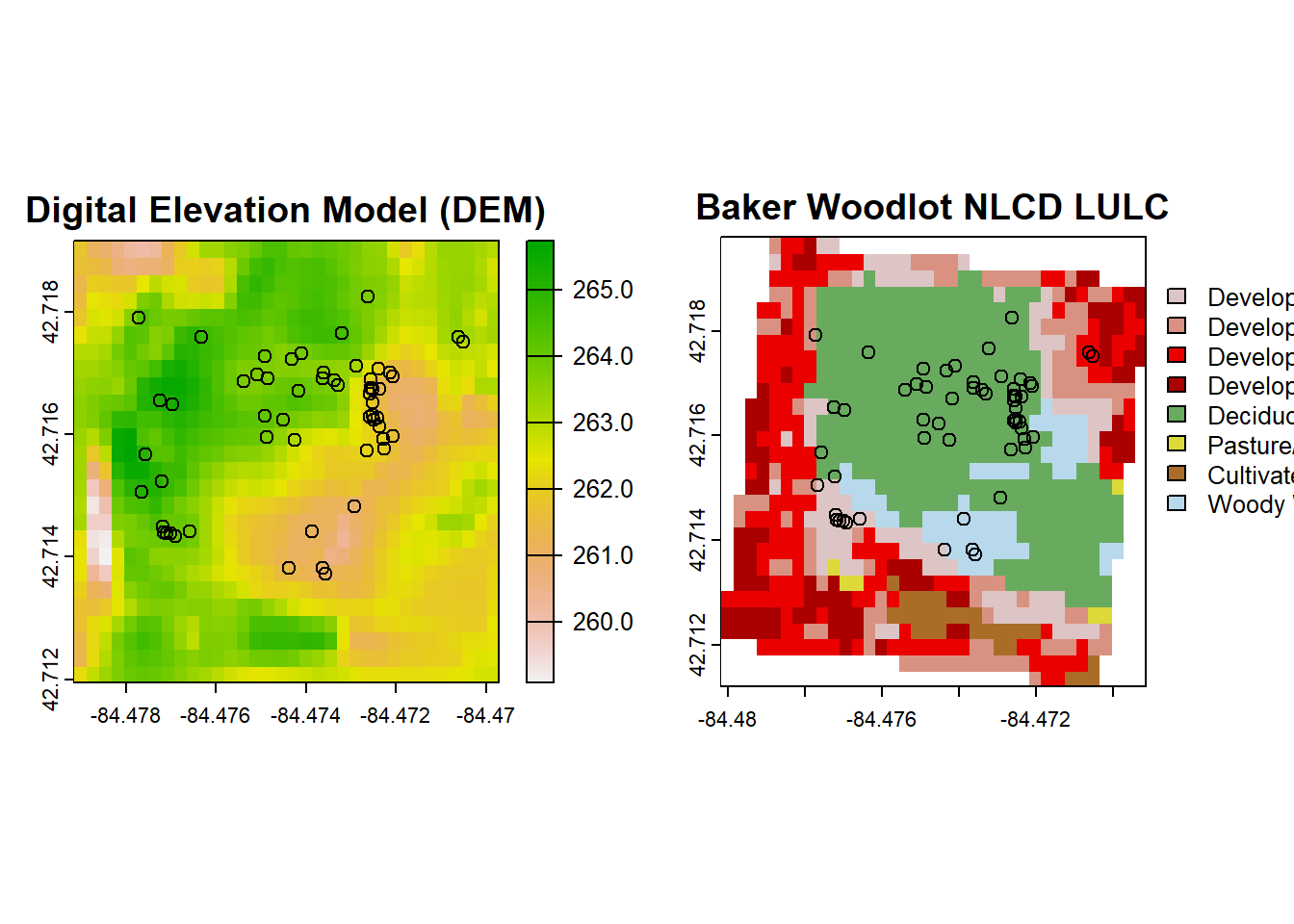 The reprojection altered our spatial extents. We can either bring in a bigger frame of data from NLCD to reproject or we can work with what we have by looking at the intersection of the above two rasters once intersected:
# Find the intersection of their extents
intersect_extent <- intersect(ext(nlcd_reprojected), ext(dem_reprojected))

# Crop both rasters to the intersected extent
dem_cropped <- crop(dem_reprojected, intersect_extent)
nlcd_cropped <- crop(nlcd_reprojected, intersect_extent)

# Plot our DEM, NLCD, and Trillium data reprojected and intersected!
par(mfrow=c(1,2))
plot(dem_cropped, main = "Digital Elevation Model (DEM)")
points(trill$decimalLongitude, trill$decimalLatitude)
plot(nlcd_cropped, main = "Baker Woodlot NLCD LULC")
points(trill$decimalLongitude, trill$decimalLatitude)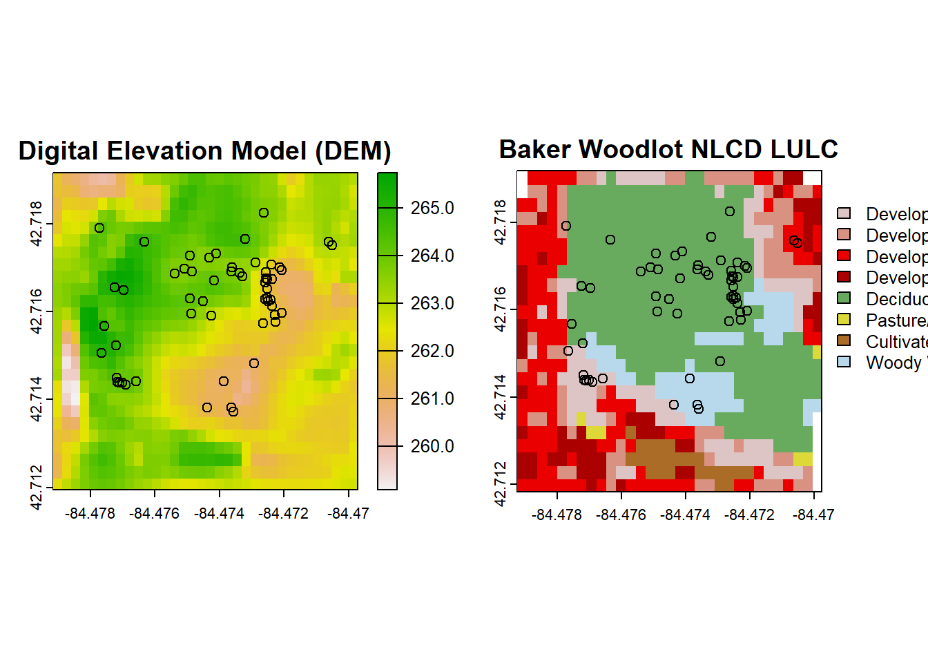
For analysis, we first need to create a ppp object out of our Trillium data to use in spatstat. For 2D analysis, a ppp object requires X and Y location data such as coordinates as well as a window for point analysis. In this case, I set it to the extent of our raster environmental data, but this may be different for your own question:
trill <- trill[!duplicated(cbind(trill$decimalLongitude, trill$decimalLatitude)),] # Remove duplicate points

trillium_ppp <- ppp(
  x = trill$decimalLongitude,           # Longitude
  y = trill$decimalLatitude,           # Latitude
  window = owin(xrange = c(intersect_extent$xmin, intersect_extent$xmax),
                yrange = c(intersect_extent$ymin, intersect_extent$ymax)),           # Observation window from the raster intersection above
)
Similarly, we need to process our environmental data into im format, which is the spatstat pixel image format using the is.im() function:
dem_mat <- as.matrix(dem_cropped, wide = TRUE)
nlcd_mat <- as.matrix(nlcd_cropped, wide = TRUE)

# Flip the matrices to align with Cartesian coordinates
dem_mat <- dem_mat[nrow(dem_mat):1,]
nlcd_mat <- nlcd_mat[nrow(nlcd_mat):1, ]

# Convert DEM and NLCD to spatstat pixel images (im object)
dem_im <- as.im(dem_mat, xrange = c(intersect_extent$xmin, intersect_extent$xmax),
                yrange = c(intersect_extent$ymin, intersect_extent$ymax))
nlcd_im <- as.im(nlcd_mat,xrange = c(intersect_extent$xmin, intersect_extent$xmax),
                yrange = c(intersect_extent$ymin, intersect_extent$ymax))
Next, we can use the ppm() function to fit a model of Trillium points as a function (the ~ symbol) of DEM.
# Fit an inhomogeneous Poisson process with elevation as a covariate
trill_dem <- ppm(trillium_ppp ~ dem_im)
summary(trill_dem)
## Point process model
## Fitted to data: trillium_ppp
## Fitting method: maximum likelihood (Berman-Turner approximation)
## Model was fitted using glm()
## Algorithm converged
## Call:
## ppm.formula(Q = trillium_ppp ~ dem_im)
## Edge correction: "border"
## [border correction distance r = 0 ]
## --------------------------------------------------------------------------------
## Quadrature scheme (Berman-Turner) = data + dummy + weights
##
## Data pattern:
## Planar point pattern: 56 points
## Average intensity 821000 points per square unit
## Window: rectangle = [-84.47917, -84.46972] x [42.71194, 42.71917] units
## (0.009444 x 0.007222 units)
## Window area = 6.82099e-05 square units
##
## Dummy quadrature points:
## 32 x 32 grid of dummy points, plus 4 corner points
## dummy spacing: 0.0002951389 x 0.0002256944 units
##
## Original dummy parameters: =
## Planar point pattern: 1028 points
## Average intensity 15100000 points per square unit
## Window: rectangle = [-84.47917, -84.46972] x [42.71194, 42.71917] units
## (0.009444 x 0.007222 units)
## Window area = 6.82099e-05 square units
## Quadrature weights:
## (counting weights based on 32 x 32 array of rectangular tiles)
## All weights:
## range: [1.33e-08, 6.66e-08] total: 6.82e-05
## Weights on data points:
## range: [1.33e-08, 3.33e-08] total: 1.62e-06
## Weights on dummy points:
## range: [1.33e-08, 6.66e-08] total: 6.66e-05
## --------------------------------------------------------------------------------
## FITTED :
##
## Nonstationary Poisson process
##
## ---- Intensity: ----
##
## Log intensity: ~dem_im
## Model depends on external covariate 'dem_im'
## Covariates provided:
## dem_im: im
##
## Fitted trend coefficients:
## (Intercept) dem_im
## -13.6591608 0.1037193
##
## Estimate S.E. CI95.lo CI95.hi Ztest Zval
## (Intercept) -13.6591608 29.7893940 -72.0453001 44.7269785 -0.4585243
## dem_im 0.1037193 0.1132382 -0.1182235 0.3256622 0.9159393
##
## ----------- gory details -----
##
## Fitted regular parameters (theta):
## (Intercept) dem_im
## -13.6591608 0.1037193
##
## Fitted exp(theta):
## (Intercept) dem_im
## 1.169235e-06 1.109289e+00We can then plot the predicted intensity surface from this nonhomogenous Poisson model. Recall that this intensity would be the same across the whole surface (just one value) if it was as homogenous Poisson model.
predicted_intensity <- predict(trill_dem, type = "intensity")
plot(predicted_intensity, main = "Predicted Intensity Based on Elevation")
points(trillium_ppp, col = "white")
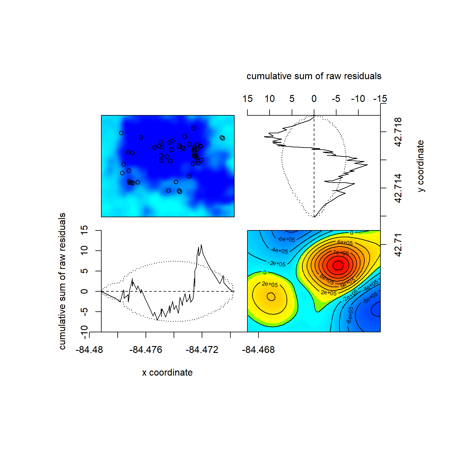
We can also check out model diagnostics, including residuals of the model (i.e., where intensity from the prediction doesn’t match our data well). The most interesting one here is the bottom right countour plot, here showing an extreme residual (lots of unexplained intensity) in red. This is likely not environmentally caused but where people are most likely to be making observations – this is near the Baker Woodlot entrance with parking.
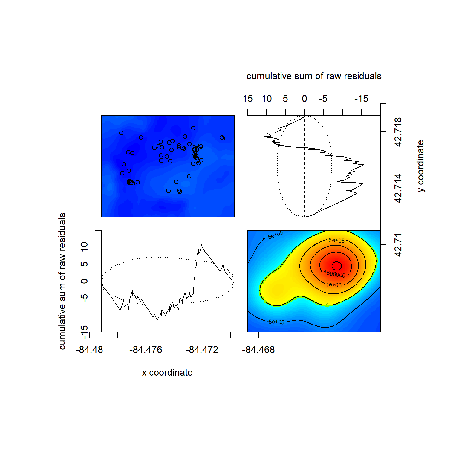
## Model diagnostics (raw residuals)
## Diagnostics available:
##  four-panel plot
##  mark plot
##  smoothed residual field
##  x cumulative residuals
##  y cumulative residuals
##  sum of all residuals
## sum of raw residuals in entire window = -1.961e-09
## area of entire window = 6.821e-05
## quadrature area = 6.821e-05
## range of smoothed field =  [-763300, 2059000]
We can then compare this nonhomogenous Poisson model to a homogenous Poisson one. Since adding one variable versus no predictors (null) is implicitly nested, we can use the likelihook ratio test:
## Analysis of Deviance Table
##
## Model 1: ~1   Poisson
## Model 2: ~dem_im      Poisson
##   Npar Df Deviance Pr(>Chi)
## 1    1
## 2    2  1  0.84758   0.3572
We see that the P-value is 0.36, meaning that we do not reject the null and that we have insufficient evidence that elevation drives Trillium intensity in Baker Woodlot.
We can repeat the same process with NLCD data. This time we specify that we want this data treated as.factor() since the values are categories of LULC. You can see the difference in model output and fits here, similar to using continous vs categorical predictors in a linear model:
## Point process model
## Fitted to data: trillium_ppp
## Fitting method: maximum likelihood (Berman-Turner approximation)
## Model was fitted using glm()
## Algorithm converged
## Call:
## ppm.formula(Q = trillium_ppp ~ as.factor(nlcd_im))
## Edge correction: "border"
##  [border correction distance r = 0 ]
## --------------------------------------------------------------------------------
## Quadrature scheme (Berman-Turner) = data + dummy + weights
##
## Data pattern:
## Planar point pattern:  56 points
## Average intensity 821000 points per square unit
## Window: rectangle = [-84.47917, -84.46972] x [42.71194, 42.71917] units
##                     (0.009444 x 0.007222 units)
## Window area = 6.82099e-05 square units
##
## Dummy quadrature points:
##      32 x 32 grid of dummy points, plus 4 corner points
##      dummy spacing: 0.0002951389 x 0.0002256944 units
##
## Original dummy parameters: =
## Planar point pattern:  1028 points
## Average intensity 15100000 points per square unit
## Window: rectangle = [-84.47917, -84.46972] x [42.71194, 42.71917] units
##                     (0.009444 x 0.007222 units)
## Window area = 6.82099e-05 square units
## Quadrature weights:
##      (counting weights based on 32 x 32 array of rectangular tiles)
## All weights:
##  range: [1.33e-08, 6.66e-08] total: 6.82e-05
## Weights on data points:
##  range: [1.33e-08, 3.33e-08] total: 1.62e-06
## Weights on dummy points:
##  range: [1.33e-08, 6.66e-08] total: 6.66e-05
## --------------------------------------------------------------------------------
## FITTED :
##
## Nonstationary Poisson process
##
## ---- Intensity: ----
##
## Log intensity: ~as.factor(nlcd_im)
## Model depends on external covariate 'nlcd_im'
## Covariates provided:
##  nlcd_im: im
##
## Fitted trend coefficients:
##          (Intercept) as.factor(nlcd_im)22 as.factor(nlcd_im)23
##           13.9217033           -1.3955110           -1.7730673
## as.factor(nlcd_im)24 as.factor(nlcd_im)41 as.factor(nlcd_im)81
##          -26.2242884            0.2137032          -26.2242884
## as.factor(nlcd_im)82 as.factor(nlcd_im)90
##          -26.2242884           -0.6425034
##
##                         Estimate         S.E.       CI95.lo       CI95.hi Ztest
## (Intercept)           13.9217033 3.535534e-01  1.322875e+01  1.461466e+01   ***
## as.factor(nlcd_im)22  -1.3955110 7.905694e-01 -2.944999e+00  1.539766e-01
## as.factor(nlcd_im)23  -1.7730673 7.905694e-01 -3.322555e+00 -2.235798e-01     *
## as.factor(nlcd_im)24 -26.2242884 2.085893e+05 -4.088537e+05  4.088012e+05
## as.factor(nlcd_im)41   0.2137032 3.865103e-01 -5.438432e-01  9.712495e-01
## as.factor(nlcd_im)81 -26.2242884 5.750409e+05 -1.127086e+06  1.127033e+06
## as.factor(nlcd_im)82 -26.2242884 2.949898e+05 -5.781956e+05  5.781431e+05
## as.factor(nlcd_im)90  -0.6425034 6.770032e-01 -1.969405e+00  6.843984e-01
##                               Zval
## (Intercept)           3.937652e+01
## as.factor(nlcd_im)22 -1.765197e+00
## as.factor(nlcd_im)23 -2.242772e+00
## as.factor(nlcd_im)24 -1.257221e-04
## as.factor(nlcd_im)41  5.529041e-01
## as.factor(nlcd_im)81 -4.560421e-05
## as.factor(nlcd_im)82 -8.889897e-05
## as.factor(nlcd_im)90 -9.490405e-01
##
## ----------- gory details -----
##
## Fitted regular parameters (theta):
##          (Intercept) as.factor(nlcd_im)22 as.factor(nlcd_im)23
##           13.9217033           -1.3955110           -1.7730673
## as.factor(nlcd_im)24 as.factor(nlcd_im)41 as.factor(nlcd_im)81
##          -26.2242884            0.2137032          -26.2242884
## as.factor(nlcd_im)82 as.factor(nlcd_im)90
##          -26.2242884           -0.6425034
##
## Fitted exp(theta):
##          (Intercept) as.factor(nlcd_im)22 as.factor(nlcd_im)23
##         1.112036e+06         2.477064e-01         1.698113e-01
## as.factor(nlcd_im)24 as.factor(nlcd_im)41 as.factor(nlcd_im)81
##         4.082595e-12         1.238255e+00         4.082595e-12
## as.factor(nlcd_im)82 as.factor(nlcd_im)90
##         4.082595e-12         5.259740e-01
predicted_intensity_2 <- predict(trill_nlcd, type = "intensity")
plot(predicted_intensity_2, main = "Predicted Intensity Based on NLCD")
points(trillium_ppp, col = "black")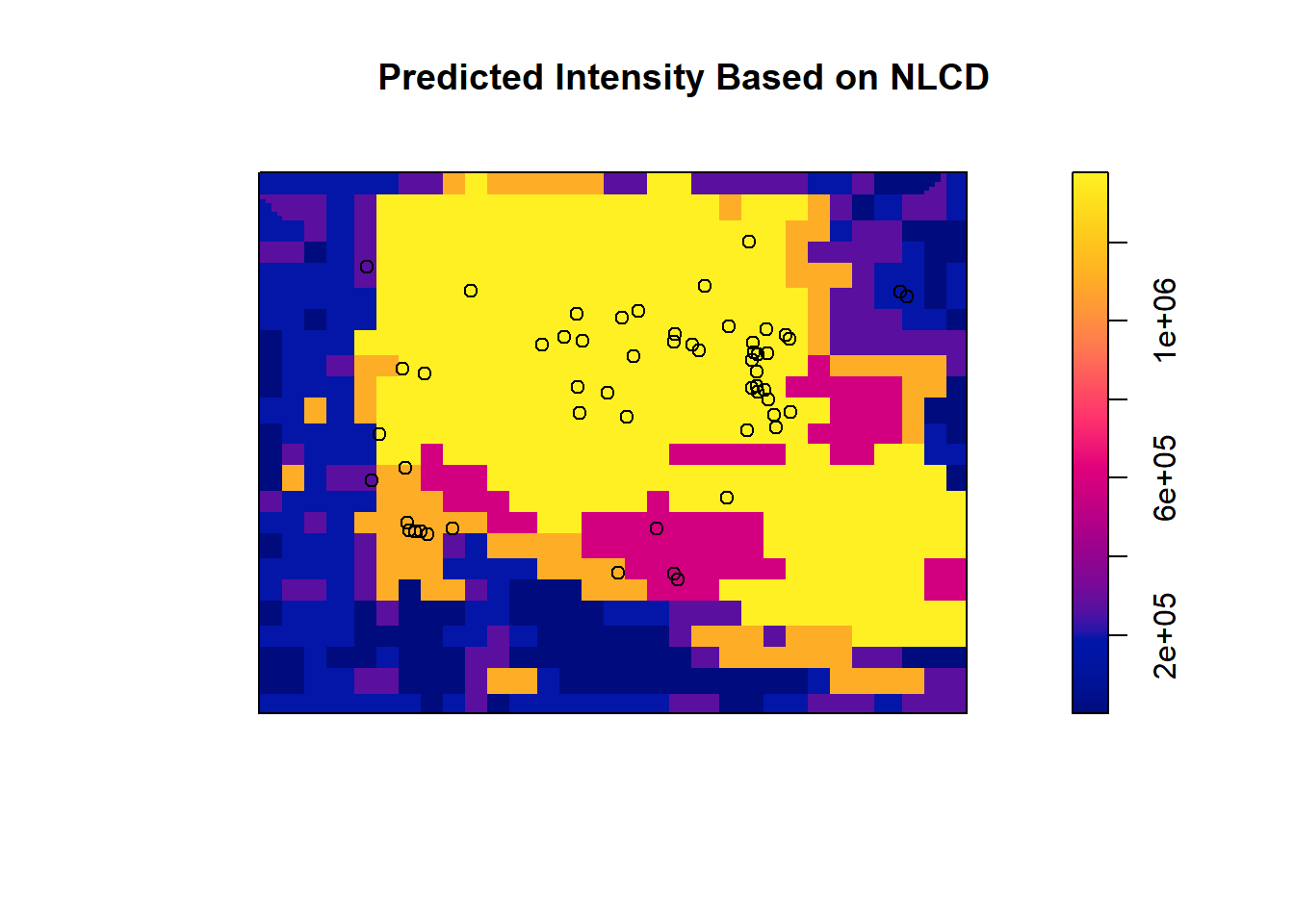
## Model diagnostics (raw residuals)
## Diagnostics available:
##  four-panel plot
##  mark plot
##  smoothed residual field
##  x cumulative residuals
##  y cumulative residuals
##  sum of all residuals
## sum of raw residuals in entire window = -7.228e-10
## area of entire window = 6.821e-05
## quadrature area = 6.821e-05
## range of smoothed field =  [-1033000, 1665000]
Again, we can do an LRT versus the null:
## Analysis of Deviance Table
##
## Model 1: ~1   Poisson
## Model 2: ~as.factor(nlcd_im)      Poisson
##   Npar Df Deviance  Pr(>Chi)
## 1    1
## 2    8  7   34.979 1.129e-05 ***
## ---
## Signif. codes:  0 '***' 0.001 '**' 0.01 '*' 0.05 '.' 0.1 ' ' 1
This time we do have a model that has significantly improved deviance, meaning we reject the null and can conclude that LULC has some control over Trillium intensity.
If we wanted to compare null vs. DEM vs. NLCD models, we should use AIC since DEM and NLCD are not nested.
# Calculate AIC for each model with labels
data.frame(
  Model = c("Model 1: Null", "Model 2: DEM", "Model 3: NLCD"),
  AIC = c(AIC(null_trill), AIC(trill_dem), AIC(trill_nlcd))
)
## Model AIC
## 1 Model 1: Null -1411.247
## 2 Model 2: DEM -1410.094
## 3 Model 3: NLCD -1432.225We can see that NLCD has the lowest AIC value and is much further than 2 AIC units from the next best model (the null). You can also see that the null is a “better” AIC model despite having less parameters due to the penalization of the DEM model.
7.2.4 Gibbs Model with Point Interaction
Next, if we want to add an interaction among points such as in a Gibbs model we again can use ppm(), this time adding the term interaction = with our type of interaction and parameters. In this case, I am showing that you can combine these two processes and have a nonhomogenous Poisson driven by elevation alongside a hardcore interaction:
hard_trill <- ppm(
  trillium_ppp ~ dem_im,  # Include DEM as covariate
  interaction = Hardcore(hc=0.00002) # Hardcore interaction radius of 0.00002
)
summary(hard_trill)
## Point process model
## Fitted to data: trillium_ppp
## Fitting method: maximum pseudolikelihood (Berman-Turner approximation)
## Model was fitted using glm()
## Algorithm converged
## Call:
## ppm.formula(Q = trillium_ppp ~ dem_im, interaction = Hardcore(hc = 2e-05))
## Edge correction: "border"
## [border correction distance r = 2e-05 ]
## --------------------------------------------------------------------------------
## Quadrature scheme (Berman-Turner) = data + dummy + weights
##
## Data pattern:
## Planar point pattern: 56 points
## Average intensity 821000 points per square unit
## Window: rectangle = [-84.47917, -84.46972] x [42.71194, 42.71917] units
## (0.009444 x 0.007222 units)
## Window area = 6.82099e-05 square units
##
## Dummy quadrature points:
## 32 x 32 grid of dummy points, plus 4 corner points
## dummy spacing: 0.0002951389 x 0.0002256944 units
##
## Original dummy parameters: =
## Planar point pattern: 1028 points
## Average intensity 15100000 points per square unit
## Window: rectangle = [-84.47917, -84.46972] x [42.71194, 42.71917] units
## (0.009444 x 0.007222 units)
## Window area = 6.82099e-05 square units
## Quadrature weights:
## (counting weights based on 32 x 32 array of rectangular tiles)
## All weights:
## range: [1.33e-08, 6.66e-08] total: 6.82e-05
## Weights on data points:
## range: [1.33e-08, 3.33e-08] total: 1.62e-06
## Weights on dummy points:
## range: [1.33e-08, 6.66e-08] total: 6.66e-05
## --------------------------------------------------------------------------------
## FITTED :
##
## Nonstationary Hard core process
##
## ---- Trend: ----
##
## Log trend: ~dem_im
## Model depends on external covariate 'dem_im'
## Covariates provided:
## dem_im: im
##
## Fitted trend coefficients:
## (Intercept) dem_im
## -13.6674773 0.1037603
##
## Estimate S.E. CI95.lo CI95.hi Ztest Zval
## (Intercept) -13.6674773 28.5656562 -69.6551347 42.3201801 -0.4784584
## dem_im 0.1037603 0.1085863 -0.1090651 0.3165856 0.9555554
##
## ---- Interaction: -----
##
## Interaction: Hard core process
## Hard core distance: 2e-05
##
## ----------- gory details -----
##
## Fitted regular parameters (theta):
## (Intercept) dem_im
## -13.6674773 0.1037603
##
## Fitted exp(theta):
## (Intercept) dem_im
## 1.159551e-06 1.109334e+00predicted_intensity_hc <- predict(hard_trill, type = "intensity")
plot(predicted_intensity_hc, main = "Predicted Intensity (Gibbs Hardcore Model)")
points(trillium_ppp, col = "white")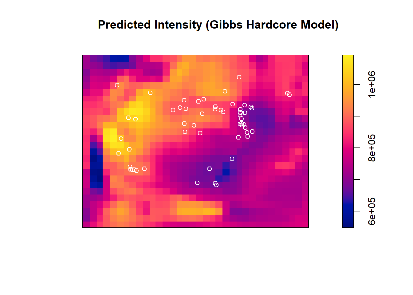 Compare analyis of deviance between the null and the hardcore Gibbs model:
## Analysis of Deviance Table
##
## Model 1: ~1   Poisson
## Model 2: ~dem_im      Hardcore
##   Npar Df AdjDeviance Pr(>Chi)
## 1    2
## 2    3  1     0.84829    0.357
Again, we see no influence of elevation + this specific Gibbs process relative to the null model.
7.2.5 Landscape Metrics
The landscapemetrics package in R provides tools to calculate landscape metrics, commonly used in landscape ecology to quantify spatial patterns. This package allows calculation of metrics at the patch, class, and landscape levels.
In this tutorial, we will explore some basic features of landscapemetrics using a the raster dataset for Baker Woodlot that we previously imported, which represents the 2019 LULC 8 land cover classes.
7.2.5.1 Setup
## Warning: package 'raster' was built under R version 4.2.3## Loading required package: sp## Warning: package 'sp' was built under R version 4.2.3## The legacy packages maptools, rgdal, and rgeos, underpinning this package
## will retire shortly. Please refer to R-spatial evolution reports on
## https://r-spatial.org/r/2023/05/15/evolution4.html for details.
## This package is now running under evolution status 0##
## Attaching package: 'raster'## The following object is masked from 'package:nlme':
##
## getData## The following object is masked from 'package:dplyr':
##
## selectDisplay basic information about the raster and check for compatiability with the R package
## class       : SpatRaster
## dimensions  : 29, 27, 1  (nrow, ncol, nlyr)
## resolution  : 30, 30  (x, y)
## extent      : 935745, 936555, 2247315, 2248185  (xmin, xmax, ymin, ymax)
## coord. ref. : NAD83 / Conus Albers (EPSG:5070)
## source      : baker_woodlot_nlcd_NLCD_Land_Cover_2019.tif
## color table : 1
## categories  : Class, Color, Description
## name        :                 Class
## min value   : Developed, Open Space
## max value   :        Woody Wetlands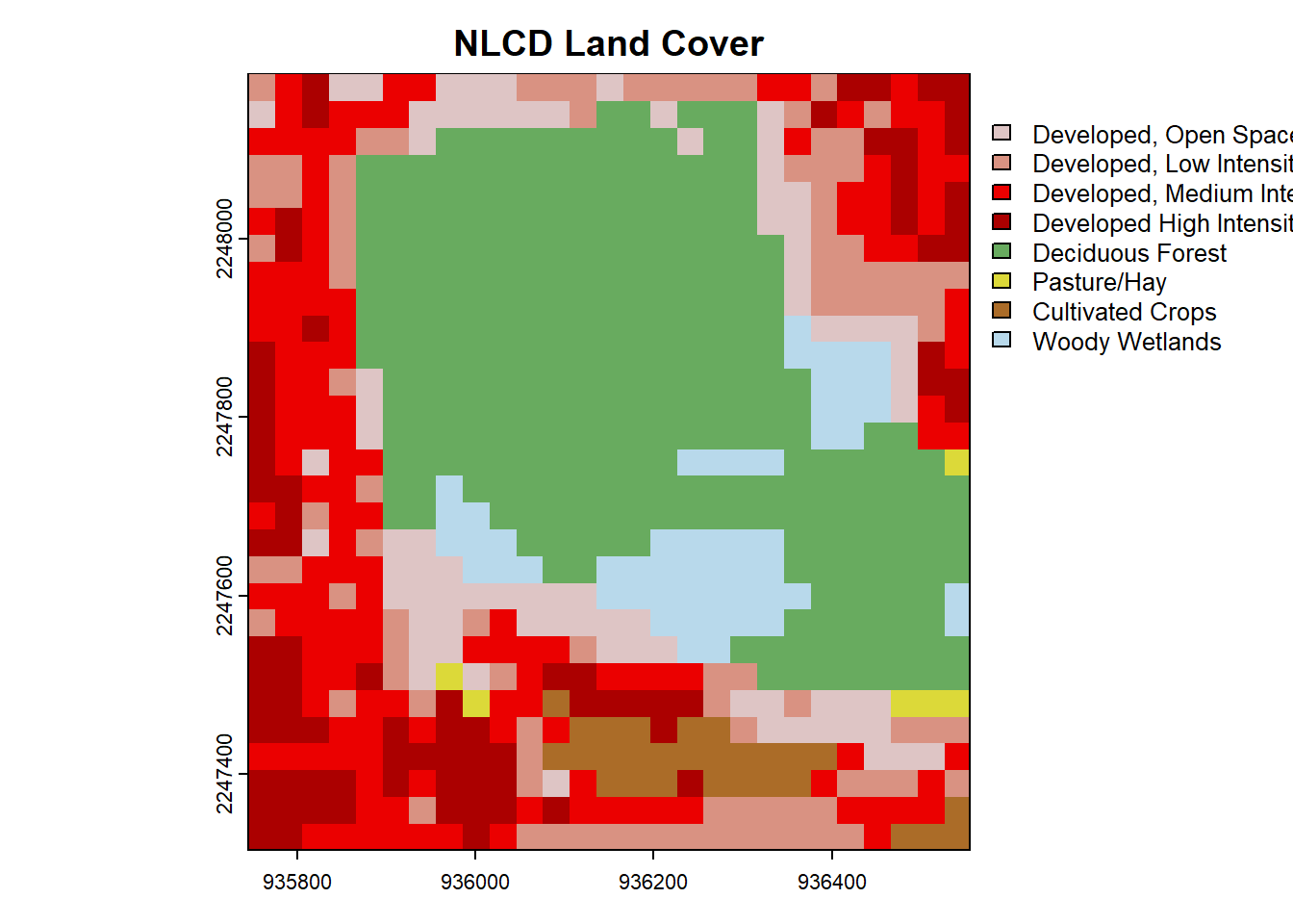
check_landscape(nlcd) # Check the validity of the landscape for use in landscape metrics before proceeding## layer crs units class n_classes OK
## 1 1 projected m integer 8 ✔Note the check mark saying our raster is OK for the package.
7.2.5.2 Patch-Level Metrics
Patch-level metrics quantify properties of individual patches (contiguous areas of the same class). Let’s extract and visualize the largest patch for a specific land cover class, e.g., class 4. Note that we can either look at individual metrics or just tell the package to give us everything for a certain spatial level. Below, I first calculate all patch level metrics (this may be massive if your landscape is huge):
# Calculate patch-level metrics for the raster
patch_metrics <- calculate_lsm(nlcd, what = "patch")
head(patch_metrics)
## # A tibble: 6 × 6
## layer level class id metric value
## <int> <chr> <int> <int> <chr> <dbl>
## 1 1 patch 21 1 area 0.09
## 2 1 patch 21 2 area 0.09
## 3 1 patch 21 3 area 0.09
## 4 1 patch 21 4 area 0.18
## 5 1 patch 21 5 area 0.27
## 6 1 patch 21 6 area 2.43# Inspect levels of nlcd for a lookup table between integer values and actual named LULC
levels(nlcd)## [[1]]
## ID Class
## 1 11 Open Water
## 2 12 Perennial Ice/Snow
## 3 21 Developed, Open Space
## 4 22 Developed, Low Intensity
## 5 23 Developed, Medium Intensity
## 6 24 Developed High Intensity
## 7 31 Barren Land (Rock/Sand/Clay)
## 8 41 Deciduous Forest
## 9 42 Evergreen Forest
## 10 43 Mixed Forest
## 11 51 Dwarf Scrub
## 12 52 Shrub/Scrub
## 13 71 Grassland/Herbaceous
## 14 72 Sedge/Herbaceous
## 15 73 Lichens
## 16 74 Moss
## 17 81 Pasture/Hay
## 18 82 Cultivated Crops
## 19 90 Woody Wetlands
## 20 95 Emergent Herbaceous Wetlands# Filter the metrics for the largest patch in class 90 (Woody Wetlands)
largest_patch_class4 <- patch_metrics %>% filter(class == "90") %>% # Filter to class
filter(metric == "area") %>% # Filter for metric patch area
arrange(desc(value)) %>% # Arrange by descending patch area
head(1) # Take the top value
# Display the largest patch for class 90
print(largest_patch_class4)## # A tibble: 1 × 6
## layer level class id metric value
## <int> <chr> <int> <int> <chr> <dbl>
## 1 1 patch 90 75 area 2.437.2.5.3 Class-Level Metrics
Class-level metrics summarize properties for each land cover class. For example, we can calculate the class area for all classes in the nlcd raster.
## Warning: Class 41: PAFRAC = NA for class with < 10 patches## Warning: Class 81: PAFRAC = NA for class with < 10 patches## Warning: Class 82: PAFRAC = NA for class with < 10 patches## Warning: Class 90: PAFRAC = NA for class with < 10 patches# Filter for class area (CA)
class_area <- class_metrics %>%
filter(metric == "ca") # Filter to class area
# Display the class area and edge density
print(class_area)## # A tibble: 8 × 6
## layer level class id metric value
## <int> <chr> <int> <int> <chr> <dbl>
## 1 1 class 21 NA ca 7.11
## 2 1 class 22 NA ca 8.64
## 3 1 class 23 NA ca 12.5
## 4 1 class 24 NA ca 7.38
## 5 1 class 41 NA ca 26.8
## 6 1 class 81 NA ca 0.54
## 7 1 class 82 NA ca 2.52
## 8 1 class 90 NA ca 4.95Plot class area for Baker Woodlot:
ggplot(class_area, aes(x = as.factor(class), y = value)) +
  geom_bar(stat = "identity", fill = "darkgrey") +
  labs(title = "LULC Class Area (CA) for Baker Woodlot and Surrounding Area", x = "Class", y = "Area") +
  theme_minimal()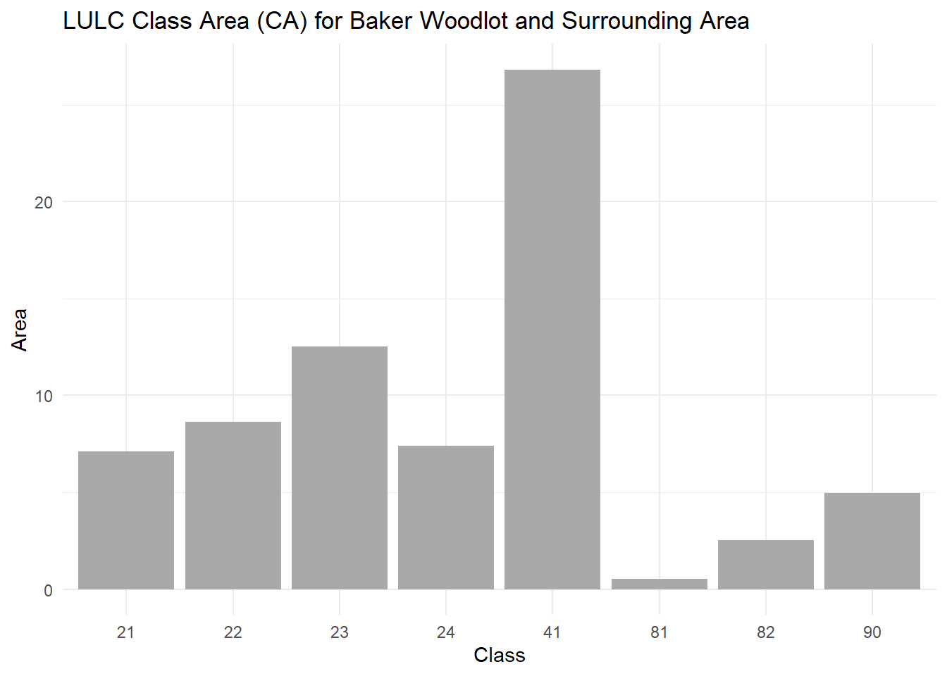
7.2.5.4 Landscape-Level Metrics
Landscape-level metrics provide a summary of the entire raster. For example, we can calculate the Shannon Diversity Index and total edge (TE) for the nlcd raster.
## Warning: No maximum number of classes provided: RPR = NA# Filter for specific metrics
double_filter <- landscape_metrics %>%
filter(metric == "shdi" | metric == "te")
double_filter## # A tibble: 2 × 6
## layer level class id metric value
## <int> <chr> <int> <int> <chr> <dbl>
## 1 1 landscape NA NA shdi 1.74
## 2 1 landscape NA NA te 15270