5 Visualization
Visualizing data and statistical outputs is an incredibly critical skill for any practicing data scientist. I’d say you can break down the purpose of visualization into two broad categories.
First, exploring and understanding your data. Data are too big to truly understand them just by staring at them or some summary. Sure, you can get a mean or median, but you don’t readily see outliers or skews. Weird distributional proprieties don’t even show up in those summaries as well. Thus, quickly graphing the data you’re about to work with is a really quick way to check for problems that need to be fixed before the fun modeling work begins.
Second, explaining your results to others of all backgrounds. Models get so complex for us making them that really the only way to start understanding how interacting features interact is by making a graph. They’re also the best way to show a pattern, trend, result to someone with a non-technical background. You’d be rightfully laughed at if you walked into a work meeting about how an advertising campaign is going and started showing tables of R outputs. Just because you’ll develop an intuitive understanding of all these statistical measures doesn’t mean others have that intuition as well!
So, data visualization (or ‘viz’ if you’re cooler than I am) should be a constant part of your workflow. This lesson is going to give you a basic overview of a few main figure types that are commonly used, as well as when you should probably use them.
5.1 ggplot - grammar of graphics
We’re going to mainly be using the R package ggplot2. This package was made by Hadley Wickham who has developed so much in the R universe… Many of the packages within Tidyverse, R Studio, and a bunch more. His goal is to make the grammar of R more intuitive, especially when it comes to graphing. Base R is great for quick plot, but ggplot figures can be made wayyyy more aesthetically pleasing.
There are three parts to any ggplot figure
Data - This is the data frame of data you want to make a figure with. This usually comes right after your
ggplot()call.Aesthetic - This is the specific columns from your data frame… your x and y, as well as their color, shape, density, etc. This is specified in the
aes()part of your call.Geometry - This is the geometry, or type, of figure you want to create. This will be after you call your
aes()and will be proceeded by a+. You’re ‘adding’ a geometry to the data.
You’ll commonly see this formatted like this:
ggplot(my_data_frame,
       aes(x = feature_from_data, y = target_from_data)) +
  geom_plot_type()
5.2 First, data.
We’re going to be using data on breakfast cereal ratings as well as aspects of their nutritional content. There are lots of datatypes that work well to illustrate different types of plots for each.
cereal <- read_csv("https://docs.google.com/spreadsheets/d/1sD1uWYNRfbPRNFNgJl7ufWqe0TPLuVZUKuNGgLEQ5Qo/gviz/tq?tqx=out:csv")What do these data look like? I can see a bunch of numeric columns, but also come characters that indicate different cereal types (hot or cold) or manufacture.
glimpse(cereal)## Rows: 77
## Columns: 16
## $ name <chr> "100% Bran", "100% Natural Bran", "All-Bran", "All-Bran wi...
## $ mfr <chr> "N", "Q", "K", "K", "R", "G", "K", "G", "R", "P", "Q", "G"...
## $ type <chr> "C", "C", "C", "C", "C", "C", "C", "C", "C", "C", "C", "C"...
## $ calories <dbl> 70, 120, 70, 50, 110, 110, 110, 130, 90, 90, 120, 110, 120...
## $ protein <dbl> 4, 3, 4, 4, 2, 2, 2, 3, 2, 3, 1, 6, 1, 3, 1, 2, 2, 1, 1, 3...
## $ fat <dbl> 1, 5, 1, 0, 2, 2, 0, 2, 1, 0, 2, 2, 3, 2, 1, 0, 0, 0, 1, 3...
## $ sodium <dbl> 130, 15, 260, 140, 200, 180, 125, 210, 200, 210, 220, 290,...
## $ fiber <dbl> 10.0, 2.0, 9.0, 14.0, 1.0, 1.5, 1.0, 2.0, 4.0, 5.0, 0.0, 2...
## $ carbo <dbl> 5.0, 8.0, 7.0, 8.0, 14.0, 10.5, 11.0, 18.0, 15.0, 13.0, 12...
## $ sugars <dbl> 6, 8, 5, 0, 8, 10, 14, 8, 6, 5, 12, 1, 9, 7, 13, 3, 2, 12,...
## $ potass <dbl> 280, 135, 320, 330, -1, 70, 30, 100, 125, 190, 35, 105, 45...
## $ vitamins <dbl> 25, 0, 25, 25, 25, 25, 25, 25, 25, 25, 25, 25, 25, 25, 25,...
## $ shelf <dbl> 3, 3, 3, 3, 3, 1, 2, 3, 1, 3, 2, 1, 2, 3, 2, 1, 1, 2, 2, 3...
## $ weight <dbl> 1.00, 1.00, 1.00, 1.00, 1.00, 1.00, 1.00, 1.33, 1.00, 1.00...
## $ cups <dbl> 0.33, 1.00, 0.33, 0.50, 0.75, 0.75, 1.00, 0.75, 0.67, 0.67...
## $ rating <dbl> 68.40297, 33.98368, 59.42551, 93.70491, 34.38484, 29.50954...5.3 Visualization for exploration
Let’s start with some initial exploration methods. These will be a mix of base R and ggplot.
5.3.1 Using histograms to see distributions of numeric data
Histograms are your first step to visualize continuous numeric data. They count up how many observations fall into each bin and plot that. Weird peaks in your histogram might suggest something is wrong.
let’s do a quick base R plot of calories. The function is simply hist() and then you just specify your data_frame$column_name you want a plot of:
hist(cereal$calories)
So, ugly, but functional and useful. We see that most cereals have around 100 calories, and there are some low-calorie options as well as some really high calorie ones. There’s nothing in this that makes me worried that there are errors… for example, negative calorie values or extremely high ones.
We could do this in ggplot as follows, but it’s not worth the extra typing for exploration IMO. Note that it gives us a warning to pick a better bin width. Bins are the value ranges that the calorie observations are grouped into. Here it defaults to dividing the range of calorie values into 30 bins. The warning is saying ‘this is stupid, you should think about how many bins make sense and not rely on defaults.’ I agree, but that’s too much effort for quick exploration.
ggplot(cereal,
       aes(x = calories)) +
  geom_histogram()
## `stat_bin()` using `bins = 30`. Pick better value with `binwidth`.
5.3.2 Using bar graphs to visualize distribution of categorical data
We also have to variables that are categorical (manufacture and type). You can also explore these to see that you don’t see one category totally over represented, or to be aware if NA values exist.
As with our numeric data, determining what is over represented depends on your domain knowledge. If you’re looking at if people default on a loan or not, you would probably expect that only 5% of people default while the other 95% don’t. But, if you were looking a distribution of degrees people can have (high school vs college), you would expect a closer distribution.
Let’s make a bar graph with ggplot of our manufactures.
ggplot(cereal,
       aes(x = mfr)) +
  geom_bar()
A is American Home Food Products, which I’ve never heard of, so not surprising they’re not well represented. You might want to remove this brand as it only has single observation in the dataset. This will cause problems in many models we’ll be learning, and really emphasizes why it’s so important to explore your data!
G is General Mills, and K is Kellogg… both popular brands. So those all look good!
5.3.3 How do visualize many features
Admittedly, this gets frustrating to do if you have a lot of features. We’re going to stick to the manual way as above for now and I’m not going to require you to know the method below. But I do want to say that there are packages out there that will plot many histograms for you at once. There are also deeper ways to manipulate your data so ggplot will do it in one go. I’ll show them to you, but they’re not required.
5.3.4 Melting your data
ggplot is happy to make many individual ‘facets’ where each facet is a plot corresponding to a different character/factor level. For example, if you wanted to illustrate how men vs. women differed in their height-weight relationships, you might want to plot those on two different graphs, with one level (i.e. women) being on one, and the other level (men) on the other graph.
To do this you need your data to be ‘tidy’. This means every observation needs to be on its own row. So you’d have a variable ‘sex’ and then two more ‘weight’ and ‘height’. ggplot needs this format as it can plot multiple figures based on the two levels present in sex.
We need to do the same here for our cereal data if we want to plot all histograms at once. Currently our data is ‘wide’ where each variable is a column.
head(cereal)## # A tibble: 6 x 16
## name mfr type calories protein fat sodium fiber carbo sugars potass
## <chr> <chr> <chr> <dbl> <dbl> <dbl> <dbl> <dbl> <dbl> <dbl> <dbl>
## 1 100%~ N C 70 4 1 130 10 5 6 280
## 2 100%~ Q C 120 3 5 15 2 8 8 135
## 3 All-~ K C 70 4 1 260 9 7 5 320
## 4 All-~ K C 50 4 0 140 14 8 0 330
## 5 Almo~ R C 110 2 2 200 1 14 8 -1
## 6 Appl~ G C 110 2 2 180 1.5 10.5 10 70
## # ... with 5 more variables: vitamins <dbl>, shelf <dbl>, weight <dbl>,
## # cups <dbl>, rating <dbl>We want to reshape it so that each row contains the brand name, the variable name (each column name will become a variable name), and the value.
We’ll first make a data frame of all our numeric values that we want histograms for and our cereal name which will be our ID
cereal_melted <- cereal %>%
  select(-mfr, -type) # remove the two character columns we don't need
Now we’ll use the melt() function in the reshape2 package. Note - melt stays happy when you specify that your data is a data frame like I’m doing below.
cereal_melted <- melt(as.data.frame(cereal_melted))## Using name as id variablesLooking at the head and tail you can see how it created a new data frame that took all the column names and made each into a level within the variable column, and then it took the associated value from the original data and put that in the value column.
head(cereal_melted)## name variable value
## 1 100% Bran calories 70
## 2 100% Natural Bran calories 120
## 3 All-Bran calories 70
## 4 All-Bran with Extra Fiber calories 50
## 5 Almond Delight calories 110
## 6 Apple Cinnamon Cheerios calories 110tail(cereal_melted)## name variable value
## 996 Total Whole Grain rating 46.65884
## 997 Triples rating 39.10617
## 998 Trix rating 27.75330
## 999 Wheat Chex rating 49.78744
## 1000 Wheaties rating 51.59219
## 1001 Wheaties Honey Gold rating 36.187565.3.5 Graphing your melted data
Now that each column is now melted down into levels within variable we can tell ggplot to make a histogram for each level. You specify your numeric for the x just like always. In this case it’s the value column. You add on another argument to the end of the plot called facet_wrap(). Inside you tell it how you want it to make the facets. Below we’re saying make a facet for each level in the variable column.
ggplot(cereal_melted,
       aes(x = value)) +
  geom_histogram() +
  facet_wrap(~variable)
## `stat_bin()` using `bins = 30`. Pick better value with `binwidth`.
Cool, that worked pretty well. It’s not perfect as it uses the same x-axis width for each facet, but it does the job of showing that the data looks good overall. In most cases we can see a bit of a normal distribution popping out. In others, the values all fall within a single bin so there are not likely to be outliers. Not perfect, but it’s pretty fast once you get the hang of it. Later we’ll be learning about scaling our data which will take care of the different scales issue and make this sorta plot even more useful.
5.4 Visualization for describing results
Now let’s chat about how to make figures to display different types of results. A big point of confusion occurs when people ask what type of plot they should use to show a result. The best way to figure this out is by stepping back and asking ‘are my variables continuous or categorical?’.
If you have one continuous target, say calories, and you’re trying to predict how a categorical feature influences that target, say cereal type (hot or cold), you probably want a boxplot
If you have to continuous features and targets, you then probably want a scatter plot. Let’s dig into both these
5.4.1 Boxplots
Boxplots are useful when you want to show how the mean and variation around that mean (i.e. properties of a continuous variable) differs between two groups. You’ll generally put the continuous variable on the y-axis and let your groups be split up along the x-axis.
Here’s a quick boxplot seeing how calorie content differs between hot and cold cereals. The geom_boxplot() geom will display the mean value of that group, and then the boxes represent the quartiles around that mean. The whiskers then show to the end of the data, excluding outliers which are shown as points.
ggplot(cereal,
       aes(x = type, y = calories)) +
  geom_boxplot()
Huh, that’s funny… we only get a mean value for hot cereals. Let’s explore that by looking at just the calorie content of hot cereals. Yep, there are only three values and they’re all the same, so you can’t have quartiles or variation!
cereal$calories[cereal$type=='H']## [1] 100 100 100Let’s try instead with calorie content across manufactures. This tells us that some manufactures make really low-calorie cereals, while others make higher calorie (and extremely high calorie) cereals.
ggplot(cereal,
       aes(x = mfr, y = calories)) +
  geom_boxplot()
5.4.2 Showing only a few levels
If you wanted to only show a few levels you could make a new data frame like we did last week of just the levels of interest. You can also do it the pro way and filter in your ggplot call. Here we’re filtering only manufactures that are in the list. Cool, huh?!
ggplot(cereal %>% filter(mfr %in% c('G', 'K', 'N')),
       aes(x = mfr, y = calories)) +
  geom_boxplot()
5.4.3 Other ways to display categorical data
Boxplots are great, but to a layperson they can be a bit confusing. You can make them less confusing by adding a scatterplot of your points over the boxplot. You can layer on your geom_jitter() argument as follows. This does a good job of showing where your individual observations fall so you can see how the parts of the boxplot are generated.
ggplot(cereal %>% filter(mfr %in% c('G', 'K', 'N')),
       aes(x = mfr, y = calories)) +
  geom_boxplot() +
  geom_jitter()
You can also try a violin plot. This shows where the most points fall through the width of the figure. Wider parts mean more points are in there. Narrower points mean fewer points. It’s pretty easy to see that the K level has cereals all over the place, while the other two brands all tend to have similar calorie counts.
ggplot(cereal %>% filter(mfr %in% c('G', 'K', 'N')),
       aes(x = mfr, y = calories)) +
  geom_violin()
5.4.4 Connecting back to regression
So when would you use a boxplot in regression modeling? Well, the regression lesson from this week is linear regression, but we discussed how you can also fit a categorical feature to predict your target. Thus, you’d put your categorical feature on the x, and illustrate differences in your target by plotting it on the y.
Normally you indicate if there are significant differences between levels using an asterisk, or you describe the difference in a figure legend.
5.5 Using scatter plots to show relationship between continuous features and targets
Scatter plots are the go-to figure for whenever you have a continuous target and feature(s). Where it gets tricky is when you want to include fit lines to show significant relationships. It gets even trickier when you have several significant features, or you have interacting features. We’ll get into how to deal with these one-by-one!
5.5.1 Simple scatter plots
Making a basic scatter plot between a target and feature is easy. Target on the y, feature on the x. geom_point() does the rest. Let’s look at how sugars relates to calories.
ggplot(cereal,
       aes(x = sugars, y = calories)) +
  geom_point()
Ah, so there’s an issue here… Calories are all rounded to 5 calorie increments, and sugars are to the nearest gram. Thus we get overlapping points which makes it look like we have fewer data points than we actually do. Let’s use geom_jitter() instead as it adds a bit if noise to each point so you can separate out the overlapping ones. Much better!
ggplot(cereal,
       aes(x = sugars, y = calories)) +
  geom_jitter()
5.5.2 Adding a trendline
Obviously there’s a positive relationship here… cereals with more sugar have more calories (shocker). We can fit a model to confirm this. I’m going to extract and show the coefficients only… look at the regression lesson again if you need to review how/why this is done.
cereal_model <- lm(calories ~ sugars, data = cereal)
coefs <- summary(cereal_model)$coefficients
coefs
## Estimate Std. Error t value Pr(>|t|)
## (Intercept) 89.820097 3.4365750 26.136516 2.040065e-39
## sugars 2.465014 0.4185484 5.889436 1.024973e-07So, there’s a highly significant p-value. We want to fit a line that shows this relationship. This line is specified by our regression formula of $y = _0 + _1x + $ which in the case of the model above is \(calories = intercept + sugars * slope\).
We need to make a line that represents that relationship. To do this we need two things:
A series of x-values to input into the formula. In this case it’ll be a sequence of values starting at the minimum x value and going to the maximum x value.
The predicted y-value that you get when you put all the x-values into the formula.
We’ll do this step-by-step
5.5.2.1 Step 1 - generate your sequence of x-values
First, let’s remember base R functions to get our min and max values.
min(cereal$sugars) # min x values## [1] -1max(cereal$sugars) # max x value## [1] 15length(cereal$sugars) # need the same number of values ## [1] 77So we can use R’s sequence generating function, seq(), to make our sequence of x-values. We need to specify length.out = to be the length of our data as ggplot likes this (don’t as me why).
x_vals <- seq(from = min(cereal$sugars), to = max(cereal$sugars), length.out = nrow(cereal))
x_vals # see, a range of x-values as long as our data is!
## [1] -1.00000000 -0.78947368 -0.57894737 -0.36842105 -0.15789474 0.05263158
## [7] 0.26315789 0.47368421 0.68421053 0.89473684 1.10526316 1.31578947
## [13] 1.52631579 1.73684211 1.94736842 2.15789474 2.36842105 2.57894737
## [19] 2.78947368 3.00000000 3.21052632 3.42105263 3.63157895 3.84210526
## [25] 4.05263158 4.26315789 4.47368421 4.68421053 4.89473684 5.10526316
## [31] 5.31578947 5.52631579 5.73684211 5.94736842 6.15789474 6.36842105
## [37] 6.57894737 6.78947368 7.00000000 7.21052632 7.42105263 7.63157895
## [43] 7.84210526 8.05263158 8.26315789 8.47368421 8.68421053 8.89473684
## [49] 9.10526316 9.31578947 9.52631579 9.73684211 9.94736842 10.15789474
## [55] 10.36842105 10.57894737 10.78947368 11.00000000 11.21052632 11.42105263
## [61] 11.63157895 11.84210526 12.05263158 12.26315789 12.47368421 12.68421053
## [67] 12.89473684 13.10526316 13.31578947 13.52631579 13.73684211 13.94736842
## [73] 14.15789474 14.36842105 14.57894737 14.78947368 15.000000005.5.2.2 Generating predicted y values
We can now put these values into our formula and generate our predicted y values (aka \(\hat{y}\)).
We can get our \(\beta_0\) and \(\beta_1\) values for our formula from our coefs object that contains our model coefficients.
Remember
coefs## Estimate Std. Error t value Pr(>|t|)
## (Intercept) 89.820097 3.4365750 26.136516 2.040065e-39
## sugars 2.465014 0.4185484 5.889436 1.024973e-07b0 <- coefs[1,1]
b1 <- coefs[2,1]
b1 # check this one## [1] 2.465014And put those into the regression formula to get \(\hat{y}\)
y_preds <- b0 + b1 * x_vals
y_preds
## [1] 87.35508 87.87403 88.39298 88.91193 89.43088 89.94983 90.46879
## [8] 90.98774 91.50669 92.02564 92.54459 93.06354 93.58249 94.10144
## [15] 94.62039 95.13934 95.65829 96.17724 96.69619 97.21514 97.73409
## [22] 98.25304 98.77199 99.29094 99.80989 100.32884 100.84779 101.36674
## [29] 101.88569 102.40464 102.92359 103.44254 103.96149 104.48044 104.99939
## [36] 105.51834 106.03730 106.55625 107.07520 107.59415 108.11310 108.63205
## [43] 109.15100 109.66995 110.18890 110.70785 111.22680 111.74575 112.26470
## [50] 112.78365 113.30260 113.82155 114.34050 114.85945 115.37840 115.89735
## [57] 116.41630 116.93525 117.45420 117.97315 118.49210 119.01105 119.53000
## [64] 120.04895 120.56790 121.08685 121.60581 122.12476 122.64371 123.16266
## [71] 123.68161 124.20056 124.71951 125.23846 125.75741 126.27636 126.79531So now we have a sequence of x-values and predicted y-values that should fall in a straight line that corresponds to the relationship dictated by our model. A quick base R plot shows this.
plot(x_vals, y_preds)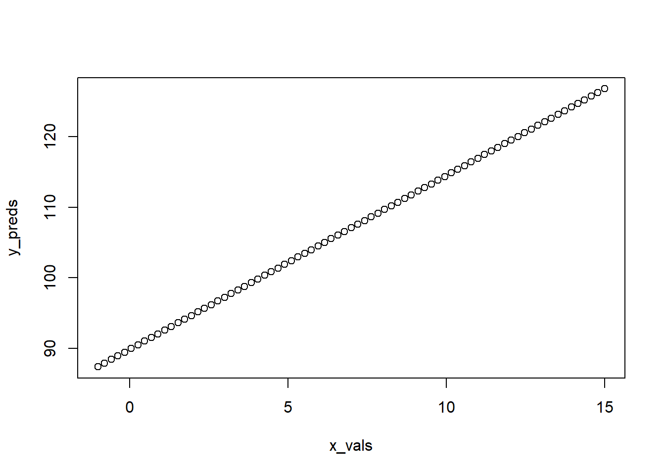
5.5.2.3 Adding our trendline to our ggplot figure
We can add these points as a line to our existing scatterplot by adding another geom. In this case, geom_line(). One thing you’ll see is that we’re going to specify a whole new aesthetic within it. This is telling it to look elsewhere for the data as it’s not in the original data frame.
ggplot(cereal,
       aes(x = sugars, y = calories)) +
  geom_point() +
  geom_line(aes(x = x_vals, y = y_preds))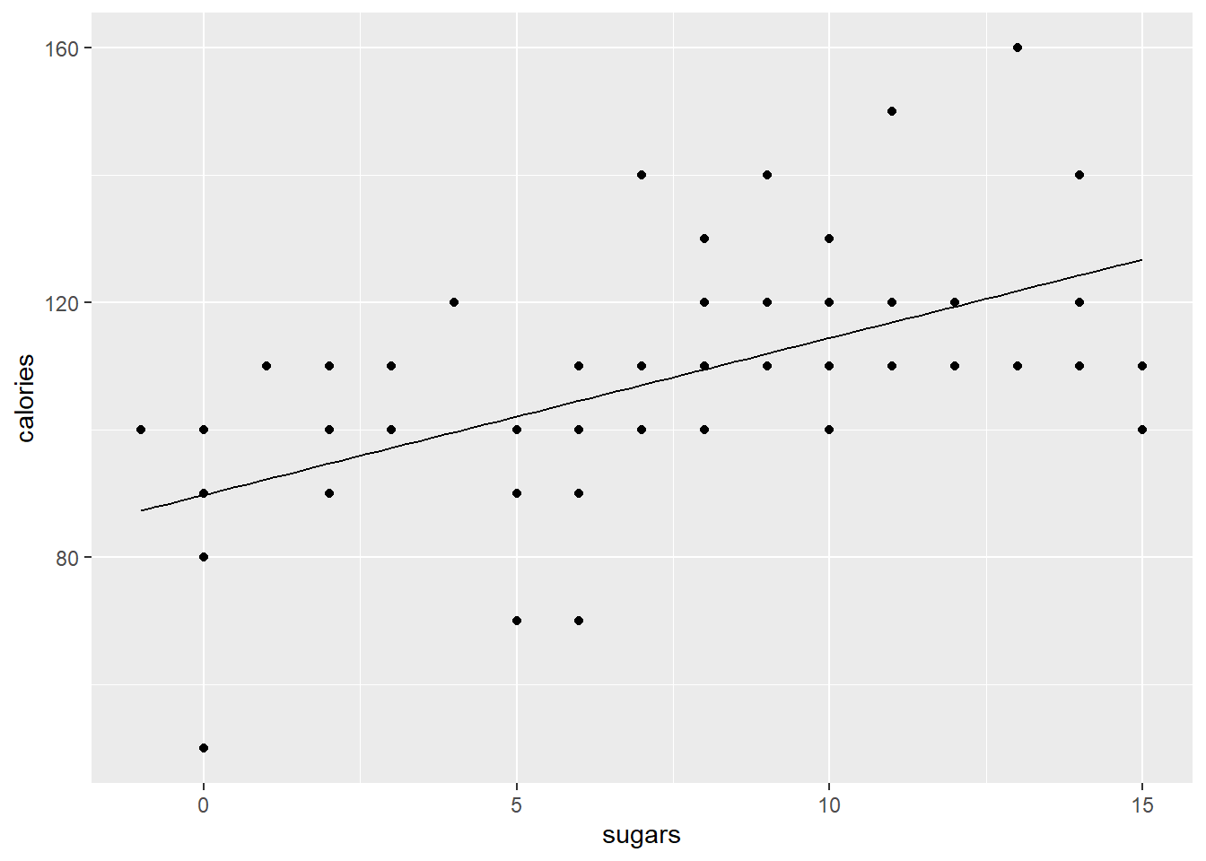
5.5.2.4 Isn’t there an easier way?
OK, so you can do this in a faster way using ggplot. Instead of geom_line() you can use geom_smooth() and add an argument method = 'lm' which tells ggplot to fit a linear model between the x and y you specified above and plot it. It’s automatically doing what we did above. It also plots the 95% confidence interval.
ggplot(cereal,
       aes(x = sugars, y = calories)) +
  geom_point() +
  geom_smooth(method = 'lm')
## `geom_smooth()` using formula 'y ~ x'
So why bother with the long way? Control! What happens if you have more than one feature in your model? What if you have interactions? The method = 'lm' addition above is great for a quick and simple plot, but it’s also really restrictive and inflexible. So, use it if you have a simple model, but step away from it if you have something more complex!
5.5.3 Plotting a multiple regression
What if you have lots of features in your model? How do you start to illustrate their effects while also accounting for the others? What about if you have interactions that you learned about? This is where an understanding of what the fitline is, a graphically illustration of your predicted relationship, really helps you decide what to plot.
5.5.3.1 Plotting a multiple regression model with two (or more) features
So over in the regression lesson you learned about multiple regression. Thus, you know that lots of times there are multiple features that predict a target. This is obvious. Thinking about predicting the weight of a human you’d rightfully assume that genetic sex, height, activity level, and a bunch of other things all contribute to the weight of an individual. Although obvious that these things all probably matter, it’s not obvious how to graph multiple features at once. You really need an \(n+1\)-dimensional figure where \(n\) is the number of features in your model. Such a figure falls apart quickly given humans max out at 3 dimension (or at least I do), and many would say even 3-d figures are bad.
So why is this tricky? Well, multiple regression models predict a target, our y-value (\(\hat{y}\)), using all the features. As we saw above, when calculating our y for our plot we need to include those features in that formula. This is easy when we only have a single feature to plot as we just plot along the range of our x-axis. But how do we plot along two ranges (assuming we have two features in our multiple regression model) when we have a two-dimensional figure? What if you have three features, or four, or 20? The simple way to deal with is by plotting along the range of the x that you’re graphing and then holding the other features at their mean value.
This is getting confusing. Let’s dig into a simple multiple regression model to illustrate why this is a problem and how to tackle it.
5.5.3.2 Our model
Let’s predict the rating of a cereal based on two features, fiber and sugars. We can predict off the bat that people will rate cereals with more sugar higher because these are American cereals and ‘Mericans love sugar. Fiber will probably reduce ratings as it’s typically ’healthy.’
rating_model <- lm(rating ~ sugars + fiber, data = cereal)
summary(rating_model)
##
## Call:
## lm(formula = rating ~ sugars + fiber, data = cereal)
##
## Residuals:
## Min 1Q Median 3Q Max
## -12.133 -4.247 -1.031 2.620 16.398
##
## Coefficients:
## Estimate Std. Error t value Pr(>|t|)
## (Intercept) 51.6097 1.5463 33.376 < 2e-16 ***
## sugars -2.1837 0.1621 -13.470 < 2e-16 ***
## fiber 2.8679 0.3023 9.486 2.02e-14 ***
## ---
## Signif. codes: 0 '***' 0.001 '**' 0.01 '*' 0.05 '.' 0.1 ' ' 1
##
## Residual standard error: 6.219 on 74 degrees of freedom
## Multiple R-squared: 0.8092, Adjusted R-squared: 0.804
## F-statistic: 156.9 on 2 and 74 DF, p-value: < 2.2e-16Weird, the negative \(\beta\) coefficient for sugars say that when sugars go up ratings decrease. I disagree, but whatever. The point is that we have two features here, each of which matters for the rating. How do we plot this? What happens if we plot just a single line using one of the features? Let’s explore!
5.5.3.3 Plotting a single feature from a multiple regression
Let’s make a plot of predicting rating from sugar content without accounting for the role of fiber It doesn’t look bad, but the line looks a bit low to me.
# get betas
coefs_2 <- summary(rating_model)$coefficients #extract betas
b0 <- coefs_2[1,1] # intercept beta
b1_sugars <- coefs_2[2,1] # and sugars beta
b2_fiber <- coefs_2[3,1] # fiber beta

# get x and y vals
x_vals_sugars <- seq(from = min(cereal$sugars), to = max(cereal$sugars), length.out = nrow(cereal)) # same as before

y_preds_1 <- b0 + b1_sugars*x_vals_sugars # NOT including beta for fat
# and plot

ggplot(cereal,
       aes(x = sugars, y = rating)) +
  geom_jitter() +
geom_line(aes( x = x_vals_sugars, y = y_preds_1)) 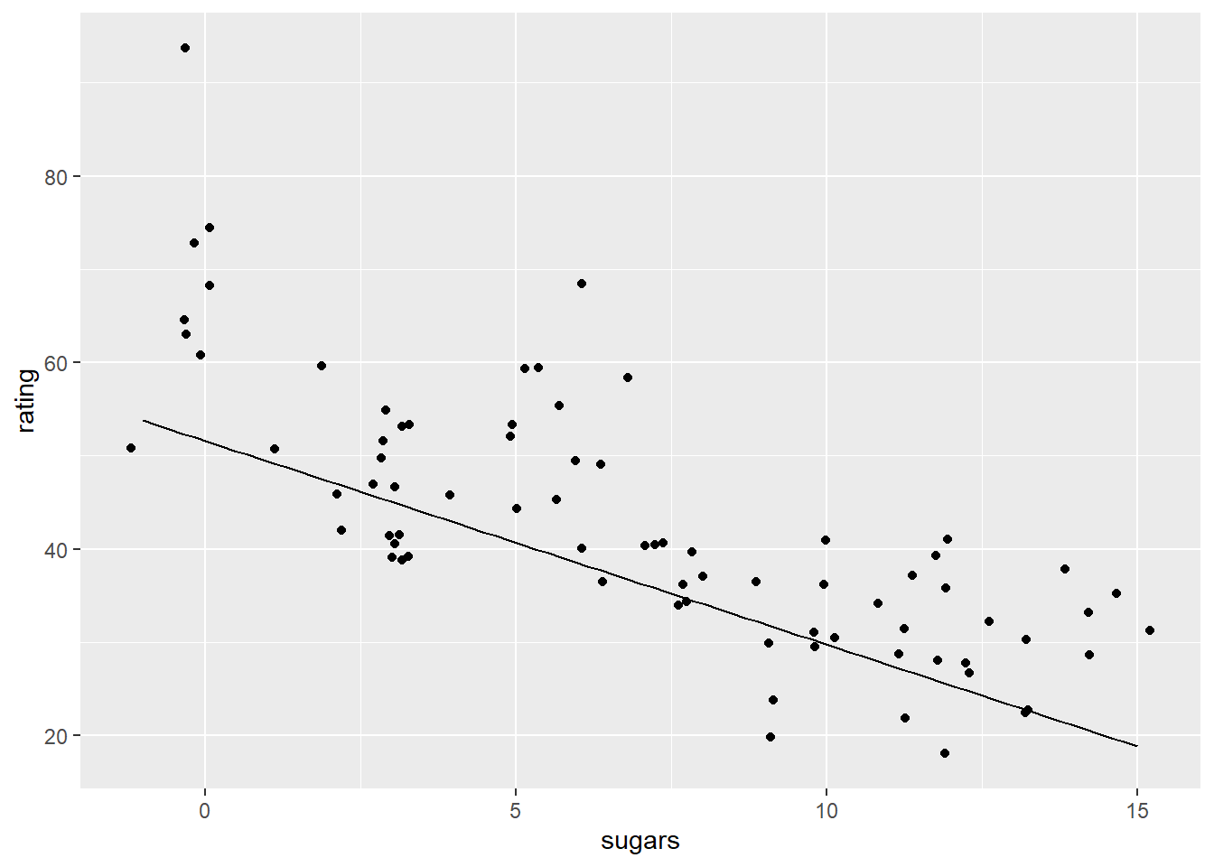
So how do we account for the effect of fat in our figure that it plotting the rating ~ sugar relationship? A common way to do this is to hold the effect of fiber (or any other features not being plotted) at their mean value.
So let’s make the same figure as above, but make a second fit line that then adds in the average effect of fiber The average cereal has a bit over 2 grams of fiber, and we know that from our model above that for each gram of fiber the cereal gets a 2.87 higher rating.
mean(cereal$fiber) # average amount of fiber ## [1] 2.151948Let’s make that plot. We’ll first make a new set of y predictions, and this time we’ll include our \(\beta\) associated with fiber, and multiple that by the mean value of fiber in our whole data set. Based on the plot we can see the fit line (the one colored red) looks ‘right.’ This is because our y predictions are actually accounting for the other features in the model.
# make new y predictions but with fiber beta
y_preds_2 <-b0 + b1_sugars*x_vals_sugars + b2_fiber*mean(cereal$fiber)

# and plot
ggplot(cereal,
       aes(x = sugars, y = rating)) +
  geom_jitter() +
  geom_line(aes( x = x_vals_sugars, y = y_preds_1)) +
  geom_line(aes( x = x_vals_sugars, y = y_preds_2), color = 'red')
5.5.4 Dealing with interactions in multiple regression.
When you have an interaction effect between features you essentially must graph it for it to make any sense. I cover how to graph these interactions over in the regression lesson so I’ll let you head over there.