13 Regression III
In this final week of looking at regression we are going to think through two complications to what we have seen so far where the impact of every variable is simply linear, where a one unit increase in the variable leads to a \(\beta\) increase in y, on average.
There are two ways that we are going to look at this: quadratics, where the impact of a variable changes over it’s levels; and interactions, where the impact of a variable changes over the level of another variable.
Both of these are somewhat “advanced” techniques; but both are often necessary for us to “model” complicated real world phenomena.
13.1 Polynomial Regression
As an example of real-world phenomena that are hard or impossible to model with a simple linear story, let’s look again at the California schools data, and specifically at the relationship between average income in a school district and the test scores of that district:
library(AER)
#> Warning: package 'AER' was built under R version 4.1.2
#> Loading required package: car
#> Warning: package 'car' was built under R version 4.1.2
#> Loading required package: carData
#> Warning: package 'carData' was built under R version 4.1.2
#> Loading required package: lmtest
#> Warning: package 'lmtest' was built under R version 4.1.2
#> Loading required package: zoo
#>
#> Attaching package: 'zoo'
#> The following objects are masked from 'package:base':
#>
#>     as.Date, as.Date.numeric
#> Loading required package: sandwich
#> Loading required package: survival
data("CASchools")
head(CASchools)
#>   district                          school  county grades
#> 1    75119              Sunol Glen Unified Alameda  KK-08
#> 2    61499            Manzanita Elementary   Butte  KK-08
#> 3    61549     Thermalito Union Elementary   Butte  KK-08
#> 4    61457 Golden Feather Union Elementary   Butte  KK-08
#> 5    61523        Palermo Union Elementary   Butte  KK-08
#> 6    62042         Burrel Union Elementary  Fresno  KK-08
#>   students teachers calworks   lunch computer expenditure
#> 1      195    10.90   0.5102  2.0408       67    6384.911
#> 2      240    11.15  15.4167 47.9167      101    5099.381
#> 3     1550    82.90  55.0323 76.3226      169    5501.955
#> 4      243    14.00  36.4754 77.0492       85    7101.831
#> 5     1335    71.50  33.1086 78.4270      171    5235.988
#> 6      137     6.40  12.3188 86.9565       25    5580.147
#>      income   english  read  math
#> 1 22.690001  0.000000 691.6 690.0
#> 2  9.824000  4.583333 660.5 661.9
#> 3  8.978000 30.000002 636.3 650.9
#> 4  8.978000  0.000000 651.9 643.5
#> 5  9.080333 13.857677 641.8 639.9
#> 6 10.415000 12.408759 605.7 605.4

#Creating Variables
CASchools$STR <- CASchools$students/CASchools$teachers
summary(CASchools$STR)
#>    Min. 1st Qu.  Median    Mean 3rd Qu.    Max.
#>   14.00   18.58   19.72   19.64   20.87   25.80

CASchools$score <- (CASchools$read + CASchools$math)/2
summary(CASchools$score)
#>    Min. 1st Qu.  Median    Mean 3rd Qu.    Max.
#>   605.5   640.0   654.5   654.2   666.7   706.8

#Changing names
dat <- CASchools
First let’s look at the regression output:
summary(lm(score ~ income, data=dat))
#>
#> Call:
#> lm(formula = score ~ income, data = dat)
#>
#> Residuals:
#>     Min      1Q  Median      3Q     Max
#> -39.574  -8.803   0.603   9.032  32.530
#>
#> Coefficients:
#>             Estimate Std. Error t value Pr(>|t|)
#> (Intercept) 625.3836     1.5324  408.11   <2e-16 ***
#> income        1.8785     0.0905   20.76   <2e-16 ***
#> ---
#> Signif. codes:
#> 0 '***' 0.001 '**' 0.01 '*' 0.05 '.' 0.1 ' ' 1
#>
#> Residual standard error: 13.39 on 418 degrees of freedom
#> Multiple R-squared:  0.5076, Adjusted R-squared:  0.5064
#> F-statistic: 430.8 on 1 and 418 DF,  p-value: < 2.2e-16
Here we have an intercept of 625, which indicates that a district with an average income of 0 dollars will have an average test score of 625 (this is obviously a nonsense number). More importantly, the coefficient on income is 1.87, which indicates that every $1000 increase in district household income (one “unit” for this variable) will increase test scores by just under 2 points.
So that seems pretty unambiguous, but let’s look at this regression against the scatterplot:
library(ggplot2)
p <- ggplot(dat, aes(x=income, y=score)) + geom_point() +
  labs(x="Avereage Household Income", y = "School Test Scores") +
  geom_smooth(method = lm, formula = y ~ poly(x, 1), se = FALSE)
p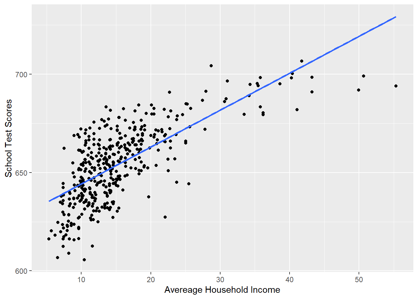
Would we say that this line does a good job of describing this relationship? Not really, no! If I was to describe this relationship in words, I would say that test scores improve a lot when household income goes from 5-25, but then the impact levels of significantly. It doesn’t matter as much to go to 30 and to 35 and to 40.
We want to build a model that takes into account the fact that the relationship between income and test scores is not linear.
The way we will do this is with a polynomial (i.e. squared) term in our regression. The easy way to think about adding polynomials is that it let’s the line curve. The less intuitive (but ultimately more helpful) way to think about it is that it let’s the effect of income change across it’s own levels. At low levels of income the relationship is steep, as income get’s higher the effect gets smaller (less steep.)
To accomplish this we simply modify the simple bivariate regression by adding an additional variable income squared:
\[ y = a + bx + e\\ y = a + b_1 x + b_2 x^2 + e \]
To implement this we can use the poly() function:
#YOU MUST USE THE RAW=T OPTION WHEN YOU USE THE POLY FUNCTION
#OR IT WILL NOT WORK

m <- lm(score ~ poly(income, 2, raw=T), data=dat )
summary(m)
#>
#> Call:
#> lm(formula = score ~ poly(income, 2, raw = T), data = dat)
#>
#> Residuals:
#>     Min      1Q  Median      3Q     Max
#> -44.416  -9.048   0.440   8.347  31.639
#>
#> Coefficients:
#>                            Estimate Std. Error t value
#> (Intercept)               607.30174    3.04622 199.362
#> poly(income, 2, raw = T)1   3.85099    0.30426  12.657
#> poly(income, 2, raw = T)2  -0.04231    0.00626  -6.758
#>                           Pr(>|t|)
#> (Intercept)                < 2e-16 ***
#> poly(income, 2, raw = T)1  < 2e-16 ***
#> poly(income, 2, raw = T)2 4.71e-11 ***
#> ---
#> Signif. codes:
#> 0 '***' 0.001 '**' 0.01 '*' 0.05 '.' 0.1 ' ' 1
#>
#> Residual standard error: 12.72 on 417 degrees of freedom
#> Multiple R-squared:  0.5562, Adjusted R-squared:  0.554
#> F-statistic: 261.3 on 2 and 417 DF,  p-value: < 2.2e-16
But note that this is exactly equivalent to simply making a variable that is income squared and adding it to the regression:
dat$income2  <- dat$income^2

m <- lm(score ~ income + income2, data=dat )
summary(m)
#>
#> Call:
#> lm(formula = score ~ income + income2, data = dat)
#>
#> Residuals:
#>     Min      1Q  Median      3Q     Max
#> -44.416  -9.048   0.440   8.347  31.639
#>
#> Coefficients:
#>              Estimate Std. Error t value Pr(>|t|)
#> (Intercept) 607.30174    3.04622 199.362  < 2e-16 ***
#> income        3.85099    0.30426  12.657  < 2e-16 ***
#> income2      -0.04231    0.00626  -6.758 4.71e-11 ***
#> ---
#> Signif. codes:
#> 0 '***' 0.001 '**' 0.01 '*' 0.05 '.' 0.1 ' ' 1
#>
#> Residual standard error: 12.72 on 417 degrees of freedom
#> Multiple R-squared:  0.5562, Adjusted R-squared:  0.554
#> F-statistic: 261.3 on 2 and 417 DF,  p-value: < 2.2e-16
The poly function is slightly preferable because it makes graphing easier, and also will allow us to easy add cubed and power of 4 terms etc.
We are going to think about these results in a second, but let’s first look at the graph:
#Plotting this relationship:
library(ggplot2)
p <- ggplot(dat, aes(x=income, y=score)) + geom_point() +
  labs(x="Avereage Household Income", y = "School Test Scores") +
  geom_smooth(method = lm, formula = y ~ poly(x, 2), se = FALSE)
p
Visually this curved line produced through a polynomial regression fits much better.
But how can we now describe this? Do we have a common sense explanation of the results of this regression like we have had up to this point?
For one thing, it is true that we can interpret the results of this regression like we have so far: the intercept is still the average value of y when all the variables are equal to 0; the coefficients all represent how a shift in one-unit of those variables impact the dependent variable. But it’s pretty unsatisfying to say that a change in 1 unit in income changes test scores by 3.85 holding constant income squared, and a change in 1 unit of income squared changes test scores by -.04 holding constant income….. what??
This is actually a place where a little bit of calculus makes our lives much easier. I know! Calculus is hard! But even if you don’t know and calculus I promise this step is really easy.
The tool that we use to calculate the slope of a line is a partial derivative from calculus. We represent the partial derivative of x on y as \(\frac{\partial y}{\partial x}\) which is a mathematical representation of saying: how does y change when x changes by one unit (i.e. exactly how we’ve been thinking about regression up to this point).
Some rules for taking partial derivatives:
The power rule states:
\[ \frac{\partial y}{\partial x}(X^k) =k*X^{k-1} \\ \]
So if:
\[ y = x^2 \]
Then
\[ \frac{\partial y}{\partial x} = 2*x^{2-1}\\ =2x \]
If there is a constant in the thing we are taking the partial derivarive of it is unaffected:
\[ \frac{\partial y}{\partial x}(aX^k) =k*aX^{k-1} \\ \]
So if:
\[ y = 3*x^2 \]
Then
\[ \frac{\partial y}{\partial x} = 2*3*x^{2-1}\\ =6x \]
If we take the partial derivative of y with respect to x for terms that do not contain x then those are just 0:
\[ \frac{\partial y}{\partial x}(a) =0 \\ \frac{\partial y}{\partial x}(Z) =0 \\ \]
So if:
\[ y = x^2 + 3 + z + 6 \]
then:
\[ \frac{\partial y}{\partial x}= 2x + 0 + 0 + 0 \]
\[ \frac{\partial y}{\partial x}= 2x \]
So if we have our standard regression equation:
\[ \hat{y} = \hat{\alpha} + \hat{\beta}*x + \hat{\beta}*z \\ \]
Then:
\[ \frac{\partial y}{\partial x} = 1*\beta*x^0 + 0\\ \frac{\partial y}{\partial x} = \beta\\ \]
Which makes a lot of sense: as we have repeatedly said a one unit change in x leads to a \(\beta\) change in y.
So, using this tool, what is the effect of x when we add a polynomial term?
\[ \hat{y} = \hat{\alpha} + \hat{\beta_1}*x + \hat{\beta_2}*x^2 \\ \frac{\partial y}{\partial x} = \hat{\beta}_1 + 2*\hat{\beta_2}*x \]
So in our case where x is income:
\[ \hat{test.scores} = \hat{\alpha} + \hat{\beta_1}*income + \hat{\beta_2}*income^2 \\ \frac{\partial test.scores}{\partial income} = \hat{\beta}_1 + 2*\hat{\beta_2}*income \]
And subbing in the actual estimates for the betas:
summary(m)
#>
#> Call:
#> lm(formula = score ~ income + income2, data = dat)
#>
#> Residuals:
#>     Min      1Q  Median      3Q     Max
#> -44.416  -9.048   0.440   8.347  31.639
#>
#> Coefficients:
#>              Estimate Std. Error t value Pr(>|t|)
#> (Intercept) 607.30174    3.04622 199.362  < 2e-16 ***
#> income        3.85099    0.30426  12.657  < 2e-16 ***
#> income2      -0.04231    0.00626  -6.758 4.71e-11 ***
#> ---
#> Signif. codes:
#> 0 '***' 0.001 '**' 0.01 '*' 0.05 '.' 0.1 ' ' 1
#>
#> Residual standard error: 12.72 on 417 degrees of freedom
#> Multiple R-squared:  0.5562, Adjusted R-squared:  0.554
#> F-statistic: 261.3 on 2 and 417 DF,  p-value: < 2.2e-16
\[ \frac{\partial test.scores}{\partial income} = 3.85 - 2*.04*income \]
How do test scores change as income changes by one unit. The answer to that question includes income as a variable. This is just the definition of a curved line! The effect of income changes across it’s own levels.
So here, if we wanted to know the effect of income when income is at 20
When income is 20 a one unit increase in income leads to an increase of 2.15 in test scores.
At income of 30 the effect is smaller. This is the flattening that we expect
And at 50 the effect is negative.
Here is where we have to be a little bit smart about what we are doing. By adding a squared term we are fitting a parabola that must go down at some point. Looking at our graph there is not a lot of data out near 50k:
p <- ggplot(dat, aes(x=income, y=score)) + geom_point() +
  labs(x="Avereage Household Income", y = "School Test Scores") +
  geom_smooth(method = lm, formula = y ~ poly(x, 2), se = FALSE)
p
So we are going to start getting weird predictions. You can’t take things at the edges of the data super literally.
Ok so adding a squared term helped us to more accurately describe the relationship. So why not keep adding terms. Let’s add \(income^3\) and \(income^4\)
#Plotting this relationship:
library(ggplot2)
p <- ggplot(dat, aes(x=income, y=score)) + geom_point() +
  labs(x="Avereage Household Income", y = "School Test Scores") +
  geom_smooth(method = lm, formula = y ~ poly(x, 4), se = FALSE)
p
We could further go through the same “chain rule process to determine how to understand how a one unit change in income will impact test scores:
\[ \hat{y} = \alpha + \beta_1*x + \beta_2*x^2 + \beta_3 * x^3 + \beta_4 *x^4\\ \frac{\partial y}{\partial x} = \beta_1 + 2*\beta_2*x + 3*\beta_3*x^2 + 4*\beta_4*x^3\\ \]
And then evaluate at the same points:
m <- lm(score ~ poly(income, 4, raw=T), data=dat )
coef(m)
#>               (Intercept) poly(income, 4, raw = T)1
#>              5.773402e+02              9.876232e+00
#> poly(income, 4, raw = T)2 poly(income, 4, raw = T)3
#>             -4.342116e-01              9.791736e-03
#> poly(income, 4, raw = T)4
#>             -8.159040e-05

#20
coef(m)[2] + 2*coef(m)[3]*20 + 3*coef(m)[4]*20^2 + 4*coef(m)[5]*20^3
#> poly(income, 4, raw = T)1
#>                  1.646959

#and at 30
coef(m)[2] + 2*coef(m)[3]*30 + 3*coef(m)[4]*30^2 + 4*coef(m)[5]*30^3
#> poly(income, 4, raw = T)1
#>                   1.44946

#and at 50
coef(m)[2] + 2*coef(m)[3]*50 + 3*coef(m)[4]*50^2 + 4*coef(m)[5]*50^3
#> poly(income, 4, raw = T)1
#>                -0.9021091
So is this “better”? Is the advice i’m giving you: add as many polynomial terms as possible? We are definitely getting a higher \(R^2\) so this must be good, right?
No! Remember right back to when we introduced regression and we compared it to a method where we found the average at all levels of x and then connected the dots. Something that looked a little like this:
#Plotting this relationship:
library(ggplot2)
p <- ggplot(dat, aes(x=income, y=score)) + geom_point() +
  labs(x="Avereage Household Income", y = "School Test Scores") +
  geom_smooth(span=.1)
p
#> `geom_smooth()` using method = 'loess' and formula = 'y ~
#> x'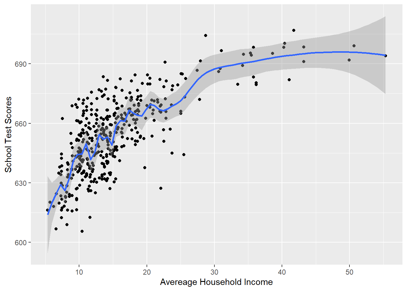
This fits really well! But the problem then, as now, is that we are “overfitting” to this sample of data. Remember, this is just one sample of many possible samples, all a little bit different. Our goal is to use this sample to learn something about the broader population. If we use a method that takes seriously every little quirk in the data then we are failing at the overall goal.
So on the one hand this linear relationship is a poor model for what we really think is happening in the data (the impact of income is most important at low levels):
#Plotting this relationship:
library(ggplot2)
p <- ggplot(dat, aes(x=income, y=score)) + geom_point() +
  labs(x="Avereage Household Income", y = "School Test Scores") +
  geom_smooth(method = lm, formula = y ~ poly(x, 1), se = FALSE)
p
But haveing 4 quadratic terms is almost certainly overfitting to this particular sample in a way that makes it hard for us to make conclusions about the population:
#Plotting this relationship:
library(ggplot2)
p <- ggplot(dat, aes(x=income, y=score)) + geom_point() +
  labs(x="Avereage Household Income", y = "School Test Scores") +
  geom_smooth(method = lm, formula = y ~ poly(x, 4), se = FALSE)
p
What is “best” is a judgement call (data science is full of them!). In this case I feel that the simple quadratic is the best trade-off between accurate modeling and over-fitting:
#Plotting this relationship:
library(ggplot2)
p <- ggplot(dat, aes(x=income, y=score)) + geom_point() +
  labs(x="Avereage Household Income", y = "School Test Scores") +
  geom_smooth(method = lm, formula = y ~ poly(x, 2), se = FALSE)
p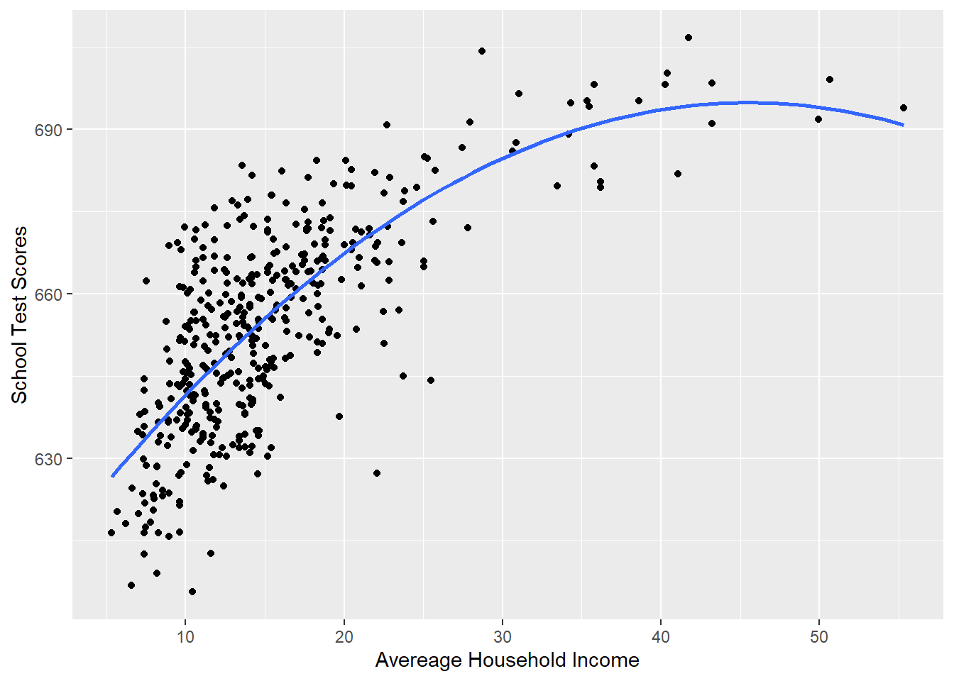
13.2 Interaction
In the first part of this chapter we talked about the first way we might think about non-linear relationships in regression: polynomial terms. What we discovered is that we think of polynomials – in both theoretic and mathematical terms – as a variable changing its effect over its own levels.
Interactions, on the other hand, are situations where variables change their effects across levels of another variable.
Let’s continue to work with the California schools data:
library(AER)
data("CASchools")
#Creating Variables
CASchools$STR <- CASchools$students/CASchools$teachers

CASchools$score <- (CASchools$read + CASchools$math)/2
dat <- CASchools
Let’s think about this question: Does the effect of income change based on whether the school is a K-6 or K-8? Why might we believe that to be true? It might be that parental income has more effect on learning at lower grade levels, and at higher grade levels teacher quality matters more. So my hypothesis will be that the effect of income will be higher in k-8 schools.
Let’s first look at the base relationship:
summary(m)
#>
#> Call:
#> lm(formula = score ~ income, data = dat)
#>
#> Residuals:
#>     Min      1Q  Median      3Q     Max
#> -39.574  -8.803   0.603   9.032  32.530
#>
#> Coefficients:
#>             Estimate Std. Error t value Pr(>|t|)
#> (Intercept) 625.3836     1.5324  408.11   <2e-16 ***
#> income        1.8785     0.0905   20.76   <2e-16 ***
#> ---
#> Signif. codes:
#> 0 '***' 0.001 '**' 0.01 '*' 0.05 '.' 0.1 ' ' 1
#>
#> Residual standard error: 13.39 on 418 degrees of freedom
#> Multiple R-squared:  0.5076, Adjusted R-squared:  0.5064
#> F-statistic: 430.8 on 1 and 418 DF,  p-value: < 2.2e-16
Similar to when we considered controlling for another variable, we can think about each of these data-points being of two types, k-6 school or k-8 schools.
Let’s create an indicator variable for k8:
dat$k8 <- NA
dat$k8[dat$grades=="KK-08"] <- 1
dat$k8[dat$grades=="KK-06"] <- 0
table(dat$k8)
#>
#>   0   1
#>  61 359
Let’s first determine what the effect of this indicator is on test scores while also taking into account income. Remember that when we do this we are effectively allowing for two intercepts, or having one intercept for the group where k8=0, and then a coefficient to tell us the intercept shift from one type of school to the other.
What does this look like visually:
plot(dat$income[dat$k8==1], dat$score[dat$k8==1], col="forestgreen", pch=16)
points(dat$income[dat$k8==0], dat$score[dat$k8==0], col="goldenrod", pch=16)
abline(m, col="black", lwd=2)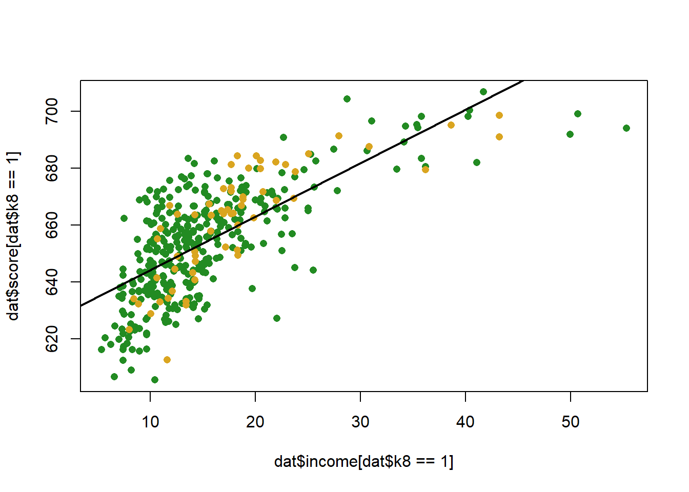
Let’s add in the dummy to our regression equation:
m <- lm(score ~ income + k8, data=dat)
summary(m)
#>
#> Call:
#> lm(formula = score ~ income + k8, data = dat)
#>
#> Residuals:
#>     Min      1Q  Median      3Q     Max
#> -39.126  -9.085   0.649   9.315  32.866
#>
#> Coefficients:
#>             Estimate Std. Error t value Pr(>|t|)
#> (Intercept) 627.8774     2.3855 263.209   <2e-16 ***
#> income        1.8585     0.0916  20.288   <2e-16 ***
#> k8           -2.5578     1.8764  -1.363    0.174
#> ---
#> Signif. codes:
#> 0 '***' 0.001 '**' 0.01 '*' 0.05 '.' 0.1 ' ' 1
#>
#> Residual standard error: 13.37 on 417 degrees of freedom
#> Multiple R-squared:  0.5097, Adjusted R-squared:  0.5074
#> F-statistic: 216.8 on 2 and 417 DF,  p-value: < 2.2e-16
What does that look like, visually:
income <- seq(0,70, 1)
pred1 <- coef(m)["(Intercept)"] + coef(m)["income"]*income + coef(m)["k8"]
pred0 <- coef(m)["(Intercept)"] + coef(m)["income"]*income

plot(dat$income[dat$k8==1], dat$score[dat$k8==1], col="forestgreen", pch=16)
points(dat$income[dat$k8==0], dat$score[dat$k8==0], col="goldenrod", pch=16)
points(income, pred1, col="forestgreen", lwd=2, type="l")
points(income, pred0, col="goldenrod", lwd=2, type="l")

abline(lm(score ~income, data=dat), lwd=2)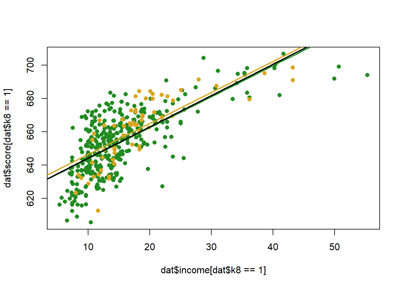
The coefficient indicates that k8 schools have slightly lower test scores than K6, but we fail to reject the null for the hypothesis test….
But we want to answer a separate question, how does the effect of income change in these two different types of schools?
The way that we do this is by interacting, or multiplying, the two variables:
m <- lm(score ~ income*k8, data=dat)
summary(m)
#>
#> Call:
#> lm(formula = score ~ income * k8, data = dat)
#>
#> Residuals:
#>     Min      1Q  Median      3Q     Max
#> -39.257  -8.979   0.734   9.273  32.829
#>
#> Coefficients:
#>             Estimate Std. Error t value Pr(>|t|)
#> (Intercept) 625.0716     4.4795 139.541   <2e-16 ***
#> income        2.0132     0.2283   8.820   <2e-16 ***
#> k8            0.6893     4.7717   0.144    0.885
#> income:k8    -0.1845     0.2492  -0.740    0.460
#> ---
#> Signif. codes:
#> 0 '***' 0.001 '**' 0.01 '*' 0.05 '.' 0.1 ' ' 1
#>
#> Residual standard error: 13.38 on 416 degrees of freedom
#> Multiple R-squared:  0.5104, Adjusted R-squared:  0.5069
#> F-statistic: 144.6 on 3 and 416 DF,  p-value: < 2.2e-16
Notice that when we run a regression with an interaction we need three things a term for each constituent part of the interaction, and the two variables interacted together. Helpfully, R does this for you automatically.
How do we interpret a regression with an interaction? We can rely on the power rule and differentiation to do this. Again, taking the first derivative with respect to a variable tells us how y changes as x changes by one unit. So if we apply the power rule to this regression equation:
\[ \hat{score} = \alpha + \beta_1Income + \beta_2K8 + \beta_3*Income*K8\\ \frac{\partial Score}{\partial Income} = \beta_1 + \beta_3*K8\\ \frac{\partial Score}{\partial K8} = \beta_2 + \beta_3*Income\\ \]
The key thing here is that now the effect of both of these variables depend on the level of the other. Again, think how this is similar to what we did above with polynomials, where the effect of income depended on itself. Here the effect of one variable depends on the level of the other.(Indeed, polynomial regression is just interaction with itself…)
So for this regression, what is the effect of income?
The effect of income depends on the value of k8, which in this case is just a binary variable:
So the effect of income in k6 schools is
And the effect of income in k8 schools is
We can interpret these two effects in the same way as we have been doing, a 1 unit change in income leads to a blank change in test scores.
So in all actuality the effect of income in k8 schools is lower. How much lower is it? Well, looking at the two equations, it is lower by the size of the interaction coefficient!
To display this visually we can, in this case, just draw two regression lines given the coefficients:
income <- seq(0,70, 1)
pred1 <- coef(m)["(Intercept)"] +coef(m)["income"]*income + coef(m)["k8"] + coef(m)["k8"] + coef(m)["income:k8"]*income
pred0 <- coef(m)["(Intercept)"] + coef(m)["income"]*income


plot(dat$income[dat$k8==1], dat$score[dat$k8==1], col="forestgreen", pch=16)
points(dat$income[dat$k8==0], dat$score[dat$k8==0], col="goldenrod", pch=16)
points(income, pred1, col="forestgreen", lwd=2, type="l")
points(income, pred0, col="goldenrod", lwd=2, type="l")
Note a couple of things here
The difference between the two slopes is the coefficient on the interaction term. As such the hypothesis test for the coefficient term tells you if the effect of a variable changes across levels of the interacted variable.
The coefficient on “income” is the effect of income when k8 equals 0. This is ALWAYS the case. This also means that the coefficient on a constituent part of an interaction might be nonsense.
Go back and read point (2) again because it is, without a doubt, the biggest mistake that is made when running regression with interaction. All the time I will see professors make this mistake. If we have the regression we are looking at here, it is absolutely nonsensical to ask: what is the effect of income. There is no one effect! All the time I will see people intepret the coefficient on income as it’s showing us some sort of average effect. It’s not. It is specifically the effect when the other variable is 0.
Let’s think about more complex regressions via the ACS data:
What if we want to know the relationship between median income and inequality in counties? To get at that we can use the Gini coefficient, which is a standard measure of income inequality. High numbers are worse.
Let’s re code our variables to aide in interpretability
acs$median.income <- acs$median.income/1000
acs$gini <- acs$gini*100

plot(acs$median.income, acs$gini, xlab="Median Income (thousands)",
     ylab="Gini Coefficient")
abline(lm(acs$gini ~ acs$median.income), col="firebrick", lwd=2)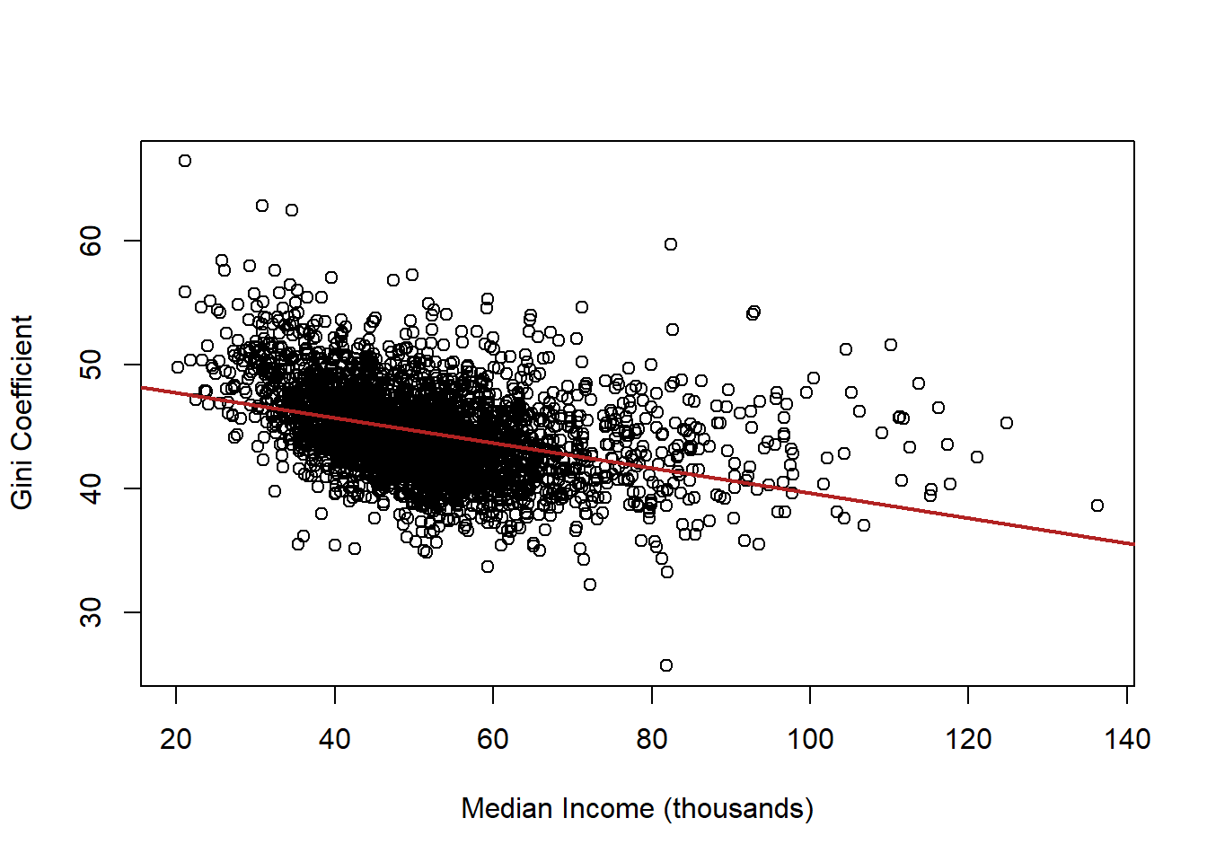
What is the interpretation of this coefficient?
summary(lm(gini ~ median.income, data=acs))
#>
#> Call:
#> lm(formula = gini ~ median.income, data = acs)
#>
#> Residuals:
#>      Min       1Q   Median       3Q      Max
#> -15.8054  -2.2822  -0.2843   1.9946  18.8559
#>
#> Coefficients:
#>               Estimate Std. Error t value Pr(>|t|)
#> (Intercept)    49.7537     0.2348  211.88   <2e-16 ***
#> median.income  -0.1011     0.0044  -22.98   <2e-16 ***
#> ---
#> Signif. codes:
#> 0 '***' 0.001 '**' 0.01 '*' 0.05 '.' 0.1 ' ' 1
#>
#> Residual standard error: 3.378 on 3139 degrees of freedom
#>   (1 observation deleted due to missingness)
#> Multiple R-squared:  0.144,  Adjusted R-squared:  0.1437
#> F-statistic: 528.1 on 1 and 3139 DF,  p-value: < 2.2e-16
Now let’s consider the role of race in this relationship. Let’s use the vairable percent.white to see how taking into account race changes this relationship
Original relationship
m1 <- lm(gini ~ median.income, data=acs)

m2 <- lm(gini ~ median.income + percent.white, data=acs)

#Use stargazer to view two models together
library(stargazer)
#>
#> Please cite as:
#>  Hlavac, Marek (2018). stargazer: Well-Formatted Regression and Summary Statistics Tables.
#>  R package version 5.2.2. https://CRAN.R-project.org/package=stargazer

stargazer(m1, m2, type="text")
#>
#> =======================================================================
#>                                     Dependent variable:
#>                     ---------------------------------------------------
#>                                            gini
#>                                (1)                       (2)
#> -----------------------------------------------------------------------
#> median.income               -0.101***                 -0.089***
#>                              (0.004)                   (0.004)
#>
#> percent.white                                         -0.070***
#>                                                        (0.003)
#>
#> Constant                    49.754***                 54.965***
#>                              (0.235)                   (0.335)
#>
#> -----------------------------------------------------------------------
#> Observations                  3,141                     3,141
#> R2                            0.144                     0.247
#> Adjusted R2                   0.144                     0.246
#> Residual Std. Error     3.378 (df = 3139)         3.170 (df = 3138)
#> F Statistic         528.123*** (df = 1; 3139) 514.099*** (df = 2; 3138)
#> =======================================================================
#> Note:                                       *p<0.1; **p<0.05; ***p<0.01
Why does the coefficient on median income get closer to zero? Part of the negative relationship between median income and inequality is caused by race. Being in a county with a high percentage of white people causes both higher income and lower inequality. Put the other way: Being in a county with a low percentage of white people causes both low income and high inequality. Once we take into account the independent relationship of race on inequality, the remaining relationship between income and inequality is smaller.
But this is not quite what we want to do. We want to look at whether the relationship between income and inequality changes based on race.
So far we’ve done this by interacting with a dummy variable like this:
acs$majority.white[acs$percent.white>=50] <- 1
acs$majority.white[acs$percent.white<50] <- 0
m3 <- lm(gini ~ median.income*majority.white, data=acs)

stargazer(m1,m2,m3, type="text")
#>
#> ==========================================================================================================
#>                                                           Dependent variable:
#>                              -----------------------------------------------------------------------------
#>                                                                  gini
#>                                         (1)                       (2)                       (3)
#> ----------------------------------------------------------------------------------------------------------
#> median.income                        -0.101***                 -0.089***                 -0.135***
#>                                       (0.004)                   (0.004)                   (0.015)
#>
#> percent.white                                                  -0.070***
#>                                                                 (0.003)
#>
#> majority.white                                                                           -4.492***
#>                                                                                           (0.724)
#>
#> median.income:majority.white                                                             0.046***
#>                                                                                           (0.016)
#>
#> Constant                             49.754***                 54.965***                 53.492***
#>                                       (0.235)                   (0.335)                   (0.680)
#>
#> ----------------------------------------------------------------------------------------------------------
#> Observations                           3,141                     3,141                     3,141
#> R2                                     0.144                     0.247                     0.173
#> Adjusted R2                            0.144                     0.246                     0.172
#> Residual Std. Error              3.378 (df = 3139)         3.170 (df = 3138)         3.322 (df = 3137)
#> F Statistic                  528.123*** (df = 1; 3139) 514.099*** (df = 2; 3138) 218.398*** (df = 3; 3137)
#> ==========================================================================================================
#> Note:                                                                          *p<0.1; **p<0.05; ***p<0.01
What now is the effect of median income on inequality?
This is fine, but we are throwing out a lot of information by making percent white into an indicator variable.
What does it mean, then, to do this?
m4 <- lm(gini ~ median.income*percent.white, data=acs)

stargazer(m1,m2,m3,m4, type="text")
#>
#> ====================================================================================================================================
#>                                                                        Dependent variable:
#>                              -------------------------------------------------------------------------------------------------------
#>                                                                               gini
#>                                         (1)                       (2)                       (3)                       (4)
#> ------------------------------------------------------------------------------------------------------------------------------------
#> median.income                        -0.101***                 -0.089***                 -0.135***                 -0.037**
#>                                       (0.004)                   (0.004)                   (0.015)                   (0.018)
#>
#> percent.white                                                  -0.070***                                           -0.039***
#>                                                                 (0.003)                                             (0.011)
#>
#> majority.white                                                                           -4.492***
#>                                                                                           (0.724)
#>
#> median.income:majority.white                                                             0.046***
#>                                                                                           (0.016)
#>
#> median.income:percent.white                                                                                        -0.001***
#>                                                                                                                    (0.0002)
#>
#> Constant                             49.754***                 54.965***                 53.492***                 52.576***
#>                                       (0.235)                   (0.335)                   (0.680)                   (0.857)
#>
#> ------------------------------------------------------------------------------------------------------------------------------------
#> Observations                           3,141                     3,141                     3,141                     3,141
#> R2                                     0.144                     0.247                     0.173                     0.249
#> Adjusted R2                            0.144                     0.246                     0.172                     0.248
#> Residual Std. Error              3.378 (df = 3139)         3.170 (df = 3138)         3.322 (df = 3137)         3.166 (df = 3137)
#> F Statistic                  528.123*** (df = 1; 3139) 514.099*** (df = 2; 3138) 218.398*** (df = 3; 3137) 346.683*** (df = 3; 3137)
#> ====================================================================================================================================
#> Note:                                                                                                    *p<0.1; **p<0.05; ***p<0.01
summary(m4)
#>
#> Call:
#> lm(formula = gini ~ median.income * percent.white, data = acs)
#>
#> Residuals:
#>      Min       1Q   Median       3Q      Max
#> -14.7470  -1.9791  -0.2637   1.8651  17.0992
#>
#> Coefficients:
#>                               Estimate Std. Error t value
#> (Intercept)                 52.5755392  0.8567078  61.369
#> median.income               -0.0365980  0.0178957  -2.045
#> percent.white               -0.0386569  0.0109061  -3.545
#> median.income:percent.white -0.0006808  0.0002248  -3.029
#>                             Pr(>|t|)
#> (Intercept)                  < 2e-16 ***
#> median.income               0.040932 *
#> percent.white               0.000399 ***
#> median.income:percent.white 0.002476 **
#> ---
#> Signif. codes:
#> 0 '***' 0.001 '**' 0.01 '*' 0.05 '.' 0.1 ' ' 1
#>
#> Residual standard error: 3.166 on 3137 degrees of freedom
#>   (1 observation deleted due to missingness)
#> Multiple R-squared:  0.249,  Adjusted R-squared:  0.2483
#> F-statistic: 346.7 on 3 and 3137 DF,  p-value: < 2.2e-16
What is now the marginal impact of median income?
\[ \hat{gini} = \alpha + \beta_1M.Income + \beta_2Perc.White + \beta_3 M.Income*Perc.White\\ \frac{\partial Gini}{\partial M.Income} = \beta_1 + \beta_3*Perc.White \]
So again, a “one unit change in income” is different based off of what value of percent white we have. But now percent white isn’t just a binary variable but a continuous one. So now every one unit change in percent white changes the effect of income by \(\beta_3\)
Indeed, looking at the coefficient on the interaction term, for every one unit change in percent white the effect of income declines by .001. This change is statistically significant.
How might we visualize this?
One way might be to pick some meaningful values of percent white, and plot the predicted effects for each:
median.income <- seq(0,150,.01)

pred0 <- coef(m4)["(Intercept)"] +
  coef(m4)["median.income"]*median.income +
  coef(m4)["percent.white"]*0 +
  coef(m4)["median.income:percent.white"]*0*median.income
pred25 <- coef(m4)["(Intercept)"] +
  coef(m4)["median.income"]*median.income +
  coef(m4)["percent.white"]*25 +
  coef(m4)["median.income:percent.white"]*25*median.income
pred50 <- coef(m4)["(Intercept)"] +
  coef(m4)["median.income"]*median.income +
  coef(m4)["percent.white"]*50 +
  coef(m4)["median.income:percent.white"]*50*median.income
pred75 <- coef(m4)["(Intercept)"] +
  coef(m4)["median.income"]*median.income +
  coef(m4)["percent.white"]*75 +
  coef(m4)["median.income:percent.white"]*75*median.income
pred100 <- coef(m4)["(Intercept)"] +
  coef(m4)["median.income"]*median.income +
  coef(m4)["percent.white"]*100 +
  coef(m4)["median.income:percent.white"]*100*median.income

library(RColorBrewer)
#> Warning: package 'RColorBrewer' was built under R version
#> 4.1.3

cols <- brewer.pal(7, "Set2")

plot(acs$median.income, acs$gini, col="gray80")
points(median.income, pred0,lwd=2, type="l", col=cols[1])
points(median.income, pred25,lwd=2, type="l", col=cols[2])
points(median.income, pred50,lwd=2, type="l",  col=cols[3])
points(median.income, pred75,lwd=2, type="l",  col=cols[4])
points(median.income, pred100,lwd=2, type="l",  col=cols[5])
legend("topleft", c("0% White",
                    "25% White",
                    "50% White",
                    "75% White",
                    "100% White"),
       lty=rep(1,6), col=cols)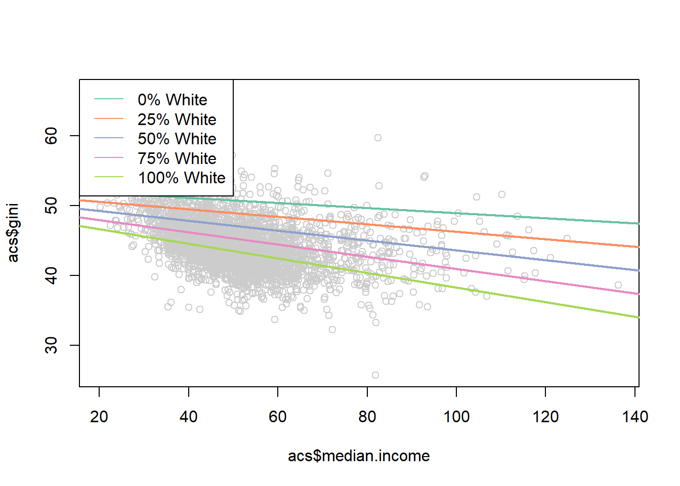
Not bad!
But for interaction with continuous variables often what is more helpful to plot is the marginal effect of the variable that we care about across levels of the other variable.
Here the effect of median income is given by the equation
\[ \frac{\partial Gini}{\partial M.Income} = \beta_1 + \beta_3*Perc.White \]
So the marginal effect of median income is
percent.white <- seq(0,100,.01)

margin <- coef(m4)["median.income"] + coef(m4)["median.income:percent.white"]*percent.white

plot(percent.white, margin, type="l", ylim=c(-0.15,0))
abline(h=0, lty=2)
rug(acs$percent.white)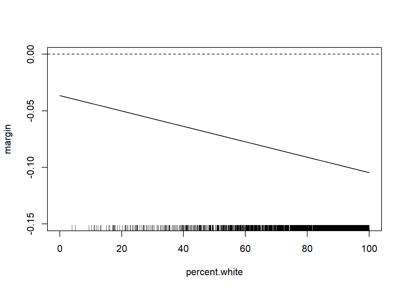
Note that we can easily think about the inverse of this
median.income <- seq(0,140,1)

margin <- coef(m4)["percent.white"] + coef(m4)["median.income:percent.white"]*median.income

plot(median.income, margin, type="l", ylim=c(-0.15,0))
abline(h=0, lty=2)
rug(acs$median.income)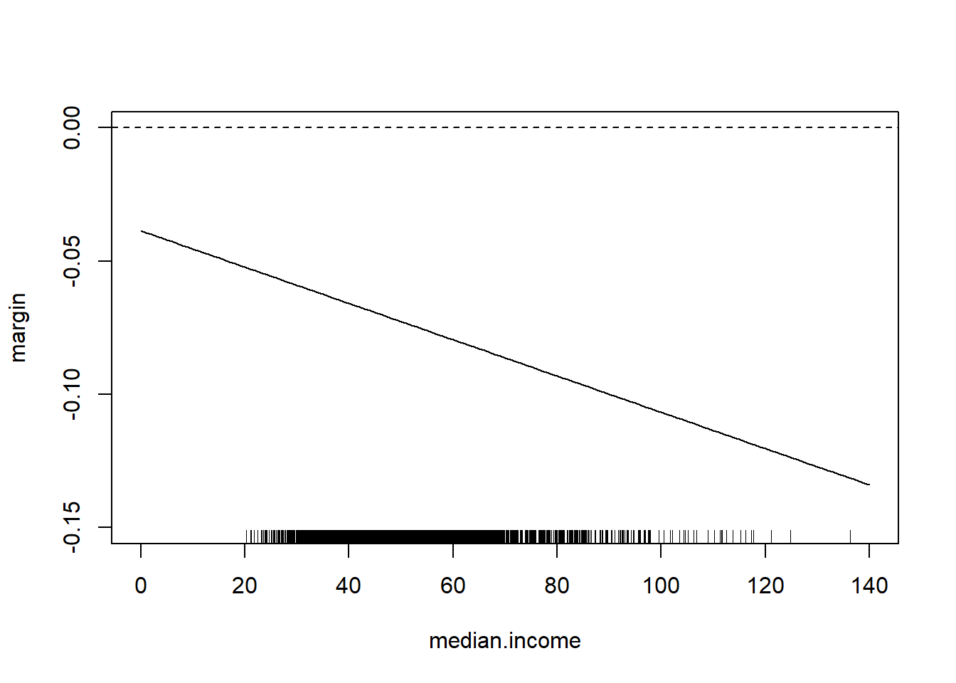
Would you like this to be a bit easier?
From the maker of the rio package: margins!
library(margins)
#> Warning: package 'margins' was built under R version 4.1.3
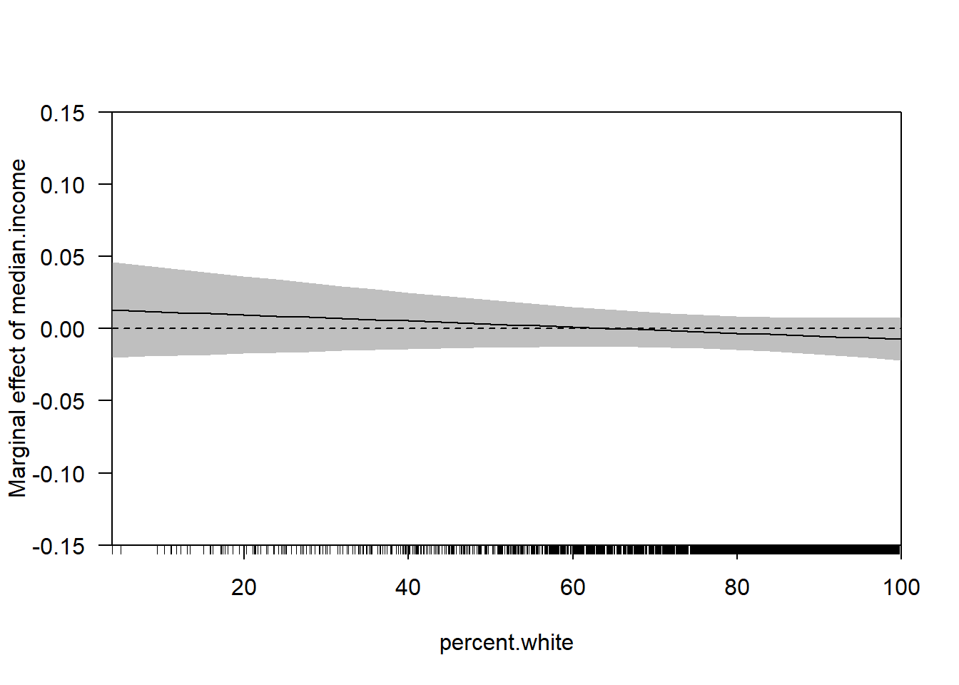
cplot(m4, x="median.income",dx="percent.white", what="effect")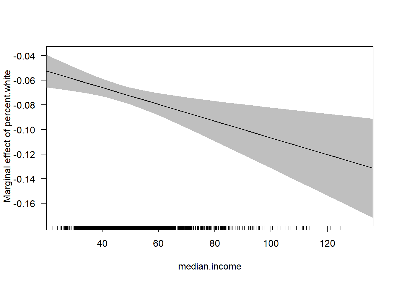
cplot(m4, dx="median.income",x="percent.white", what="effect")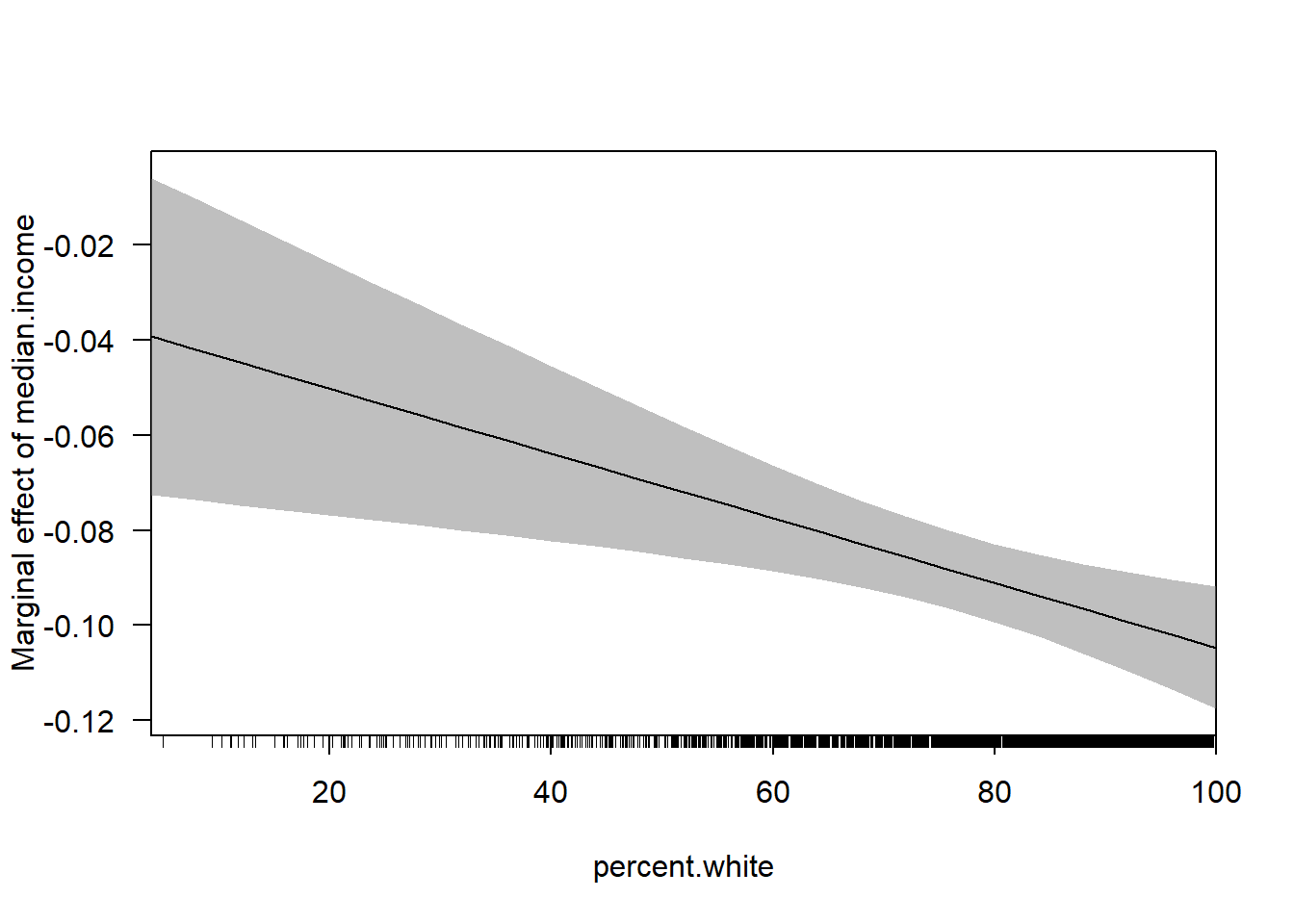
With the huge benefit of there being confidence intervals included!
We can also use the margins package to get marginal effects across levels:
margins(m4, at=list(percent.white=c(0,25,50,75,100)))
#> Warning in check_values(data, at): A 'at' value for
#> 'percent.white' is outside observed data range
#> (3.89119297389607,100)!
#> Average marginal effects at specified values
#> lm(formula = gini ~ median.income * percent.white, data = acs)
#>  at(percent.white) median.income percent.white
#>                  0      -0.03660      -0.07377
#>                 25      -0.05362      -0.07377
#>                 50      -0.07064      -0.07377
#>                 75      -0.08766      -0.07377
#>                100      -0.10468      -0.07377
margins(m4, at=list(median.income=c(0,50,150)))
#> Warning in check_values(data, at): Some 'at' values for
#> 'median.income' are outside observed data range
#> (20.188,136.268)!
#> Average marginal effects at specified values
#> lm(formula = gini ~ median.income * percent.white, data = acs)
#>  at(median.income) median.income percent.white
#>                  0      -0.09315      -0.03866
#>                 50      -0.09315      -0.07270
#>                150      -0.09315      -0.14078
How does this change when we add additional control variables?
m5 <- lm(gini ~ median.income*percent.white + population.density +
           percent.adult.poverty + percent.car.commute, data=acs)

summary(m5)
#>
#> Call:
#> lm(formula = gini ~ median.income * percent.white + population.density +
#>     percent.adult.poverty + percent.car.commute, data = acs)
#>
#> Residuals:
#>      Min       1Q   Median       3Q      Max
#> -13.8154  -1.7762  -0.2256   1.6935  18.6010
#>
#> Coefficients:
#>                               Estimate Std. Error t value
#> (Intercept)                  4.137e+01  1.279e+00  32.348
#> median.income                1.377e-02  1.759e-02   0.783
#> percent.white               -2.108e-02  1.026e-02  -2.053
#> population.density           2.727e-04  3.226e-05   8.455
#> percent.adult.poverty        2.893e-01  1.365e-02  21.202
#> percent.car.commute          7.685e-03  7.824e-03   0.982
#> median.income:percent.white -2.105e-04  2.124e-04  -0.991
#>                             Pr(>|t|)
#> (Intercept)                   <2e-16 ***
#> median.income                 0.4340
#> percent.white                 0.0401 *
#> population.density            <2e-16 ***
#> percent.adult.poverty         <2e-16 ***
#> percent.car.commute           0.3261
#> median.income:percent.white   0.3217
#> ---
#> Signif. codes:
#> 0 '***' 0.001 '**' 0.01 '*' 0.05 '.' 0.1 ' ' 1
#>
#> Residual standard error: 2.923 on 3134 degrees of freedom
#>   (1 observation deleted due to missingness)
#> Multiple R-squared:  0.3604, Adjusted R-squared:  0.3591
#> F-statistic: 294.3 on 6 and 3134 DF,  p-value: < 2.2e-16
This is a more complicated regression… but the way we approach the marginal effect is identical, because of the calculus. If we apply the power rule we get the exact same outcome:
\[ \hat{gini} = \alpha + \beta_1M.Income + \beta_2Perc.White + \beta_3 M.Income*Perc.White\\ + \beta_4* population.density + \beta_5* adult.poverty + \beta_6 * percent.car.commute \\ \frac{\partial Gini}{\partial M.Income} = \beta_1 + \beta_3*Perc.White \]
So we can still do:
percent.white <- seq(0,100,.01)

margin <- coef(m5)["median.income"] + coef(m5)["median.income:percent.white"]*percent.white

plot(percent.white, margin, type="l", ylim=c(-0.15,0.15))
abline(h=0, lty=2)
rug(acs$percent.white)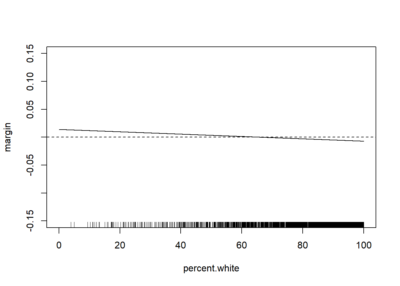
The relationship has changed substantially with these additional control variables. But the way we examine the marginal effect does not. Can get the same thing with:
Let’s do one more example of an interaction using the ACS data:
How does the effect of the percent who commute by car on commute time change as population density increases?
What do we mean by this question? First, we think there is some sort of unconditional relationship between the percent of people who commute by transit and commuting time. Given that, in the US at least, transit commuting is a real second-class option, my expectation is that the more people who commute by transit in a location the longer average commute times will be.
We can confirm that using a bivariate regression:
library(stargazer)
m <- lm(average.commute.time ~ percent.transit.commute, data=acs)
stargazer(m, type="text")
#>
#> ===================================================
#>                             Dependent variable:
#>                         ---------------------------
#>                            average.commute.time
#> ---------------------------------------------------
#> percent.transit.commute          0.353***
#>                                   (0.032)
#>
#> Constant                         23.225***
#>                                   (0.105)
#>
#> ---------------------------------------------------
#> Observations                       3,140
#> R2                                 0.037
#> Adjusted R2                        0.037
#> Residual Std. Error          5.630 (df = 3138)
#> F Statistic              121.671*** (df = 1; 3138)
#> ===================================================
#> Note:                   *p<0.1; **p<0.05; ***p<0.01
Indeed, for every additional percent of people commuting by transit average commute times increase by .353.
An objection to that regression might be that rural places have both low transit commuting and low commute times (if people work on their farms, for example). So we may want to take into account the independent effect of population density on both the percent who commute by transit and average commute times:
m2 <- lm(average.commute.time ~ percent.transit.commute + population.density, data=acs)
stargazer(m,m2, type="text")
#>
#> ==========================================================================
#>                                        Dependent variable:
#>                         --------------------------------------------------
#>                                        average.commute.time
#>                                    (1)                      (2)
#> --------------------------------------------------------------------------
#> percent.transit.commute         0.353***                  0.391***
#>                                  (0.032)                  (0.056)
#>
#> population.density                                        -0.0001
#>                                                           (0.0001)
#>
#> Constant                        23.225***                23.209***
#>                                  (0.105)                  (0.107)
#>
#> --------------------------------------------------------------------------
#> Observations                      3,140                    3,140
#> R2                                0.037                    0.038
#> Adjusted R2                       0.037                    0.037
#> Residual Std. Error         5.630 (df = 3138)        5.631 (df = 3137)
#> F Statistic             121.671*** (df = 1; 3138) 61.166*** (df = 2; 3137)
#> ==========================================================================
#> Note:                                          *p<0.1; **p<0.05; ***p<0.01
Actually this relationship gets stronger once we take into account the independent effect of population density.
But that’s not the question we asked, we want to know if the effect of the percent transit commuters changes as population density increases. To do that we have to multiply the two variables:
m3 <- lm(average.commute.time ~ percent.transit.commute*population.density, data=acs)

stargazer(m,m2,m3, type="text")
#>
#> ======================================================================================================================
#>                                                                        Dependent variable:
#>                                            ---------------------------------------------------------------------------
#>                                                                       average.commute.time
#>                                                       (1)                      (2)                      (3)
#> ----------------------------------------------------------------------------------------------------------------------
#> percent.transit.commute                            0.353***                  0.391***                 0.272***
#>                                                     (0.032)                  (0.056)                  (0.061)
#>
#> population.density                                                           -0.0001                  0.001***
#>                                                                              (0.0001)                 (0.0002)
#>
#> percent.transit.commute:population.density                                                          -0.00002***
#>                                                                                                      (0.00000)
#>
#> Constant                                           23.225***                23.209***                23.110***
#>                                                     (0.105)                  (0.107)                  (0.109)
#>
#> ----------------------------------------------------------------------------------------------------------------------
#> Observations                                         3,140                    3,140                    3,140
#> R2                                                   0.037                    0.038                    0.045
#> Adjusted R2                                          0.037                    0.037                    0.044
#> Residual Std. Error                            5.630 (df = 3138)        5.631 (df = 3137)        5.610 (df = 3136)
#> F Statistic                                121.671*** (df = 1; 3138) 61.166*** (df = 2; 3137) 49.045*** (df = 3; 3136)
#> ======================================================================================================================
#> Note:                                                                                      *p<0.1; **p<0.05; ***p<0.01
Let’s break down what it is that we are seeing here.
The intercept here is 23.110. I have said many times that the intercept is the average value of the outcome when all variables in the regression are equal to 0, so this is the average commute time in a place with 0 transit commuters and 0 population density. So, as often is this case, this is a nonsense number.
To get the effect of the percent commuting by transit we can deploy a derivative:
\[ \hat{commute} = \alpha + \beta_1 Transit + \beta_@ Dens + \beta_3 Transity*Dens\\ \frac{\partial\hat{commute} }{\partial Transit} = \beta_1 + \beta_3*Dens\\ \]
As we wanted, the effect of the percent who commute by transit changes across levels of population density. If this equation describes the effect of % transit, under what conditions is the effect \(\beta_1\)? This is only the case when population density is equal to 0. So in a county with zero people the effect of an additional transit commuter is to increase average commute times by .272. Is this an important number? No! You have to know to ignore this number.
To determine what the effect of percent transit commute is, we have to evaluate at many values of of population density. Again, we have to be smart here. Try to think: what values does density take on?
summary(acs$population.density)
#>     Min.  1st Qu.   Median     Mean  3rd Qu.     Max.
#>     0.04    16.69    44.72   270.68   116.71 72052.96
OK! Let’s just do the math:
population.density <- seq(0,73000,1)
marginal.effect <- coef(m3)["percent.transit.commute"] + population.density*coef(m3)["percent.transit.commute:population.density"]

plot(population.density, marginal.effect, type="l", xlab="Population Density", ylab="Effect of % Transit Commute on Commute Time")
abline(h=0, lty=2)
rug(acs$population.density)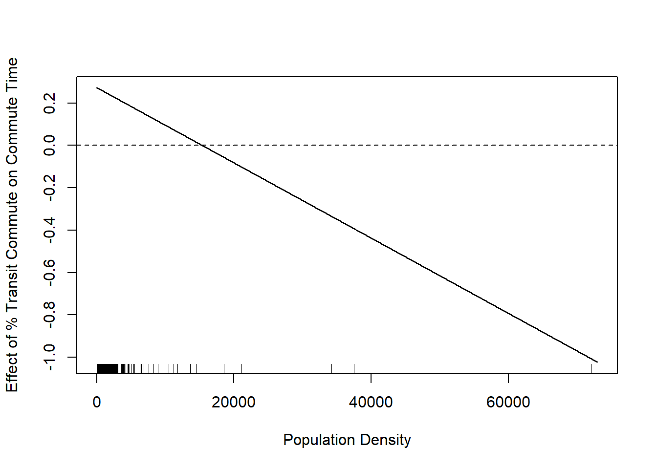
We see that this line is negative. This is saying that the effect of percent commuting by transit decreases as population density increases. In other words, when a place gets more dense having more people commute by transit moves from a net time suck on commute times to a net positive.
I have added the rug plot here to show where counties population densities actually are, and that rug plot somewhat tempers this finding. The truth is that the majority of counties have very small population densities and so this negative relationship is not true for many places.