13 Comparing quantitative data within individuals
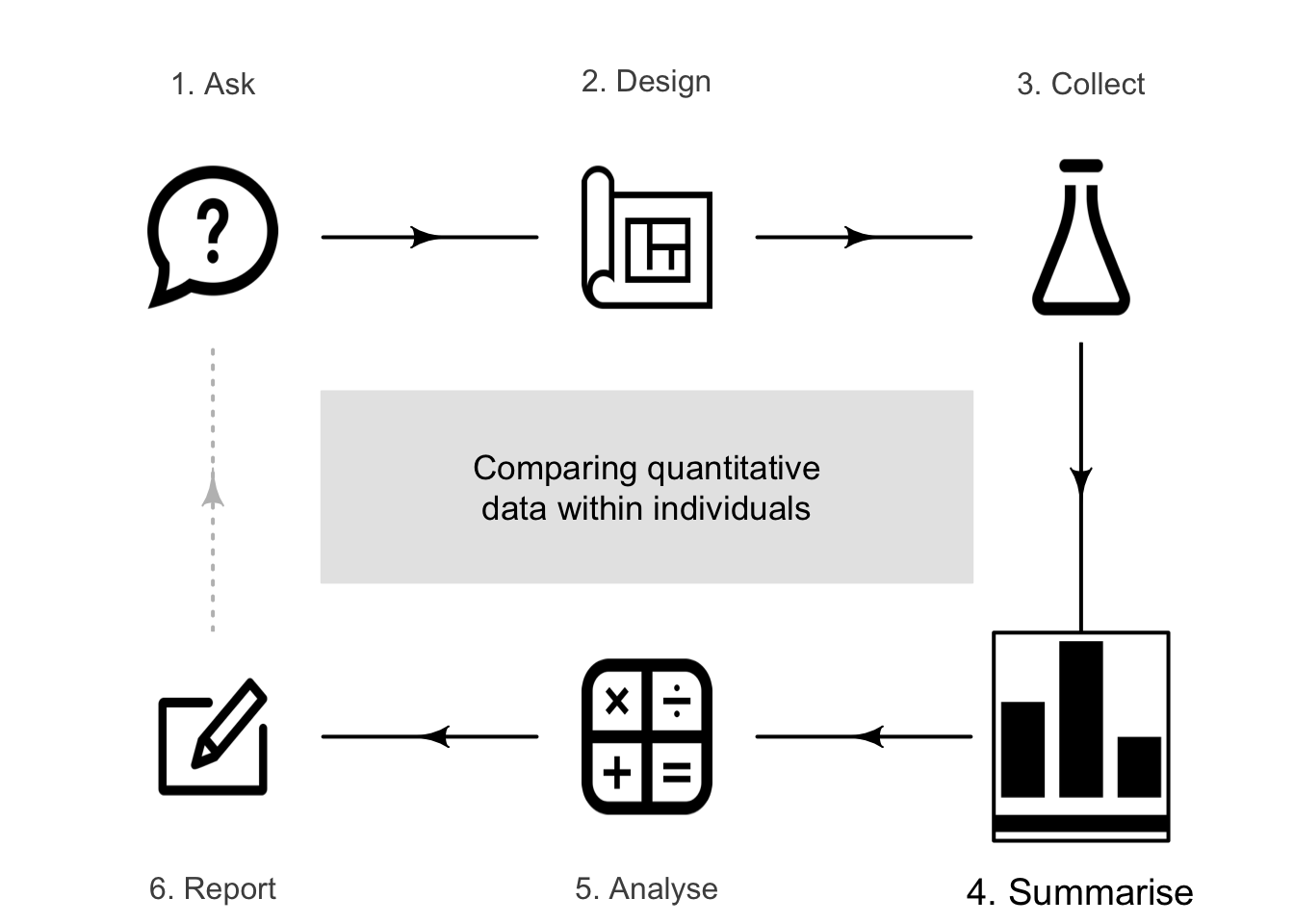
So far, you have learnt to ask a RQ, design a study, collect the data, describe the data and summarise the data. In this chapter, you will learn to:
- summarise within-individual changes in quantitative data using appropriate graphs.
- summarise within-individual changes using summary tables.
13.1 Introduction
Sometimes the same quantitative variable is measured on each individual more than once (i.e., within-individual changes for each unit of analysis) but only a small number of times. Examples of this type of data include:
- Measurements of household water consumption for many households, before and after installing water-saving devices.
- Blood pressure recorded for people at \(8\)am, \(1\)pm and \(8\)pm each day.
In both cases, the same variable is measured multiple times for each individual. This chapter studies summarising within-individuals changes in quantitative variables.
13.2 Numerical summary: mean differences
The best way to compare two observations for each individual is to summarise the differences between both observations for each individual; for example, using the mean of these differences. A numerical summary table can be constructed summarising both groups, plus the differences.
When more than two observations are made for each individual, the changes from the first observation may be computed (e.g., if the first observation is pre-intervention, or a benchmark, observation); for example, using the mean change (see Sect. 13.5).
Example 13.1 (Within-individual comparisons) Lothian, Grey, and Lands (2006) studied children with atopic asthma, and measured the immunogoblin E concentrations (IgE) before and after an intervention for each child (Table 13.1). The child is the individual.
For the IgE data, the numerical summary table is shown in Table 13.2. The direction of the difference is implied by the word 'reduction'.
| IgE (before) in micrograms/L | IgE (after) in micrograms/L | IgE reduction in micrograms/L |
|---|---|---|
| \(\phantom{0}\phantom{0}83\) | \(\phantom{0}\phantom{0}83\) | \(\phantom{0}\phantom{0}\phantom{0}0\) |
| \(\phantom{0}292\) | \(\phantom{0}292\) | \(\phantom{0}\phantom{0}\phantom{0}0\) |
| \(\phantom{0}293\) | \(\phantom{0}292\) | \(\phantom{0}\phantom{0}\phantom{0}1\) |
| \(\phantom{0}623\) | \(\phantom{0}542\) | \(\phantom{0}\phantom{0}81\) |
| \(\phantom{0}792\) | \(\phantom{0}709\) | \(\phantom{0}\phantom{0}83\) |
| \(1543\) | \(1000\) | \(\phantom{0}543\) |
| \(1668\) | \(1000\) | \(\phantom{0}668\) |
| \(1960\) | \(1626\) | \(\phantom{0}334\) |
| \(2877\) | \(2502\) | \(\phantom{0}375\) |
| \(2961\) | \(2711\) | \(\phantom{0}250\) |
| \(5504\) | \(4504\) | \(1000\) |
| Mean | Std dev. | Sample size | |
|---|---|---|---|
| Before | \(\phantom{0}1690.5\) | \(1615.53\) | \(11\) |
| After | \(\phantom{0}1387.4\) | \(1354.28\) | \(11\) |
| Reduction | \(\phantom{0}\phantom{0}303.2\) | \(\phantom{0}325.28\) | \(11\) |
13.3 Graphs for the differences
For within-individual changes for a quantitative variable, options for plotting include:
- Histograms of differences (Sect. 13.3.1): useful for changes in pairs of measurements or observations.
- Case-profile plots (Sect. 13.3.2): useful when the same individuals are measured or observed a small number of times.
13.3.1 Histogram of differences
Sometimes the same variable is measured on each unit of analysis twice, when the changes (or differences) for each individual can be produced, and a histogram of the changes or differences can be constructed. The direction of the differences should be clear (e.g., first measurement minus second, or second measurement minus first).
Issues relevant for constructing histograms (Sect. 11.3.1), such as bin widths and boundary values, also apply here.
The axis displaying the counts (or percentages) should start from zero, since the height of the bars visually implies the frequency of those differences (see Example 17.3).
Example 13.2 (Within-individual comparisons) For the IgE data (Table 13.1), the reduction in IgE for each child can be shown using a histogram (Fig. 13.1, top panel).
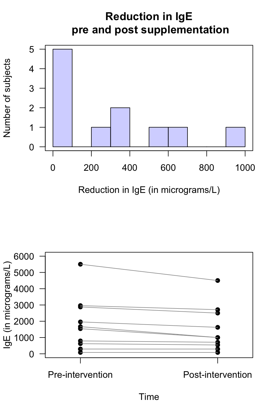
FIGURE 13.1: The IgE data. Top: a histogram of the differences. Bottom: a case-profile plot. Each line represents one subject, joining that person's pre-intervention score to their post-intervention score.
13.3.2 Case-profile plots
Sometimes the variable is measured or recorded more than twice, and so a single set of differences cannot be produced. In these cases, the values for each individual can be plotted using a case-profile plot. A case-profile plot is still useful for paired data, of course.
The axis displaying the counts (or percentages) need not start from zero, since the distance from the axis to the lines do not visually imply any quantity of interest. Rather, the relative changes represented by the lines display the quantity of interest.
Example 13.3 (Case-profile plot) For the IgE data (Table 13.1), the measurements of IgE for each child at both times can be shown in a case-profile plot (Fig. 13.1, bottom panel). Each line corresponds to a unit of analysis (i.e., a child).
Example 13.4 (Case-profile plot) Runners use wearable devices to measure many performance indicators, including vertical oscillation (VO). VO contributes to running economy and injury risk, so reliable VO measurements are crucial. Smith et al. (2022) compared four devices, and obtained data from video analysis for \(n = 150\) athletes; that is, each participant had the same runs measured using five methods. The case-profile plot (Fig. 13.2) shows the means for each method using a solid point. NOVA and Footpod give smaller VO measurements in general.
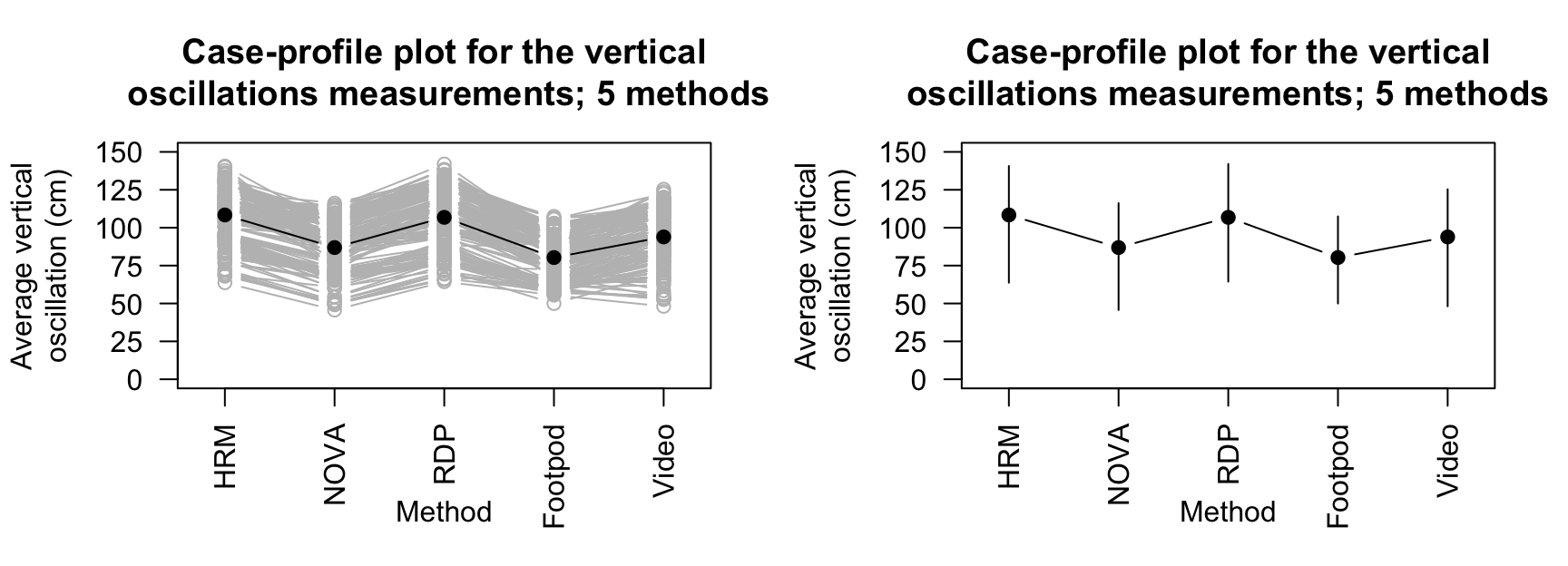
FIGURE 13.2: Vertical oscillation measured using five methods for \(15\) runners. The solid black points represent the means for each method. Left: a line is plotted for each individual. Right: only the means are shown, with vertical lines from the minimum value to the maximum value.
As in Example 13.4, the case-profile plot is hard to read with large numbers of individuals, and so sometimes the mean (or median, as appropriate) is shown, with some measure of the variation of the observations (Fig. 13.2 shows the minimum and maximum values for each method, for instance).
13.4 Example: invasive plants
[Dataset: Flowering]
Skypilot (Polemonium viscosum) is a native alpine wildflower growing in the Colorado Rocky Mountains (USA).
In recent years, a willow shrub (Salix) has been encroaching on skypilot territory and, because willow often flowers early, researchers (Kettenbach et al. 2017) are concerned that the willow may 'negatively affect pollination regimes of resident alpine wildflower species' (p. \(6\,965\)).
One RQ was:
In the Colorado Rocky Mountains, what is the mean difference between first-flowering day for the native skypilot and the encroaching willow?
Data for both species was collected at \(25\) different sites (Fig 13.3). The site is the individual; the data are paired (Sect. 29.1), a form of blocking (Sect. 7.2). The 'first-flowering day' is the number of days since the start of the year (e.g., January 12 is 'day 12') when flowers were first observed.
FIGURE 13.3: The cyclone data.
Since the data are available, the data should be summarised graphically (Fig. 13.5) and numerically (Table 13.3), using software output (Fig. 13.4).
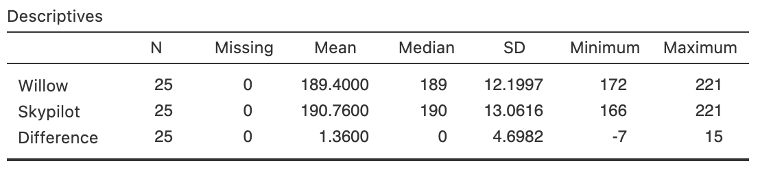
FIGURE 13.4: Software output for the flowering-day data.
| Mean | Std dev. | Sample size | |
|---|---|---|---|
| Willow (encroaching) | \(189.40\) | \(12.200\) | \(25\) |
| Skypilot (native) | \(190.76\) | \(13.062\) | \(25\) |
| Differences | \(\phantom{0}\phantom{0}1.36\) | \(\phantom{0}4.698\) | \(25\) |
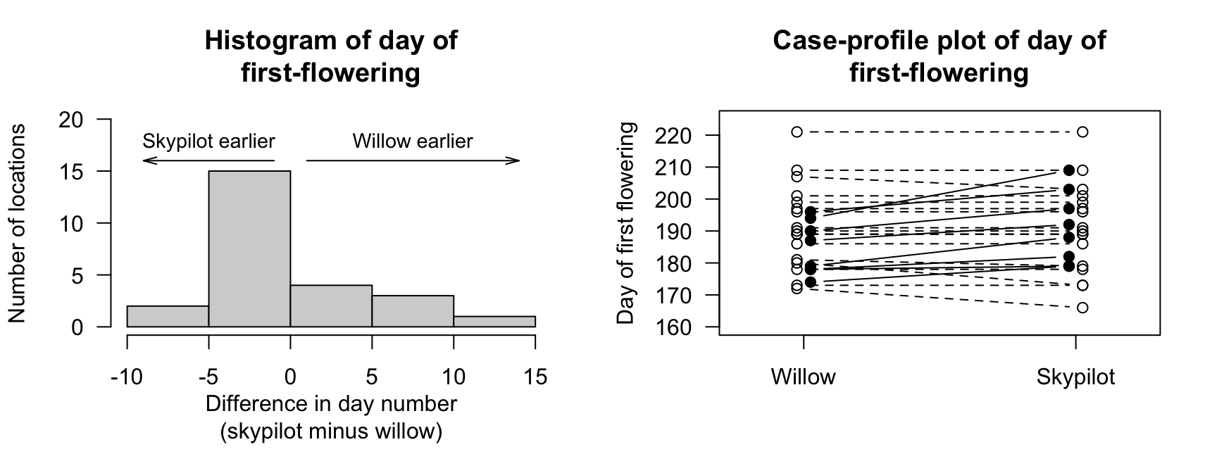
FIGURE 13.5: The flowering-day data. Left: a histogram of the difference between the first-flowering days (skypilot minus willow). Right: a case-profile plot of days of first flowering (unfilled points and dashed lines indicate earlier or same dates (smaller or equal values) for willow).
13.5 Example: pain-relieving tape
Naugle et al. (2021) studied the effect of using Kinesio Tape to alleviate pain in athletes. Pain was measured by applying a slow constant rate of pressure on the left arm, and subjects pressed a button when the sensation moved from pressure to pain. The pressure at which this occurred was recorded. This was repeated \(5\,\text{mins}\) before applying the tape, \(5\,\text{mins}\) after applying the tape, and again \(15\)--\(20\,\text{mins}\) after applying the tape.
Figure 13.6 shows the reported pain for \(16\) subjects. A summary table is shown in Table 13.4. The pain thresholds are increasing slightly as time progresses.
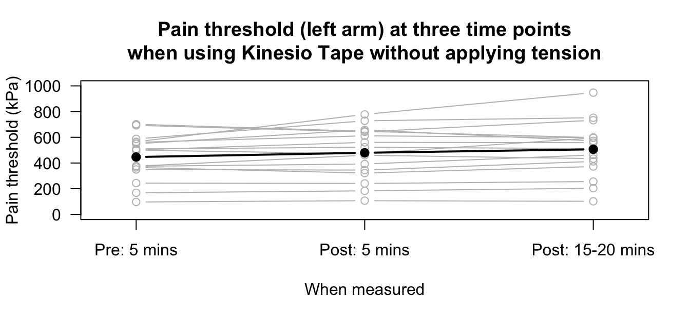
FIGURE 13.6: Pain threshold (left arm) at three time points when using Kinesio Tape, without applying tension, for \(n = 16\) subjects. The filled, black points represent the means for each time point.
| Mean (in kPa) | Std dev. (in kPa) | Sample size | Mean increase | SD increase | |
|---|---|---|---|---|---|
| Pre: \(5\,\text{mins}\) | \(446.5\) | \(175.18\) | \(16\) | ||
| Post: \(5\,\text{mins}\) | \(479.6\) | \(199.61\) | \(16\) | \(33.1\) | \(\phantom{0}73.93\) |
| Post: \(15-20\,\text{mins}\) | \(506.9\) | \(214.36\) | \(16\) | \(60.4\) | \(102.72\) |
13.6 Chapter summary
Quantitative data measured within individuals can be summarised using a histogram of differences when the variable is measured (or observed) twice, or a case-profile plot (with two or more measurement or observations per individual). A summary table should show the numerical summaries for the quantitative variable at each measurement or observation and for appropriate changes.
13.7 Quick review questions
Are the following statements true or false?
- A histogram of the differences is only appropriate for showing changes for two measurements or observations.
- A case-profile plot is only appropriate for showing changes for two measurements or observations.
- The median and IQR are not appropriate for summarising differences.
- Explaining how the differences are computed is important.
13.8 Exercises
Answers to odd-numbered exercises are given at the end of the book.
Exercise 13.1 [Dataset: Insulation]
The Electricity Council in Bristol wanted to determine if a certain type of wall-cavity insulation reduced average energy consumption in winter (The Open University 1983; Hand et al. 1996):
In Bristol homes, what is the mean reduction in energy consumption after adding home insulation?
- What are the individuals (units of analysis)?
- Explain why this study uses a within-individuals comparison.
- Use the collected data (shown below) to sketch a case-profile plot.
- Use the data to sketch a histogram of the differences.
- Use software or a calculator to prepare a summary table.
Exercise 13.2 [Dataset: Captopril]
In a study of hypertension (Hand et al. 1996; MacGregor et al. 1979), \(15\) patients were given a drug (Captopril) and their systolic blood pressure measured (in mm Hg) immediately before and two hours after being given the drug (Table 13.5).
- Explain why this study uses a within-individuals comparison.
- Construct a histogram of the differences.
- Construct a case-profile plot for the data.
| Before | After | Before | After |
|---|---|---|---|
| \(210\) | \(201\) | \(173\) | \(147\) |
| \(169\) | \(165\) | \(146\) | \(136\) |
| \(187\) | \(166\) | \(174\) | \(151\) |
| \(160\) | \(157\) | \(201\) | \(168\) |
| \(167\) | \(147\) | \(198\) | \(179\) |
| \(176\) | \(145\) | \(148\) | \(129\) |
| \(185\) | \(168\) | \(154\) | \(131\) |
| \(206\) | \(180\) |
Exercise 13.3 [Dataset: PainRelief]
Augustino et al. (2023) measured the reported pain of new mothers in Dodoma (Tanzania) at four times: near giving birth, then \(20\), \(40\) and \(60\,\text{mins}\) after giving birth.
Mothers were administered either paracetamol or a cold pack as pain relief.
Pain was recorded using a 'numeric rating scale represented by the horizontal line marked from zero to ten', where higher scores mean greater pain.
Since the number of individuals is large (\(n = 912\)), use the summary data in Table 13.6 to sketch a plot of the means and the range, like that in Figure 13.6.
| At birth | After 20 mins | After 40 mins | After 60 mins | ||
|---|---|---|---|---|---|
| Paracetamol | Mean | \(\phantom{0}7.44\) | \(\phantom{0}6.89\) | \(4.69\) | \(2.84\) |
| (\(n = 456\)) | Std deviation | \(\phantom{0}2.01\) | \(\phantom{0}1.83\) | \(1.49\) | \(1.19\) |
| Minimum | \(\phantom{0}2.00\) | \(\phantom{0}2.00\) | \(2.00\) | \(0.00\) | |
| Maximum | \(10.00\) | \(10.00\) | \(9.00\) | \(7.00\) | |
| Cold pack | Mean | \(\phantom{0}8.63\) | \(\phantom{0}5.67\) | \(3.19\) | \(0.99\) |
| (\(n = 455\)) | Std deviation | \(\phantom{0}1.40\) | \(\phantom{0}2.03\) | \(1.63\) | \(0.99\) |
| Minimum | \(\phantom{0}4.00\) | \(\phantom{0}0.00\) | \(0.00\) | \(0.00\) | |
| Maximum | \(10.00\) | \(\phantom{0}9.00\) | \(6.00\) | \(4.00\) |
Exercise 13.4 [Dataset: Stress]
The concentration of beta-endorphins in the blood is a sign of stress.
One study (Hand et al. (1996), Dataset 232; Hoaglin, Mosteller, and Tukey (2011)) measured the beta-endorphin concentration for \(19\) patients about to undergo surgery.
Each patient had their beta-endorphin concentrations measured \(12\)--\(14\,\text{h}\) before surgery, and also \(10\,\text{mins}\) before surgery. A numerical summary (from software output) is in Table 13.7.
| Mean | Std deviation | Sample size | |
|---|---|---|---|
| 12--14 hours before surgery | \(\phantom{0}8.35\) | \(\phantom{0}4.397\) | \(19\) |
| 10 minutes before surgery | \(16.05\) | \(12.509\) | \(19\) |
| Increase | \(\phantom{0}7.70\) | \(13.519\) | \(19\) |
- Explain why this study uses a within-individuals comparison.
- Explain why the standard deviation for the increase is not the difference between the two individuals time-point standard deviations.
- Using the data file and software, construct a histogram of the differences.
- Using the data file and software, construct a case-profile plot for the data.
Exercise 13.5 [Dataset: Running]
Create a summary table for the data in Example 13.4.
Exercise 13.6 [Dataset: WCTennis]
Alberca et al. (2022) recorded the push-time for French wheelchair tennis players, while holding and not holding a racquet (Table 13.8; Alberca (2022)).
- What do the differences mean (as given in the table)?
- Create a plot of the data.
- Create a numerical summary table for the data.
| Person | With racquet | Without racquet | Difference (in s) |
|---|---|---|---|
| \(\phantom{0}\phantom{0}1\) | \(\phantom{0}0.2625\) | \(\phantom{0}0.1833\) | \(\phantom{0}\phantom{0}0.0792\) |
| \(\phantom{0}\phantom{0}2\) | \(\phantom{0}0.2375\) | \(\phantom{0}0.2250\) | \(\phantom{0}\phantom{0}0.0125\) |
| \(\phantom{0}\phantom{0}3\) | \(\phantom{0}0.2583\) | \(\phantom{0}0.2042\) | \(\phantom{0}\phantom{0}0.0542\) |
| \(\phantom{0}\phantom{0}4\) | \(\phantom{0}0.1917\) | \(\phantom{0}0.1875\) | \(\phantom{0}\phantom{0}0.0042\) |
| \(\phantom{0}\phantom{0}5\) | \(\phantom{0}0.1875\) | \(\phantom{0}0.1708\) | \(\phantom{0}\phantom{0}0.0167\) |
| \(\phantom{0}\phantom{0}6\) | \(\phantom{0}0.2542\) | \(\phantom{0}0.1750\) | \(\phantom{0}\phantom{0}0.0792\) |
| \(\phantom{0}\phantom{0}7\) | \(\phantom{0}0.2333\) | \(\phantom{0}0.1917\) | \(\phantom{0}\phantom{0}0.0417\) |
| \(\phantom{0}\phantom{0}8\) | \(\phantom{0}0.1917\) | \(\phantom{0}0.1708\) | \(\phantom{0}\phantom{0}0.0208\) |
| \(\phantom{0}\phantom{0}9\) | \(\phantom{0}0.2208\) | \(\phantom{0}0.2208\) | \(\phantom{0}\phantom{0}0.0000\) |
| \(\phantom{0}10\) | \(\phantom{0}0.2583\) | \(\phantom{0}0.2750\) | \(\phantom{0}{-0.0167}\) |
| \(\phantom{0}11\) | \(\phantom{0}0.2083\) | \(\phantom{0}0.1750\) | \(\phantom{0}\phantom{0}0.0333\) |
| \(\phantom{0}12\) | \(\phantom{0}0.2042\) | ||
| \(\phantom{0}13\) | \(\phantom{0}0.2208\) | \(\phantom{0}0.2292\) | \(\phantom{0}{-0.0083}\) |
Exercise 13.7 [Dataset: Jumping]
Hébert-Losier, Boswell-Smith, and Hanzlı́ková (2023) recorded double-legged jumping distance for \(80\) healthy people, when they wore both shoes and were barefoot
(data below).
- What do the differences mean (as given in the table)?
- Create a plot of the data.
- Create a numerical summary table for the data.