第 26 章 ggplot2之扩展内容
ggplot2的强大,还在于它的扩展包。本章在介绍ggplot2新的内容的同时还会引入一些新的宏包,需要提前安装
install.packages(c("sf", "cowplot", "patchwork", "gghighlight", "ggforce", "ggfx"))如果安装不成功,请先update宏包,再执行上面安装命令
library(tidyverse)
library(gghighlight)
library(cowplot)
library(patchwork)
library(ggforce)
library(ggridges)
26.1 你喜欢哪个图
p1 <- ggplot(mpg, aes(x = cty, y = hwy)) +
  geom_point() +
  geom_smooth() +
  labs(title = "1: geom_point() + geom_smooth()") +
  theme(plot.title = element_text(face = "bold"))

p2 <- ggplot(mpg, aes(x = cty, y = hwy)) +
  geom_hex() +
  labs(title = "2: geom_hex()") +
  guides(fill = FALSE) +
  theme(plot.title = element_text(face = "bold"))

p3 <- ggplot(mpg, aes(x = drv, fill = drv)) +
  geom_bar() +
  labs(title = "3: geom_bar()") +
  guides(fill = FALSE) +
  theme(plot.title = element_text(face = "bold"))

p4 <- ggplot(mpg, aes(x = cty)) +
  geom_histogram(binwidth = 2, color = "white") +
  labs(title = "4: geom_histogram()") +
  theme(plot.title = element_text(face = "bold"))

p5 <- ggplot(mpg, aes(x = cty, y = drv, fill = drv)) +
  geom_violin() +
  guides(fill = FALSE) +
  labs(title = "5: geom_violin()") +
  theme(plot.title = element_text(face = "bold"))

p6 <- ggplot(mpg, aes(x = cty, y = drv, fill = drv)) +
  geom_boxplot() +
  guides(fill = FALSE) +
  labs(title = "6: geom_boxplot()") +
  theme(plot.title = element_text(face = "bold"))

p7 <- ggplot(mpg, aes(x = cty, fill = drv)) +
  geom_density(alpha = 0.7) +
  guides(fill = FALSE) +
  labs(title = "7: geom_density()") +
  theme(plot.title = element_text(face = "bold"))

p8 <- ggplot(mpg, aes(x = cty, y = drv, fill = drv)) +
  geom_density_ridges() +
  guides(fill = FALSE) +
  labs(title = "8: ggridges::geom_density_ridges()") +
  theme(plot.title = element_text(face = "bold"))

p9 <- ggplot(mpg, aes(x = cty, y = hwy)) +
  geom_density_2d() +
  labs(title = "9: geom_density_2d()") +
  theme(plot.title = element_text(face = "bold"))

p1 + p2 + p3 + p4 + p5 + p6 + p7 + p8 + p9 +
  plot_layout(nrow = 3)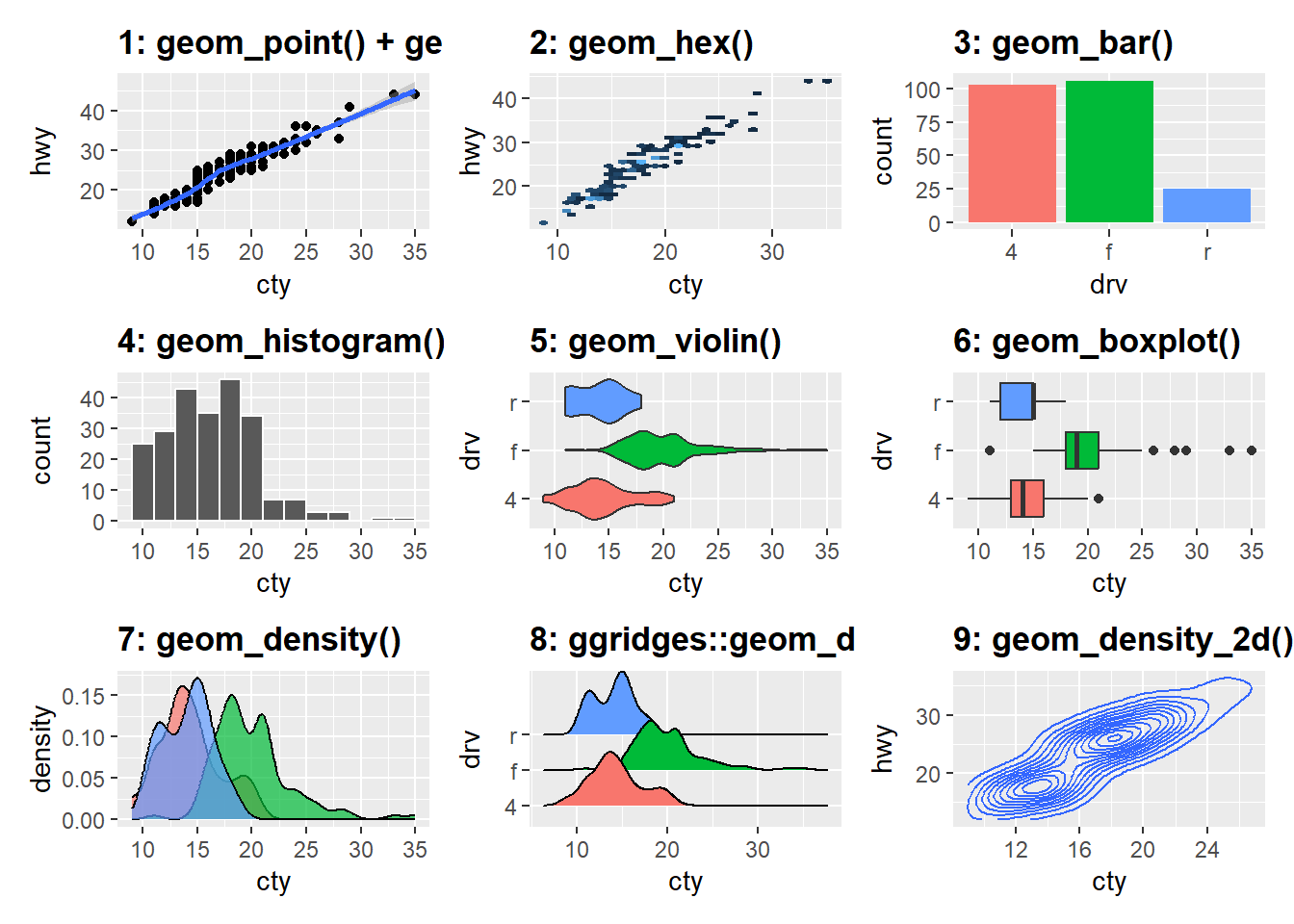
26.2 定制
26.2.1 标签
gapdata <- read_csv("./demo_data/gapminder.csv")
gapdata
## # A tibble: 1,704 × 6
## country continent year lifeExp pop gdpPercap
## <chr> <chr> <dbl> <dbl> <dbl> <dbl>
## 1 Afghanistan Asia 1952 28.8 8425333 779.
## 2 Afghanistan Asia 1957 30.3 9240934 821.
## 3 Afghanistan Asia 1962 32.0 10267083 853.
## 4 Afghanistan Asia 1967 34.0 11537966 836.
## 5 Afghanistan Asia 1972 36.1 13079460 740.
## 6 Afghanistan Asia 1977 38.4 14880372 786.
## 7 Afghanistan Asia 1982 39.9 12881816 978.
## 8 Afghanistan Asia 1987 40.8 13867957 852.
## 9 Afghanistan Asia 1992 41.7 16317921 649.
## 10 Afghanistan Asia 1997 41.8 22227415 635.
## # ℹ 1,694 more rowsgapdata %>%
ggplot(aes(x = gdpPercap, y = lifeExp, color = continent)) +
geom_point() +
scale_x_log10() +
ggtitle("My Plot Title") +
xlab("The X Variable") +
ylab("The Y Variable")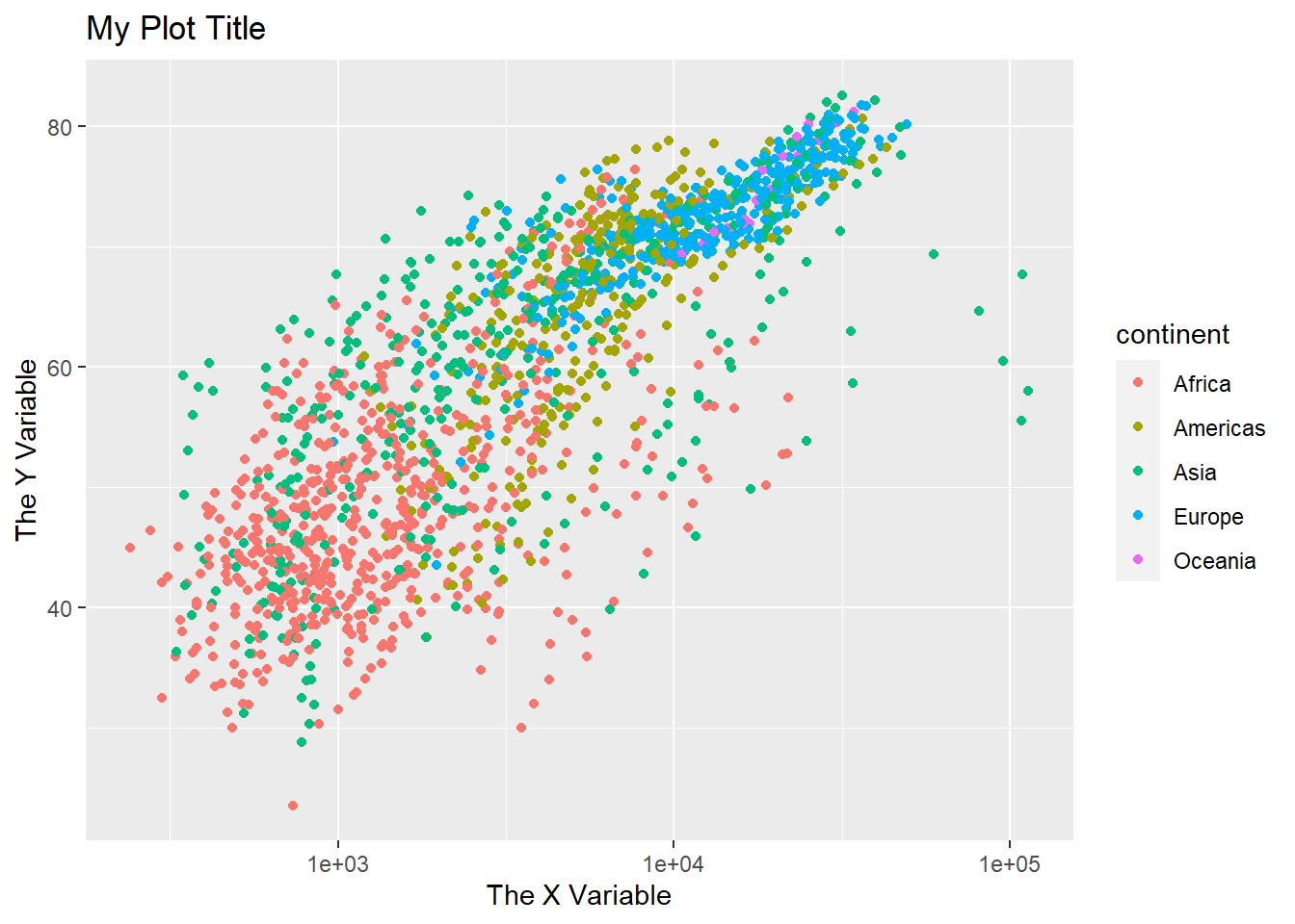
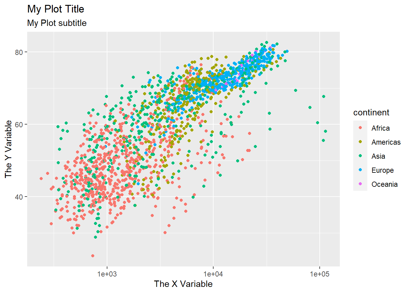
gapdata %>%
  ggplot(aes(x = gdpPercap, y = lifeExp, color = continent)) +
  geom_point() +
  scale_x_log10() +
  labs(
    title = "My Plot Title",
    subtitle = "My Plot subtitle",
    x = "The X Variable",
    y = "The Y Variable"
  )
26.2.2 定制颜色
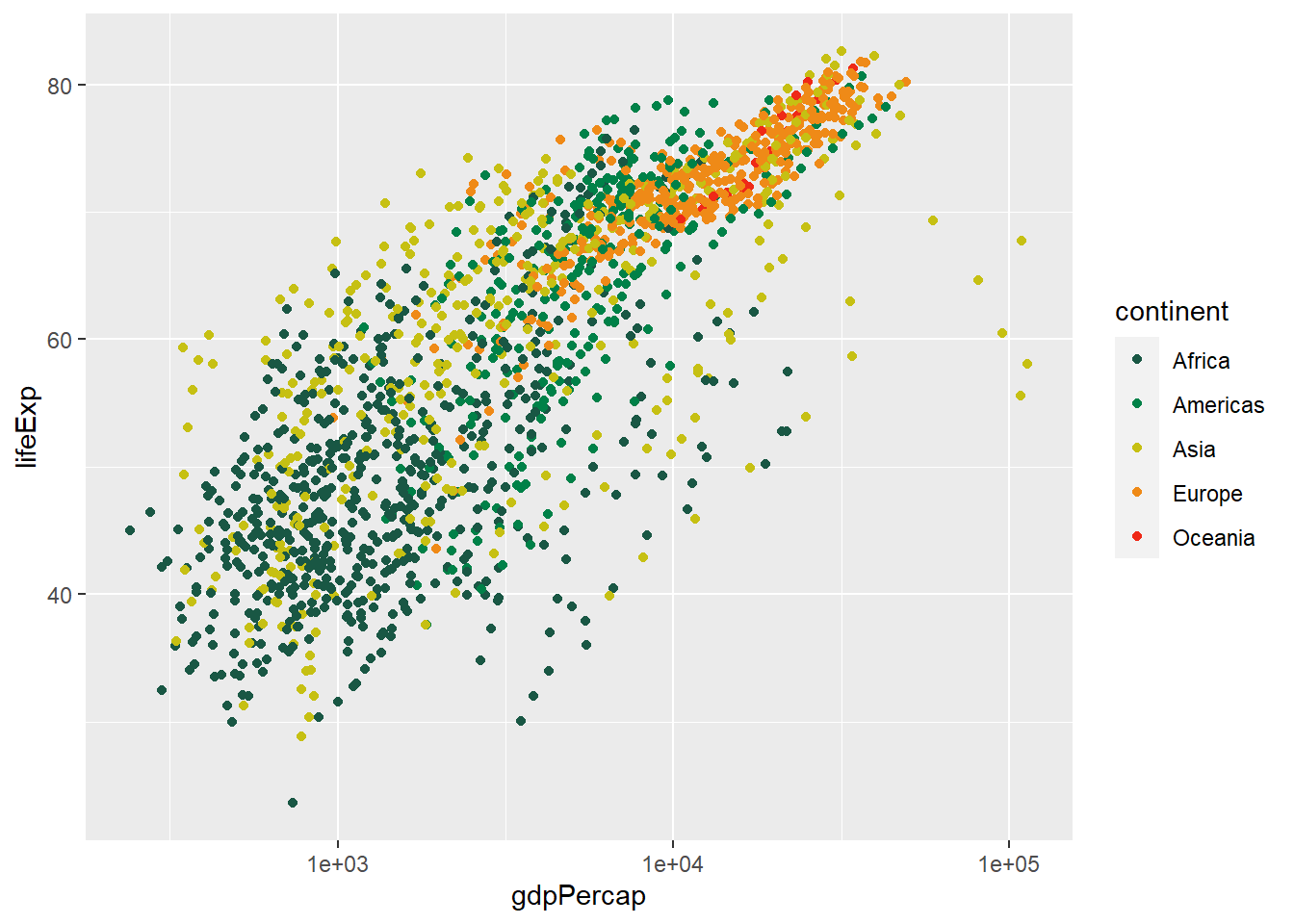
我喜欢用这两个函数定制喜欢的绘图色彩,scale_colour_manual() 和 scale_fill_manual(). 更多方法可以参考 Colours chapter in Cookbook for R
gapdata %>%
  ggplot(aes(x = gdpPercap, y = lifeExp, color = continent)) +
  geom_point() +
  scale_x_log10() +
  scale_color_manual(
    values = c("#195744", "#008148", "#C6C013", "#EF8A17", "#EF2917")
  )
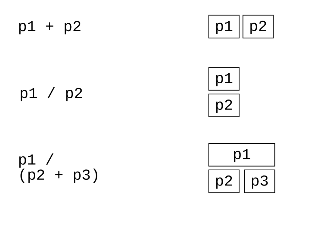
26.3 组合图片
我们有时候想把多张图组合到一起
26.3.1 cowplot
可以使用 cowplot 宏包的plot_grid()函数完成多张图片的组合,使用方法很简单。
p1 <- gapdata %>%
  ggplot(aes(x = gdpPercap, y = lifeExp)) +
  geom_point(aes(color = lifeExp > mean(lifeExp))) +
  scale_x_log10() +
  theme(legend.position = "none") +
  scale_color_manual(values = c("orange", "pink")) +
  labs(
    title = "My Plot Title",
    x = "The X Variable",
    y = "The Y Variable"
  )
p2 <- gapdata %>%
ggplot(aes(x = gdpPercap, y = lifeExp, color = continent)) +
geom_point() +
scale_x_log10() +
scale_color_manual(
values = c("#195744", "#008148", "#C6C013", "#EF8A17", "#EF2917")
) +
theme(legend.position = "none") +
labs(
title = "My Plot Title",
x = "The X Variable",
y = "The Y Variable"
)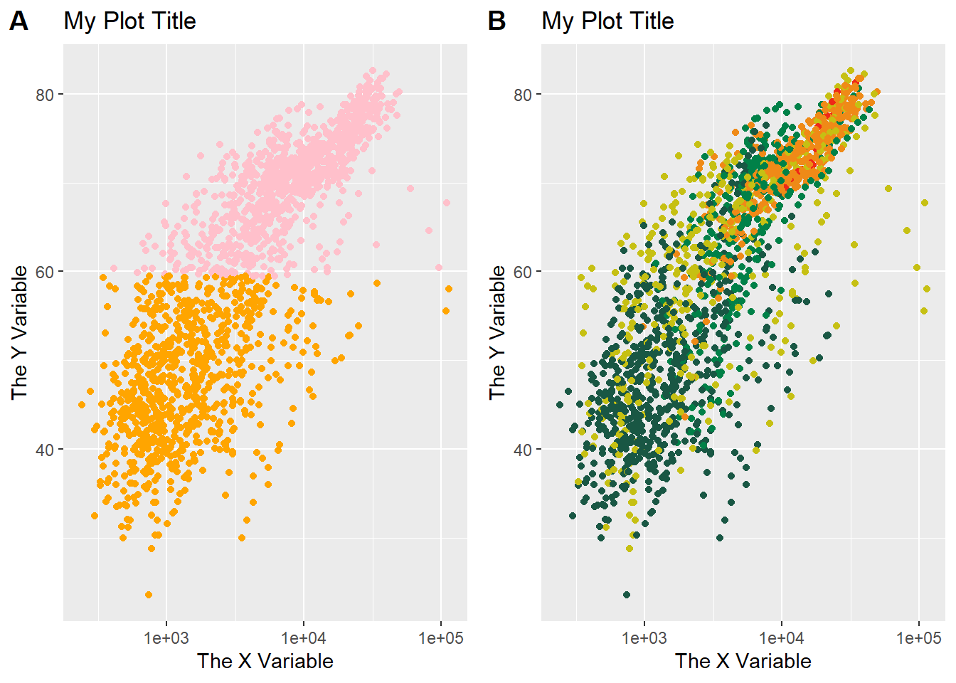
也可以使用patchwork宏包,更简单的方法
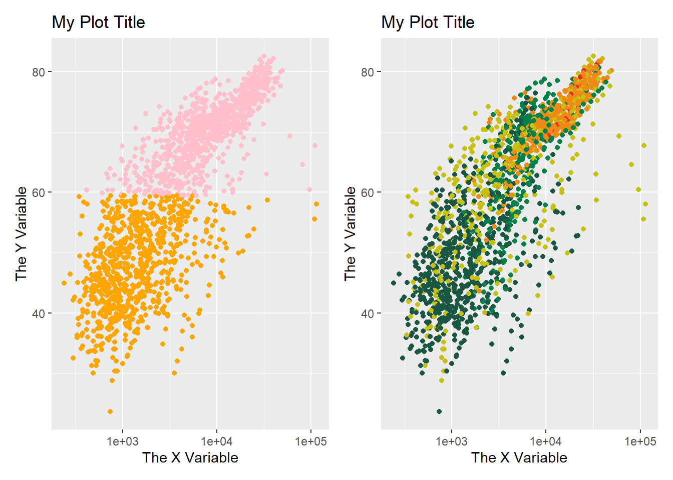
p1 / p2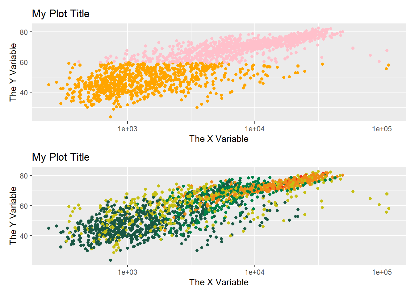
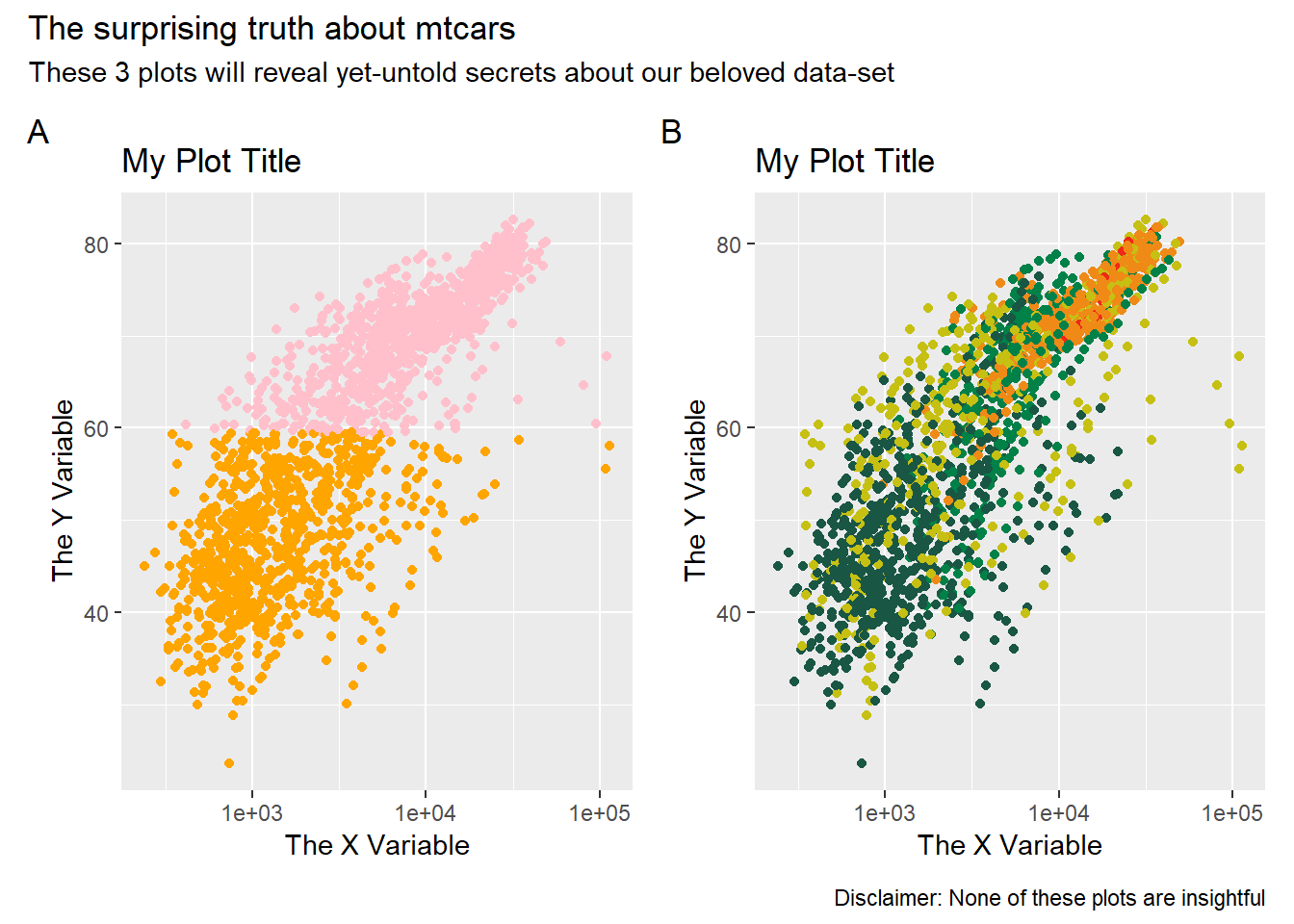
p1 + p2 +
  plot_annotation(
    tag_levels = "A",
    title = "The surprising truth about mtcars",
    subtitle = "These 3 plots will reveal yet-untold secrets about our beloved data-set",
    caption = "Disclaimer: None of these plots are insightful"
  )
再来一个
library(palmerpenguins)

g1 <- penguins %>%
  ggplot(aes(bill_length_mm, body_mass_g, color = species)) +
  geom_point() +
  theme_bw(base_size = 14) +
  labs(tag = "(A)", x = "Bill length (mm)", y = "Body mass (g)", color = "Species")

g2 <- penguins %>%
  ggplot(aes(bill_length_mm, bill_depth_mm, color = species)) +
  geom_point() +
  theme_bw(base_size = 14) +
  labs(tag = "(B)", x = "Bill length (mm)", y = "Bill depth (mm)",  color = "Species")

g1 + g2 + patchwork::plot_layout(guides = "collect")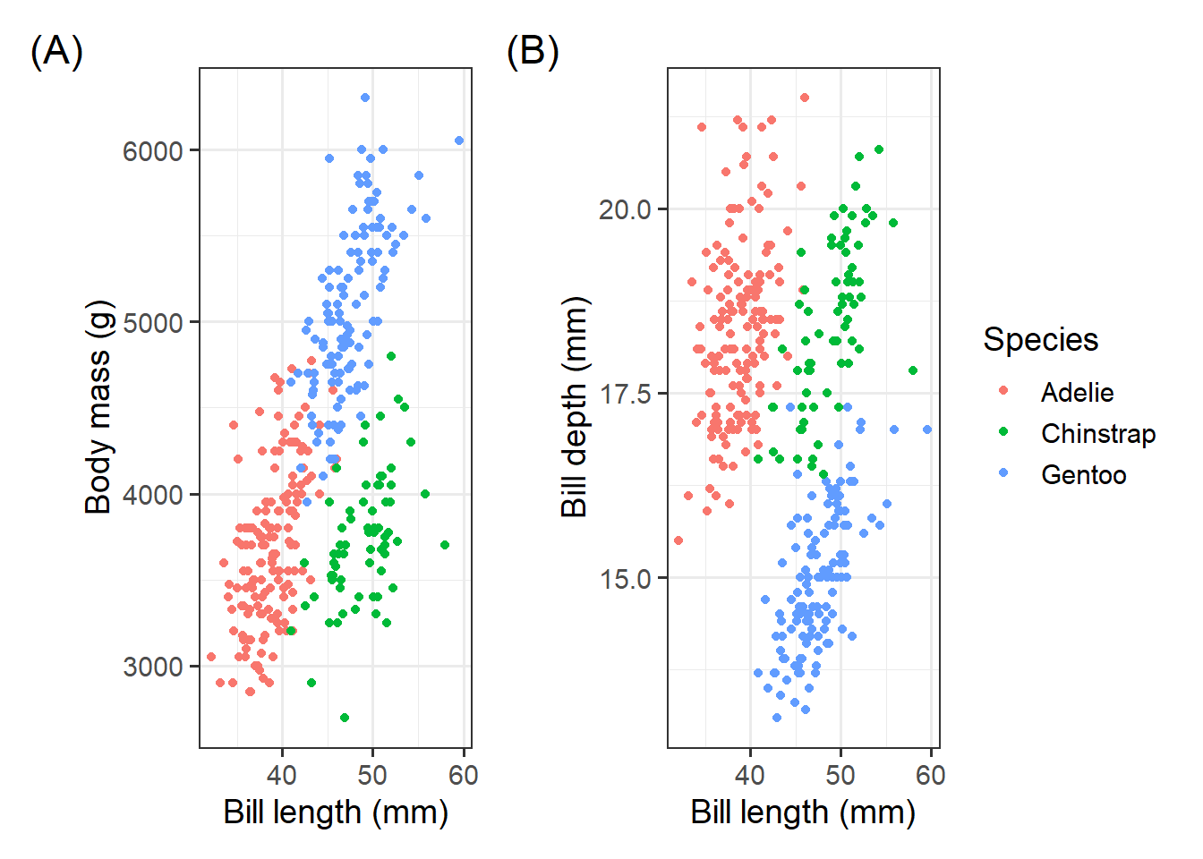
patchwork 使用方法很简单,根本不需要记
26.4 高亮某一组
画图很容易,然而画一张好图,不容易。图片质量好不好,其原则就是不增加看图者的心智负担,有些图片的色彩很丰富,然而需要看图人配合文字和图注等信息才能看懂作者想表达的意思,这样就失去了图片“一图胜千言”的价值。
分析数据过程中,我们可以使用高亮我们某组数据,突出我们想表达的信息,是非常好的一种可视化探索手段。
26.4.1 ggplot2方法
这种方法是将背景部分和高亮部分分两步来画
drop_facet <- function(x) select(x, -continent)

gapdata %>%
  ggplot() +
  geom_line(
    data = drop_facet,
    aes(x = year, y = lifeExp, group = country), color = "grey",
  ) +
  geom_line(aes(x = year, y = lifeExp, color = country, group = country)) +
  facet_wrap(vars(continent)) +
  theme(legend.position = "none")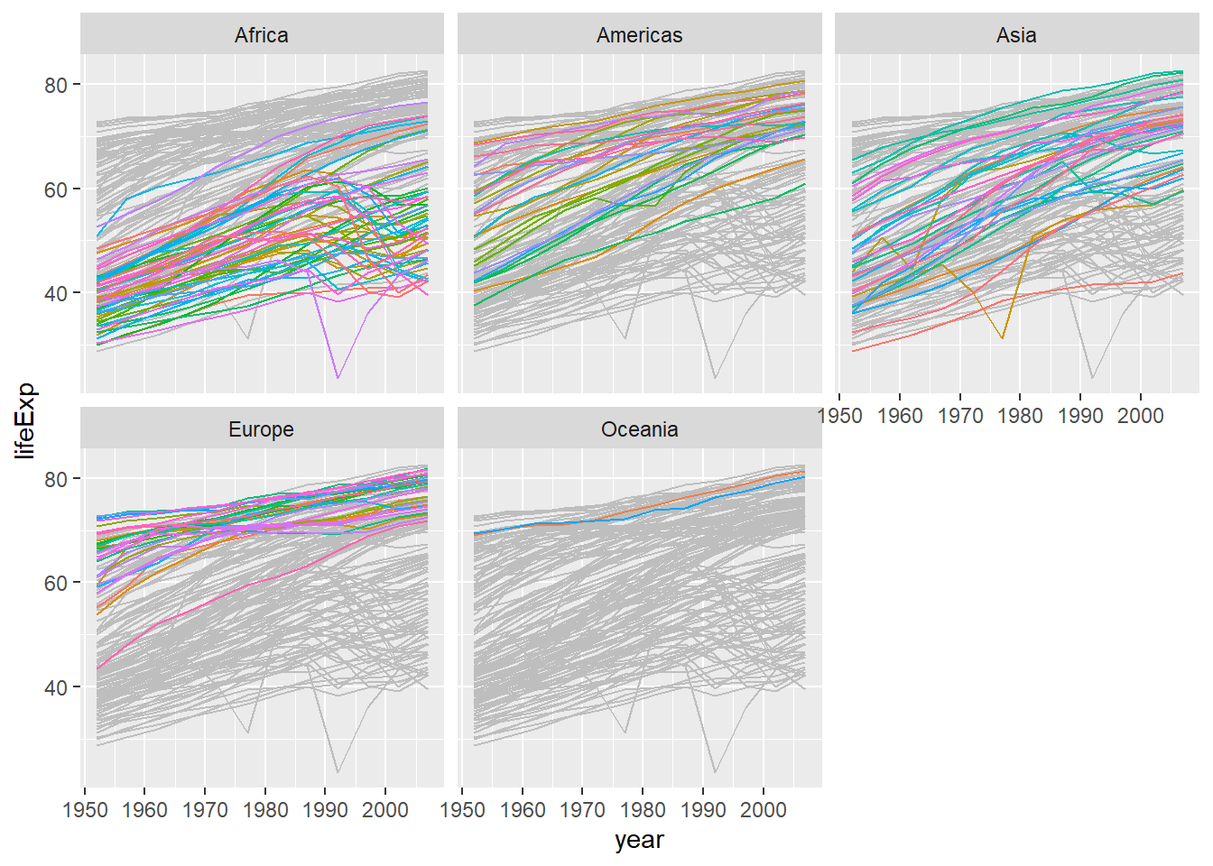
再来一个
gapdata %>%
  mutate(group = country) %>%
  filter(continent == "Asia") %>%
  ggplot() +
  geom_line(
    data = function(d) select(d, -country),
    aes(x = year, y = lifeExp, group = group), color = "grey",
  ) +
  geom_line(aes(x = year, y = lifeExp, group = country), color = "red") +
  facet_wrap(vars(country)) +
  theme(legend.position = "none")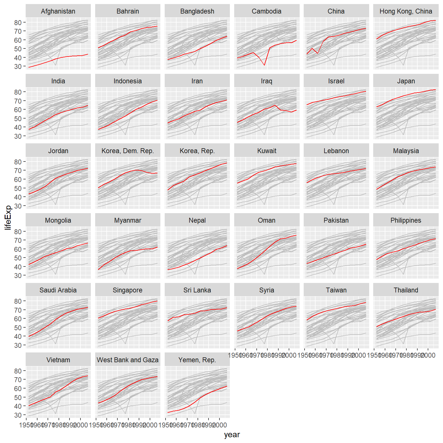
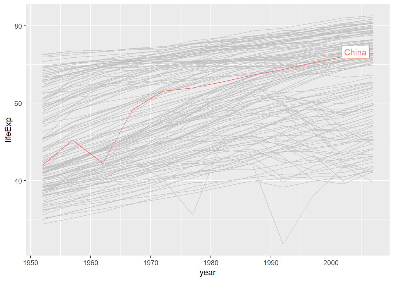
26.4.2 gghighlight方法
这里推荐gghighlight宏包
- dplyr has filter()
- ggplot has Highlighting
## # A tibble: 12 × 6
##    country continent  year lifeExp        pop gdpPercap
##    <chr>   <chr>     <dbl>   <dbl>      <dbl>     <dbl>
##  1 China   Asia       1952    44    556263527      400.
##  2 China   Asia       1957    50.5  637408000      576.
##  3 China   Asia       1962    44.5  665770000      488.
##  4 China   Asia       1967    58.4  754550000      613.
##  5 China   Asia       1972    63.1  862030000      677.
##  6 China   Asia       1977    64.0  943455000      741.
##  7 China   Asia       1982    65.5 1000281000      962.
##  8 China   Asia       1987    67.3 1084035000     1379.
##  9 China   Asia       1992    68.7 1164970000     1656.
## 10 China   Asia       1997    70.4 1230075000     2289.
## 11 China   Asia       2002    72.0 1280400000     3119.
## 12 China   Asia       2007    73.0 1318683096     4959.
gapdata %>%
ggplot(
aes(x = year, y = lifeExp, color = continent, group = country)
) +
geom_line() +
gghighlight(
country == "China", # which is passed to dplyr::filter().
label_key = country
)
## # A tibble: 396 × 6
##    country     continent  year lifeExp      pop gdpPercap
##    <chr>       <chr>     <dbl>   <dbl>    <dbl>     <dbl>
##  1 Afghanistan Asia       1952    28.8  8425333      779.
##  2 Afghanistan Asia       1957    30.3  9240934      821.
##  3 Afghanistan Asia       1962    32.0 10267083      853.
##  4 Afghanistan Asia       1967    34.0 11537966      836.
##  5 Afghanistan Asia       1972    36.1 13079460      740.
##  6 Afghanistan Asia       1977    38.4 14880372      786.
##  7 Afghanistan Asia       1982    39.9 12881816      978.
##  8 Afghanistan Asia       1987    40.8 13867957      852.
##  9 Afghanistan Asia       1992    41.7 16317921      649.
## 10 Afghanistan Asia       1997    41.8 22227415      635.
## # ℹ 386 more rows
gapdata %>%
filter(continent == "Asia") %>%
ggplot(aes(year, lifeExp, color = country, group = country)) +
geom_line(size = 1.2, alpha = .9, color = "#E58C23") +
theme_minimal(base_size = 14) +
theme(
legend.position = "none",
panel.grid.major.x = element_blank(),
panel.grid.minor = element_blank()
) +
gghighlight(
country %in% c("China", "India", "Japan", "Korea, Rep."),
use_group_by = FALSE,
use_direct_label = FALSE,
unhighlighted_params = list(color = "grey90")
) +
facet_wrap(vars(country))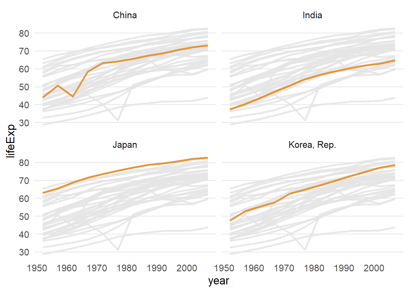
26.5 3D效果
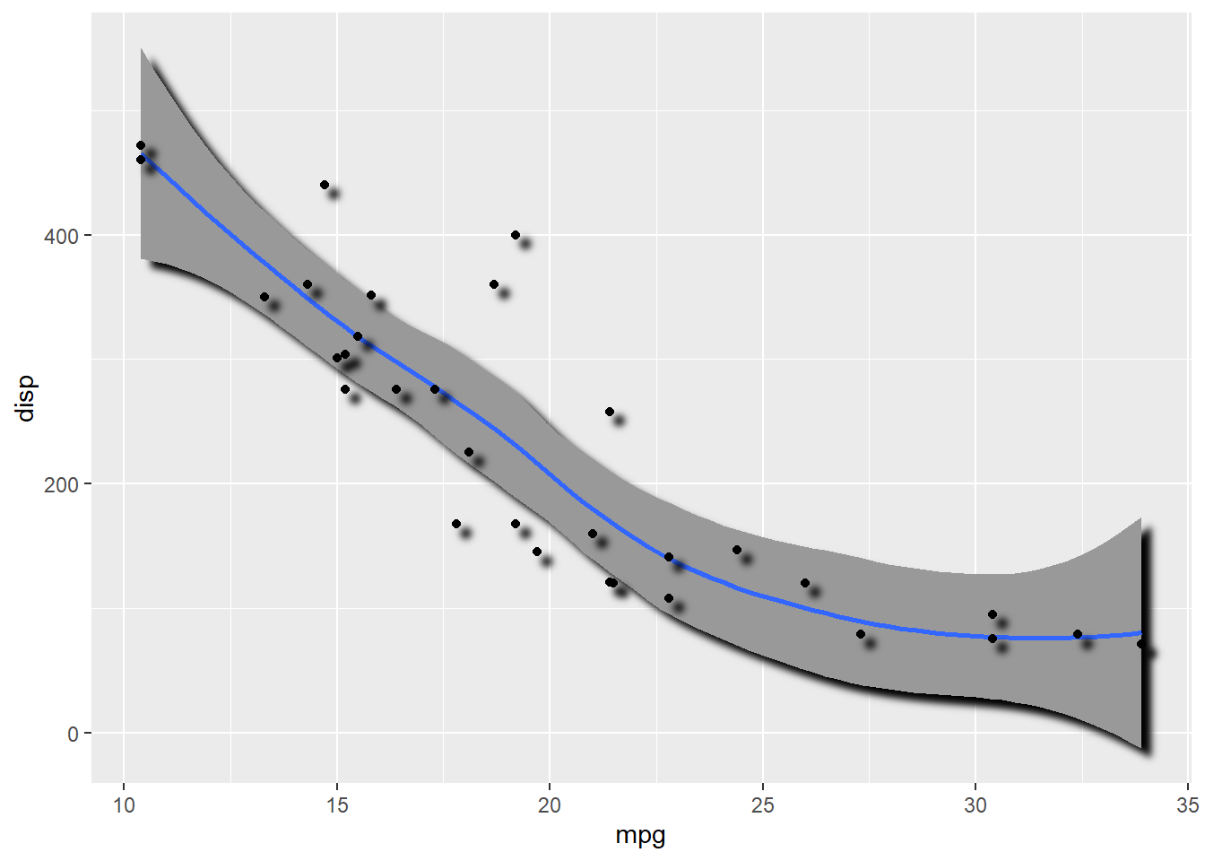
library(ggfx)
# https://github.com/thomasp85/ggfx

mtcars %>%
  ggplot(aes(mpg, disp)) +
  with_shadow(
    geom_smooth(alpha = 1), sigma = 4
  ) +
  with_shadow(
    geom_point(), sigma = 4
  )
26.6 弯曲文本
弯曲文本,使其匹配多种图形的轨迹。
library(geomtextpath) # remotes::install_github("AllanCameron/geomtextpath")iris %>%
ggplot(aes(x = Sepal.Length, colour = Species, label = Species)) +
geom_textdensity(size = 6, fontface = 2, hjust = 0.2, vjust = 0.3) +
theme(legend.position = "none")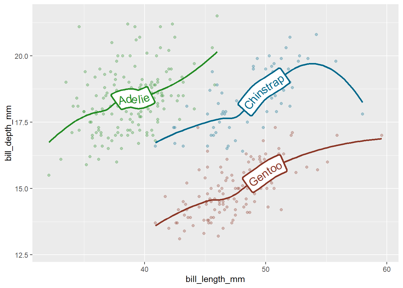
library(palmerpenguins)
penguins %>%
  ggplot(aes(x = bill_length_mm, y = bill_depth_mm, color = species)) +
  geom_point(alpha = 0.3) +
  geom_labelsmooth(aes(label = species), method = "loess", size = 5, linewidth = 1) +
  scale_colour_manual(values = c("forestgreen", "deepskyblue4", "tomato4")) +
  theme(legend.position = "none")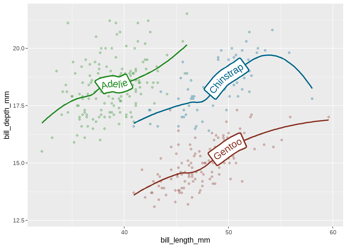
26.7 函数图
有时候我们想画一个函数图,比如正态分布的函数,可能会想到先产生数据,然后画图,比如下面的代码
tibble(x = seq(from = -3, to = 3, by = .01)) %>%
  mutate(y = dnorm(x, mean = 0, sd = 1)) %>%
  ggplot(aes(x = x, y = y)) +
  geom_line(color = "grey33")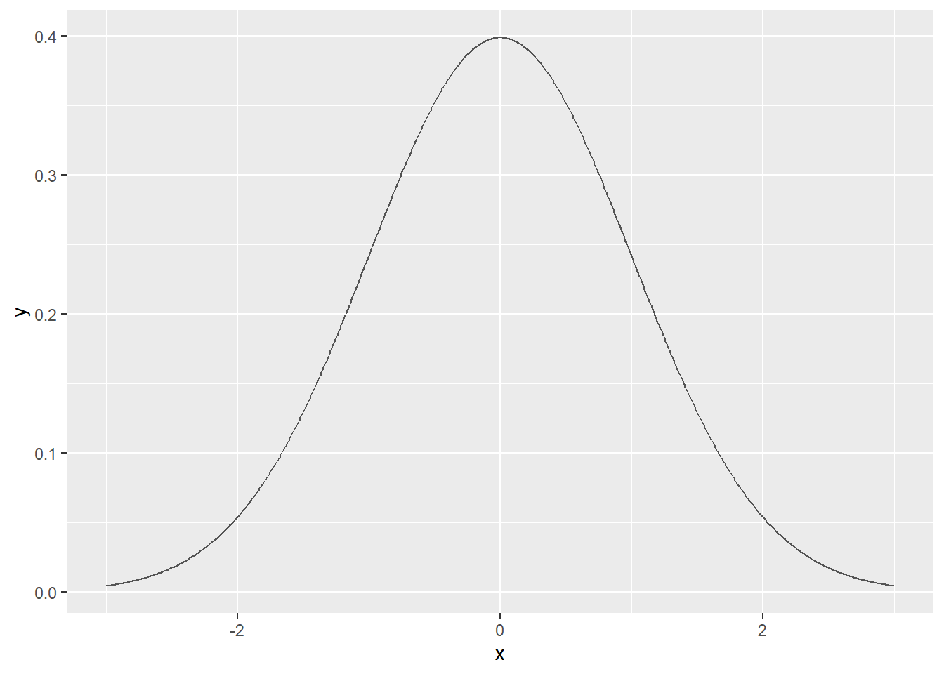
事实上,stat_function()可以简化这个过程
ggplot(data = data.frame(x = c(-3, 3)), aes(x = x)) +
  stat_function(fun = dnorm)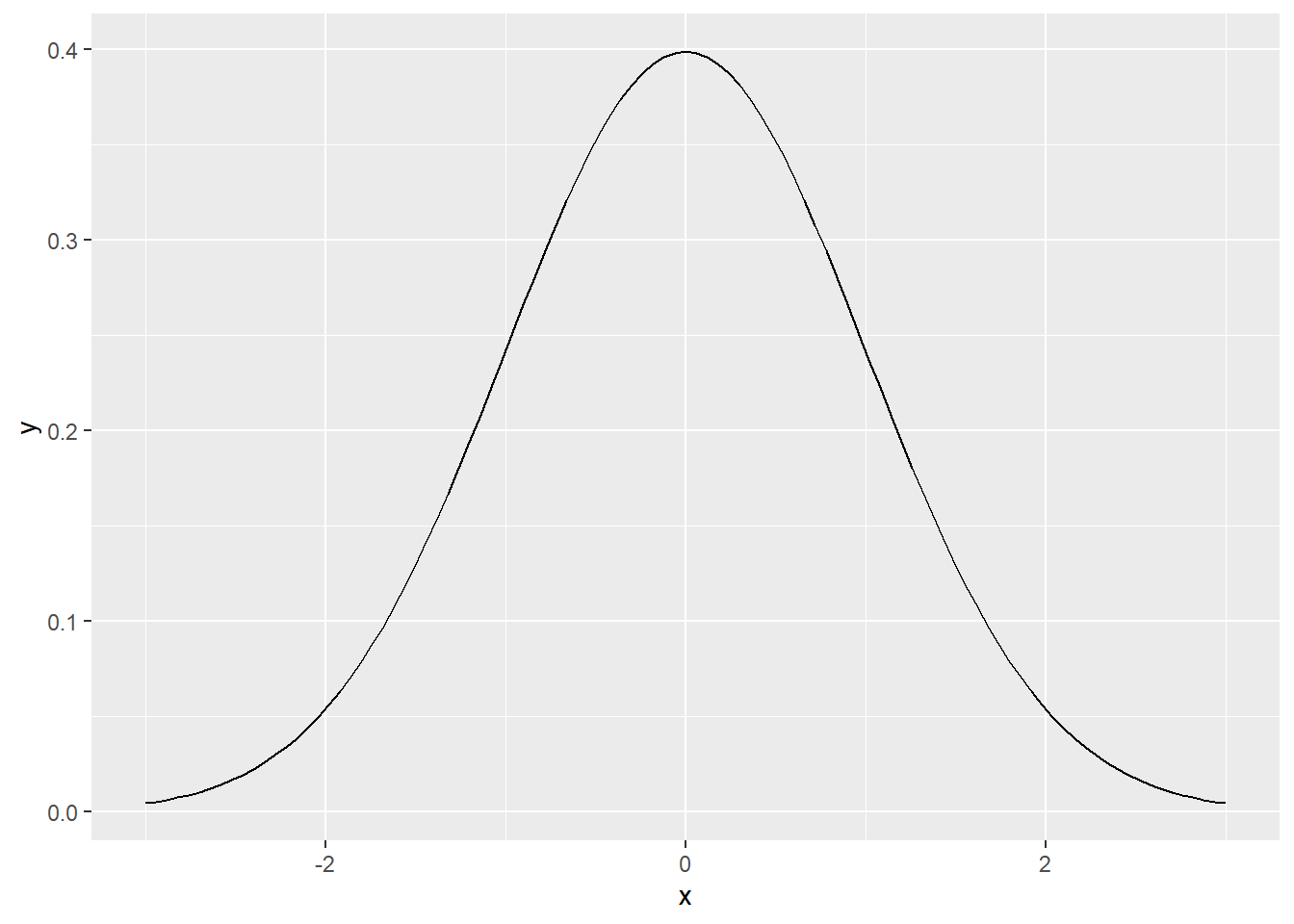
当然我们也可以绘制自定义函数
myfun <- function(x) {
  (x - 1)**2
}

ggplot(data = data.frame(x = c(-1, 3)), aes(x = x)) +
  stat_function(fun = myfun, geom = "line", colour = "red")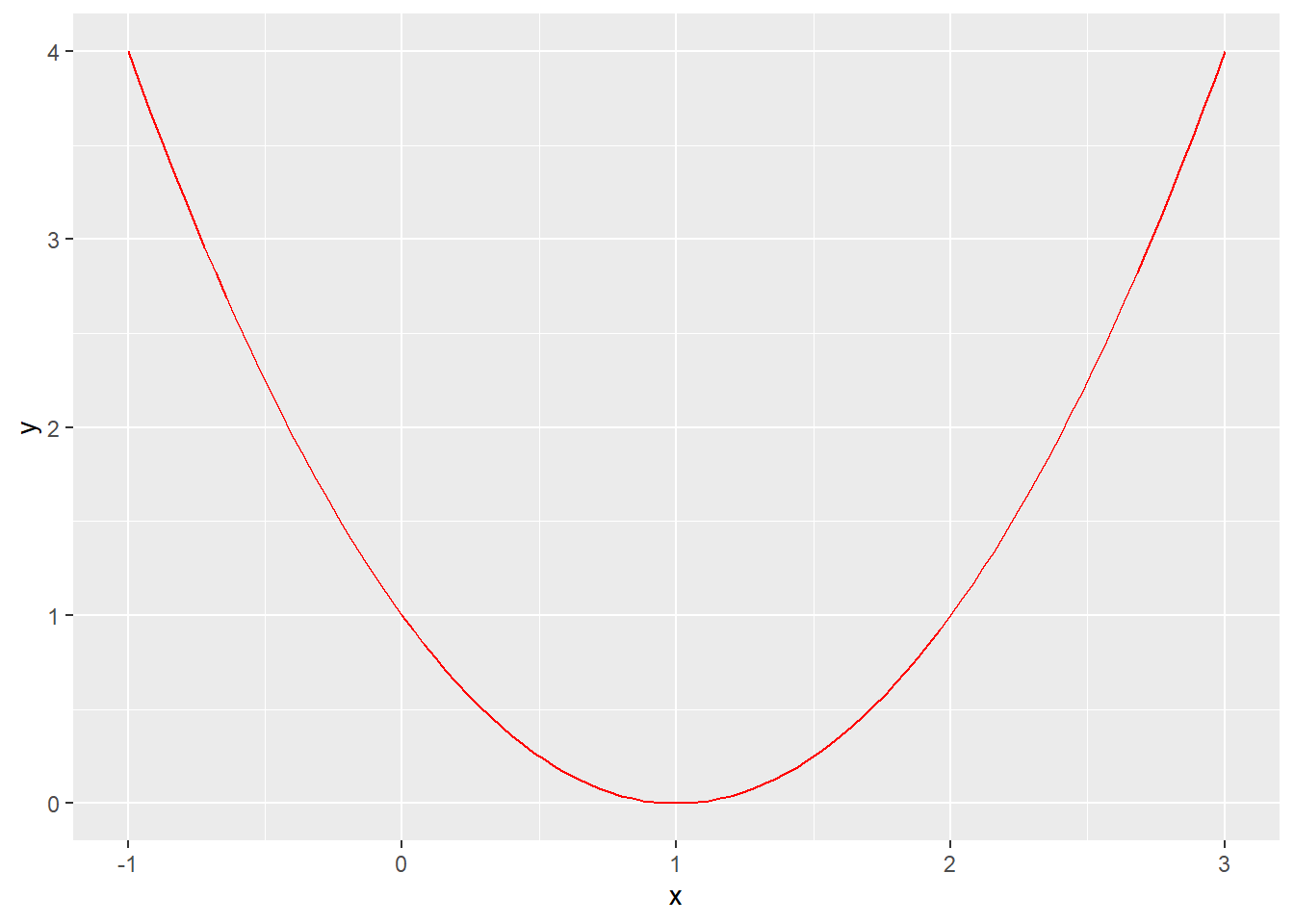
下面这是一个很不错的例子,细细体会下
d <- tibble(x = rnorm(2000, mean = 2, sd = 4))

ggplot(data = d, aes(x = x)) +
  geom_histogram(aes(y = after_stat(density))) +
  geom_density() +
  stat_function(fun = dnorm, args = list(mean = 2, sd = 4), colour = "red")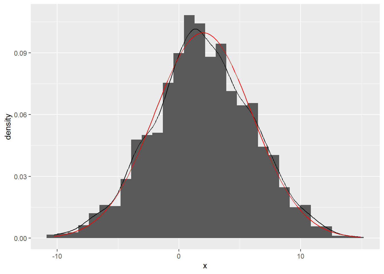
26.8 地图
小时候画地图很容易,长大了画地图却不容易了。
这是一个公园🏞地图和公园里松鼠🐿数量的数据集
nyc_squirrels <- read_csv("./demo_data/nyc_squirrels.csv")
central_park <- sf::read_sf("./demo_data/central_park")
先来一个地图,
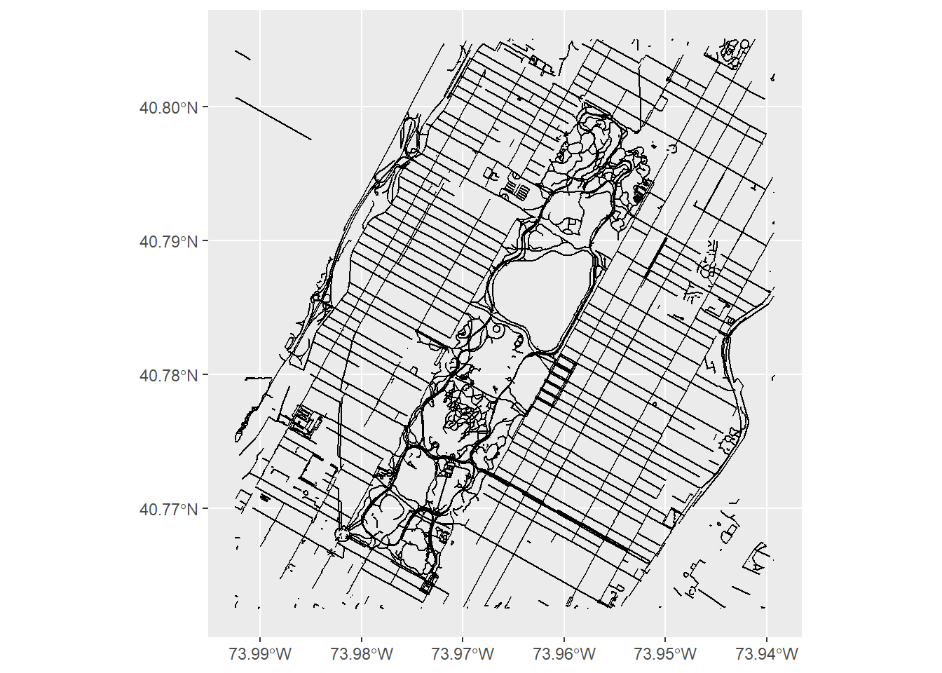
一个geom_sf就搞定了🥂,貌似没那么难呢? 好吧,换个姿势,在地图上标注松鼠出现的位置
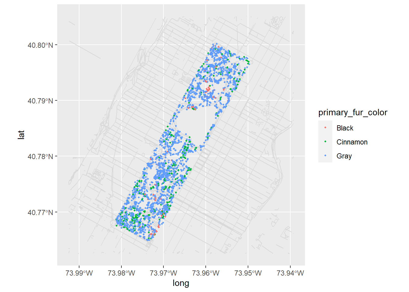
nyc_squirrels %>%
  drop_na(primary_fur_color) %>%
  ggplot() +
  geom_sf(data = central_park, color = "grey85") +
  geom_point(
    aes(x = long, y = lat, color = primary_fur_color),
    size = .8
  )
分开画呢
nyc_squirrels %>%
  drop_na(primary_fur_color) %>%
  ggplot() +
  geom_sf(data = central_park, color = "grey85") +
  geom_point(
    aes(x = long, y = lat, color = primary_fur_color),
    size = .8
  ) +
  facet_wrap(vars(primary_fur_color)) +
  theme(legend.position = "none")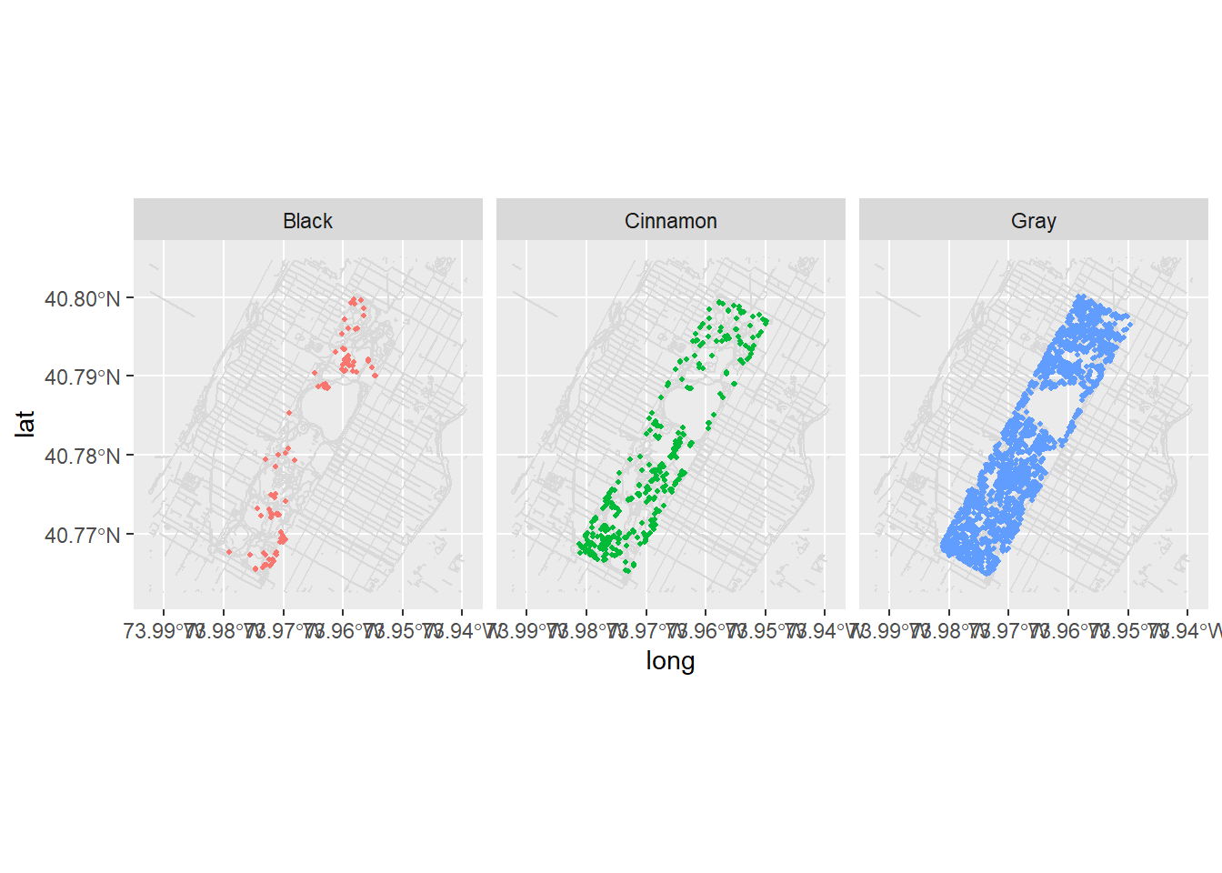
label_colors <-
  c("all squirrels" = "grey75", "highlighted group" = "#0072B2")

nyc_squirrels %>%
  drop_na(primary_fur_color) %>%
  ggplot() +
  geom_sf(data = central_park, color = "grey85") +
  geom_point(
    data = function(x) select(x, -primary_fur_color),
    aes(x = long, y = lat, color = "all squirrels"),
    size = .8
  ) +
  geom_point(
    aes(x = long, y = lat, color = "highlighted group"),
    size = .8
  ) +
  cowplot::theme_map(16) +
  theme(
    legend.position = "bottom",
    legend.justification = "center"
  ) +
  facet_wrap(vars(primary_fur_color)) +
  scale_color_manual(name = NULL, values = label_colors) +
  guides(color = guide_legend(override.aes = list(size = 2)))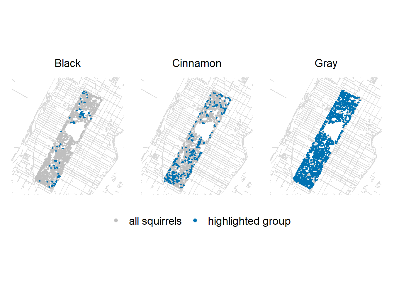
# ggsave("Squirrels.pdf", width = 9, height = 6)当然,也可以用gghighlight的方法
nyc_squirrels %>%
  drop_na(primary_fur_color) %>%
  ggplot() +
  geom_sf(data = central_park, color = "grey85") +
  geom_point(
    aes(x = long, y = lat, color = primary_fur_color),
    size = .8
  ) +
  gghighlight(
    label_key = primary_fur_color,
    use_direct_label = FALSE
  ) +
  facet_wrap(vars(primary_fur_color)) +
  cowplot::theme_map(16) +
  theme(legend.position = "none")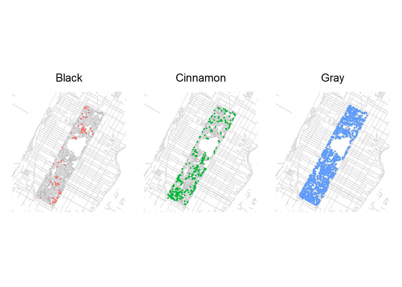
26.9 字体
如果想使用不同的字体,可以用theme() 的 element_text() 函数
-
family: font family -
face: bold, italic, bold.italic, plain -
color,size,angle, etc.
其中,family =字体名,可以用 extrafont 导入C:\Windows\Fonts\的字体,然后选取
library(extrafont)
font_import() # will take 2-3 minutes. Only need to run once
loadfonts()
fonts()
fonttable()
mpg %>%
ggplot() +
geom_jitter(aes(x = cty, y = hwy, color = class)) +
theme(text = element_text(family = "Peralta"))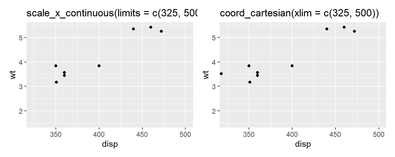
26.10 中文字体
有时我们需要保存图片,图片有中文字符,就需要加载library(showtext)宏包
根据往年大家提交的作业,有同学用rmarkdown生成pdf,图片标题使用了中文字体,但中文字体无法显示。解决方案是R code chunks加上fig.showtext=TRUE
详细资料可参考这里
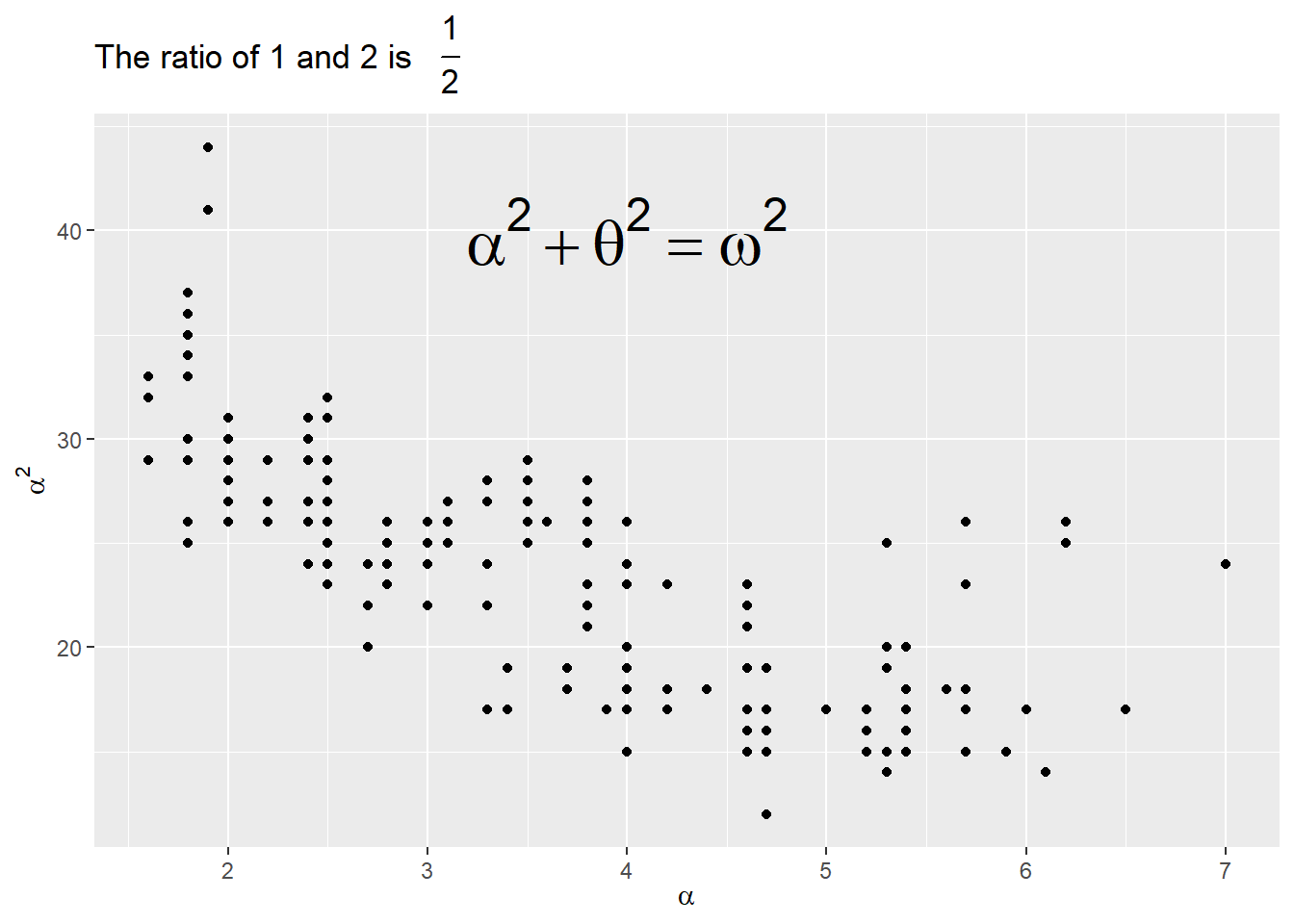
26.11 latex公式
library(ggplot2)
library(latex2exp)

ggplot(mpg, aes(x = displ, y = hwy)) +
  geom_point() +
  annotate("text",
    x = 4, y = 40,
    label = TeX("$\\alpha^2 + \\theta^2 = \\omega^2 $"),
    size = 9
  ) +
  labs(
    title = TeX("The ratio of 1 and 2 is $\\,\\, \\frac{1}{2}$"),
    x = TeX("$\\alpha$"),
    y = TeX("$\\alpha^2$")
  )
26.12 “coord_cartesian() 与 scale_x_continuous()”
乍一看,这两个操作没有区别
p1 <- mtcars %>%
  ggplot(aes(disp, wt)) +
  geom_point() +
  scale_x_continuous(limits = c(325, 500)) +
  ggtitle("scale_x_continuous(limits = c(325, 500))")

p2 <- mtcars %>%
  ggplot(aes(disp, wt)) +
  geom_point() +
  coord_cartesian(xlim = c(325, 500)) +
  ggtitle("coord_cartesian(xlim = c(325, 500))")


p1 + p2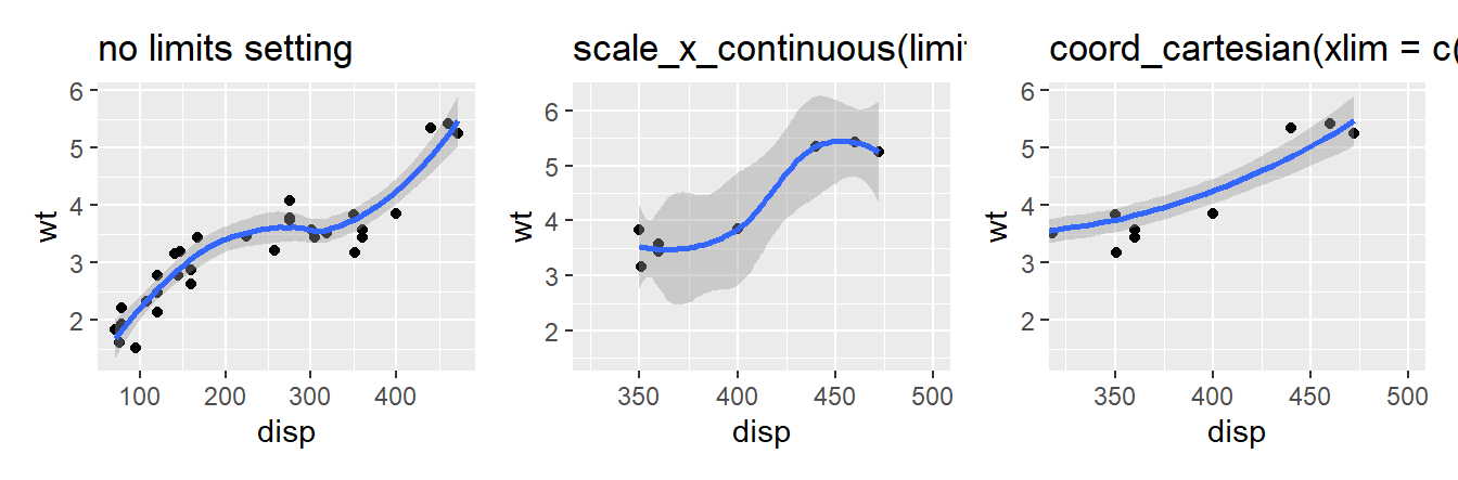
实际上这两个操作,区别蛮大的
p3 <- mtcars %>%
  ggplot(aes(disp, wt)) +
  geom_point() +
  geom_smooth() +
  ggtitle("no limits setting")

p4 <- mtcars %>%
  ggplot(aes(disp, wt)) +
  geom_point() +
  geom_smooth() +
  scale_x_continuous(limits = c(325, 500)) +
  ggtitle("scale_x_continuous(limits = c(325, 500))")


p5 <- mtcars %>%
  ggplot(aes(disp, wt)) +
  geom_point() +
  geom_smooth() +
  coord_cartesian(xlim = c(325, 500)) +
  ggtitle("coord_cartesian(xlim = c(325, 500))")


p3 + p4 + p5
解释:
scale_x_continuous(limits = c(325,500))的骚操作,会把limits指定范围之外的点全部弄成NA, 也就说改变了原始数据,那么geom_smooth()会基于调整之后的数据做平滑曲线。coord_cartesian(xlim = c(325,500))操作,不会改变数据,只是拿了一个放大镜,重点显示xlim = c(325, 500)这个范围。